What is Burmese Cane Rattan?
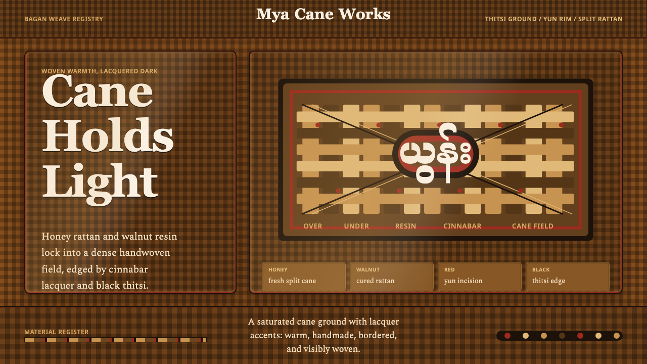
Burmese Cane Rattan turns a household craft — hand-split rattan woven into trays and frames — into a design system built entirely from visible weave, warm wood tones, and a single line of lacquer red.
Burmese Cane Rattan in brief
Burmese Cane Rattan is a design system distilled from roughly half a century of Myanmar wickerwork, spanning the 1900s to the 1950s — the period when the country's basket and tray weaving trades expanded alongside colonial-era trade and craft markets. The source material is humble and domestic: trays, storage baskets, and underframes built by splitting rattan cane and kyun bamboo into thin strips, then weaving them into tight lattices that run from honeyed gold to deep walnut brown. Every one of those objects was also, before it left the workshop, coated in a resin lacquer called thitsi — the same lacquer that gives Myanmar's more famous lacquerware its glassy dark ground.
As a design language, the system treats that combination — visible weave plus lacquer trim — as its entire vocabulary. The color range never strays past what a real rattan tray could show: honey-toned cane at its lightest, walnut cane at its darkest, blackened thitsi where the lacquer pools thickest, and one sharp accent — a cinnabar-red lacquer known as hinthabada — used the way a craftsman would use it, as a rim line rather than a fill. Nothing in the system is allowed to sit as a smooth, unbroken flat color; the weave itself is the texture, and it is meant to be seen at every scale, from a large background panel down to a thin card border.
The result reads as warm and handmade rather than manufactured. Where a lot of natural-material design trends flatten wicker or rattan into a printed pattern applied over a generic layout, this system keeps the logic of the object itself: panels behave like the rim of a woven tray, borders behave like a lashed edge, and the cinnabar line behaves like the one deliberate stroke of color a lacquer artisan would add last. It is a system built around containment and craft, not around decoration for its own sake.
Where does Burmese Cane Rattan come from?
Wickerwork — weaving split plant fiber into baskets, trays, mats, and furniture — is one of the oldest craft traditions across Southeast Asia, and Myanmar's version grew out of exceptionally abundant local material: rattan cane, which climbs through the region's forests in long flexible canes, and kyun, a bamboo variety prized for its strength once split into thin strips. Both materials could be harvested locally, split by hand with simple tools, and woven without a loom, which meant basket-weaving stayed a village-level craft even as other Burmese industries modernized.
The wa-zaung — Burmese basket-weavers — worked this material inside family workshops, where the skill of splitting cane into strips of even width and weaving them into a tight, gapless lattice was passed down through apprenticeship rather than written instruction. The period this system draws from, roughly 1900 to 1950, was the era when that domestic craft met a growing colonial-era market for household goods and curio-trade souvenirs, pushing weavers to refine their lattices into the dense, honey-to-walnut surfaces this design language now borrows.
The lacquer half of the story belongs to a separate but overlapping trade: Myanmar's yun lacquerware artisans, who coated woven and turned vessels in thitsi, a resin tapped from a native lacquer tree. Thitsi dries into a hard, glossy, near-black ground that seals and waterproofs whatever it covers — which is why a woven rattan tray finished this way could survive daily household use. Bagan's thitsi lacquer masters were the acknowledged center of this finishing craft, and it is their cinnabar-red pigment, hinthabada, that supplies this design system's one accent color: a deep, mineral red traditionally used as a rim or line color against the blackened lacquer ground.
Geographically, the tradition this system draws on runs through a specific belt of central and eastern Myanmar: Bagan, historically the country's most prominent lacquer center; Kyaukka, a village long associated with lacquerware and basket production; and the villages around Inle Lake, where weaving remains a living craft practice today. Rather than isolating one town's output, Burmese Cane Rattan treats this whole regional craft belt — weaving on one side, lacquer finishing on the other — as a single unified visual language.
What defines the Burmese Cane Rattan look?
Color
The palette runs entirely within what a real woven-and-lacquered object could show: honeyed rattan at the light end, deep walnut cane in the middle, and blackened thitsi at the dark end, with a single cinnabar-red lacquer accent — hinthabada — reserved for rim lines and small highlights rather than large fields. There is no cream or off-white flat fill anywhere in the system; every light area is still a lighter shade of woven cane, not a blank background.
Weave & Texture
The over-under interlace of split rattan and bamboo strips is the system's primary surface pattern, not a decorative overlay. It appears at every scale — as a dense lattice across a large panel, and as a thinner woven border around a small card — so that nothing in the layout is allowed to read as a smooth, machine-flat surface.
Tray & Frame Structure
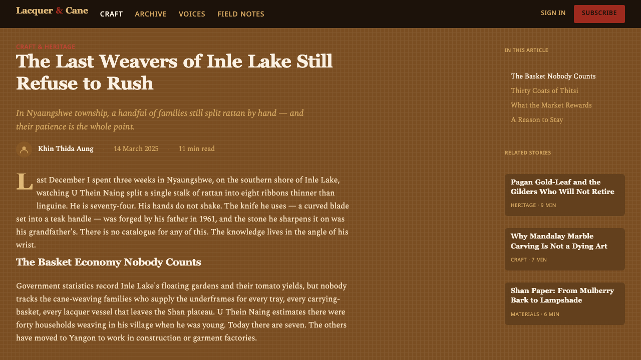
Layout blocks behave like the physical objects they borrow from: a panel reads as the base of a woven tray, and its border reads as the rim that holds the weave together. This gives the system a built-in sense of containment — content sits inside a woven vessel rather than floating on an open page — which is a structural habit inherited directly from tray-and-underframe basketry rather than a graphic invention.
Lacquer Rim Accent
The cinnabar-red hinthabada lacquer is used exactly the way a lacquer artisan would use it on a finished tray: as a thin rim line, a border stroke, or a small area of emphasis — never as a large fill. Its scarcity is what gives it force; a system that let cinnabar spread across whole panels would lose the sense of a deliberate, hand-applied final touch.
Surface & Sheen
Two finishes coexist in every composition: the matte, fibrous texture of raw woven cane, and the harder, faintly glossy sheen of the thitsi lacquer ground beneath and around it. The contrast between the two — dry weave against wet-looking lacquer — does the work that a flat design system would otherwise assign to shadow or gradient.
Compositional Density
Up close, the woven surface is busy — every strip visible, every crossing point distinct — but the system organizes that density into calm, legible blocks at a distance, the same way a finished tray reads as one clean object even though its surface is made of hundreds of individual strips. Content areas stay open and uncluttered so the weave can carry the visual richness instead of competing with it.
Who shaped Burmese Cane Rattan?
The wa-zaung are the artisans who split rattan cane and kyun bamboo into even strips and weave them into the tight honey-to-walnut lattices this system takes its surface pattern from. Their skill — passed down through family and apprentice workshops rather than formal schooling — is what makes an even, gapless weave possible at the scale of a full tray or underframe.
Working alongside the weavers, yun lacquerware artisans applied the thitsi resin ground and cinnabar trim that finished a woven object and made it durable enough for daily use. Their craft is the direct source of this system's lacquer palette — the blackened ground and the hinthabada rim-line red.
Bagan was the historic center of Myanmar's thitsi lacquer craft, and it is Bagan's lacquer workshops that this system credits for refining the resin-ground, cinnabar-and-black finishing technique it borrows. Their standard for a glossy, near-black lacquer ground is what the system's darkest tones are built to evoke.
Kyaukka, a village long associated with lacquerware and basketry, and the weaving villages around Inle Lake round out the regional craft belt this system draws from. Each community contributed its own hand to the same shared vocabulary of honey-to-walnut weave and cinnabar lacquer trim, which is why the system reads as a regional language rather than one workshop's individual style.
How do you use Burmese Cane Rattan today?
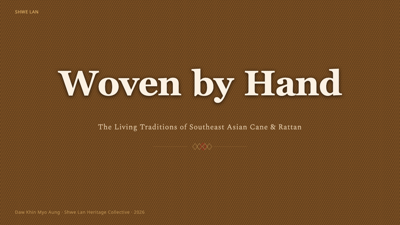
On a presentation cover slide, Burmese Cane Rattan works best when the woven texture is allowed to fill the frame the way it would on a real tray: a warm honey-to-walnut lattice as the background, with the title block sitting on top like an object resting on the surface, and a single cinnabar rim line used to underline the title or trace the edge of the title block rather than color it in. Do not let the lattice compete with the type — keep the woven area large and continuous so it reads as a single material, not a busy backdrop.
On content and data slides, keep the weave to the edges — a bordered strip along the top or side of the frame — while the body of the slide stays open enough to hold text and charts legibly. For data visualization, bars and segments should move through the honey-to-walnut range, with the cinnabar accent reserved for the one bar, line, or number the audience is meant to notice first, the same way a lacquer artisan would use hinthabada as a single deliberate highlight rather than spread it across the whole object.
In web interfaces, this system suits products built around warmth, craft, and tactility rather than speed or density — artisan marketplaces, hospitality and travel booking, home-goods retail, wellness products. Card and panel borders can carry a woven-edge treatment, and a pricing tier or featured product can be marked with a thin cinnabar rim rather than a solid color fill, keeping the background in a warm walnut or honey tone instead of stark white so the interface never loses its handmade register.
In editorial and marketing contexts, the system supports a slow, crafted brand story well: full-width panels of woven texture behind a headline, pull-quotes framed like the rim of a tray, and the cinnabar accent used consistently as the one color readers learn to associate with calls to action or key facts. It photographs and screenshots well precisely because it never asks for a flat, empty background — there is always texture doing quiet work behind the type.
A common mistake is treating the weave as a printed background pattern rather than a structural material — dropping a generic wicker texture behind a layout that otherwise ignores tray-and-frame logic, or letting the cinnabar red spread across large areas the way a conventional accent color would. Both moves erase the thing that makes this system distinctive: content should sit inside a woven vessel, and the lacquer red should behave like the single last stroke a craftsman adds, not like a brand color used everywhere.
Burmese Cane Rattan — FAQ
What is thitsi lacquer, and why does it matter to this palette?
Thitsi is a resin tapped from a lacquer tree native to Myanmar, and it dries into a hard, glossy, near-black finish that has been used for centuries to seal and waterproof woven and turned objects. It supplies the darkest end of this system's palette and the glossy contrast against the matte weave, and it is also the ground into which the cinnabar-red hinthabada accent is traditionally set.
Is this just a generic wicker or rattan pattern?
No — a generic wicker texture is decorative and interchangeable; this system is built from a specific regional craft (Burmese wickerwork paired with yun lacquerware finishing) and carries specific structural rules with it: content behaves like it sits inside a tray, and one named pigment, cinnabar-red hinthabada, is reserved for rim accents rather than used as an interchangeable brand color. Those constraints are what separate it from a generic bohemian-rattan surface treatment.
Does this system only work on dark backgrounds?
It is built as a dark-leaning system: the source material treats woven cane over blackened thitsi lacquer as the default ground, and it explicitly avoids a flat cream or off-white fill anywhere. That doesn't mean every element must be black, but the overall composition is meant to read as warm-dark rather than light-and-airy — a cream-background version would work against the craft logic the system is built on.
How is this different from Burmese Yun Lacquerware?
They come from the same regional lacquer culture but emphasize different crafts. Burmese Cane Rattan centers on the woven surface itself, with lacquer used as a trim accent around it. Burmese Yun Lacquerware centers on the lacquer ground as the whole surface, with fine incised lines carrying figural and floral motifs cut directly through it. One is a weaving system with a lacquer accent; the other is an incised-lacquer system with no visible weave at all.
What kinds of brands or products suit this aesthetic?
Anything that wants to read as handmade, warm, and unhurried: artisan and craft marketplaces, home-goods and furniture brands, hospitality and travel products, wellness and slow-living brands, and editorial content about craft or material culture. It is a poor fit for anything that needs to read as fast, technical, or coldly efficient — the woven texture and lacquer trim actively work against that register.
Related design styles
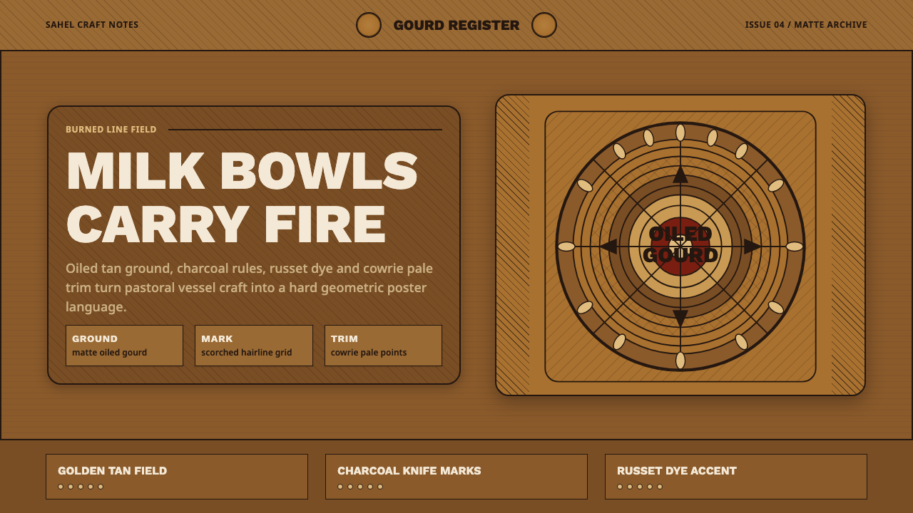 Fulani Milk CalabashMatte craft burns bright. Oiled gourd tan meets charred concentric linework.
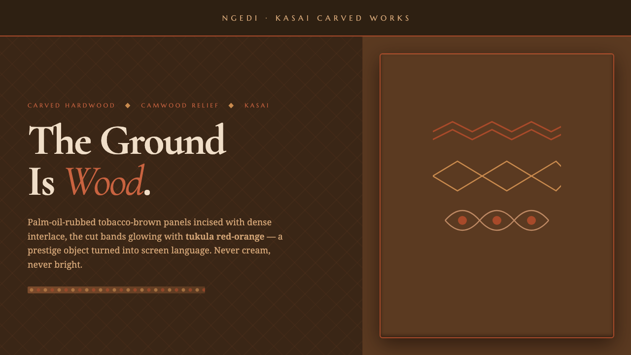 Kuba Calabash BrownPrestige in dark wood. Calabash brown ground, dense incisions, tukula red rel…
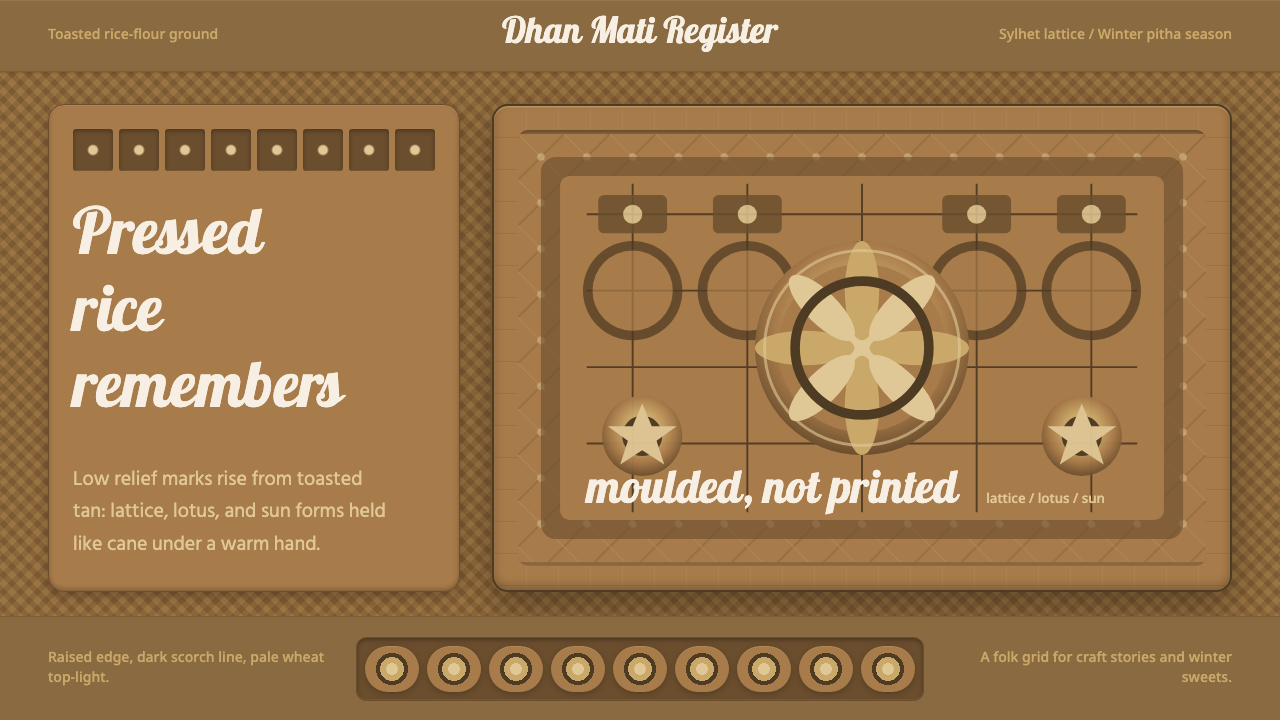 Bangladeshi Nakshi Pitha MotifsWarm relief, never print. Galada type and tan lattice press rice-flour craft…
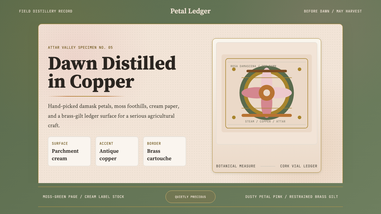 Bulgarian Rose Attar (Valley of Roses)Quietly precious craft. Moss green, dusty rose and brass borders frame a dawn…
 Rattan & WickerWarm shade has texture. Honey cane and palm green weave across a dark veranda…
 Ainu Attus RobeProtection is cut, not painted. Indigo bands and square-ended thread hold elm…