What is Tbilisi Art Nouveau?
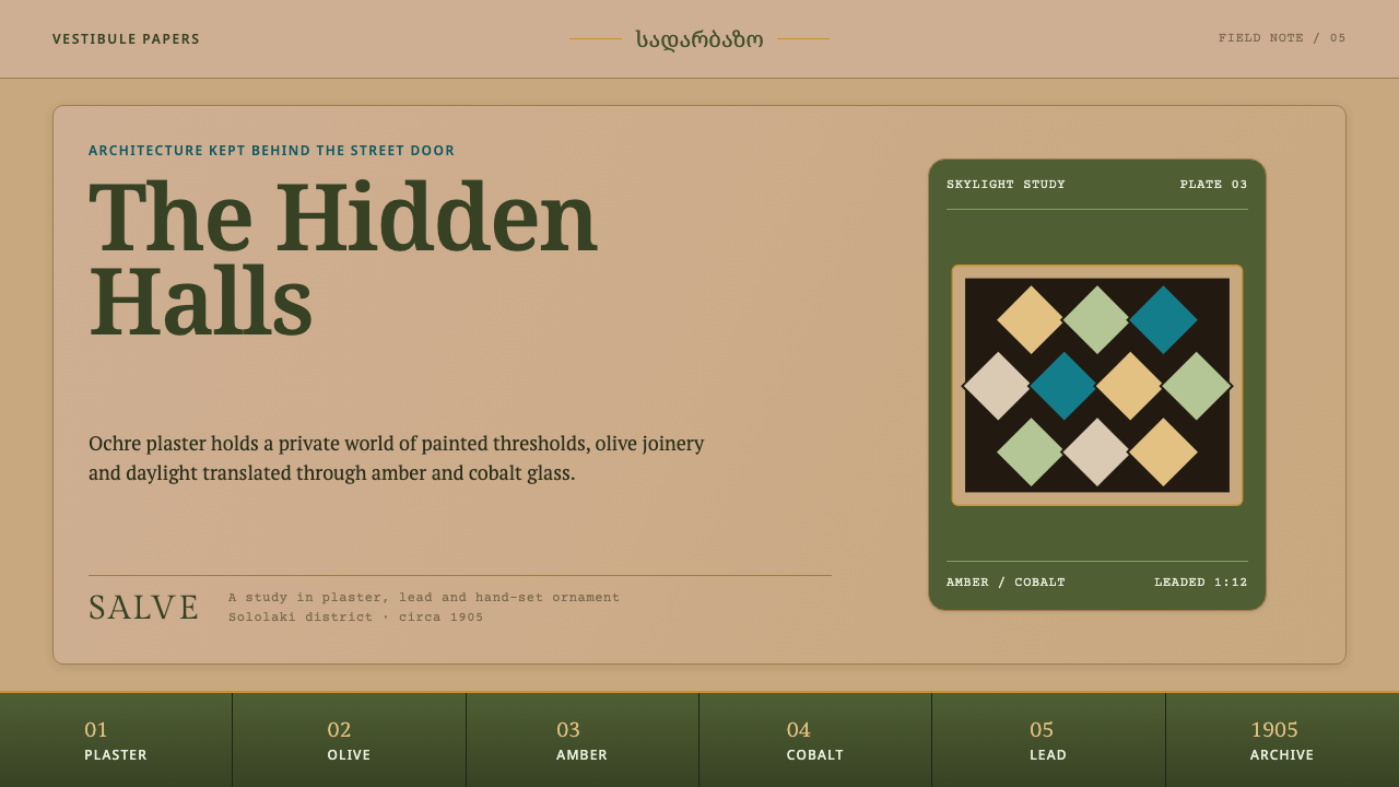
Tbilisi Art Nouveau is the style of the room behind the street door — ochre plaster, an olive dado, vine friezes and leaded amber glass, painted for the people who lived upstairs rather than the people who walked past.
Tbilisi Art Nouveau in brief
Tbilisi Art Nouveau is the ornamental language of the merchant apartment houses of Sololaki and Mtatsminda, the hillside districts of old Tbilisi, built and decorated in the years from about 1890 to 1915 and at its richest near 1905. Its centre of gravity is a single room that is not quite a room: the sadarbazo, the shared entrance hall and stair that every household in the building passed through. Behind a fairly sober street front, that hall was painted from floor to ceiling with garlands, peacocks, small landscape views of the Darial Gorge and, in the more ambitious houses, a 'Persian' hall dressed in the dense polychrome of a carpet.
What distinguishes the style from the Art Nouveau of Paris or Brussels is where its energy sits. The famous whiplash line is present — a cast-iron balustrade winds upward through the stairwell — but the real subject is surface. A warm lime-plaster wall in ochre holds the whole composition. A panelled dado in olive-sage anchors the lower edge of every wall. Continuous vine friezes do the work that ruled lines would do elsewhere. And the only saturated colour comes from glass, where amber and cobalt lozenges held in black lead pour daylight from a skylight onto a mosaic floor that spells out the Latin greeting SALVE.
As a visual system it reads as warm, handmade and deliberately uneven. Pictures are set into the walls like framed vignettes, each composed on its own terms, so the layout is asymmetric not by theory but by habit: nobody was painting the whole hall as one mirrored scheme. The effect sits somewhere between a grand interior and a collected album — rich without being glossy, decorative without being frivolous, and unmistakably the product of one particular place.

Where does Tbilisi Art Nouveau come from?
The style belongs to Tbilisi — Tiflis in the language of the Russian Empire, which governed the city and made it the administrative and commercial centre of the Caucasus in this period. Sololaki, the district climbing the slope below Mtatsminda, filled during these decades with multi-storey apartment houses commissioned by merchants and well-off professionals. Curio dates the style to roughly 1890–1915, with a peak around 1905, and places it in those two districts, Sololaki and Mtatsminda.
Three currents meet in these halls. The first is Art Nouveau itself, the international fashion for organic line, stylised plants and the unity of architecture and decoration, which reached the Caucasus as a regional variant rather than a copy. The second is Russian-imperial eclecticism, the habit of the empire's provincial cities of combining classical garlands, stucco and borrowed historical motifs in a single scheme; it supplied the grammar of cornices, panels and formal stairwells. The third is Georgian ornamental painting, a long tradition of painted decoration in which the grapevine — in a country so bound up with wine — is never far away. The vine friezes that divide Tbilisi's walls are as much local as they are international.
Why spend so much on a hall that nobody from the street would ever see? Because the sadarbazo was where a household met the rest of the building and where a visitor formed a first impression. The street door was a threshold; the hall behind it was the showroom. Hence the subjects. Garlands and peacocks signal display and good fortune. Vignettes of the Darial Gorge, the dramatic mountain pass north of the city and a favourite subject of nineteenth-century travellers, bring the wider country indoors. The 'Persian' hall, with its carpet-like colour and arches hung in stalactite-like tiers, shows off a taste for the exotic. Overhead, a coloured-glass skylight turns daylight into the room's last ornament, and underfoot the SALVE mosaic welcomes everyone in.
Authorship is unevenly recorded. Curio's source names two figures for the period, the architects Mikheil Ohanjanov and Simon Kldiashvili, but the work of a hall was shared between an architect, a builder and, above all, the decorative painters, ironworkers and glaziers whose names rarely survive. What can be seen today has often been weathered by a century of daily use, faded in places and restored in others, and that patina — chalky plaster, softened paint, glass dulled by years of dust and light — is now part of how the style looks.
What defines the Tbilisi Art Nouveau look?
Ochre Lime-Plaster Ground
Everything sits on a warm ochre ground that reads as lime plaster rather than paint: matte, slightly chalky, a little uneven. It is not a neutral background but the main colour of the system, and it gives the whole palette its temperature. Other colours are chosen to sit comfortably against it — the olive-sage of the dado, the black of the lead lines, the jewel accents of glass. Pure white is used sparingly, because stark white next to this ochre makes the plaster look dirty rather than golden.
Panelled Olive-Sage Dado
The base of every wall is held by a panelled dado in muted olive-sage. In design terms it is a visual floor: a darker, heavier band along the lower edge of each surface that gives a layout something to stand on. The panels are rectangular and framed with mouldings, so the dado also introduces a quiet rhythm of repeated rectangles. Cards, sections and slides in this style close at the bottom with a band of this kind rather than floating free.
Vine Friezes as Dividers
Where a modern layout would use a hairline rule, this style uses a frieze: a continuous band of vine, leaf and tendril that runs across the top of a wall or between sections. The frieze separates and decorates at once, and because it is organic its rhythm is slightly irregular, drawn by hand rather than stamped. It is the single most transferable device of the system — a divider that has character and still does a divider's job.
Leaded Glass Accents
Colour intensity is rationed. The saturated hues appear almost only as amber and cobalt lozenges set in the skylight, each pane outlined by a black lead line. These are the system's jewels: small, bright, framed in dark contour, and read as light passing through rather than paint sitting on a surface. Amber warms and draws the eye; cobalt cools and steadies it. Used as accents against the ochre they feel like daylight entering the room; used as large fields they lose all of that.
Painted Vignettes and Asymmetry
Garlands, peacocks and views of the Darial Gorge are painted as separate pictures, and each is composed on its own terms. The hall therefore has no single mirrored plan: a landscape on one wall, a garland swag on another, a bird on a third, each sized and placed by the wall it occupies. The system inherits this — pictorial panels are allowed to differ in size and weight, and balance comes from the whole wall rather than from symmetry. Illustration is figurative, painterly and slightly flat, closer to decorative painting than to photography.
Iron, Mosaic and Threshold Lettering
Two harder materials punctuate the softness. A cast-iron balustrade spirals up the stair with a sinuous, plant-like line, and the floor is a mosaic that spells the word SALVE in capitals at the threshold. Together they set the tone for linework and type: lines that curve and wind rather than run straight, and lettering that behaves like signage — capitals, set deliberately, used for greeting and naming rather than for long reading.

Who shaped Tbilisi Art Nouveau?
Mikheil Ohanjanov is one of two names Curio's source attaches to this period. He belongs to the generation of architects who adapted European Art Nouveau for Tbilisi's apartment houses, working within a market of merchant clients who wanted fashionable facades and showy common halls. His name stands here for a wider practice: the architect set the structure — stair, landing, skylight, wall bays — and left generous surfaces for painters and craftsmen to fill.
Simon Kldiashvili is the second key figure named for the style. Like Ohanjanov he represents the local architect who translated an international fashion into a regional building type, balancing imperial eclectic conventions with Georgian ornament. For designers, the useful lesson is structural: in halls of this kind the architecture provides a calm frame — plaster walls, a dado, a glazed ceiling — and decoration is concentrated where people pause, at landings and thresholds.
Individual painters are rarely identified in the record Curio draws on, yet they made the style what it is. They covered walls with garlands, peacocks and gorge views, working within a shared repertoire to produce pictures that are bright, competent and slightly flat rather than academic. That anonymity matters for the visual system: its images are meant to read as craft and decoration, not as individual fine-art statements.
The merchant families who commissioned the apartment houses are the style's real patrons. Curio's source notes that these houses kept their best work private, and that choice explains the whole aesthetic: investment went into a shared hall that residents and guests would see every day, not into a loud street front. The style is the visual record of a social decision — to show prosperity inward, to the building's own community.
How do you use Tbilisi Art Nouveau today?
Tbilisi Art Nouveau is a warm, tactile, heritage-flavoured system, and it suits work whose subject is craft, place or hospitality more than raw data throughput. Apply it by its structure — ground, dado, frieze, accent — rather than by pasting ornament over a neutral layout. If those four layers are present, the result reads as the style even when the individual motifs are simple.
For slides, the cover is the strongest moment: an ochre field, a vine frieze running across the top edge, the title set in a confident serif or classical capitals, and a small cluster of amber and cobalt lozenges outlined in black as the single burst of colour. Content slides can keep a slim olive band along the bottom edge as the dado, with text sitting on the plaster tone. Data slides should keep charts flat, using olive and ochre tints for most bars and reserving amber and cobalt for the one or two series that matter, each outlined like leaded glass.
On the web, the style fits restaurants, wineries, boutique hotels, museums, cultural festivals, artisan e-commerce and portfolios better than dense dashboards. A landing page can open on a plaster ground, run a vine frieze as the section divider and close each block with an olive band at the foot. Product cards should look like framed vignettes with generous margins rather than tiles in a tight grid. For pricing or account pages, confine ornament to the header and the dividers; forms and tables stay plain and legible against the plaster.
In editorial and marketing work, the system excels at heritage storytelling: travel features, wine and food writing, architecture essays, exhibition catalogues and event programmes. Pull-quotes can sit in a framed panel, section breaks become frieze bands, and illustrations should be painterly vignettes of varied sizes rather than a uniform photo grid. One glass colour is enough to mark calls to action; keeping the rest of the page in plaster and olive makes that accent feel earned.
The most common mistake is treating the style as 'Art Nouveau with a yellow filter' — loading every surface with whiplash curves and gold. The system is built on restraint around ornament: plain plaster carries the decoration, and decoration is concentrated at edges, dividers and thresholds. Other errors include mirrored, perfectly symmetrical layouts that contradict the logic of separate vignettes; turning amber and cobalt into large background fills; using glossy gradients or soft drop shadows, which belong to a different material world than lime plaster and leaded glass; and forgetting the dado, which leaves a layout feeling unmoored.

Tbilisi Art Nouveau — FAQ
What is a sadarbazo, and why does it matter to this style?
A sadarbazo is the shared entrance hall and stairwell of a Tbilisi apartment house, the space every resident and visitor passes through. It matters because the whole style grew out of it: the best decoration of a merchant house was concentrated here, behind the street door, rather than on the facade. Painted garlands, peacocks, gorge landscapes, panelled dados, coloured-glass skylights and mosaic floors all belong to this one room, which is why the design system treats ground, dado, frieze and glass as a single ensemble.
How is it different from Parisian or Brussels Art Nouveau?
The family resemblance is real — organic line, stylised plants, a belief that architecture and decoration belong together — but the emphasis differs. Tbilisi's version puts less weight on a single dramatic curve and more on layered painted surfaces, drawing on Russian-imperial eclecticism and Georgian ornamental painting alongside the international fashion. It is also an interior style: much of its richness is deliberately hidden from the street. The palette is correspondingly local, built on ochre plaster and olive timber with jewel-like glass, rather than the pale, floral tones that many people associate with the French and Belgian examples.
Why is the layout asymmetrical?
Because the hall was never conceived as one mirrored composition. Each painted vignette — a garland, a bird, a mountain landscape — was composed for the wall it occupies, so sizes, weights and positions vary from wall to wall. The sense of order comes from the repeated frame around them: plaster ground, panelled dado, vine frieze. In design terms, keep the structural bands consistent and let the pictorial panels differ. The result is balanced by the whole wall rather than by reflection.
Can this style work as a dark theme?
Its natural condition is a light, warm ground lit from above by a skylight, so the light version is the authentic one. A dark variant is possible but needs a clear logic: let the olive-sage dado take over as the ground, keep ochre as a secondary tone for text and ornament, and treat amber and cobalt as small lit panes, as if glass glowing at dusk. Avoid pure black backgrounds, which strip out the plaster warmth that gives the style its character.
What kinds of products suit Tbilisi Art Nouveau best?
Work that trades on craft, hospitality, place and storytelling: restaurants, wine and food brands, boutique stays, museums and heritage institutions, cultural festivals, artisan shops and personal portfolios. It is a poor fit for high-density analytics, trading screens or anything that depends on a cool, neutral, machine-like tone. The style asks for room to breathe, hand-made imagery and a certain slowness; where a product can offer that, it feels distinctive, and where it cannot, a simpler system will serve better.
Related design styles
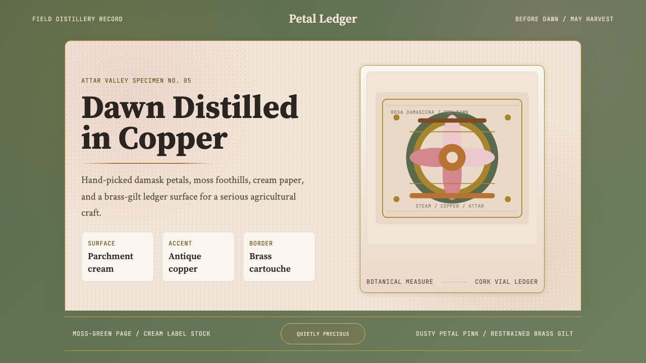 Bulgarian Rose Attar (Valley of Roses)Quietly precious craft. Moss green, dusty rose and brass borders frame a dawn…
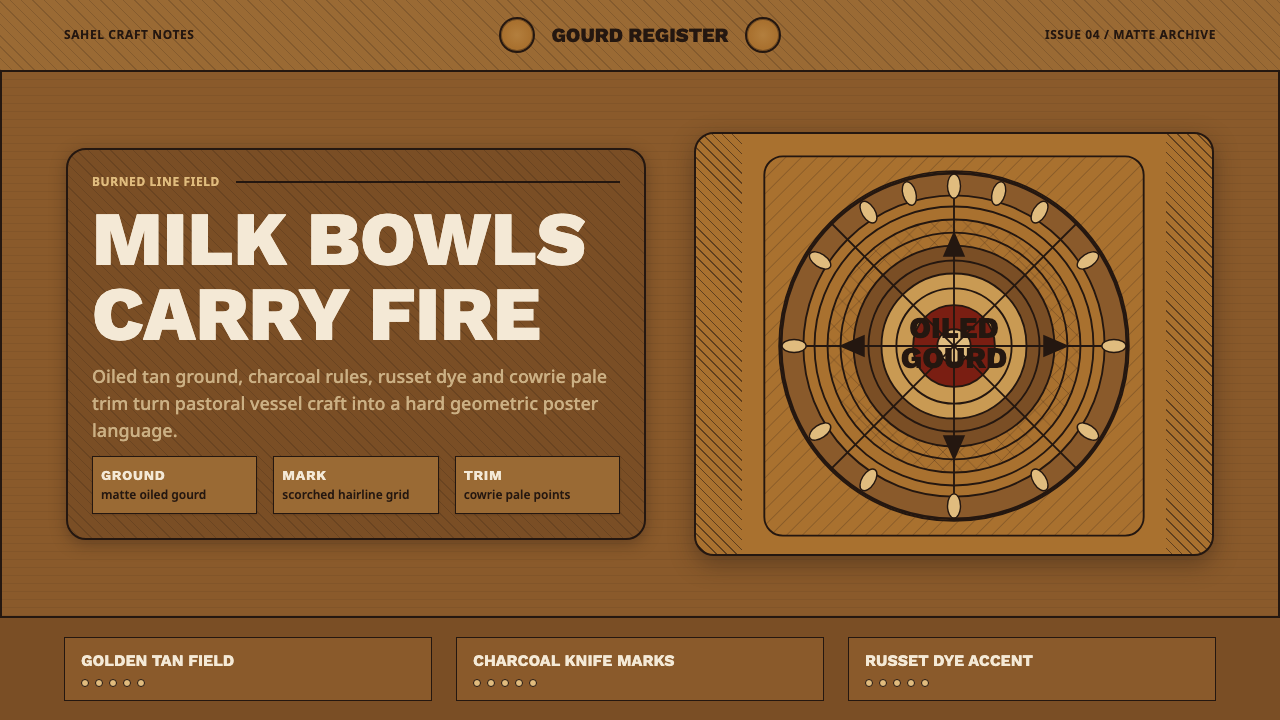 Fulani Milk CalabashMatte craft burns bright. Oiled gourd tan meets charred concentric linework.
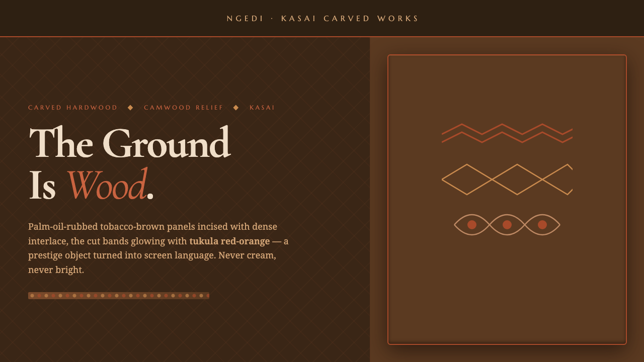 Kuba Calabash BrownPrestige in dark wood. Calabash brown ground, dense incisions, tukula red rel…
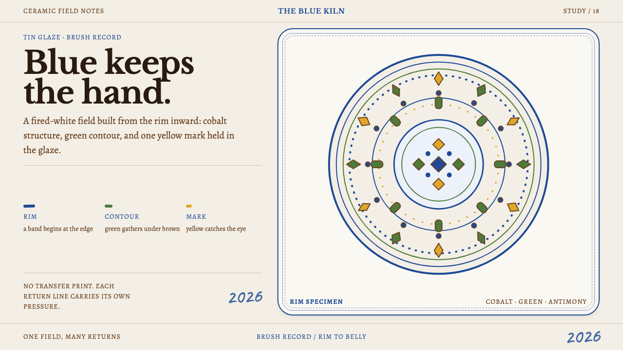 Modra MajolicaBlue keeps the hand. Cobalt rim bands and off-register pigment marks animate…
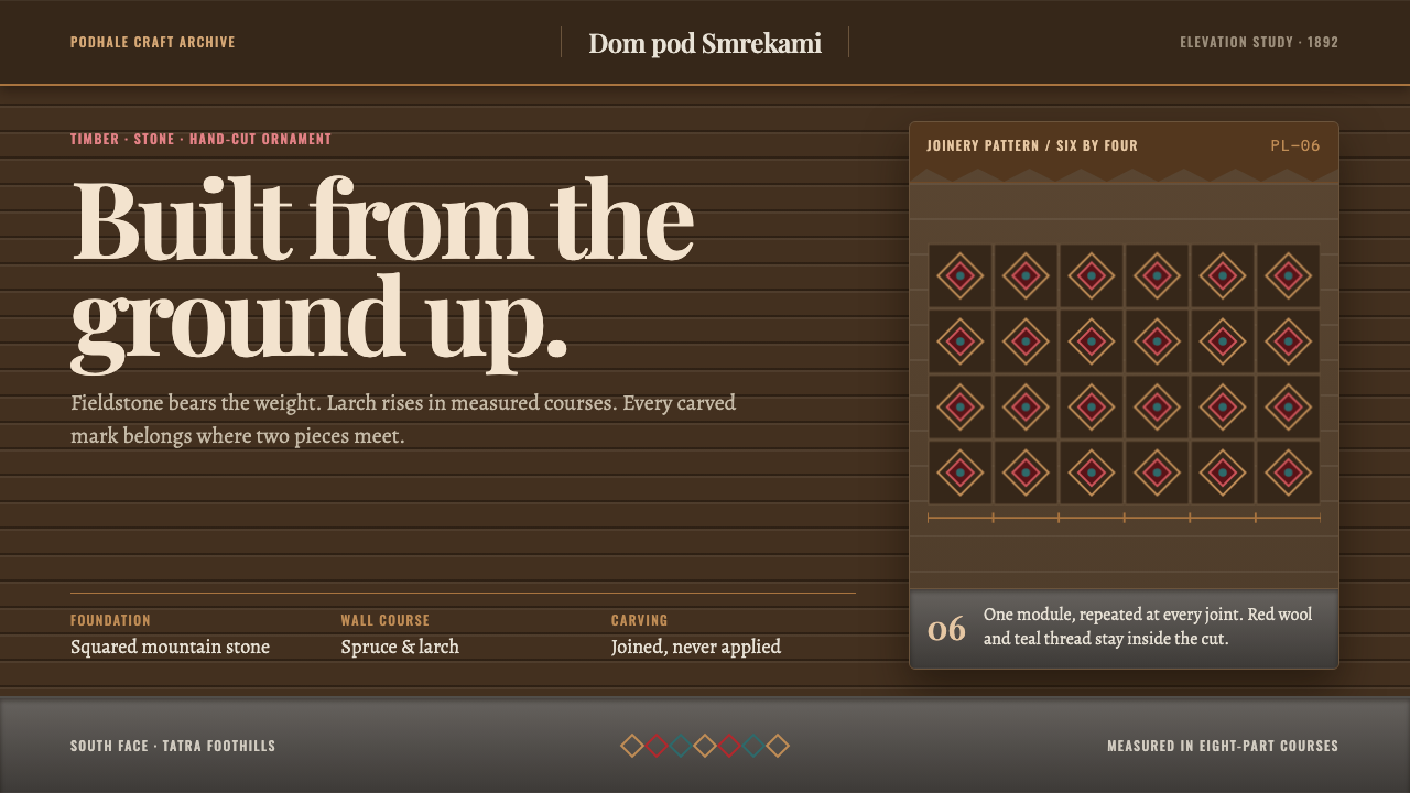 Zakopane StyleOrnament bears weight. Larch bands rise from stone, with red and teal marking…
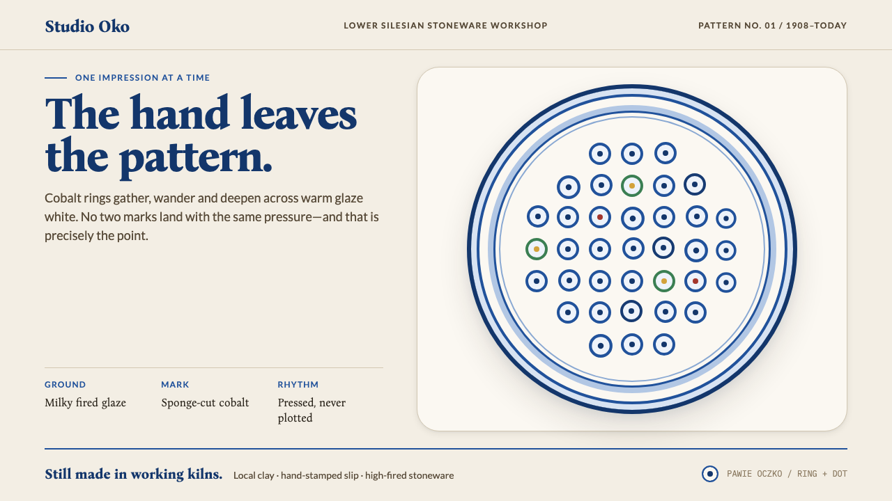 Bolesławiec PotteryThe hand stays visible. Cobalt ring-and-dot stamps drift across warm glaze wh…