What is Kuba Calabash Brown?
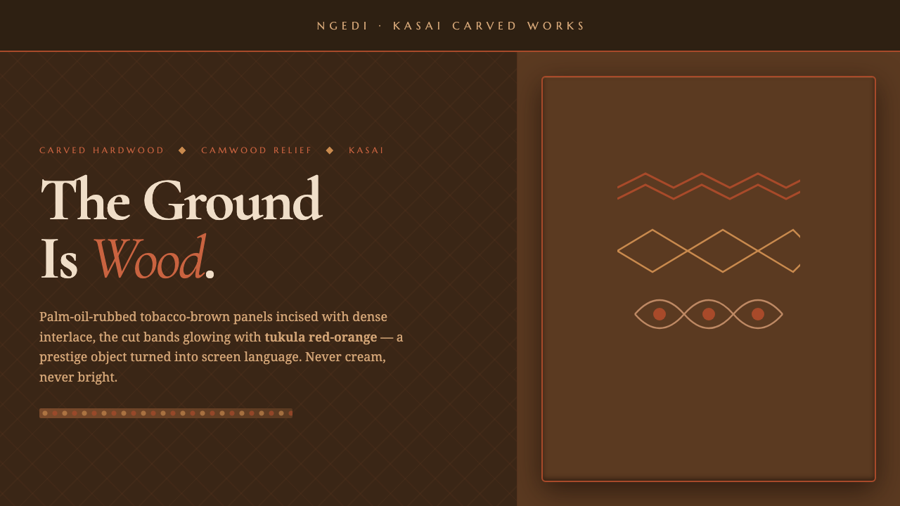
Kuba Calabash Brown turns carved wood, dense interlace, and tukula red-orange into a visual language of quiet authority.
Kuba Calabash Brown in brief
Kuba Calabash Brown is rooted in the carved cosmetic boxes and divination tools of the Kuba Kingdom in the Kasai region of central Democratic Republic of the Congo. Its visual identity begins with dark hardwood and calabash gourd, rubbed with palm oil until the surface takes on a deep tobacco-brown sheen. Across that ground, dense geometric incisions create a pattern that feels constructed, tactile, and ceremonial.
The defining contrast comes from tukula, the red-orange camwood powder worked into the cuts. It does not behave like a separate decorative color laid over the object; it inhabits the carved recesses and makes the geometry legible as relief. The result is a dark object animated by restrained warmth, where prestige comes from material depth, labor, and controlled complexity rather than brightness or ornament.
As a screen design system, Kuba Calabash Brown translates this hand-carved prestige object into a dark interface language. The ground remains calabash brown, never cream. Tobacco-brown panels provide carved surfaces, tukula red-orange marks focal points and active relief, and refined serif type supplies a composed, cultivated voice. The design should feel made, rubbed, and incised rather than glossy, weightless, or digitally generic.
Where does Kuba Calabash Brown come from?
The historical setting is the Kuba Kingdom in the Kasai region of central Democratic Republic of the Congo. The approved reference period is 1900–1950, within a continuing Kuba carving tradition. During this period, Kuba or Bushoong court carvers and ngedi mu ntey box makers sustained a prestige-object culture centered on carved cosmetic boxes and divination tools. These objects carried refinement through their making and material presence, not through applied luxury effects.
The material vocabulary is unusually specific. Dark hardwood supplies structural seriousness, while calabash gourd introduces a related but distinct carved surface. Palm oil is rubbed into the material, producing the deep tobacco-brown appearance that anchors the system. In design terms, this means the dark field should feel organic and substantial, with the visual gravity of wood rather than the emptiness of pure black or the neutrality of a pale page.
The carving itself is built from dense interlace geometry. Lines cross, return, and lock into one another, creating a surface whose richness comes from rhythm and repetition. Tukula, or red-orange camwood powder, is rubbed into the incisions so that the cut designs gain a warm, visible register. The color is therefore inseparable from the carved structure: it clarifies the work already done by the hand.
Kuba Calabash Brown distills this tradition rather than reproducing an object literally. Its screen language keeps the dark ground, carved-panel logic, dense interlace, tukula relief, and refined serif typography, while making them usable across interfaces and communication formats. The historical continuity matters because the style is not a generic dark luxury aesthetic; it is a focused interpretation of Kuba geometric carving, the prestige cosmetic-box tradition, and the divination-tool tradition.
What defines the Kuba Calabash Brown look?
Wooden Ground
The ground is a dark calabash brown with the visual gravity of rubbed wood. It should feel warm, dense, and settled, never like a neutral black canvas. Every panel, title, and accent gains meaning from this field, so the background is not an empty backdrop but the first material statement of the system.
Carved Panels
Tobacco-brown panels act as the interface equivalent of carved surfaces. Their difference from the ground should be felt through restrained tonal separation rather than glossy contrast. Panels can hold content, metadata, or controls, but they should remain composed and substantial, as though cut from the same object.
Interlace Geometry
Dense interlace is the signature pattern language. It is rhythmic and constructed, with lines that cross and return rather than scatter randomly. Use it to establish a carved register around a panel, behind a title, or at an edge of the composition. Its complexity should be controlled so that it enriches hierarchy without competing with reading.
Tukula Relief
Tukula red-orange is the system's signature relief accent. Because the material is worked into the carving, the color should appear as a warm emergence from the dark surface rather than a loud fluorescent signal. Reserve it for active states, key marks, divination-related emphasis, or the small areas that need to carry authority.
Rubbed Surface
The physical reference combines palm-oil sheen with the design system's matte, hand-carved interpretation. The screen version should therefore feel tactile without becoming glossy. Surface changes are quiet and deliberate; depth comes from panel separation, incision, and relief, not from simulated glass, atmospheric effects, or excessive lighting.
Refined Serif Type
Refined serif typography gives the system its cultivated voice. Against the dark ground, letterforms should feel deliberate and legible, with hierarchy established through scale, spacing, and placement rather than typographic spectacle. The type should support the carved geometry, not imitate it with ornamental display lettering.
Who shaped Kuba Calabash Brown?
The Kuba or Bushoong court carvers are central to the historical reference. Their work represents the disciplined hand-carved prestige object: dark hardwood or calabash, dense interlace geometry, and a surface whose authority comes from material and labor. In the design system, they are the reason pattern is treated as structure rather than casual ornament.
The ngedi mu ntey box makers are identified with the continuing tradition of carved cosmetic boxes. Their contribution connects utility with prestige: the object is made for use, yet its carving gives it cultural and visual importance. This dual character informs interfaces that need to feel practical without becoming plain or disposable.
Kuba geometric carving is the formal force that unifies the system. Its dense interlace gives the surface order, rhythm, and identity, while tukula powder makes the incisions visible as warm relief. It is not a single person but a named movement within the source tradition, and it provides the clearest bridge from carved object to screen composition.
How do you use Kuba Calabash Brown today?
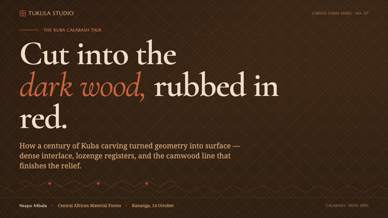
For presentation slides, let the cover behave like a prestige object seen in low light: a dark calabash-brown field, a restrained tobacco-brown panel, a refined serif title, and a small tukula red-orange mark that gives the composition its focal authority. Content slides should use carved-panel logic, separating narrative, evidence, and metadata through quiet tonal shifts. Data slides can treat charts as geometric relief, with red-orange reserved for the most important finding rather than spread across every element.
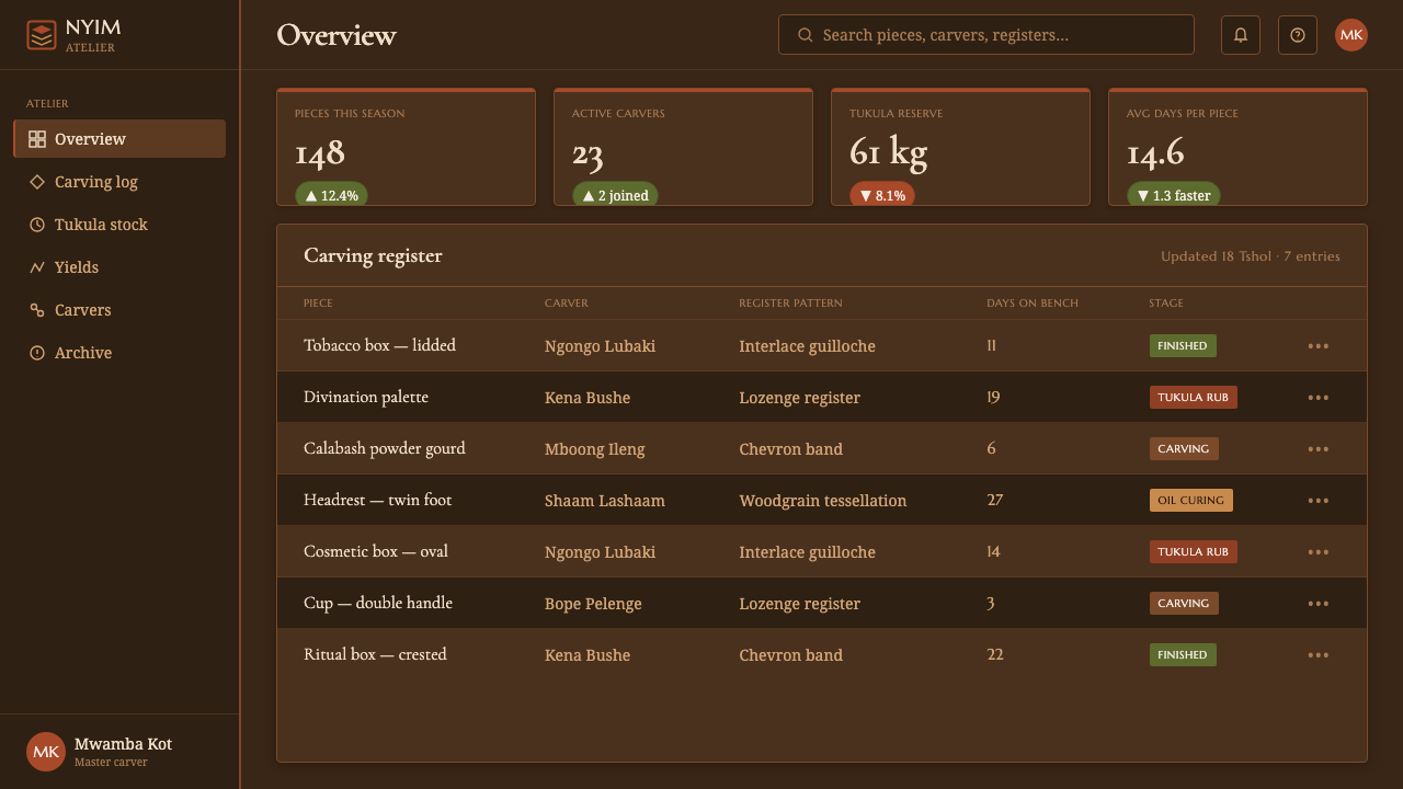
For web interfaces, the style suits dashboards and pricing pages that need to feel established, selective, and materially grounded. Use the dark ground as the continuous environment, tobacco brown to group related controls or information, and tukula red-orange to indicate selection, priority, or an active decision. Serif type is especially effective for page titles, plan names, and explanatory copy. The interface should remain clear and usable; dense interlace belongs at edges, panels, or supporting surfaces, not behind every line of text.
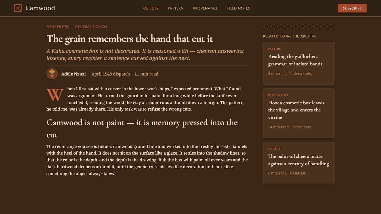
For editorial work, Kuba Calabash Brown supports articles, cultural reports, catalogues, and long-form material that benefit from a sense of provenance. Give the body text quiet space within the dark field, then use carved geometry to mark section openings, pull quotes, or object notes. The contrast between a composed reading area and a denser patterned panel creates the feeling of opening a carefully made box: discovery is staged through material layers rather than decorative abundance.
For marketing, the system is strongest when the product is positioned around craft, heritage, rarity, or considered expertise. A campaign can place a concise serif message on the wooden ground, introduce a tobacco-brown object panel, and use tukula red-orange as a recurring signature across calls to action and key details. The tone should suggest prestige through restraint. Avoid turning the pattern into a background wallpaper; its value lies in appearing as a deliberate carved encounter.
The common mistake is to reduce the style to dark brown plus red-orange and then fill the layout with glossy luxury effects. That misses the source logic. The system depends on the relationship between material, incision, interlace, and relief. It also depends on keeping the ground distinctly wooden and dark, never cream. If every element becomes equally ornate or equally red, the design loses the quiet authority that makes the style recognizable.
Kuba Calabash Brown — FAQ
Is Kuba Calabash Brown a general dark luxury style?
No. It is specifically grounded in Kuba carving traditions from the Kuba Kingdom in the Kasai region of central Democratic Republic of the Congo. Its identity depends on dark hardwood and calabash, palm-oil rubbed tobacco-brown surfaces, dense interlace geometry, tukula red-orange worked into incisions, and refined serif type. Removing those relationships leaves only a generic brown interface.
Can the system use a cream or pale background?
The defining ground is dark calabash brown, and the source explicitly treats the ground as wood, never cream. A pale field would reverse the material hierarchy and make the style feel lighter, more editorial, or more neutral than intended. If greater openness is needed, create quiet space within the dark environment rather than replacing the ground.
How much tukula red-orange should appear?
Treat it as relief, not as the dominant field. Its role is to make carved geometry, active states, key findings, or important calls visible against the dark brown structure. When it spreads evenly across the interface, it stops feeling like tukula worked into incisions and starts behaving like an ordinary accent color. Its power comes from selective emergence.
Does dense interlace belong on every surface?
No. Dense carving is a signature, but its effectiveness depends on contrast with quieter areas. Use interlace to define a panel, frame a section, mark an object detail, or create a controlled moment of discovery. Clear reading zones are essential. The style feels prestigious when complexity is placed deliberately, not when every surface demands attention at once.
Should the interface imitate literal wood texture?
Not necessarily. The system distills a matte, hand-carved prestige object into screen language. What must survive is the material logic: dark wood ground, carved-panel separation, dense geometric incision, and tukula relief. Literal texture can become noisy or theatrical. Controlled tonal fields and disciplined pattern usually communicate the reference more clearly than a photographic wood surface.
Related design styles
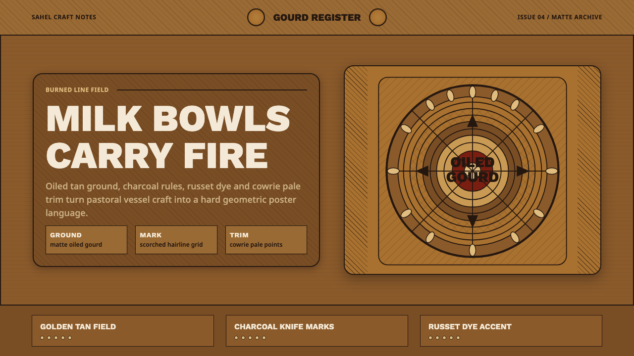 Fulani Milk CalabashMatte craft burns bright. Oiled gourd tan meets charred concentric linework.
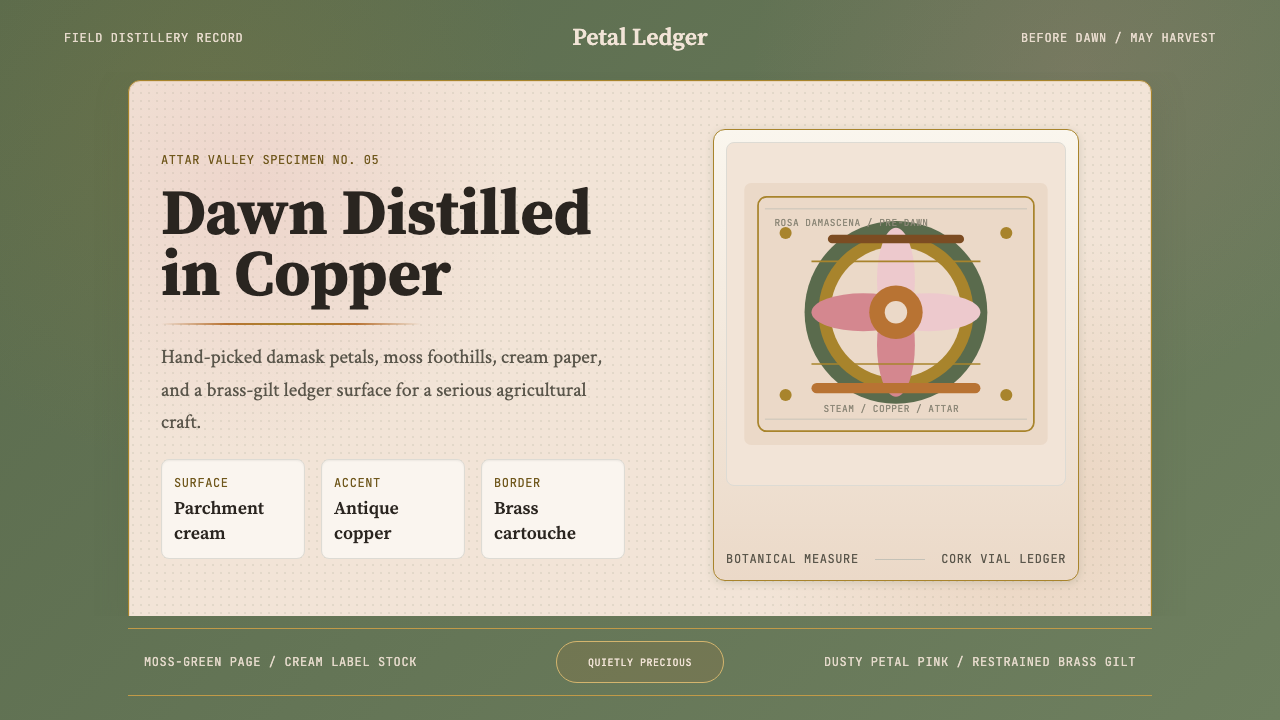 Bulgarian Rose Attar (Valley of Roses)Quietly precious craft. Moss green, dusty rose and brass borders frame a dawn…
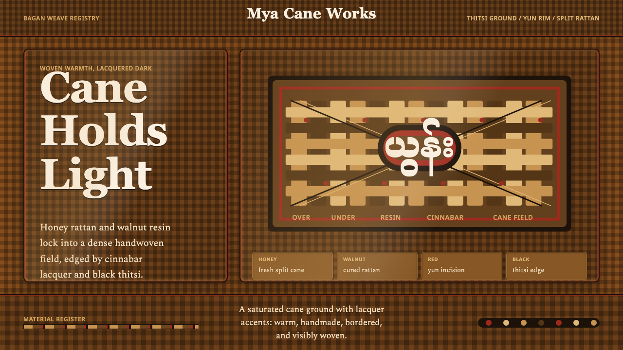 Burmese Cane RattanWoven warmth holds the page. Walnut cane lattice glows with cinnabar rim line…
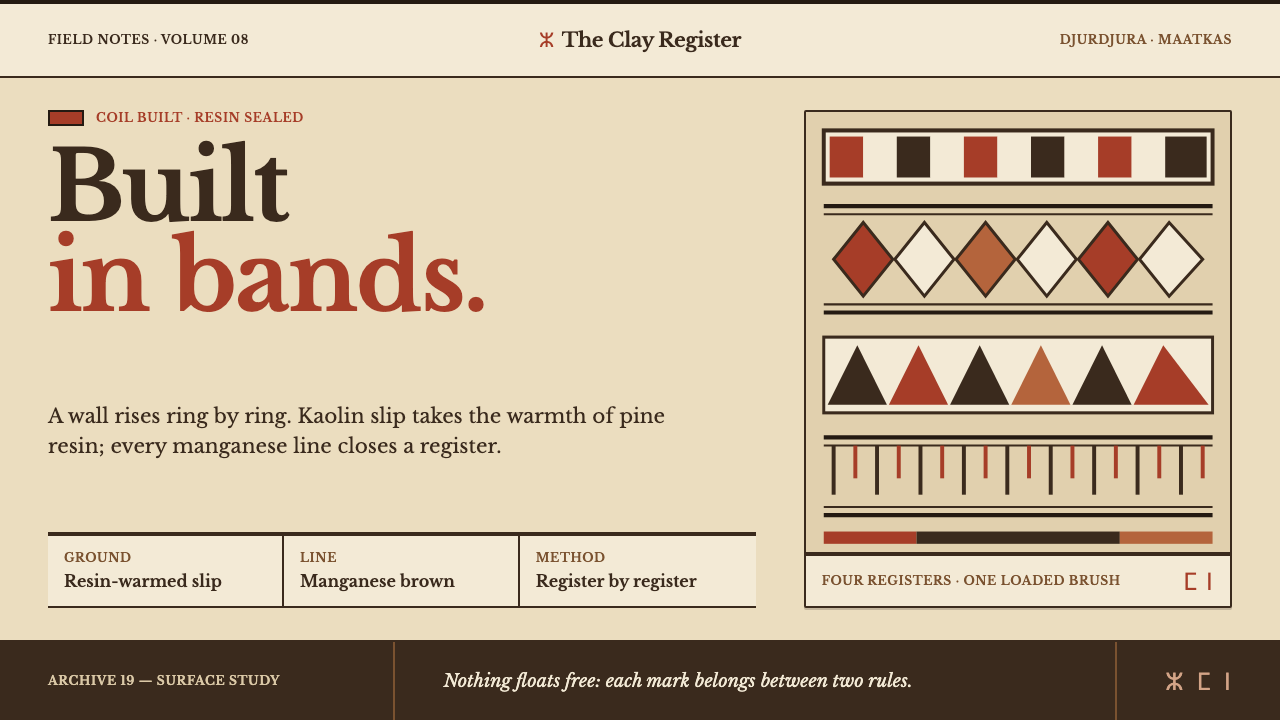 Kabyle PotteryBuilt band by band. Resin-warm kaolin carries manganese rules and iron-red ge…
 Ainu Attus RobeProtection is cut, not painted. Indigo bands and square-ended thread hold elm…
 Bangladeshi Nakshi Pitha MotifsWarm relief, never print. Galada type and tan lattice press rice-flour craft…