What is Fulani Milk Calabash?

Fulani Milk Calabash turns a pastoral vessel into a radiant visual system, where warm oiled gourd, charcoal-black geometry, and the memory of fire meet in disciplined matte contrast.
Fulani Milk Calabash in brief
Fulani Milk Calabash is a design language derived from the decorated milk bowls made by Fulani, or Fulbe, pastoralist women across the Sahel, particularly those represented in documented colonial-era collections from northern Nigeria. Dried calabash gourds are hollowed into rounded vessels, then marked with fine geometric patterns by applying red-hot knives to the shell. The resulting surface joins warm, organic material with ornament that is precise, dark, and visibly transformed by heat.
Its defining contrast is not simply brown against black. The ground carries the depth of a gourd repeatedly handled and oiled over many years, moving from golden tan toward a warm matte brown. Against it, scorched lines remain charcoal-black and hard edged. Russet-red dye and cowrie-shell trimming may enter as secondary accents, but the fundamental relationship remains the same: a living vessel whose surface has been patiently darkened, incised, burned, and cared for.
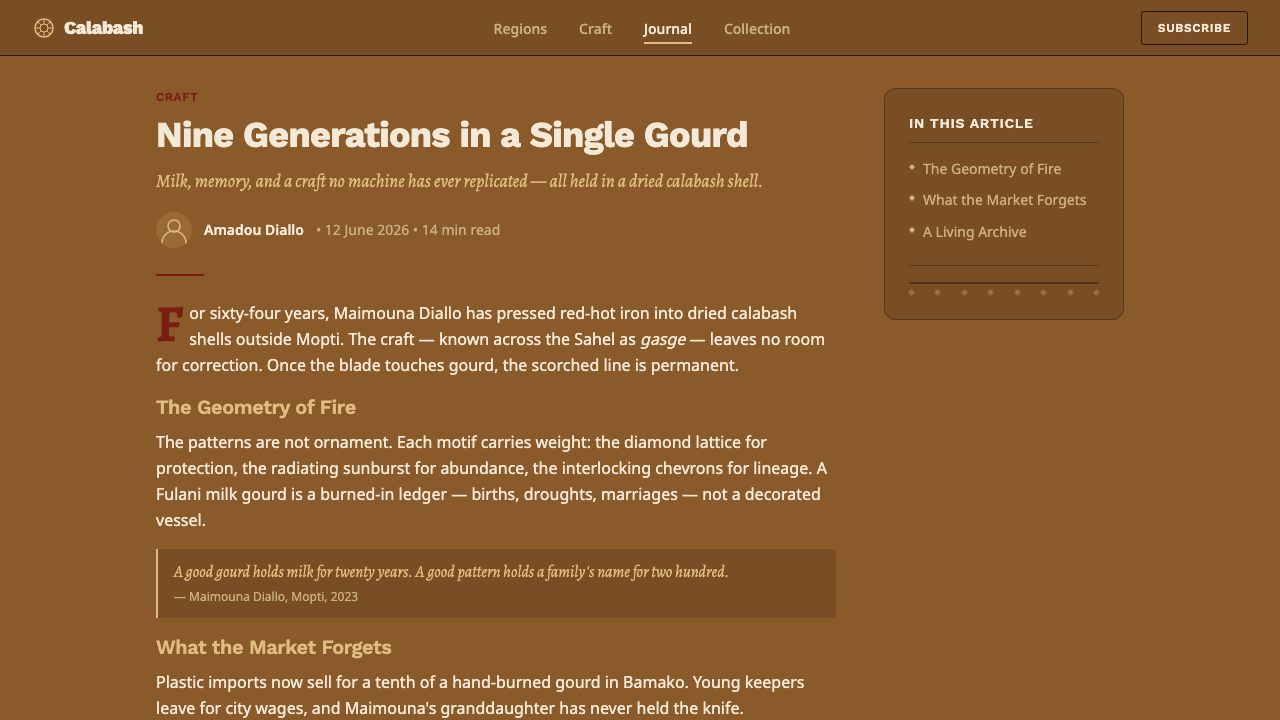
As an interface style, Fulani Milk Calabash preserves that material logic rather than imitating a generic rustic mood. The background should feel like dry, oil-nourished gourd grain, never cream-colored and never glossy. Geometry appears as concentric bands, repeated line structures, and controlled borders rather than floating decoration. Sans-serif type provides a disciplined contemporary counterpoint, allowing the craft vocabulary to organize information without turning the interface into a theatrical replica of an artifact.
Where does Fulani Milk Calabash come from?
The style originates in the pastoral culture of the Fulani, also known as Fulbe, across the African Sahel. Within this setting, the calabash is not conceived first as an art object but as a useful vessel associated with milk. Fulbe milkmaids and herders belong to the living context in which such bowls are carried, handled, maintained, and recognized. Their rounded forms emerge from the gourd itself, so the material establishes the vessel’s structure before ornament begins.
Fulani women decorators transform the dried shell through pyrography. Using red-hot knives, they burn fine geometric line patterns into the calabash rather than laying a separate decorative skin over it. Heat alters the surface directly, producing charcoal-black marks with firm edges and a close visual bond to the vessel. The pattern therefore belongs to the material: it is neither printed imagery nor removable embellishment, but a controlled trace of contact between tool, fire, and gourd.
Time contributes another layer of authorship. Repeated hand-oiling deepens the shell from golden tan toward a warmer matte brown, so use and care continue developing the appearance after the initial decoration is complete. Some examples extend the vocabulary through russet-red dye or cowrie-shell trimming, introducing color and tactile edging without abandoning the dominant relationship between warm gourd and blackened linework. The vessel records making, maintenance, and daily pastoral life on the same surface.
The tradition is living, while examples from roughly 1900 to 1950 are represented in documented colonial-era northern Nigerian collections. That record provides a historical frame without fixing the practice in the past. Fulani Milk Calabash should therefore be understood neither as an anonymous geometric trend nor as a frozen museum style. It is a contemporary design translation grounded in an ongoing regional craft practiced by women and connected to the material culture of Fulbe milkmaids and herders.
What defines the Fulani Milk Calabash look?
Oiled-Gourd Color
The palette begins with golden tan deepened into warm matte brown, recalling a shell enriched by years of hand-oiling. This ground must retain earthy density without drifting toward pale cream or polished amber. Charcoal-black supplies the decisive contrast, while russet red may appear as a restrained secondary note. Color should feel absorbed into material rather than coated onto it.
Charred Linework
Line is the style’s primary graphic instrument. It should appear scorched, dark, narrow, and deliberate, with firm boundaries rather than smoky diffusion. Repetition creates density, but individual marks remain legible as paths made by a heated tool. The best digital translation avoids distressed effects that suggest accidental damage; the force comes from controlled burning, not visual decay.
Concentric Geometry
Concentric bands and closely repeated geometric structures echo ornament organized around a rounded vessel. Curves can radiate, enclose, or establish zones, while straight segments introduce measured interruption. Geometry should feel adapted to a bowl’s continuous surface rather than imposed as a detached modernist grid. Pattern follows curvature, gathering attention toward centers and carrying rhythm around edges.
Matte Materiality
Every surface is matte. The visual depth comes from tonal variation, grain, handling, and accumulated oil, not from glossy highlights or glass-like overlays. Texture should be quiet enough to support reading yet present enough to prevent the background from becoming a flat generic brown. The intended impression is dry natural shell made richer by care, not luxury leather, varnished wood, or polished metal.
Disciplined Typography
Sans-serif type introduces clarity against the richly patterned craft ground. Letterforms should be direct, stable, and free of ornamental mimicry; attempting to make typography look hand-burned weakens both reading and material distinction. Hierarchy comes from scale, spacing, placement, and the contrast between quiet text fields and concentrated pattern. Type behaves as information, while pyrographic linework carries cultural and material expression.
Cowrie and Russet Accents
Cowrie-shell trimming and russet-red dye belong to the vocabulary as optional accents, not compulsory decoration. Cowries are most convincing when interpreted as a paced border or a sequence of pale tactile markers. Russet red works best in contained areas that deepen the warmth of the gourd. Neither should compete with the foundational black linework or turn every surface into an ornamental field.

Who shaped Fulani Milk Calabash?
Fulani women decorators are the makers at the center of the tradition. They dry and prepare calabash gourds, then use red-hot knives to burn fine geometric patterns into the shell. Their work establishes the essential vocabulary of matte gourd, charcoal line, repetition, and controlled contrast. Treating them as authors rather than anonymous sources is crucial to any responsible contemporary adaptation.
Fulbe milkmaids locate the decorated vessel within its practical world. The calabash is a milk bowl before it becomes a visual reference, and its meaning depends on handling, use, care, and pastoral routine. Their relationship to the vessel explains why the style must retain functional clarity: ornament grows around an object that participates in daily life rather than existing solely for display.
Fulbe herders represent the broader pastoral setting to which the milk calabash belongs. The vessel’s rounded body, durable shell, matte surface, and accumulated signs of care are inseparable from that setting. In design translation, this context argues for grounded, useful compositions and against turning the craft into weightless geometric fashion detached from the people and practices that sustain it.
How do you use Fulani Milk Calabash today?
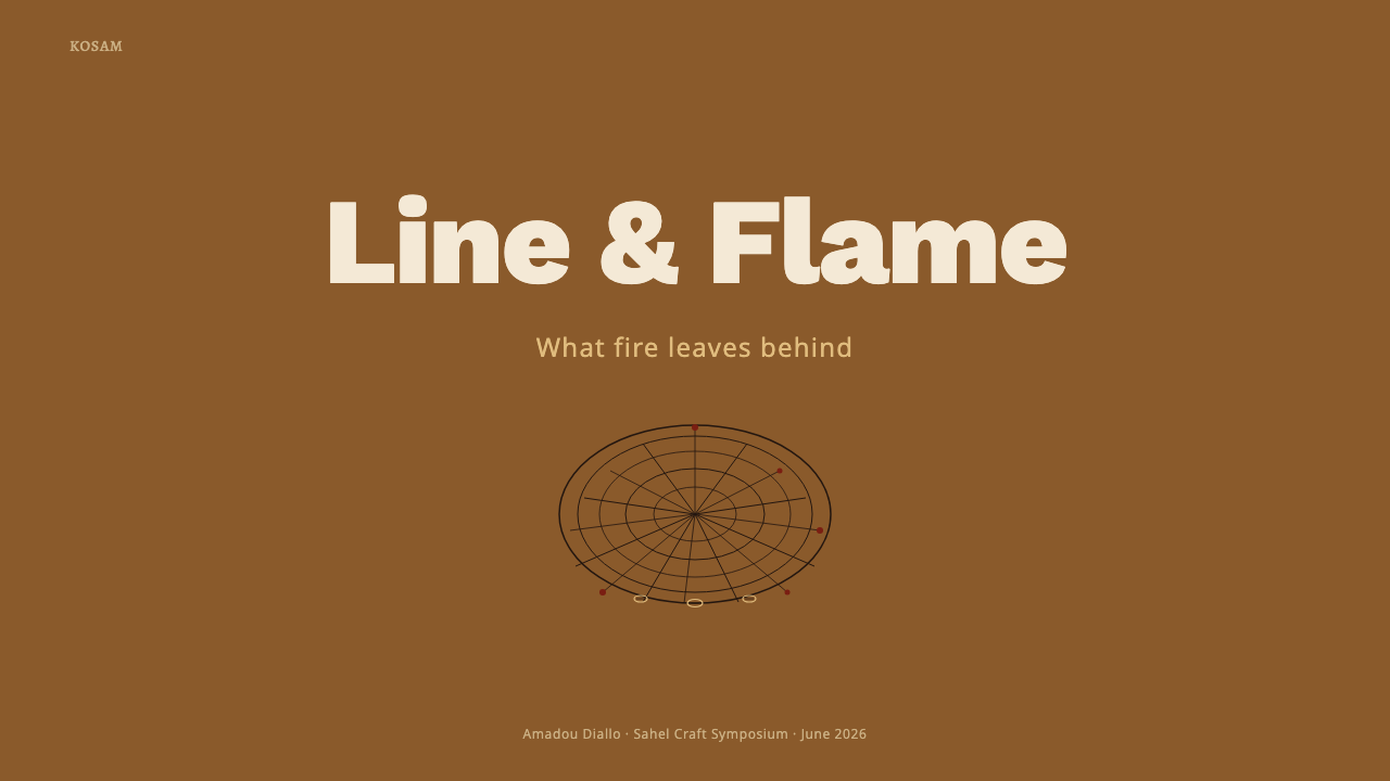
For presentation slides, the style is strongest when the cover behaves like the face of a vessel. A broad warm-brown field can hold one concentrated zone of concentric charcoal pattern, leaving a calm area for the title. Content slides should reduce the ornament to edge bands, corner arcs, or section markers so paragraphs remain readable. The same visual language can distinguish opening, transitional, and concluding pages without covering every slide in identical pattern.
Data slides benefit from the tradition’s disciplined repetition. Circular diagrams can echo concentric decoration, while bar charts and timelines can borrow the cadence of burned line groups. Use charcoal for the main information structure, warm gourd tones for the field, and russet red for a selected comparison or exception. Pattern should frame or group the data rather than occupy the same visual channel as values, labels, and explanatory text.
For web interfaces, Fulani Milk Calabash suits dashboards, archives, membership areas, and pricing pages that need warmth without softness. Panels can sit as slightly differentiated matte gourd surfaces bounded by dark lines, while navigation remains typographic and restrained. Pricing tiers may be separated through pattern density, russet accents, or distinct concentric emblems. Interactive states should feel marked or burned into the system, not illuminated beneath glass.
Editorial and marketing layouts can use the style to create a strong relationship between narrative and object. An article might reserve a patterned margin for notes, origins, or captions while keeping the reading column relatively quiet. Marketing pages can alternate broad matte fields with tightly framed feature sections, using cowrie-like border rhythms sparingly around calls to action or testimonials. Product imagery, when present, should be grounded by the palette rather than placed inside glossy floating cards.
The most common mistake is to treat the theme as a collection of African-looking patterns applied over a brown background. That removes the logic of the source: a milk vessel shaped by material, women’s pyrographic skill, repeated oiling, and pastoral use. Another error is adding cream surfaces, metallic shine, soft glass effects, or excessive cowrie motifs. A convincing application begins with matte gourd depth and functional structure, then earns each black line, russet accent, and patterned band.
Fulani Milk Calabash — FAQ
Is Fulani Milk Calabash simply a brown geometric style?
No. Brown and geometry are only the visible surface of a material process. The warm ground refers to dried gourd deepened through repeated hand-oiling, while the dark pattern refers to lines burned with red-hot knives. The rounded vessel, its milk-related use, and the work of Fulani women decorators all shape the visual system. Removing that context turns a specific craft tradition into generic decoration.
Why must the surface remain matte rather than glossy?
Because the style’s depth comes from dry shell, accumulated oil, handling, and scorched marks, not from reflective polish. Glossy surfaces suggest glass, lacquer, or synthetic luxury and separate the viewer from the tactile material character of the vessel. A matte treatment lets tonal variation and fine linework remain present without simulating a glass interface. The result feels cared for and substantial rather than polished for spectacle.
Can russet red and cowrie motifs dominate the composition?
They can be prominent in a focused area, but they should not displace the core relationship between oiled-gourd brown and charcoal pyrographic linework. Russet red is most effective as a deepening accent, while cowrie references work naturally as trimming, paced borders, or tactile markers. If both are repeated everywhere, the interface loses hierarchy and begins to resemble a decorative collage rather than a coherent translation of the vessel.
How should typography relate to the traditional patterns?
Typography should provide a clear functional layer rather than imitate the burned ornament. A disciplined sans-serif family keeps labels, paragraphs, prices, and data readable against the warm material field. Pattern may frame text, establish sections, or direct attention, but it should not run through dense reading areas. The productive tension comes from contemporary typographic restraint set beside tactile, repeated linework.
How can designers use the style without detaching it from its cultural source?
Begin with attribution and material understanding. Recognize Fulani women decorators as makers, identify the Fulbe pastoral setting, and retain the connection between the vessel and milk use. Translate principles such as matte gourd depth, heat-made linework, concentric organization, and careful maintenance rather than copying pattern fragments without explanation. The design should make the source more legible, not erase it behind a fashionable label.
Related design styles
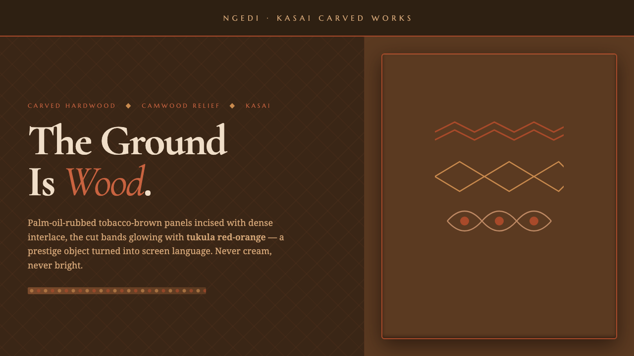 Kuba Calabash BrownPrestige in dark wood. Calabash brown ground, dense incisions, tukula red rel…
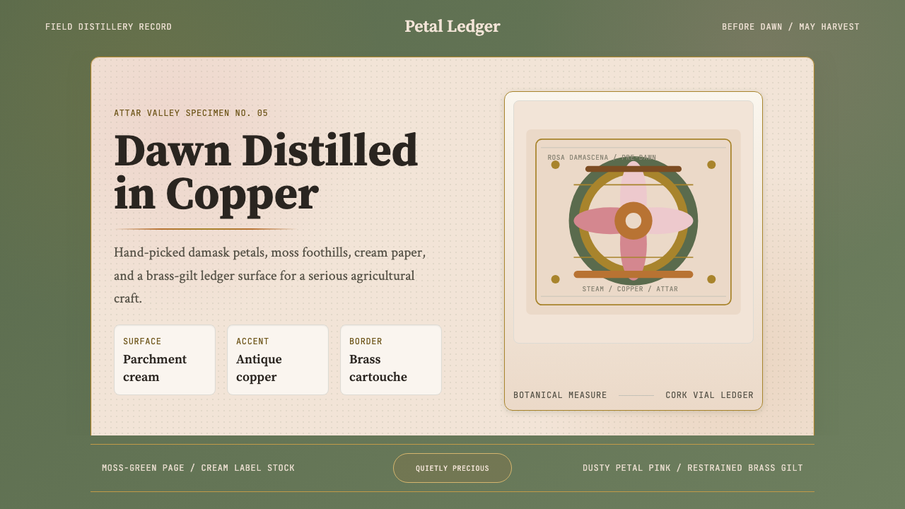 Bulgarian Rose Attar (Valley of Roses)Quietly precious craft. Moss green, dusty rose and brass borders frame a dawn…
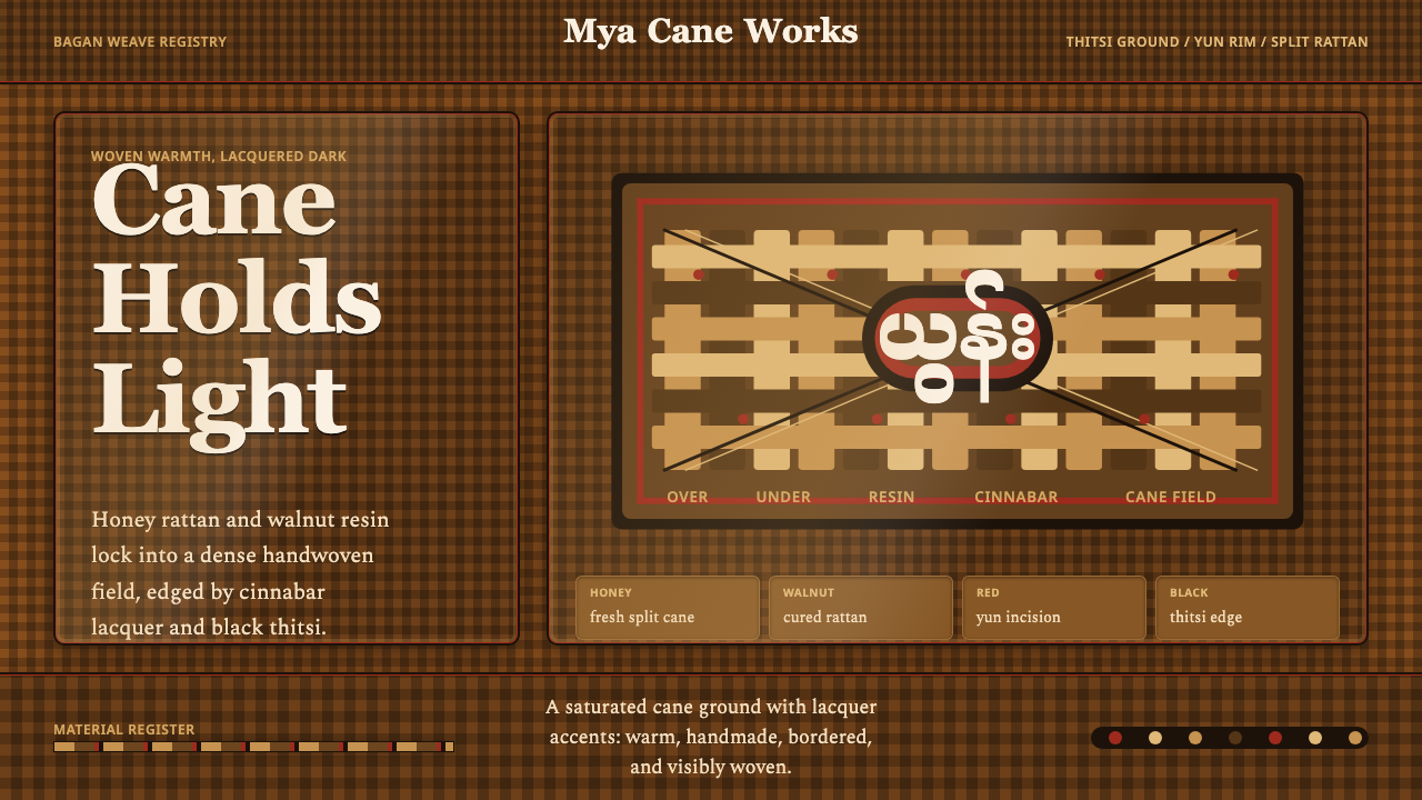 Burmese Cane RattanWoven warmth holds the page. Walnut cane lattice glows with cinnabar rim line…
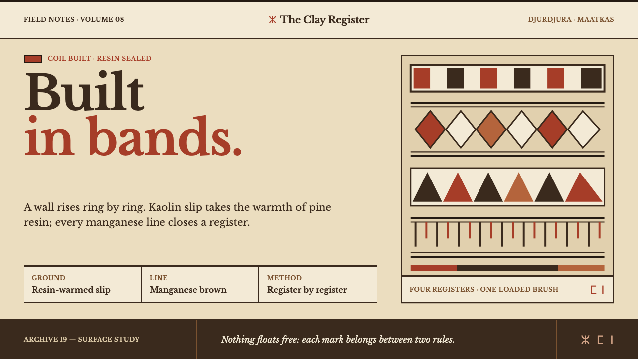 Kabyle PotteryBuilt band by band. Resin-warm kaolin carries manganese rules and iron-red ge…
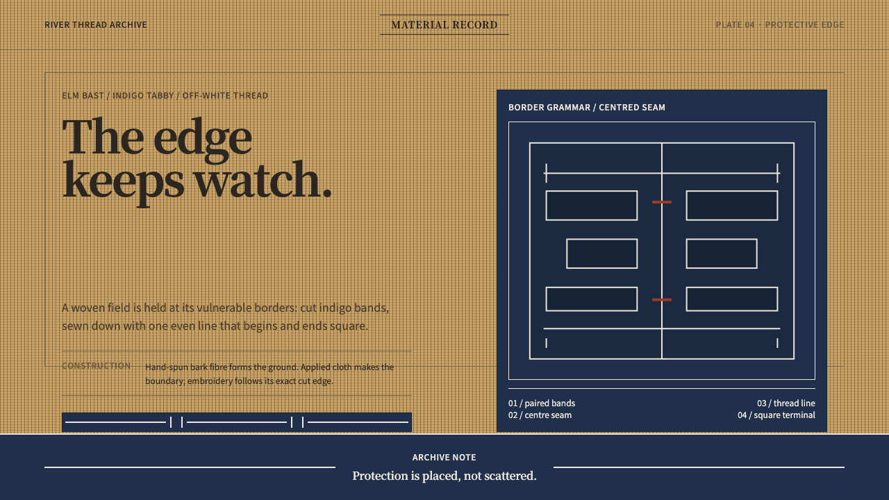 Ainu Attus RobeProtection is cut, not painted. Indigo bands and square-ended thread hold elm…
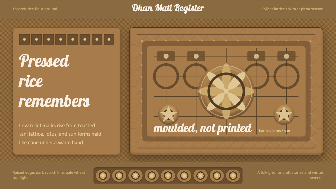 Bangladeshi Nakshi Pitha MotifsWarm relief, never print. Galada type and tan lattice press rice-flour craft…