What is Zakopane Style?
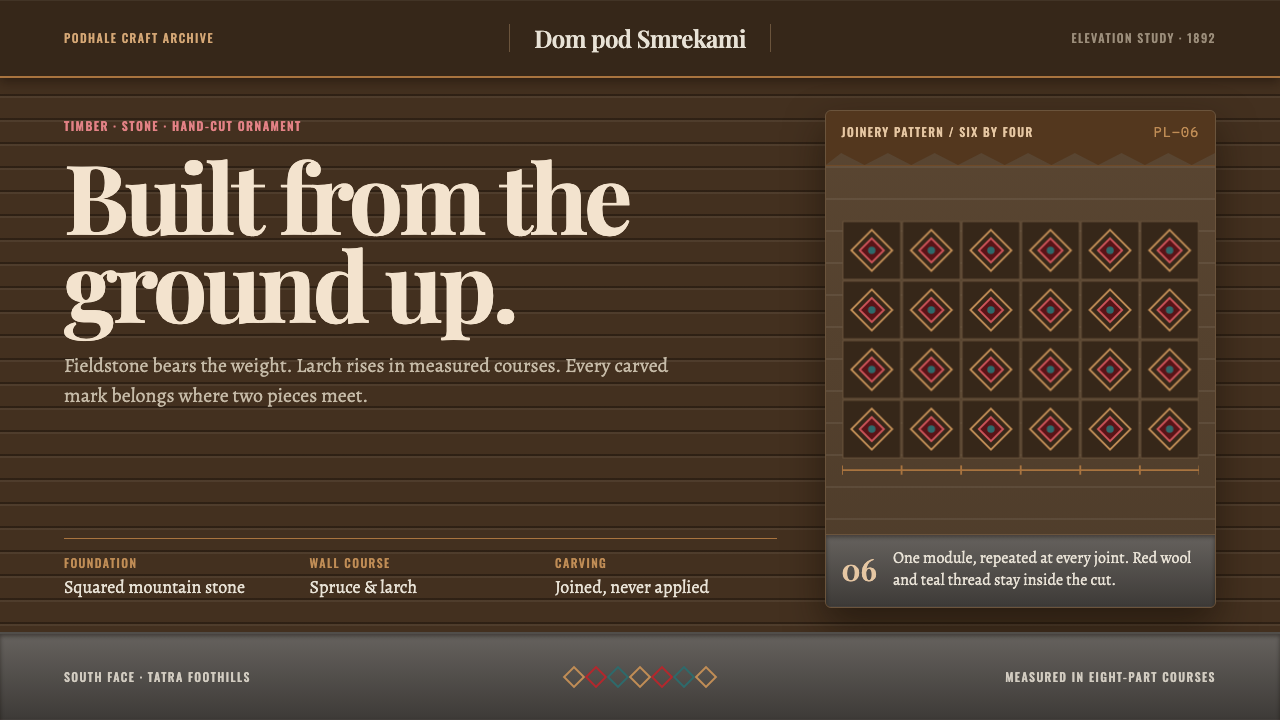
Zakopane Style turns a highlander log cottage into a design logic: heavy stone below, banded timber above, and ornament allowed only where a building needs strength.
Zakopane Style in brief
Zakopane Style is a regional design idiom that took shape in the 1890s in Zakopane, the mountain town at the foot of the Tatra range in southern Poland. It is built from the vernacular of the Górale, the highland people of the Podhale region: horizontal logs of spruce and larch stacked on a squared fieldstone base, steep shingled roofs, deep verandas, and carved ornament borrowed from the highlanders' own clothing and tools.
What separates it from the generic mountain-cabin look is a single rule: ornament has a job. The heart-shaped parzenica began as reinforcing stitching on trousers. The vertical slats in a window are read as rays of the sun. The rosette is a six-petal sun, and the sun on a gable is there to throw light across the house. Pattern follows structure, and nothing is placed only for atmosphere.
Visually the style is heavy at the bottom, banded in the middle and capped at the top. A dense stone block carries courses of dark timber; resinous browns dominate, and red and a cool teal appear only at joints, edges and thresholds, the way painted detail marks the connections in a carved door. The overall impression is weight, shelter and craft rather than delicacy, and in a dark interface it reads as lamp-lit timber against a mountain night.

Where does Zakopane Style come from?
The style begins with a building. In 1892 the painter Stanisław Witkiewicz built the Koliba villa in Zakopane, and the way he went about it is the whole story. He did not invent an ornament. He took the Górale highlander cottage, with its horizontal spruce and larch logs on a squared fieldstone base, its steep shingle roof and its deep veranda, and rebuilt it at the scale of a villa. Then he let local carpenters carve it the way they carved their own doors and the seams of their trousers.
The setting matters. At the time Poland did not exist as an independent state; its lands were divided among neighbouring empires, and Zakopane lay inside the Austrian partition. The town had become a mountain retreat for painters, writers and city visitors, and the question of what a Polish architecture could look like, one not borrowed from the ruling powers, was a live one. Three currents are usually named alongside the style: Young Poland (Młoda Polska), the modernist cultural current of the period; Secession-era national romanticism, which looked to rural craft for a native visual identity; and Arts and Crafts, with its belief in honest materials and the visible hand of the maker. Zakopane Style sits where all three overlap.
Its method was structural before it was decorative. Everything rises from a heavy stone block, passes through banded log courses, and finishes under a shingled cap or a small gable. The ornament arrives later and keeps its origins visible: the parzenica from reinforcement stitching, the window slats from sun rays, the rosette from a six-petal sun. Alongside Witkiewicz, the name of Zygmunt Gnatowski is attached to the style, a reminder that it was a shared practice among builders and designers in the town rather than the invention of one hand.
The first flowering of the style runs from 1892 to 1914. After that it did not disappear. A Neo-Zakopane revival in the 1950s brought the vocabulary back into mountain architecture and furnishing, and today the idiom lives a double life, as a protected heritage language and as a regional brand that is easy to cheapen. Understanding the original logic, that every carved line marks a place where the building is under stress, is what keeps a modern use of it from becoming costume.
What defines the Zakopane Style look?
Stone Foundation
Everything begins with a heavy block of squared fieldstone. In visual terms this is the darkest, widest, least decorated mass in the composition, and it sits at the bottom: a footer, a base band, a plinth under a title. It gives the rest permission to be lively. Layouts that float with no visible foundation are the first thing to break this style.
Banded Timber
Above the stone, horizontal log courses stack into bands. The eye reads the composition as layers laid down one after another, each as wide as the building, each separated from the next by a clear joint. Sections, cards and table rows inherit this: broad horizontal strips with visible seams rather than loose floating objects, and a long left-to-right rhythm that feels hand-laid rather than machined.
Palette of a Timber House
The palette is that of a lived-in timber house at dusk: resinous larch browns, the near-black of weathered logs, the grey of fieldstone, and a warm lamp-lit light. Red and teal are the exceptions, and they are used as marks on joints, the way a painted line picks out a carved edge. Used sparingly they read as craftsmanship; spread across large fields they turn the system into a folk-costume cliché.
The Parzenica
The parzenica is a heart-shaped return pattern that began as reinforcing stitching on the highlanders' trousers. It is a pattern with a structural reason, and it is therefore placed where reinforcement would be: at corners, at the start of sections, along an edge that bears load. As a repeating border it gives a quiet pulse; as a field filler it loses its meaning entirely.
Sun Imagery
Solar imagery runs through the system: a sun on the gable, a six-petal rosette, window slats that are read as rays. These share a radiating geometry of lines spreading from a point, which contrasts deliberately with the horizontal logic of the walls. Use one sun per composition at a moment of emphasis, such as a title, a threshold or a closing mark, and it will carry real weight.
Cap and Veranda
The building finishes under a steep shingled roof, and a deep veranda wraps around it. Translated into layout, the cap is an overlapping, scale-like closing band at the top of a page or panel, and the veranda is generous shaded space around the main content. Shelter is part of the look: content sits under cover, with room to pause at the edge, not pressed against the border of the screen.
Ornament with a Job
The governing rule, stated plainly: every carved or painted mark must correspond to a structural position. Stress points, joints, thresholds and openings get ornament; open walls of log stay plain. The system is therefore much quieter than its folk reputation suggests, and its richness comes from where the ornament is placed rather than how much of it there is.

Who shaped Zakopane Style?
Witkiewicz was a painter who turned to building, and the Koliba villa he completed in Zakopane in 1892 is the system's founding act. His achievement was one of translation: he took the highlander cottage seriously as a complete construction logic, enlarged it to villa scale and had local carpenters carve it in their own manner. Everything later associated with the style, from the stone base to the sun on the gable, traces back to that decision to respect the vernacular rather than decorate over it.
Gnatowski is the second name the record sets beside Witkiewicz. His presence matters less as a biography than as evidence: Zakopane Style was a shared practice among the builders and designers of the town, worked out in many hands and many houses. Treating it as a collective vocabulary, not a signature, is the more accurate way to borrow from it.
The anonymous carpenters and carvers of Podhale are the style's unnamed authors. The highlanders had long carved their own doors, beams and tools and stitched the parzenica onto their own clothes; the villa-scale buildings of the 1890s worked because that skill already existed. Their handwork explains the slight irregularity of real Zakopane carving, and it is the quality that digital imitations most often lose.
How do you use Zakopane Style today?
Zakopane Style is a specific regional vocabulary, so it works best where the subject genuinely shares its values: craft, shelter, hospitality, mountains, heritage and slow, durable things. Its logic also travels further than its motifs. Weight at the bottom, work in horizontal bands and ornament only at points of stress will give a layout a grounded character even when no heart-shaped pattern appears anywhere on it.
For presentation slides, build every slide like the house. A cover sets a wide, dark stone-toned block along the bottom and a band of timber above it for the title, with a single sun rosette or one short run of parzenica as the only ornament. Content slides stack two or three horizontal bands, with ornament confined to the corners and to section openers. For data, bar charts can borrow the log courses directly: long horizontal bars separated by clear seams, in timber tones, with red or teal marking only the figure that matters, such as the highest value or the threshold.
For web interfaces, treat the page as a building. The header is the shingled cap, the footer is the stone block, and sections are timber bands with visible joints between them. Cards should feel framed and load-bearing rather than floating, with firm edges and little or no soft glow. Reserve red and teal for the joints of the interface: the active tab, a selected row, a link underline, a focus ring. This suits hospitality and travel sites, regional tourism, craft shops, museums, cultural venues and food producers that trade on provenance.
For editorial and marketing work, the style gives a strong sense of place. A long article can open with a decorative heart-pattern band, run in a calm, wide column on a dark ground, and break sections with a single thick seam instead of an ornamental flourish. Photography of timber, stone, wool and mountains sits comfortably in it, and a single sun mark makes a distinctive closing signature for a campaign or newsletter.
The most common mistake is to scatter folk motifs everywhere as wallpaper. This ignores the rule that ornament marks structure, and it makes the result look like a souvenir stand. A related error is to treat the style as a generic rustic cabin, with a wood-grain texture laid over a conventional layout; the identity is the construction logic of stone, bands and cap, not a surface skin. Finally, using red and teal in equal measure across large areas erases the sense that they are rare, deliberate marks.

Zakopane Style — FAQ
How is Zakopane Style different from an Alpine chalet or Scandinavian log style?
All three come from timber mountain vernaculars, so they share steep roofs and sheltering eaves. The difference lies in lineage and ornament. Zakopane Style takes its horizontal log courses on a squared fieldstone base, and its motifs, such as the parzenica, the six-petal sun and the sun-ray window slats, from the Górale of Podhale and their clothing and tools. It is a Polish highland idiom with its own vocabulary, not a general rustic look.
Is Zakopane Style a folk tradition or a designed style?
Both. The cottage form and the carving skills belonged to the Górale long before the style had a name. The style as such was created when the painter Stanisław Witkiewicz built the Koliba villa in 1892, scaling the cottage up to villa size and asking local carpenters to carve it. It is best understood as a designed movement resting on a living folk base, in the spirit of Arts and Crafts.
How does Zakopane Style relate to Art Nouveau and the Secession?
It belongs to the same era and shares the Secession-period impulse to find a native visual identity instead of copying historical styles from the imperial centres. Where Art Nouveau tends toward flowing, plant-derived curves, Zakopane Style stays with straight timber, horizontal courses and stylised motifs rooted in specific local objects. The relationship is one of shared ambition, not shared forms.
How should the parzenica be used in an interface?
Use it where reinforcement would sit on a garment or a beam: as a thin border at the start of a section, along a header edge, or around a corner element. Keep it small and repeating, in one of the timber or accent tones, and let the plain area around it do the work of contrast. Used as a full-page background, it stops meaning anything and starts to compete with the text.
Where does Zakopane Style struggle?
It is a poor fit for contexts that depend on speed, lightness and neutrality, such as fintech dashboards, clinical tools or ultra-minimal product pages. Its weight, band structure and rich dark palette ask for a slower, more tactile experience. It also needs care in children's or fashion contexts, where its solemn, load-bearing character can feel heavy. It shines wherever a sense of shelter and provenance is the point.
Related design styles
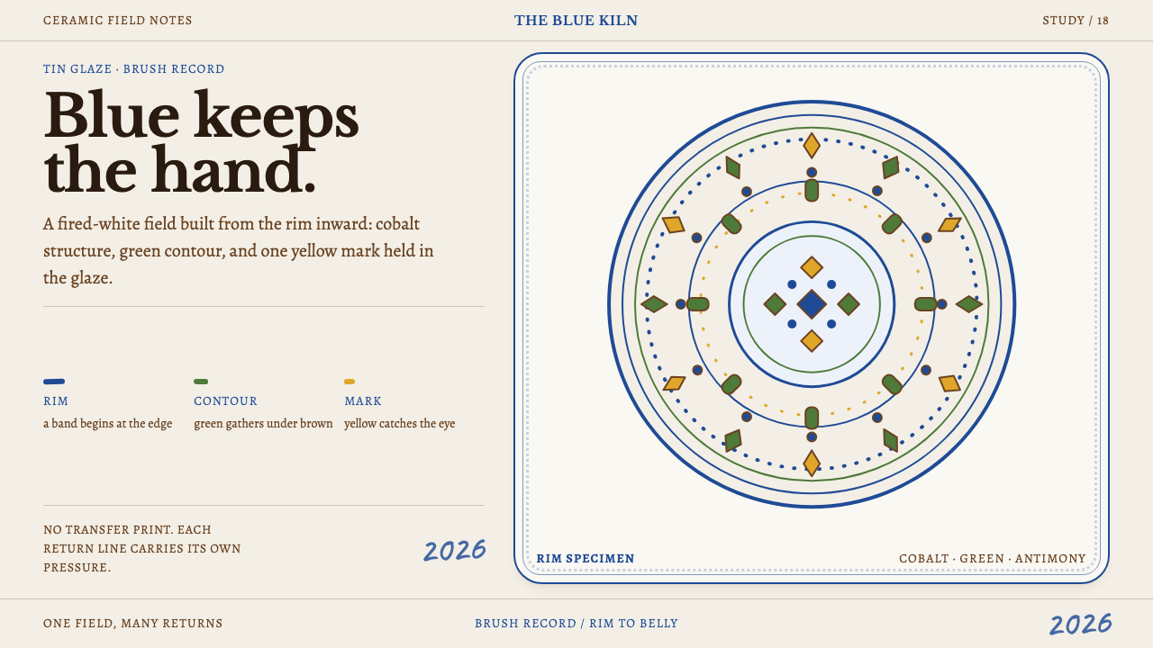 Modra MajolicaBlue keeps the hand. Cobalt rim bands and off-register pigment marks animate…
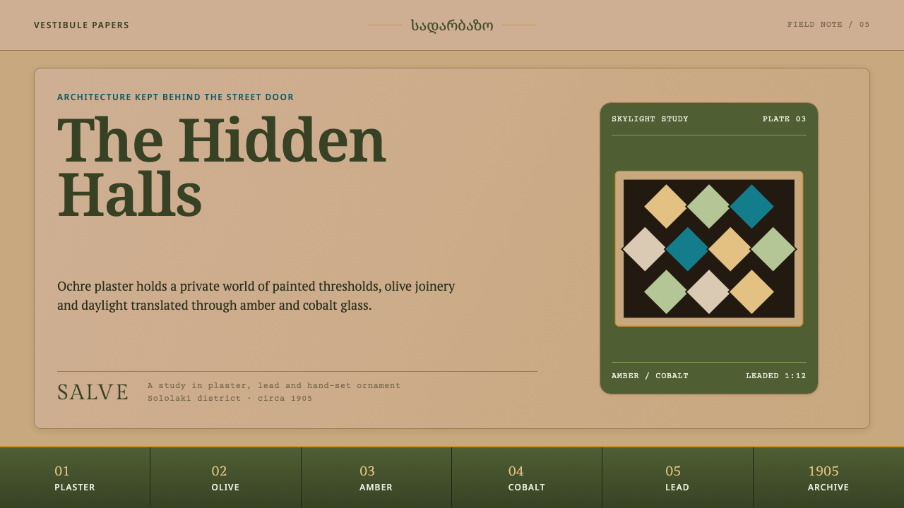 Tbilisi Art NouveauPrivate halls, richly revealed. Ochre plaster meets olive dados and leaded am…
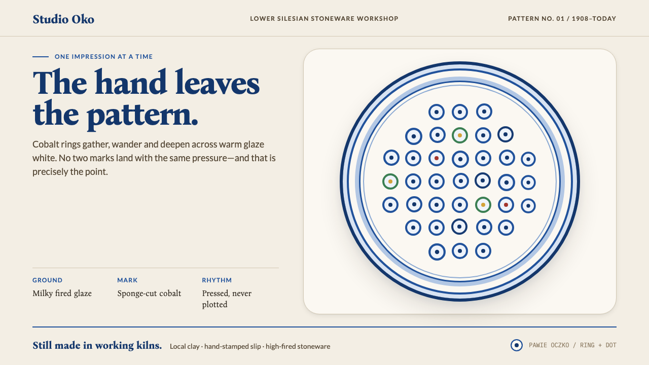 Bolesławiec PotteryThe hand stays visible. Cobalt ring-and-dot stamps drift across warm glaze wh…
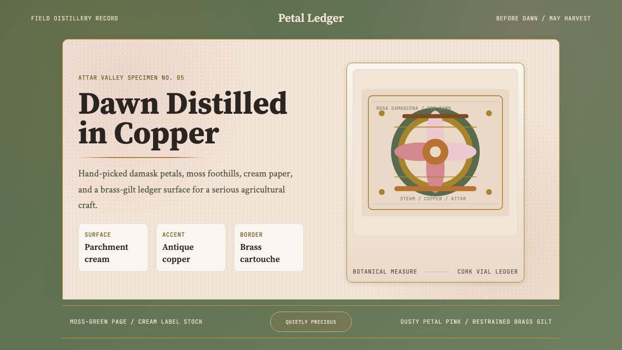 Bulgarian Rose Attar (Valley of Roses)Quietly precious craft. Moss green, dusty rose and brass borders frame a dawn…
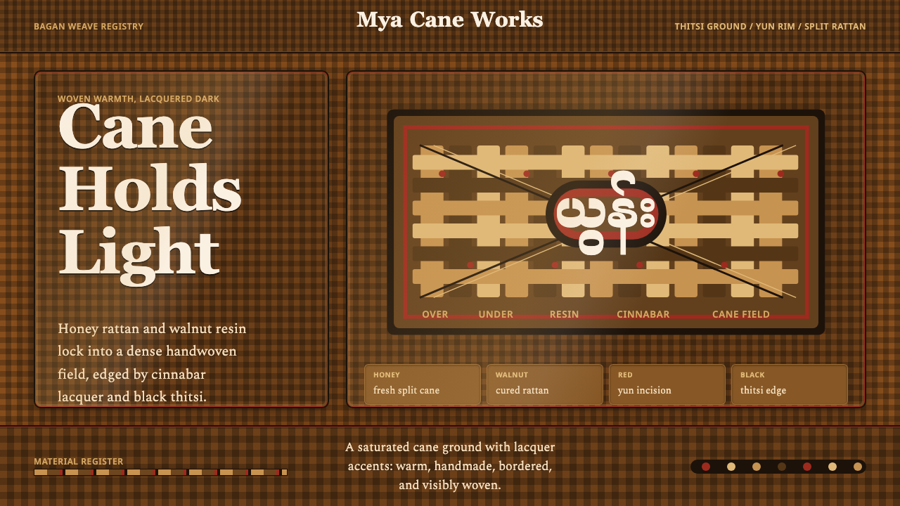 Burmese Cane RattanWoven warmth holds the page. Walnut cane lattice glows with cinnabar rim line…
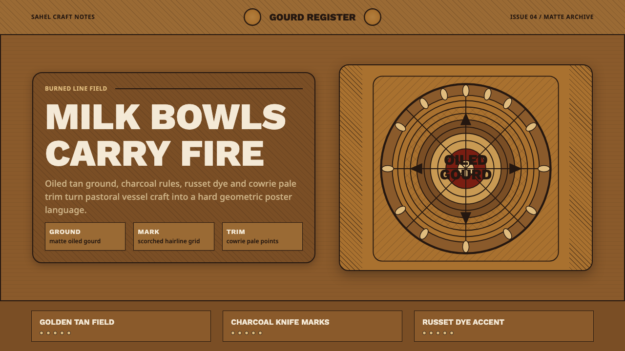 Fulani Milk CalabashMatte craft burns bright. Oiled gourd tan meets charred concentric linework.