What is Modra Majolica?
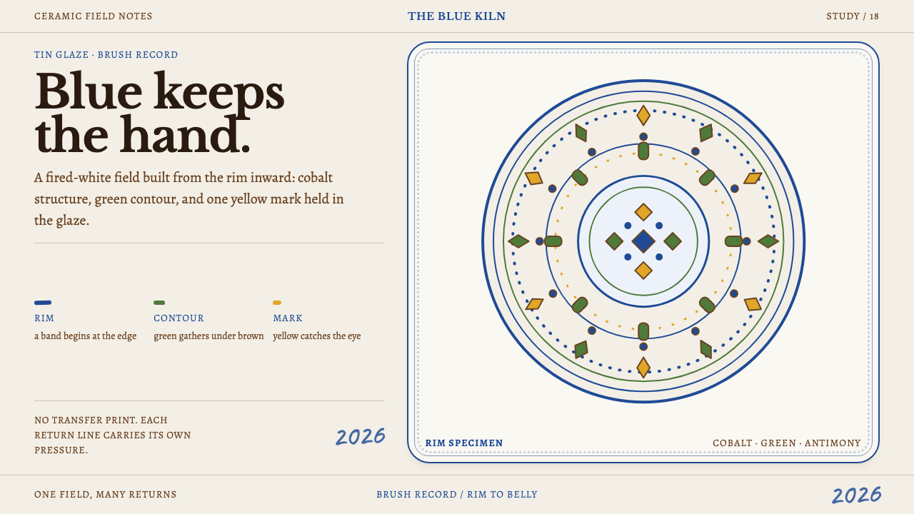
Modra majolica turns a milky tin glaze into a page and lets cobalt blue, brushed by hand, do most of the talking.
Modra Majolica in brief
Modra majolica is the tin-glazed earthenware of the town of Modra, in the Little Carpathians of western Slovakia. The name of the town is the Slovak word for blue, and blue is the colour that defines the ware: cobalt rim bands, cobalt tulips and cobalt contours, supported by touches of yellow, green and brown. Each piece begins as raw earthenware dipped in an opaque white glaze and is then painted entirely by hand.
That white glaze is the heart of the style. It is milky rather than stark, slightly glossy and a little uneven, and it works exactly like paper: everything else is painted onto it before the second firing. Cobalt, antimony yellow, copper green and manganese brown go on piece by piece, so no two plates are the same. A plate is composed from its rim inward, with concentric bands first, then a bouquet in the middle, and finally a year brushed on the belly in the potter's own hand.
Visually the result is warm, dense and lively. It is not printed pattern, and it is not the sparse, white-space look of Nordic studio pottery. It is a style that fills the surface with tulips, hearts and leaf sprays, then holds that abundance in order through banding and framing. The traces of the hand, such as the thickness of a brushstroke, a tail where it lifts off, or a small pooling of glaze, are not flaws to be hidden. They are the point.

Where does Modra Majolica come from?
The roots of the tradition go back to 1546, when Habán potters began the faience craft that would later take hold in Modra. The Habáns were members of an Anabaptist community whose craftsmen became known across Central Europe for tin-glazed earthenware, and their name remains attached to the technique as Habán faience. This is the oldest layer of the tradition: a method of dipping earthenware in white tin glaze and painting it with mineral pigments, brought into the region and carried on by later generations.
Majolica of this kind belongs to a wider family of tin-glazed pottery found across Europe, which developed in several regions under different names. In Central Europe it settled into a distinctive local manner, and the reference record places the Modra tradition within what it calls Central European majolica. Tin glaze has a technical consequence that shapes the style: it is opaque and absorbent, so pigment sinks into it at once and cannot be erased or corrected. Painters learned to work with sure, quick strokes, and the confident, slightly loose brushwork of the ware follows from that.
A Modra workshop was founded in 1883, giving the town an organised centre for the craft, and the later history of the ware is tied to a Slovak folk revival in which local decorative arts were collected, taught and promoted as national heritage. In that revival, the folk motifs of the region, such as tulips, carnations, hearts and leaf sprays, were gathered into a recognisable repertoire. The reference record names Ferdiš Kostka and Heřman Landsfeld among the key figures of this lineage, and the article treats them as markers of that revival, without attributing particular pieces to either man.
Modra majolica is not a museum survivor. It is described in the reference record as a living practice, and it was listed as intangible cultural heritage in 2017. Potters still dip, paint and fire in the way their predecessors did, and a plate is still signed with a year by hand. For a designer, this continuity matters, because it means the style is not a closed historical vocabulary to be quoted but a working craft with current makers, current colours and a continuing sense of what a good plate looks like.
What defines the Modra Majolica look?
Milky Tin Glaze
The ground is an opaque white glaze with a soft, milky depth and a slight gloss. It is not the pure white of a screen but a warm, creamy-white surface that reads like thick paper. Faint crazing, small pools where the glaze gathers and gentle undulations all add to its liveliness. This surface is the stage on which every colour is set, and it should feel like a material rather than a flat fill.
Cobalt Rim Bands
Concentric bands of cobalt blue run around the rim, some thick and some thin, sometimes doubled or separated by narrow white gaps. They frame the piece, establish its edge and give the eye a calm ring to read before it reaches the busy centre. The bands are brushed rather than ruled, so they wobble very slightly and show where the brush was loaded or running dry.
Four Mineral Pigments
The palette is essentially four colours: cobalt blue, antimony yellow, copper green and manganese brown. Blue is dominant, yellow warms it, green gives leaves and stems their growth, and brown draws contours and fine detail. Colours are applied as individual brushstrokes rather than blended, and each keeps its own identity against the white. The range is limited, which gives the ware a coherence that a larger palette would lose.
Rim-In Composition
A plate is composed from the outside in. The rim comes first with its concentric bands, then a bouquet of flowers fills the middle, and a year is brushed on the belly in the potter's hand. This order is almost a template for the style: frame first, focal motif second, signature last. It gives the ware a centred, balanced look even though every element is freehand.
Visible Brushwork
Every stroke carries information about the hand that made it: how loaded the brush was, how fast it moved, where it lifted, how a petal begins heavy and ends in a thin tail. Nothing repeats exactly, because nothing was printed. This irregularity is not decoration added for effect. It is a record of process, and the style depends on it to stay warm rather than mechanical.
Glazed Surface Depth
The glaze gives the painting a slightly sunken, liquid look, as though pigments sit just beneath a clear skin. Edges soften a little where the colour has sunk into the white, and the surface catches light unevenly. This depth is subtle but important, because it separates a glazed ceramic from a flat illustration. A faithful translation keeps a sense of surface and avoids the harsh crispness of vector art.
Abundant Flora and Hearts
Tulips, hearts and leaf sprays crowd the centre of the piece, painted in a loose, joyful folk manner. The motifs are stylised but not rigid, and they overlap, tuck against one another and fill the available space. This density is the opposite of white-space minimalism, yet it never feels chaotic, because the rim bands and the milky ground keep it contained.

Who shaped Modra Majolica?
Ferdiš Kostka is one of the two individuals named in the reference record for this style. His name is associated with the folk revival that gave Modra's ware its modern identity, the period when local decorative motifs were gathered, taught and promoted. This article does not attribute particular pieces to him. For designers, he stands for the idea that a living craft is shaped by people who decide what its repertoire is and how it is passed on.
Heřman Landsfeld is the second individual named in the record. Like Kostka, his name belongs to the later chapter of the tradition, the folk revival that carried Modra's ware into the twentieth century, rather than to its early history. As with Kostka, the article treats him as a marker of that period rather than crediting him with specific designs. His presence in the lineage reflects how the craft became an organised enterprise with a home in the town rather than a scattering of individual potters.
The Habáns were the Anabaptist craftsmen whose faience from 1546 laid the technical and decorative foundation of the tradition. Their tin-glazed earthenware, painted in mineral colours, set the pattern that Modra later made its own. They represent the origin of the method itself, the dipping, the painting and the second firing that still define how a Modra plate is made today.
The anonymous potters and painters of Modra are the real authors of the ware, each producing pieces that differ slightly from every other. Their hands decide the width of a band, the shape of a petal and the placement of a year. A design system built on their work should preserve the variation they bring, because the character of the style is carried by their unrepeated strokes.
How do you use Modra Majolica today?
Modra majolica is a strong reference for brands that want warmth, handmade character and cultural depth without sliding into nostalgia. Its logic is easy to adapt: a creamy ground, a dominant blue, a limited set of supporting colours, and a composition that goes from frame to focal point. The challenge is to keep the sense of the hand, since a perfectly regular rendering destroys the quality the style is built on.
For presentation slides, a cover can use a creamy white ground with a blue banded border around the edge, a central bouquet motif and the title set in a warm serif beneath it. A small handwritten year in the corner can echo the potter's signature. Content slides can use the rim-and-centre logic, with a blue band framing each panel and the content sitting in the white middle. Data slides work well with cobalt as the main series colour, and yellow, green and brown as secondary series, so that charts feel like pigments on a plate.
For web interfaces, the style suits hospitality, food, homeware, craft shops, travel and cultural sites. Cards can be framed by a single blue line or a double band, and circular crops can echo the shape of a plate. Primary buttons take cobalt, and secondary highlights can use the warm yellow. Keep the background a soft cream rather than pure white, add a little texture or variation to the surface if the product allows it, and use hand-drawn dividers instead of perfectly straight ones.
For editorial and marketing work, the style supports stories about craft, food, regional identity and family businesses. A page can open with a banded frame, place the main illustration or photograph at the centre, and use handwritten notes for captions or dates. Product pages for ceramics or tableware can borrow the rim-in logic directly, putting the object at the centre of a series of concentric frames. The tone should be warm and personal, not corporate.
A common mistake is to treat the style as a stock folk pattern repeated mechanically, which kills the sense that every piece is painted by hand. Another is to give all the colours equal weight, when blue is meant to lead and the others support. Over-clean vector shapes, perfect symmetry and sterile white backgrounds also work against it. If an element repeats, vary it slightly, and let the milky ground and the visible brush do some of the talking.

Modra Majolica — FAQ
What is the difference between majolica, faience and delftware?
They are all names for tin-glazed earthenware, a technique in which a clay body is covered in an opaque white glaze made with tin and then painted with mineral pigments. The different names mostly reflect region and period rather than a different technology. Habán faience is the earlier local form in Central Europe, and Modra majolica is the continuing tradition that grew from it.
Why is the painting so permanent and confident?
Because tin glaze is opaque and absorbent. Pigment is painted onto the glazed surface before the second firing, and it sinks in at once, so there is no way to rub out or correct a mark. Painters therefore work with decisive strokes, and the slight looseness and variation in their lines is a natural result of fast, committed brushwork rather than a stylistic affectation.
Does the style depend on blue?
Yes, to a large degree. The town's name is the Slovak word for blue, and cobalt carries the rim bands, the main flowers and the contours. Yellow, green and brown are present, but they support rather than compete. If you remove blue or put another colour in the lead, the result stops reading as Modra and becomes a generic folk-ceramic look.
What is the year on the plate for?
In the tradition described in the reference record, a year is brushed on the belly of a plate in the potter's own hand. It works both as a date and as a personal mark, a small human signature within an otherwise decorative composition. For designers, a handwritten date or short label can play the same role, adding a trace of the maker without disturbing the larger pattern.
Can this style work in a digital interface without looking like clip art?
It can, if you borrow its structure rather than its ornament. Use the cream ground, the cobalt lead colour, the banded frames and the rim-in logic, and introduce small variations in line weight and placement so nothing repeats exactly. Avoid tiling a single flower motif across the screen. A few hand-placed elements with some irregularity will carry more of the style than a large amount of perfect decoration.
Related design styles
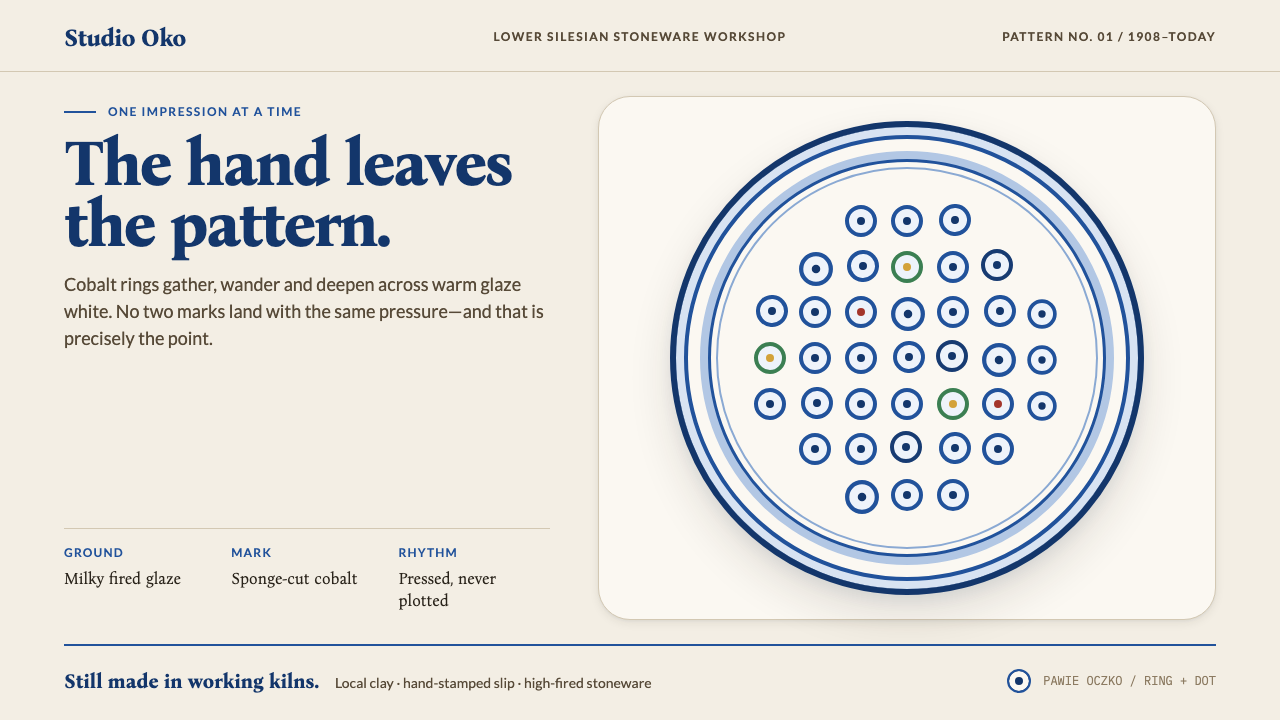 Bolesławiec PotteryThe hand stays visible. Cobalt ring-and-dot stamps drift across warm glaze wh…
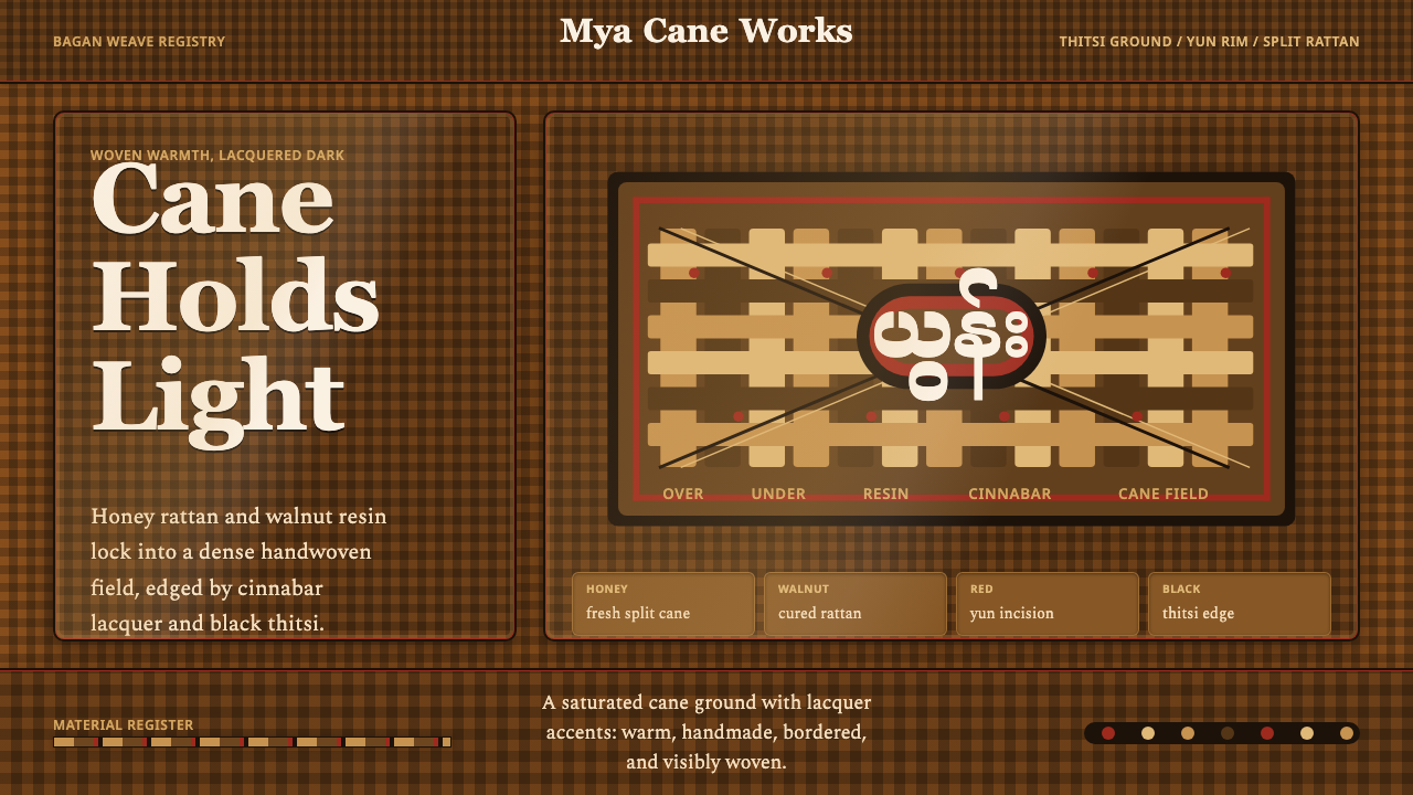 Burmese Cane RattanWoven warmth holds the page. Walnut cane lattice glows with cinnabar rim line…
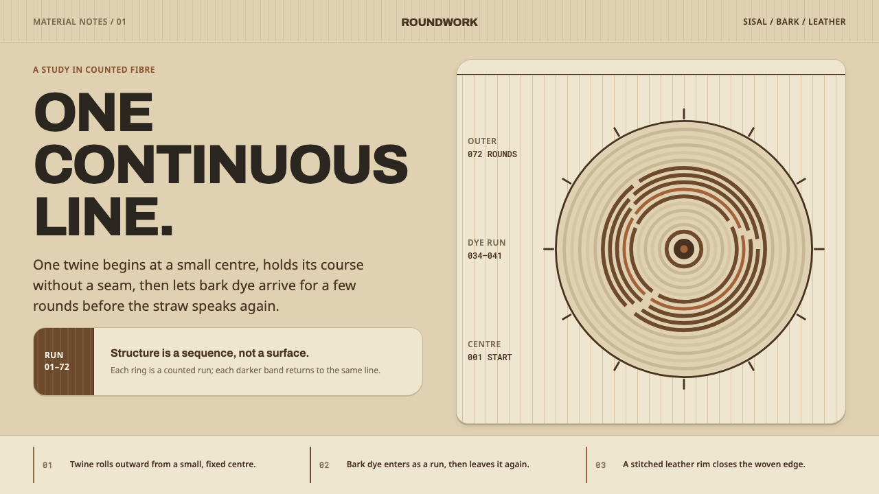 Kenyan KiondoCraft is structural, not applied. Straw ground and counted brown rings carry…
 Bulgarian Rose Attar (Valley of Roses)Quietly precious craft. Moss green, dusty rose and brass borders frame a dawn…
 Fulani Milk CalabashMatte craft burns bright. Oiled gourd tan meets charred concentric linework.
 Kuba Calabash BrownPrestige in dark wood. Calabash brown ground, dense incisions, tukula red rel…