What is Roblox (2006)?
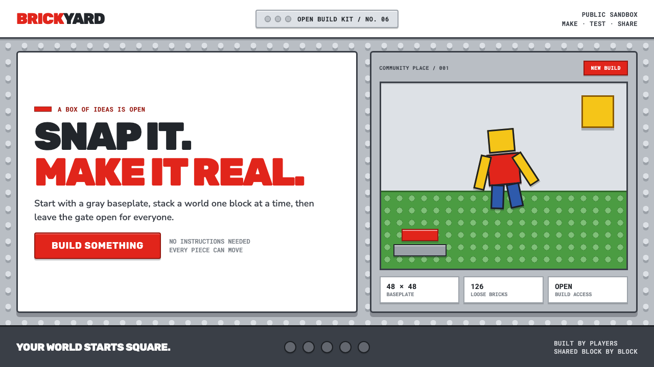
Play begins with a click: fire-engine red cuts through a hard-edged gray field of studs, turning a browser page into a box of bricks.
Roblox (2006) in brief
Roblox 2006 is the visual language of the platform at public launch: a gray plastic sandbox stamped edge to edge with circular studs, a loud red logo, and block-built avatars with peg-like legs. Its central image is not a polished virtual world but an accessible construction kit. The page appears to offer tangible parts, visible connection points, and an invitation to rearrange them.
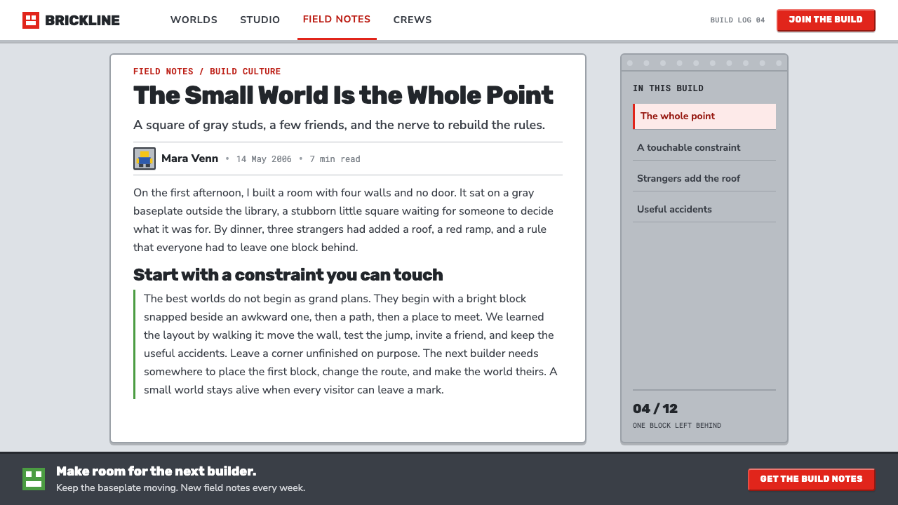
The style fuses injection-molded toy honesty with the utilitarian web chrome of the mid-2000s. Matte silver-gray bricks, chunky beveled controls, simple hard shadows, and one emphatic primary red create a system that feels mechanical without becoming technical. A button does not merely label an action; its thick form makes it appear pressable. A stud does not merely decorate a surface; it suggests that another piece can attach there.
This early Roblox look rejects the later language of premium digital spectacle. It does not depend on gloss, atmospheric depth, or luxury finish. Instead, it makes construction visible: a baseplate under direct daylight, a red avatar caught in motion, blocks apparently placed by hand. Its promise is practical and social at once: take the available pieces, make something, then share the result.
Where does Roblox (2006) come from?
The relevant period runs from the DynaBlocks beta of 2004–2005 through Roblox's public launch in September 2006 and the early years that followed. The setting was San Mateo, California, at a moment when user-generated content platforms, physics-sandbox games, Lego-descended digital toy design, and the early social web were beginning to overlap. Roblox entered that overlap with a visual vocabulary built around making rather than consumption.
The DynaBlocks name belongs to the beta period, while Roblox marked the public-facing launch. That progression matters to the aesthetic: the style reads as a product still close to its basic proposition. Its gray stud surfaces and modular avatars explain the world through its parts. Before a player is asked to admire a finished scene, they are asked to understand that a scene can be assembled, altered, and passed on.
David Baszucki, Erik Cassel, and Keith Lucas are the key figures named in the source material for this origin. In this context, the article's focus is not on an invented hierarchy of authorship but on the environment around the early platform: a browser-based place where play, building, and social sharing were treated as connected activities. The visual system gives that idea a concrete toy-like form.
The result was a distinct early-social-web aesthetic. Where many online products presented smooth surfaces and abstract navigation, Roblox foregrounded seams, studs, blocks, and controls. Its design made a digital environment feel assembled from visible units. That decision joined the sandbox tradition to an unusually direct public invitation: a red BUILD button, a field of pieces, and the expectation that users would turn the field into their own creations.
What defines the Roblox (2006) look?
Studded Plastic Ground
The gray ground is not a neutral backdrop. Circular studs cover it from edge to edge, making the surface read as a baseplate rather than an empty canvas. Repetition establishes order, while the studs imply attachment, alignment, and future expansion. The texture is manufactured and tactile in character, but it remains visually simple enough for avatars and blocks to stay legible.
Fire-Engine Red
One loud primary red carries the identity. Against matte gray, it works as an immediate directional signal: logo, principal action, or the visual focus of a scene. Its power comes from restraint. Red is not distributed across every object; it is held back so that its appearance feels like a command to begin, build, or notice.
Pressable Controls
Buttons are chunky and beveled, borrowing their logic from molded plastic rather than invisible interface layers. Their edges suggest thickness, and their form communicates action before a label is read. This is utility expressed through objecthood: the interface behaves less like a floating command system and more like a tray of physical controls waiting for a hand.
Block-Built Avatar
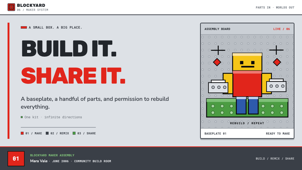
The peg-leg avatar is deliberately simple and visibly assembled. Rather than concealing construction, it turns construction into personality. Its blocky body can be understood at a glance as a combination of pieces, which makes the figure feel rebuildable by any child. A single red avatar in motion is enough to state the larger premise: the player belongs inside the construction system.
Hard Little Shadows
Depth is conveyed with compact, hard-edged shadows rather than soft atmosphere. A placed block appears to sit on the baseplate; a control appears to rise from its surface. The shadow is not a cinematic lighting effect. It is a small structural cue that separates pieces, clarifies their placement, and preserves the feeling that every object could snap into position.
Matte Utility
Nothing is asked to look glossy, luxurious, or premium. Matte silver-gray bricks and plain browser-era chrome keep attention on the available actions and parts. This material restraint gives the world a candid, workshop-like mood. It says that value lies in what can be made with the pieces, not in an immaculate surface that asks to be admired from a distance.
Who shaped Roblox (2006)?
David Baszucki is identified in the source material as one of the key figures connected to the early Roblox origin. Within this style story, the important point is the platform context in which he appears: a project emerging from the DynaBlocks beta period and reaching the public as Roblox in September 2006. The resulting visual language made building intelligible through studs, blocks, and an unmistakable invitation to act.
Erik Cassel is likewise named as a key figure in the source material. The early Roblox aesthetic associated with this period is useful precisely because it does not hide its system behind polished abstraction. Gray baseplates, visible studs, and modular figures turn an online environment into an understandable set of parts, aligning the platform with digital toy design and user-generated play.
Keith Lucas is the third key figure named in the provided origin material. The design language around the 2006 launch frames the platform as a shared making space: a player sees a construction field, a conspicuous build action, and forms that appear ready to be recombined. That clarity supports the source material's broader context of physics-sandbox games and the early social web.
How do you use Roblox (2006) today?
For presentation covers, use the style as a direct invitation. Place a single block-built object or red focal form against a restrained gray stud field, then let a compact title feel like a label applied to a toy package. Keep the scene frontal and tangible. The cover should communicate that the topic is something to enter, manipulate, or make, rather than a polished world to passively observe.
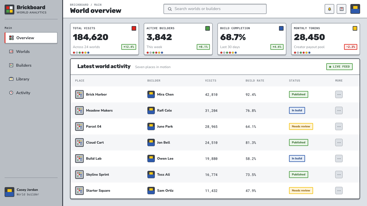
For content slides, treat the stud grid as a quiet organizing surface rather than an image to overwhelm the text. Use chunky, clearly bounded information groups and controls that visibly belong to the same molded-plastic family. On data slides, convert categories into block-like modules, retain gray for the shared ground, and reserve red for the figure or decision that matters most. Avoid atmospheric charts: the visual goal is a readable construction board.
For web interfaces, this language suits creator dashboards, learning tools, build flows, inventories, and pricing pages that need to make actions feel approachable. A prominent red action can mark the route into creation, while gray studded areas can establish a persistent workspace. Panels should feel like pieces placed on a baseplate, with hard separation and obvious pressability. The interface should answer what can be made here before it tries to impress.
For editorial and marketing work, lead with the platform's toy honesty. A feature story can use a blocky red figure as a recurring navigational marker, while product explanations can be divided into visibly connected modules. Marketing copy benefits from the literalness of the system: show the parts, show the build action, show the result being shared. Keep photographic polish subordinate to the visual claim that participation matters more than spectacle.
The common mistake is reducing Roblox 2006 to generic red-and-gray nostalgia. Red is effective here because it is scarce and functional, not because it covers the page. Studs work because they describe attachment and construction, not because they are a decorative pattern. Likewise, adding glossy gradients, luxury textures, or soft cinematic depth weakens the original premise. The style succeeds when every surface makes the next act of building feel possible.
Roblox (2006) — FAQ
Is Roblox 2006 a minimalist style?
Not in the usual sense. The palette is limited and the forms are simple, but the surfaces are deliberately busy with studs, seams, buttons, and visible construction cues. Its restraint lies in material honesty and a narrow set of recognizable parts, not in blankness. The style is closer to a toy construction system than to a silent, reduced interface.
Why are the studs so important?
Studs make the environment legible as a place for assembly. They turn an otherwise generic gray surface into a baseplate with implied rules: pieces can land here, align here, and connect here. Because the pattern repeats across the field, it also gives the interface a common visual ground. It is texture with a job, not texture added for richness alone.
Can the red be used everywhere in a Roblox 2006-inspired design?
That usually loses the effect. In the source material, the fire-engine red does the branding and highlights the build invitation precisely because the gray plastic field remains dominant. Use red for the logo, the key action, or a single active avatar or object. When every panel demands the same attention, the clear build signal disappears.
What kinds of products fit this style best?
It fits products where making, learning, collecting, configuring, or sharing is central to the experience. Creator tools, educational activities, inventories, playful onboarding, and community build spaces can all benefit from its visible logic of parts and actions. It is less suitable when a product must feel quiet, luxurious, or immaterial, because Roblox 2006 derives much of its character from deliberate plastic weight and mechanical directness.
Related design styles
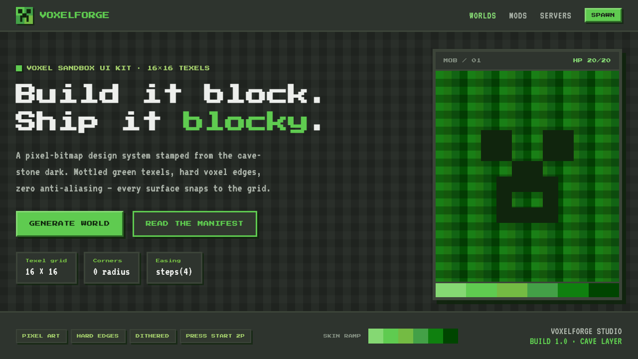 Minecraft CreeperBuild it blocky. Mottled lime texels on cave-stone gray, hard voxel edges, pe…
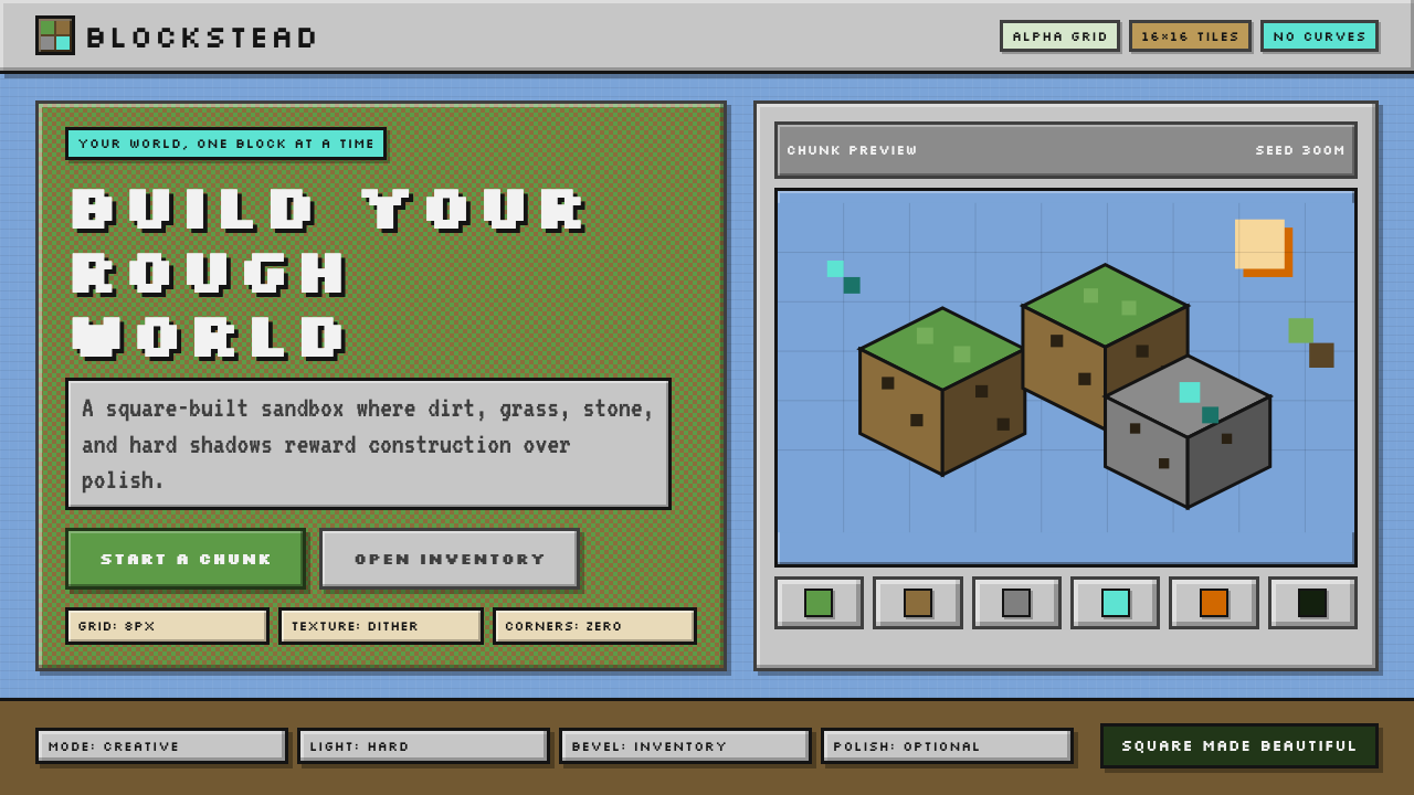 Minecraft VoxelUgly becomes buildable. Grass green, dirt brown, hard bevels, and 16×16 grids…
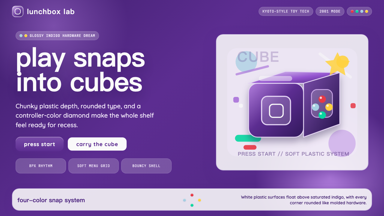 Nintendo GameCube (2001)Toy-tech refuses restraint. Indigo plastic, glossy cubes, and four-color butt…
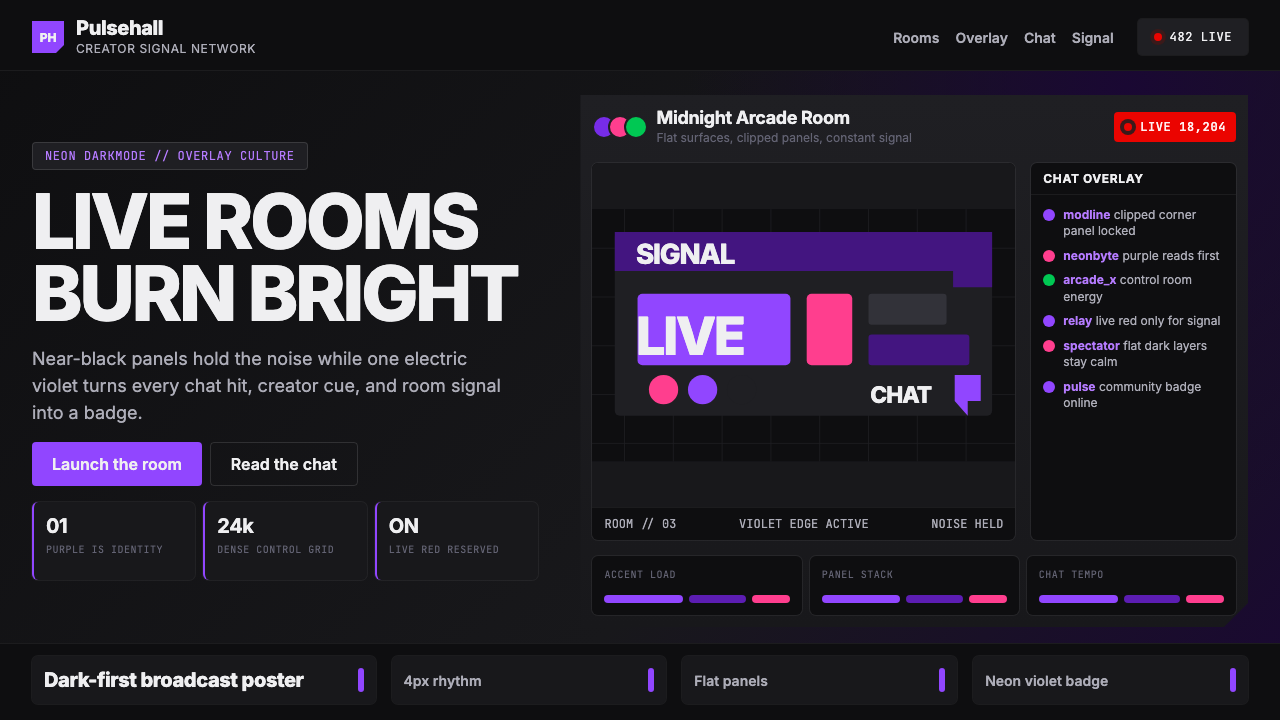 TwitchPurple is tribal signal. Neon violet cuts through flat dark panels and chat g…
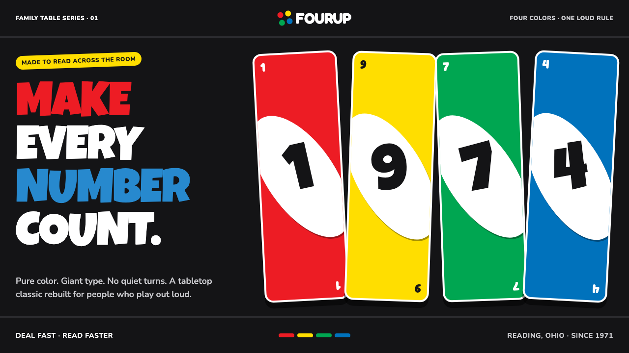 UNO (1971)Every number shouts. Four pure primaries punch through black with tilted whit…
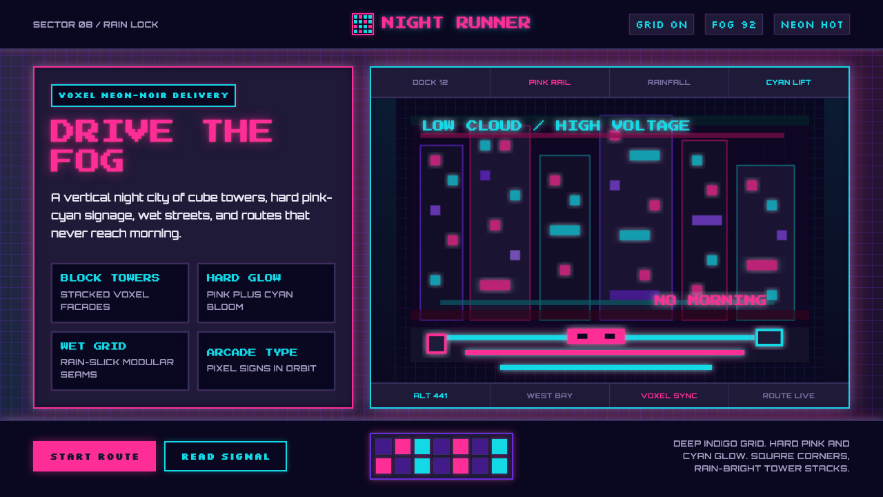 CloudpunkNeon-noir goes voxel. Pink-cyan glow cuts deep-indigo grids and blocky tower…