What is bilibili?
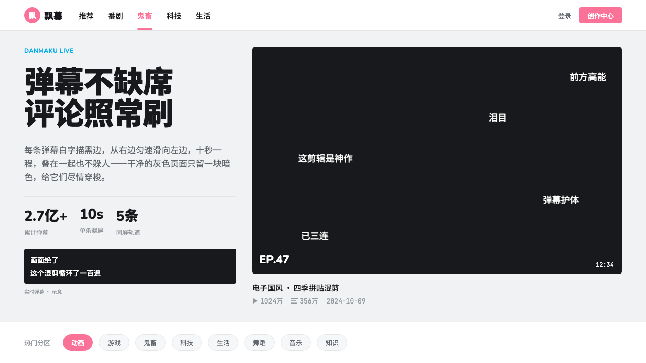
bilibili wraps a dense, cold-grey video feed around one hot pink and one dark player, where white outlined comments sweep across the picture like weather.
bilibili in brief
bilibili is a Chinese video-platform style built from two opposite temperatures. The page itself is a dense, cold light grey with white cards stacked on it, calm to the point of being industrial. Against that, the brand pink arrives on follow buttons, badges, active tabs and unread markers, and the video player sits as a dark window in the middle of the light page. The style is a lesson in how a neutral frame can make a few hot signals feel loud.
Its defining feature is danmaku, the overlay of viewer comments that slide across the video. In this style the comments are small white text with a dark outline, running in several lanes from right to left at an even speed and overlapping without dodging one another. Danmaku is the only theatre on the page. Everything outside the player is quiet, so that all of the motion and personality is concentrated where the video is.
Nothing in the layout is airy. Card titles are limited to two lines, secondary information sits in muted grey, and a single screen holds many cards. There are no oversized headlines, no gradients and no paper textures. The logic is that density is not a problem to be solved with whitespace but a feature of a feed that people browse the way they browse a shelf.

Where does bilibili come from?
bilibili was founded in 2009 as Mikufans, was renamed bilibili in 2010, and listed on the NASDAQ in 2018. Its background material places it in Shanghai and names Xu Yi and Chen Rui as key figures. The current visual system captured in this style dates from roughly 2022 to 2024, so the look it records is that of a company well past its start-up years, with a feed interface refined for a very large audience.
The movements behind the style are the real source of its identity. The first is Chinese ACG and the 二次元 subculture, the community of anime, comics and games fans and the broader 'two-dimensional' taste that grew up around them. The second is danmaku video, imported from Niconico: the technique of attaching comments to precise moments of a video so that they scroll over the picture and turn watching into a shared, simultaneous act. The third is Vocaloid and UP主 creator culture, in which amateur and semi-professional uploaders, the UP主, make and share music, remixes and other work. The platform's first name, Mikufans, points in the same direction.
Danmaku explains why the interface is built the way it is. If the comments are going to carry the energy, the surrounding chrome has to stay out of the way. The result is a counterintuitive design: a subculture platform whose pages look closer to a utilitarian index than to a fan site. Light grey, white cards and near-black body text provide a stable, readable surface, and the pink, together with the cyan of the logo, is allowed to be the only thing that looks like youth culture.
The decision to keep darkness inside the player is the final piece. Video is naturally watched against dark surroundings, but making the whole site dark would turn the feed into a wall. The style instead lets the dark room exist only as a widescreen rectangle inside a bright page, so a viewer moves between browsing and watching without the interface changing mood.
What defines the bilibili look?
Cold Grey Ground
The page ground is a light grey with a faint blue cast, neutral enough not to compete and cool enough to make white feel like a distinct material. White cards stand on it as objects with edges, and the contrast between ground and card replaces borders and shadows as the main way of separating content.
Hot Pink for Action
The brand pink is the only warm colour in the interface, and it is assigned to interaction and status: follow buttons, badges, the active navigation tab and unread markers. Because the rest of the page is cold and neutral, even a small pink element is the first thing the eye finds. The cyan of the logo acts as its cool counterpart and appears far less often.
A Narrow Ladder of Greys
Text is organised as a short ladder: a near-black for titles and body, a muted grey for view counts, dates and other metadata, and a very faint grey for hairline dividers. The ladder is deliberately narrow, which keeps a screen full of cards readable without any decoration to separate them.
Dense White Cards
Cards are pure white, tightly packed and uniformly structured: a thumbnail, a title clamped to two lines and a metadata row beneath. Titles and metadata are modest in size, which lets many cards share a screen. The density is intentional. The feed is meant to be scanned and sampled like a shelf, not read like an article.
The Danmaku Layer
Danmaku is white small type with a dark outline, which keeps it legible against any frame of video. Comments travel from right to left in several parallel lanes at a constant pace and overlap each other freely. The effect is of a crowd talking over the picture, and the constant speed and the outline keep that crowd readable instead of chaotic.
A Dark Player in a Light Page
The only dark surface in the system is the widescreen video player. It sits inside the light page without replacing it, so the transition from browsing to watching is a change of frame, not a change of theme. This containment also gives the danmaku a stage that is visibly separate from the interface.
No Ornament
There are no big headlines, no gradients and no paper textures in the chrome. The platform's personality comes from its content and its comments, not from its container. That restraint is what lets user-made thumbnails, colourful and varied, be the loudest thing on the page.

Who shaped bilibili?
Xu Yi is the first of the two key figures named in bilibili's background material. His name belongs to the origin of the platform, which began in 2009 as Mikufans and was renamed bilibili the following year. The material does not describe his role, so this article does not either. Its relevance to the style is the moment he is tied to: the carrying of danmaku video into Chinese-language internet culture.
Chen Rui is the second named key figure. His name is linked to the company that moved from its Mikufans beginnings to a NASDAQ listing in 2018. The style records the visual outcome of that growth, an interface that stayed calm, dense and cold-grey even as the audience expanded, with the hot pink and the dark player left as the only loud elements.
Niconico is not a person but the influence the background material credits with danmaku video. The technique of overlaying viewer comments on a video's timeline came to bilibili from it. Naming it here recognises that the signature feature of this style, outlined comments racing across a dark player, is an inherited form that bilibili adapted to its own interface and community.
How do you use bilibili today?
The bilibili style is for interfaces that must be dense, fast to scan and a little playful. Its method is easy to state: build a calm cold-grey frame and spend colour on a handful of signals. It is hard to execute, because every pink element has to earn its place.
For slides, a bilibili-like cover is a cold grey field with a white card and one pink element, not a pink-flooded poster. Content slides read like feed pages: white cards on grey, titles in near-black and metadata in muted grey. Data slides suit leaderboards and ranking tables, with the top item or the growth figure picked out in pink. A dark rectangle holding a screenshot or video still, set inside a light slide, borrows the player idea.
In web UI, the style fits content feeds, community platforms, creator dashboards and video or livestream front ends. Follow, subscribe and notification states take the pink, and everything else stays in grey, white and black. Dashboards should use white cards on a grey ground with small, muted-grey metrics and a pink highlight for the number that changed. Membership or pricing pages work if the plan to recommend is the only pink-marked card. Comments or live chat can borrow the danmaku treatment, outlined white text moving across a dark media surface, as long as the dark surface stays contained.
For editorial and marketing pages, treat the pink as the call to action and the grey, white and black system as the reading surface. Campaign pages for creator-led or fan-community products can place a hero player or still in dark and let overlaid comments suggest an audience. Keep headlines modest. This style gets its energy from content density and from the hot-cold contrast, not from large display type.
The usual mistake is to flood the page with pink, which removes the contrast the system depends on. A second is to darken the whole page for a video feel, which destroys the containment of the player. A third is to add soft shadows, gradients or paper-like textures in an attempt to look youthful. The style's youth comes from its comments and thumbnails, and the chrome stays flat.

bilibili — FAQ
What is danmaku?
Danmaku, literally 'bullet curtain', is a layer of viewer comments that scroll across a video at the moment they were written. The technique came to bilibili from Niconico. In this style the comments are small white text with a dark outline, travelling right to left in several lanes at an even pace, and they are allowed to overlap one another.
Why is the page a cold grey rather than white?
A faintly blue light grey lets white cards register as separate objects without borders or shadows. It also stays out of the way of the colours that matter: the pink for actions and the cyan of the logo. A pure-white page would make the cards disappear into the ground and would leave the pink with less to push against.
Why is the player dark when the page is light?
Video is best watched against dark surroundings, but a fully dark site would make the browsing feed heavy and harder to scan. The style keeps the dark inside the widescreen player, so the viewer gets a cinema-like frame for watching while the rest of the page remains a bright, dense index. It also gives the outlined comments a stage that is visibly separate from the interface.
Where should the pink go?
On interaction and status: follow buttons, badges, the active tab and unread markers. The test is whether the element asks the user to do or notice something. If it does not, keep it grey, white or black. Pink on headings, backgrounds or decorative shapes dilutes the contrast between the cold frame and the hot signal that gives the style its energy.
Does the style suit products that are not video?
Yes, where the content is a dense feed shaped by an active community: forums, creator platforms, live-streaming, learning communities, music or game hubs. It works less well for sparse, premium or contemplative products, since the style assumes density, many cards per screen and a user who browses quickly.
Related design styles
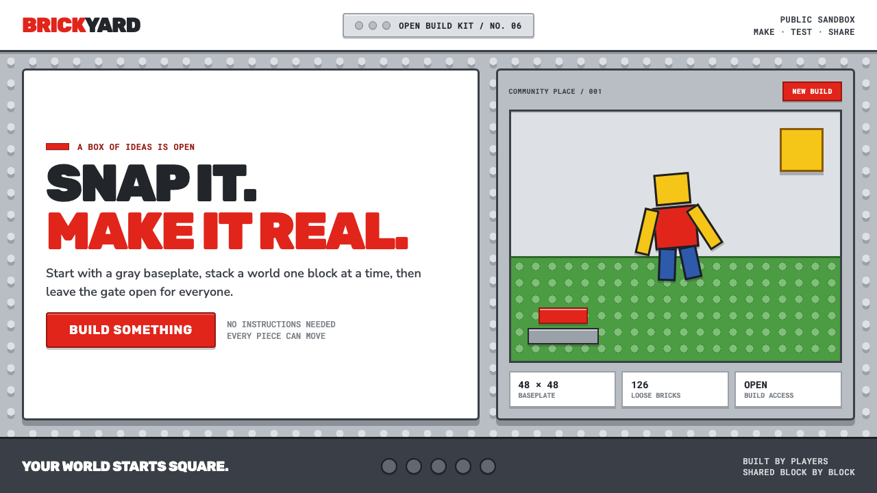 Roblox (2006)Play begins with a click. Fire-engine red cuts through a hard-edged gray stud…
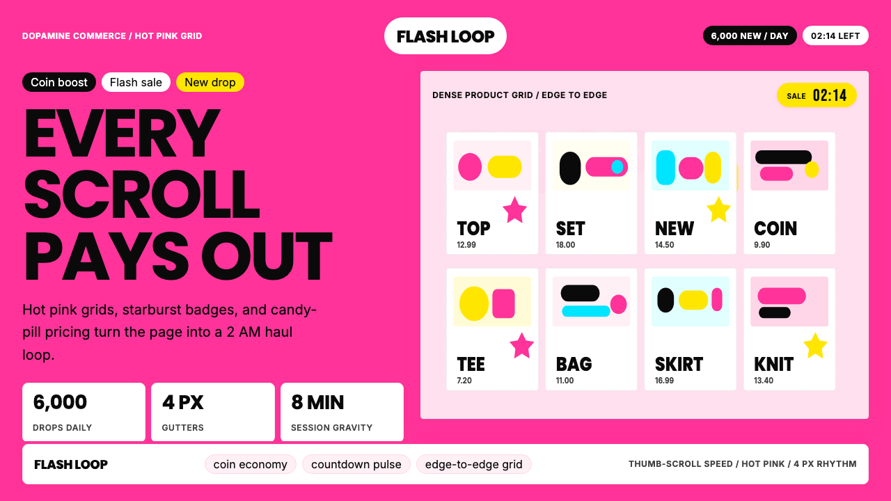 Shein Fast FashionDopamine density wins. Hot pink grids, starbursts, and candy pills pack every…
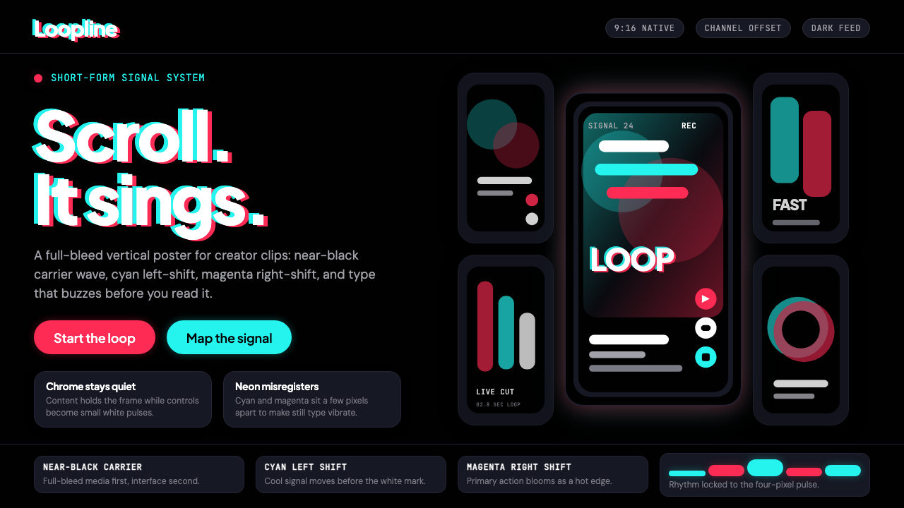 TikTok 2024Attention vibrates. Near-black feed, cyan-magenta offsets, and vertical frame…
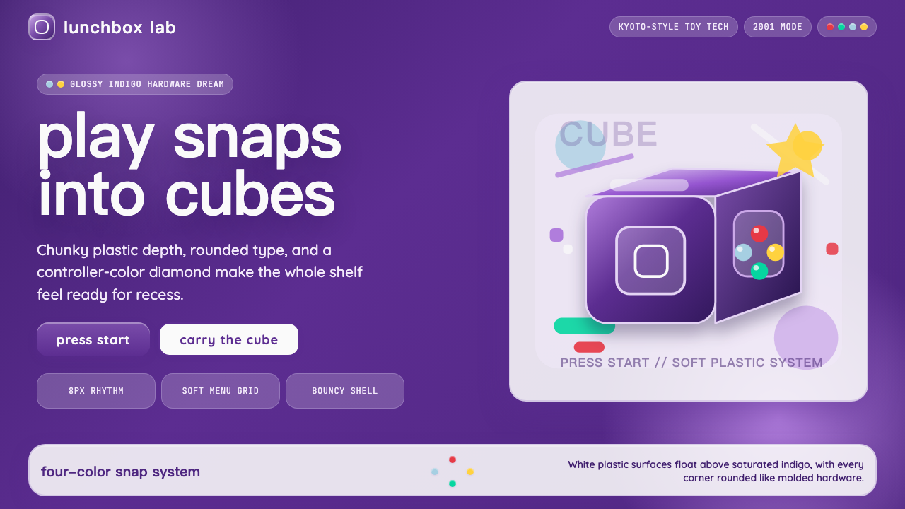 Nintendo GameCube (2001)Toy-tech refuses restraint. Indigo plastic, glossy cubes, and four-color butt…
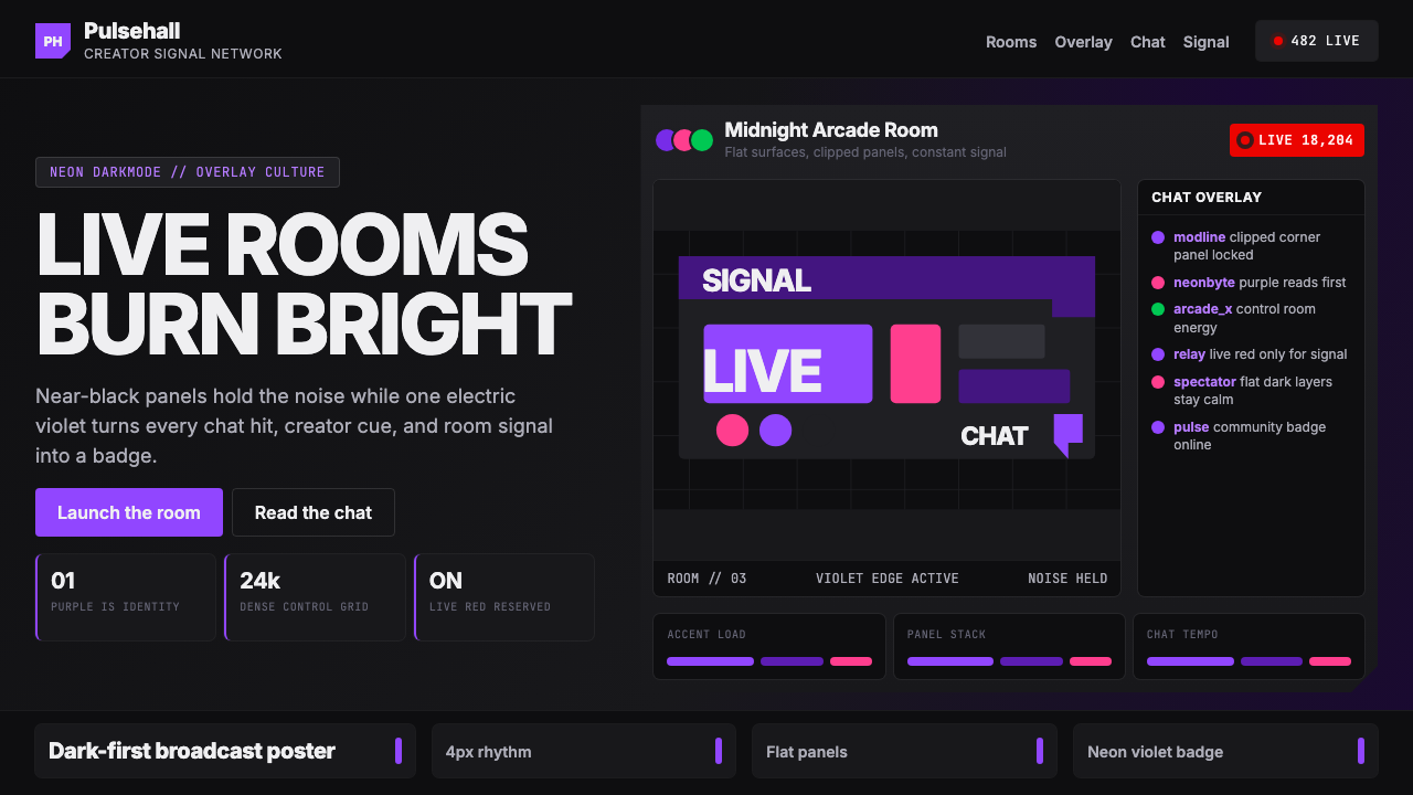 TwitchPurple is tribal signal. Neon violet cuts through flat dark panels and chat g…
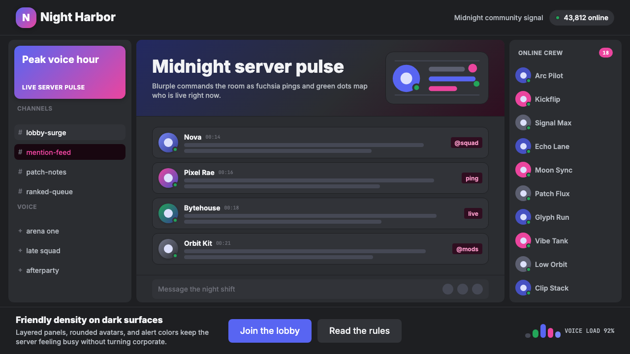 Discord Blurple Server (2020)Midnight server energy. Blurple panels, fuchsia pings, and green status dots…