What is Twitch?什么是 Twitch?
Twitch transformed a single shade of electric violet into the defining signal of an entire generation of live-streaming culture.Twitch 将一种电光紫变成了整整一代直播文化最鲜明的身份信号。
Twitch in briefTwitch 速览
Twitch Purple is the visual identity system born from one of the most consequential rebrands in digital product history. When the design studio COLLINS overhauled the platform's look in 2019, the goal was not merely cosmetic refresh — it was to codify, in a single coherent visual language, what live-streaming culture had already taught millions of viewers to feel: the electric charge of presence, the tribal warmth of a shared chat room, the control-room intensity of a creator's workspace.Twitch 紫是数字产品史上最具影响力的品牌重塑之一的产物。2019年,设计工作室 COLLINS 对平台视觉进行了全面改造,目标并不仅仅是表面翻新,而是将直播文化早已在数百万观众心中植入的感受——在场的电流感、共享聊天室的部落温度、创作者工作台的控制室张力——凝固为一套统一连贯的视觉语言。
At its center is a vivid, deeply saturated violet that sits in an unusual perceptual register — neither the corporate blue of legacy tech brands nor the aggressive neon of gaming peripherals, but something that reads simultaneously as dark-mode-native and unmistakably alive. This anchor color functions as both brand mark and community badge; it appears on filled action buttons, live-indicator dots, subscription highlights, and donation banners, pulsing with the same electric identity across every surface.系统的核心是一种鲜艳、高饱和的紫罗兰色,它处于一种不寻常的感知区间——既非传统科技品牌的商务蓝,也非游戏外设的侵略性荧光,而是一种既天然属于暗色模式、又鲜明充满生命力的色彩。这个锚点色同时充当品牌标志和社区徽章,出现在填充式按钮、直播指示灯、订阅高亮和打赏横幅上,在每一个界面都跳动着同样的电光身份。
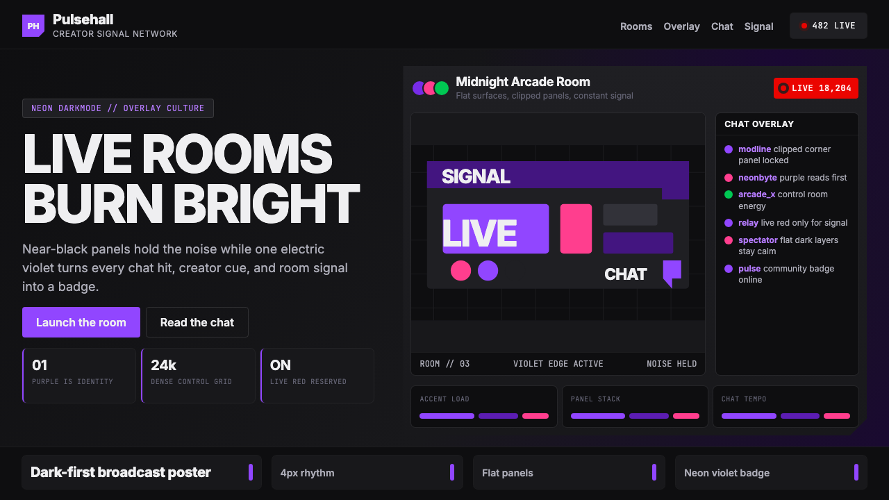
The broader design language draws from stream-overlay culture — the layered HUD panels, chat feeds, and alert boxes that creators build on top of their game footage. Flat dark backgrounds, neon accent edges on interactive elements, rounded avatars floating over near-black surfaces, and dense information grids form a visual ecosystem that feels like a control room: functional and information-rich, never cold or sterile.更广泛的设计语言脱胎于直播覆盖层文化——创作者叠加在游戏画面上的分层 HUD 面板、聊天信息流与提醒框。扁平的深色背景、交互元素的霓虹边缘高光、漂浮在近黑表面上的圆形头像,以及密集的信息网格,共同构建了一个像控制室一样的视觉生态:功能充实、信息丰富,从不冰冷或乏味。
Where does Twitch come from?Twitch 从何而来?
The story of Twitch Purple begins not with a designer's palette but with a platform pivot. In 2011, Justin Kan and Emmett Shear spun out the gaming-focused live-streaming section of Justin.tv into a standalone service called Twitch. The name, borrowed from an internet slang term for the twitching reflex of a gamer's hands under pressure, signaled from the start that this was a platform built from and for a specific subculture. The early visual identity was utilitarian — a dark interface inherited from the practical demands of streaming software overlaid on gaming sessions, without deliberate aesthetic ambition.Twitch 紫的故事并非始于设计师的调色板,而是始于一次产品的战略转向。2011年,Justin Kan 与 Emmett Shear 将 Justin.tv 中专注游戏的直播频道拆分出来,建立了独立服务 Twitch。这个名字借用了网络俚语,指游戏玩家在高压下的手部抽搐反应,从一开始就宣告这是一个从特定亚文化中诞生、为特定亚文化服务的平台。早期的视觉识别是实用主义的——深色界面源于直播软件叠加在游戏画面上的实际需求,没有刻意的美学追求。
The visual culture of early Twitch was in large part shaped not by the company's designers but by its creator community. Stream overlays — the custom graphic panels, animated alerts, and chat boxes that streamers placed over their broadcasts — established the visual grammar that would eventually define the brand. Neon accents on dark grounds, high-contrast information panels, rounded avatar frames: these conventions emerged organically from thousands of independent creators building their own visual identities, then became the common language of the medium.早期 Twitch 的视觉文化,在很大程度上不是由公司设计师塑造的,而是由创作者社区塑造的。直播覆盖层——主播叠加在画面上的自定义图形面板、动画提醒与聊天框——确立了视觉语法,而这套语法最终将定义整个品牌。深色底面上的霓虹高光、高对比度信息面板、圆角头像框:这些惯例由数千名独立创作者在建立各自视觉身份的过程中自然涌现,最终成为这种媒介共同的语言。
Amazon acquired Twitch in 2014 for nearly one billion dollars, accelerating its growth far beyond the gaming niche into a broader live-entertainment platform. By the late 2010s, Twitch hosted cooking shows, political commentary, live music, and talk formats alongside its core gaming content. This expansion created a visual identity problem: the scrappy dark-ground aesthetic of early streaming culture needed to mature into a system capable of representing a platform at the scale and ambition of a major media company.2014年,亚马逊以近十亿美元收购 Twitch,推动其从游戏垂直领域大幅扩张为更广泛的直播娱乐平台。到2010年代末,Twitch 在核心游戏内容之外还承载着烹饪节目、政治评论、现场音乐和脱口秀等形式。这一扩张带来了视觉识别问题:早期直播文化那种粗粒感的深色美学,需要成熟为一套能代表大型媒体公司规模与抱负的系统。
In 2019, COLLINS — the New York-based brand and design consultancy — undertook the rebrand that would crystalize the Twitch visual identity into its current form. The studio's approach was to look at what the community had already created — the overlay culture, the emote vocabulary, the ritual language of raids and hype trains — and distill those vernacular signals into a designed system. The choice of a single vivid violet as the irreducible brand signal was deliberate: it honored the community's longstanding association of purple with Twitch (a color that had been present since the early interface) while giving it the formal precision and consistency needed to function as a global visual brand.2019年,纽约品牌与设计咨询工作室 COLLINS 承接了这次品牌重塑,将 Twitch 的视觉识别凝练为今日形态。工作室的方法是审视社区已经创造的东西——覆盖层文化、表情词汇、突袭与炒作列车的仪式化语言——并将这些民间信号提炼为一套被设计的系统。选择一种鲜艳的紫罗兰色作为不可化约的品牌信号是深思熟虑的结果:它尊重了社区长期以来将紫色与 Twitch 联系在一起的传统(这种色彩自早期界面就已存在),同时赋予它作为全球视觉品牌所需的形式精准性与一致性。
What defines the Twitch look?Twitch 的视觉特征是什么?
Anchor Violet锚点紫
The defining characteristic of the system is a single, electrically saturated violet that functions simultaneously as brand color, interactive signal, and community marker. This violet sits at a precise perceptual point: deep enough to read as dark-native, vivid enough to pulse with energy against near-black backgrounds. It appears on every primary action surface — filled buttons, live indicators, subscription badges — and its consistent deployment across contexts means users instantly associate any appearance of this color with Twitch's presence and liveness.这套系统最鲜明的特征是一种电气感十足的高饱和紫罗兰色,它同时充当品牌色、交互信号与社区标记三重角色。这种紫罗兰色处于一个精确的感知位置:深度足以天然属于暗色模式,鲜艳度足以在近黑背景上跳动出能量感。它出现在每一个主要操作界面——填充按钮、直播指示灯、订阅徽章——其在不同语境中的一致部署意味着用户看到这种色彩时立刻联想到 Twitch 的在场与直播状态。
Dark-First Foundations暗色优先的基底
The system is engineered from the ground up for dark environments. Near-black backgrounds are not an alternative mode — they are the canonical surface. This decision is grounded in platform context: viewers and creators typically use Twitch in dimly lit rooms during long sessions, and a dark foundation reduces eye strain while making the vivid violet accent feel more electric rather than simply bright. Text, icons, and structural elements are rendered in light tones calibrated to maintain comfortable contrast across extended use.这套系统从底层开始就为暗色环境而设计。近黑背景并非备选模式,而是标准表面。这一决策根植于平台语境:观众和创作者通常在光线昏暗的房间里进行长时间使用,暗色基底能减少视觉疲劳,同时让鲜艳的紫罗兰色强调更显电光感,而非仅仅显得明亮。文字、图标与结构性元素以浅色调呈现,经过标定以在长时间使用中保持舒适的对比度。
Layered Information Density分层的信息密度
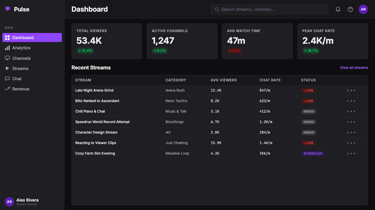
Twitch interfaces are designed to carry multiple simultaneous streams of information: video content, live chat, channel metadata, recommended streams, and viewer statistics can all coexist on a single screen. The design system manages this density through clear visual hierarchy — chat panels, video frames, and navigation surfaces are distinguished by subtle tonal shifts within the dark range, not by hard dividing lines or decorative borders. The result is a layout that reads as structured even when packed with real-time information.Twitch 界面被设计为同时承载多路信息流:视频内容、实时聊天、频道元数据、推荐直播间与观看人数统计可以在同一屏幕上共存。设计系统通过清晰的视觉层级管理这种密度——聊天面板、视频画面与导航表面通过暗色调范围内的细微色调差异加以区分,而非依赖硬性分割线或装饰边框。结果是一种即便塞满实时信息也显得有条理的版面。
Rounded, Soft-Edged Identity Marks圆润柔边的身份标记
Avatar frames, emote containers, and badge shapes throughout the system use pronounced rounding — circles and pill shapes rather than sharp rectangles. This softness is not incidental; it creates a sense of personal warmth and approachability that counterbalances the density and technicality of the surrounding interface. Rounded shapes have become shorthand for community membership: the circular avatar is an identity badge as much as a profile image, and its consistent form across millions of channels creates visual cohesion across the entire platform.系统中的头像框、表情容器与徽章形状普遍采用明显的圆角处理——使用圆形与胶囊形,而非锐角矩形。这种柔和感并非偶然;它创造了一种个人化的温度与亲切感,平衡了周围界面的密度与技术感。圆角形状已成为社区归属感的速记符号:圆形头像既是个人形象,也是身份徽章,其在数百万频道中的一致形态为整个平台创造了视觉凝聚力。
Neon Accent Economy霓虹强调的经济性
Beyond the primary violet, the system deploys a small vocabulary of secondary neon accents — electric greens for achievement indicators, bright magentas and teals for promotional moments — that echo the aesthetic of stream overlays and gaming peripherals. Critically, these accents are used sparingly and contextually rather than spread across the interface uniformly. Each accent color earns its presence by signaling something specific: a milestone, a notification, a live status. This controlled scarcity keeps each accent legible as a signal rather than noise.在主紫之外,系统还运用了一套小型霓虹辅助强调色词汇——电绿色用于成就指示,亮洋红与深青用于推广时刻——呼应了直播覆盖层和游戏外设的美学。关键在于,这些强调色是节制而有语境地使用的,而非均匀铺展于整个界面。每种强调色通过指示某种具体事物来赢得自己的在场:一个里程碑、一条通知、一种直播状态。这种受控的稀缺性使每种强调色保持为信号而非噪音。
Broadcast Typography播报式排印
Type in the Twitch system is direct, legible, and scale-conscious. Headlines and channel names are set boldly to compete with the visual noise of live video thumbnails; interface labels and metadata use compact, tightly spaced settings that maximize information density without sacrificing readability. The typographic register is closer to sports broadcast graphics than to traditional print or web editorial — designed for fast scanning, ambient awareness, and the interrupted attention patterns of a viewer who is also engaged with chat and gameplay.Twitch 系统中的字体直接、清晰、尺度感强。标题与频道名称以粗体设置,以在实时视频缩略图的视觉噪音中脱颖而出;界面标签与元数据使用紧凑、间距密集的排版,在不牺牲可读性的前提下最大化信息密度。排印风格更接近体育转播图形而非传统印刷或网络编辑排版——专为快速扫视、环境感知以及同时关注聊天与游戏画面的观众的碎片化注意力模式而设计。
Emote and Icon Vernacular表情与图标的民间语言
Twitch's visual system extends beyond the designed interface into a rich community-generated vocabulary of emotes — small expressive icons that function as a specialized emoji dialect unique to each channel. The platform's design accommodates this vernacular by treating the emote grid as a native interface element rather than an external plug-in. This integration is philosophically significant: the brand acknowledges that the community's own visual language is as much a part of the platform's identity as any asset created by the design team.Twitch 的视觉系统延伸到被设计的界面之外,进入一套丰富的社区生成表情词汇——小型表达性图标,在每个频道内功能如同专属的表情方言。平台的设计将表情网格作为原生界面元素而非外部插件来容纳这种民间语言。这种整合具有重要的哲学意义:品牌承认社区自己的视觉语言与设计团队创作的任何资产同等构成平台的身份认同。
Who shaped Twitch?谁塑造了 Twitch?
Justin Kan co-founded Justin.tv in 2007 and pioneered the concept of always-on personal live-streaming before the medium had an established audience or economic model. His decision to spin out the gaming-focused segment as Twitch in 2011 was a pivotal act of product vision: recognizing that gaming audiences had distinct cultural needs and community behaviors that warranted a dedicated platform. Though Kan departed before the current visual identity was established, the structural decisions he made — the dark-by-default interface, the chat-centered community model — became the cultural substrate on which the Twitch aesthetic was eventually built.Justin Kan 于2007年共同创立了 Justin.tv,在这种媒介尚无成熟受众或商业模式之前就率先探索了全时个人直播的概念。他在2011年将游戏专注板块拆分为 Twitch 的决定是一次关键的产品远见:认识到游戏受众具有独特的文化需求与社区行为,值得拥有一个专属平台。尽管 Kan 在当前视觉识别确立之前就已离开,但他所做的结构性决策——默认暗色界面、以聊天为中心的社区模型——成为 Twitch 美学最终得以建立的文化基底。
Emmett Shear served as Twitch's CEO from its founding through 2023, overseeing the platform through its most transformative periods: the Amazon acquisition in 2014, the explosive growth of the creator economy in the late 2010s, and the 2019 COLLINS rebrand that crystallized the visual identity. Under his leadership, Twitch made the cultural and product decisions — investing in streamer relationships, developing the subscription and bits economy, formalizing the emote system — that gave the design language its social meaning. A visual system carries weight only when the community it represents is real; Shear's long tenure helped ensure the Twitch community was.Emmett Shear 自 Twitch 创立起担任 CEO 直至2023年,领导平台经历了最具变革性的时期:2014年被亚马逊收购、2010年代末创作者经济的爆炸性增长,以及2019年凝练视觉识别的 COLLINS 品牌重塑。在他的领导下,Twitch 做出了赋予设计语言社会意义的文化与产品决策——投资主播关系、发展订阅与虚拟货币经济、将表情系统正式化。一套视觉系统只有在其所代表的社区是真实的时候才具有分量;Shear 的长期任职帮助确保了 Twitch 社区的真实性。
COLLINS is the New York-based brand consultancy responsible for the 2019 Twitch rebrand that transformed an ad-hoc visual vernacular into a designed system. The studio's approach — treating the streaming community's own aesthetic conventions as raw material rather than noise to be cleaned up — was methodologically distinctive. By studying overlay culture, emote design, and chat behavior before setting any visual direction, COLLINS arrived at a brand identity that felt indigenous to the platform rather than imposed upon it. The resulting system has proven durable across multiple years of rapid platform change, a testament to how grounded its origins were.COLLINS 是纽约品牌咨询工作室,负责了2019年将 Twitch 的临时视觉民间语言转化为设计系统的品牌重塑。工作室的方法——将直播社区自身的美学惯例作为原材料而非需要清理的噪音——在方法论上独具特色。通过在确定任何视觉方向之前研究覆盖层文化、表情设计与聊天行为,COLLINS 得出了一套让人感觉发源于平台内部而非强加于其上的品牌识别。由此产生的系统在平台快速变化的多年间经受了考验,证明了其根基的深厚。
The internal Twitch brand and design team has been responsible for extending and evolving the COLLINS-established visual system across every touchpoint of the platform — from mobile app interactions to partnership marketing, from streamer onboarding materials to the physical presence at events like TwitchCon. The ongoing work of maintaining a brand system at the scale of a platform with millions of daily active users requires constant decisions about how to apply the visual language to new product surfaces, emerging creator categories, and cultural moments. The internal team's stewardship has been as important to the identity's coherence as its original design.Twitch 内部品牌与设计团队负责将 COLLINS 建立的视觉系统延伸并演进至平台的每一个触点——从移动端交互到合作伙伴营销,从主播入驻材料到 TwitchCon 等活动的实体呈现。在拥有数百万日活用户的平台规模上维护一套品牌系统,需要不断决策如何将视觉语言应用于新产品界面、新兴创作者类别与文化时刻。内部团队的守护对于身份识别的连贯性与最初的设计同等重要。
How do you use Twitch today?今天怎么用 Twitch?
Applying the Twitch visual language outside its native platform context requires understanding what the system is actually communicating: immediacy, community belonging, and the electric tension of live presence. These are not values that every product shares, and the design language will feel inauthentic if applied purely for its visual drama without matching emotional register. The style works best for products that genuinely operate in real-time, community-driven, or high-engagement contexts — tools for creators, gaming platforms, live event experiences, and community-centric social products.将 Twitch 视觉语言应用于其原生平台语境之外,需要理解这套系统实际上在传达什么:即时感、社区归属感,以及直播在场的电光张力。这些并非每种产品都具备的价值观,如果仅仅为了视觉戏剧性而应用这套设计语言,而不匹配相应的情感基调,则会显得不真实。这种风格最适合真正在实时、社区驱动或高参与度语境中运作的产品——面向创作者的工具、游戏平台、直播活动体验,以及以社区为核心的社交产品。
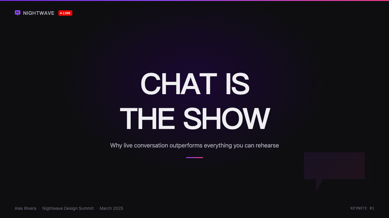
For presentation slides, the Twitch aesthetic translates most naturally into covers and section breaks rather than dense content pages. A cover built on a near-black ground with a single vivid violet headline and a bold rounded logotype immediately evokes the platform's broadcast energy. Content slides should maintain the dark foundation and use the accent color exclusively for the single most important data point or call-out per slide — treating the violet the way a live indicator dot treats liveness, as a signal that demands attention precisely because it appears rarely. Data visualizations benefit from the high-contrast approach: charts with dark backgrounds and neon-edged bars or highlighted segments read as broadcast-graphics, authoritative and immediate.在演示文稿中,Twitch 美学最自然地转化为封面和章节分割页,而非密集的内容页。以近黑背景为基底、配以单一鲜艳紫罗兰色标题和粗体圆角字标的封面,立即唤起平台的广播能量。内容页应保持暗色基底,并将强调色专门用于每页唯一最重要的数据点或引用——将紫色的使用方式视同直播指示灯对直播状态的处理方式:正因为出现稀少,才作为需要关注的信号。数据可视化受益于高对比度方法:深色背景配以霓虹边缘柱条或高亮扇区的图表,读起来如同广播图形——权威而即时。
For web interfaces — particularly dashboards, creator tools, and subscription or pricing pages — the design system's density management principles are directly applicable. Define a clear surface hierarchy using tonal shifts within a dark range: the deepest near-black for background, a slightly elevated dark tone for card and panel surfaces, and a lighter mid-tone for secondary information areas. Reserve the primary violet strictly for interactive elements: primary buttons, active navigation states, and live or status indicators. Secondary accent colors should appear only for categorical differentiation in data displays or promotional badges, never as decorative fill.对于网页界面——尤其是仪表板、创作者工具,以及订阅或定价页面——设计系统的密度管理原则可以直接应用。在暗色范围内使用色调差异定义清晰的表面层级:最深的近黑色用于背景,略微提亮的深色调用于卡片与面板表面,较浅的中间色调用于次要信息区域。严格将主紫色保留给交互元素:主要按钮、活跃导航状态以及直播或状态指示灯。辅助强调色仅应出现在数据展示的类别区分或推广徽章中,绝不作为装饰性填充。
For editorial and marketing applications — event announcements, creator spotlights, partnership decks, and social cards — the Twitch style supports a bold, poster-like visual register. Full-bleed dark backgrounds allow vivid typography and graphic elements to carry maximum visual weight. A recurring design move is the neon-edged frame or panel: a thin violet or secondary-neon border around a content block creates the visual grammar of a stream overlay, immediately anchoring the piece in the platform's cultural context. Photography and video stills integrate naturally into dark-ground compositions when treated with high contrast and tight cropping, echoing the thumbnail culture of the platform.对于编辑与营销应用——活动公告、创作者聚焦、合作伙伴提案和社交卡片——Twitch 风格支持大胆的海报式视觉基调。满版深色背景让鲜艳的排印和图形元素承载最大视觉重量。一种反复出现的设计手法是霓虹边缘框架或面板:内容块周围的细线紫色或辅助霓虹色边框创造出直播覆盖层的视觉语法,立即将作品锚定在平台的文化语境中。摄影与视频截图在以高对比度处理和紧凑裁切的情况下,能自然融入深色背景构图,呼应平台的缩略图文化。
The most common mistake when working with Twitch-style visual language is over-saturating the accent palette. The system's power comes from restraint: the vivid violet earns its impact because everything around it is dark and comparatively neutral. Introducing multiple bright accent colors simultaneously — violet competing with neon green, electric teal, and bright magenta on the same surface — collapses the hierarchy and reads as chaotic rather than electric. A second common error is applying rounded corners inconsistently: the soft-edged avatar and badge forms are markers of community identity, and their application to structural layout elements like content cards or navigation panels dilutes their meaning. Use rounding intentionally, at the identity level, and keep structural layouts more angular.使用 Twitch 风格视觉语言时最常见的错误是过度饱和强调色板。这套系统的力量来自克制:鲜艳的紫罗兰色之所以产生冲击力,是因为周围的一切都是深暗而相对中性的。在同一表面同时引入多种亮强调色——紫罗兰与电绿、电青和亮洋红相互竞争——会瓦解层级,看起来是混乱而非电光感。第二个常见错误是不一致地使用圆角:柔边头像与徽章形态是社区身份的标记,将其应用于内容卡片或导航面板等结构性版面元素会稀释其含义。有意识地、在身份识别层面使用圆角,保持结构性版面更为棱角分明。
Twitch — FAQTwitch · 常见问题
Is Twitch Purple only appropriate for gaming or streaming products?Twitch 紫只适合游戏或直播类产品吗?
Not strictly, but it carries strong cultural associations with live digital communities, and those associations will color how audiences read the design. The system works well for any product whose core experience involves real-time participation, community membership, or high-engagement interaction — creator tools, event platforms, competitive gaming adjacent products, and community-centric social apps. It will feel mismatched in contexts calling for calm authority, professional formality, or organic warmth — financial products, healthcare applications, and lifestyle brands, for instance. The question to ask is whether the values of immediacy and communal electric energy align with what the product is actually trying to make the user feel.并非严格如此,但它与数字直播社区有强烈的文化关联,这些关联会影响受众解读设计的方式。这套系统适合任何核心体验涉及实时参与、社区归属或高参与度互动的产品——创作者工具、活动平台、竞技游戏周边产品以及以社区为核心的社交应用。在需要沉静权威、专业正式或有机温暖的场景中则会显得不协调——例如金融产品、医疗健康应用和生活方式品牌。需要问的问题是:即时感与社区电光能量的价值观,是否与产品真正试图让用户感受到的东西相一致。
How does Twitch Purple handle light mode?Twitch 紫如何处理亮色模式?
The design system is architecturally dark-first, and the vivid violet accent is calibrated to work against dark grounds. A light-mode variant is technically possible but involves genuine tradeoffs: on white or light-gray backgrounds, the same vivid violet can read as overly aggressive or corporate rather than electric. The accent's sense of charged energy is partly a product of its dark context. If a light-mode application is required, the violet typically needs to be slightly desaturated or deepened to maintain visual comfort, and the characteristic broadcast-dense information layering should be simplified considerably — the dark-mode aesthetic of overlapping panels and neon edges does not translate gracefully to light grounds.这套设计系统在架构上以暗色为先,鲜艳的紫罗兰强调色经标定适用于深色背景。亮色模式变体在技术上是可行的,但涉及真实的权衡:在白色或浅灰背景上,同样鲜艳的紫色可能显得过于攻击性或商务感,而非电光感。强调色的充电能量感,部分是其暗色语境的产物。如果需要亮色模式应用,紫罗兰色通常需要略微降低饱和度或加深,以保持视觉舒适度,而且标志性的广播密度信息分层应大幅简化——叠层面板和霓虹边缘的暗色模式美学无法优雅地迁移到浅色背景上。
What is the difference between Twitch Purple and generic dark-mode neon design?Twitch 紫与普通的暗色霓虹设计有何不同?
Generic dark-mode neon design typically stacks multiple high-saturation colors against black for visual spectacle, often with gradients, glow effects, and futuristic science-fiction references. Twitch Purple is disciplined in a way that generic neon is not: it commits to a single dominant accent color, uses secondary accents contextually rather than decoratively, and grounds its aesthetic in the specific functional vernacular of streaming overlays rather than in generalized cyberpunk or synthwave imagery. The rounded organic shapes, the chat-panel information density, and the community-identity forms like avatar circles are all specific to live-streaming culture — they are not borrowed from science fiction but evolved from actual platform use patterns.普通的暗色霓虹设计通常将多种高饱和色叠加在黑色上以追求视觉奇观,往往伴随渐变、发光效果和未来主义科幻参考。Twitch 紫的克制是普通霓虹所不具备的:它承诺使用单一主导强调色,辅助强调色是有语境地而非装饰性地使用,其美学根植于直播覆盖层的特定功能民间语言,而非泛化的赛博朋克或合成波图像。圆润的有机形状、聊天面板的信息密度,以及头像圆圈等社区身份形态,都是直播文化所特有的——它们不是从科幻小说中借用的,而是从实际平台使用模式中演化出来的。
Can the Twitch visual style work for print or physical media?Twitch 视觉风格能用于印刷或实体媒体吗?
Yes, with deliberate adaptation. The dark-ground vivid-accent palette translates well to print contexts where the production process supports rich dark inks — event programs, promotional posters, merchandise, and packaging for gaming-adjacent products. The main challenge is that the style's most distinctive characteristics — the ambient glow around interface elements, the translucent layered panels, the real-time chat density — are intrinsically digital and do not have direct print equivalents. A successful print adaptation preserves the color logic and the bold typographic scale while substituting the digital translucency for solid flat shapes and the layered density for cleaner, more readable composition.可以,但需要有意识地调整。深色背景配鲜艳强调色的色彩方案在生产工艺支持浓郁深色油墨的印刷语境中转化效果良好——活动节目册、推广海报、周边商品以及游戏周边产品的包装。主要挑战在于,这种风格最具特色的属性——界面元素周围的环境辉光、半透明的叠层面板、实时聊天的密度——本质上是数字性的,没有直接的印刷对等物。成功的印刷改编应保留色彩逻辑与大胆的排印尺度,同时用实心平面形取代数字半透明效果,用更清晰、更易读的构图取代分层密度。
How should the Twitch style handle brand moments that need to feel celebratory or festive?Twitch 风格应如何处理需要欢庆或节日感的品牌时刻?
The system has natural mechanisms for escalation that do not require abandoning its core visual language. Celebratory moments in Twitch's own design — subscriber milestones, hype-train peaks, seasonal events — are handled through controlled amplification rather than palette replacement: additional secondary accent colors enter the composition, animation brings static elements to life, and the information density temporarily spikes with celebratory overlays. For static applications like event posters or partnership announcements, the equivalent approach is introducing a second accent color alongside the primary violet, increasing typographic scale, and leaning into the broadcast-graphics energy of the system's boldest compositions. The celebration is in the volume, not in switching to a different visual system entirely.这套系统有自然的升级机制,无需放弃其核心视觉语言。Twitch 自身设计中的欢庆时刻——订阅里程碑、炒作列车高峰、季节性活动——通过受控放大而非色板替换来处理:额外的辅助强调色进入构图,动效让静态元素活跃起来,信息密度暂时因欢庆覆盖层而飙升。对于活动海报或合作伙伴公告等静态应用,等效方法是在主紫旁引入第二种强调色,增大排印尺度,并倚重系统最大胆构图的广播图形能量。欢庆感体现在音量上,而非彻底切换到另一套视觉系统。
Related design styles相关设计风格
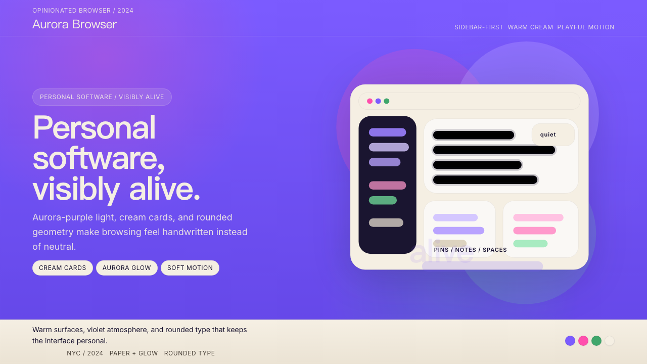 Arc BrowserPersonal software, visibly alive. Aurora purple glows over cream cards and ro…有生命感的个人软件。极光紫铺底,奶油卡片和圆润字形发光。
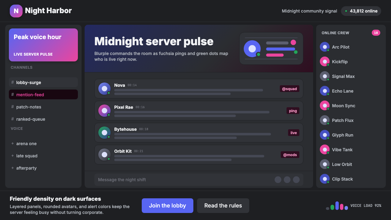 Discord Blurple Server (2020)Midnight server energy. Blurple panels, fuchsia pings, and green status dots…午夜服务器能量:蓝紫面板、品红提醒、在线绿点保持密集。
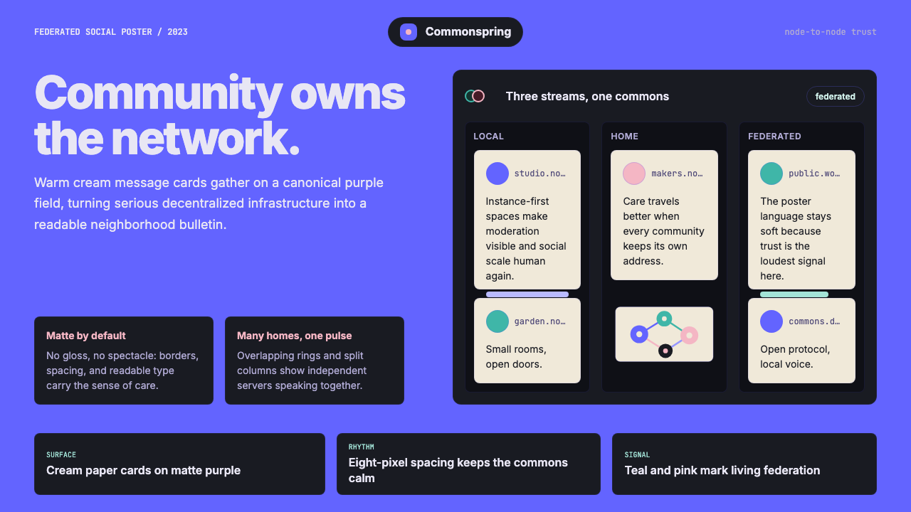 Mastodon FediverseDecentralized warmth. Purple fields and cream toot-cards make federation feel…去中心化也温暖:紫色场域与奶油嘟文卡让联邦网络有人情味。
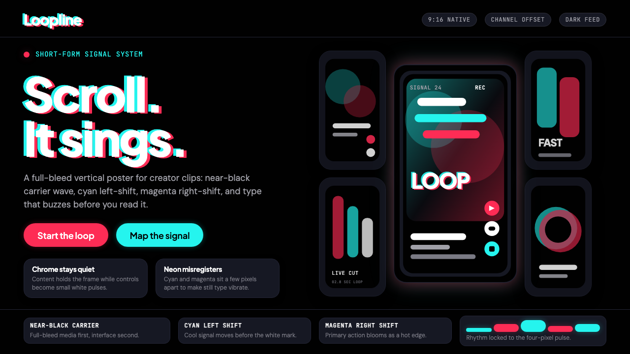 TikTok 2024Attention vibrates. Near-black feed, cyan-magenta offsets, and vertical frame…注意力在震动。近黑底、青粉错位与竖屏框架发出嗡鸣。
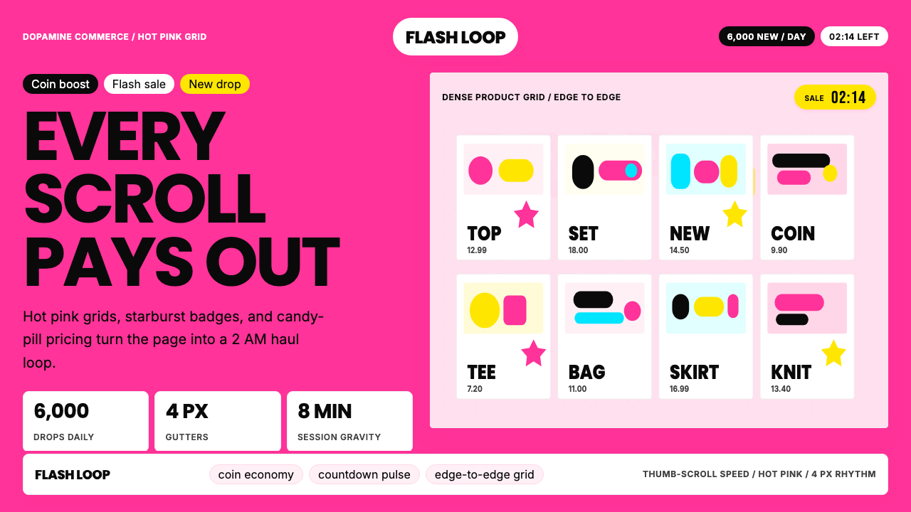 Shein Fast FashionDopamine density wins. Hot pink grids, starbursts, and candy pills pack every…高密度多巴胺取胜。热粉网格、星爆和糖果药丸挤满每个像素。
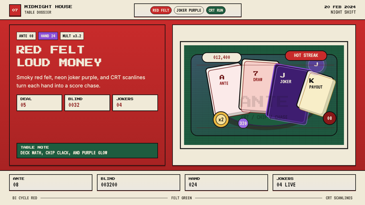 Balatro Poker RoguelikeLate-night poker math with a grin. Bicycle red, felt green, and CRT scanlines.深夜扑克数学感。自行车牌红、毛毡绿和CRT扫描线。