What is Arc Browser?什么是 Arc Browser?
Arc Browser turned a web browser into a personality — aurora-purple gradients, warm cream cards, and hand-drawn mascots that make software feel genuinely alive.Arc 浏览器把网页浏览器变成了一种个性——极光紫渐变、温暖的奶油卡片,以及让软件真正有生命感的手绘吉祥物。
Arc Browser in briefArc Browser 速览
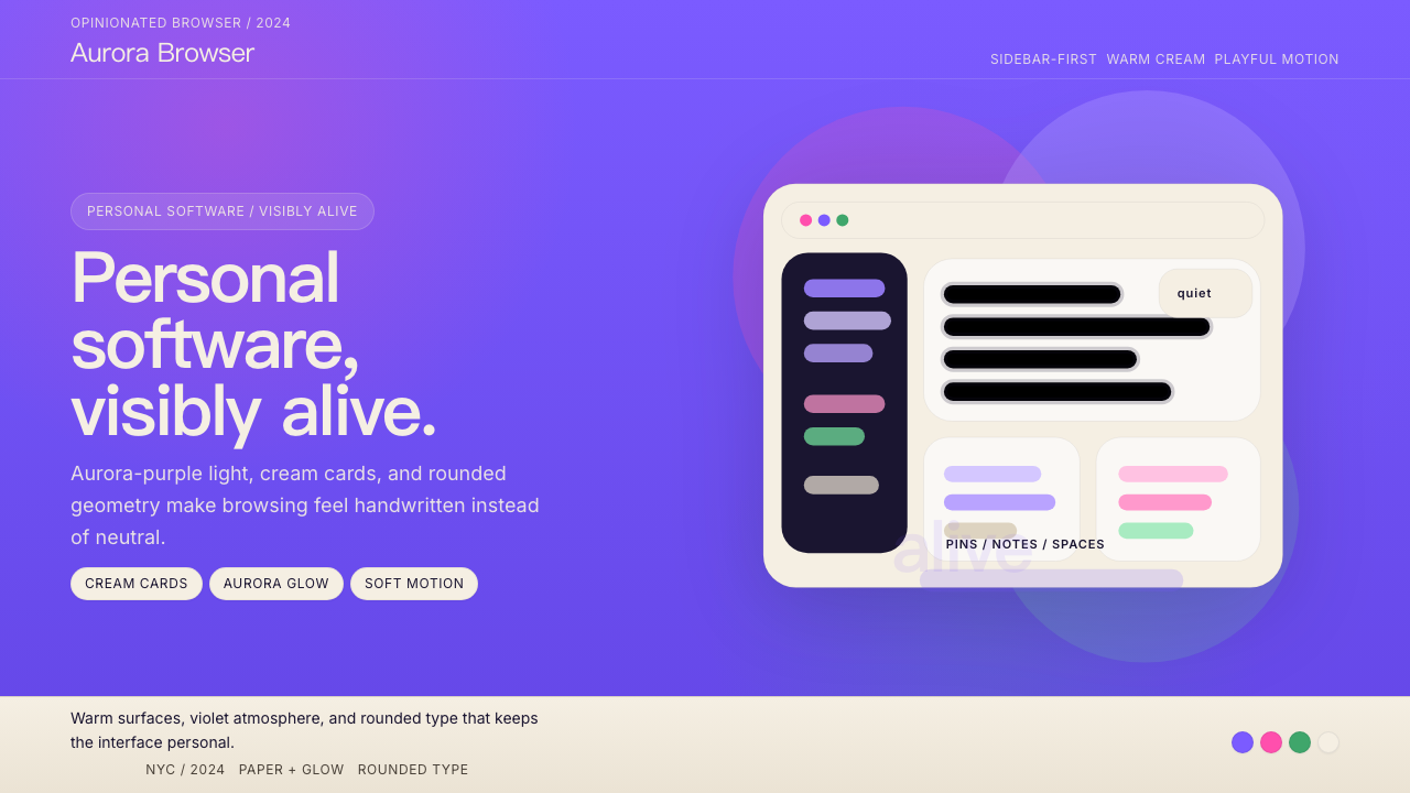
Arc Browser is a visual design language born from The Browser Company's conviction that software can have warmth, personality, and emotional presence. Its most recognizable feature is an aurora-purple gradient that sweeps across the sidebar and primary surfaces — not a flat tint but a living, shifting field of violet and indigo that recalls the natural phenomenon it is named after. Against this gradient, cream-white cards float with generous rounding at every corner, giving the interface a softness that distinguishes it sharply from the hard-edged chrome of conventional browsers.Arc 浏览器的视觉设计语言诞生于 The Browser Company 的一个信念:软件可以拥有温度、个性与情感存在感。最具辨识度的特征是一道极光紫渐变,铺展于侧边栏与主要界面——不是平铺的色调,而是紫罗兰与靛蓝交织的活跃色场,令人联想到同名自然现象。在这道渐变之上,奶油白卡片以大弧度圆角浮悬,赋予界面一种柔软感,与传统浏览器硬朗的灰色铬边框形成鲜明对比。
The type choices reinforce this warmth. Geometric, rounded sans-serif headlines pair with a neutral, highly legible body face — the combination reads as simultaneously friendly and serious, casual but considered. Hand-illustrated characters appear throughout the product: a small cat named Pip occupies empty states and onboarding screens, converting potentially frustrating UI moments into something closer to a greeting. These illustrations are not decorative afterthoughts; they are load-bearing elements of the brand's emotional register.字体选择强化了这种温暖。圆润的几何无衬线标题字与高可读性的中性正文字相搭配——这种组合读起来同时亲切而认真,随性但经过思考。手绘角色散布于整个产品:一只名叫 Pip 的小猫出现在空状态和引导页面,将那些可能令人沮丧的界面时刻转化为近乎问候的体验。这些插图并非装饰性的附加物,它们是品牌情感基调中承重的结构元素。
Taken together, Arc's visual language argues a specific position: that personal software should reflect the personality of its user, not dissolve into the bland neutrality of a generic tool. The aesthetic is opinionated, warm, and unapologetically expressive — a direct reaction to a decade of grey Chromium-based browsers that treated the browser chrome as something to minimize rather than celebrate.综合来看,Arc 的视觉语言表达了一个明确的立场:个人软件应当映射出使用者的个性,而非消融在通用工具的无聊中立里。这套美学有态度、有温度、毫不掩饰地具有表达性——对过去十年千篇一律的灰色 Chromium 浏览器的直接回应,那些浏览器将界面外壳视为应当最小化而非值得庆祝的东西。
Where does Arc Browser come from?Arc Browser 从何而来?
The Browser Company was founded in New York City in 2019 by Josh Miller, previously a product manager at Facebook, and Hursh Agrawal, a former engineer at Stripe. The company's founding premise was that the web browser — unchanged in its fundamental interaction model since the early 1990s — was overdue for reimagining. Rather than building a feature-competitive product that targeted power users with tab management add-ons, the team decided to reconceive the browser as personal software: something that should feel more like a journal or a workspace than a neutral viewport.The Browser Company 于2019年在纽约市由 Josh Miller(前 Facebook 产品经理)和 Hursh Agrawal(前 Stripe 工程师)联合创立。公司的创立前提是:网页浏览器——自1990年代初以来交互模型从未根本改变——早已到了需要重新想象的时候。团队没有构建一个以标签页管理插件吸引高级用户的功能竞争型产品,而是决定将浏览器重构为个人软件:一种应该更像日记本或工作空间、而非冰冷中立窗口的存在。
Arc launched in public beta in 2022 and saw its visual identity crystallize through 2023 and into 2024. The aurora-purple palette did not arrive fully formed; early builds experimented with more muted, neutral tones before the team committed to the expressive gradient system that became the product's signature. The decision to center the identity on purple was deliberate — purple occupies a space in color culture that primary red, blue, and yellow do not. It carries associations with creativity, individuality, and a certain romantic quality that supported the product's narrative of the browser as a personal companion.Arc 于2022年进入公开测试,视觉身份在2023年至2024年间逐渐清晰成型。极光紫色板并非一蹴而就;早期版本尝试过更为低调的中性色调,之后团队才确定了成为产品标志的表达性渐变系统。将品牌核心定于紫色是经过深思熟虑的——紫色在色彩文化中占据着原色红、蓝、黄所没有的独特位置。它携带着创造力、个体性与某种浪漫气质的联想,支撑了产品关于「浏览器作为个人伙伴」的叙事。
The hand-illustrated mascot Pip emerged from a broader design philosophy championed by Ellie Sands and the design team: that software interfaces had become so rationalized and abstracted that they had lost any sense of human authorship. Pip's presence in the UI was a deliberate act of restoration — proof that a human being had made choices, had cared enough to add something unexpected. The cat's appearances are contextual and sometimes surprising, occupying the gaps in the UI where most applications would show only a generic empty state or a loading spinner.手绘吉祥物 Pip 诞生于 Ellie Sands 与设计团队所倡导的更广泛设计哲学:软件界面已变得如此理性化与抽象化,以至于失去了任何人类创作感。Pip 出现在界面中是一种刻意的修复行为——证明一个人类曾在此做过选择,曾在意到足以添加某种出乎意料的东西。这只猫的出现是有语境的,有时令人惊喜,占据着大多数应用只会显示通用空状态或加载动画的界面空隙。
Nate Parrott, whose background spanned both engineering and design, played a significant role in developing the motion and interaction language that made Arc's visual identity feel dynamic rather than static. The sidebar's animated responses to hover states, the way new Spaces transition, and the general sense that the UI is aware of and responsive to user presence — these qualities distinguish Arc's implementation from products that might share surface visual similarities but lack the underlying animation philosophy. By 2024, Arc's visual identity had become a reference point in product design discussions, representing the possibilities of opinionated, emotionally engaged software design in an era dominated by neutral design systems.Nate Parrott 的背景横跨工程与设计,在开发使 Arc 视觉身份感觉动态而非静态的动效与交互语言方面发挥了重要作用。侧边栏对悬停状态的动画响应、新空间切换的方式,以及整个界面对用户存在感知与响应的整体感——这些特质将 Arc 的实现与那些可能拥有相似表面视觉风格但缺乏底层动效哲学的产品区分开来。到2024年,Arc 的视觉身份已成为产品设计讨论中的参照点,代表着在中性设计系统主导的时代里,有态度、有情感投入的软件设计的可能性。
What defines the Arc Browser look?Arc Browser 的视觉特征是什么?
Aurora Gradient极光渐变
The defining visual element is a gradient that shifts from deep violet through purple and into softer lavender tones — evoking the natural aurora borealis rather than any conventional UI color ramp. It appears primarily on the sidebar and background surfaces, giving them a sense of atmospheric depth. The gradient is neither flat nor photorealistic; it occupies a middle register that feels crafted rather than procedurally generated, and its warmth prevents it from reading as cold or corporate.最具定义性的视觉元素是一道从深紫罗兰穿越紫色渐至柔和薰衣草色调的渐变——唤起自然极光而非任何惯常的界面配色方案。它主要出现在侧边栏与背景界面,赋予它们一种大气深度感。这道渐变既非平铺也非写实,处于一种中间语调,感觉像是手工制作而非程序生成,其温暖感使它读起来不冷漠、不企业化。
Cream-White Card System奶油白卡片体系
Content areas sit on warm cream-white cards that contrast cleanly against the purple ground. These cards carry generous corner rounding — not the subtle rounding of conventional UI components, but a full, soft curve that gives each card an almost pillowed quality. The card system creates a clear visual hierarchy: the aurora background recedes as atmosphere, and the cream foreground advances as content. This contrast is fundamental to the design's legibility at a glance.内容区域置于温暖奶油白卡片上,与紫色背景形成干净对比。这些卡片具有大幅度的圆角——不是常规界面组件那种微妙的倒角,而是完整、柔软的弧度,赋予每张卡片近乎蓬松的质感。卡片体系创造出清晰的视觉层级:极光背景作为氛围退至后方,奶油前景作为内容推向前方。这种对比是设计一目了然可读性的基础。
Rounded Geometric Type圆润几何字体
Headlines and prominent UI labels use a rounded geometric sans-serif — letterforms built on circular and oval structures with softened terminals rather than hard cuts. The effect is simultaneously contemporary and approachable: the geometric construction reads as modern and confident, while the rounded details prevent it from feeling clinical. Body text shifts to a more neutral, highly legible face that steps back from the expressiveness of the headline choice, giving the typographic system a clear two-register structure.标题与突出的界面标签使用圆润几何无衬线字体——字母形态建立在圆形与椭圆结构之上,终端是柔化的而非硬切的。效果同时具有当代感与亲近感:几何构造读起来现代而自信,而圆润的细节又阻止了它变得冰冷。正文转向更为中性、高度可读的字体,从标题字体的表现性中退后一步,赋予排版系统清晰的双层结构。
Hand-Illustrated Characters手绘角色
The mascot Pip — a small, loosely sketched cat — appears throughout the interface in contextual moments: empty states, onboarding flows, and error conditions. The illustration style is deliberately imprecise and warm, more like a quick notebook sketch than a polished brand asset. This imprecision is the point: it signals human authorship and breaks the mechanical predictability of software UI. Pip's presence asserts that someone cared enough to draw something, and that care is legible even to users who cannot name the design choice explicitly.吉祥物 Pip——一只轮廓松散的小猫速写——在整个界面的情境时刻出现:空状态、引导流程与错误状态。插图风格刻意不精确而温暖,更像是笔记本上的随手速写,而非精抛光的品牌资产。这种不精确性正是重点:它传递出人类创作感,打破了软件界面机械的可预测性。Pip 的存在断言了某人曾在意到足以画出某样东西,而这份在意即使对无法明确命名这一设计选择的用户而言也是可感知的。
Spatial Depth and Layering空间深度与层叠
Arc creates a sense of depth not through hard drop shadows but through layered translucency and surface differentiation. The sidebar and the content area feel as though they occupy different spatial planes — one atmospheric and receding, the other solid and present. This spatial logic is carried through in motion: transitions between states feel like moving through space rather than swapping flat images. The result is an interface that has genuine volumetric presence without relying on skeuomorphic simulation.Arc 创造的深度感不依赖硬边投影,而是通过层叠的半透明与界面分层实现。侧边栏与内容区域感觉占据着不同的空间平面——一个大气而退后,另一个实体而当前。这种空间逻辑在动效中得以延续:状态间的转场感觉像是在空间中移动,而非交换平面图像。结果是一个具有真实体积感的界面,而无需依赖拟物化模拟。
Color as Personality, Not Hierarchy色彩作为个性,而非层级
Where most design systems deploy color primarily to signal interactive states and information hierarchy, Arc uses color to express mood and belonging. The purple palette is not a neutral container for content — it is an assertion of identity. Accent colors shift across different Spaces in the browser, allowing users to assign distinct color personalities to different contexts of their digital life. Color here is biographical, not functional: it tells you who this Space belongs to, not what tier of information it represents.大多数设计系统主要以色彩标示交互状态和信息层级,而 Arc 用色彩表达情绪与归属感。紫色色板不是内容的中立容器——它是身份的宣言。强调色在浏览器的不同空间(Spaces)之间切换,让用户为数字生活的不同情境赋予独特的色彩个性。这里的色彩是传记性的,而非功能性的:它告诉你这个空间属于谁,而非它代表哪个层级的信息。
Restrained Animation Language克制的动效语言
Arc's motion is conspicuous by its quality, not its quantity. Transitions are swift and spring-based, with a physical elasticity that makes UI elements feel as though they have mass. Hover responses are immediate and subtle — a slight brightening, a gentle translation — rather than elaborate effects. The animation philosophy is that motion should confirm, not entertain: every animated transition answers a user's implied question about what just happened or what is about to happen, without adding theatrical delay.Arc 的动效以质量而非数量引人注目。转场迅速而具有弹簧感,带有一种物理弹性,使界面元素感觉拥有质量。悬停响应即时而微妙——轻微的提亮、温和的位移——而非精心设计的特效。动效哲学是:运动应当确认,而非娱乐——每一个动画转场都回答用户关于「刚才发生了什么」或「即将发生什么」的隐含问题,而不增加戏剧性的延迟。
Who shaped Arc Browser?谁塑造了 Arc Browser?
Josh Miller co-founded The Browser Company after a career in consumer product at Facebook, where he worked on Groups and other social infrastructure. His product vision for Arc was explicitly humanistic: that software could be a companion with a distinct point of view, not merely a neutral tool. Miller has been the primary public voice articulating the philosophy that browsers had stagnated and that the interaction paradigm of tabs and bookmarks inherited from the 1990s was worth challenging fundamentally. His leadership framed Arc not as a feature race against Chrome but as a question about what personal software could be.Josh Miller 在 Facebook 从事消费者产品(参与 Groups 等社交基础设施)后,联合创立了 The Browser Company。他对 Arc 的产品愿景具有明确的人文主义色彩:软件可以是拥有鲜明视角的伙伴,而非单纯的中立工具。Miller 是公开阐述「浏览器已停滞」这一哲学的主要声音,认为从1990年代继承下来的标签与书签交互范式值得从根本上挑战。他的领导将 Arc 定义为不是对抗 Chrome 的功能竞赛,而是关于个人软件可以是什么的追问。
Hursh Agrawal brought engineering leadership and a sensibility shaped by his time at Stripe — a company whose own design language had demonstrated that developer-facing products could be visually sophisticated and brand-expressive. Agrawal's technical decisions enabled the animation quality and spatial depth that distinguish Arc's interface from conventional browser UIs. The spring-based motion system and the layered surface architecture that gives Arc its characteristic sense of volume both required engineering investment that most browser projects would not have prioritized.Hursh Agrawal 带来了工程领导力,以及在 Stripe 工作期间塑造的敏感性——那家公司自身的设计语言已证明:面向开发者的产品可以在视觉上精致且具有品牌表现力。Agrawal 的技术决策使 Arc 界面区别于常规浏览器的动效质量与空间深度成为可能。基于弹簧的动效系统,以及赋予 Arc 标志性体积感的分层界面架构,都需要大多数浏览器项目不会优先投入的工程资源。
Nate Parrott's background bridging design and engineering made him central to the development of Arc's interaction language — specifically the motion principles and spatial transitions that give the browser its sense of physical presence. His work demonstrates how animation can operate as a medium of meaning rather than decoration: the way a Space transition communicates navigation depth, the way the sidebar's response to user gestures confirms that the system is aware and reactive. Parrott's contributions are most visible not in any single screen but in the cumulative felt experience of using Arc over time.Nate Parrott 横跨设计与工程的背景,使他成为 Arc 交互语言开发的核心——尤其是赋予浏览器物理存在感的动效原则与空间转场。他的工作展示了动效如何作为意义的媒介而非装饰运作:空间切换如何传达导航深度,侧边栏对用户手势的响应如何确认系统的感知与反应。Parrott 的贡献不体现在任何单一画面上,而是体现在长期使用 Arc 所积累的整体感受体验中。
As a key member of the design team, Ellie Sands was instrumental in establishing the human and emotional register of Arc's visual identity — particularly the decision to include hand-illustrated characters as first-class interface elements rather than optional decorations. Her design philosophy, that software had become too abstracted from human authorship, directly shaped the inclusion and treatment of Pip and the broader approach to illustration in the product. Sands's work is a reminder that the most consequential design decisions in a product are often about what to add that rationalization would argue against.作为设计团队的核心成员,Ellie Sands 在确立 Arc 视觉身份的人性化与情感基调方面发挥了关键作用——尤其是将手绘角色纳入一级界面元素而非可选装饰的决定。她的设计哲学——软件已经过度远离人类创作感——直接塑造了 Pip 的引入与处理方式,以及产品中对插图的整体态度。Sands 的工作提醒我们:产品中最具影响力的设计决定,往往恰恰是那些添加了理性化逻辑所反对之物的决定。
How do you use Arc Browser today?今天怎么用 Arc Browser?
Arc Browser's visual language is most effective when adapted rather than copied wholesale. Its power comes from a specific emotional position — warmth, personality, and the feeling of being made by humans for humans — and any application of the aesthetic must serve that position rather than simply reassemble its surface features. Before reaching for the aurora gradient or the rounded card system, the designer should ask whether the product's intent aligns with Arc's values: personal, expressive, emotionally present. The style will feel hollow applied to products whose personality is institutional, transactional, or deliberately neutral.Arc 浏览器的视觉语言在被适配而非整体复制时效果最佳。它的力量来自一个特定的情感立场——温暖、个性,以及被人类为人类制造的感觉——任何对这套美学的应用都必须服务于这一立场,而非简单地重新组装其表面特征。在动用极光渐变或圆角卡片系统之前,设计师应先问:这个产品的意图是否与 Arc 的价值观一致——个人化的、有表达性的、情感在场的。将这种风格应用于本质上机构性、交易性或刻意中立的产品,只会显得空洞。
For presentation slides, Arc's visual language works best on covers and section dividers where atmosphere takes precedence over information density. A cover that uses a deep violet-to-lavender gradient as the full-bleed background, with cream-colored type and a single loosely illustrated accent, immediately signals personality and craft. Content slides should pull back from the gradient drama and work within the cream card paradigm — a warm light background with generous padding, rounded containers grouping related information, and type weight as the primary hierarchy signal. Data slides benefit from the card system: each chart or table sits in its own rounded card, giving data visual containment without resorting to hard borders.对于演示文稿,Arc 的视觉语言在封面与章节分隔页上效果最佳,此时氛围优先于信息密度。一张以深紫到薰衣草全出血渐变为背景、奶油色文字搭配单一手绘风格点缀的封面,立即传递出个性与用心。内容页应从渐变的戏剧感中退出,转向奶油卡片范式——温暖的浅色背景,宽松的内边距,圆角容器将相关信息分组,以字重作为主要层级信号。数据页受益于卡片系统:每张图表或表格置于各自的圆角卡片中,为数据提供视觉容纳,而无需借助硬边框线。
For web UI and dashboards, the style translates well to products positioning themselves as personal or creative tools — project management for individuals, portfolio platforms, productivity applications aimed at knowledge workers who value aesthetics. Apply the aurora gradient sparingly: as a sidebar background, a hero section gradient, or a focused highlight rather than a global skin. Navigation elements and interactive controls should carry the rounded corner language consistently — inputs, buttons, and dropdowns with a unified corner radius create the cohesive softness that makes Arc's UI feel finished. Pricing pages work well with a card-per-tier structure using the cream card treatment, with gradient accents reserved for the recommended or featured plan.对于网页界面与仪表板,这种风格适合将自身定位为个人或创意工具的产品——面向个人的项目管理、作品集平台、面向重视美学的知识工作者的效率应用。克制地使用极光渐变:作为侧边栏背景、首屏区域渐变或聚焦高亮,而非全局皮肤。导航元素与交互控件应一致延续圆角语言——统一圆角半径的输入框、按钮和下拉菜单,共同创造出使 Arc 界面感觉完成度高的凝聚柔软感。定价页面适合采用每级别一张卡片的结构,配以奶油卡片处理,渐变强调色留给推荐或特色方案。
For editorial and marketing work, Arc's aesthetic supports a visual voice that is confident and personality-driven without being loud. A marketing page in this style opens with a full-width gradient hero — atmospheric and rich in color depth — transitions to cream-background content sections, and uses illustration moments to break up long text passages or mark key value propositions. The hand-drawn character approach, when adapted, should maintain its loose and imprecise quality; a polished, over-rendered illustration defeats the purpose of human warmth the style depends on. Email templates in this idiom use cream backgrounds with a centered column layout, subtle rounded card sections for feature callouts, and the gradient palette as a header treatment rather than a body background.对于编辑与营销内容,Arc 的美学支持一种自信而个性驱动但不喧嚣的视觉声音。这种风格的营销页面以全宽渐变首屏开场——大气而色彩丰富——过渡到奶油背景的内容区段,并以插图时刻打断长段文字或标记核心价值主张。当手绘角色方法被适配时,应保持其松散和不精确的品质;过度精抛光的插图会破坏这种风格所依赖的人文温暖感。这种风格的邮件模板使用奶油背景搭配居中列式布局,功能亮点使用微妙的圆角卡片区段,渐变色板作为页眉处理而非正文背景。
The most common mistake when working with Arc's visual language is treating the aurora gradient as wallpaper — applying it as a full-page background behind all content. The gradient works because it is atmospheric: it recedes behind cream cards and lets content come forward. When content sits directly on the gradient with no intermediate card layer, the color noise competes with text legibility and the spatial hierarchy collapses. A related mistake is over-illustrating: Pip's power comes from scarcity and surprise. Placing character illustrations in every section of a marketing page turns a signature moment into clutter. Use the illustration device at the moments of highest emotional significance — onboarding, error states, empty states, and calls to action — and leave the rest to typography and color.使用 Arc 视觉语言时最常见的错误,是将极光渐变当作墙纸——将其作为所有内容的整页背景。渐变之所以有效,是因为它有大气感:它退缩在奶油卡片之后,让内容向前推进。当内容直接置于渐变之上、没有中间卡片层时,色彩噪声与文字可读性相互竞争,空间层级随之崩溃。一个相关的错误是过度插图化:Pip 的力量来自稀缺性与惊喜感。在营销页面的每个区段都放置角色插图,会把一个标志性时刻变成视觉噪音。将插图装置保留给情感显著性最高的时刻——引导流程、错误状态、空状态与行动号召——其余部分交给字体与色彩。
Arc Browser — FAQArc Browser · 常见问题
Can the Arc visual language work for B2B or enterprise products?Arc 的视觉语言能用于 B2B 或企业产品吗?
It can work, but only for B2B products that are explicitly positioning themselves as human-centered or that serve creative and knowledge worker audiences who respond to expressive design. The aurora gradient and rounded warmth carry strong associations with personal, consumer-facing software; applying them to an enterprise compliance tool or a financial infrastructure dashboard would create a mismatch between the aesthetic's implied values and the product's actual purpose. For enterprise contexts, the more transferable elements are the card system, the rounded type choices, and the spatial depth approach — the gradient itself is the most context-specific element and should be used most cautiously.可以,但仅限于明确将自身定位为以人为中心的 B2B 产品,或服务于对表达性设计有共鸣的创意与知识工作者受众。极光渐变与圆润温暖感与个人、面向消费者的软件有强烈的联想关联;将其应用于企业合规工具或金融基础设施仪表板,会在美学隐含的价值观与产品实际用途之间制造错位。在企业语境中,可移植性更强的元素是卡片系统、圆润字体选择与空间深度方法——渐变本身是最具语境特殊性的元素,应最为谨慎地使用。
How is Arc's design different from other rounded, friendly UI styles like Notion or Linear?Arc 的设计与 Notion 或 Linear 等其他圆润友好的界面风格有何不同?
All three share a commitment to approachable, rounded corners and clean information architecture, but they diverge sharply in emotional temperature and use of color. Notion is deliberately neutral — its palette is near-monochrome and its personality is designed to recede so that user content can take center stage. Linear is high-contrast and precise, prioritizing clarity and speed over warmth. Arc is the most emotionally committed of the three: its gradient is atmospheric and immersive, its mascot is deliberately imprecise and warm, and its color choices assert personality rather than recede. Arc treats the browser chrome as expressive content; Notion and Linear treat their containers as near-invisible.三者都致力于亲近感、圆角与清晰的信息架构,但在情感温度与色彩使用上有明显差异。Notion 是刻意中立的——其色板近乎单色,个性设计为退后,让用户内容占据中心。Linear 是高对比度且精确的,优先考虑清晰度与速度而非温暖感。Arc 是三者中情感投入最深的:其渐变具有大气感与沉浸感,吉祥物刻意不精确而温暖,色彩选择表达个性而非退却。Arc 将浏览器界面外壳视为具有表达性的内容;Notion 和 Linear 则将其容器视为近乎透明的存在。
Does the aurora gradient work well in dark mode?极光渐变在深色模式下效果如何?
Arc's aurora gradient is actually well-suited to dark contexts because deep purple and violet tones naturally read as dark without requiring a separate dark-mode inversion. The gradient's depth — the shift from very dark indigo at one edge to a slightly lighter violet — provides the atmospheric layering that dark mode needs to avoid feeling flat. The main consideration is that cream cards, which contrast cleanly against the gradient in light contexts, may need to shift toward a more neutral warm grey in dark-mode implementations to prevent the card surfaces from feeling too bright or harsh against the darker gradient background.Arc 的极光渐变实际上非常适合深色语境,因为深紫和紫罗兰色调天然读起来就是深色,无需单独的深色模式反转。渐变的深度——从一侧极深靛蓝到略浅紫色的过渡——提供了深色模式所需的大气分层感,以避免显得扁平。主要考量是:奶油卡片在浅色语境中与渐变形成干净对比,但在深色模式实现中可能需要向更中性的暖灰色偏移,以防止卡片表面在较深的渐变背景下显得过亮或刺眼。
Should illustrations always be used when applying this style?应用这种风格时必须使用插图吗?
No — and forcing illustration where it does not fit is one of the most common ways to misapply the style. The hand-drawn character device in Arc works because it is specific, contextual, and scarce. It is not a decorative pattern that repeats across every surface; it appears at specific moments of emotional significance. If an application of the style omits illustration entirely but maintains the gradient, card, and rounding systems, it can still feel coherent and warm. The illustration element is the most brand-specific aspect of Arc's visual language and the one most likely to feel derivative or forced when transplanted to a different product context.不必——在不合适的地方强行使用插图,是误用这种风格最常见的方式之一。Arc 中的手绘角色装置之所以有效,是因为它是具体的、有语境的、稀少的。它不是在每个界面上重复出现的装饰图案,而是在特定的情感显著时刻出现。如果某种风格应用完全省略了插图,但保留了渐变、卡片与圆角系统,仍然可以感觉连贯而温暖。插图元素是 Arc 视觉语言中最具品牌特殊性的方面,也是当被移植到不同产品语境时最容易显得照搬或生硬的元素。
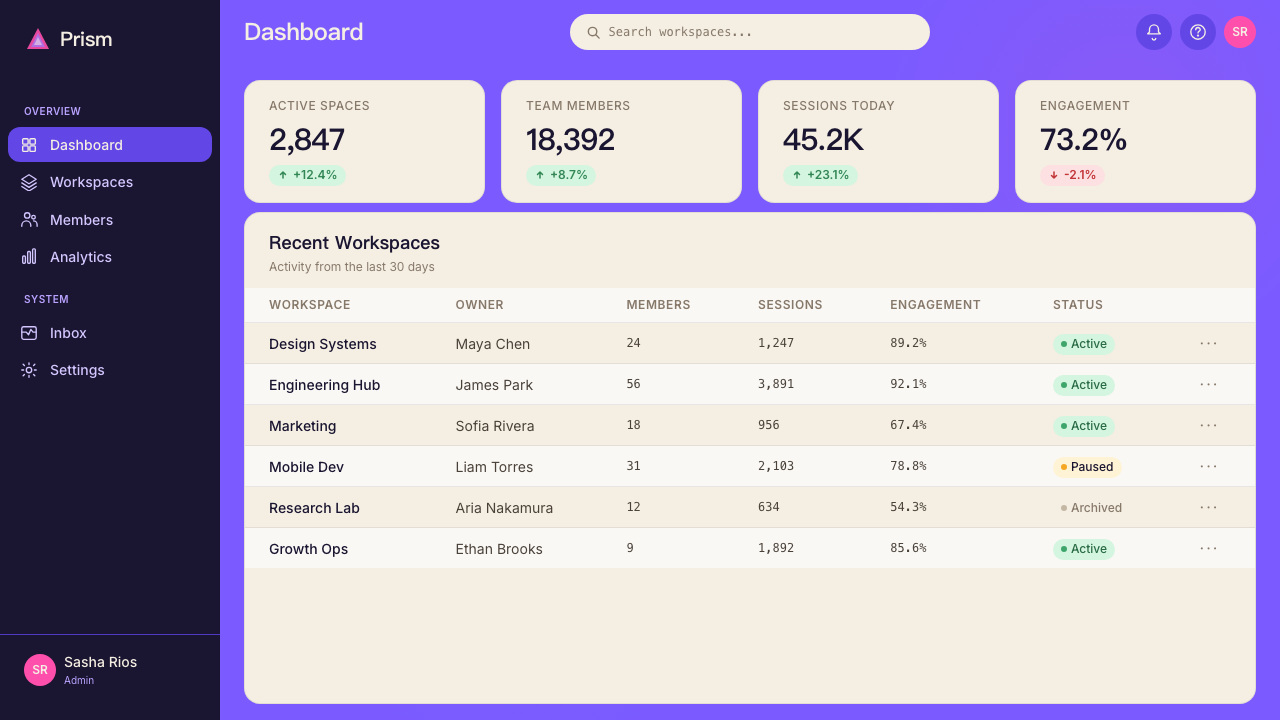
How does Arc's aesthetic handle information density — can it scale to complex data-heavy interfaces?Arc 的美学如何处理信息密度——它能扩展到复杂的高密度数据界面吗?
Arc's visual language was designed for a browsing context where information density is moderate and atmosphere is a legitimate design priority. It scales reasonably well to moderately complex dashboards, but it encounters challenges at high information density. The generous corner rounding and warm card surfaces consume screen real estate that data-dense interfaces cannot afford to give up. At high density, the softness that makes the style appealing at normal density can read as space-inefficient. The approach for data-heavy contexts is to keep the atmospheric gradient as a peripheral or structural element, tighten the card padding, and allow the rounded corners to diminish toward a more compact radius — preserving the aesthetic's softness directionally while not sacrificing the data space that complex interfaces require.Arc 的视觉语言是为信息密度适中、氛围感是合理设计优先级的浏览语境设计的。它在中等复杂度的仪表板上扩展得相当好,但在高信息密度下会遇到挑战。大幅度的圆角与温暖的卡片表面消耗了高密度数据界面无法承受放弃的屏幕空间。在高密度下,使风格在正常密度下具有吸引力的柔软感,可能会被读作空间效率低下。高密度数据语境的处理方式是:将大气渐变保留为外围或结构性元素,收紧卡片内边距,并允许圆角向更紧凑的半径缩减——在方向上保留美学的柔软性,同时不牺牲复杂界面所需的数据空间。
Related design styles相关设计风格
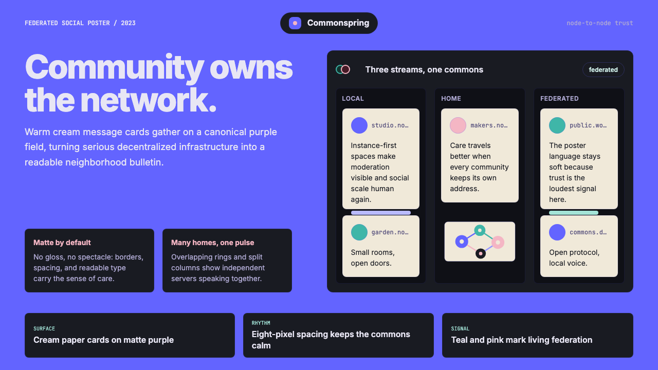 Mastodon FediverseDecentralized warmth. Purple fields and cream toot-cards make federation feel…去中心化也温暖:紫色场域与奶油嘟文卡让联邦网络有人情味。
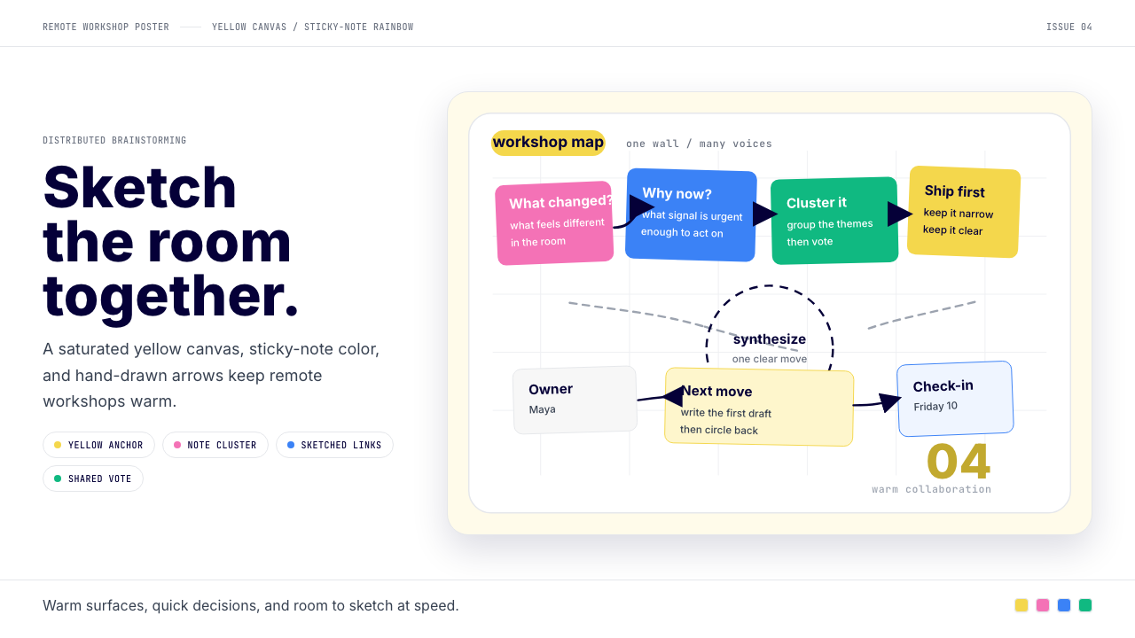 Miro Collab YellowWarm brainstorming in motion. Yellow canvas, sticky-note rainbow, hand-drawn…暖黄白板上的协作灵感。便利贴彩虹和手绘箭头带出流动感。
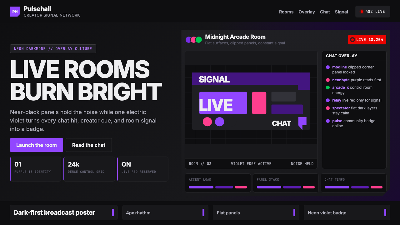 TwitchPurple is tribal signal. Neon violet cuts through flat dark panels and chat g…紫色即社群信号。电光紫穿透暗面板与聊天网格。
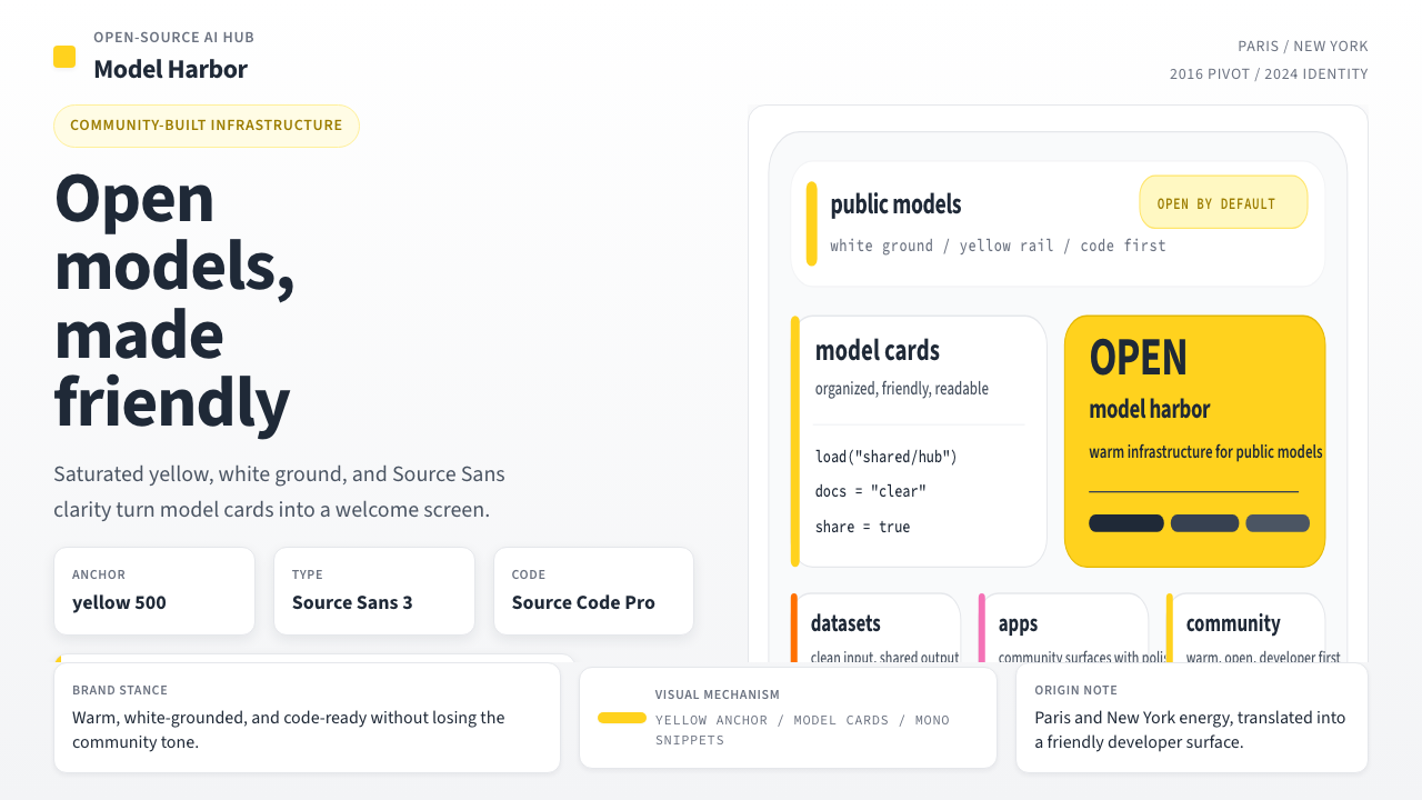 Hugging Face Emoji-YellowWarm infrastructure. Yellow rails, Source Sans, and code cards make openness…温暖的开源基础设施:黄条、无衬线与代码卡片,让开放感更有人味。
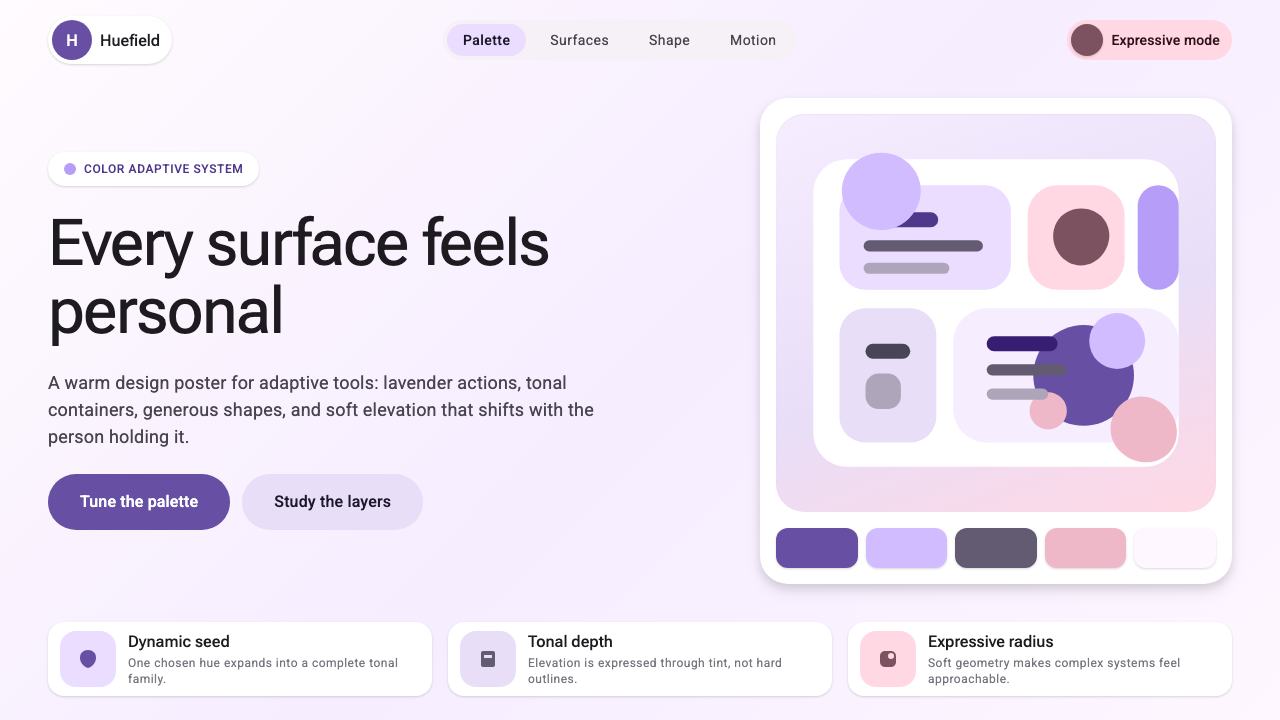 Google Material 3 ExpressiveA living system, themed by your wallpaper. Larger radii, tonal surfaces, emot…能从用户壁纸生成配色的活系统:更大的圆角、表面层级以色调递进取代硬边界——既几…
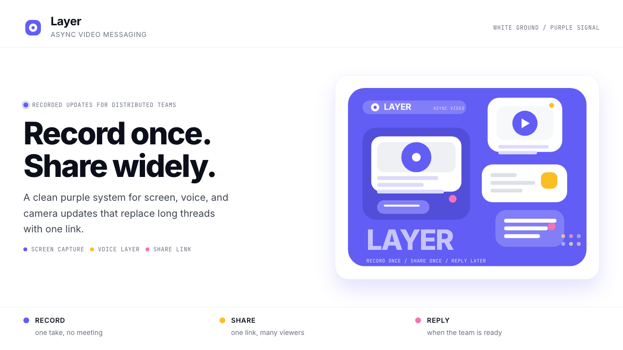 Loom Async-Video PurpleAsync, not meetings. Pure white ground, electric purple, record-button geomet…异步,不开会:纯白底、电紫与录制按钮几何。