What is Hugging Face Emoji-Yellow?什么是 Hugging Face Emoji-Yellow?
Where most AI brands go cold and corporate, Hugging Face went warm, playful, and unmistakably yellow — proving that open-source infrastructure can smile back.当大多数 AI 品牌选择冷峻与严肃,Hugging Face 偏偏选择了温暖、��俏皮与那一抹无可替代的明黄——证明开源基础设施也可以向你微笑。
Hugging Face Emoji-Yellow in briefHugging Face Emoji-Yellow 速览
Hugging Face Emoji-Yellow is the visual identity system of Hugging Face, the open-source AI model hub often called the GitHub of machine learning. The aesthetic centers on a single saturated brand-yellow paired with the platform's signature hugging-face emoji, deployed across a white-grounded, card-organized interface that feels simultaneously like documentation and a social network. The result is a design language that is warm, developer-friendly, and instantly recognizable — an anomaly in an industry that otherwise defaults to cold gradients and corporate neutrality.Hugging Face Emoji-Yellow 是 Hugging Face 开源 AI 模型平台的视觉识别系统,该平台素有「AI 界 GitHub」之称。这套美学以一个高饱和度的品牌黄为核心,搭配平台标志性的拥抱表情符号,落地于白底卡片式界面之上——既像技术文档,又像社区网络。由此形成的设计语言温暖、开发者友好且辨识度极高,在普遍偏好冷色渐变与企业中性调的 AI 行业里显得格外特立独行。
The system borrows its structural clarity from modernist developer tooling — clean humanist sans-serif type, generous white space, syntax-highlighted code blocks, and restrained card shadows — then welds all of it to a single joyful chromatic anchor. Yellow appears in navigation rails, section headers, call-to-action buttons, notification badges, and hover states. Everything else is held in white, near-white, and a deep slate that grounds text and structural elements. The color hierarchy is strict: yellow signals interactivity and brand identity; slate carries information; white provides breathing room.这套系统从现代主义开发者工具中汲取结构上的清晰感——人文主义无衬线字体、充裕的留白、语法高亮代码块与克制的卡片阴影——然后将这一切焊接到单一欢快的色彩锚点上。黄色出现在导航条、章节标题、行动按钮、通知角标与悬停状态之中,其余全部交由白色、近白色与深石板灰承载。色彩层级严格而清晰:黄色主张互动性与品牌身份,石板灰传递信息,白色提供呼吸空间。
What makes the Hugging Face aesthetic distinctive is not sophistication but intentionality. The emoji is deployed seriously — in hero sections, in model card headers, in documentation — without irony or apology. The effect communicates that the platform is community-built, openly hosted, and genuinely welcoming. It is the visual equivalent of a README that opens with a friendly greeting rather than a legal disclaimer.Hugging Face 美学的独特之处并不在于精致,而在于蓄意。那个表情符号被认真地使用——出现在英雄区、模型卡头部、技术文档之中——没有自嘲,没有辩解。它传达出的效果是:这个平台是社区共建的、开放托管的、真诚欢迎的。这相当于一份 README 的视觉版本,开篇是友好的问候,而非法律免责声明。
See the Hugging Face Emoji-Yellow design system查看 Hugging Face Emoji-Yellow 完整设计系统
Where does Hugging Face Emoji-Yellow come from?Hugging Face Emoji-Yellow 从何而来?
Hugging Face was founded in 2016 by Clément Delangue, Julien Chaumond, and Thomas Wolf — originally as a conversational AI app for teenagers. The company's name and emoji came first, chosen for their warmth and approachability long before anyone considered what a developer platform should look like. The hugging-face emoji was a deliberate bet against the prevailing assumption that serious technology requires a serious face: the founders believed that friendliness and technical rigor were not in tension.Hugging Face 由 Clément Delangue、Julien Chaumond 与 Thomas Wolf 于 2016 年创立,最初是一款面向青少年的对话式 AI 应用。公司名称与表情符号先于一切而存在——早在任何人思考开发者平台该长什么样子之前,它们就已因温暖与亲和力而被选定。拥抱表情是对当时主流假设的蓄意押注:严肃的技术必须配一张严肃的面孔。创始人们相信,友好感与技术严谨性并不相互排斥。
The company pivoted toward becoming an AI developer platform in 2018 and accelerated dramatically in the early 2020s, when transformer-based models like BERT, GPT-2, and later the open-source releases of large language models made the platform's model-hosting infrastructure indispensable to researchers, startups, and enterprise teams alike. As the platform scaled, its visual identity crystallized around the same values that drove its technical decisions: openness, community, and the conviction that the best tools should be accessible to everyone.公司于 2018 年前后转型为 AI 开发者平台,并在 2020 年代初期迅速加速——彼时以 BERT、GPT-2 为代表的 Transformer 系列模型,以及后来大型语言模型的开源发布,令该平台的模型托管基础设施对研究者、初创公司与企业团队而言几乎不可或缺。随着平台规模扩大,其视觉识别围绕与技术决策一脉相承的价值观逐渐定形:开放、社区,以及最好的工具应当对所有人触手可及的信念。
The visual system that emerged around 2020 and refined through 2024 drew directly from the culture of open-source software. Documentation aesthetics — monospace code blocks, high-information-density layouts, structured card grids — were taken seriously rather than replaced with a consumer-facing gloss. The brand yellow was chosen as a deliberate interruption of the neutral grey-and-blue palette that dominated developer tooling at the time. In a landscape of dignified restraint, yellow was a declaration: this platform has a personality.大约在 2020 年成型、于 2024 年前持续精炼的视觉系统,直接从开源软件文化中汲取养分。文档美学——等宽代码块、高信息密度版面、结构化卡片网格——被认真对待,而不是被消费级光泽所替代。品牌黄被选定为对当时开发者工具领域主导色——中性灰蓝——的蓄意打断。在一片庄重克制的景观中,黄色是一次宣告:这个平台有自己的个性。
Thomas Wolf, as Chief Science Officer, and the growing design team shaped a visual language that needed to work simultaneously for three very different audiences: academic researchers who value precision and density, startup engineers who want tools that feel modern and credible, and community contributors who want to feel welcome and celebrated. The Emoji-Yellow system addresses all three by separating information architecture (white, slate, structured grids) from brand warmth (yellow, emoji, rounded card corners) — layering them rather than forcing a choice.首席科学官 Thomas Wolf 与不断壮大的设计团队塑造了一套视觉语言,它需要同时服务于三类截然不同的受众:重视精确与密度的学术研究者,期望工具既现代又可信的初创工程师,以及希望被欢迎与认可的社区贡献者。Emoji-Yellow 系统通过将信息架构(白色、石板灰、结构化网格)与品牌温度(黄色、表情符号、圆角卡片)分离,再将两者叠合而非强迫二选一,同时回应了三类人群的需求。
What defines the Hugging Face Emoji-Yellow look?Hugging Face Emoji-Yellow 的视觉特征是什么?
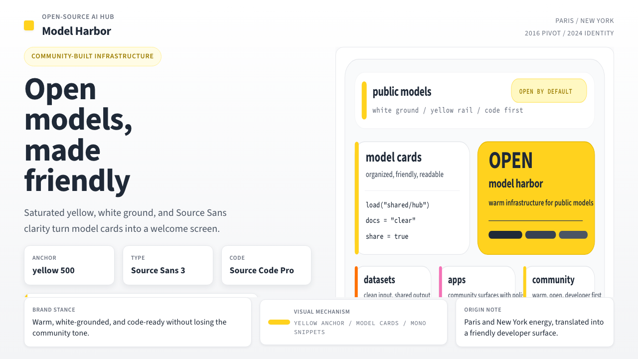
Saturated Brand Yellow饱和品牌黄
A single high-saturation warm yellow functions as the sole chromatic anchor of the entire system. It appears in navigation highlights, primary buttons, active states, notification indicators, and anywhere the interface signals interactivity or identity. Its warmth distinguishes it from the cool accent colors typical of developer tooling: it reads as energetic and approachable rather than clinical. The yellow is used sparingly enough that it retains shock value — a page dominated by white and slate makes any yellow element immediately focal.一个高饱和度的暖黄色是整套系统唯一的色彩锚点。它出现在导航高亮、主按钮、激活状态、通知指示器,以及界面需要标示互动性或身份认同的一切位置。其暖调使其区别于开发者工具中惯用的冷色强调——它传达的是充满活力与亲和力,而非临床式的精准。黄色被节制地使用,以保持其冲击力:在以白色与石板灰为主导的页面上,任何黄色元素都立刻成为视觉焦点。
White-Ground Architecture白底架构
White is the true foundation of the system. Backgrounds, card surfaces, and content areas are held in pure or near-pure white, which performs two functions: it maximizes legibility for code-heavy content, and it makes the yellow brand accent read clearly without needing to compete against a tinted ground. The white-ground discipline also connects visually to the tradition of technical documentation — users feel they are reading something authoritative and well-organized rather than something marketed at them.白色是整套系统真正的基础。背景、卡片表面与内容区域保持纯白或近白,发挥双重功能:最大化代码密集内容的可读性,并让黄色品牌强调色清晰呈现,无需与有色底面竞争。白底的纪律同时在视觉上与技术文档传统相连——用户感受到的是在阅读权威而有条理的内容,而非被营销推销。
Humanist Sans-Serif Type人文主义无衬线字体
Body text, headings, and interface labels are set in humanist sans-serif type — letterforms that carry geometric clarity while retaining the subtle warmth of human calligraphic origins. This choice sits deliberately between the cold neutrality of strictly geometric sans-serifs and the formality of serifs: it reads as professional without feeling distant. Monospace type carries all code, commands, and technical identifiers, creating a clear visual grammar that separates natural language from executable content.正文、标题与界面标签均采用人文主义无衬线字体——这类字形在保持几何清晰度的同时,保留了人类书写起源带来的微妙温度。这一选择介于严格几何无衬线字体的冷峻中性与衬线字体的正式感之间:读来专业而不疏离。等宽字体承载所有代码、命令与技术标识符,形成清晰的视觉语法,将自然语言与可执行内容明确区分。
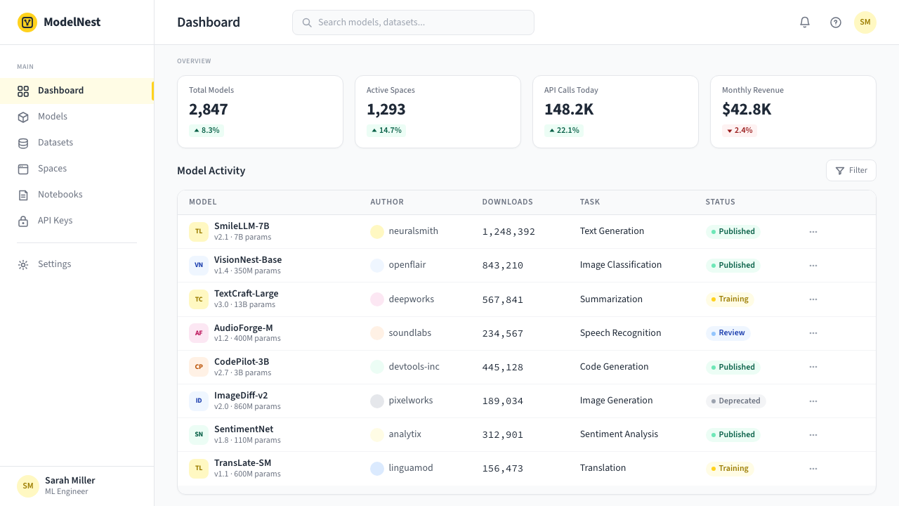
Card-Grid Information Structure卡片网格信息结构
Model listings, dataset entries, space previews, and user profiles are organized into uniform card grids with softly rounded corners and restrained shadows. The rounding is deliberate — it softens the interface without introducing the organic irregularity of fully curved or blob-based design. Shadows are present but minimal, providing just enough depth to separate card from ground without introducing the visual noise of strong elevation. This card grammar allows dense information to be presented in a scannable, approachable format.模型列表、数据集条目、Space 预览与用户资料均被组织进统一的卡片网格,具有柔和的圆角与克制的阴影。圆角是经过深思熟虑的——它软化了界面,同时不引入全曲线或有机不规则形状设计所带来的随意感。阴影存在但极为微弱,提供恰好足够将卡片从底面分离出来的深度,而不引入强烈层次带来的视觉噪声。这套卡片语法允许以可扫描、易亲近的方式呈现高密度信息。
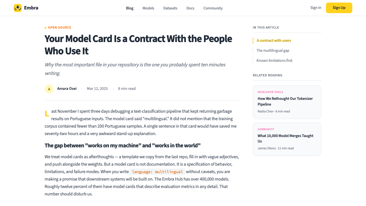
Emoji as Functional Graphic Element表情符号作为功能性图形元素
The hugging-face emoji and a broader set of emoji appear throughout the interface not as decoration but as a functioning part of the visual communication system. Emoji serve as category markers, mood indicators, section labels, and celebratory feedback signals. They are treated with the same compositional seriousness as icons in other design systems — placed with purpose, scaled consistently, and never used so densely that they overwhelm the information they annotate. This approach breaks the convention that professional interfaces must rely solely on geometric iconography.拥抱表情及更广泛的表情符号集贯穿整个界面——不作为装饰,而是作为视觉传达系统的功能性组成部分。表情符号充当类别标记、情绪指示器、章节标签与庆祝反馈信号。它们被以与其他设计系统中图标同等的构图严肃性对待——有目的地放置,尺寸保持一致,从不密集到压过它们所注解的信息。这一处理方式打破了专业界面必须仅依赖几何图标的惯例。
Deep Slate for Text and Structure深石板灰用于文本与结构
Rather than pure black, the system uses a deep, slightly warm slate for body text, interface labels, and structural dividers. This choice softens the contrast against white backgrounds just enough to reduce reading fatigue during extended documentation sessions, while remaining decisively legible. The slate also creates a tonal bridge between the white ground and the yellow accent — the three-value system of white, slate, and yellow is internally coherent and requires no additional neutrals to function.系统使用带有微弱暖调的深石板灰(而非纯黑)承载正文、界面标签与结构分隔线。这一选择将白底上的对比度略微柔化,足以在长时间阅读文档时减少视觉疲劳,同时保持确定性的可读性。石板灰还在白底与黄色强调之间创造色调过渡——白、灰、黄三值系统内部自洽,无需额外中性色即可运转。
Syntax-Highlighted Code Presentation语法高亮代码呈现
Code blocks are first-class citizens in the visual hierarchy, not afterthoughts embedded in prose. They appear in dedicated containers with a subtly distinct background, monospace type, and syntax highlighting that uses a restrained palette — typically distinguishing keywords, strings, comments, and function names through hue shifts rather than saturation extremes. The code presentation connects the interface to the tradition of well-designed developer documentation and signals that the platform takes technical precision seriously.代码块在视觉层级中是一等公民,而非嵌入散文的事后补充。它们出现在具有细微差异背景的专属容器中,采用等宽字体,并通过克制的色板进行语法高亮——通常以色相偏移而非饱和度极端来区分关键字、字符串、注释与函数名。代码呈现将界面与精心设计的开发者文档传统相连,传达出平台认真对待技术精确度的态度。
See the Hugging Face Emoji-Yellow design system查看 Hugging Face Emoji-Yellow 完整设计系统
Who shaped Hugging Face Emoji-Yellow?谁塑造了 Hugging Face Emoji-Yellow?
Co-founder and CEO of Hugging Face, Delangue was instrumental in the company's strategic pivot from a consumer chatbot into an open-source AI platform. His consistent advocacy for openness and community — including the decision to release transformers as a public library and to host model weights freely — directly shaped the platform's identity as a welcoming, inclusive resource. The warmth embedded in the Emoji-Yellow visual system reflects values he has articulated publicly throughout the company's growth.Hugging Face 联合创始人兼 CEO,Delangue 在推动公司从消费级聊天机器人战略转型为开源 AI 平台的过程中发挥了关键作用。他对开放性与社区价值的持续倡导——包括将 transformers 作为公共库发布、免费托管模型权重的决策——直接塑造了平台作为欢迎、包容资源的身份认同。Emoji-Yellow 视觉系统中内嵌的温度感,正是他在公司成长历程中公开表达的价值观的视觉映射。
Co-founder and Chief Science Officer, Wolf led the technical effort to build the transformers library that made Hugging Face's reputation. His background bridging academic machine learning and open-source software culture influenced both what the platform prioritized technically and how it chose to present itself visually. The commitment to documentation quality, community contribution norms, and technical transparency that Wolf championed is encoded in the design system's clarity and information density.联合创始人兼首席科学官,Wolf 主导了构建 transformers 库的技术工作,正是这一成果奠定了 Hugging Face 的声誉。他在学术机器学习与开源软件文化之间搭桥的背景,影响了平台在技术上的优先选择,以及它选择如何在视觉上呈现自己。Wolf 所倡导的文档质量、社区贡献规范与技术透明度,被编码在设计系统的清晰感与信息密度之中。
Co-founder and CTO, Chaumond shaped the engineering culture that underpins the platform's reliability and scale. His emphasis on developer experience — making the API clean, the documentation thorough, and the tooling frictionless — is reflected in the visual system's prioritization of legibility and information architecture over decorative gesture. The interface's readability is not an accident; it is the product of an engineering culture that treats clarity as a form of respect for the user's time.联合创始人兼 CTO,Chaumond 塑造了支撑平台可靠性与规模的工程文化。他对开发者体验的重视——使 API 整洁、文档详尽、工具链无摩擦——体现在视觉系统对可读性与信息架构的优先排序,而非装饰性姿态。界面的可读性并非偶然;它是一种工程文化的产物,这种文化将清晰视为对用户时间的尊重。
Unlike most design systems, which are authored by centralized brand teams, the Emoji-Yellow aesthetic was shaped as much by community practice as by internal decisions. Hundreds of thousands of contributors writing model cards, dataset descriptions, and Space demonstrations established informal norms for how the platform's content should look and feel. The design system evolved to accommodate and celebrate this community output — which is why emoji, informal language, and personality are treated as legitimate rather than suppressed in favor of corporate uniformity.与大多数由集中式品牌团队主导的设计系统不同,Emoji-Yellow 美学的塑造,社区实践与内部决策同等重要。数十万名撰写模型卡、数据集描述与 Space 演示的贡献者,建立了关于平台内容应有外观与感受的非正式规范。设计系统演化为容纳并庆祝这些社区产出——这正是为什么表情符号、非正式语言与个性化被视为合法,而非被压制以求企业统一性。
How do you use Hugging Face Emoji-Yellow today?今天怎么用 Hugging Face Emoji-Yellow?
Hugging Face Emoji-Yellow translates with high fidelity into presentation slides, particularly for AI, machine learning, and developer-tooling contexts. A cover slide benefits from a bold yellow band or block anchoring the top or left edge, with the title set in large, light-weight humanist sans-serif against a white field. The contrast is immediate and warm — it signals technical seriousness without the coldness of a purely monochromatic dark scheme. Content slides should replicate the platform's card grammar: each major point lives in a softly rounded container with a hairline border, separated by generous white space. Data slides — model benchmark comparisons, accuracy tables, infrastructure cost charts — work well with yellow used as the highlight color for the primary metric, slate for secondary values, and white as the chart ground. Avoid filling bar charts or area graphs with heavy color; let the data breathe.Hugging Face Emoji-Yellow 能以高保真度转化为演示文稿,尤其适合 AI、机器学习与开发者工具相关场景。封面页适合以一个大胆的黄色色带或色块锚定顶边或左边,标题以大号轻字重人文主义无衬线字体置于白色底面。对比鲜明而温暖——它传达技术严肃性,同时不带纯粹暗色系方案的冷峻。内容页应复刻平台的卡片语法:每个要点置于柔和圆角的容器中,以细边框分隔,周围留有充裕白空间。数据页——模型基准对比、精度表、基础设施成本图——适合以黄色高亮主要指标,石板灰承载次要数值,白色作为图表底面。避免用重色填充条形图或面积图,让数据呼吸。
For web interfaces and dashboards, the system is particularly well-suited to platforms that host content created by many different contributors — model registries, dataset catalogs, community forums, developer portals. The approach: build on a strict column grid, hold the background at white or near-white, use the slate for all body text and navigation labels, and deploy yellow only for primary interactive elements and active states. Card components should have softly rounded corners and minimal shadow — enough to separate them from the background, not enough to create the impression of strong physical elevation. Pricing pages work well with the system: tier differentiation can be achieved through yellow as the accent on the recommended plan, with slate and white handling the rest. Avoid heavy gradients in pricing tier backgrounds — they conflict with the flat, clear-ground aesthetic.对于网页界面与仪表板,该系统尤其适合托管大量贡献者内容的平台——模型注册表、数据集目录、社区论坛、开发者门户。方法:建立在严格的列网格之上,保持背景为白色或近白色,所有正文与导航标签使用石板灰,仅将黄色部署于主要交互元素与激活状态。卡片组件应有柔和圆角与极简阴影——足以将其与背景分离,但不足以制造强烈实体层次感。定价页与此系统配合良好:可通过在推荐方案上以黄色强调来实现等级区分,其余部分由石板灰与白色处理。避免在定价层级背景中使用厚重渐变——它们与平面、清晰底面的美学相冲突。
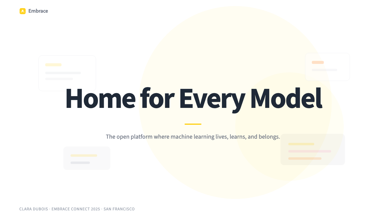
For editorial and marketing contexts — blog posts, model launch announcements, conference materials, social sharing cards — the Emoji-Yellow system produces work that is recognizably warm and community-oriented. Section headers benefit from a yellow underscore or left border in place of a decorative ornament. Pull quotes can sit in yellow-tinted containers with the text itself in deep slate. Hero sections for major announcements work with a large, centered emoji as the primary visual element — this approach sounds unconventional but reads as confident and distinctive when executed with adequate white space and typographic scale. The emoji should be the only non-typographic element; resist the urge to add background illustrations or textured surfaces.对于编辑与营销场景——博客文章、模型发布公告、会议材料、社交分享卡片——Emoji-Yellow 系统产出的作品具有可辨识的温暖感与社区导向。章节标题适合以黄色下划线或左边框取代装饰性装饰元素。引用语可置于黄色调容器中,文字本身以深石板灰呈现。重要公告的英雄区适合以单个大号居中表情符号作为主要视觉元素——这听起来非常规,但在充裕留白与字体规模配合下执行,读来自信而独特。表情符号应是唯一的非字体图形元素;克制添加背景插图或纹理表面的冲动。
A common mistake when applying this style is treating yellow as a neutral background rather than an accent. Yellow at large area will dominate the composition and shift the reading from energetic to aggressive — it competes with text legibility rather than enhancing it. Confine yellow to interface elements, borders, highlights, and small structural markers. A second frequent error is abandoning the white-ground discipline in favor of grey backgrounds — the grey-on-grey card patterns common in many design systems flatten the Emoji-Yellow system's warmth entirely. A third mistake is using the emoji casually and densely: one or two emoji per section, placed with purpose, reinforces the brand character; a scattering of emoji across every element reads as visual clutter rather than personality.应用此风格时最常见的错误,是将黄色当作中性背景而非强调色使用。大面积黄色将主导构图,把阅读感受从充满活力转为过于强势——它与文字可读性形成竞争而非增强。将黄色限制于界面元素、边框、高亮与小型结构标记之中。第二个常见错误是放弃白底纪律,转而采用灰色背景——许多设计系统中常见的灰底灰卡片模式,会将 Emoji-Yellow 系统的温度感彻底抹平。第三个错误是随意且密集地使用表情符号:每个章节一到两个、有目的地放置的表情符号能强化品牌个性;散落于每个元素的表情符号只会被读作视觉噪声,而非个性。
See the Hugging Face Emoji-Yellow design system查看 Hugging Face Emoji-Yellow 完整设计系统
Hugging Face Emoji-Yellow — FAQHugging Face Emoji-Yellow · 常见问题
Can this style work for non-AI products that want a warm developer aesthetic?这种风格能用于希望呈现温暖开发者气质的非 AI 产品吗?
Yes, with attention to context. The Emoji-Yellow system's core principles — white ground, restrained accent color, card grammar, humanist type, emoji-as-communication — are transferable to any developer platform, open-source project, or community-oriented product that wants to feel approachable without sacrificing technical credibility. The emoji usage requires more care in contexts where the audience expects strict formality, but the broader color and layout principles work broadly. The main risk is that a very saturated yellow reads as reminiscent of Hugging Face specifically — consider whether that association is an asset or a liability for your product.可以,但需要注意语境。Emoji-Yellow 系统的核心原则——白底、克制的强调色、卡片语法、人文主义字体、表情符号作为传达媒介——可移植至任何希望亲和而不失技术可信度的开发者平台、开源项目或社区导向产品。在受众期待严格正式性的语境中,表情符号的使用需要更多谨慎,但更广泛的色彩与版面原则具有普遍适用性。主要风险在于,高饱和黄色会让人联想到 Hugging Face——需考量这种关联对你的产品是资产还是负担。
How does Emoji-Yellow differ from other warm, developer-friendly design systems?Emoji-Yellow 与其他温暖的开发者友好设计系统有何不同?
Most developer-friendly design systems choose warmth through typography and spacing rather than through color — they use off-white backgrounds, slightly warmer neutral tones, and restrained illustrations, but keep the primary accent color in a safe blue or teal. Emoji-Yellow is distinctive in choosing a genuinely saturated warm yellow as its primary accent, and in treating emoji as a first-class design element rather than a concession to informality. This combination is unusual in developer contexts: it produces a result that feels simultaneously more playful and more community-oriented than competitors like GitHub's Primer or Vercel's geometric monochrome.大多数开发者友好的设计系统通过字体与间距而非色彩来实现温度——它们使用偏白的背景、略带暖调的中性色与克制的插图,但将主要强调色保持在安全的蓝色或蓝绿色范围。Emoji-Yellow 的独特之处在于选择真正饱和的暖黄作为主要强调色,并将表情符号视为一等设计元素,而非对非正式性的让步。这种组合在开发者语境中相当罕见:它产生的结果同时比 GitHub Primer 或 Vercel 几何单色风格更具游戏感与社区导向。
Is it appropriate to use this style for a dark-mode version of an interface?这种风格适合用于界面的深色模式版本吗?
A dark-mode adaptation is possible but requires deliberate adjustment. The system's warmth comes substantially from the white-ground discipline — removing it changes the character significantly. On a dark background, the brand yellow tends to vibrate strongly against the dark field, which can read as energetic or as harsh depending on the saturation level. The most successful dark adaptations reduce the yellow's saturation slightly, use it for highlights and active states only, and replace the white-card surface with a slightly lighter dark rather than pure black. The emoji elements perform well in dark mode and can serve as warm anchors that soften the overall atmosphere.深色模式适配是可行的,但需要审慎调整。这套系统的温度感很大程度上来自白底的纪律——移除它将显著改变整体气质。在深色背景上,品牌黄对深色底面有强烈的视觉振动,根据饱和度高低,可能被读作充满活力或过于刺眼。最成功的深色适配会略微降低黄色饱和度,仅将其用于高亮与激活状态,并以稍浅的深色而非纯黑替代白色卡片表面。表情符号元素在深色模式中表现良好,可作为软化整体气氛的温暖锚点。
How do you handle the emoji elements in contexts where emoji rendering is unreliable?在表情符号渲染不可靠的场景中,如何处理表情符号元素?
Emoji rendering varies meaningfully across operating systems, browsers, and print environments — what looks like the intended face on one platform may look subtly different or misaligned on another. For web contexts, the risk is manageable: modern browsers render common emoji consistently enough that the core communication is preserved even if pixel-level details differ. For print, conference materials, or environments where rendering cannot be predicted, replace emoji with custom icon components that replicate the visual character of the emoji at the relevant size — a rounded, filled circle with simplified feature geometry achieves the same warmth with predictable output. Never use emoji as the sole carrier of critical information; always pair them with text labels.表情符号的渲染在不同操作系统、浏览器与印刷环境之间存在显著差异——在某个平台上看起来符合预期的表情,在另一个平台上可能呈现细微差别或对齐偏差。对于网页场景,风险是可控的:现代浏览器对常用表情符号的渲染足够一致,即便像素层面的细节有所不同,核心传达也得以保留。对于印刷品、会议材料或无法预测渲染环境的场景,以自定义图标组件替代表情符号,在相关尺寸下复现其视觉特质——带有简化特征几何的圆润实心圆可以以可预测的输出实现同样的温度感。永远不要将表情符号作为关键信息的唯一载体;始终与文字标签配对使用。
Does the Emoji-Yellow system work for data-heavy analytical interfaces, or is it too playful for that context?Emoji-Yellow 系统适合数据密集型分析界面吗,还是说对这类场景来说过于活泼?
The system works well for data-heavy interfaces precisely because its playfulness is surface-level — the underlying structure is rigorous. The white ground, strict grid, high-density card layout, and clear typographic hierarchy are all analytically capable. The yellow accent and emoji elements operate as selective warmth within a fundamentally serious information architecture. Model leaderboards on Hugging Face itself demonstrate this: dense numerical data, sortable tables, and technical metadata presented within the Emoji-Yellow system reads as both approachable and credible. The key is keeping emoji away from the data tables themselves and using yellow only for row highlights, active filters, or top-ranked items — not as background fills for data cells.这套系统之所以适合数据密集型界面,恰恰是因为其活泼感停留在表面——底层结构是严格的。白底、严格的网格、高密度卡片布局与清晰的字体层级,都具备分析能力。黄色强调与表情符号元素在根本上严肃的信息架构中发挥选择性温度的作用。Hugging Face 自身的模型排行榜便是明证:在 Emoji-Yellow 系统中呈现的密集数值数据、可排序表格与技术元数据,读来既亲和又可信。关键是让表情符号远离数据表格本身,仅将黄色用于行高亮、激活筛选器或排名靠前的条目——而非作为数据单元格的背景填充。
Related design styles相关设计风格
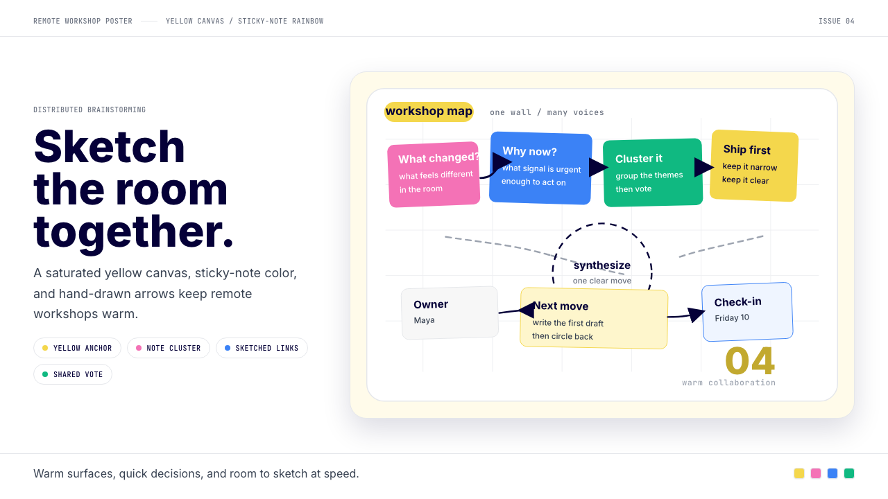 Miro Collab YellowWarm brainstorming in motion. Yellow canvas, sticky-note rainbow, hand-drawn…暖黄白板上的协作灵感。便利贴彩虹和手绘箭头带出流动感。
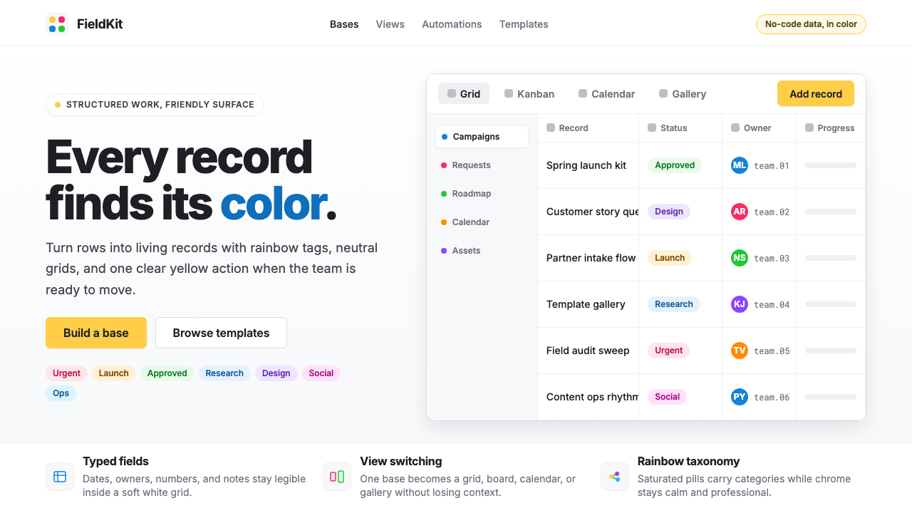 Airtable Spreadsheet-RainbowWork becomes celebratory. Inter grids stay white while rainbow pills and yell…工作变得欢快:白色 Inter 网格中,彩虹标签与黄色按钮点亮节奏。
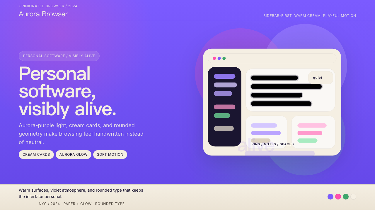 Arc BrowserPersonal software, visibly alive. Aurora purple glows over cream cards and ro…有生命感的个人软件。极光紫铺底,奶油卡片和圆润字形发光。
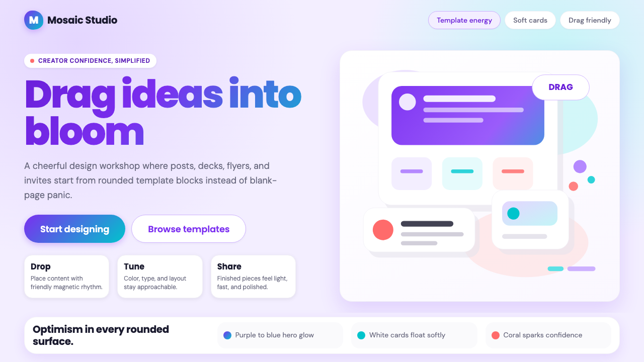 Canva 2024Confidence feels draggable. Purple-blue gradients and floating white template…信心可拖拽:紫蓝渐变与漂浮白卡,让创作变柔和。
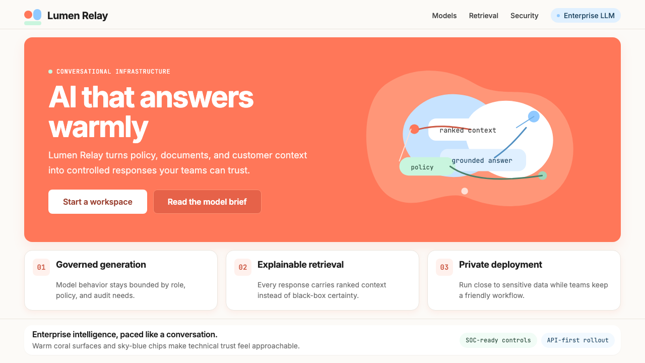 Cohere Coral-AIEnterprise AI feels humane. Coral panels, sky-blue chips, and organic curves…企业 AI 有人情味:珊瑚面板、天蓝标签与有机曲线软化网格。
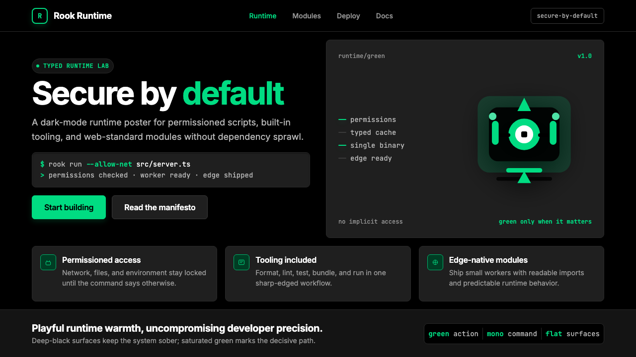 Deno Runtime-GreenWarm precision on black. Saturated green, Inter, and mono code turn security…黑底上的温暖精度:饱和绿、Inter 与等宽代码让安全成为主角。