What is Miro Collab Yellow?什么是 Miro Collab Yellow?
Miro Collab Yellow turns the distributed brainstorm into a visual language — warm amber canvas, sticky-note rainbow, and hand-drawn energy that makes remote teams feel like they are sketching at the same wall.Miro Collab Yellow 把分布式头脑风暴变成一套视觉语言——暖琥珀底色、便利贴彩虹、手绘线条的流动感,让远程团队仿佛真的围在同一面白板前。
Miro Collab Yellow in briefMiro Collab Yellow 速览
Miro Collab Yellow is the visual identity system of Miro, the online whiteboard platform that transformed distributed collaboration into a design category of its own. The aesthetic is built on a saturated, warm yellow anchor color paired with a pure white or near-white canvas ground, accented by the cheerful multicolor palette of sticky notes — soft pink, sky blue, sage green, and tangerine orange — that Miro users reach for dozens of times a day.Miro Collab Yellow 是在线白板平台 Miro 的视觉识别系统,这家公司将分布式协作变成了一个独立的设计品类。这套美学以一种饱和的暖黄色为核心锚点,搭配纯白或近白色的画布底色,再以便利贴系统的多彩色系点缀其间——粉红、天蓝、鼠尾草绿、橘橙——这些颜色是 Miro 用户每天都会反复接触的。
Where enterprise SaaS design typically defaults to cool blues and authoritative grays, Miro chose warmth and approachability as its visual strategy. The hero blocks on miro.com are populated with whiteboard mockups — sticky notes clustered into affinity maps, hand-drawn arrows connecting ideas, circled callouts highlighting key insights — communicating not what the software does in the abstract but what it feels like to use it with a team. The look says collaboration in motion, not software at rest.企业级 SaaS 设计通常默认使用冷静的蓝色与权威的灰色,Miro 却选择了温暖与亲切作为视觉策略。miro.com 的主视觉区域充满了白板模型场景——便利贴按亲和性聚拢成簇、手绘箭头串联起各个想法、圆圈批注突出关键洞察——传达的不是这款软件抽象意义上能做什么,而是与团队一起使用时的真实感受。这种视觉语气说的是协作正在发生,而非软件静静等待。
The typographic system leans into clean, geometric sans-serif forms that feel contemporary without being cold. Headlines and CTAs arrive in the bold amber-yellow, while body copy stays in near-black for readability. The result is a palette that reads as simultaneously professional and human — rigorous enough for enterprise procurement teams, warm enough that designers and product managers want to live inside it.字体系统倾向于干净的几何无衬线形态,感觉当代而不冷漠。标题和行动号召以加粗的琥珀黄呈现,正文保持接近黑色的深色以确保可读性。最终效果是一套既专业又有人情味的色板——严谨到足以通过企业采购团队的审视,温暖到足以让设计师和产品经理愿意长期沉浸其中。
See the Miro Collab Yellow design system查看 Miro Collab Yellow 完整设计系统
Where does Miro Collab Yellow come from?Miro Collab Yellow 从何而来?
Miro was founded in 2011 in Perm, Russia, by Andrey Khusid and Oleg Shardin under the name RealtimeBoard. The original product was a straightforward digital whiteboard targeting design and engineering teams that needed a shared visual space. The early visual identity was functional and unremarkable — the brand had not yet found its voice. The pivot toward a richer, personality-driven aesthetic came gradually as the company grew its user base and began to understand that its real value proposition was not the whiteboard itself but the feeling of creative co-presence it enabled.Miro 于 2011 年由 Andrey Khusid 与 Oleg Shardin 在俄罗斯彼尔姆以「RealtimeBoard」的名义创立,最初产品是一个面向设计和工程团队的直接易用的数字白板,视觉识别功能性有余、个性不足,品牌尚未找到自己的声音。向更丰富、更具个性的美学的转变是随着公司用户规模的扩大逐步发生的——团队开始意识到,真正的价值主张不是白板本身,而是它所带来的创意共在感。
The rebrand to Miro in 2019 was the pivotal moment. The name — shorter, warmer, more international — was accompanied by a deliberate visual repositioning. The in-house brand team centered the identity on a saturated warm yellow that stood apart from the cool-toned palettes dominant in enterprise software at the time. The choice was strategic: yellow is energetic, optimistic, and attention-grabbing in a way that signals creative industries rather than financial or legal ones. Combined with a friendly illustration vocabulary and the whiteboard-as-hero-image motif, the rebrand successfully communicated that Miro was for teams who think visually.2019 年更名为 Miro 是决定性的时刻。更短、更温暖、更具国际感的新名字,伴随着刻意的视觉重新定位。内部品牌团队将识别系统的核心锁定在一种饱和的暖黄色上,与当时企业软件领域占主导的冷调色板形成鲜明对比。这一选择具有战略意义:黄色充满活力、乐观向上、吸引注意力,传递的是创意行业的气质,而非金融或法律行业的气息。结合亲切的插画词汇与「白板即主视觉」的设计母题,这次品牌焕新成功传达出 Miro 是为视觉思维团队而生的产品。
The timing was prescient. When the COVID-19 pandemic forced millions of knowledge workers into remote arrangements beginning in early 2020, Miro was positioned as a primary beneficiary. The platform's user base grew explosively, and the visual identity — already warm and collaborative in register — became closely associated with the new reality of distributed creative work. The sticky-note rainbow in particular became a cultural shorthand: a screenshot of a Miro board filled with colorful notes was almost universally recognizable as a signal of remote teamwork in action.时机的选择颇具先见之明。2020 年初新冠疫情迫使数以百万计的知识工作者转入远程工作模式时,Miro 正好处于最有利的位置。平台用户数量爆炸式增长,那套本就温暖、协作感十足的视觉语言,也随之与分布式创意工作的新现实紧密相连。便利贴彩虹尤其成为一种文化速记——一张塞满彩色便利贴的 Miro 白板截图,几乎已经成为远程协作正在发生的通用符号。
By the mid-2020s, Miro had reached a valuation exceeding seventeen billion dollars and expanded its brand system across an increasingly broad product surface. The core visual language — amber yellow anchor, white canvas ground, sticky-note accents, hand-drawn illustration details — remained consistent even as the product evolved to include more structured templates, diagramming tools, and integrations with the broader product development ecosystem. The Miro brand team's decision to maintain the warmth and approachability of the original identity, rather than pivoting to the colder authority signaling common in late-stage enterprise SaaS, is itself a meaningful design position.进入 2020 年代中期,Miro 估值超过 170 亿美元,品牌系统随着产品边界的扩展不断延伸。核心视觉语言——琥珀黄锚点色、白色画布底、便利贴点缀、手绘插画细节——在产品迭代出更多结构化模板、图表工具和生态系统集成后依然保持一致。Miro 品牌团队选择维护原始识别系统的温暖与亲切,而非向晚期企业级 SaaS 常见的冷峻权威感靠拢,这本身就是一个有分量的设计立场。
What defines the Miro Collab Yellow look?Miro Collab Yellow 的视觉特征是什么?
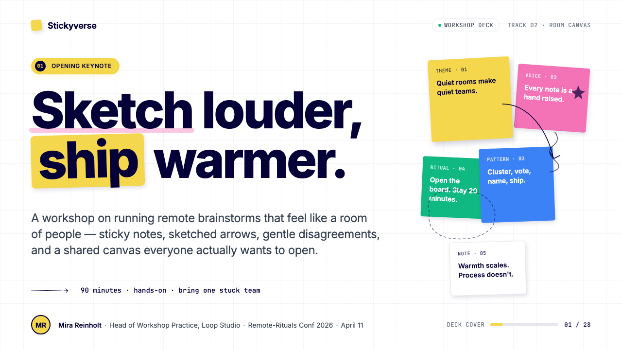
Anchor Yellow锚点黄
A saturated, warm amber-yellow serves as the entire identity's load-bearing color. It appears on primary CTAs, key headlines, logo marks, and selected hero backgrounds. The yellow reads as energetic and optimistic rather than cautionary — it belongs to the register of creativity and sunlight rather than warning signs. Used at full saturation against white or near-black, it creates immediate visual priority without requiring any supporting graphic complexity.一种饱和的暖琥珀黄承担着整套识别系统的核心视觉重量。它出现在主要行动号召按钮、关键标题、品牌标识以及部分主视觉背景上。这种黄色传递的是能量与乐观,而非警示感——它属于创意与阳光的语域,而非警示标识的领域。在白色或接近黑色的底色上以满饱和度使用时,无需任何复杂图形支撑便能立即建立视觉优先级。
Sticky-Note Rainbow便利贴彩虹
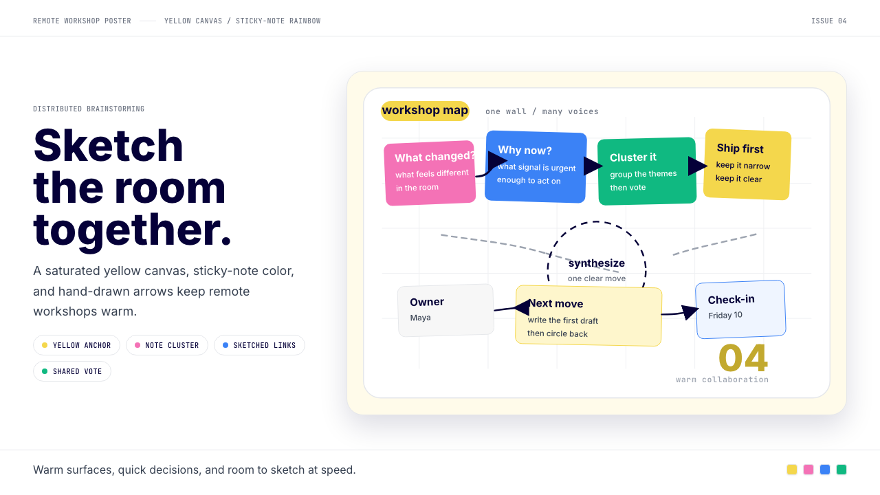
Alongside the yellow anchor, Miro maintains a secondary palette of soft, cheerful note colors — a dusty pink, a gentle sky blue, a muted sage green, and a warm orange — that mirrors the physical sticky notes users place on real whiteboards. These colors appear primarily in product screenshots, illustrations, and supporting graphic elements. They are deliberately kept lighter and less saturated than the anchor yellow, ensuring that the primary brand color always dominates while the note palette contributes warmth and visual variety.在锚点黄之外,Miro 维护着一套次级的便利贴色系——柔粉、天蓝、静谧绿、暖橙——与用户在真实白板上贴的物理便利贴遥相呼应。这些颜色主要出现在产品截图、插画和辅助图形元素中,刻意保持比锚点黄更浅、更低饱和度的状态,确保主品牌色始终占据视觉主导,便利贴色系则贡献温度与视觉层次。
White Canvas Ground白色画布底
The dominant background across miro.com and Miro's marketing materials is pure or near-pure white, directly referencing the white surface of a physical whiteboard. This ground color is not simply neutral — it is the visual metaphor that holds the entire brand together. Against the white canvas, the amber yellow pops with authority, and the sticky-note colors retain their legibility. The whiteness also communicates openness and possibility, reinforcing the brand's core message that the surface is waiting to be filled.miro.com 及 Miro 营销物料的主导背景是纯白或接近纯白,直接援引物理白板的白色表面。这个底色并非简单的中性色——它是串联起整套品牌的视觉隐喻。在白色画布的映衬下,琥珀黄以强劲的力度跳出,便利贴色系也保持清晰可辨。白色同时传达开放与可能性,强化品牌的核心信息:这片空白等待着被填满。
Hand-Drawn Warmth手绘温度
A signature characteristic of the Miro aesthetic is the deliberate incorporation of hand-drawn elements into otherwise clean digital layouts. Arrows connecting ideas are sketched rather than perfectly rendered; callouts are circled in a slightly wobbly line; annotations look written rather than typeset. This imperfection is purposeful — it signals human presence and active thinking. The hand-drawn vocabulary communicates that Miro is a place where ideas are being formed, not where finished products are being presented.Miro 美学的标志性特征之一,是在干净的数字版面中刻意融入手绘元素。连接想法的箭头是勾画出来的而非精确渲染的;批注圆圈的线条带着轻微的颤动感;注释像是手写而非排版。这种不完美是刻意为之的——它传递人的存在与思维的活跃。手绘词汇传达出 Miro 是一个想法正在成形的地方,而不是展示成品的舞台。
Friendly Sans-Serif Typography亲切无衬线字体
The typographic system favors clean, geometric sans-serif forms that carry a modern sensibility without feeling clinical. Headlines set in the brand's typeface choices carry authority at large sizes while remaining approachable; the open apertures and balanced proportions prevent the coldness that highly geometric type can sometimes project. Body text is set in near-black for strong contrast against the white ground, ensuring readability while maintaining the overall warmth of the palette.字体系统偏爱干净的几何无衬线形态,具有现代感而不显刻板。品牌字体的大号标题有力量感的同时仍保持亲切;开放的字腔与均衡的比例避免了高度几何化字体有时会投射出的冷漠感。正文以接近黑色的深色排版,与白色底面形成强烈对比,在保证可读性的同时维持整体色板的温度。
Whiteboard-as-Hero Motif「白板即主视觉」母题
Rather than using abstract illustrations or stock photography to represent collaboration, Miro's marketing consistently uses the product itself — specifically, screenshots and mockups of actual Miro boards populated with sticky notes, frameworks, and diagrams — as its primary hero imagery. This approach serves as both demonstration and aspiration: viewers see immediately what the tool does and can imagine their own team's work represented on that canvas. The motif reinforces the brand's claim that the product experience is itself the value.Miro 的营销物料不使用抽象插画或图库摄影来表现协作,而是一贯以产品本身——具体来说,是贴满便利贴、框架图和流程图的真实 Miro 白板截图与模型——作为主视觉。这一做法同时具备示范与激励两层作用:观者立刻看到这个工具能做什么,并能想象自己团队的工作如何呈现在那块画布上。这一母题强化了品牌的核心主张:产品体验本身就是价值所在。
Optimistic, Anti-Corporate Tone乐观的、反企业腔调
Across its visual and verbal communication, Miro consistently resists the authoritative, formal register common in enterprise software. The color choices are warm rather than commanding, the illustrations suggest play rather than process, and the overall visual energy communicates creative possibility rather than operational control. This tonal positioning is a strategic decision — Miro competes partly by making enterprise users feel like creative individuals rather than corporate operators, and the visual identity is the primary carrier of that positioning.在视觉与文字传播的各个层面,Miro 始终拒绝企业软件中常见的权威、正式腔调。色彩选择温暖而非威严,插画暗示的是玩耍而非流程,整体视觉能量传达的是创意可能性而非操作控制感。这种调性定位是一个战略决策——Miro 的竞争策略之一是让企业用户感觉自己是有创造力的个体而非公司机器上的操作员,而视觉识别是这一定位的主要载体。
See the Miro Collab Yellow design system查看 Miro Collab Yellow 完整设计系统
Who shaped Miro Collab Yellow?谁塑造了 Miro Collab Yellow?
Co-founder and long-serving CEO of Miro, Khusid was the primary creative and strategic force behind the company's evolution from a functional whiteboard tool into a platform with a distinctive visual identity. His decision to pursue a warm, human-centered brand aesthetic at scale — resisting pressure to adopt the colder authority signaling of late-stage enterprise software — shaped the Miro Collab Yellow system and remains the most consequential design choice in the company's history.Miro 联合创始人与长期担任 CEO,Khusid 是推动公司从功能性白板工具进化为具有独特视觉识别品牌的核心创意与战略力量。他在规模化扩张中坚持温暖、以人为本的品牌美学——抵制向晚期企业软件常见的冷峻权威感靠拢的压力——塑造了 Miro Collab Yellow 系统,也是公司历史上最具影响力的设计决策。
Co-founder of Miro, Shardin contributed to the foundational product vision that made the whiteboard metaphor central to the platform's design language. The product's core conceit — that a digital canvas populated with moveable objects, sticky notes, and connectors could replicate the creative energy of a physical collaborative session — established the visual and interaction model that the Miro brand identity would later crystallize.Miro 联合创始人,Shardin 参与确立了以白板隐喻为平台设计语言核心的产品愿景。产品的核心构想——一块铺满可移动对象、便利贴和连接线的数字画布能够复制物理协作会议的创意能量——建立了 Miro 品牌识别后来结晶化的视觉与交互模型。
The collective internal design team responsible for executing the 2019 rebrand and evolving the visual identity system through the rapid growth years of 2020 to 2024. Their key contributions include systematizing the sticky-note color palette as a secondary brand system, establishing the whiteboard-mockup as the canonical hero image format, and maintaining the warmth of the aesthetic even as the platform expanded into more complex enterprise product territory. Their work demonstrates how an in-house team can sustain a distinctive visual identity through a period of intense product and company scaling.负责执行 2019 年品牌焕新并在 2020 至 2024 年高速增长期间持续演进视觉识别系统的内部设计团队。他们的核心贡献包括:将便利贴色板系统化为次级品牌系统、确立白板模型作为标准主视觉图像格式,以及在平台向更复杂的企业产品领域扩展的过程中维持美学的温度。他们的工作展示了一个内部团队如何在产品与公司规模急剧扩张期间坚守独特视觉识别。
While not an individual figure, the mass adoption of remote work beginning in 2020 functions as a co-author of the Miro Collab Yellow aesthetic in cultural terms. The pandemic-driven shift to distributed teams created an enormous demand for visual collaboration tools and simultaneously elevated the Miro board — with its colorful sticky notes, hand-drawn arrows, and collaborative energy — into a widely recognized symbol of how knowledge work could feel engaging even at distance. The identity absorbed this cultural moment and was shaped by it in return.虽非个体人物,2020 年起大规模兴起的远程协作运动在文化意义上是 Miro Collab Yellow 美学的共同作者。疫情驱动的分布式团队转型产生了对视觉协作工具的巨大需求,同时将 Miro 白板——彩色便利贴、手绘箭头、协作能量——提升为一个被广泛认知的符号,代表着即便相隔千里知识工作也可以令人投入。这套视觉识别吸收了这一文化时刻,也被它反过来塑造。
How do you use Miro Collab Yellow today?今天怎么用 Miro Collab Yellow?
Miro Collab Yellow translates most naturally into contexts that want to communicate creative energy, collaboration, and approachable expertise — rather than authority or precision. Before applying it, ask whether the audience is being invited to think together or being presented with finished conclusions. The style is calibrated for the former and will feel out of place in the latter.Miro Collab Yellow 最自然地适用于那些希望传达创意能量、协作氛围与亲切专业感的场景——而非权威或精确感。在应用它之前,先问自己:这里是在邀请受众一起思考,还是在向他们呈现已完成的结论?这套风格为前者而校准,在后者的语境中会感觉格格不入。
For presentation slides, the style is well-suited to workshop decks, kickoff presentations, brainstorming facilitation guides, and team retrospective templates. A cover slide benefits from a bold amber-yellow background with dark near-black type and a whiteboard-style illustration or sticky-note cluster as the hero element. Content slides work best on white or near-white grounds with the anchor yellow reserved for key labels, callout boxes, and section headers. Data slides can incorporate the sticky-note palette as a categorical color system — different colors for different series or groups — maintaining the warmth of the overall palette while serving a functional role. Avoid using the full rainbow simultaneously on a single chart; choose two or three notes colors per slide and maintain consistency across the deck.对于演示文稿,这套风格最适合工作坊资料包、项目启动演示、头脑风暴引导指南和团队复盘模板。封面幻灯片适合使用大面积琥珀黄底色、深近黑色文字,并以白板风格插画或便利贴聚簇作为主视觉元素。内容页在白色或接近白色的底面上效果最佳,锚点黄保留给关键标签、引用框和章节标题。数据页可以将便利贴色板用作分类色彩系统——不同颜色对应不同数据系列或分组——在服务功能性用途的同时维持整体色板的温度。避免在单张图表中同时使用完整彩虹色系;每张幻灯片选择两到三种便利贴色,并在整套资料中保持一致。
For web UI and product design, the system adapts well to dashboards, project management interfaces, and collaboration tool landing pages. The approach mirrors Miro's own product design: white or very light background, amber yellow for primary interactive states and active indicators, near-black for all type, and sticky-note accent colors for tags, labels, and categorical status indicators. Card components work well with a subtle warm border rather than shadow, keeping the surface feeling open and light. Pricing pages benefit from the anchor yellow as the highlighted tier color — it reads as energetic and desirable rather than aggressive.对于网页界面与产品设计,这套系统能很好地适配仪表板、项目管理界面和协作工具落地页。方法与 Miro 自身的产品设计一脉相承:白色或极浅色背景,琥珀黄用于主要交互状态和活跃指示器,接近黑色的深色用于所有文字,便利贴强调色用于标签、分类和状态指示。卡片组件适合使用细腻的暖色边框而非阴影,保持界面的开放轻盈感。定价页面以锚点黄作为推荐套餐的高亮颜色效果最佳——它传递的是活力与吸引力,而非攻击性。
For editorial and marketing work, the style supports feature announcements, case study layouts, and event landing pages where creative energy is the message. Hero sections with a white canvas and an embedded whiteboard-style mockup communicate product value authentically. Editorial layouts use the anchor yellow for pull quotes, section markers, and highlighted statistics. Marketing emails can use the anchor yellow as a header background for the primary message block, with sticky-note accents in supporting sections.对于编辑与营销内容,这套风格支持功能发布公告、案例研究版面和活动落地页等创意能量是核心信息的场景。以白色画布为底、嵌入白板风格模型的主视觉区域能真实地传达产品价值。编辑版面将锚点黄用于引用语、章节标记和高亮数据。营销邮件可将锚点黄用作主消息区块的标题背景色,便利贴强调色则点缀辅助内容区。
A common mistake is treating the anchor yellow as a general background color across all content sections, which saturates the visual field and exhausts its impact. The yellow should punctuate, not paper. Equally, the hand-drawn illustration style is difficult to replicate without appropriate illustration resources — attempting it with low-quality clip art or mismatched stroke weights will undermine the warmth the style depends on. Designers without access to on-brand illustration assets should use the whiteboard-mockup approach instead, letting real product screenshots carry the visual storytelling.一个常见错误是将锚点黄用作所有内容区块的通用背景色——这会让视觉场域过度饱和,耗尽它的冲击力。黄色应当是标点,而非底纸。同样,手绘插画风格如果没有合适的插画资源几乎无法复现——用低质量剪贴画或不匹配的线条粗细来尝试,只会损害这套风格赖以成立的温暖感。没有品牌插画资源的设计师应改用「白板模型」路径,让真实产品截图承担视觉叙事的任务。
See the Miro Collab Yellow design system查看 Miro Collab Yellow 完整设计系统
Miro Collab Yellow — FAQMiro Collab Yellow · 常见问题
Is Miro Collab Yellow suitable for B2B enterprise products outside collaboration software?Miro Collab Yellow 适合协作软件以外的 B2B 企业产品吗?
It depends on whether the product's core value proposition involves creative, exploratory, or people-facing work. The style works well for HR platforms, educational tools, workshop facilitation products, design and research operations software, and any product that positions collaboration or creativity as a primary feature. It is less suited to financial analytics, legal compliance, cybersecurity, or infrastructure tools where the audience expects cool authority rather than warm approachability. The test is simple: would a prospect trust this color palette with their sensitive data or their deadline-driven workflow? If the answer is uncertain, the warmth may be working against you.取决于产品的核心价值主张是否涉及创意性、探索性或面向人的工作。这套风格适合人力资源平台、教育工具、工作坊引导产品、设计与研究运营软件,以及任何将协作或创造力定位为主要特性的产品。它不太适合金融分析、法律合规、网络安全或基础设施工具——这些领域的受众期待的是冷静的权威感而非温暖的亲切感。测试方法很简单:目标客户会信任这套色板来处理敏感数据或截止日期驱动的工作流吗?如果答案不确定,这种温暖感可能正在反噬你。
How do I balance the anchor yellow with the sticky-note palette without the result looking chaotic?如何在不让结果显得杂乱的前提下,平衡锚点黄与便利贴色板?
The key discipline is hierarchy: anchor yellow is for the most important element on any given surface, the sticky-note colors are for supporting categorical information only. Never let a sticky-note color compete with the anchor yellow at the same visual weight. In practice, this means anchor yellow appears at large scale or high contrast — a button, a headline, a background block — while the note colors appear at small scale or low contrast — tags, labels, small chart elements, decorative dots. If you find yourself using three or four note colors simultaneously at similar sizes and saturations, the palette will read as a children's product rather than a professional collaboration tool.关键纪律是层级:锚点黄用于任意界面上最重要的元素,便利贴色系仅用于辅助性的分类信息。永远不要让便利贴色以相同的视觉重量与锚点黄竞争。在实践中,这意味着锚点黄出现在大尺寸或高对比度的场合——按钮、标题、背景色块——而便利贴色出现在小尺寸或低对比度的场合——标签、分类标记、小型图表元素、装饰性圆点。如果你发现自己在以相近的大小和饱和度同时使用三到四种便利贴色,整体色板将会读起来像儿童产品而非专业协作工具。
Can this style work on a dark background?这套风格能用在深色背景上吗?
A dark inversion is possible but requires significant care. The style's warmth derives substantially from the white-canvas metaphor — the dark inversion loses that metaphor entirely and risks projecting a different brand register (edgy, technical, dramatic) that is out of character with Miro's approachable identity. If a dark mode is necessary, keep the amber yellow as the primary accent and reduce the sticky-note palette to two colors maximum, both kept at lower saturation to prevent them from overwhelming the composition. Avoid making the background fully black; a very dark warm gray preserves more of the palette's inherent warmth. Treat any dark-mode version as an accessibility or user preference accommodation rather than a design-expressive choice.深色反转版本是可能的,但需要相当谨慎。这套风格的温度很大程度上来源于白色画布的隐喻——深色反转会彻底失去这一隐喻,并有传递完全不同品牌气质的风险(前卫感、技术感、戏剧感),与 Miro 亲切可近的品牌人格背道而驰。如果必须使用深色模式,保留琥珀黄作为主要强调色,将便利贴色板减少到最多两种颜色,且两者都保持较低饱和度以防压倒整体构图。避免将背景设置为纯黑;极深的暖灰色能更好地保留色板固有的温度。将任何深色模式版本视为无障碍或用户偏好的适配,而非设计表达的选择。
How should I handle the hand-drawn illustration style if I don't have custom illustration resources?如果没有定制插画资源,应该如何处理手绘插画风格?
The hand-drawn element is appealing but it is also the hardest part of the Miro aesthetic to replicate authentically without purpose-built assets. The most reliable substitute is leaning into the whiteboard-mockup approach: use actual screenshots of collaboration tools, product workflows, or even simple sticky-note arrangements photographed on a real whiteboard as your primary visual content. This preserves the authenticity of the style better than a poorly executed hand-drawn pastiche. If you need arrows and callouts, many vector tools offer stroke styles that approximate a hand-drawn quality at small sizes — use them sparingly, at consistent weights, and never mixed with precise machine-drawn elements in the same composition.手绘元素很有吸引力,但也是 Miro 美学中在没有专门定制资产的情况下最难真实复现的部分。最可靠的替代方案是回归「白板模型」路径:使用协作工具的真实截图、产品工作流程图,甚至在真实白板上拍摄的便利贴排列,作为主要视觉内容。这比拙劣的手绘模仿更能保留风格的真实感。如果需要箭头和批注,许多矢量工具提供的描边样式在小尺寸时能接近手绘质感——克制地使用它们,保持统一的线条粗细,且绝不与同一构图中的精确机械线条混用。
Is Miro Collab Yellow too trendy to use for a long-lived brand?Miro Collab Yellow 会不会太时髦,不适合用于长期品牌?
The warm-yellow-on-white combination and the sticky-note color association are tied to a specific cultural moment — the remote-collaboration boom of the early 2020s. However, the underlying elements are not inherently time-stamped: warm yellows have long histories in editorial, product, and identity design, and the whiteboard metaphor is durable because it references something physical and universally understood. The risk of datedness is greatest if you import the entire system uncritically — sticky-note colors, hand-drawn arrows, whiteboard mockup, amber yellow CTA, all at once. Selectively applying the warmth, the canvas metaphor, and the single-anchor-color discipline will produce something that feels like a contemporary interpretation rather than a period piece.暖黄配白色的组合以及便利贴色彩联想,确实与一个特定的文化时刻相关联——2020 年代初的远程协作热潮。然而,底层元素本身并没有内在的时效性:暖黄色在编辑、产品和品牌设计中有着悠久的历史,白板隐喻之所以经久耐用,是因为它指向某种实体的、被普遍理解的事物。最容易显得过时的风险在于不加甄别地引入整套系统——便利贴色、手绘箭头、白板模型、琥珀黄行动号召,一次性全部用上。有选择地应用其中的温暖感、画布隐喻与单锚点色纪律,能产出一个让人感觉像当代诠释而非历史复刻的结果。
Related design styles相关设计风格
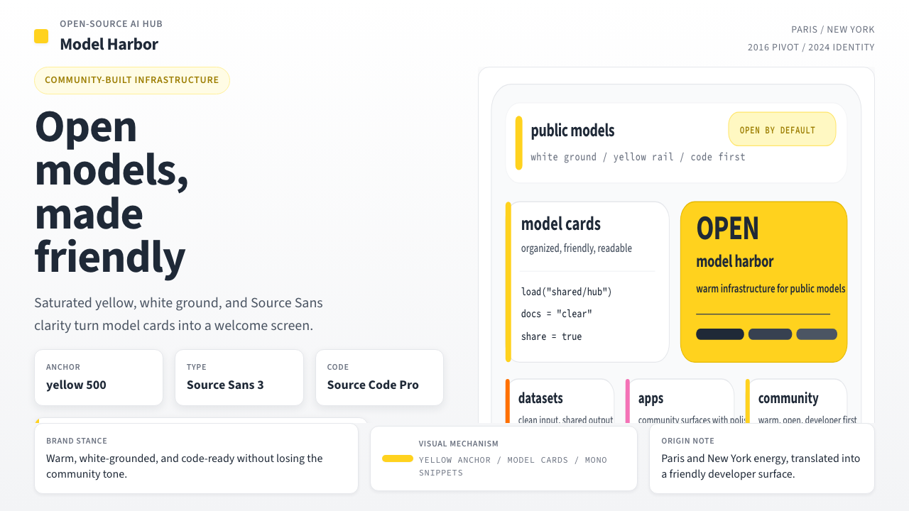 Hugging Face Emoji-YellowWarm infrastructure. Yellow rails, Source Sans, and code cards make openness…温暖的开源基础设施:黄条、无衬线与代码卡片,让开放感更有人味。
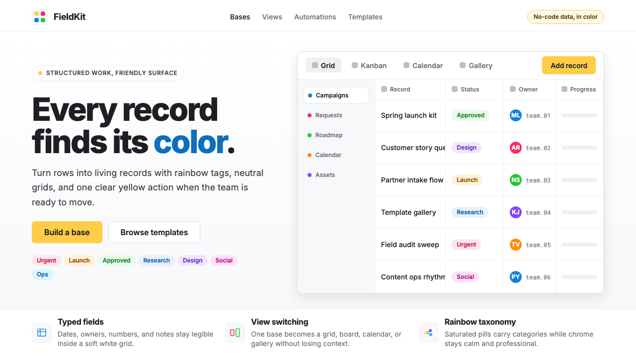 Airtable Spreadsheet-RainbowWork becomes celebratory. Inter grids stay white while rainbow pills and yell…工作变得欢快:白色 Inter 网格中,彩虹标签与黄色按钮点亮节奏。
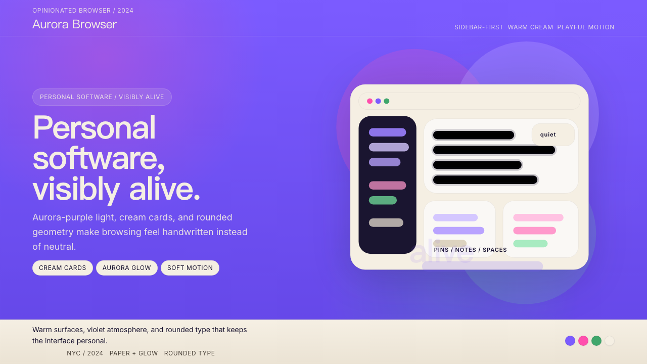 Arc BrowserPersonal software, visibly alive. Aurora purple glows over cream cards and ro…有生命感的个人软件。极光紫铺底,奶油卡片和圆润字形发光。
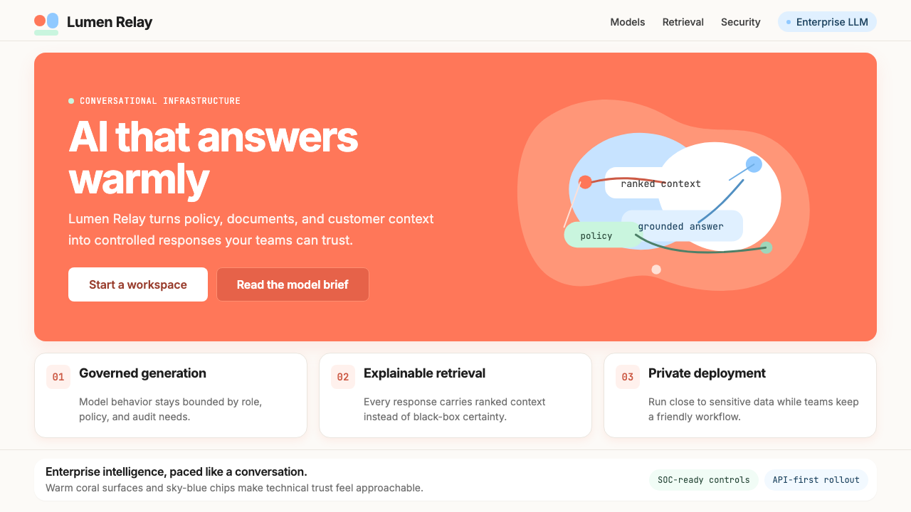 Cohere Coral-AIEnterprise AI feels humane. Coral panels, sky-blue chips, and organic curves…企业 AI 有人情味:珊瑚面板、天蓝标签与有机曲线软化网格。
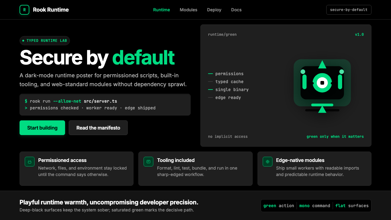 Deno Runtime-GreenWarm precision on black. Saturated green, Inter, and mono code turn security…黑底上的温暖精度:饱和绿、Inter 与等宽代码让安全成为主角。
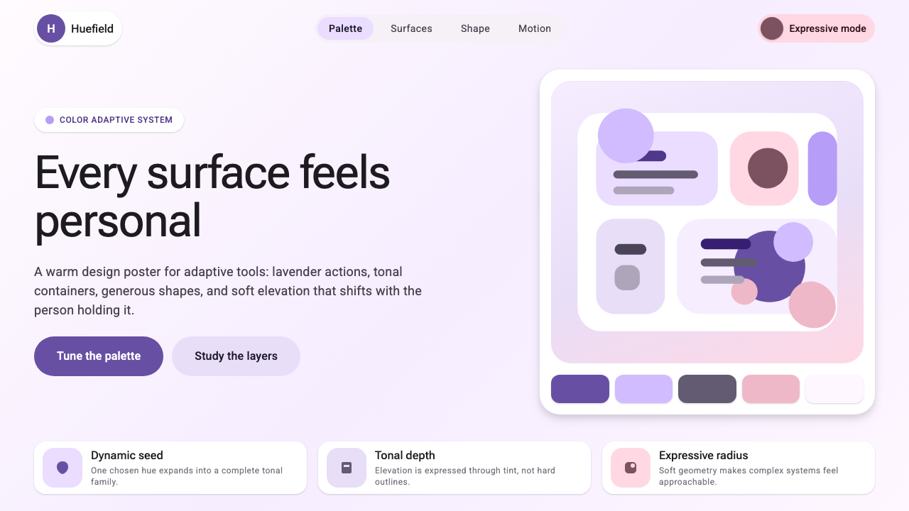 Google Material 3 ExpressiveA living system, themed by your wallpaper. Larger radii, tonal surfaces, emot…能从用户壁纸生成配色的活系统:更大的圆角、表面层级以色调递进取代硬边界——既几…