About Miro Collab Yellow
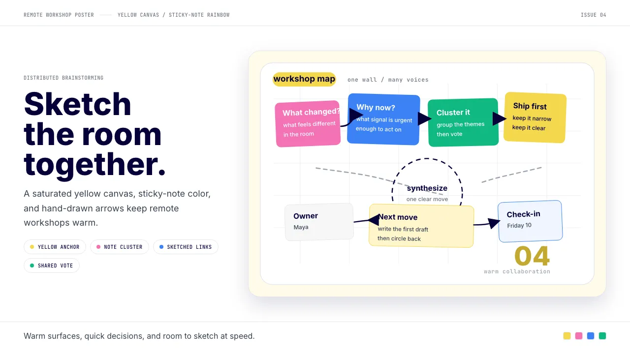
Miro is the online-whiteboard collaboration SaaS that turned distributed brainstorming into a $17B+ category. Founded 2011 as RealtimeBoard and rebranded Miro in 2019, the visual identity centers on a saturated Miro-yellow anchor, warm hand-drawn illustration, and a sticky-note rainbow.
The aesthetic feels like miro.com itself: white ground, Miro-yellow CTAs, friendly Inter typography, and hero blocks rendered as whiteboard mockups full of sticky notes, sketched arrows, and circled callouts. It says "remote teams sketching together," not "enterprise SaaS slab."
- Origin
- San Francisco, USA (HQ); origin Perm, Russia; globally distributed
- Era
- 2011 founded as RealtimeBoard; rebranded Miro 2019; current identity ~2019–2024
- Key figures
- Andrey Khusid · Oleg Shardin · Miro in-house brand team
- Movements
- digital-whiteboard SaaS · remote-collaboration boom 2020+ · warm-modernist SaaS aesthetic
Miro Collab Yellow design spec
Colors
Typography
The other 11 sections — buttons, cards, spacing, motion, techniques and more — open once you unlock. Download the DESIGN.md or send it to your AI in one click. Unlock once, yours forever.
Sign up nowStyles similar to Miro Collab Yellow
Also inspired by brands & products, with a close feel.
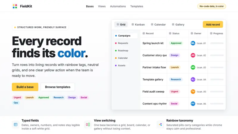 Airtable Spreadsheet-RainbowWork becomes celebratory. Inter grids stay white while rainbow pills and yellow CTAs carry energy.
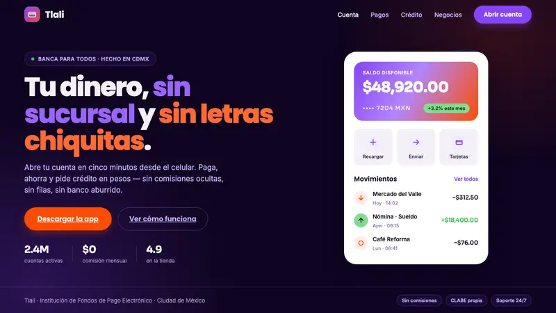 Mexican Fintech StartupNeobank, not legacy bank. White rounded cards float on near-black plum, lit by violet and hot coral.
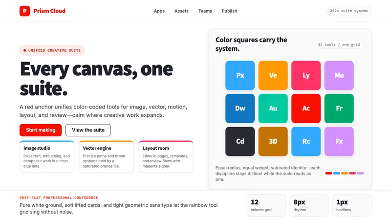 Adobe Creative CloudUnified, not uniform. Red anchor, white space, and saturated app tiles organize the suite.
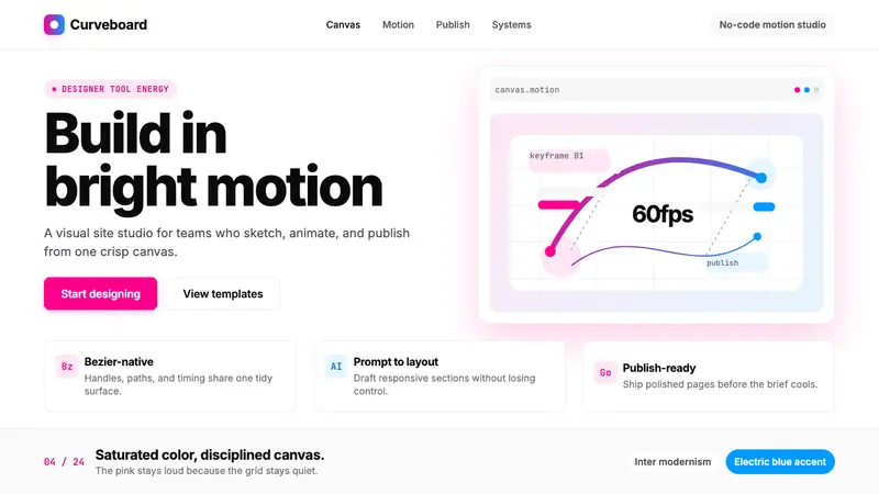 Framer Motion PinkDesigner-tool pink stays sharp. Inter whitespace frames electric blue Bezier motion.