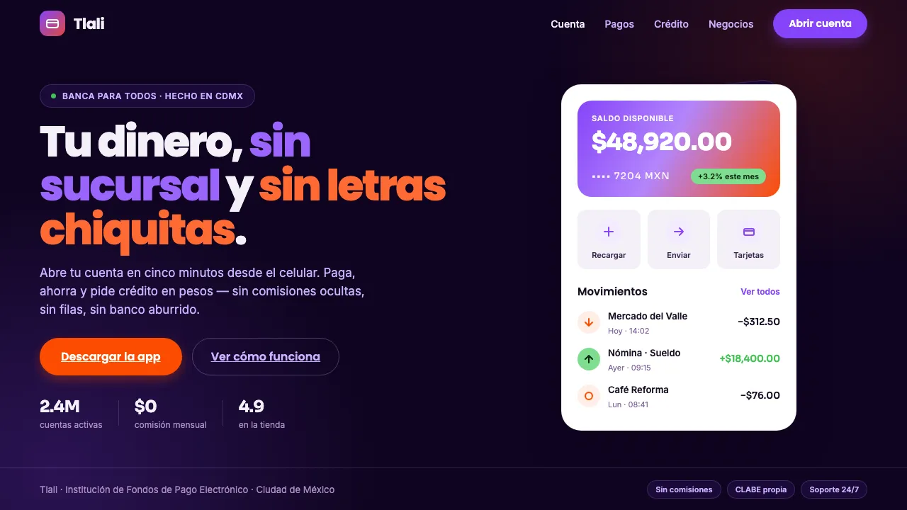
About Mexican Fintech Startup
The Mexican fintech wave of the 2010s — Konfío, Clip, Stori and the Mexico City neobank cohort — built a shared visual language: clean white card UI floating on a deep violet app-hero canvas, with vivid violet and coral accents and a friendly geometric sans. It is the look of a phone screen for borrowing, paying and saving money in Spanish.
Confident, approachable, and unmistakably digital-first, the aesthetic reads as near-black plum ground, white rounded cards, bright violet primary, and a hot-coral CTA — modern Latin American consumer finance, not a stuffy legacy bank.
- Origin
- Mexico (Mexico City fintech ecosystem; broader Latin America)
- Era
- 2010s–now (the 2015–2020 Mexico City neobank / SME-lending boom)
- Key figures
- David Arana (Konfío) · Adolfo Babatz (Clip) · Bin Chen (Stori)
- Movements
- Latin American neobanking · SME digital lending · Mobile-first consumer finance · Friendly-geometric-sans brand design
Mexican Fintech Startup design spec
Colors
Typography
The other 11 sections — buttons, cards, spacing, motion, techniques and more — open once you unlock. Download the DESIGN.md or send it to your AI in one click. Unlock once, yours forever.
Sign up nowStyles similar to Mexican Fintech Startup
Also inspired by brands & products, with a close feel.
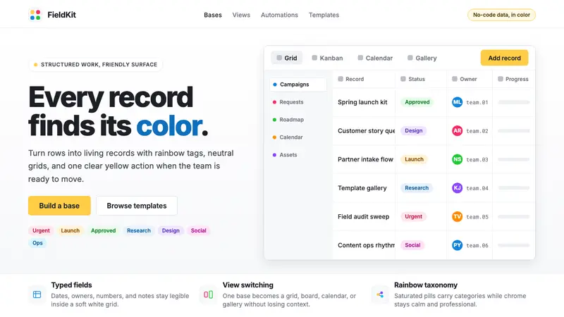 Airtable Spreadsheet-RainbowWork becomes celebratory. Inter grids stay white while rainbow pills and yellow CTAs carry energy.
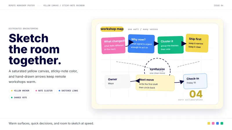 Miro Collab YellowWarm brainstorming in motion. Yellow canvas, sticky-note rainbow, hand-drawn arrows.
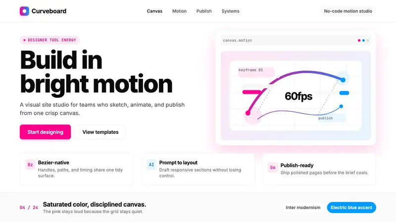 Framer Motion PinkDesigner-tool pink stays sharp. Inter whitespace frames electric blue Bezier motion.
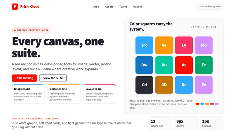 Adobe Creative CloudUnified, not uniform. Red anchor, white space, and saturated app tiles organize the suite.