What is Mexican Fintech Startup?
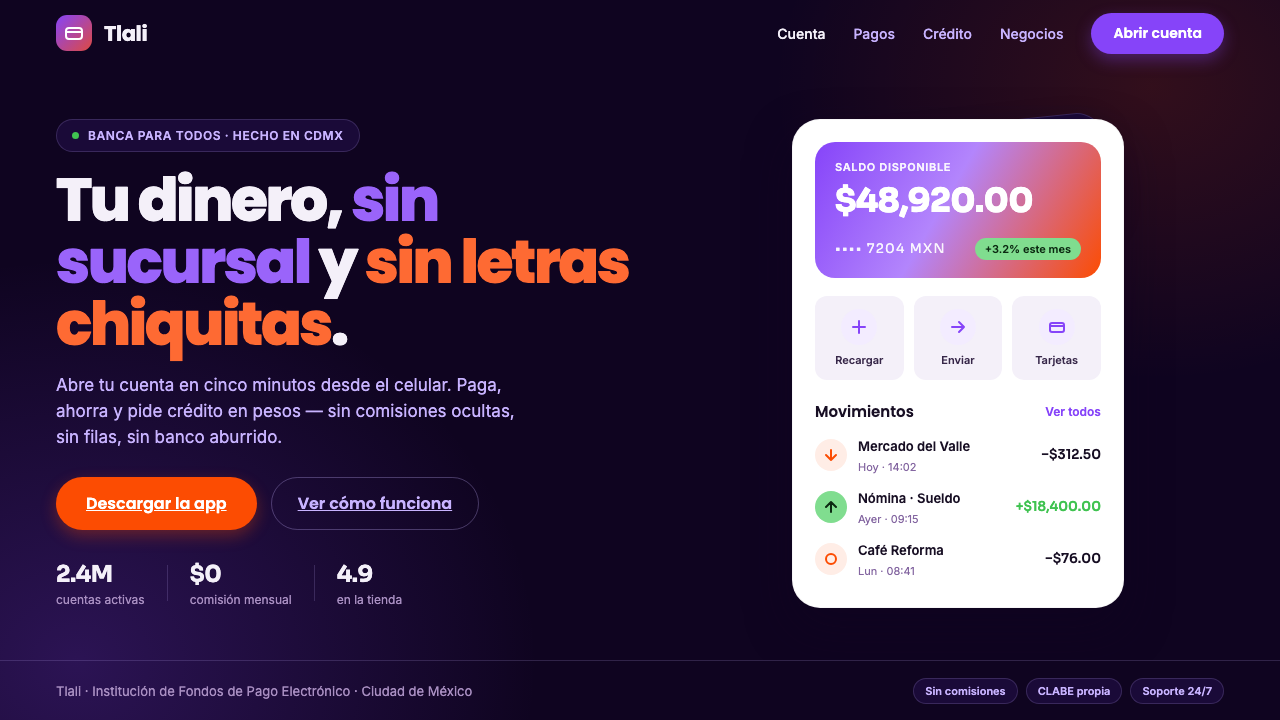
Mexican Fintech Startup turns everyday money into a bright mobile promise: white cards rising from deep plum darkness, violet confidence, and a coral invitation to act.
Mexican Fintech Startup in brief
Mexican Fintech Startup is the visual language associated with the Mexican fintech wave of the 2010s: Konfío, Clip, Stori, and a broader Mexico City cohort of digital lenders, payment businesses, and neobanks. It presents finance as something native to the phone rather than inherited from a branch office. The central image is a clean white interface card floating on a near-black plum field, with vivid violet carrying the brand voice and hot coral marking the decisive next action.
The style is built for people borrowing, paying, and saving in Spanish. Its tone is confident without looking ceremonial, and friendly without becoming casual to the point of losing financial credibility. Large areas of dark color make the product feel focused and digital-first; bright surfaces and rounded forms make individual balances, payment choices, and form steps feel graspable. The result is consumer finance with momentum: modern Latin American, mobile, and visibly separate from the stiffness of a legacy bank.
Visually, contrast does much of the work. The deep plum background creates a theatrical stage for information, while white cards establish calm, legible islands within it. Violet gives the system continuity across navigation, product highlights, and branded moments. Coral appears more selectively, carrying urgency and warmth at the moment a user is asked to continue, request, pay, or confirm. A friendly geometric sans keeps the interface direct and contemporary, so the color drama never overwhelms the practical work of reading numbers and making decisions.
Where does Mexican Fintech Startup come from?
This aesthetic emerged from the Mexican fintech wave of the 2010s and remains tied to the Mexico City fintech ecosystem and the wider Latin American market. Its setting was not traditional institutional banking but a growing field of Latin American neobanking, SME digital lending, and mobile-first consumer finance. That context explains why the style begins with the phone screen: finance is framed as an immediate service people open, understand, and use in the course of ordinary life.
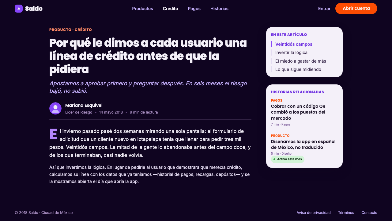
The 2015–2020 Mexico City neobank and SME-lending boom gave this visual language its most recognizable context. Rather than borrowing the visual cues of a long-established bank, the cohort emphasized a fresh digital surface. Deep violet app-hero canvases establish a distinctive branded environment, while white rounded cards hold the practical information that must remain clear: a balance, a payment option, a lending step, or a savings-related choice. The composition makes a product interface feel more like a focused consumer app than a financial document.
The language is also shaped by the need to balance trust and accessibility. Consumer finance must communicate seriousness, but a product designed around a phone cannot feel distant or administrative. Bright violet gives the brand a confident digital signature. Hot coral introduces a human, active counterpoint where attention is needed. Rounded white cards soften the field without making it ornamental, and the geometric sans makes language feel approachable and organized. Together, those choices turn a dark interface into something inviting rather than forbidding.
The style is best understood as a shared regional product-design response, not as a single fixed house style. David Arana of Konfío, Adolfo Babatz of Clip, and Bin Chen of Stori are named figures within the source context, alongside the broader Mexico City cohort. What connects the visual direction is its alignment with mobile-first financial behavior: white card UI, a deep violet ground, vivid accents, and a friendly geometric typographic voice. Its identity comes from the coordinated effect of those parts, especially the contrast between an almost-black setting and an optimistic interface surface.
What defines the Mexican Fintech Startup look?
Dark Plum Stage
The background is near-black plum rather than neutral black. That choice gives the interface a branded night-like depth while preserving the violet family as the emotional center of the system. It makes white surfaces appear luminous and deliberate, and it immediately distances the product from pale, document-like banking screens. The dark field should feel continuous and spacious, not busy with competing decorative layers.
Floating White Cards
White rounded cards are the functional core of the style. They hold information, controls, and transactional choices against the darker hero canvas, making the product feel composed of clear, touchable units. Their roundness should communicate welcome and ease, while their white surface carries the responsibility of legibility. The card is not a generic decoration: it is the visual boundary that turns a complex financial task into a contained step.
Violet Authority
Bright violet is the primary signal of the system. It carries recognition across the app hero, key product moments, and selected interactive emphasis. Against the plum ground it feels related rather than detached; against white it becomes sharp and unmistakably digital. Violet should provide continuity and conviction, not become a blanket that colors every possible element. Its strongest role is to make the product feel unified and confidently native to a screen.
Coral Decision Point
Hot coral is the action color: the visual prompt that says this is the moment to continue. It works especially well when used for a primary call to action because its warmth interrupts the cool violet environment without breaking the system. Coral should remain scarce enough to preserve its force. If it spreads through labels, decorations, and secondary controls, the hierarchy collapses and the decisive action loses its special status.
Friendly Geometric Type
A friendly geometric sans gives the interface its human voice. The lettering should feel clean and contemporary, but not severe or corporate in the legacy-bank sense. It needs enough warmth to support Spanish-language borrowing, paying, and saving flows while remaining orderly around financial figures and choices. Clear scale contrast is more useful than typographic ornament: important amounts, headings, explanations, and supporting labels should each have an obvious role.
Digital-First Contrast
The style depends on a clear separation between environment and task. The dark violet canvas supplies mood and brand presence; the white card supplies the stable place where a user reads and decides. This contrast lets the product feel vivid without sacrificing usability. It is not an attempt to imitate a physical bank, a paper statement, or a formal counter. It is finance designed as an active mobile interaction.
Who shaped Mexican Fintech Startup?
David Arana is listed in the source context with Konfío, placing him within the Mexican fintech wave that helped define this visual direction. In the style narrative, Konfío belongs to the SME digital-lending side of the ecosystem: a context where trust, speed, and clarity must coexist. The resulting visual language favors contained white information surfaces and a confident digital setting over the visual formality associated with legacy banking.
Adolfo Babatz is named with Clip in the source material. Clip sits within the payment-oriented dimension of the Mexico City fintech cohort, where an interface must make action feel direct and understandable. This is reflected in the style's use of visual contrast: dark branded atmosphere for recognition, white cards for practical choices, and a warm coral cue for the point at which a user is asked to move forward.
Bin Chen is identified with Stori in the approved context. Alongside Konfío and Clip, Stori helps establish the style as a language of mobile-first consumer finance rather than a narrow product category. The shared visual lesson is that a financial product can be serious and approachable at once: deep violet can create conviction, rounded white cards can make information feel manageable, and geometric type can keep the experience modern and welcoming.
How do you use Mexican Fintech Startup today?
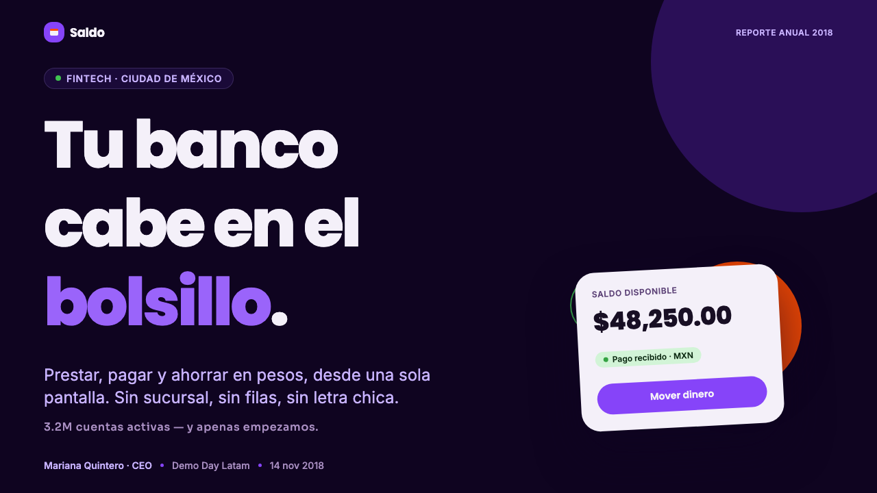
For presentation covers, use the near-black plum field as the dominant environment and introduce a single white rounded card or panel as the focal surface. A concise title in friendly geometric sans can sit directly on the dark canvas or within the card, while violet establishes brand presence and coral is reserved for a small action-oriented highlight. The cover should feel like the opening screen of a financial product: composed, optimistic, and immediately digital rather than like a conventional corporate title page.
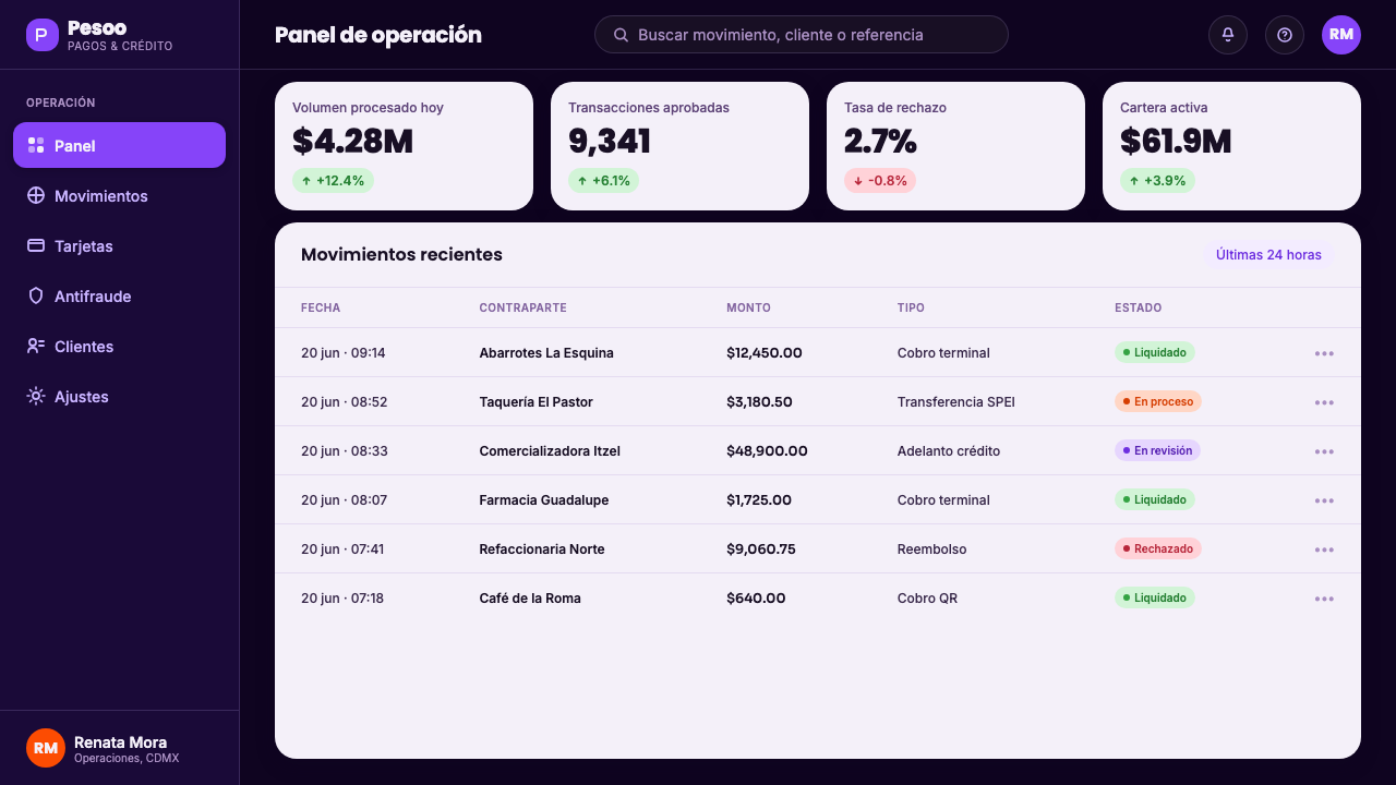
For content slides, treat each white card as a distinct thought, transaction, or explanation. Keep the dark field visible around the cards so the presentation retains its signature depth. Use violet to connect headings, navigation cues, or featured concepts, and let coral identify the one conclusion or next step that deserves urgency. On data slides, charts should remain clear white-card objects with restrained violet series and a selective coral emphasis for the most important change, category, or decision. The data should feel actionable, not merely decorated.
For web interfaces, the style is especially effective for dashboards, lending journeys, payment flows, and savings views. A deep plum app-hero or shell creates a branded frame, while white rounded cards organize balances, progress, offers, and form fields into approachable sections. Make the financial task visually calm inside the card even when the surrounding environment is dramatic. Violet should establish the primary product identity, and coral should be limited to the control that moves a user through the current task.
For pricing pages, editorial pages, and marketing work, use the contrast between a dark branded field and bright white content surfaces to build a memorable rhythm. A marketing story can begin with a confident violet-on-plum moment, then reveal benefits, product explanations, and customer-facing choices in clean cards. Editorial layouts can use the same structure for pull-out facts, summaries, or sign-up prompts. The approach works best when the white areas remain spacious enough to read as useful interface space rather than as decorative boxes.
The most common mistake is to copy the violet, coral, and rounded-card ingredients without preserving their hierarchy. A page crowded with many coral actions, constant violet emphasis, or too many floating cards becomes noisy and loses the reassuring focus that finance requires. Do not make every panel a hero, and do not let the dark background turn into a purely fashionable backdrop. The style succeeds when darkness establishes atmosphere, white establishes clarity, violet establishes identity, and coral identifies the meaningful moment of commitment.
Mexican Fintech Startup — FAQ
Is this style only suitable for a neobank?
No. It is rooted in Latin American neobanking, SME digital lending, payments, and mobile-first consumer finance, but its principles transfer to many financial experiences. It is most useful when a product needs to feel digital-first, approachable, and decisive. The visual system can support a payment feature, a borrowing journey, a savings view, or a finance-related marketing page as long as the white cards still make the task clear and the action hierarchy remains disciplined.
Why use such a dark background for consumer finance?
The near-black plum ground creates a strong branded environment and makes the white interface cards feel bright, distinct, and easy to locate. It signals a product built for a screen rather than a paper-like banking document. The darkness is not meant to make the product feel opaque or intimidating; the white cards counterbalance it by giving every practical decision a calm and legible home. The contrast is what makes the experience feel both confident and approachable.
How should violet and coral divide responsibilities?
Violet is the primary brand signal and should create continuity across the product. It can identify important product areas, featured states, and the overall digital character of the interface. Coral is more specific: it marks the action that matters now. Keeping coral scarce gives it urgency and warmth, while violet carries the larger identity. If both colors are applied everywhere with equal force, neither can tell the user what deserves attention first.
Can the style work for dense dashboards and data?
Yes, provided that the dashboard uses the dark field as a surrounding environment rather than as the place where every detail must be read. White rounded cards should contain the balances, summaries, filters, tables, and charts that demand concentration. Violet can connect related information, while coral should highlight only the exceptional action or result. The key is to let information density live inside clear surfaces instead of placing many competing signals directly on the plum background.
Related design styles
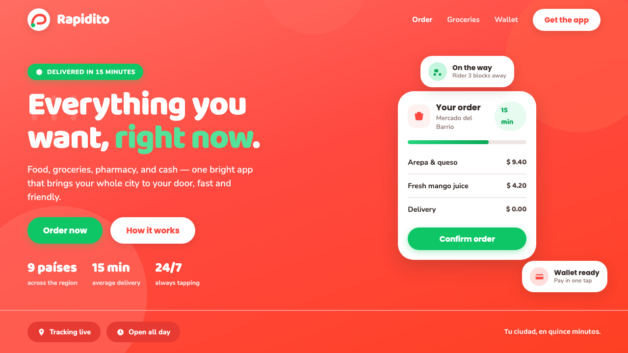 Rappi DeliveryOrdering, made joyful. A hot red-orange wash floods the page; white pill card…
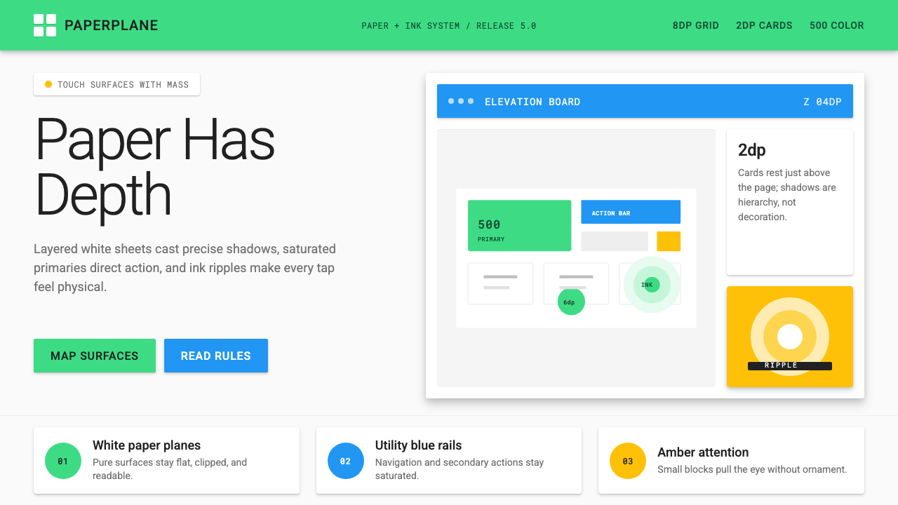 Android Lollipop (Material 1.0)Paper becomes physical. Roboto, green FABs and sharp shadows give white cards…
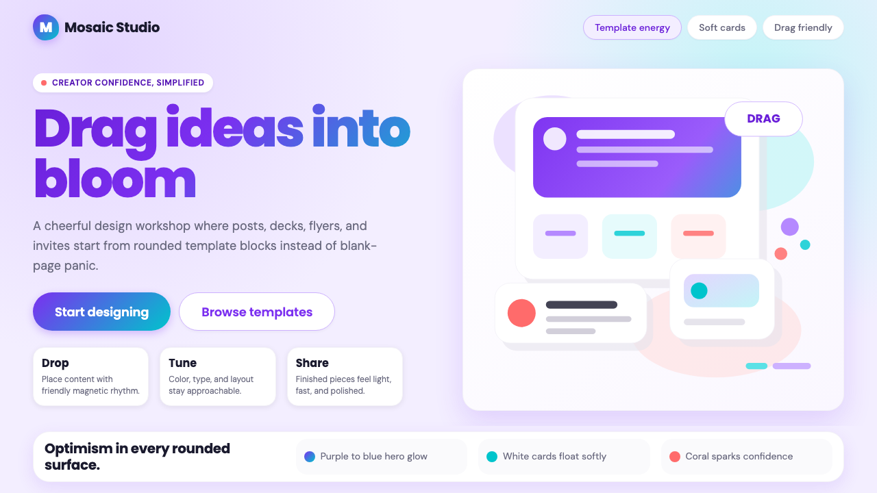 Canva 2024Confidence feels draggable. Purple-blue gradients and floating white template…
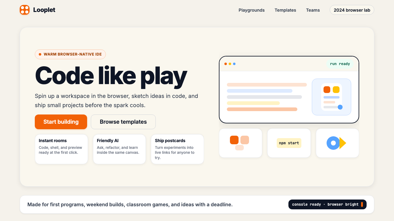 Replit 2024Coding feels warm. Coral buttons, cream panels, rounded code tiles make build…
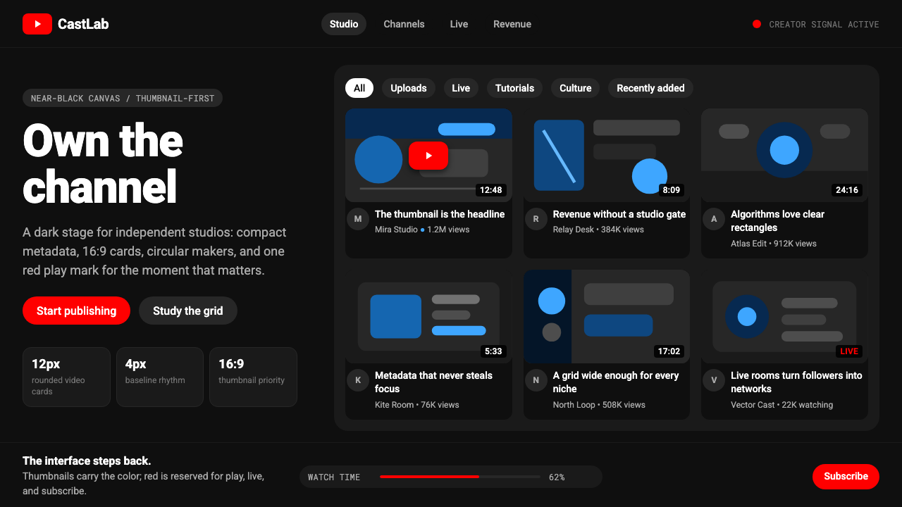 YouTube Creator EconomyThe UI disappears. Near-black Roboto grids let thumbnails shout; red only mea…
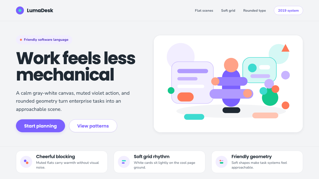 Corporate Memphis (Alegria)Friendly by design. Violet flats and rubber-hose geometry soften the SaaS gri…