What is Rappi Delivery?
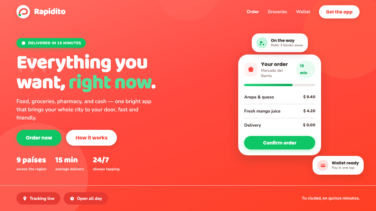
Rappi Delivery turns a routine order into a small burst of momentum: a hot red-orange world, floating white cards, and green invitations that make convenience feel celebratory.
Rappi Delivery in brief
Rappi is a Colombian on-demand super-app, headquartered in Bogotá and built for the fast-moving, many-purpose logic of urban convenience. Its identity is organized around an unmistakable warm red-orange wash: the saturated coral-orange field associated with app splash screens, storefront gradients, and the cheerful Rappitendero mascot. This is not a quiet interface language. It announces itself immediately, then makes room for shopping, food, groceries, cash access, and other everyday requests inside a single familiar environment.
The visual character is loud, friendly, and decisively mobile-first. A broad field of warm color creates the emotional climate; crisp white cards sit above it to make choices, products, and actions legible. Malachite-green calls to action add a contrasting burst of permission and motion, while salmon accents keep the palette warm rather than mechanically oppositional. Rounded geometric sans-serif lettering echoes the buoyant wordmark and makes the whole system feel conversational instead of corporate.
Rappi Delivery is therefore less a historical art movement than a branded service aesthetic: a way of making logistical speed feel generous and socially alive. Its design turns the promise of rapid fulfillment into a visible atmosphere. The red-orange field communicates appetite, urgency, and energy; the white card UI restores clarity; the pill-shaped actions soften the transaction into a tap that feels easy, cheerful, and within reach.
Where does Rappi Delivery come from?
Rappi was founded in 2015 in Colombia, with Bogotá as its headquarters, during the rise of on-demand delivery and super-app services across Latin America. The setting matters because the product idea is inherently expansive. Rather than presenting one narrowly bounded task, the service is associated with a cluster of practical city needs: ordering food, getting groceries, accessing cash, and solving an immediate errand from a phone. Its visual language needed to hold that breadth together without making the service feel fragmented.
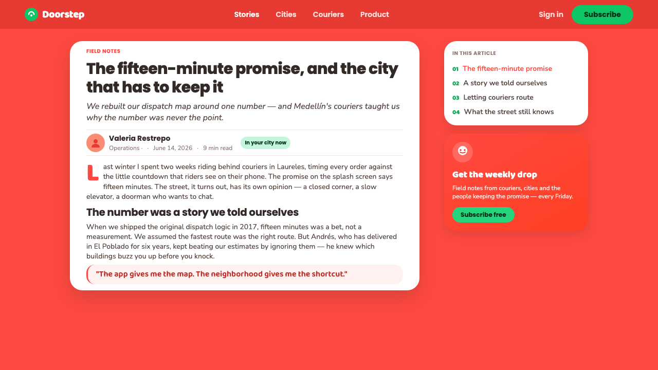
The current visual period is associated with the years from roughly 2017 through 2024, when the Latin American super-app boom made speed, availability, and mobile convenience central public promises. Rappi’s hot coral-orange brand wash gives that promise a memorable emotional form. It can stretch across a splash screen, a storefront-like surface, or a gradient-rich brand moment without losing recognition. Against it, white cards behave as islands of utility: places where the user can pause, scan, choose, and continue.
The supplied identity links this look to playful mascot branding and to the Rappitendero figure. The mascot is important because it gives an otherwise abstract delivery network a buoyant, human-facing presence. Instead of making rapid fulfillment appear invisible or purely technical, the system gives it an expressive companion. Rounded type, bouncy forms, and friendly pill-shaped controls continue that same gesture through the interface, making speed seem approachable rather than demanding.
Simón Borrero, Sebastián Mejía, and Felipe Villamarín are the named key figures associated with Rappi’s origin. Within the public design story, their significance lies in the platform they helped establish: a Colombian service that grew into a pan–Latin American super-app context. The identity that emerged around it does not depend on restrained luxury or neutral efficiency. It adopts warmth, saturation, and play as useful signals for a service meant to be recognized quickly and used often.
What defines the Rappi Delivery look?
Red-Orange Brand Wash
The dominant field is a saturated, hot coral-orange that behaves less like a small accent and more like a surrounding environment. It fills the first impression with appetite, heat, and immediacy. Because it is so assertive, it should carry the emotional opening of a screen or campaign rather than compete with every piece of information inside it. The color works best as a broad invitation, then yields to white surfaces where decisions need to be made.
White Card Clarity
Crisp white card UI is the system’s practical counterweight to the warm brand field. Cards create clear zones for products, categories, order details, and utility without cooling the overall mood. Their separation should feel clean and buoyant, as though useful information has been lifted above the color beneath it. The result is a service interface that can remain dense with options while still reading as approachable.
Green Permission
Malachite green provides the most decisive contrast in the identity, especially for calls to action. Against the red-orange environment, green feels like a lively signal that something can happen now: continue, choose, request, or complete. Its role is not decorative variety. It is a behavioral cue, so it should be concentrated around the actions that matter most and allowed to remain visually special.
Rounded Geometric Type
The typography is a rounded geometric sans-serif language aligned with the cheerful wordmark. It replaces formality with ease: letters appear open, compact, and comfortable inside mobile surfaces. Hierarchy should come from confident changes in scale, grouping, and placement, not from ornamental letter treatment. The type needs to feel quick to scan and pleasant to return to, matching an app used for repeated everyday decisions.
Pill-Shaped Motion Cues
Pill-shaped controls make interaction look soft, direct, and low-friction. Their rounded ends echo the friendly character of the wordmark and mascot while avoiding the severity of sharp rectangular controls. In this style, a primary action should feel like an invitation rather than a command. The form is especially effective when paired with short, plain language that tells the user exactly what will happen next.
Warm Accent Family
Salmon accents keep the visual system internally warm. They can soften transitions between the dominant red-orange field, white information cards, and green action signals, adding variety without breaking the identity into unrelated colors. These accents should support emphasis, illustration, or secondary states rather than rival the brand wash. The palette remains strongest when every hue has a clear emotional and functional reason to appear.
Mascot-Level Playfulness
The Rappitendero mascot establishes a bouncy, expressive benchmark for the whole identity. Even when the mascot is absent, surfaces should retain that sense of friendly movement through rounded geometry, lively contrast, and a willingness to be visibly cheerful. This is not childish decoration. It is a service cue: the app acknowledges that errands can be tedious, then designs the moment of ordering to feel lighter and more social.
Who shaped Rappi Delivery?
Borrero is one of the key figures named in Rappi’s origin story. His association with the 2015 founding places him within the creation of a Colombian service that developed in the wider pan–Latin American super-app context. In the design narrative, that platform context matters because the identity must make many types of everyday convenience feel like parts of one coherent, immediately recognizable experience.
Mejía is another named key figure associated with Rappi’s founding. The public material positions the company at the intersection of on-demand delivery, mobile-first convenience, and Latin American super-app growth. That intersection helps explain the identity’s directness: a service with many possible requests benefits from a visual language that is emotionally memorable at entry and structurally clear once the user begins choosing.
Villamarín is listed among the key figures of Rappi’s origin. The resulting brand is notable for treating convenience as a visible emotional proposition rather than an invisible back-end claim. Its coral-orange field, white cards, green actions, rounded type, and mascot-led tone together frame fast service as something warm, accessible, and enjoyable to use repeatedly.
How do you use Rappi Delivery today?
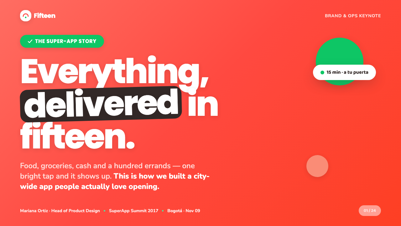
For presentation slides, use the Rappi Delivery approach to make a consumer-service story feel immediate. A cover can open on a generous coral-orange field, with a short rounded headline and a single white card or friendly graphic as the focal point. Keep the composition optimistic and direct. On content slides, let white card-like regions hold the real information while the warm background remains visible as the surrounding brand atmosphere. This avoids turning a lively identity into an exhausting wall of color.
Data slides benefit from treating the palette as a system of meaning rather than a decorative assortment. Let the dominant warm field establish the frame, use white for tables or explanation areas, and reserve green for the metric, outcome, or decision that needs the strongest action-oriented emphasis. Salmon can distinguish a supporting comparison or secondary category. The important thing is to preserve a clear reading path: the audience should sense energy first, then understand the information without hunting through competing highlights.
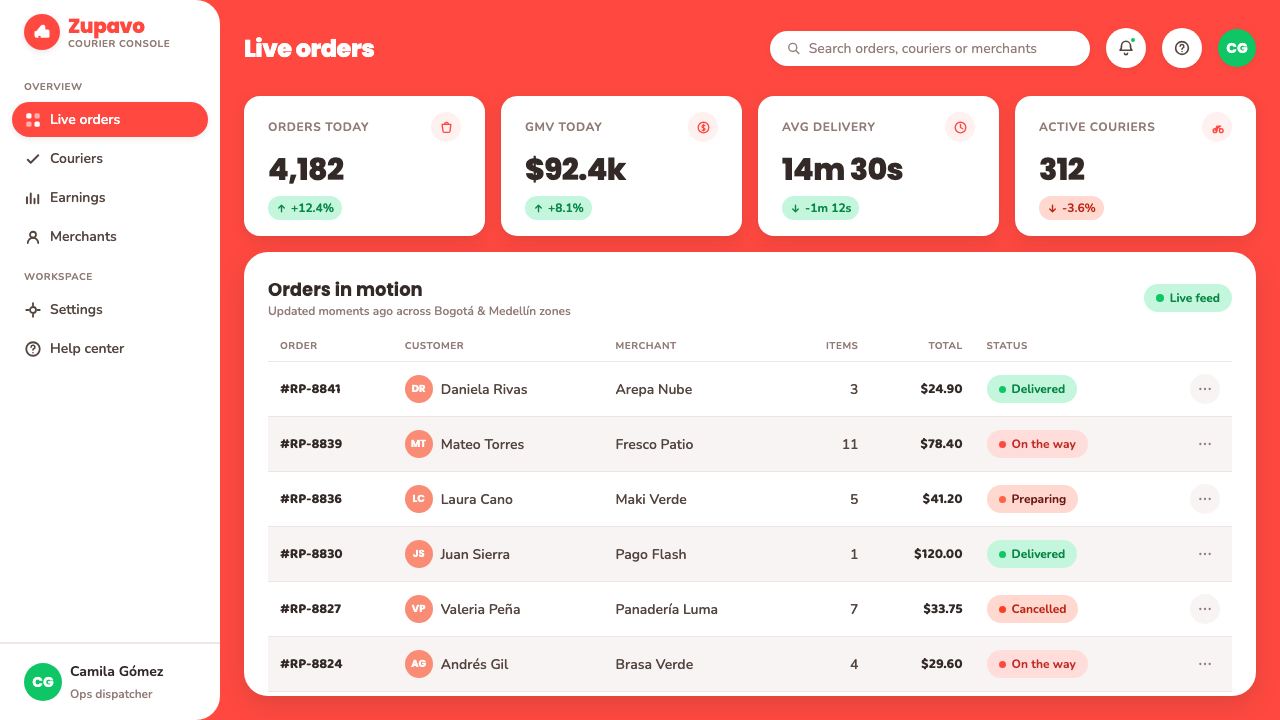
For web interfaces, the style is particularly suited to consumer dashboards, order flows, marketplace entry points, and pricing or membership pages that need to feel fast and welcoming. Use the red-orange wash for high-recognition landing moments, then introduce white cards for categories, progress, offers, and order details. Green pill actions should mark the clearest route forward. Rounded geometric type and compact, friendly labels help a dense mobile-first service remain easy to scan without losing personality.
For editorial and marketing work, Rappi Delivery supports announcements that need appetite, warmth, and instant visibility. A campaign page can alternate broad red-orange sections with calm white information areas, using salmon to keep transitions warm and green to concentrate the invitation to act. Photography or product imagery, if present, should feel integrated into the energetic service moment rather than staged as distant luxury. The overall voice should be plain, encouraging, and practical: this is about making an everyday need easier right now.
A common mistake is to treat this style as a simple recipe of red-orange background plus green buttons. That imitation misses the balance that makes the system work. If every area is saturated, every card is rounded, and every action is green, nothing feels urgent or easy to choose. The real logic is contrast between mood and utility: the warm wash supplies excitement, white surfaces supply clarity, green supplies permission, and the playful forms make the service feel human. Keep each role distinct.
Rappi Delivery — FAQ
Is Rappi Delivery only a food-delivery visual style?
No. Food is part of the atmosphere because the identity is warm, appetizing, and immediate, but the source material frames Rappi as an on-demand super-app. The style can extend to groceries, cash access, marketplace choices, and other everyday requests. Its transferable idea is not food imagery; it is the combination of broad energetic branding and clear card-based utility for a service that helps users act quickly.
Why does the green action color work against the red-orange field?
It creates a clear emotional and functional contrast. The red-orange wash supplies heat, appetite, and brand recognition; malachite green signals the moment when the user can proceed. Because the two colors have distinct jobs, the interface can feel lively without becoming ambiguous. The green should remain selective. Its power comes from marking the actions that deserve an immediate response, not from appearing everywhere.
Can this style work with a restrained content-heavy dashboard?
Yes, if the energetic brand layer and the information layer are separated. Use the warm red-orange field for entry points, navigation moments, campaign areas, or high-level status; let white cards contain the detailed choices, lists, and order information. Rounded typography and clear green actions can preserve the tone without forcing every data area to become visually loud. The design succeeds when it feels fast and friendly while the information remains calm enough to scan.
What role does the Rappitendero mascot play when it is not shown?
It remains a tonal reference. The mascot establishes that the brand can be visibly cheerful, bouncy, and personable. Designers can carry that quality forward through rounded geometry, warm contrast, short encouraging copy, and controls that look inviting rather than severe. The goal is not to scatter mascot-like decoration through every screen. It is to preserve the feeling that a practical service can still have a friendly face.
What is the most common way to make a Rappi-inspired design feel inauthentic?
The usual failure is overusing every recognizable ingredient at once. A saturated red-orange surface, green buttons, salmon accents, white cards, rounded type, and playful graphics all need hierarchy. If each one demands equal attention, the interface becomes noisy and the promise of convenient action disappears. Start with the service moment you need to emphasize, then assign the warm field, white card, green action, and supporting accent their separate roles.
Related design styles
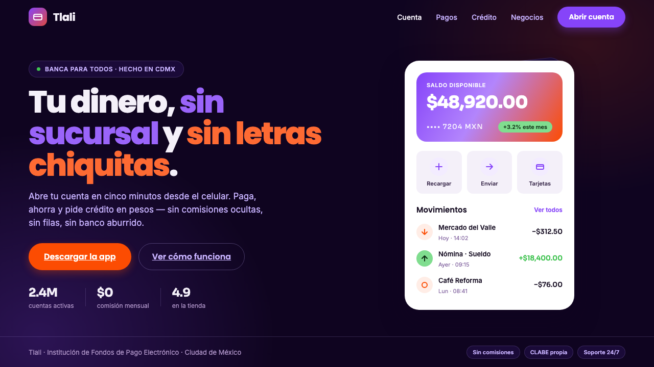 Mexican Fintech StartupNeobank, not legacy bank. White rounded cards float on near-black plum, lit b…
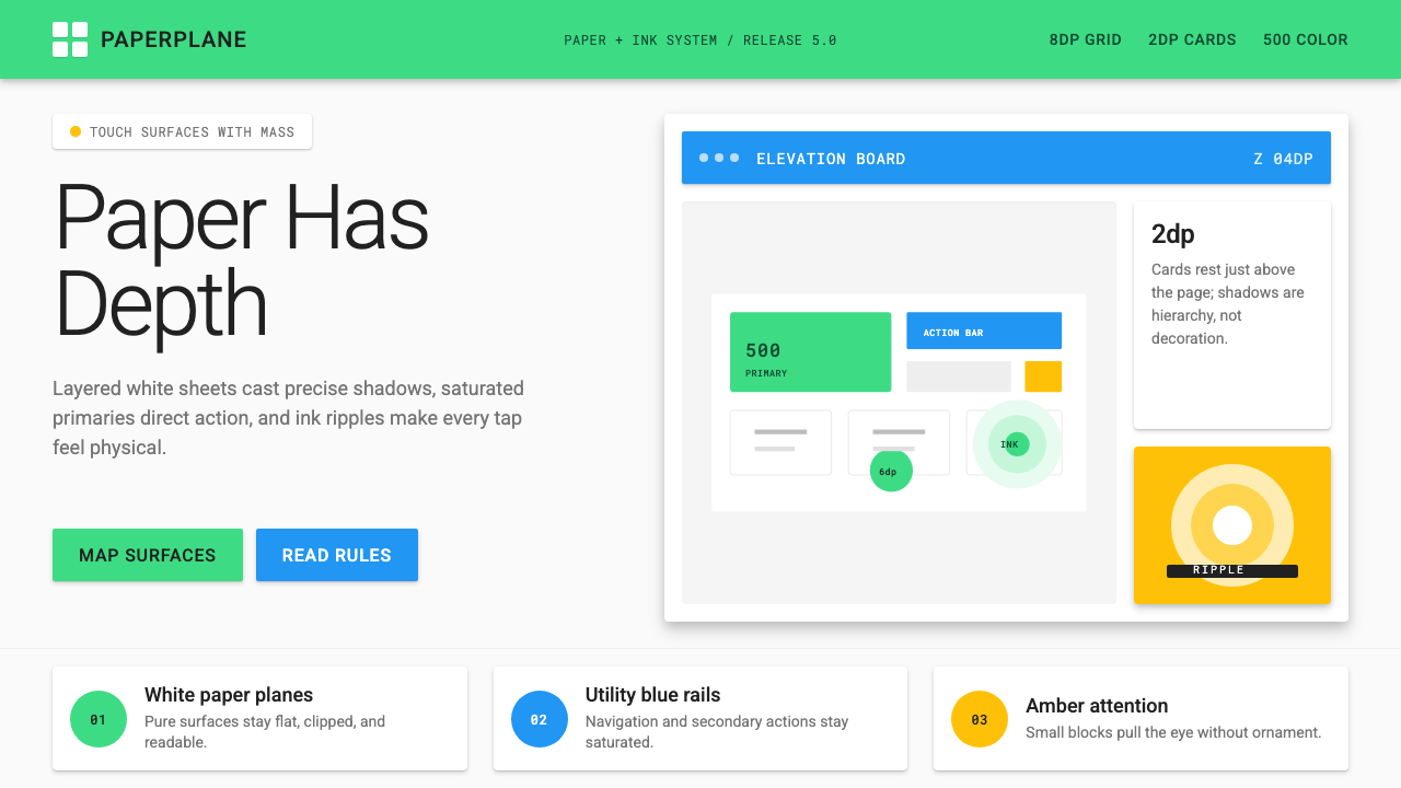 Android Lollipop (Material 1.0)Paper becomes physical. Roboto, green FABs and sharp shadows give white cards…
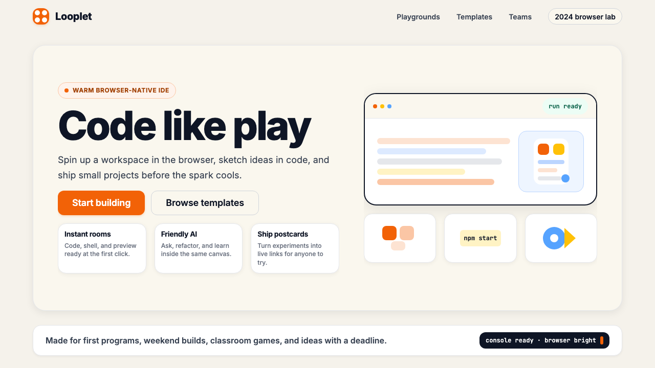 Replit 2024Coding feels warm. Coral buttons, cream panels, rounded code tiles make build…
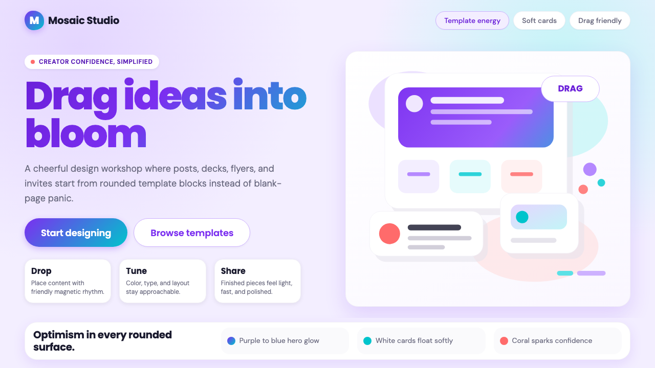 Canva 2024Confidence feels draggable. Purple-blue gradients and floating white template…
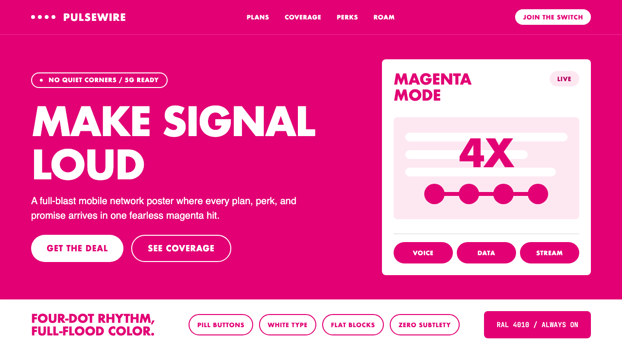 T-Mobile MagentaSaturation owns the frame. Magenta flood, white type, pill CTAs, four-dot rhy…
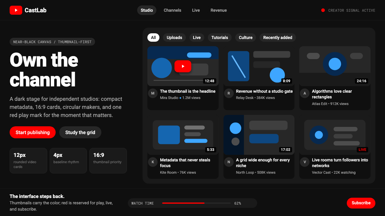 YouTube Creator EconomyThe UI disappears. Near-black Roboto grids let thumbnails shout; red only mea…