What is Snapchat?
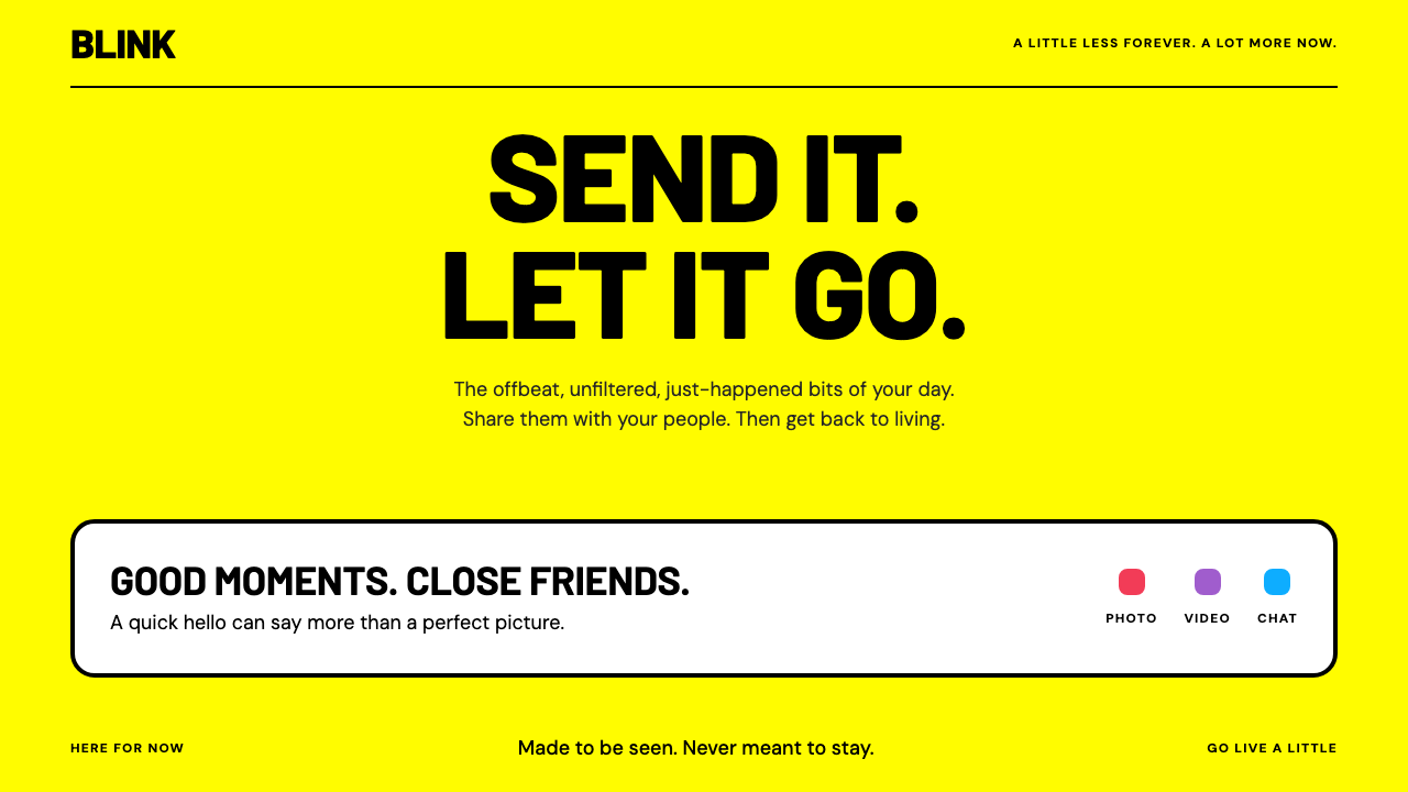
Snapchat's style treats yellow as the ground, not the highlight: loud black capitals, white cards with heavy edges, and a small ghost that has barely changed since 2011.
Snapchat in brief
Snapchat's visual style is built on a full field of bright yellow, often called Snap Yellow, with a white ghost outlined in black at its centre. That square of yellow and the ghost appear on the app icon, the launch screen and the Snapcode used to add friends. The identity is so consistent that it has hardly moved in over a decade.
The system turns this identity into a whole interface language. Yellow is the background rather than an accent. Black, all-capital Barlow headings sit directly on it. White cards float above with thick black edges, and three message colours, red, purple and blue, tell users what kind of snap is waiting for them. It is bright, brief and unapologetic, and it makes the present moment the centre of attention.
The app itself reinforces the look. It opens directly onto the camera, with no feed to scroll and no public counts of likes. Content is meant to be seen and then gone. The visual style mirrors that attitude: direct, high-contrast and impatient with decoration, as if each screen were a quick message and not a document to be archived.

Where does Snapchat come from?
Snapchat began in 2011 as a project among students at Stanford University in California. Evan Spiegel and Bobby Murphy are widely credited as co-founders, and Reggie Brown is the third name connected to the early work. The idea was simple and, at the time, unusual: send a photo that disappears after a few seconds. The first version was called Picaboo, and in September 2011 it was renamed Snapchat. The company later settled in Venice, in Los Angeles, which is why its story is tied to both Stanford and the Los Angeles coast.
At a moment when social networks were built around permanent profiles, archives and public approval, the idea of ephemeral messaging was a deliberate contrast. It treated conversation as something closer to speaking than to publishing. This attitude is the root of the brand's tone: informal, playful, immediate. It also made camera-first design a natural choice. Instead of a news feed, the first screen is a viewfinder, and everything else is reached by swiping away from it.
In 2013 Snapchat introduced Stories, a format in which a sequence of snaps remains viewable for a day. The format became one of the most influential interface ideas of the decade and was later adopted by many other platforms. Alongside it came AR lenses, which use the camera to place playful effects on faces and surroundings. Both are part of the wider movement of ephemeral messaging, camera-first mobile apps, and the Stories and lens formats that made the camera the home screen.
Through all of this, the yellow-ghost identity remained remarkably stable and is still current through 2025. Its constancy is a design lesson. While competitors rebranded frequently, Snapchat kept a single block of colour and one simple mascot, and let them carry recognition on a small phone screen. The visual style described here extracts the logic of that identity and extends it from an icon to a full set of typography, cards, buttons and colour roles.
What defines the Snapchat look?
Full-field yellow
A single saturated, warm yellow fills the whole background rather than appearing as a stripe or button. It is the first thing the eye registers and the colour most associated with the brand. Because it is both bright and warm, it feels friendly and urgent at the same time, which suits a product about the present moment.
Loud black Barlow capitals
Headings are set in heavy black capitals in Barlow, a sturdy, slightly condensed sans with a friendly, industrial character. Black on yellow gives the strongest legible contrast available, so titles read instantly even at a glance. Capitals and tight phrasing give the screen a shouted, poster-like energy.
White cards with thick black edges
Content sits on white cards bordered by a thick black line, sometimes with a hard offset shadow. The border draws a clear boundary against the yellow and gives the cards a sticker-like, tactile quality. There are no soft gradients and no blurred shadows, so each card feels like a flat object laid on the page.
Message colours
Red, purple and blue serve as functional signals that identify the type of snap or message waiting: one for photos, one for video or chat, one for another category. They are used in small doses, as dots, icons and labels, so they never compete with the yellow. This is colour as a quick code, learned through repeated use.
The ghost mascot
A white ghost with a black outline is the one illustrative element of the identity, used as a logo, an avatar placeholder, a loading mark and an empty-state figure. It is drawn with a simple, rounded, slightly cheeky silhouette. Because it is so simple, it can be placed on any page without clutter.
Direct, camera-first layout
Screens are arranged around one dominant action, usually capturing or sending, with few competing elements. Navigation is gestural, with swipes between camera, chat and stories, so persistent menus are minimal. Large tap targets and plenty of contrast make the layout feel quick and forgiving.
Short, informal voice
Copy is brief, lowercase or capitalised for emphasis, and conversational. Buttons say what they do in a word or two. The voice is playful without being childish, and it treats the user as a friend rather than a customer.

Who shaped Snapchat?
Co-founder of Snapchat and the person most closely associated with its product vision and its camera-first design philosophy.
Co-founder of Snapchat, associated with the engineering and technical foundations of the app.
A name connected with the earliest work on the idea in 2011, when the app was still known as Picaboo.
How do you use Snapchat today?
In slides, Snapchat's style is a gift for youth-oriented brands, social campaigns, creative pitches and any talk that wants energy. A cover can be a full yellow slide with a huge black capitalised title and one small ghost-like mark. Content slides can use white cards with thick black borders, one idea per card, set on the yellow. For data slides, use bold black numbers and chunky bars, and use the message colours sparingly as category codes.
On the web, it suits campaign sites, event pages, creator and youth products, sign-up flows and playful landing pages. Make hero sections a field of yellow with a short black headline and one prominent button. Keep forms short, use large tap targets, and show confirmation states with the same heavy black outlines. Pricing and feature pages can use a row of white bordered cards, with the recommended option shown by an offset shadow rather than a new colour.
For editorial and marketing work, the style speaks in short, punchy bursts: announcements, social posts, stickers, posters and campaign graphics. Pair a single large phrase with a small mascot-like illustration and a lot of yellow. It communicates immediacy and a lack of pretension. It is not well suited to long, serious reading, financial or legal content, or any situation where a calm, formal tone is needed.
To adapt it, keep three things: one dominant colour as the ground, heavy black type directly on it, and bordered white cards for content. Then choose your own mascot or mark. If yellow does not belong to your brand, the structure still works with another bold colour, though the sense of warmth will change.
A common mistake is to use yellow only as an accent on a white page, which gives up the whole idea of colour as ground. Another is to put light grey text on yellow, which fails on contrast. A third is to soften the cards with gradients or blur, losing the sticker-like crispness. A fourth is to add many message colours, so that they stop meaning anything. Keep the ground bold, the type black and the card edges thick.

Snapchat — FAQ
Why is Snapchat yellow?
Snap Yellow is the colour of the brand's identity: a square of yellow with a white, black-outlined ghost at its centre, used on the app icon, the launch screen and the Snapcode. It has stayed essentially the same for over a decade, which is why it is so recognisable on a small phone screen.
What was Snapchat originally called?
It launched in 2011 as Picaboo, a project connected to Stanford students, and was renamed Snapchat in September 2011. Stories arrived in 2013 and AR lenses followed, but the yellow-ghost identity continued unchanged.
What is the typeface in this style?
Headings are set in heavy black capitals in Barlow, a sturdy and slightly condensed sans-serif. Its friendly, industrial feel works well on a bold yellow ground, and capitals give the layout a poster-like energy.
What do the red, purple and blue colours mean?
They are message colours that mark the type of snap waiting for you, such as photos, video or chat. They are used in small amounts, as dots and labels, so they act as codes and never compete with the yellow background.
Can I use this style without the ghost mascot?
Yes. The structure is a full-field colour ground, heavy black capitals and bordered white cards, and it works with any simple mascot or mark of your own. Keep the shape simple and the outline bold so that it reads at small sizes.
Related design styles
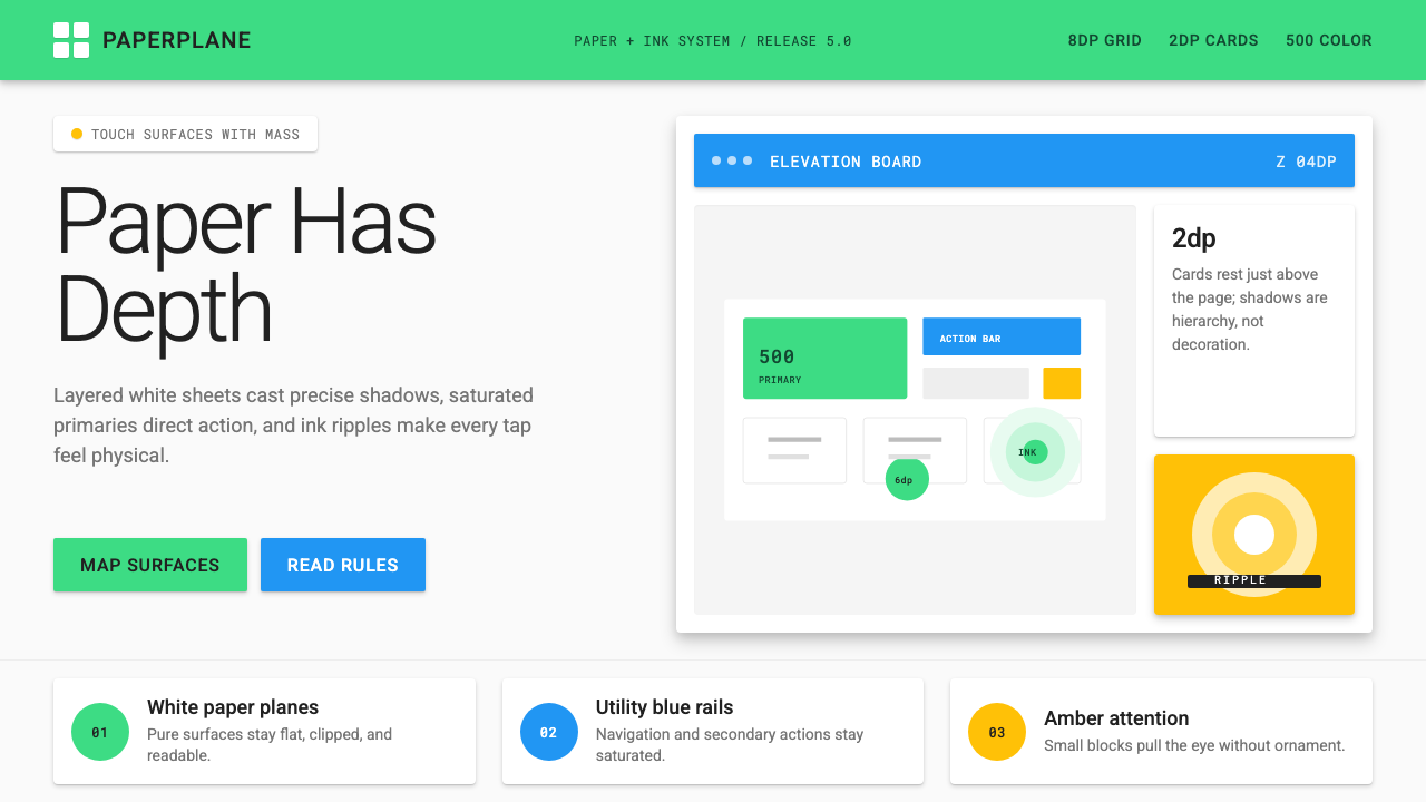 Android Lollipop (Material 1.0)Paper becomes physical. Roboto, green FABs and sharp shadows give white cards…
 Rappi DeliveryOrdering, made joyful. A hot red-orange wash floods the page; white pill card…
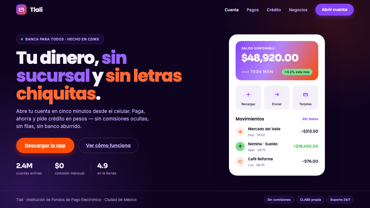 Mexican Fintech StartupNeobank, not legacy bank. White rounded cards float on near-black plum, lit b…
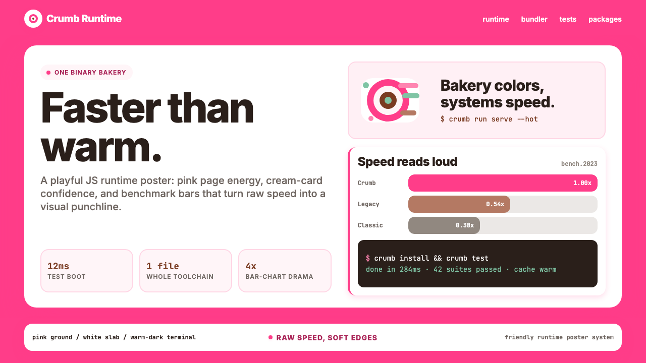 Bun JS Runtime Pink 2023Dev speed gets bakery-bright. Hot pink grounds white slabs, mono bars, and wa…
 Discord 2024Blurple cozy. Charcoal grounds, illustrated characters — every surface says '…
 Discord Blurple Server (2020)Midnight server energy. Blurple panels, fuchsia pings, and green status dots…