What is T-Mobile Magenta?什么是 T-Mobile Magenta?
T-Mobile turned a single shade of pink-red into a trademarked territorial claim — and then used it to conquer the American wireless market.T-Mobile 将一种粉红色调升级为注册商标,再以这枚色彩武器席卷美国无线通信市场。
T-Mobile Magenta in briefT-Mobile Magenta 速览
T-Mobile Magenta is one of the most aggressive chromatic identities in contemporary brand design: a vivid, high-energy pink-leaning red that saturates every surface it touches. Unlike most corporate color systems that pair a signature hue with a wide supporting palette, Magenta operates as a near-monocolor system — the hue itself is the message. White type, white icons, and white negative space are its only permitted companions at full intensity, creating a contrast so stark it reads across any medium, from billboard to smartphone notification badge.T-Mobile 品红是当代品牌设计中最具攻击性的色彩体系之一:一种充满能量、偏向粉红的红色,所到之处皆被饱和。与大多数企业色彩系统将主色配合宽泛辅助色系使用的做法不同,品红体系近乎单色运作——色相本身即是信息。白色文字、白色图标与白色留白是它在高强度状态下唯一允许的伴侣,形成一种在任何媒介上——从广告牌到手机通知图标——都清晰可辨的极致对比。
The system's visual logic is built around saturation dominance. Where most brands reserve their hero color for accents and calls to action, T-Mobile inverts the convention: Magenta floods the entire canvas — hero sections, navigation bars, physical store facades, employee uniforms, device packaging — and leaves white to perform the functional roles of type and spacing. The effect is simultaneously unmistakable and, for competitors, unreplicable: the shade has been actively defended through trademark litigation across multiple countries, making it one of the few colors in commercial history to be legally owned in a specific industry context.这套系统的视觉逻辑建立在饱和度主导之上。大多数品牌将主色保留用于点缀与行动号召,T-Mobile 则颠倒了这一惯例:品红漫溢整张画布——英雄区块、导航栏、实体门店外立面、员工制服、设备包装——让白色承担文字与间距的功能性角色。效果既无可辨认,又令竞争对手无从复制:这一色调已在多个国家通过商标诉讼获得积极保护,使其成为商业史上为数不多地在特定行业语境中被法律认定为专属财产的色彩之一。
Visually, the design system pairs this chromatic dominance with a small set of sharp geometric elements: pill-shaped button forms, clean sans-serif type at confident weights, and a recurring four-dot motif that functions as both pattern element and brand rhythm. The combination produces an aesthetic that reads as bold, accessible, and slightly irreverent — qualities that mapped precisely onto the brand's positioning as a disruptive challenger in a market dominated by more sober corporate blues and reds.在视觉上,该设计系统将这种色彩霸权与一组简洁的几何元素相结合:胶囊形按钮、自信字重的干净无衬线字体,以及作为图案元素和品牌节奏双重角色的四点图案。这种组合产生了一种大胆、易亲近又略带不羁的美学气质——这些品质恰好精准对应了品牌作为颠覆者的市场定位,在被更沉稳的企业蓝与红主导的赛道中脱颖而出。
See the T-Mobile Magenta design system查看 T-Mobile Magenta 完整设计系统
Where does T-Mobile Magenta come from?T-Mobile Magenta 从何而来?
The story of T-Mobile Magenta begins in Bonn, Germany, not in Bellevue, Washington. Deutsche Telekom — T-Mobile's parent company — was founded in 1990 as Germany's state-owned telecommunications monopoly was privatized following reunification. The company needed a visual identity capable of embodying both institutional solidity and the dynamism of a newly liberalized market. In 1996, the brand consultancy Wolff Olins was commissioned to develop a new corporate identity, and the result was a magenta — specifically a vivid pink-red registered under the German RAL color system — that would become one of the most recognized brand colors on earth.T-Mobile 品红的故事起源于德国波恩,而非华盛顿州贝尔维尤。T-Mobile 的母公司德国电信成立于 1990 年,彼时德国统一后国有电信垄断体制走向私有化。这家公司需要一套视觉识别系统,既能体现机构的稳重,又能展现新自由化市场的活力。1996 年,品牌咨询公司 Wolff Olins 受托打造全新企业形象,成果是一种品红色——具体是依德国 RAL 色彩体系注册的一种鲜艳粉红红——它此后成为地球上最具辨识度的品牌色之一。
The choice of magenta was neither arbitrary nor purely aesthetic. Magenta sat outside the conventional telecom palette of the mid-1990s, which leaned heavily on corporate blues, greens, and neutral grays. By choosing a color associated with energy, visibility, and a certain deliberate loudness, Deutsche Telekom staked a claim to difference in a sector historically characterized by conservative institutional design. The color was trademarked not as a logo but as a standalone hue — making it illegal for other telecommunications companies in Germany and later across the European Union to use the same shade in their branding. This legal protection became a competitive asset: as the brand expanded into new markets through the T-Mobile subsidiary, the color arrived with enforceable exclusivity.选择品红既非随意,也非纯粹出于美学考量。1990 年代中期的电信色系普遍偏向企业蓝、绿和中性灰,品红处于这一传统色谱之外。通过选择一种与能量、视觉冲击力和刻意张扬相关联的色彩,德国电信在一个历来以保守机构设计著称的行业中宣告了与众不同。这一色彩不是作为标志而被注册,而是作为独立色相被保护——这意味着德国乃至后来整个欧盟的其他电信公司在品牌中使用同一色调均属违法。这项法律保护成为竞争资产:随着品牌通过 T-Mobile 子公司扩展至新市场,品红色带着可执行的专属权抵达每一处落脚点。
The American chapter of the story accelerated dramatically under the leadership of CEO John Legere, who took charge of T-Mobile USA in 2012. At that point, the carrier was a distant third or fourth in the American market, hemorrhaging subscribers to AT&T and Verizon. Legere's response was the "Un-carrier" strategy, launched in 2013: a series of moves designed to eliminate the industry's most despised consumer pain points — annual contracts, international roaming charges, data throttling — while simultaneously adopting a brand voice that was deliberately combative, irreverent, and loud. Magenta became the visual emblem of this strategy, and the brand leaned further into chromatic dominance: full-bleed magenta advertising, magenta-painted store interiors, magenta-dyed corporate culture.这个故事的美国篇章在 CEO John Legere 的领导下急剧提速。他于 2012 年接掌 T-Mobile USA 时,这家运营商在美国市场排名第三或第四,持续向 AT&T 和 Verizon 失血。Legere 的回应是 2013 年推出的「Un-carrier」战略:一系列旨在消除业内最令消费者厌恶的痛点的举措——年度合同、国际漫游费、数据降速——同时刻意采用一种对抗性、不羁且高调的品牌声音。品红成为这一战略的视觉徽章,品牌在色彩主导上愈发激进:满版品红广告、品红涂装的门店内部、品红渗透的企业文化。
The acquisition of Sprint in 2020 — completed after years of regulatory battles — transformed T-Mobile into the second-largest wireless carrier in the United States and gave the brand a new phase of visual consolidation. The combined company unified under the Magenta identity, retiring Sprint's yellow and accelerating the rollout of T-Mobile's chromatic system across thousands of additional retail locations. By the mid-2020s, Magenta had transcended mere brand color to become a cultural shorthand for disruption in the American wireless industry, its loudness now read not as brash upstart energy but as the confidence of market leadership.2020 年完成的对 Sprint 的收购——历经多年监管博弈——将 T-Mobile 变为美国第二大无线运营商,并开启了品牌视觉整合的新阶段。合并后的公司统一在品红旗帜下,退役了 Sprint 的黄色,加速将 T-Mobile 色彩系统铺开至数千个新零售门店。到 2020 年代中期,品红已超越单纯品牌色的范畴,成为美国无线行业颠覆创新的文化代名词——它的张扬不再被读解为莽撞新贵的气焰,而是市场领导者的自信。
What defines the T-Mobile Magenta look?T-Mobile Magenta 的视觉特征是什么?
Chromatic Dominance色彩霸权
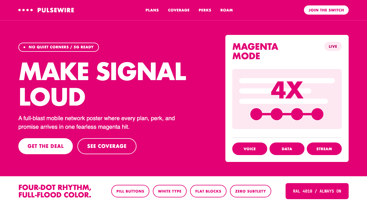
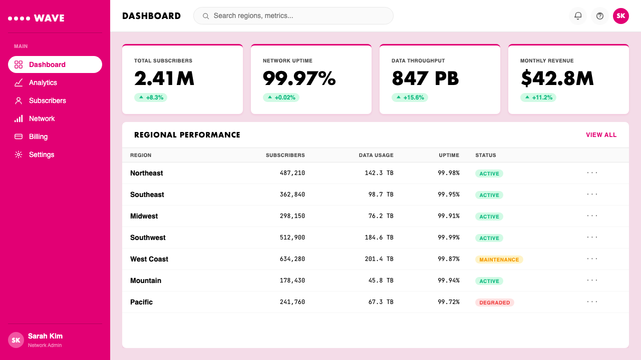
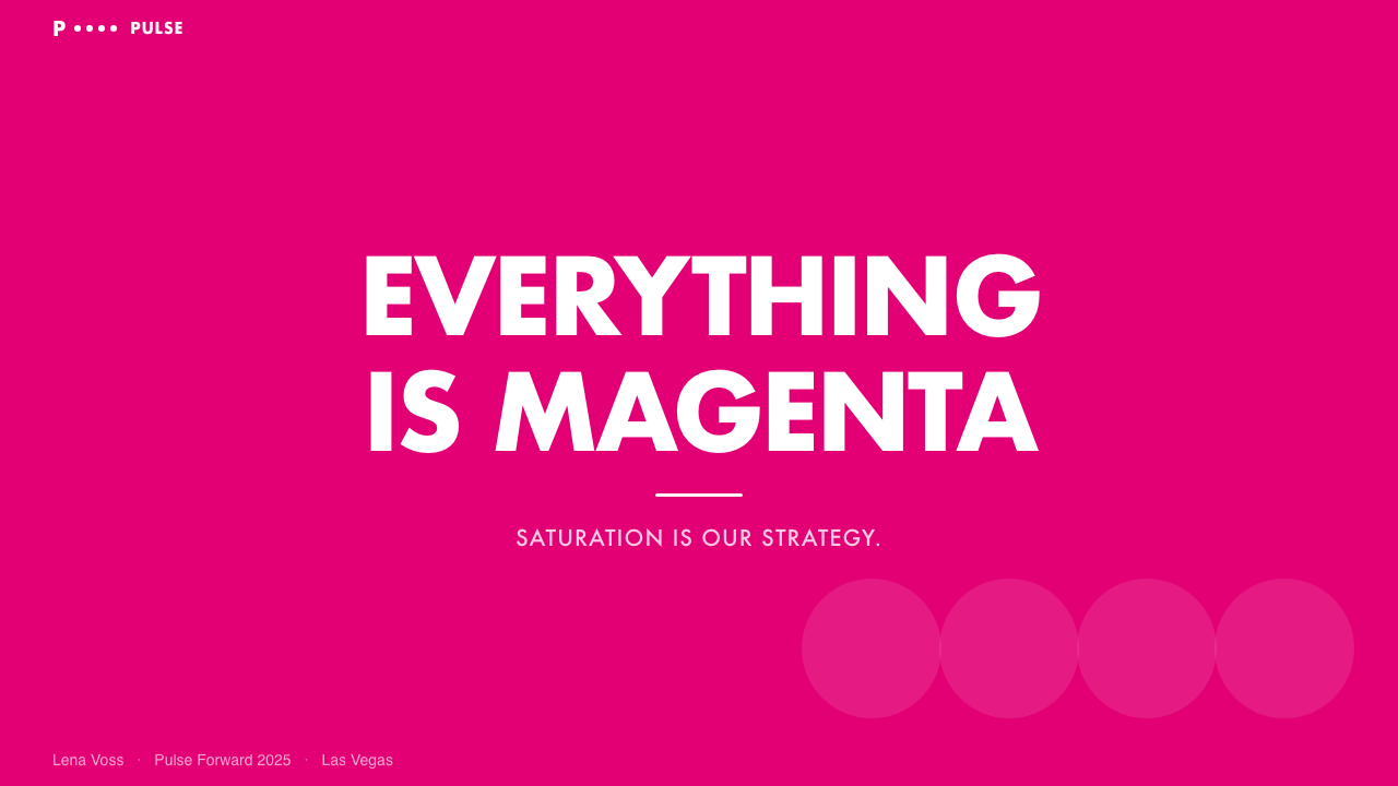
The defining visual principle of T-Mobile Magenta is saturation at scale. Rather than reserving the signature hue for accents, the system deploys it as the primary ground — flooding full-bleed surfaces, large UI panels, and physical environments entirely. This inversion of the conventional figure-ground relationship means that Magenta is never a highlight; it is the environment itself, with white serving as the only counterpoint. The psychological effect is one of total chromatic ownership: viewers cannot partially associate the color with the brand because there is never a neutral ground from which it emerges.T-Mobile 品红最核心的视觉原则是规模化饱和。这套系统不将标志性色相保留用于点缀,而是将其作为主要底面——完全覆盖满版画面、大面积界面面板与实体空间。这种对传统图底关系的颠覆意味着:品红从不是高光;它本身就是环境,白色是唯一的对位元素。心理效果体现为一种全面的色彩占有感:观者无法仅将这种颜色部分地与品牌关联,因为从来没有一个中性背景供它从中浮现。
Pill-Form Geometry胶囊形几何
Across the T-Mobile visual system, interactive elements — buttons, tags, badges, and call-to-action components — consistently favor the pill shape: a rectangle with fully rounded ends that reads as approachable and energetic rather than corporate or rigid. This form choice is not merely decorative; it reinforces the brand's anti-establishment positioning by softening the edges of what might otherwise be a harsh, high-contrast visual field. The pill shape, combined with Magenta as fill, produces a component vocabulary that is immediately legible as a single system across wildly different contexts.在 T-Mobile 整套视觉系统中,交互元素——按钮、标签、徽章和行动号召组件——始终偏爱胶囊形:两端完全圆润的矩形,传递出亲切、充满活力而非企业化或刻板的感受。这一形态选择并非纯粹装饰性的;它通过柔化边缘,在原本高对比度、视觉强烈的画面中强化了品牌的反建制定位。胶囊形与品红填充的组合,构建了一套在截然不同的语境下都能立即被识别为同一系统的组件语汇。
The Four-Dot Motif四点图案
One of the more quietly powerful elements in the T-Mobile visual toolkit is the four-dot pattern — a tight cluster of four circular marks that appears as a recurring textural and rhythmic device across print, digital, and environmental applications. The motif functions at multiple scales: dense and tiled, it creates a halftone-like surface texture; isolated and enlarged, it becomes an abstract focal point. Its consistent appearance across contexts reinforces brand recognition without requiring the logotype and serves as a subtle visual signature that operates even in peripheral vision.T-Mobile 视觉工具箱中最安静却有力的元素之一,是四点图案——四个圆点紧密排列成的图形,作为反复出现的肌理与节奏装置,遍布于印刷、数字与环境应用之中。这一图案在多个尺度上发挥作用:密集平铺时,它形成类似半色调的表面肌理;独立放大时,它化身为抽象的视觉焦点。在各种语境中的持续出现,无需依赖品牌标志即可强化品牌识别,成为一种在余光感知中仍能发挥作用的微妙视觉签名。
White as Infrastructure白色作为基础设施
In most design systems, white is the default ground — the neutral field against which colored elements are placed. In T-Mobile Magenta, white's role is inverted: it functions as infrastructure within a chromatic environment. White type on Magenta, white icons within Magenta panels, white negative space carving breathing room from Magenta floods — all treat white not as default but as an active design decision. This reversal produces a visual system where conventional hierarchy (colored element on neutral ground) is abandoned in favor of a single chromatic statement punctuated by white.在大多数设计系统中,白色是默认底面——用于衬托彩色元素的中性场域。在 T-Mobile 品红系统中,白色的角色被颠倒:它在色彩环境中充当基础设施。品红底面上的白色文字、品红面板中的白色图标、从品红漫溢中切割出呼吸空间的白色留白——所有这些都将白色不作默认,而视为主动的设计决策。这种逆转产生了一套视觉系统,在其中,传统的层级关系(彩色元素置于中性底面)被彻底放弃,代之以一种单一色彩陈述,以白色加以标点。
Typographic Confidence字体的自信
The typographic register of T-Mobile's visual language is one of deliberate weight and directness. Headlines appear at bold, unflinching scale — all-caps callouts are a recurring device in campaign and retail contexts. Body text and informational copy step back to a supporting role, set in clean sans-serif forms at a comfortable reading weight. The contrast between the aggressive headline presence and the restrained informational text creates a natural reading hierarchy: brand statement first, detail second, which aligns precisely with the company's marketing philosophy of leading with attitude before fact.T-Mobile 视觉语言的字体语域以刻意的字重与直接性为标志。标题以大胆、毫不退缩的尺度出现——全大写的感叹式标语是品牌广告与零售语境中的常见手法。正文与信息性文案退居辅助角色,以干净的无衬线字体配以舒适的阅读字重呈现。激进的标题存在感与克制的信息性文字之间的对比,构建了清晰自然的阅读层级:品牌主张优先,细节其次——这与公司先态度后事实的营销哲学精准吻合。
Flatness and Anti-Ornament平面性与零装饰
For all its chromatic loudness, the T-Mobile visual system is remarkably restrained in its surface treatment. Gradients are largely absent — the system commits to flat Magenta rather than tonal transitions that might dilute the purity of the hue. Shadows, where they appear in digital interfaces, are clean and functional rather than decorative. Illustration and photography, when used, are subordinated to the chromatic system: imagery is typically cropped aggressively, placed against Magenta grounds, or treated with high contrast to maintain the system's overall flatness. Ornamentation for its own sake finds no home here.尽管色彩极度张扬,T-Mobile 视觉系统在表面处理上却十分克制。渐变基本缺席——系统坚守平面品红,而非可能稀释色相纯粹性的色调过渡。界面中偶尔出现的阴影也是简洁功能性的,而非装饰性的。插图与摄影在使用时,都从属于色彩系统:图像通常被激进裁切,置于品红底面,或以高对比度处理以维系整体的平面性。纯粹出于装饰目的的装饰,在这里找不到容身之所。
Deliberate Loudness刻意的高调
Perhaps the most unusual aspect of the T-Mobile design system is that its loudness is not a failure of restraint but an intentional strategic principle. In an industry where competitors typically compete on understated professionalism, T-Mobile's visual aggression is a calculated posture. The system is designed to be impossible to ignore: in a retail environment, at a trade show, in a digital feed, or on a billboard, Magenta does not coexist quietly with its surroundings. This deliberate refusal of visual modesty is inseparable from the brand's competitive positioning and cannot be neutralized without undermining the entire identity logic.T-Mobile 设计系统最不寻常之处,也许在于:它的高调并非克制失败的结果,而是一种刻意为之的战略原则。在竞争对手通常以低调专业形象相互比拼的行业中,T-Mobile 的视觉攻击性是一种经过计算的姿态。这套系统被设计为无法忽视:无论在零售环境、行业展会、数字信息流还是广告牌上,品红都不会悄然融入周围环境。这种刻意的视觉不谦逊与品牌的竞争定位密不可分,一旦被淡化,整个识别系统的逻辑便随之瓦解。
See the T-Mobile Magenta design system查看 T-Mobile Magenta 完整设计系统
Who shaped T-Mobile Magenta?谁塑造了 T-Mobile Magenta?
The British brand consultancy Wolff Olins was commissioned by Deutsche Telekom in 1996 to create the visual identity that would eventually become one of the most legally protected color systems in commercial history. Wolff Olins brought the same philosophy to Telekom Magenta that it would later apply to other transformative brand projects — the conviction that a singular, extreme visual commitment creates stronger long-term brand equity than a diverse, modular palette. The Magenta they specified was deliberately chosen for its rarity in the corporate landscape of the time, giving Deutsche Telekom's subsequent subsidiaries a visual asset with genuine competitive moats.英国品牌咨询公司 Wolff Olins 受德国电信委托,于 1996 年创建了视觉识别系统,这套系统最终成为商业史上受法律保护最严密的色彩体系之一。Wolff Olins 将其在其他变革性品牌项目中贯彻的理念同样用于电信品红——坚信单一、极致的视觉承诺比多元模块化色板能建立更强大的长期品牌资产。他们确定的品红是经过深思熟虑的选择,刻意取其在当时企业景观中的稀缺性,为德国电信此后的子公司赋予了具有真正竞争壁垒的视觉资产。
John Legere served as CEO of T-Mobile USA from 2012 to 2020 and is credited with engineering the brand's most dramatic period of growth through the Un-carrier strategy. As important as his policy changes were, Legere's personal embodiment of the Magenta brand — wearing it publicly, performing its irreverence on social media, positioning himself as a loud counterpoint to the suited executives at Verizon and AT&T — accelerated the color's cultural resonance in ways that conventional advertising could not. Under his tenure, Magenta ceased to be a corporate color and became something closer to a competitive ideology made visible.John Legere 于 2012 年至 2020 年担任 T-Mobile USA CEO,被誉为通过「Un-carrier」战略推动品牌最戏剧性增长阶段的操盘手。他的政策变革固然重要,但 Legere 对品红品牌的身体力行——公开穿戴、在社交媒体上演绎其不羁姿态、将自己定位为 Verizon 和 AT&T 西装革履高管的高调对照——以传统广告无法实现的方式加速了这一色彩的文化共鸣。在他任期内,品红不再是一种企业色,而演变为某种可见的竞争意识形态。
Mike Sievert succeeded Legere as CEO in 2020 and presided over the post-Sprint merger integration — the most consequential visual consolidation challenge in the brand's history. Under Sievert, the Magenta identity underwent a process of maturation: the loudness was preserved but refined, the system extended to absorb Sprint's customer base and retail footprint without losing the chromatic coherence that made the brand recognizable. Sievert's tenure represents the transition from disruptor identity to market leader identity — and the design system's ability to stretch to cover both phases without breaking is testament to the robustness of the original chromatic commitment.Mike Sievert 于 2020 年接替 Legere 出任 CEO,主持了 Sprint 合并后的整合——品牌历史上最具影响力的视觉整合挑战。在 Sievert 任期内,品红视觉识别经历了一个成熟化过程:张扬得以保留但更加精炼,系统得以延伸,在不失去令品牌可辨识的色彩一致性的同时,吸纳了 Sprint 的用户群与零售版图。Sievert 的任期代表了从颠覆者身份向市场领导者身份的过渡——而设计系统能够在不崩溃的前提下延展覆盖这两个阶段,正是原始色彩承诺之稳健性的明证。
As the parent company and originator of the Magenta identity, Deutsche Telekom has been the consistent steward of the system's legal and creative integrity since 1996. The company's trademark enforcement actions — pursued across Germany, the European Union, and international markets — have made Magenta one of the most litigated colors in brand history. Deutsche Telekom has successfully challenged competitors ranging from local carriers to satellite services to streaming platforms who have used similar shades. This legal infrastructure is as much a part of the brand's design system as any visual specification, because it defines and enforces the competitive space the color occupies.作为品红视觉识别的母公司和创始方,德国电信自 1996 年以来一直是这套系统法律与创意完整性的持续守护者。公司在德国、欧盟及国际市场追行的商标维权行动,使品红成为品牌史上被诉讼最多的色彩之一。德国电信成功挑战了从本地运营商到卫星服务、流媒体平台等使用类似色调的竞争对手。这一法律基础设施与任何视觉规范一样,都是品牌设计系统的组成部分,因为它定义并捍卫了这种色彩所占据的竞争空间。
How do you use T-Mobile Magenta today?今天怎么用 T-Mobile Magenta?
T-Mobile Magenta translates most directly to presentation contexts where the goal is to communicate confidence, disruption, or market leadership. A cover slide benefits enormously from committing fully to the chromatic system: a full-bleed Magenta background with a single, bold white headline and the brand's four-dot motif as a subtle texture communicates authority without decoration. The risk — and the distinction between authentic application and pastiche — lies in how much the Magenta is allowed to breathe. Overcrowding a Magenta field with multiple competing elements breaks the system's core logic of saturation plus restraint.T-Mobile 品红在演示场景中的适用性最为直接,尤其适合传递自信、颠覆性或市场领导力的目标。封面页通过完全投入这套色彩系统而大获裨益:满版品红背景配以单一粗体白色标题,以四点图案作为微妙底纹,无需装饰便可传达权威感。风险——以及真正应用与模仿之间的区别——在于品红被允许呼吸的空间。用多个竞争元素挤满品红画面,会破坏这套系统「饱和加克制」的核心逻辑。
For content slides within a presentation, the system calls for clean alternation: Magenta as section dividers or emphasis blocks, white as the field for body content and data. Data visualizations in this system should avoid introducing multiple new colors — a Magenta primary with white or near-white as the only secondary produces bar charts, progress indicators, and pie segments that feel native to the system. Where additional data categories genuinely require differentiation, a muted dark tone works better than introducing a second bright hue that would compete with Magenta for dominance.对于演示文稿中的内容页,系统要求清晰的交替节奏:品红用作章节分隔或强调块,白色用作正文与数据的底面。这套系统中的数据可视化应避免引入多种新色彩——以品红为主色、白色或近白色为唯一辅色,能产生与系统原生感十足的柱状图、进度指示和饼图。当数据类别确实需要差异化时,使用一种柔和深色调比引入第二种与品红争夺主导权的高饱和色更为妥当。
In web interface and dashboard design, T-Mobile Magenta works best when the chromatic intensity is concentrated in the navigation bar, primary buttons, and selected states, with the content area reserved for white or very light grounds. This approach preserves the brand's chromatic character at the interaction layer — the places users look when taking action — without fatiguing the eye across extended reading sessions. Pricing pages and comparison tables particularly benefit from this approach: Magenta highlights the recommended tier, white grounds the alternatives, and the pill-shaped CTA button becomes the natural convergence point for user attention.在网页界面与仪表板设计中,T-Mobile 品红在色彩强度集中于导航栏、主要按钮与选中状态时效果最佳,内容区域留给白色或极浅底面。这种方式在交互层——用户执行操作时关注的区域——保持了品牌的色彩特质,同时避免在长时间阅读中使眼睛疲劳。定价页与对比表格尤其适合这种方式:品红突出推荐方案,白色衬托备选项,胶囊形行动号召按钮自然成为用户注意力的汇聚点。
For editorial and marketing applications — social content, campaign landing pages, out-of-home advertising, and event graphics — the system permits its most maximalist expression. Full-bleed Magenta with large, confidently-spaced white all-caps headlines is the canonical campaign treatment, echoing the visual language of the brand's retail environments. The four-dot motif can be deployed as a background texture at low opacity or as a compositional accent. Photography, when used, should be placed on a Magenta ground or treated with Magenta overlays rather than allowed to compete with the system's chromatic dominance from within a neutral field.在编辑与营销应用场景——社交内容、营销活动落地页、户外广告与活动视觉——这套系统允许最大化的表达。满版品红配以大号、自信留白的全大写白色标题,是标准的广告活动处理方式,与品牌零售空间的视觉语言相呼应。四点图案可以低不透明度作为背景底纹,或作为构图点缀使用。摄影图像在使用时,应置于品红底面或叠加品红蒙版处理,而非从中性底面对系统的色彩主导权发起竞争。
The most common mistake when applying this system is hedging on the Magenta. Designers accustomed to using color as an accent instinctively reduce it — moving from full-bleed to thirty percent coverage, introducing grays or secondary colors, softening the contrast with tonal backgrounds. Each compromise of this kind makes the system progressively less itself: Magenta at reduced saturation or area coverage begins to resemble pink, which carries entirely different brand associations. The system's power is binary: either you commit to chromatic dominance and gain all of its recognition benefits, or you dilute it and produce something that has the palette's associations without its authority.应用这套系统时最常见的错误,是对品红的妥协退让。习惯将色彩用作点缀的设计师会本能地缩减它——从满版覆盖退回到三成面积,引入灰色或辅助色,用色调背景柔化对比。每一步此类妥协都使系统逐渐失去自我:饱和度或覆盖面积减损的品红开始接近粉红,而粉红携带着截然不同的品牌联想。这套系统的力量是二元的:要么投入色彩霸权,收获它带来的全部识别红利;要么将其稀释,得到的只是一个拥有此色调联想却无其权威的东西。
See the T-Mobile Magenta design system查看 T-Mobile Magenta 完整设计系统
T-Mobile Magenta — FAQT-Mobile Magenta · 常见问题
Can T-Mobile Magenta work for a brand that is not a telecom company?T-Mobile 品红能用于非电信品牌吗?
The chromatic system is fully transferable as a design approach — the principles of saturation dominance, white-as-infrastructure, and pill-form geometry are not property-specific. However, the specific shade carries enormous brand recognition in the telecom context, so any application in that sector would read as derivative. Outside telecom, a designer can adopt the system's structural logic — full-bleed primary color with white as the only complement, pill-shaped interactive elements, deliberate typographic loudness — while using a different high-saturation hue. The system's DNA is the commitment to monochromatic dominance, not the specific color, and that commitment can be ported to any palette.这套色彩系统作为一种设计方法完全可以移植——饱和度主导、白色作为基础设施、胶囊形几何等原则并非特定属性。然而,这一具体色调在电信语境中携带着巨大的品牌识别度,因此在该行业内的任何应用都会被解读为衍生之作。在电信行业以外,设计师可以采用这套系统的结构逻辑——满版主色配以白色为唯一补色,胶囊形交互元素,刻意的字体张扬——同时选用不同的高饱和色相。这套系统的基因是对单色主导的承诺,而非具体的色彩,这种承诺可以移植到任何色板上。
How does T-Mobile Magenta differ from other high-saturation brand colors like Barbie Pink or Coca-Cola Red?T-Mobile 品红与芭比粉、可口可乐红等高饱和品牌色有何不同?
All three are high-saturation identity colors defended through trademark or cultural ownership, but their systems differ significantly. Coca-Cola Red operates within a warm, nostalgic system that pairs the hue with script typography, ribbon motifs, and photography of joyful human moments — the color is emotional and narrative-dependent. Barbie Pink functions within a maximalist, playful system that tolerates many additional colors and textures — the pink creates a chromatic tent under which variety flourishes. T-Mobile Magenta, by contrast, is a reductive system: it eliminates rather than accumulates. The magenta is not the emotional anchor of a warm story; it is a territorial statement, paired with almost nothing, designed to communicate dominance rather than delight.这三种都是通过商标或文化所有权保护的高饱和识别色,但它们的系统存在显著差异。可口可乐红在一套温暖、怀旧的系统中运作,将色相与手写字体、飘带图案和快乐人物摄影相搭配——这种颜色具有情感性,依赖叙事。芭比粉在一套最大化、充满玩心的系统中运作,容纳大量附加色彩与肌理——粉色搭建了一顶色彩帐篷,多样性在其中蓬勃生长。T-Mobile 品红则相反,是一套减法系统:它消除而非积累。品红不是温暖故事的情感锚点;它是一种领土宣示,几乎不与任何元素配对,旨在传达主导力而非愉悦感。
Is there a light or dark mode equivalent for T-Mobile Magenta design systems?T-Mobile 品红设计系统有浅色模式或深色模式的对应版本吗?
The canonical T-Mobile system is a light-mode construct — the hero ground is Magenta (which reads as saturated mid-value) and the type ground is white, together creating a perceptually active rather than restful surface. A dark mode variant exists in practice — primarily in entertainment and streaming contexts where darker grounds reduce eye strain during extended viewing — and is most often executed by pairing a deep near-black or dark charcoal with Magenta as the accent and interactive element color. In this inversion, Magenta shifts from ground to figure, which reduces its dominance but preserves brand recognition. The risk is that a dark background with Magenta accents begins to resemble many other tech-brand dark mode systems, sacrificing the distinctiveness that full-bleed Magenta provides.标准 T-Mobile 系统是一套浅色模式构造——主底面是品红(在感知上呈现为饱和中明度),文字底面是白色,共同形成一种感知上活跃而非静息的画面。深色模式变体在实践中确实存在——主要出现在娱乐与流媒体语境中,深色底面在长时间观看时可降低眼部疲劳——通常以深近黑或深炭灰搭配品红作为点缀色与交互元素色来实现。在这种反转中,品红从底面角色转变为前景角色,主导力有所下降,但品牌识别度得以保留。风险在于:深色背景加品红点缀开始与许多其他科技品牌的深色模式系统趋于相似,牺牲了满版品红所提供的独特性。
Why does the four-dot motif matter — can it simply be omitted?四点图案有什么重要性——可以直接省略吗?
The four-dot motif is not load-bearing in the way the Magenta color is — no single application will collapse without it. But its cumulative effect across the system is meaningful. It provides a secondary visual layer that operates at a scale below the headline elements, giving the system depth and texture without introducing new colors or competing complexity. In contexts where Magenta alone might feel monolithic or undifferentiated — large physical surfaces, event installations, video graphics — the four-dot pattern introduces visual rhythm that prevents perceptual fatigue. Omitting it consistently produces a simpler but also somewhat flatter brand expression; using it occasionally and without system logic makes it feel like decoration rather than identity.四点图案不像品红色那样承担着基础性的作用——没有任何单一应用会因为缺少它而崩溃。但它在整套系统中的累积效果是有意义的。它在标题元素之下的尺度提供了次级视觉层次,赋予系统深度与肌理,而无需引入新色彩或制造相互竞争的复杂性。在品红单独呈现可能显得单调或缺乏层次的场景中——大型实体表面、活动装置、视频图形——四点图案引入视觉节奏,防止感知疲劳。持续省略它会产生更简洁但也稍显平淡的品牌表达;偶尔使用且缺乏系统逻辑,则会使它感觉像装饰而非识别系统的一部分。
Does T-Mobile Magenta work in print contexts where color reproduction varies?T-Mobile 品红在色彩还原因介质而异的印刷场景中表现如何?
Color-accurate reproduction of the Magenta is essential and can be challenging in uncoated paper, textile, and large-format printing contexts where the hue can shift perceptibly toward either orange or purple depending on substrate and ink type. Deutsche Telekom's approach has historically been to maintain precise color specifications across production contexts — the RAL registration that anchors the hue is precisely this kind of production standard. For designers applying the system outside official T-Mobile production pipelines, the practical guidance is to over-saturate slightly in digital preparation for print, and to request proofs before committing to large runs. A Magenta that lands too light reads as pink and loses the territorial quality that makes the system work; one that lands too dark reads as a warm red and loses the pink-red tension that distinguishes it.品红的色彩准确还原至关重要,在非涂布纸、织物及大幅面印刷场景中可能颇具挑战,色相会因基材与油墨类型的不同而明显偏向橙色或紫色。德国电信的一贯做法是在各生产场景中维持精确的色彩规范——锚定这一色相的 RAL 注册恰恰是这类生产标准的体现。对于在 T-Mobile 官方生产流程之外应用这套系统的设计师,实践建议是:为印刷准备数字文件时略微提高饱和度,并在大批量印刷前要求打样确认。还原偏浅的品红会显得像粉红,失去使整套系统奏效的领土感;还原偏深则显得像暖红,失去将其与众不同的粉红红张力。
Related design styles相关设计风格
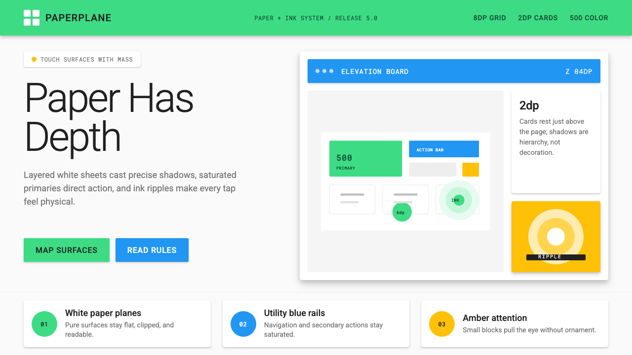 Android Lollipop (Material 1.0)Paper becomes physical. Roboto, green FABs and sharp shadows give white cards…纸张拥有物理感:Roboto、鲜绿浮动按钮与硬阴影让白卡片产生深度。
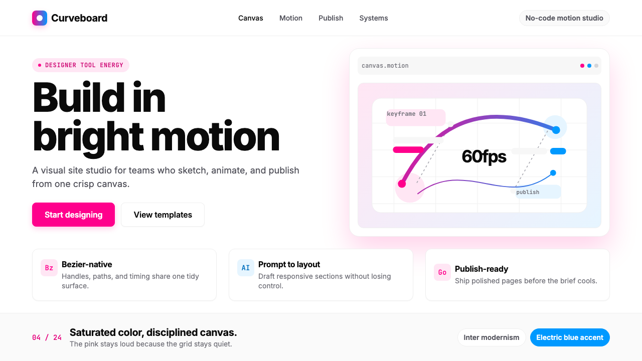 Framer Motion PinkDesigner-tool pink stays sharp. Inter whitespace frames electric blue Bezier…设计工具粉很锋利:Inter 留白托起电光蓝贝塞尔曲线。
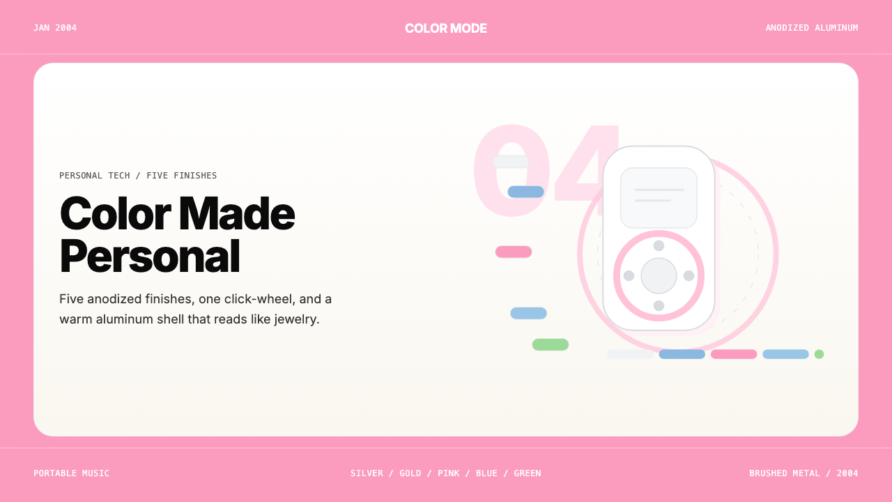 iPod Mini Anodized (2004)Color becomes identity. Pink panels, clean sans, and click-wheel geometry kee…色彩即身份。粉色面板、无衬线字体与点击轮几何保持触感。
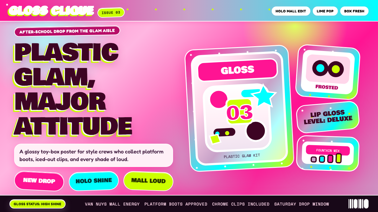 Bratz Doll 2003Y2K maximalism, mall-glossy. Hot-pink gradients, holographic lavender, chunky…Y2K 极繁的商场美学:热粉渐变、全息薰衣草紫、厚重展示字体——拆开 Brat…
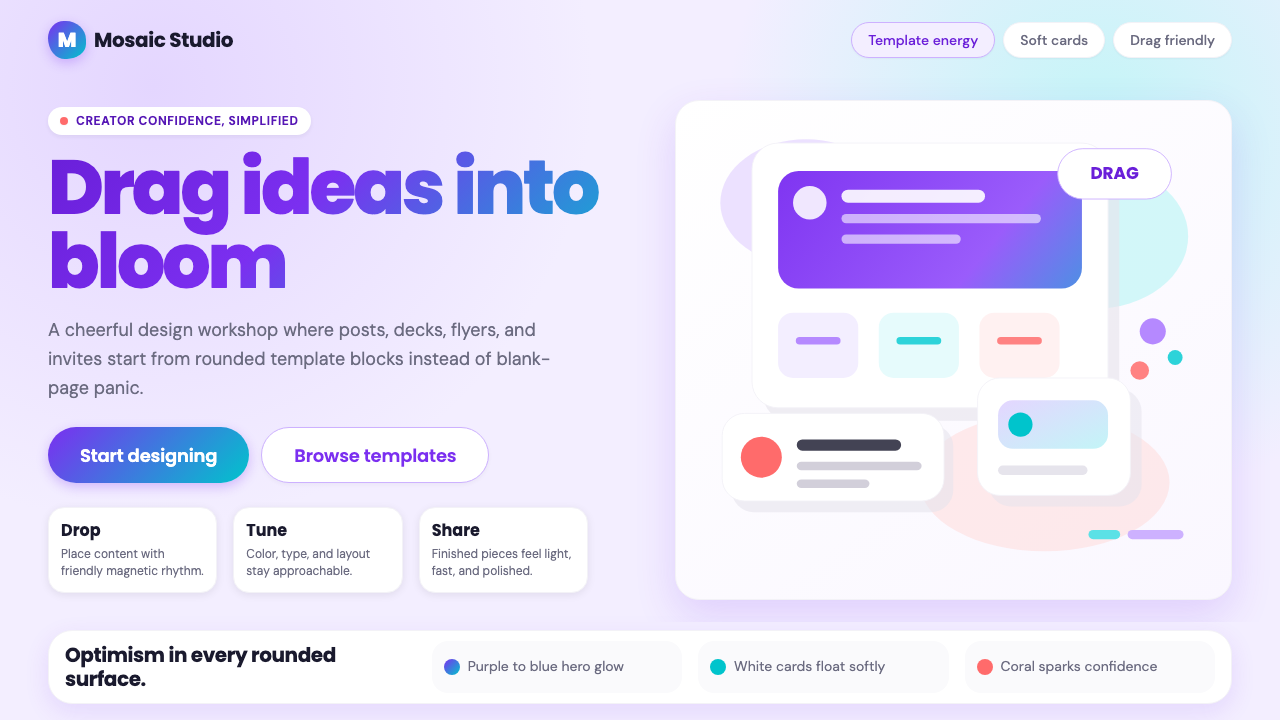 Canva 2024Confidence feels draggable. Purple-blue gradients and floating white template…信心可拖拽:紫蓝渐变与漂浮白卡,让创作变柔和。
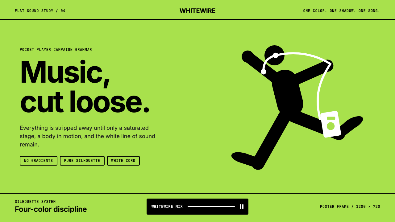 iPod Silhouette 2004Discipline dances. Lime flat-field, black silhouette, and one white cord carr…纪律在跳舞。柠檬绿纯色场、黑色剪影与白线撑起海报。