What is Framer Motion Pink?什么是 Framer Motion Pink?
Framer's electric pink is a designer's signal flare — saturated, disciplined, and unmistakable in a sea of neutral SaaS interfaces.Framer 的荧光粉是设计师的信号弹——饱和、克制,在一片中性 SaaS 界面的海洋里无可混淆。
Framer Motion Pink in briefFramer Motion Pink 速览
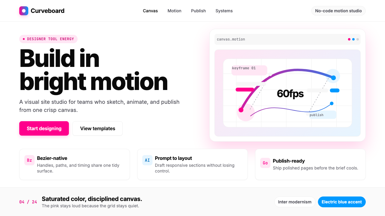
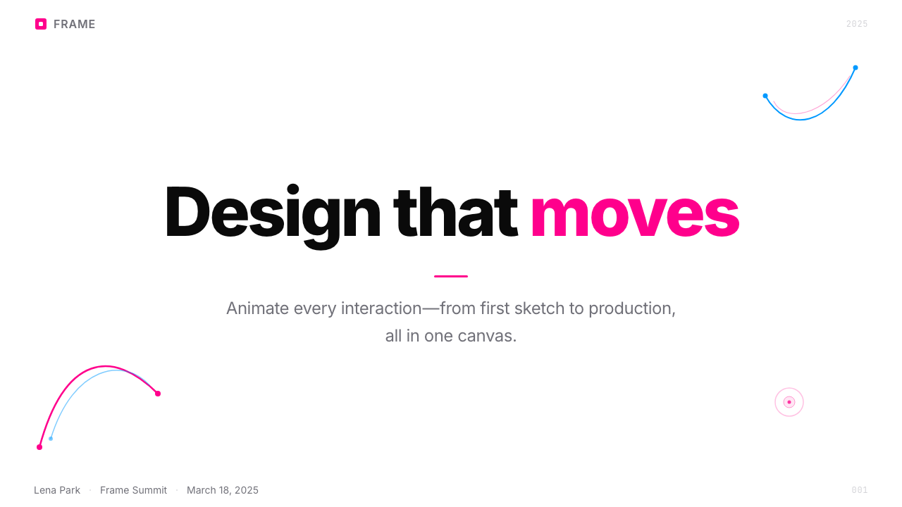
Framer Motion Pink is the visual identity system of Framer, an Amsterdam-based no-code and AI design platform. The style is built on a tight, deliberate pairing: a saturated bright pink and an electric blue, deployed on pure white backgrounds with near-black type. Together these two colors function as a brand signature that reads simultaneously as playful and professional — warmth without softness, energy without noise.Framer Motion Pink 是 Framer 的视觉识别系统。Framer 是来自荷兰阿姆斯特丹的无代码与 AI 网页设计平台。这套风格建立在一对简洁而刻意的颜色组合之上:饱和的亮粉色与电光蓝,铺设于纯白底色和近黑文字之上。这两种颜色共同构成品牌签名,读来既像玩乐,又像专业——有温度,但不失锋利;有能量,但不沦为噪音。
What distinguishes the style from generic pastel-tech or candy-colored consumer apps is its discipline. The pink is not a tint or a softened blush; it is fully saturated and commands attention. The blue is its counterweight — cooler, more spatial, used for interactive cues, animated bezier-curve motifs, and moments of technical precision. White space does much of the compositional work, keeping the palette from overwhelming the layout.将这种风格与泛滥的柔化科技粉或糖果色消费应用区别开来的,是其克制。这里的粉不是淡色调或柔和的腮红色,而是充分饱和、直接夺目的。蓝色是它的对位——更冷静、更具空间感,用于交互提示、动画贝塞尔曲线母题,以及需要技术精确感的时刻。留白承担了大量构图工作,使色板不至于淹没版面。
The typographic system centers on a clean, geometric sans-serif rendered at generous scale with deliberate weight contrast. Headlines are set large and confident; body copy is airy and well-spaced. Rounded corners on component frames soften what would otherwise be a stark modernist grid. The overall effect is a visual language that belongs to the world of professional tools but refuses the anonymity of enterprise software — it is specific, branded, and immediately recognizable.字体系统以一款简洁的几何无衬线字体为核心,在充裕的尺度下以刻意的字重对比呈现。标题设得大而自信,正文则通透、行距宽松。组件框架的圆角柔化了否则会显得刚硬的现代主义网格。整体效果构成一套属于专业工具世界的视觉语言,却拒绝了企业软件的匿名感——它是特定的、有品牌个性的,且一眼可辨。
See the Framer Motion Pink design system查看 Framer Motion Pink 完整设计系统
Where does Framer Motion Pink come from?Framer Motion Pink 从何而来?
Framer was founded in Amsterdam in 2014 by Koen Bok and Jorn van Dijk. In its earliest form, the product was a code-based prototyping toolkit aimed at designers who wanted to express complex interactions beyond the reach of static mockup tools. The brand of this period was functional and subdued — appropriate for a developer-adjacent product where credibility came from technical depth rather than visual personality.Framer 由 Koen Bok 与 Jorn van Dijk 于 2014 年在阿姆斯特丹创立。产品最初是一款面向设计师的代码原型工具,旨在让设计师能够表达静态稿件工具无法承载的复杂交互。这一时期的品牌形象功能性而克制——对于一款亲近开发者的产品来说,这再合适不过,因为可信度来自技术深度,而非视觉个性。
The company's visual identity began to shift decisively around 2022, when Framer repositioned from a prototyping tool to a Webflow-class visual website builder with AI-assisted design capabilities. This pivot demanded a new brand register: one that could attract a broader audience of designers, freelancers, and agencies while signaling that Framer was not merely another builder but an opinionated design platform with a clear point of view. The saturated pink and electric blue emerged as the anchors of this repositioned identity.公司的视觉识别大约在 2022 年前后开始决定性地转变。彼时 Framer 从原型工具转型为 Webflow 同档次的可视化建站平台,并引入 AI 辅助设计能力。这次转型需要一套新的品牌调性:既能吸引更广泛的设计师、自由职业者与设计机构,又要传递出 Framer 不仅仅是又一个建站工具,而是一个有主张、有立场的设计平台。饱和粉与电光蓝由此成为这次重新定位的视觉锚点。
The 2023 and 2024 brand expression codified what would become the recognizable Framer aesthetic. Hero imagery made extensive use of two-dimensional bezier-curve motifs and design-mockup compositions — a knowing self-reference that positioned the tool's output as its own best advertisement. The pink, specifically, was chosen to occupy a precise register: neither the gentle blush of consumer wellness apps nor the neon aggression of gaming brands, but a designer-tool pink that signals craft, intentionality, and a slight irreverence toward the sea of blue-and-gray enterprise software.2023 年与 2024 年的品牌表达将这套可辨识的 Framer 美学固化下来。英雄区大量运用二维贝塞尔曲线母题与设计稿合成图景——这是一种心照不宣的自我指涉,将工具的产出物变成它自己最好的广告。那抹粉色的选择尤为精准:不是消费健康类应用的柔和腮红,不是游戏品牌的霓虹攻击,而是一种设计工具的粉——传递工艺感、刻意感,以及对大片蓝灰企业软件的一丝不羁。
The cultural context matters. The 2020s saw a broader movement in design-tool branding away from corporate neutrality and toward expressive, opinionated color. Competitors in the design-tool space had long gravitated toward dark backgrounds and muted palettes, making Framer's white-ground, high-saturation approach a deliberate counter-positioning. The style draws loosely on a lineage of playful modernism — the warmth of mid-century Swiss graphics, the boldness of contemporary design-forward software brands — while remaining firmly rooted in its own moment and medium.文化背景不可忽视。2020 年代,设计工具品牌整体经历了一次从企业中性调向表达性、有主张色彩的迁移。设计工具赛道的竞争对手长期偏爱深色背景与低饱和色板,Framer 的白底高饱和方案由此成为刻意的反向定位。这套风格松散地承接了一脉有温度的现代主义传统——中世纪瑞士平面的温暖、当代设计导向软件品牌的大胆——同时牢牢扎根于自己的时代与媒介。
What defines the Framer Motion Pink look?Framer Motion Pink 的视觉特征是什么?
Color Pairing色彩配对
The style lives or dies on two colors: a saturated, fully-committed bright pink and a clear electric blue. Neither is softened with white nor deepened with black — they are presented at full intensity against white, creating maximum chromatic contrast without competing with each other. The pink functions as the brand's primary signature and emotional anchor; the blue carries the sense of motion, technology, and interactive precision. A near-black is used for body type and structural elements, keeping legibility uncompromised.这套风格的成败系于两种颜色:一种饱和而全力以赴的亮粉色,以及一种清澈的电光蓝。两者都没有被白色冲淡,也没有被黑色压深——它们以全饱和度呈现在白底之上,制造最大色度对比,却又互不争抢。粉色是品牌的主要签名与情感锚点;蓝色承载运动感、技术感与交互精确性。近黑色用于正文与结构性元素,保持毫不妥协的可读性。
Typography字体排印
The typographic approach pairs a clean geometric sans-serif for display and UI text with generous spacing that lets each element breathe. Scale contrast is substantial: headline type runs large and confident, creating an immediate visual hierarchy, while body copy settles into a quieter, highly legible register. The system favors slightly more letter-spacing than strictly necessary — a choice that reads as airy and design-conscious rather than compressed. Bold weight is used selectively, not habitually, making its appearance carry genuine emphasis.字体排印方案以一款简洁的几何无衬线字体承担展示与界面文字,配以充裕的间距让每个元素自由呼吸。尺度对比显著:标题文字大而自信,直接建立起视觉层级;正文则退居更安静、高可读性的档位。系统略倾向于比严格必要量更多的字间距——这一选择读来通透而有设计意识,而非紧凑压迫。粗字重是选择性而非习惯性使用的,其出现因而具有真正的强调意义。
Bezier and Motion Motifs贝塞尔曲线与动态母题
Flowing two-dimensional curves — references to the bezier paths that are the building blocks of vector design — appear as decorative and structural elements in hero imagery, feature illustrations, and marketing compositions. These motifs function as the style's most distinctive ornamental gesture: they are simultaneously abstract and self-referential, alluding to the tooling that Framer provides. The curves are typically rendered in the electric blue on white, sometimes in pink, and carry a sense of kinetic potential even when static.流动的二维曲线——对矢量设计基础元素贝塞尔路径的视觉引用——作为装饰性与结构性元素出现在英雄区图像、功能插图与营销构图之中。这些母题是该风格最具辨识度的装饰性姿态:它们同时是抽象的和自我指涉的,暗指 Framer 所提供的工具本身。曲线通常以电光蓝在白底上呈现,有时用粉色,即便静止也携带着动态的潜力感。
White Space and Breathing Room留白与呼吸感
The generosity of white space is not accidental — it is one of the primary devices that stops the saturated colors from overwhelming the composition. Sections are given room to exist as discrete visual moments; components do not crowd each other. This disciplined airiness is a quality most associated with premium design tools and editorial design, and it lends the Framer identity a sense of confidence: the design does not need to fill every corner to assert itself.充裕留白并非偶然——它是防止饱和色彩淹没构图的主要手段之一。各区块获得充分空间,作为独立的视觉时刻存在;组件之间不相互拥挤。这种克制的通透感是高端设计工具与编辑设计最常与之关联的品质,它赋予 Framer 视觉识别一种从容的自信:无需填满每一个角落,设计依然能够自我主张。
Refined-Rounded Corners精炼圆角
Component frames, card containers, and interface elements carry rounded corners that are perceptible but not exaggerated — the rounding is calibrated to communicate approachability without sliding into the soft, toy-like quality of heavily-rounded consumer apps. This precise calibration is part of what places the style in the playful-professional register: the edges are friendly, but they do not suggest naivety. The rounded corners also harmonize with the curves of the bezier motifs, giving the system visual coherence.组件框架、卡片容器与界面元素均采用可感知但不夸张的圆角——圆度经过精心校准,传递亲和感,却不滑向高度圆角消费应用的柔软、玩具质感。这种精确校准是将这套风格置于「玩乐-专业」档位的关键之一:边缘是友好的,但不暗示幼稚。圆角也与贝塞尔曲线母题的弧线相呼应,赋予整个系统视觉连贯性。
Design-Mockup Heroics设计稿英雄区
A recurring compositional strategy places actual design mockups — interface screenshots, component previews, canvas compositions — as the primary hero imagery. This is a form of honest product advertisement: the tool shows what it can make. The mockups are typically arranged in layered, slightly-overlapping compositions that suggest depth without resorting to strong three-dimensional perspective. They are lit consistently, cropped to reveal partial frames, and integrated with the bezier motifs to create a sense of a live, working design environment.一种反复出现的构图策略是将真实设计稿——界面截图、组件预览、画布合成——作为主要英雄区图像。这是一种诚实的产品广告方式:工具展示它能创造什么。设计稿通常以层叠、略微重叠的方式排布,暗示纵深感,却不借助强烈的三维透视。它们光线一致、裁切以显示局部框架,并与贝塞尔曲线母题整合,营造出鲜活运作的设计环境感。
Playful-Professional Tone玩乐-专业双重调性
The style occupies a carefully maintained middle ground between the seriousness of enterprise software and the exuberance of consumer apps. It is warm but not casual, energetic but not frantic, opinionated but not alienating. This tonal balance is achieved through the combination of disciplined white space, a restrained palette that never uses more than two of its colors prominently at once, confident typography, and motion references that feel intelligent rather than decorative. The result is a brand that appeals to designers who think of themselves as both creative professionals and discerning technologists.这套风格精心维持着企业软件的严肃性与消费应用的活力之间的中间地带。它温暖但不随意,有能量但不焦躁,有主张但不令人疏远。这种调性平衡通过以下组合实现:克制的留白、一套同一时刻从不将超过两种颜色以显著方式同时使用的色板、自信的排版,以及更多智识感而非装饰感的动态引用。最终结果是一套品牌,吸引那些将自己视为创意专业人士与眼光挑剔的技术人的设计师。
See the Framer Motion Pink design system查看 Framer Motion Pink 完整设计系统
Who shaped Framer Motion Pink?谁塑造了 Framer Motion Pink?
Koen Bok co-founded Framer in Amsterdam in 2014 and has served as its CEO. He guided the company through its most significant strategic pivots: from a React-based code prototyping tool toward an AI-assisted visual website builder capable of competing in the no-code market. His product vision shaped the decision to invest in a distinct, opinionated visual identity at a time when most design-tool competitors favored anonymous, neutral brand presentations. The current pink-and-blue brand system reflects a company direction he helped set: unapologetically design-forward, warm but precise.Koen Bok 于 2014 年在阿姆斯特丹共同创立 Framer 并出任 CEO。他引导公司完成了最重要的战略转型:从基于 React 的代码原型工具,转向能够在无代码市场竞争的 AI 辅助可视化建站平台。在大多数设计工具竞争对手偏爱匿名中性品牌形象的时期,他的产品愿景推动了对独特、有主张视觉识别的投入。当前的粉蓝品牌体系折射出他参与确立的公司方向:毫不掩饰地以设计为先,温暖而精确。
Jorn van Dijk co-founded Framer alongside Koen Bok and contributed deeply to the product's early design philosophy. With a background as a product designer, he helped define the experience principles that would eventually underpin the visual identity: the belief that a design tool's own interface should demonstrate the quality of design it enables, and that the tool's brand should be an honest expression of its values rather than a neutral container. His influence is most visible in the way Framer's visual language treats its own design artifacts — mockups, curves, components — as first-class citizens of the brand system.Jorn van Dijk 与 Koen Bok 共同创立 Framer,并在产品早期设计哲学的形成中做出了深刻贡献。凭借产品设计师的背景,他帮助确立了最终支撑视觉识别的体验原则:设计工具自身的界面应当展示它所能实现的设计品质,工具的品牌应当是其价值观的诚实表达,而非一个中性容器。他的影响最清晰地体现在 Framer 视觉语言对待自身设计产物的方式上——设计稿、曲线、组件——将它们视为品牌系统中的一等公民。
The current brand identity — the specific pink, the electric blue pairing, the bezier-curve hero motifs, the generous whitespace system, the rounded-corner component language — was developed and refined by Framer's in-house design team across the 2022 to 2024 period. This team made the decisions that define the style at its most characteristic: the choice not to soften the pink, the commitment to white grounds over dark ones, the use of the company's own design output as its primary marketing imagery. Their work demonstrates the style's central thesis — that a design tool's brand should be its best portfolio piece.当前的品牌识别——特定的粉色与电光蓝配对、贝塞尔曲线英雄母题、充裕的留白系统、圆角组件语言——由 Framer 内部设计团队在 2022 至 2024 年间开发和打磨而成。这个团队做出了定义这套风格最具特色之处的决策:选择不软化那抹粉色,坚持白色底面而非深色底面,用公司自身的设计产出作为主要营销图像。他们的工作印证了这套风格的核心论点——设计工具的品牌应当是它最好的作品集。
Webflow, the San Francisco-based visual website builder that Framer is often compared to and positioned against, maintained a more subdued and neutral brand identity through much of the period when Framer was developing its own. This contrast is instructive: Webflow's relative neutrality created space for Framer's saturated, opinionated palette to function as a differentiating signal. Understanding the Framer style benefits from understanding it as a deliberate act of market positioning — not just a visual preference, but a statement about what kind of design platform Framer intends to be.Webflow 是总部位于旧金山的可视化建站工具,Framer 常被与之比较并将自身定位为其对立面。在 Framer 发展自身视觉识别的大部分时期,Webflow 保持着相对克制和中性的品牌形象。这一对比颇具启示意义:Webflow 的相对中性为 Framer 的饱和、有主张色板创造了作为差异化信号发挥作用的空间。理解 Framer 风格,需要将其理解为一种刻意的市场定位行为——不仅是视觉偏好,更是关于 Framer 意图成为何种设计平台的声明。
How do you use Framer Motion Pink today?今天怎么用 Framer Motion Pink?
Framer Motion Pink is well-suited to presentation work where the designer wants to signal technical sophistication alongside visual warmth — a combination that positions the sender as a design-aware professional rather than a generic agency. For slide covers, the style rewards full-bleed compositions in which the saturated pink or electric blue anchors one zone of the frame while white space and large-scale type hold the rest. A bezier-curve motif or abstract two-dimensional shape can introduce the motion reference without requiring animation. Content slides work best with a grid that is strict but not rigid: two or three columns, generous top and bottom margins, and a typographic hierarchy built purely on scale and weight without decorative dividers or icon clusters.Framer Motion Pink 非常适合演示场合,当设计师希望同时传递技术精度与视觉温度时——这一组合能将发送者定位为有设计意识的专业人士,而非泛化的机构。在封面页上,这套风格偏好满铺构图:饱和粉色或电光蓝锚定画面的某一区域,留白与大比例文字持守其余空间。贝塞尔曲线母题或抽象二维形可以在不需要动画的前提下引入动态引用。内容页最好以严格但不僵硬的网格呈现:两到三列、充裕的顶底边距,以及纯粹依靠尺度与字重构建的文字层级,无装饰性分割线或图标集群。
Data slides in this style carry a diagrammatic quality that earns trust. Bar charts and line graphs should be rendered with the electric blue as the primary data color and the pink reserved for the highlighted value or call-out point — never both at high weight simultaneously on the same chart. Keep chart backgrounds white and axes typographically quiet; the data should speak through the color pairing, not through visual decoration. Tables benefit from thin ruling lines and alternating row tints that stay within the white-and-very-light-gray range, with the pink appearing only in header cells or total rows.这种风格下的数据页具有赢得信任的示意图品质。柱状图与折线图应以电光蓝作为主要数据颜色,粉色保留给高亮数值或标注点——同一图表上两者绝不同时以大面积高字重呈现。保持图表背景为白色,坐标轴字体排印安静;数据应通过色彩配对说话,而非通过视觉装饰。表格适合使用细线框和在白色至极浅灰范围内交替的行底色,粉色只出现在表头行或合计行。
For web interfaces, the style is particularly effective on product landing pages, pricing tables, and dashboard-style interfaces where scannable hierarchy matters more than emotional warmth. Define a grid with clear column gutters, use white as the ground throughout, and apply the pink as the primary call-to-action color — buttons, active states, selected tabs, pricing tier highlights. The electric blue handles secondary interactivity: links, hover states, progress indicators, and the decorative bezier motifs that might appear in background illustrations. Card components should have gently rounded corners consistent with the brand's component language, with subtle borders rather than heavy shadows.在网页界面上,这套风格对产品落地页、定价表格与仪表板式界面尤为有效——这些场景中可扫描的层级比情感温度更重要。定义带有清晰列间距的网格,全程以白色为底,将粉色作为主要行动号召色——按钮、激活状态、选中标签、定价档次高亮。电光蓝处理次级交互:链接、悬停状态、进度指示器,以及可能出现在背景插图中的装饰性贝塞尔曲线母题。卡片组件应采用与品牌组件语言一致的轻度圆角,辅以细边框,而非厚重的阴影。
In editorial and marketing contexts, the style brings poster-like confidence to feature announcements, case study headers, and social media assets. A single large typographic statement in near-black on white, punctuated by a pink accent word or underline, achieves the right combination of legibility and brand personality. Marketing pages work in alternating full-width bands: white-ground sections for copy-heavy content, pink-ground sections for key claims or testimonials. The electric blue enters primarily as an illustration element — the bezier curves and design-mockup compositions that remind the viewer what product is being advertised.在编辑与营销场景中,这套风格为功能发布、案例研究页眉与社交媒体素材带来海报式的自信感。白底上一句大型近黑色文字陈述,以粉色强调词或下划线作为点睛,便能实现可读性与品牌个性的正确组合。营销页面适合交替排列的全宽色块:白底区块承载文字密集内容,粉底区块承载核心主张或用户证言。电光蓝主要以插图元素进入——贝塞尔曲线与设计稿构图,时刻提醒读者正在广告的是什么产品。
A common mistake is misreading the style's energy as a license to use both pink and blue at full saturation simultaneously across large areas of a layout. In the Framer brand system itself, the two colors rarely appear at equal visual weight in the same composition — one leads, the other accents. Overuse of the pink in particular creates layouts that feel loud rather than confident. Similarly, abandoning the generous white space to accommodate more content destroys the premium register the style depends on. The airiness is not a stylistic luxury; it is load-bearing. Reducing it undermines the entire tonal balance.一个常见错误是将这套风格的活力误读为在版面大面积同时使用粉色与蓝色全饱和度的许可。在 Framer 品牌系统自身中,两种颜色几乎从不在同一构图中以同等视觉分量出现——一个主导,另一个衬托。尤其是粉色的过度使用,会使版面显得嘈杂而非自信。同样,为了容纳更多内容而放弃充裕留白,会摧毁这套风格所依赖的高端调性。那种通透感不是风格奢侈品——它是承重墙。削减它,整个调性平衡便随之崩塌。
See the Framer Motion Pink design system查看 Framer Motion Pink 完整设计系统
Framer Motion Pink — FAQFramer Motion Pink · 常见问题
Is this style only appropriate for design-tool or SaaS products?这套风格只适合设计工具或 SaaS 产品吗?
Not exclusively, but its associations are strong. Framer Motion Pink carries a clear signal of the professional designer-tool world, and that signal will feel resonant or misaligned depending on the product's own context. For a design agency's portfolio, a product-launch site aimed at design-aware audiences, or a developer tool with design sensibilities, the fit is immediate. For a food brand, a healthcare provider, or any context where the pink reads as clinical rather than warm, the associations become liabilities. The style's energy is confident and modern, but it is not universally neutral.并非仅此,但其联想指向很强。Framer Motion Pink 清晰地传递着专业设计工具世界的信号,而这个信号是否与产品语境共鸣或错位,取决于产品自身的定位。对于设计机构的作品集、面向有设计意识受众的产品发布站点,或具有设计感的开发者工具,契合感是直接的。对于食品品牌、医疗服务机构,或任何粉色会被读作临床冷漠而非温暖的场景,这些联想便成为负担。这套风格的能量是自信而现代的,但并非普遍中性。
How does Framer Motion Pink differ from other tech-brand pinks like Dribbble or Product Hunt?Framer Motion Pink 与 Dribbble 或 Product Hunt 等科技品牌的粉色有何不同?
Dribbble's pink sits in a warmer, softer register — it evokes community, creativity, and the sharing of finished work. Product Hunt's orange-pink is more appetizing and consumer-oriented, closer to a warm sunset than a design tool. Framer's pink is cooler, more saturated, and more purposefully paired with an electric blue counterpart, which pushes it toward the technical and kinetic rather than the social. The bezier-curve motifs and the white-ground discipline further separate the style: it references digital making rather than human connection, precision rather than warmth.Dribbble 的粉色处于更温暖、更柔和的调位——它唤起社区感、创造力,以及分享完成作品的氛围。Product Hunt 的橙粉色更具食欲感和消费导向,更接近温暖的日落,而非设计工具。Framer 的粉色更冷、更饱和,并被刻意与电光蓝对位配对,将其推向技术感与动态感,而非社交感。贝塞尔曲线母题与白底纪律进一步区分了这套风格:它引用的是数字制造,而非人际连接;是精确,而非温情。
Can the style work on a dark background?这套风格能用在深色背景上吗?
The canonical Framer identity is a white-ground system, and that white ground is one of the structural reasons the saturated palette works — the colors have room to vibrate against a neutral field. A dark inversion is possible but requires rethinking the color roles. On a dark background, the pink can retain its energy, but the electric blue tends to recede. White or near-white becomes the dominant typographic color, which shifts the tonal register away from the airy, professional warmth that defines the style at its best. Dark variants work for specific moments — full-bleed section breaks, data visualization backgrounds — but a sustained dark-ground application of the style risks losing the distinctive whitespace-driven breathing room that gives it its character.Framer 标准识别是白底系统,而白底正是饱和色板得以运作的结构性原因之一——颜色有足够的空间在中性底面上振动。深色反转是可能的,但需要重新思考色彩角色。在深色背景上,粉色可以保留其能量,但电光蓝往往会退缩。白色或近白色成为主导字体色,这会将调性档位从这套风格最佳状态下所呈现的通透、专业温度中移走。深色变体适合特定时刻——满铺的区块分隔、数据可视化背景——但长时间持续的深底应用,有失去那种由留白驱动的呼吸空间的风险,而正是那种呼吸空间赋予这套风格以个性。
How should animation be approached when applying this style?应用这套风格时应如何处理动画?
The style's bezier-curve motifs already carry an implicit sense of motion, which means animation is a natural extension rather than a forced addition. When adding animation, the appropriate vocabulary is smooth, spring-physics transitions rather than linear or ease-in-out mechanical movement — the curves should feel alive, not mechanical. Color transitions work well as animated state changes: a button shifting from white with pink border to pink-filled on hover, a card lifting with a soft-offset shadow on interaction. Avoid particle effects, heavy parallax, or anything that competes with the white space — the motion should feel like the design is breathing, not performing.这套风格的贝塞尔曲线母题本身已承载着隐式的动态感,这意味着动画是自然延伸,而非强加的添加。在加入动画时,恰当的词汇是流畅的弹簧物理过渡,而非线性或机械的缓入缓出——曲线应该感觉是活的,而非机械的。颜色过渡作为动态状态切换效果很好:按钮从白底粉色边框到悬停时的粉色填充;卡片在交互时以轻微偏移阴影提升。避免粒子效果、强烈视差,或任何与留白竞争的元素——动态应该让人感觉设计在呼吸,而非在表演。
Is it possible to apply this style without using the exact brand colors?可以在不使用精确品牌色的情况下应用这套风格吗?
Yes — the style's logic does not depend on any single specific color but on the relationship between the colors. A different saturated primary paired with a contrasting secondary at similar saturation levels, on white grounds with generous spacing and geometric sans-serif type, can evoke the same tonal register. What must be preserved is the structural relationship: one dominant color that anchors brand identity, one secondary that handles motion and technical cues, white as the ground, and near-black for type. Softening the saturation of either primary color is the most common way to lose the style's character — the commitment to full-intensity color is what separates it from the pastels and muted palettes that surround it.可以——这套风格的逻辑并不依赖任何特定颜色,而是依赖颜色之间的关系。以相似饱和度水平将不同的饱和主色与对比次色配对,在白底上配以充裕间距与几何无衬线字体,同样可以唤起相同的调性档位。必须保留的是结构性关系:一种锚定品牌识别的主导色,一种处理动态与技术提示的次要色,白色作为底,近黑色用于文字。将任意主色的饱和度降低,是最常见的失去这套风格个性的方式——对全饱和色彩的坚守,正是将它与周围那片柔化与低饱和色板区别开来的关键。
Related design styles相关设计风格
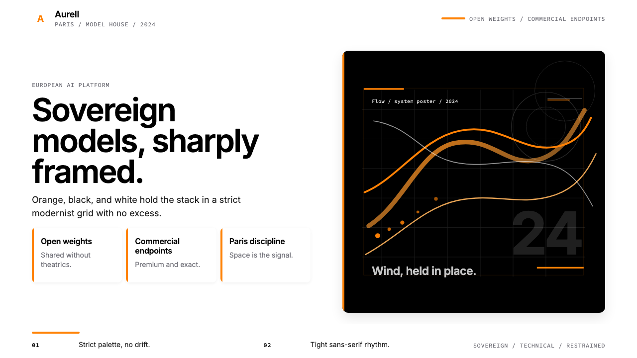 Mistral AI OrangeSovereign AI with restraint. Orange, black, and white lock the grid.主权AI很克制。橙黑白锁定网格。
 Adobe Creative CloudUnified, not uniform. Red anchor, white space, and saturated app tiles organi…统一而不单一:红色锚点、留白与高饱和应用方块组织整套工具。
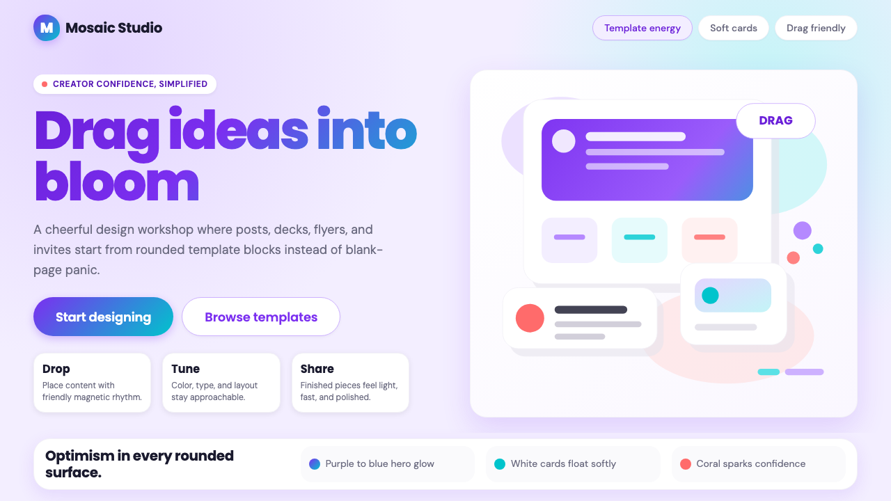 Canva 2024Confidence feels draggable. Purple-blue gradients and floating white template…信心可拖拽:紫蓝渐变与漂浮白卡,让创作变柔和。
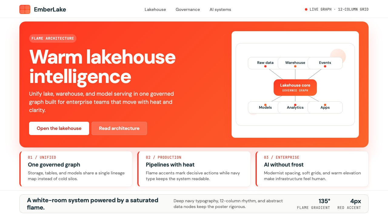 Databricks LakehouseWarm enterprise confidence. Flame red-orange gradients meet DM Sans and clean…温暖的企业信心:红橙火焰渐变配 DM Sans 与洁净数据图。
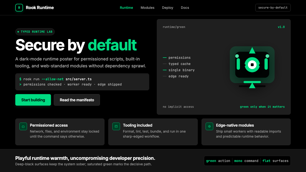 Deno Runtime-GreenWarm precision on black. Saturated green, Inter, and mono code turn security…黑底上的温暖精度:饱和绿、Inter 与等宽代码让安全成为主角。
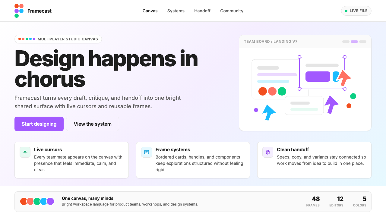 Figma 2024A brand that looks like its canvas. Five dots scatter like cursors, soft card…把产品体验直接变成品牌:五枚标志圆点如共享光标散落、柔和圆角卡片、紫色药丸按钮…