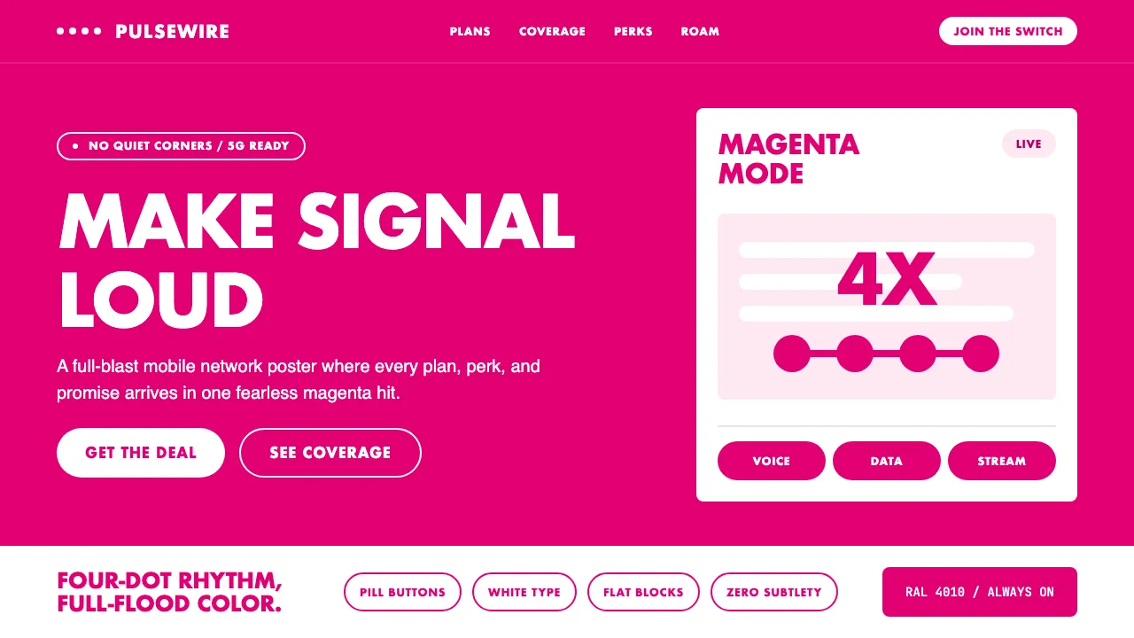
About T-Mobile Magenta
T-Mobile's visual identity is an exercise in chromatic dominance — Telekom Magenta (#E20074) isn't just a brand color, it's a trademarked territorial claim (RAL 4010) enforced through litigation. The system pairs full-bleed magenta hero blocks with white typography and the iconic four-dot motif, creating an aesthetic that reads simultaneously as telecom utility and Y2K rave flyer.
Under John Legere's "Un-carrier" era, the brand leaned into deliberate loudness: pill-shaped buttons, all-caps callouts, and zero visual subtlety. Every surface is an opportunity for saturation. The result is a design language that refuses restraint and treats magenta as both message and medium.
- Origin
- Bonn, Germany / Bellevue, Washington, USA
- Era
- 1990 founded; magenta identity since 1996 Wolff Olins rebrand; Un-carrier era 2013–present
- Key figures
- Mike Sievert · John Legere · Wolff Olins
- Movements
- Late-90s German modernism · Un-carrier loud marketing · Y2K saturated branding
T-Mobile Magenta design spec
Colors
Typography
The other 11 sections — buttons, cards, spacing, motion, techniques and more — open once you unlock. Download the DESIGN.md or send it to your AI in one click. Unlock once, yours forever.
Sign up nowStyles similar to T-Mobile Magenta
Also inspired by brands & products, with a close feel.
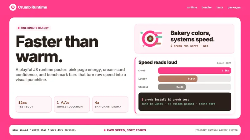 Bun JS Runtime Pink 2023Dev speed gets bakery-bright. Hot pink grounds white slabs, mono bars, and warm terminal depth.
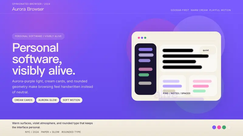 Arc BrowserPersonal software, visibly alive. Aurora purple glows over cream cards and rounded type.
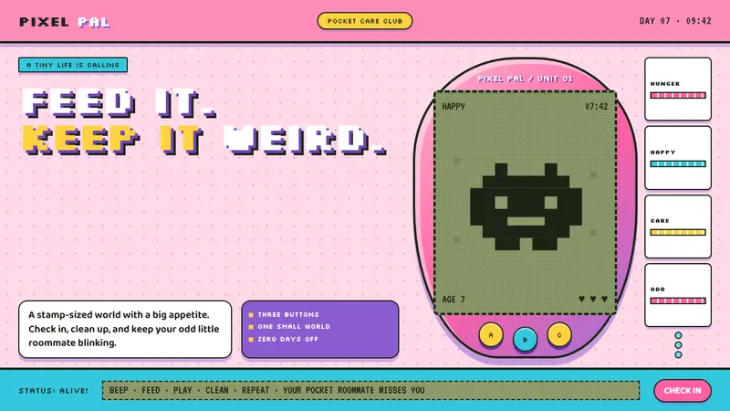 Tamagotchi (1996)Care gets candy-coated. Bubblegum plastic frames a crunchy pea-green pixel world.
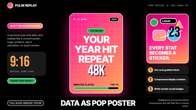 Spotify Wrapped 2023Social data goes neon. Hot pink-orange gradients, huge Inter stats, sticker badges.