What is Corporate Memphis (Alegria)?
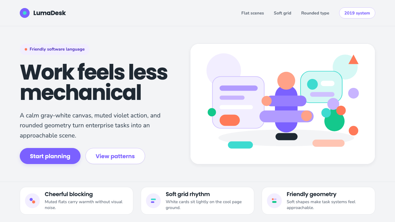
Corporate Memphis is the flat, weightless illustration style that convinced an entire decade of tech company homepages to greet visitors with cheerful, faceless cartoon people.
Corporate Memphis (Alegria) in brief
Corporate Memphis — commonly known by the industry name Buck gave its Facebook commission, "Alegria" — is the flat, near-white illustration system that colonized SaaS landing pages, onboarding flows, and empty-state screens through the back half of the 2010s and into the 2020s. Bendy, boneless figures with impossibly long limbs and oversized hands move through soft geometric scenes: a person gestures at a floating chart, another leans against an abstract building, a third pours coffee into a cup that is really just two overlapping ellipses. Every shape is rendered in a muted, non-representational flat fill — no gradients, no texture, no cast shadow that isn't itself a hard flat shape.
The canvas is a cool, slightly gray-tinted white rather than warm cream or pure paper white, and the system's signature accent is a soft, muted violet that leans toward periwinkle — a hue chosen precisely because it reads as neither masculine nor feminine, neither corporate-cold nor consumer-playful. That deliberate neutrality is the whole point: Alegria and its many descendants were built to represent "everyone" and therefore render no one in particular. Facial features are minimal to nonexistent; skin tones, when shown, span a token rainbow of the human population without lingering on any one of them.
Because the style was engineered for speed and infinite reuse rather than for any single illustrator's hand, it spread far beyond its Facebook origin. Component libraries let a designer swap a head, an arm, a prop, and a background color to generate a "new" illustration in minutes, which is exactly why, within a few years, unrelated companies across finance, healthcare, education, and productivity software all seemed to be greeted by variations of the same weightless, gesturing figures.
Where does Corporate Memphis (Alegria) come from?
The visual grammar underneath Corporate Memphis is older than any tech company. Its bendy, joint-free limbs descend from "rubber hose" animation, the technique early American cartoon studios used in the 1920s and 1930s to animate characters cheaply and fluidly: arms and legs were drawn as simple curved tubes that could bend anywhere, with no elbows or knees to keyframe. That same rubber-hose logic — limbs as flexible tubes rather than jointed structures — is exactly what gives Alegria-style figures their loose, gestural, faintly boneless movement nearly a century later.
The immediate design-industry precondition was the flat-design shift of the early 2010s. Once interface design abandoned skeuomorphic gradients, bevels, and drop shadows in favor of flat color and geometric simplicity — a shift crystallized by major platform redesigns around 2013 and 2014 — illustration followed the same logic. Flat, non-representational figures were cheap to produce, resized cleanly across device sizes, and matched the flat UI they sat inside. Illustration stopped being a decorative afterthought and became a load-bearing part of the interface itself, filling empty states, error screens, and onboarding flows that would otherwise be blank.
Buck, a Los Angeles-based design studio, built the specific system that gave the style its most famous name when it developed "Alegria" for Facebook's internal brand library around 2019 — a modular illustration kit meant to give the company's sprawling suite of products a single, friendly, endlessly reusable visual voice. Because the components were built to be mixed and matched by in-house teams rather than commissioned individually, the look propagated with unusual speed through Facebook's own products and, once other companies' brand and illustration teams saw how efficiently it scaled, through the wider SaaS landscape — Slack, Mailchimp, Dropbox, and countless smaller startups all arrived at visibly related looks within a couple of years, often via customizable illustration libraries like Humaaans, which let any designer generate the same genre of figure without commissioning original art.
The style's very ubiquity produced its backlash. Around 2021, critics and designers began referring to it, half-mockingly, as "Corporate Memphis" — a name that borrows the word "Memphis" from the loud, maximalist Milanese furniture and design collective of the 1980s founded by Ettore Sottsass, even though the two styles share almost nothing visually. The joke was pointed rather than descriptive: where the original Memphis Group reveled in clashing color, pattern, and irreverence, "Corporate Memphis" was accused of using a surface layer of playful diversity to smooth over the fact that every company using it looked, felt, and said essentially the same thing. Commentators argued the style had become a way for large companies to signal warmth and inclusion cheaply, at scale, without committing to anything specific — a criticism that stuck hard enough that the style's use has visibly declined since its early-2020s peak, even as its component vocabulary remains instantly recognizable.
What defines the Corporate Memphis (Alegria) look?
Rubber-Hose Anatomy
Limbs are drawn as simple, boneless curves rather than jointed segments — a direct descendant of 1920s cartoon animation technique. Hands and feet are noticeably oversized relative to the body, exaggerating gesture so a figure can "point," "hold," or "reach" with maximum legibility at small sizes. There is no anatomical realism to speak of; the body is a flexible prop for a gesture, not a rendered human form.
Flat Non-Representational Fill
Every shape is a single flat color with a hard, clean edge — no gradients, no highlights, no simulated material or light source. Shadows, where they appear at all, are themselves flat geometric shapes rather than soft, diffused forms, which keeps the whole scene reading as a graphic composition rather than an illusion of physical space.
Signature Palette
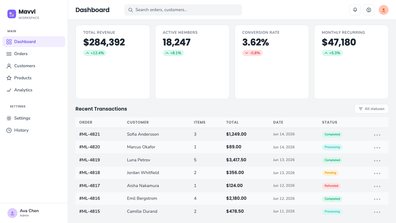
The system is built around a cool, faintly gray-tinted white ground and a muted, dusty violet that sits between purple and periwinkle blue. This particular hue was chosen for its studied neutrality — warm enough to feel approachable, cool enough to feel professional, and specific enough to become instantly recognizable as belonging to this style rather than any single brand.
Ambiguous Figuration
Faces are reduced to the barest suggestion of features, or omitted entirely, and skin tones are distributed across a deliberately broad range within a single scene. The intent is to represent a generalized, universal "anyone" rather than a specific, particular person — a choice that made the style attractive for global brands wanting to signal inclusiveness without depicting any one identifiable community.
Geometric Stage-Setting
Figures inhabit sparse, softly geometric environments — a rounded desk, a floating circle standing in for a planet or a screen, an oversized potted plant reduced to a few overlapping blobs. Props are simplified to their most legible silhouette and scattered across generous negative space rather than composed into a believable room.
Rounded Geometric Sans
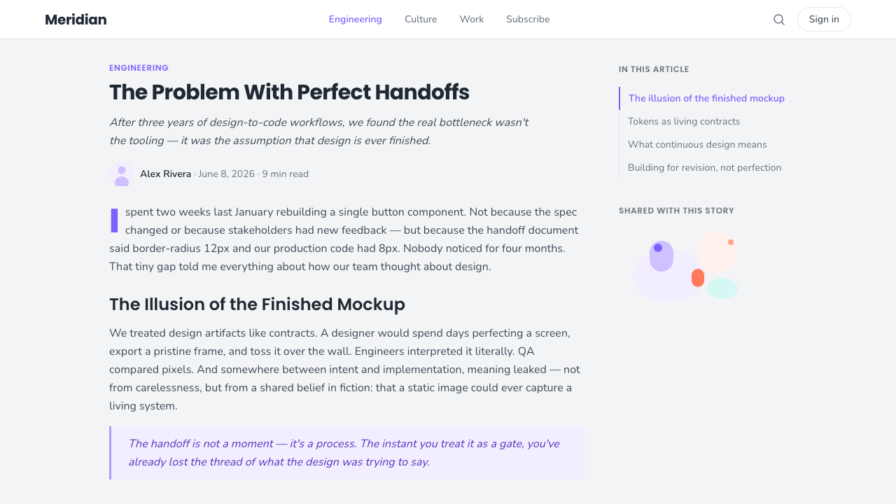
Supporting typography favors rounded, geometric sans-serif letterforms with soft terminals rather than sharp corners — a typographic echo of the illustration's own boneless, friendly curves. Type is kept light in weight and generously spaced, reinforcing the overall impression of ease rather than urgency.
Who shaped Corporate Memphis (Alegria)?
The Los Angeles design studio that built "Alegria," the modular illustration system commissioned by Facebook around 2019. Buck's system packaged the rubber-hose figure into reusable, swappable components — heads, limbs, props, backgrounds — designed for in-house teams to recombine without commissioning new art, which is the mechanism that let the look scale across an entire product suite almost overnight.
The commissioning client whose internal illustration library made Alegria the reference example for the entire genre. Because Facebook's product suite spanned so many surfaces — the core app, ads tools, developer platforms, onboarding flows — the style got an unusually fast and visible proving ground before other companies' brand teams adopted variations of it.
One of the best-known free component libraries built in this genre, created by designer Pablo Stanley, letting anyone assemble rubber-hose figures from a kit of interchangeable body parts and poses. Libraries like this — not any single illustrator's commissioned work — are what carried the look far beyond big tech and into countless independent products, decks, and marketing sites.
The pejorative label critics attached to the style around 2021, borrowing the name of the 1980s Milanese Memphis Group by way of ironic contrast rather than lineage. The name's spread marks the moment the style shifted from a fresh, efficient solution to a widely mocked shorthand for interchangeable, personality-free corporate branding.
The broader institutional context — the wave of software-as-a-service homepages, onboarding screens, and empty states across the 2010s and early 2020s — that gave the style its natural habitat. It was less a movement any single artist led than a genre-wide default that emerged wherever product teams needed cheap, fast, endlessly reusable warmth.
How do you use Corporate Memphis (Alegria) today?
Corporate Memphis reads best where the goal is to lower a visitor's guard rather than to project authority or precision. It signals approachability, so it belongs in contexts where a product wants to feel human, friendly, and a little informal — exactly the register that made it the default choice for SaaS onboarding for the better part of a decade.
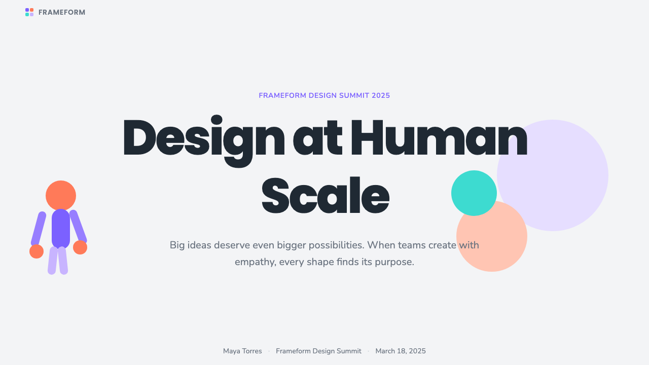
On slides, the style works hardest on section-break and concept slides rather than dense data pages: a single large illustrated scene — a figure interacting with an abstract chart or object — can stand in for an entire idea on a cover or transition slide, carrying the emotional tone while a much simpler type treatment carries the words. On content slides, the illustrations should shrink to supporting spot art beside real text rather than dominating the page; on data slides, the style's own logic argues against it, since flat gestural figures compete with rather than clarify numbers — data is better served by plain geometric chart forms in the same muted palette, with the figures kept off the page entirely.
In web interfaces, the aesthetic belongs on empty states, onboarding flows, and marketing sections of dashboards and pricing pages — the moments where a product needs to explain itself to a first-time or lapsed user without yet having real data to show. A dashboard's actual working screens, dense with numbers and controls, should generally avoid the style entirely; its softness reads as noise once a user is doing real work rather than being welcomed. A pricing page can use one illustrated figure near the top to set tone, but should let the tier comparison itself stay plain and legible.
For editorial and marketing content, the style suits explainer content, blog headers, and email illustrations aimed at a broad, non-technical audience — it lowers the perceived complexity of a subject before a reader has read a word. It is a poor match for anything that wants to convey precision, luxury, technical depth, or urgency; a security product, a financial trading tool, or a healthcare diagnostic interface will undercut its own credibility by wrapping itself in figures designed to look weightless and unthreatening.
The most common mistake is treating the style as a free, interchangeable stock-art category rather than a coherent system — mixing rubber-hose figures from one library with photographic imagery, skeuomorphic icons, or a completely different color logic elsewhere on the same page. A second common mistake, given the style's history, is reaching for it by default in 2026 without asking whether "friendly and generic" is actually the right message; the backlash against Corporate Memphis was specifically a backlash against sameness, and a page that uses it today reads, fairly or not, as a page that didn't think hard about its own visual identity.
Corporate Memphis (Alegria) — FAQ
Why is it called "Corporate Memphis" if it looks nothing like the 1980s Memphis Group?
The name is a deliberately ironic borrowing. The original Memphis Group, founded in Milan in the early 1980s by designer Ettore Sottsass and collaborators, was loud, clashing, and maximalist — the opposite of this style's muted, weightless calm. Critics reached for the name around 2021 precisely because the two styles share nothing but a surface gloss of playfulness; the joke is that a supposedly bold, expressive furniture movement got reduced, decades later, to a synonym for safe, homogenized corporate branding.
Is this the same thing as "flat design"?
It's a specific illustration style that emerged from the broader flat-design movement rather than a synonym for it. Flat design describes an entire interface philosophy — no gradients, no bevels, no drop shadows — that applies to buttons, icons, and layout generally. Corporate Memphis is what happened when that same flat, gradient-free logic was applied specifically to human figures, producing the rubber-hose, boneless-limb character style. You can build a flat-design interface without ever using a Corporate Memphis figure.
Why did the style spread so fast across completely unrelated companies?
Because it was built as a modular component system rather than a set of finished illustrations. Once libraries existed that let a designer swap a head, a prop, a background color, or a gesture and recombine them freely, any team could generate an apparently original scene in minutes without commissioning an illustrator. That combination of speed, low cost, and a look already associated with major tech brands made it close to a default choice for any product wanting to appear modern and friendly fast — which is also exactly why it started to look identical everywhere.
Can this style still be used today without looking dated or generic?
Yes, but it requires restraint the original wave often lacked. It works best used sparingly — a single hero illustration rather than figures scattered across every screen — paired with a specific, considered color choice rather than the exact muted violet everyone else used, and combined with a typographic and layout system that has its own point of view. Used as occasional accent rather than the whole visual identity, the underlying rubber-hose technique still communicates warmth effectively; used as wallpaper, it reads instantly as a 2019-era default.
Does the style work with a dark background instead of the canonical near-white ground?
It is possible but works against the style's original intent. The near-white, gray-tinted canvas was chosen specifically to feel light, airy, and unthreatening, and the muted violet accent was calibrated against that pale ground. Inverting to a dark background pulls the whole system toward a moodier, more premium register that the original rubber-hose figures — designed to look weightless and approachable rather than dramatic — don't naturally support. A dark variant needs to brighten and simplify the color accent considerably, or the flat figures will read as murky rather than confident.
Related design styles
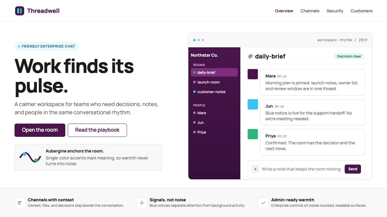 Slack 2019Warm enterprise chat. Aubergine rail, Manrope type, and single-accent badges…
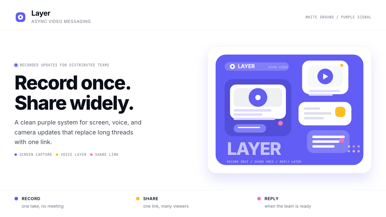 Loom Async-Video PurpleAsync, not meetings. Pure white ground, electric purple, record-button geomet…
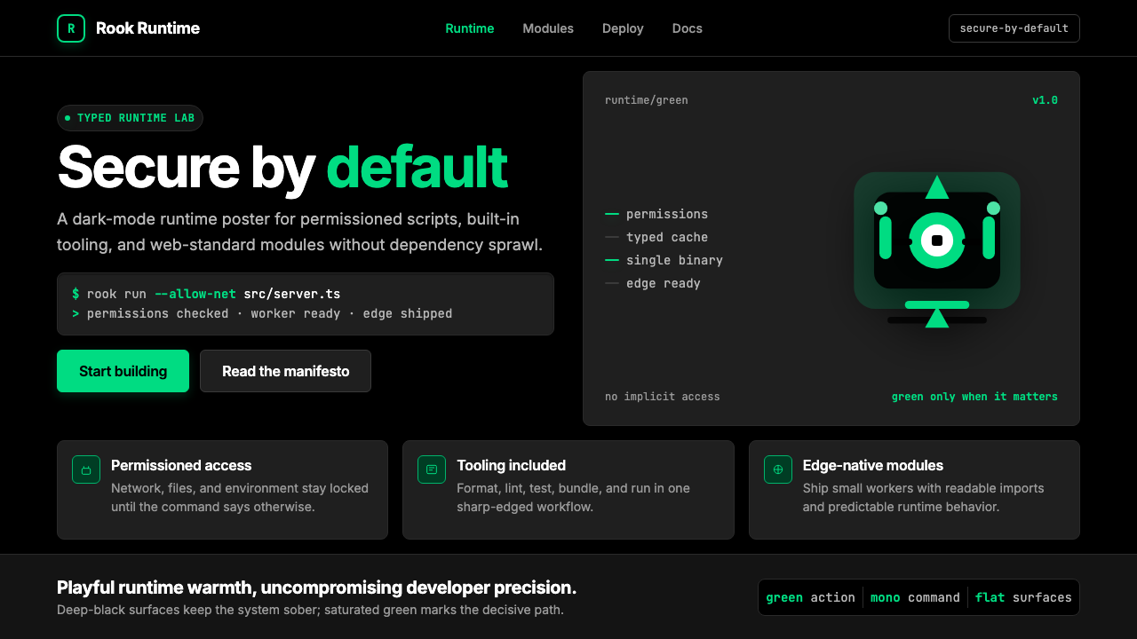 Deno Runtime-GreenWarm precision on black. Saturated green, Inter, and mono code turn security…
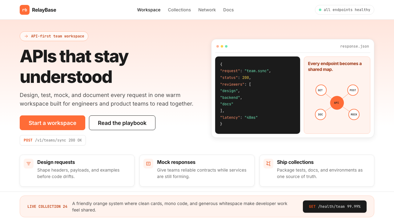 Postman 2024Warm APIs feel approachable. Orange gradients, Inter headlines, and dark mono…
 Replit Browser IDE BlueFriendly code gravity. Cyan run lights and mono panels warm the deep navy IDE…
 Salesforce TrailheadFriendly enterprise glows. Cloud-white, cobalt, and rainbow badges keep it wa…