What is Mastodon Fediverse?
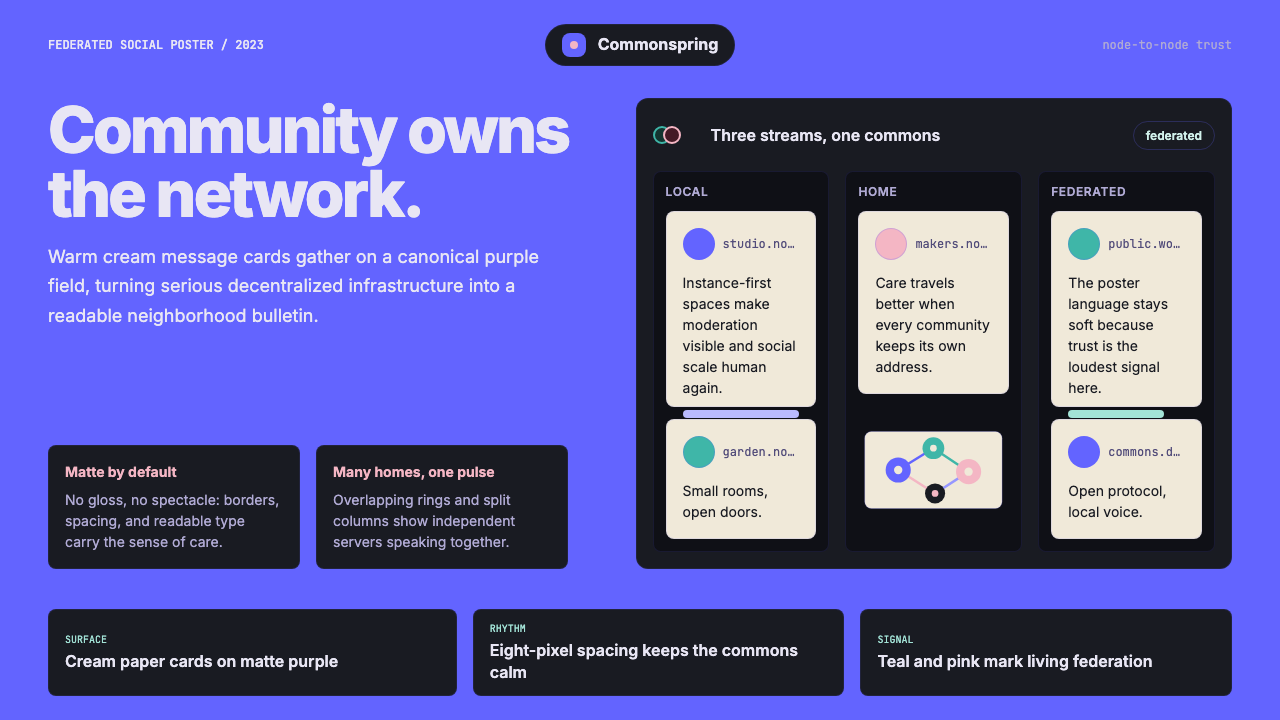
Mastodon's design language proves that decentralized infrastructure can be warm, human, and instantly recognizable — wrapped in a canonical purple that no corporate social network dared to claim.
Mastodon Fediverse in brief
Mastodon Fediverse is the visual identity of the open-source, federated social network Mastodon — a design system that emerged organically from community contribution and deliberate brand stewardship between 2016 and 2023. Its hallmark is a deep, saturated violet-purple that serves as the primary brand color, deployed against matte dark backgrounds with floating cream or off-white content cards. The result is a dark-mode-first aesthetic that feels neither sterile nor aggressive: it is warm, communal, and unapologetically non-corporate.
The visual system draws its character from three interlocking elements: the brand purple, the hand-illustrated mammoth mascot with soft pink accents, and a layout architecture inherited from multi-column desktop clients. Together, these create a distinctive look — recognizable at a glance — that communicates Mastodon's values of community ownership, federation, and transparency without requiring a single word of explanation.
Unlike design systems built by product teams to maximize engagement metrics, the Mastodon visual language evolved in public, shaped by the maintainers and contributors who used the platform themselves. This origin gives the aesthetic an honest, lived-in quality. It is not slick in the way that venture-backed social products are slick; it is composed, purposeful, and legible — closer in spirit to a well-maintained open-source project than to a growth-optimized consumer app.
Where does Mastodon Fediverse come from?
The story of the Mastodon visual identity begins in Jena, Germany, in 2016, when software developer Eugen Rochko — then in his early twenties — launched the first version of Mastodon as an open-source alternative to Twitter. Rochko chose the ActivityPub protocol as the federation backbone, a W3C standard that would eventually unite dozens of platforms — from Pixelfed to PeerTube to Pleroma — into the broader Fediverse ecosystem. The name Mastodon came from the prehistoric mammal, and Rochko commissioned a hand-illustrated mascot: a woolly mammoth rendered in soft, rounded strokes with warm pink tusks and an approachable, cartoonish face. This mascot became the emotional anchor of the brand, humanizing what would otherwise be a technically daunting proposition.
The canonical purple was not chosen arbitrarily. In the early years of open-source software branding, deep violet-purples occupied a relatively uncontested territory: they read as creative and technical without the aggressive authority of red or the corporate neutrality of blue. For a platform explicitly positioning itself against Twitter's blue-and-white minimalism and Facebook's corporate blue, purple carried useful connotations — counterculture, individuality, and a certain digital-bohemian warmth. By 2022, the purple had become so strongly associated with Mastodon that it functioned as instant brand recognition across the Fediverse.
The November 2022 Twitter acquisition by Elon Musk triggered a migration event that stress-tested the Mastodon design system at scale. Hundreds of thousands of new users joined within days. The visual identity — already coherent but largely known only within open-source circles — suddenly had to perform for a mainstream audience. Renaud Chaput, who had taken on a key role in stewarding the web client's interface, led a significant visual refresh in this period, refining the three-column layout, improving the card component system, and sharpening the brand application of the purple across both light and dark modes. The 2022–2023 period represents the consolidation of the Mastodon visual system into something that could be called a mature design language.
The broader Fediverse context shaped the design philosophy in important ways. Because Mastodon is federated — meaning users join individual instances rather than a single monolithic platform — the design system had to work as both a unified brand and a flexible substrate for hundreds of independently operated servers. Instance administrators could and did customize their installations, adding their own logos and color schemes, but the underlying Mastodon chrome remained recognizably consistent. This tension between brand coherence and instance diversity is baked into the system: the purple functions as a shared signal, while the mammoth mascot and card-based layout provide structural continuity across the federation.
What defines the Mastodon Fediverse look?
The Brand Purple
The defining element of the Mastodon palette is a deep, fully saturated violet-purple that functions as the primary brand signal across every surface. It appears as the application chrome background in many client implementations, as the accent color on interactive elements, and as the dominant hue in the mammoth mascot's illustrated form. This purple is warm rather than cool — it leans toward violet rather than true blue-purple — which gives it a human quality that colder purples lack. Against dark backgrounds it glows with quiet authority; against light surfaces it reads as bold and decisive.
Dark-Mode-First Surface Architecture
The canonical Mastodon experience is dark-mode-first: a matte near-black or very dark desaturated background serves as the primary canvas. Content cards — the 'toot' posts — float on this surface as cream, off-white, or slightly elevated dark panels, creating a clear figure-ground separation without hard borders. This layered approach treats depth as information: the background recedes, the cards advance, and interactive elements are elevated further still. The result is an interface that feels soft and readable even at high information density.
The Hand-Illustrated Mascot
The Mastodon mammoth mascot is deliberately non-corporate: hand-illustrated in a warm, slightly cartoonish style with rounded forms, expressive eyes, and tusks rendered in a soft pinkish tone rather than stark ivory. It stands in deliberate contrast to the geometric logos of mainstream social platforms. The mascot appears in onboarding flows, empty states, error pages, and promotional materials — always as a reassuring presence rather than a purely decorative element. Its hand-made quality signals community ownership and craft over corporate polish.
Multi-Column Layout Language
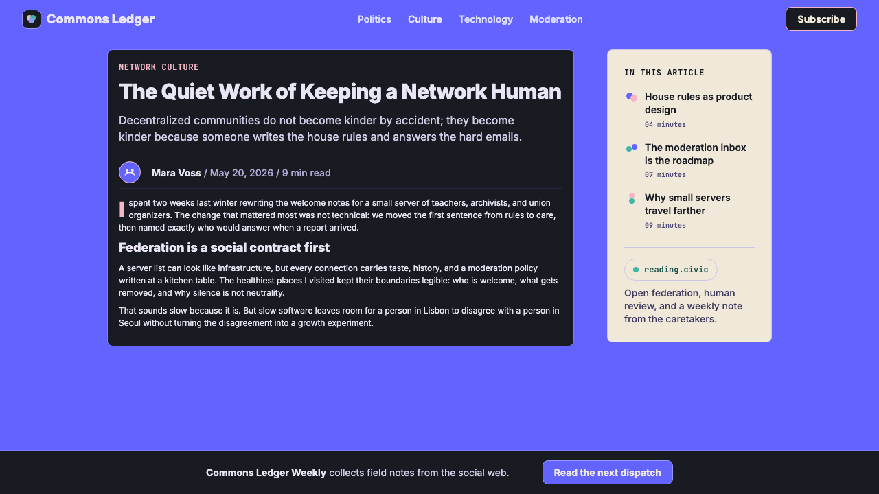
Mastodon's desktop layout draws from the tradition of multi-column Twitter clients like TweetDeck — presenting the home feed, notifications, and additional columns as parallel vertical streams that can be scanned simultaneously. Each column is a contained scroll context with a fixed header, creating a spatial logic where different streams of content have dedicated territories. This layout communicates plurality and federation: there is no single authoritative feed, only multiple parallel views into the network. On smaller screens the experience collapses gracefully to a single-column view without losing the underlying spatial logic.
Federation Iconography
A distinctive feature of the Mastodon visual vocabulary is its iconography of federation: instance logos appear alongside usernames in a consistent format that makes the decentralized structure visible rather than hiding it. The at-sign combined with domain name — the full federated handle — is treated as a designed element in its own right, not an afterthought. Boost (reblog) and favourite indicators use custom iconographic treatments that feel native to the platform rather than borrowed from mainstream social conventions, reinforcing the sense that this is a distinct ecosystem with its own visual culture.
Generous Spacing and Legibility
The Mastodon interface uses notably generous spacing within and between content cards, giving individual posts room to breathe even when feeds are dense. This choice prioritizes readability over information density — a value judgment that reflects the platform's community-over-growth orientation. Text is sized for comfortable reading across long sessions, and avatar images are given meaningful prominence rather than being reduced to near-invisible indicators. The overall rhythm of the interface feels measured and respectful of the reader's attention.
Warm Neutrals and Cream Accents
To prevent the deep purple and dark backgrounds from feeling cold or oppressive, the Mastodon palette consistently reaches for warm neutrals: off-whites that lean toward cream rather than blue-white, warm grays that carry a slight violet undertone, and the mammoth mascot's pink tusk accents that introduce a biological warmth to an otherwise digital palette. These warm anchors are not decorative flourishes — they are structural counterweights that keep the overall system feeling approachable. The interplay between cool purple authority and warm neutral warmth is what gives the Mastodon aesthetic its distinctive character.
Who shaped Mastodon Fediverse?
Rochko founded Mastodon in 2016 and remains its primary maintainer. His decision to build on the ActivityPub protocol — and to open-source the entire codebase — determined the federated architecture that shaped every aspect of the visual system. The need to brand something decentralized, community-owned, and explicitly non-corporate drove the aesthetic choices that distinguish Mastodon from its commercial peers. Rochko's insistence on maintaining the project independently, without venture capital, is legible in the design: nothing about it optimizes for growth metrics.
Chaput took on a central role in the visual development of the Mastodon web client, particularly during and after the 2022 migration surge. He shepherded the interface refinements that consolidated the design language for a mainstream audience — improving component consistency, sharpening the card system, and ensuring that the brand purple was applied with discipline across the expanding interface surface. His work represents the transition from an organically grown interface to a consciously maintained design system.
Lemmer-Webber is one of the primary authors of the ActivityPub W3C specification — the federation protocol that makes the Fediverse possible. While her contribution is technical rather than visual, the design philosophy of Mastodon is inseparable from the architectural decisions enshrined in ActivityPub. The visual language of federation — instance icons, full federated handles, the spatial logic of multi-server network views — exists because ActivityPub made federation a first-class concern. Lemmer-Webber's work gave designers something genuinely new to visualize.
Dansup is the developer behind Pixelfed, a federated image-sharing platform that shares the ActivityPub foundation with Mastodon. While Pixelfed developed its own visual identity, its existence within the Fediverse ecosystem influenced how Mastodon designers thought about the shared visual language of federation — what signals are universal across ActivityPub platforms, and what signals are Mastodon-specific. This cross-platform visual dialogue helped sharpen the distinctiveness of the Mastodon brand within a broader decentralized ecosystem.
How do you use Mastodon Fediverse today?
The Mastodon Fediverse style is most appropriate for products that need to communicate openness, community, and trustworthy infrastructure without corporate gloss. Applied correctly, it conveys that a product is built with its users rather than for them. The dark-mode-first, card-based, purple-accented system translates well to a range of contexts — but it is not a neutral aesthetic, and it should not be treated as one. Before reaching for it, ask whether the product's values align with what the style signals: decentralization, community governance, and an explicit rejection of engagement-maximization.
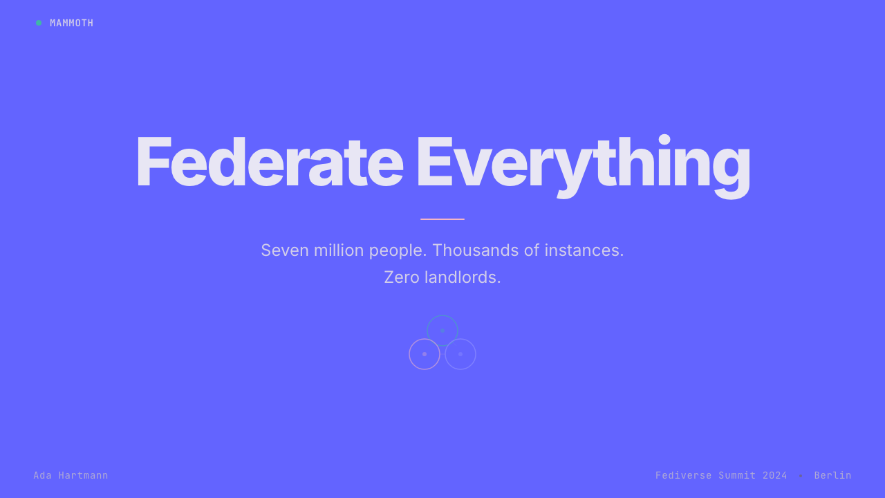
For presentation slides, the style works best when used with discipline. A cover slide built on this system uses the brand purple as a full-bleed background, with the presentation title in large, light-weight type, and perhaps a simplified mammoth silhouette as a visual anchor — nothing more. Content slides commit to the dark surface with cream or white card panels containing text; data slides treat charts as floating card elements with purple used exclusively for the primary data series. Resist the temptation to introduce additional colors: the power of the system lies in its restraint, and a third or fourth hue immediately dissolves the coherence.
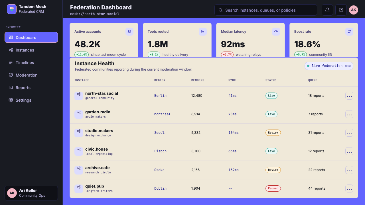
For web interfaces — dashboards, community tools, developer portals, or any product with a technical-minded audience — the style integrates naturally. A dashboard built on this system uses the dark matte background as the primary surface, card components with subtle elevation for data modules, and the brand purple for active states, primary actions, and key metrics. Navigation should be typographic and spatial rather than icon-heavy, with instance or account identity given visual prominence in the header area. The three-column spatial logic adapts well to dense information environments where multiple parallel streams need simultaneous visibility.
For editorial and marketing contexts, the style's most effective application is in materials aimed at developer communities, open-source audiences, or technically literate users who will recognize and appreciate the reference. A marketing page built on this system leads with the dark purple background, uses cream and off-white for content sections, and applies the mammoth mascot sparingly as a signature element. The anti-corporate quality of the aesthetic is a genuine asset in contexts where authenticity is valued — using it in a financial services or luxury product context would produce a jarring mismatch.
A common mistake when applying this style is treating the brand purple as an all-purpose background. It is most effective as an accent and structural element; when used as the dominant surface across an entire interface, it can feel overwhelming and reduces the visual hierarchy that makes the system legible. A second common error is abandoning the warmth that defines the palette — replacing cream and off-white with cool blue-grays strips the system of the human quality that distinguishes it from generic dark-mode design. Keep the warm neutrals, keep the cream, and let the purple do specific work rather than total dominance.
Mastodon Fediverse — FAQ
Is the Mastodon style the same as general dark-mode design?
No — though the two overlap in obvious ways. Generic dark-mode design typically uses cool near-black backgrounds and blue or teal accents drawn from the conventions of developer tooling and OLED screen optimization. The Mastodon style is darker in intent: the purple is a warm violet rather than a cool tech-blue, the neutrals lean cream rather than steel, and the mammoth mascot introduces an illustrated warmth that generic dark-mode design entirely lacks. Mastodon's dark surfaces feel communal and lived-in; generic dark mode feels technical and clinical. The difference is not primarily technical — it is cultural and intentional.
Can this style work in a light-mode context?
Yes, with adjustments. Mastodon itself offers a light mode in its official web client, where the dark surfaces are replaced by white or very light warm-gray backgrounds and the card panels shift to slightly elevated white surfaces. The brand purple retains its role as the primary accent and active-state color. The light mode variant is less immediately distinctive than the dark mode canonical form — it reads as a clean, slightly warm social interface rather than carrying the immediately recognizable Mastodon character. If brand recognition is important, the dark-mode application is stronger. If accessibility or context (bright environments, print) requires light mode, the warm-neutral approach produces better results than a stark blue-white inversion.
How does this style differ from other open-source platform aesthetics, like WordPress or Wikipedia?
WordPress and Wikipedia prioritize legibility and neutrality in ways that make them deliberately aesthetically recessive — they foreground content and step back visually. Mastodon's design makes a different choice: it has a strong, recognizable brand that asserts itself alongside the content. The brand purple is not wallpaper; it is a statement. Where WordPress and Wikipedia aim to be invisible, Mastodon aims to be present — not in a way that overwhelms content, but in a way that signals the platform's values and invites community identification. This makes the Mastodon aesthetic riskier to apply in generic contexts, but more powerful when applied appropriately.
What makes a Mastodon-style implementation feel authentic versus superficial?
Authenticity in this style comes from understanding what the system is communicating, not just what it looks like. A superficial application uses the purple accent and the dark background and stops there — producing something that reads as generic dark-mode with a tinted primary. An authentic application understands that the card-based structure is communicating containment and safety (each voice in its own bounded space), that the warm neutrals are preventing the technical infrastructure from feeling cold, and that the federation iconography — when present — is making decentralization visible rather than hiding it. The mammoth mascot is optional; the warmth it represents is not.
Is this style appropriate for commercial or profit-driven products?
It can work, but with significant caveats. The Mastodon aesthetic carries strong anti-corporate connotations — this is not a neutral quality but a built-in signal. Using it for a product that is functionally indistinguishable from the corporate products the style implicitly critiques will read as inauthentic, and audiences familiar with the Fediverse will notice. The style works for commercial products when those products genuinely share the values it signals: developer tools built in the open-source tradition, community platforms with genuine user ownership, infrastructure products oriented toward transparency. It does not work for consumer goods, financial services, luxury brands, or growth-maximizing social platforms — in those contexts, the misalignment between aesthetic signal and product reality undermines both.
Related design styles
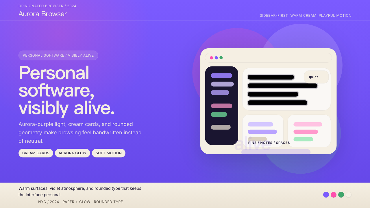 Arc BrowserPersonal software, visibly alive. Aurora purple glows over cream cards and ro…
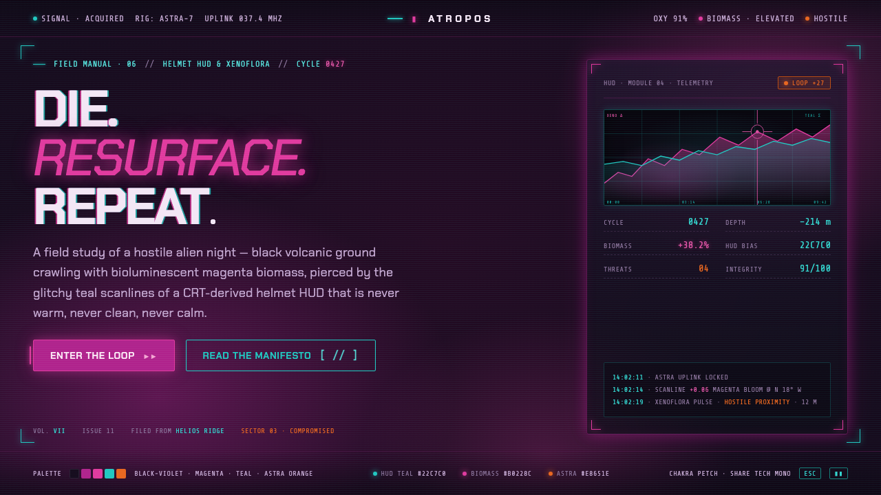 ReturnalNever warm, never clean, never calm. Magenta biomass on a violet night, pierc…
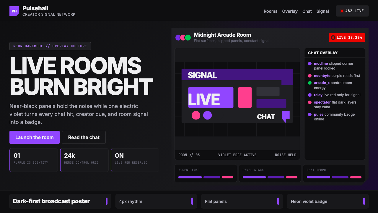 TwitchPurple is tribal signal. Neon violet cuts through flat dark panels and chat g…
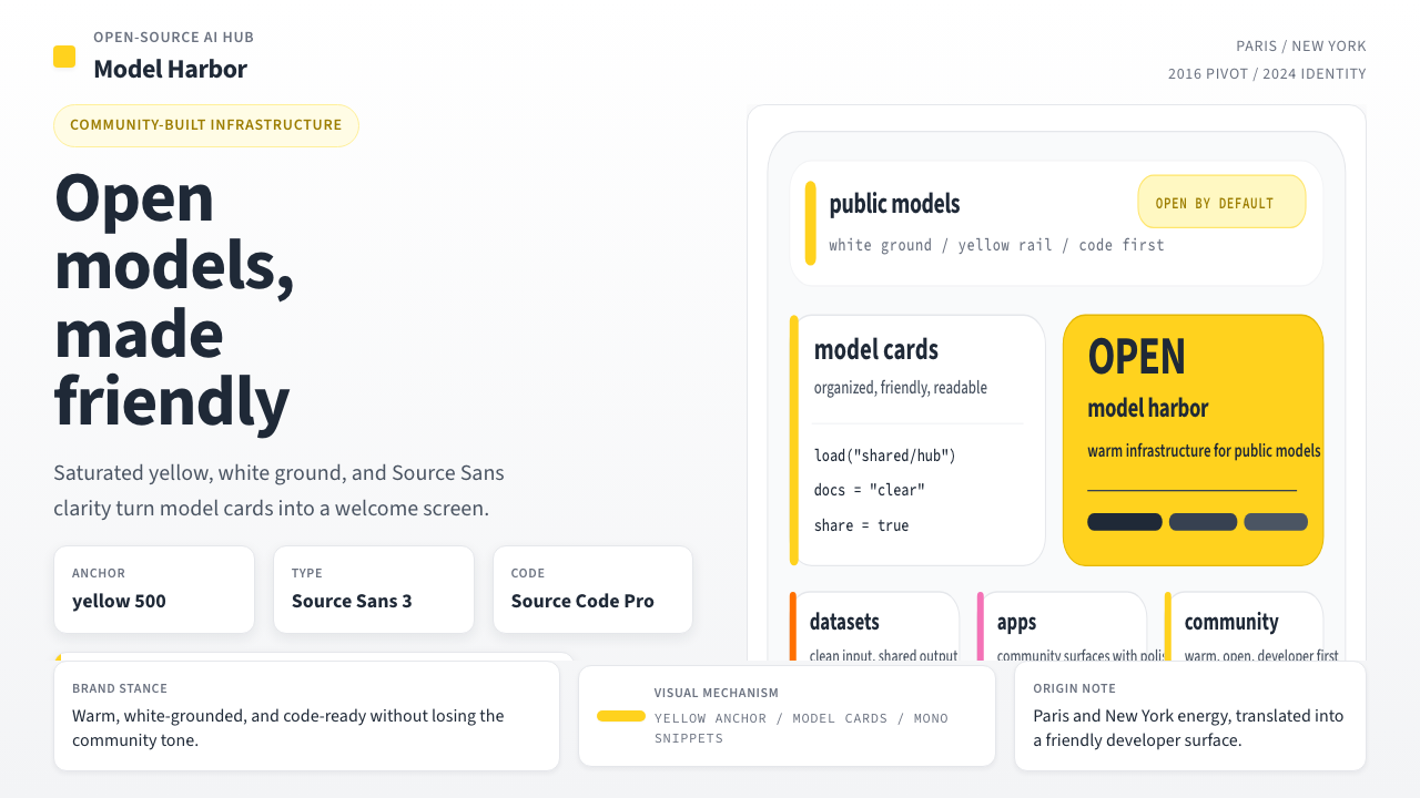 Hugging Face Emoji-YellowWarm infrastructure. Yellow rails, Source Sans, and code cards make openness…
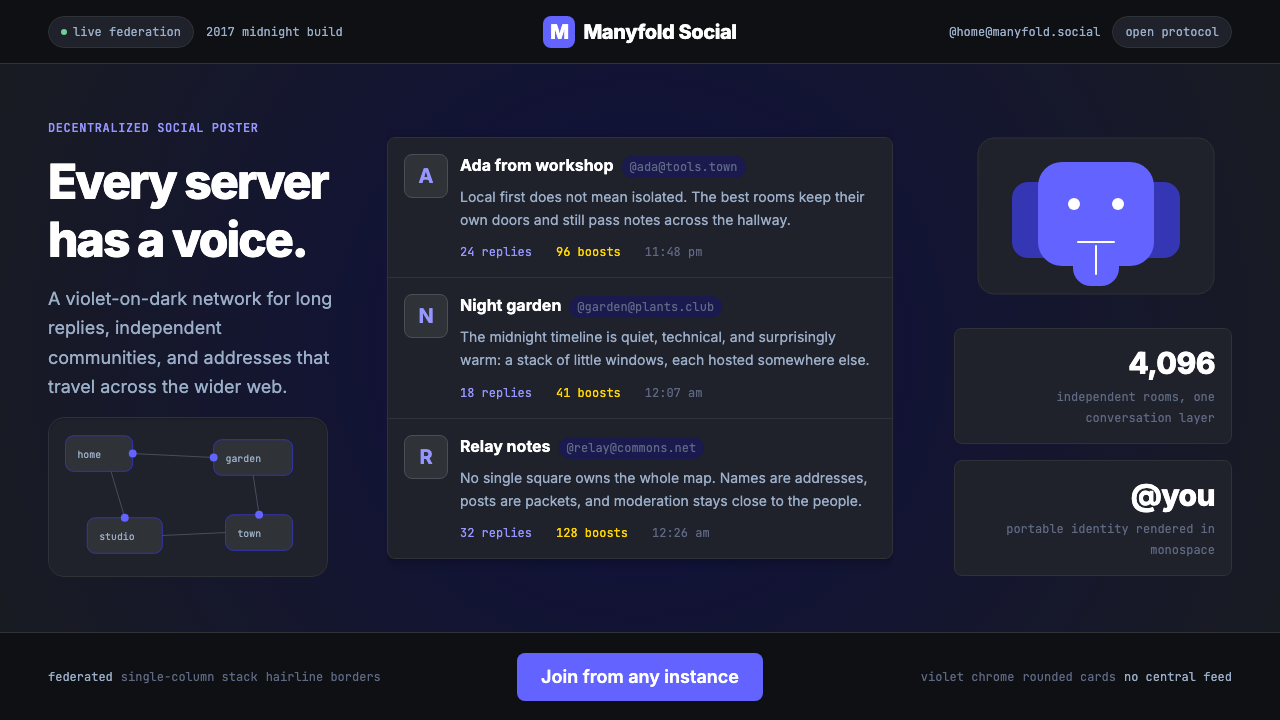 Mastodon Fediverse Elephant (2017)Federation feels friendly. Violet dark cards and monospace domains stack like…
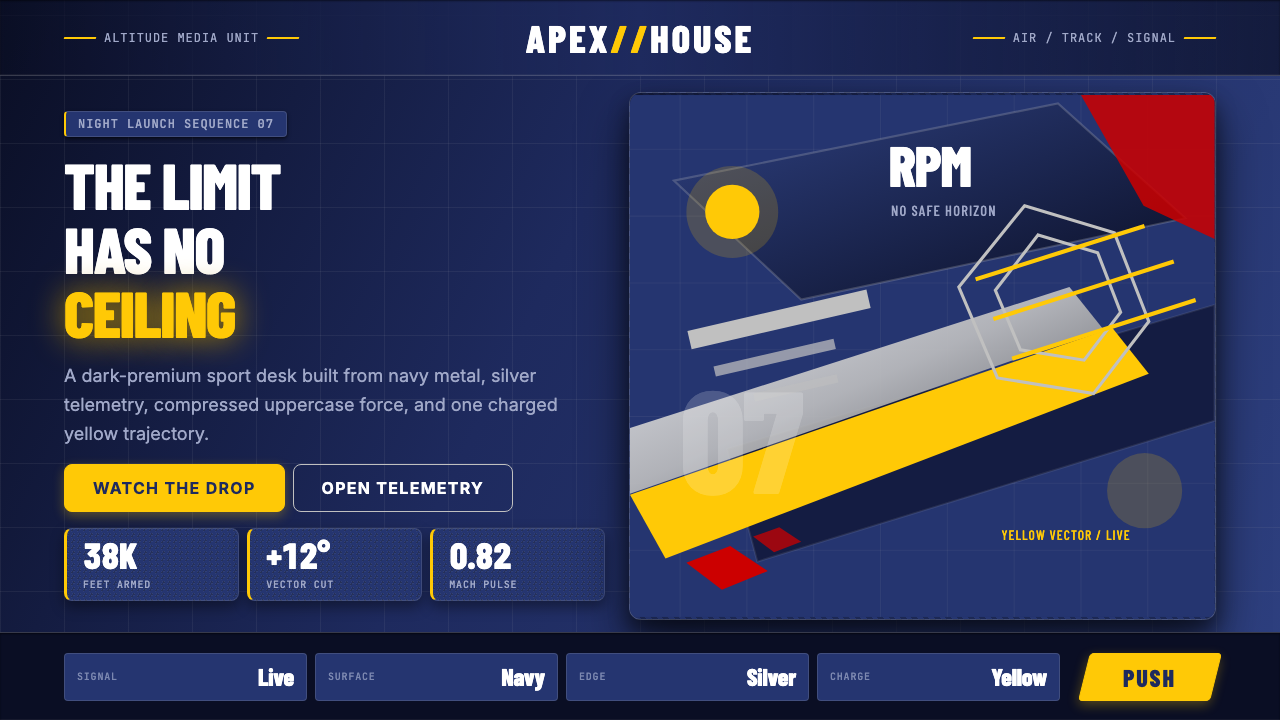 Red Bull Extreme SportsAdrenaline goes corporate. Navy chrome, condensed uppercase, yellow slashes a…