What is MSN Messenger (2001)?
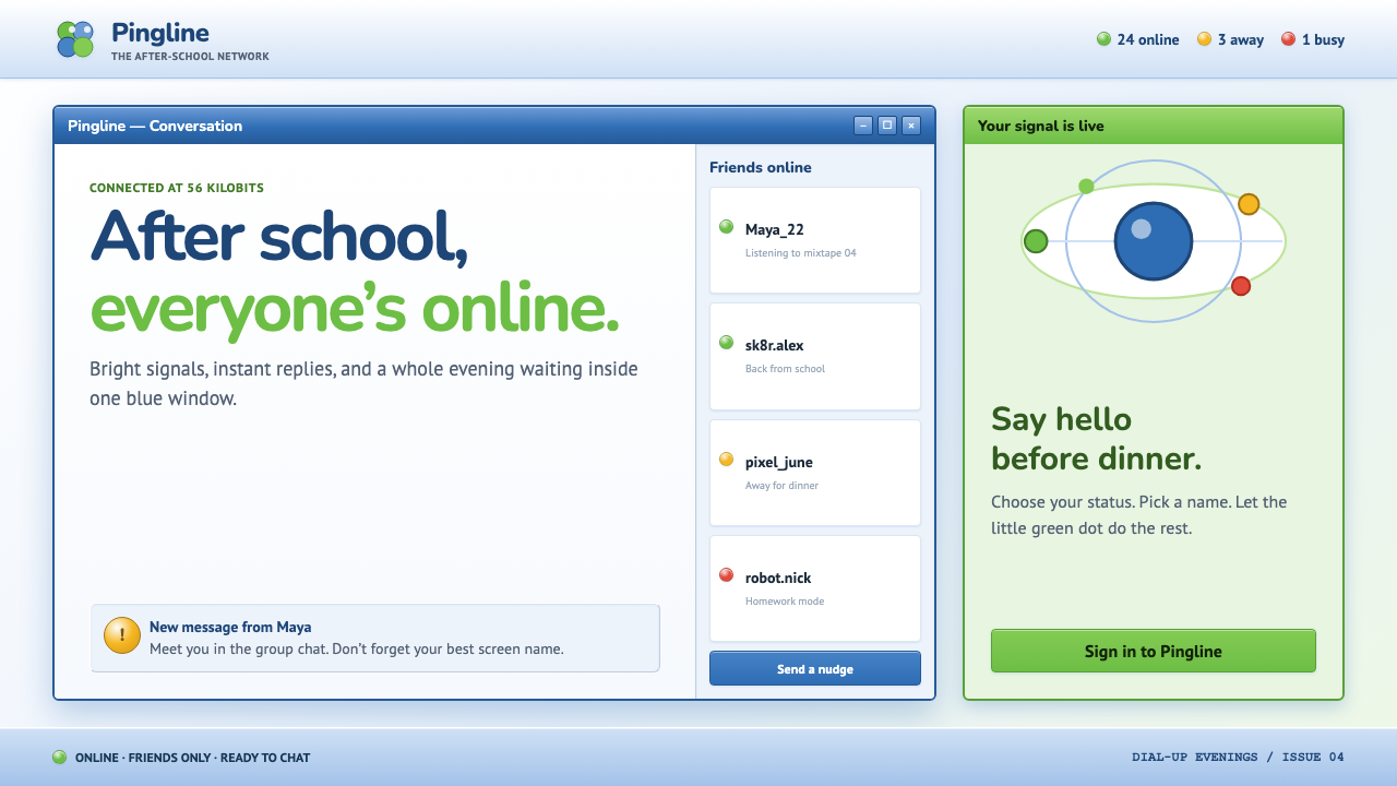
MSN Messenger was the friendly, glassy face of the dial-up internet — a chat window that glowed blue, buzzed green, and never stopped feeling like a toy.
MSN Messenger (2001) in brief
This style rebuilds the classic MSN Messenger chat window as a complete visual system: a glassy Luna-blue title bar running along the top, a green-to-cyan butterfly logo tucked in the corner, and a small colored dot beside every contact's name announcing whether they are Online, Away, or Busy. The message pane itself is pure white, kept deliberately plain so the surrounding chrome can carry all the personality.
Every surface wears a specific vertical gloss — a highlight running top to bottom that makes buttons, title bars, and dialog frames look like they are made of glass or gel rather than flat plastic. Buttons are small and gently rounded, group boxes carry a subtle beveled edge, and dialogs float above the desktop on a soft blue-tinted shadow. Type is a crisp, functional UI sans, never decorative, because the software's job was to get out of the way of the conversation happening inside it.
The whole aesthetic reads as optimistic and a little toylike — the after-school internet, built by a company confident that computers were becoming genuinely fun rather than merely functional. The status-dot vocabulary of green, amber, red, and gray gave an entire generation its first taste of ambient presence — knowing, at a glance and without asking, whether a friend was available to talk.
Where does MSN Messenger (2001) come from?
MSN Messenger emerged from Microsoft's MSN division in the late 1990s, entering a market already shaped by AOL Instant Messenger and ICQ, and it grew rapidly through the early 2000s by riding two advantages: default bundling with Windows and a visual identity that felt distinctly more playful and colorful than its more utilitarian rivals. The versions that defined the era for most users were the 4.x through 6.0 releases, with the 2001-era version 4 window becoming the single most recognizable icon of the software.
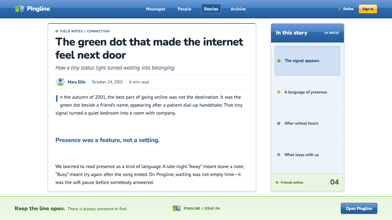
The glassy, gel-like surface treatment across buttons and title bars grew out of the same design sensibility Microsoft was developing for Windows XP's Luna interface, which launched in 2001 and popularized rounded forms, saturated blues and greens, and a glossy, almost aqua-like finish across the operating system's chrome. MSN Messenger's visual language and Luna's visual language developed alongside each other, sharing a design lead in Bill Flora, whose work connected the instant messenger's look to the broader aesthetic direction Microsoft was pushing across its consumer products at the time.
That aqua-gel sensibility is now often described, retrospectively, as an early precursor to what later became known as Frutiger Aero — a broader early-2000s design movement across software and hardware that combined glossy surfaces, bright blue-and-green palettes, and an optimistic, tech-forward mood, before flat design swept it away later in the decade. MSN Messenger's window chrome sits comfortably as one of the clearest software examples of that transitional moment.
Functionally, the status-dot system — green for online, amber for away, red for busy, gray for offline or signed-out — became one of the software's most influential contributions to everyday computing, establishing a shorthand for presence that instant-messaging and chat products have carried forward ever since, long after the glassy Luna-blue chrome itself fell out of fashion.
What defines the MSN Messenger (2001) look?
Color
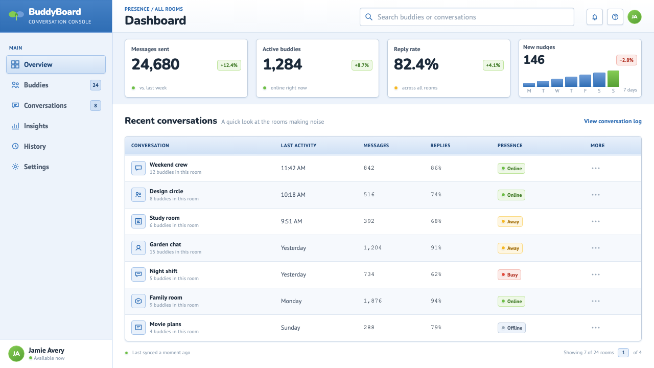
Luna blue dominates the chrome — title bars, dialog frames, and buttons — paired with a green-to-cyan butterfly logo mark. Status dots introduce the only other functional colors: green, amber, red, and gray, each tied to one specific meaning and never used decoratively elsewhere in the interface.
Typography
A crisp, functional UI sans carries all text — window titles, contact names, and message content alike. The typeface makes no attempt at personality of its own, deferring entirely to the colorful chrome and status indicators to carry the software's character.
Vertical Gloss
A consistent top-to-bottom highlight runs across buttons, title bars, and panel surfaces, simulating a glassy or gel-like material rather than flat plastic. This gloss is the single most distinctive surface treatment of the era and the clearest visual fingerprint separating this style from later flat interfaces.
Beveled Group Boxes
Contact lists and settings panels are divided into group boxes with a subtle beveled edge, giving each section a slight sense of physical thickness. The beveling is delicate rather than heavy — a hint of dimensionality rather than an aggressive 3D effect.
Rounded 3-Pixel Buttons
Buttons are small, compact, and rounded only slightly at the corners — just enough to soften the edge without looking bubbly. Combined with the vertical gloss, this gentle rounding is what makes every clickable element feel tactile and toylike.
Status Dots
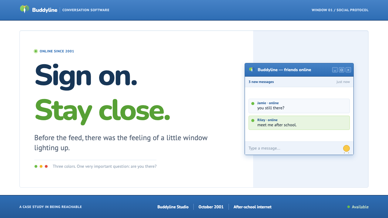
A single small colored dot beside a contact's name carries the software's most functional design idea: ambient presence at a glance. Green for available, amber for away, red for busy, gray for offline — a compact, unambiguous vocabulary that later instant-messaging and chat products inherited almost unchanged.
Soft Blue Drop Shadow
Chat windows and dialogs float above the desktop on a gentle, blue-tinted shadow rather than a neutral gray one, tying the shadow's color back into the software's overall Luna-blue identity even in a detail most users would never consciously notice.
Who shaped MSN Messenger (2001)?
A designer within Microsoft's consumer software group, Flora's work connected MSN Messenger's glassy, gel-like visual treatment to the broader Windows XP Luna aesthetic being developed at the same time, giving Microsoft's instant messenger a visual identity that felt like part of a coherent, optimistic design direction rather than a standalone utility.
The broader MSN division built and iterated the software across its 4.x through 6.0 releases, expanding features like emoticons, winks, and custom display pictures while keeping the core glassy-blue window chrome and status-dot system consistent across versions, which is why the aesthetic reads as a single coherent era rather than a series of disconnected redesigns.
Working alongside the team developing Windows XP's Luna visual system, Microsoft's broader user-experience group established the shared vocabulary of rounded forms, saturated blue-green color, and glossy surface treatment that MSN Messenger borrowed and applied specifically to the context of real-time conversation and presence.
How do you use MSN Messenger (2001) today?
This style is best applied wherever a product wants to feel warm, playful, and a little nostalgic without abandoning function — it works because its glossy surfaces and status-dot language were built for a genuinely useful communication tool, not for decoration alone.
For presentation slides, the glassy Luna-blue title-bar treatment makes an effective cover motif: a rounded rectangle with a top-to-bottom highlight, a status dot beside the title as a playful detail, and a crisp UI sans for the headline. Content slides benefit from beveled group-box dividers to organize sections, echoing the software's own settings-panel structure rather than using plain rules or cards.
For web interfaces, this aesthetic suits chat products, community tools, and anything wanting to evoke early-2000s internet nostalgia deliberately — status dots for presence, glossy buttons for primary actions, and a soft blue-tinted shadow beneath floating panels or modals. It also works well for playful consumer apps that want warmth over the flatness of most contemporary UI.
For editorial and marketing work, the style supports retrospective or nostalgic content about internet history, Y2K-era design, or messaging culture. A feature article can use the glassy button and status-dot motifs as recurring illustrative devices, framing the era's optimism visually rather than only describing it in text.
The most common mistake is applying the glossy highlight inconsistently — putting it on some buttons but not others, or mixing it with flat, shadowless elements. The gel-like gloss needs to be applied uniformly across every clickable and framed surface, or the whole system starts to look like a mismatched patchwork rather than one coherent material language.
MSN Messenger (2001) — FAQ
Is this the same as generic 'skeuomorphic' design?
It's a specific, dated flavor of skeuomorphism rather than the broader category. Skeuomorphism spans many looks — leather-textured calendar apps, wood-grain bookshelves, brushed-metal panels. This style is narrower and more specific: it is the glassy, gel-like, Luna-blue treatment tied to one particular software era and one particular status-dot vocabulary, not skeuomorphism's full range of material simulation.
Can this style work with a dark background?
It can, but it changes character. The original relies on a pure-white message pane to keep the glossy blue chrome feeling light and friendly. A dark variant would need to darken the chrome itself rather than just the background, and the vertical gloss would need to read as a subtle highlight rather than the bright glassy sheen of the original, or the effect will look inconsistent.
Why does the status-dot system still feel familiar today?
Because nearly every chat and collaboration tool built after it adopted the same basic vocabulary — a small colored dot beside a name, with green, amber or yellow, red, and gray each carrying a fixed meaning. MSN Messenger didn't invent presence indicators outright, but it popularized this specific compact form at massive scale, and later products largely kept the convention rather than reinventing it.
Does the gloss effect need to be literal, or can it be suggested more subtly?
A contemporary application can suggest the gloss with a subtle highlight rather than reproducing the strong, glassy sheen of the original pixel-for-pixel. What matters is keeping the highlight consistent across all surfaces and pairing it with the rounded corners and beveled group boxes — the combination of cues, not the intensity of any single one, is what reads as this specific era.
Does this style suit a serious, enterprise-facing product?
Not usually as a primary system. Its warmth and toylike playfulness work against the authority most enterprise software wants to project. It fits far better in consumer-facing chat and community products, nostalgia-driven marketing, or playful internal tools where a bit of friendliness and charm is a genuine asset rather than a liability.
Related design styles
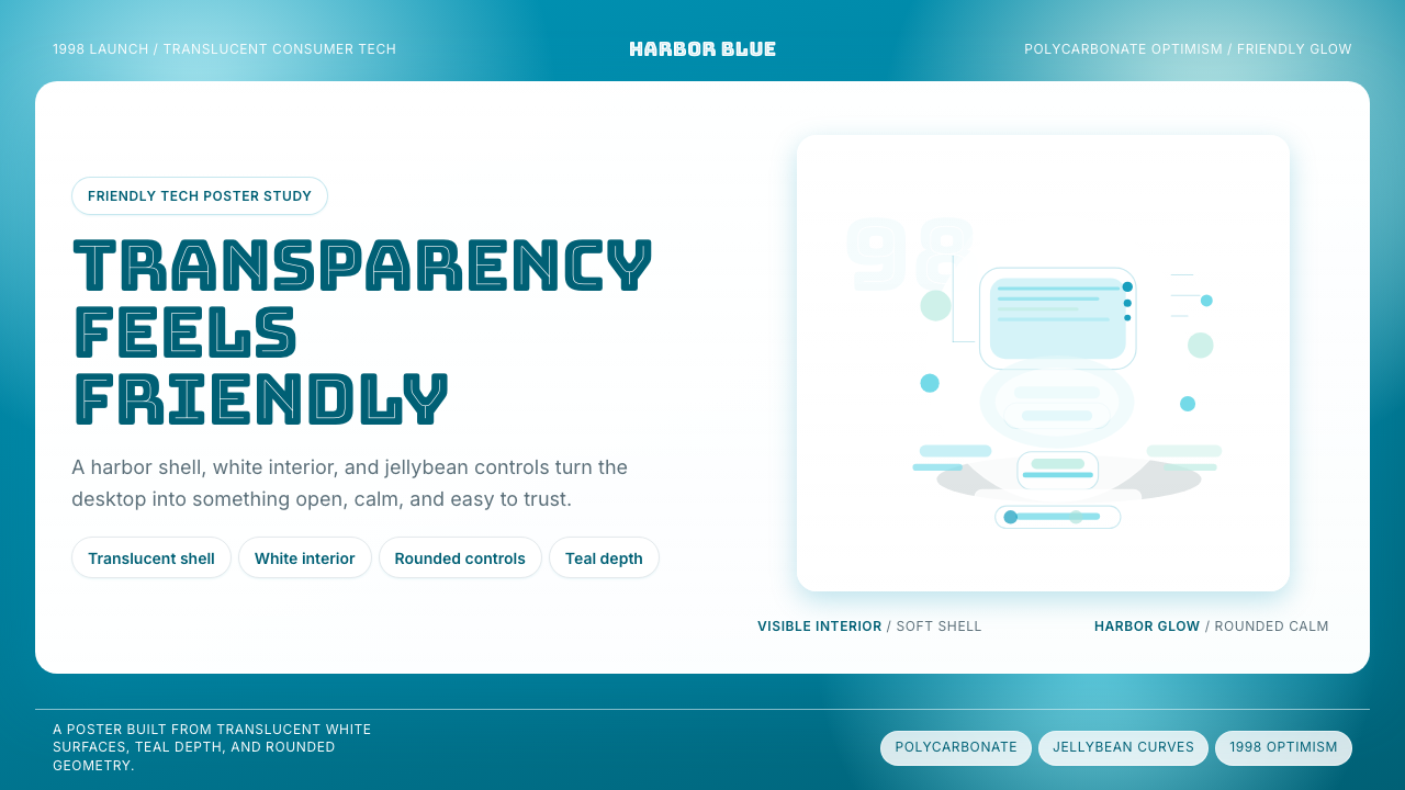 iMac G3 Bondi Blue (1998)Transparency feels friendly. Bondi blue, white glass, and pill curves set the…
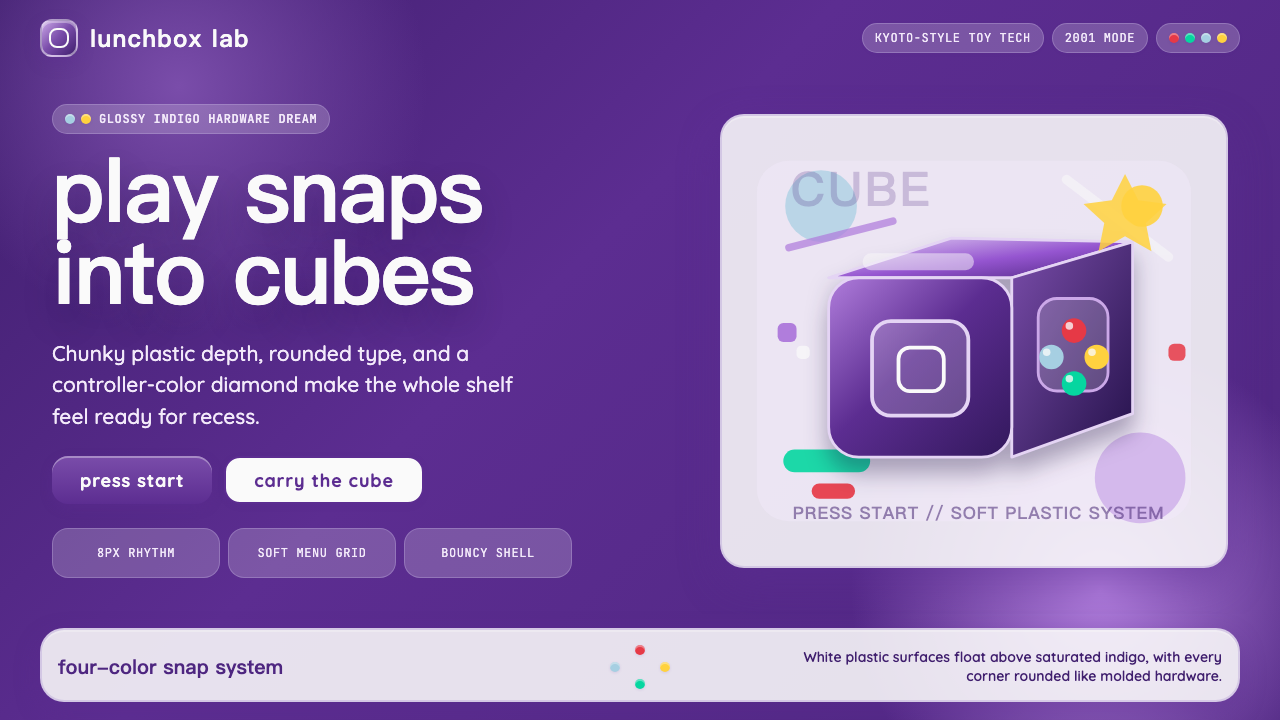 Nintendo GameCube (2001)Toy-tech refuses restraint. Indigo plastic, glossy cubes, and four-color butt…
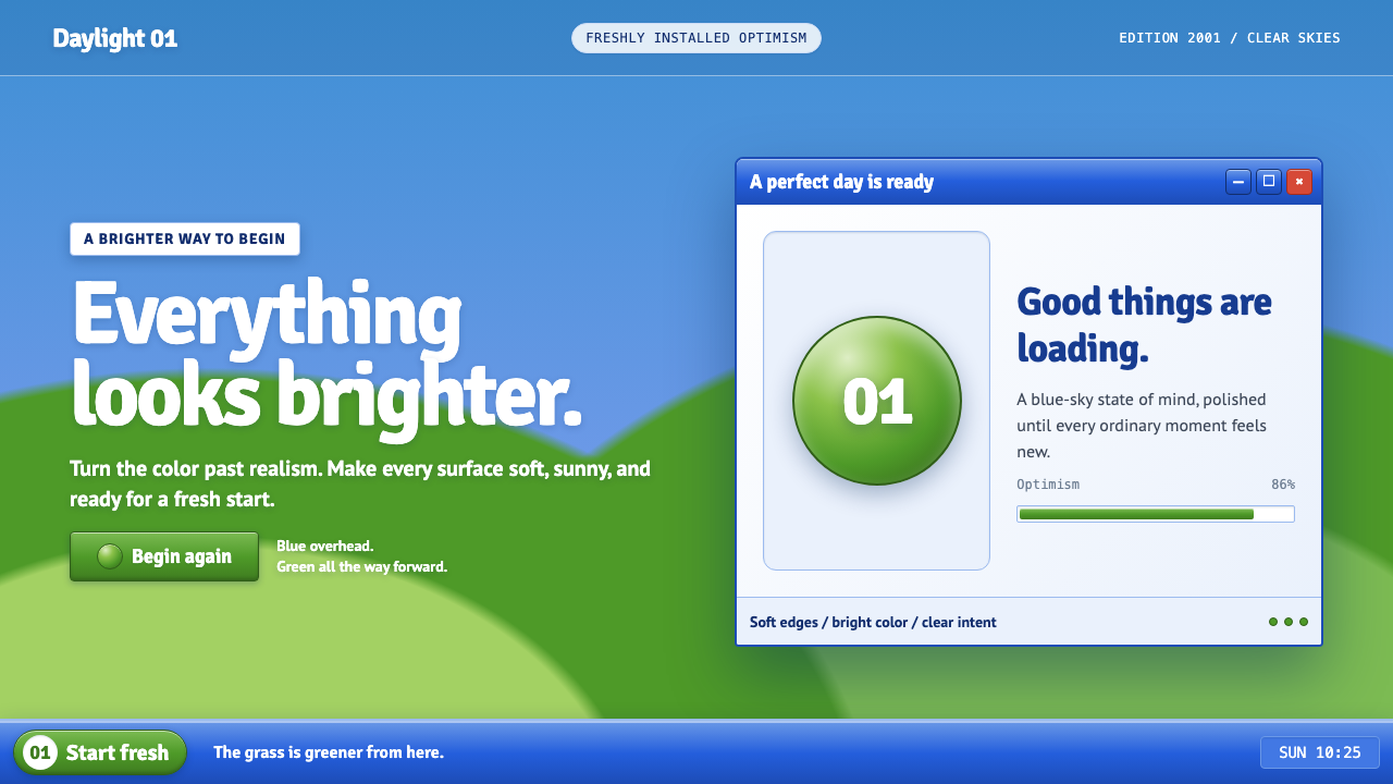 Windows XP Bliss (2001)Fresh-install optimism. Sky blue, hill green, and glossy gel chrome turn real…
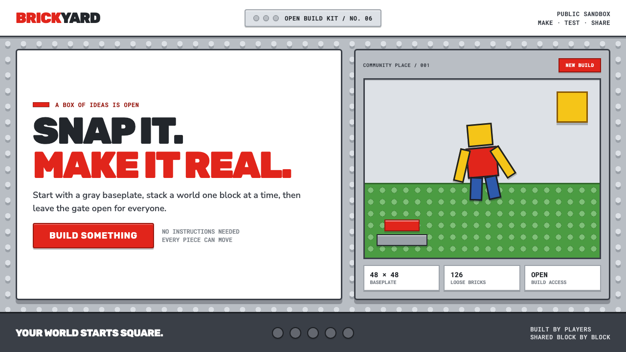 Roblox (2006)Play begins with a click. Fire-engine red cuts through a hard-edged gray stud…
 Twitter (Classic Bird)Text takes the stage. Sky blue actions, white feed stack, and hairline divide…
 Y2K Aqua 2000Optimism looks lickable. Candy-blue pills, pinstripes, and glass panels gleam…