What is Windows XP Bliss (2001)?
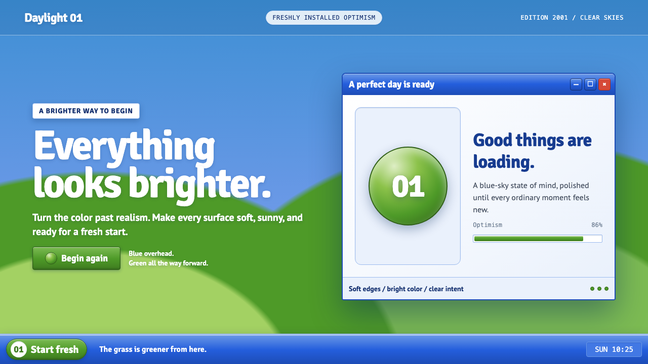
Windows XP Bliss turns the desktop into a brighter, smoother version of reality: green hills, open sky, and glossy controls that make a fresh start feel tangible.
Windows XP Bliss (2001) in brief
Windows XP Bliss is the visual world created when Charles O’Rear’s Sonoma hillside photograph met Microsoft’s Luna interface theme. The image presents a rolling green hill under a deep blue sky broken by soft cumulus clouds; Luna answers it with rounded windows, luminous controls, colored title bars, and a green Start button that seems to glow from within. Together, they establish a desktop environment in which nature and interface share the same intensified optimism.
The style belongs to the glossy, skeuomorphic branch of early digital design. It does not aim for literal realism. Instead, it pushes recognizable materials and physical cues beyond realism: buttons resemble molded plastic, highlights imply a polished surface, shadows suggest objects resting above a background, and gradients make panels feel lit from inside. The result is deliberately inviting. Every interactive element looks separate, substantial, and ready for contact.
Its mood is as important as its visual vocabulary. Windows XP Bliss communicates the feeling of a newly prepared computer, before clutter, errors, and unfinished work enter the picture. The sky is unusually open, the grass appears unusually vivid, and the interface treats action as uncomplicated. That combination makes the style useful as a reference for designs that need warmth, reassurance, technological familiarity, and a slightly idealized sense of everyday life.
Where does Windows XP Bliss (2001) come from?
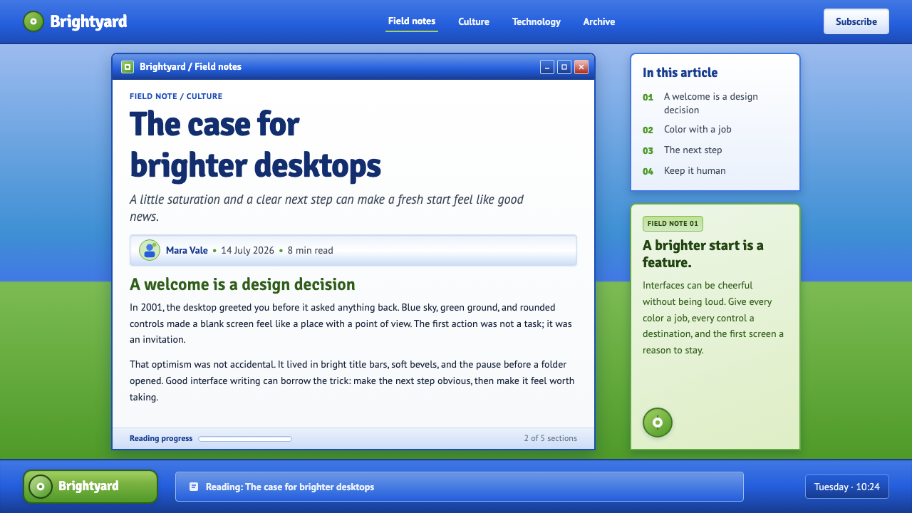
The visual story begins with the Bliss photograph, taken in 1996 in Sonoma County, California. Charles O’Rear’s image of a green hillside beneath a cloud-dotted blue sky supplied the landscape that would become inseparable from Windows XP. Its subject is simple enough to read immediately, yet unusually concentrated in its emotional effect: a single slope opens toward an expansive sky, with no urban density, hardware, or visual noise competing for attention.
Windows XP shipped in 2001, and its Luna visual language remained associated with the era from roughly 2001 through 2007. Developed in the Microsoft context of Redmond, Washington, Luna brought a consciously glossy interface treatment to the desktop. Title bars became colorful and dimensional, controls became rounder and more visibly tactile, and the Start area became a glowing green landmark. The interface did not hide its presence behind neutral surfaces; it made the operating system feel like a designed place.
This approach emerged alongside Y2K digital design, Aqua and gel-like interface aesthetics, and skeuomorphism. All of these tendencies used shine, translucency, rounded volume, and softened geometry to make software appear friendlier and more legible. In the XP version, those tendencies were paired with an outdoor photographic image rather than an abstract technological backdrop. The contrast is central: the landscape promises calm and abundance, while the polished interface promises that technology can deliver both.
Tjeerd Hoek is named alongside Charles O’Rear as a key figure in the source material for this theme. The pairing matters because Windows XP Bliss is not only a photograph or only a user interface. It is a complete visual memory created through the relationship among image, operating system, interface chrome, and the cultural expectation of a new desktop era. Its enduring identity depends on that fusion rather than on any isolated decorative detail.
What defines the Windows XP Bliss (2001) look?
Bright Pastoral Backdrop
The Bliss landscape establishes the emotional baseline: hill green against sky blue, with rounded white clouds breaking the field of color. It is not treated as a subdued wallpaper. The scene is vivid, open, and uncomplicated, making the screen feel less like a machine surface and more like a window onto an ideal afternoon. The broad slope also creates a calm visual ground against which interface elements can stand out without feeling harsh.
Gel Gloss
Luna surfaces are defined by polished, gel-like shine. Controls appear to catch light along their upper edges and to hold richer color toward their lower areas, creating a sense of molded material rather than flat paint. This is a deliberately amplified form of realism: the interface is not pretending to be physically accurate, but it uses familiar cues from plastic, glass, and illuminated signage to make software feel touchable.
Rounded Tactility
Corners, buttons, tabs, and window forms avoid severe angles. Their softened outlines imply comfort and reduce the sense that a command is a technical demand. Rounded forms also make the interface read as friendly and continuous: panels appear to belong to the same family, while clickable elements are visibly differentiated from surrounding content. The visual message is immediate: this surface welcomes interaction.
Back-Lit Color
Color in the XP Bliss vocabulary behaves as though it is illuminated from behind. Blue, green, and warm accents are not merely labels; they become atmospheric signals that identify places, states, and actions. The green Start area is especially important because it turns navigation into a glowing destination. This use of color favors instant recognition and emotional reassurance over restrained neutrality.
Dimensional Chrome
Title bars, borders, and controls use highlights, shading, and bevel-like transitions to separate layers of the interface. A window does not simply occupy space; it appears to have an outer shell, an inner face, and a visible edge. These cues make hierarchy legible without requiring dense text labels. The chrome is expressive rather than invisible, turning framing devices into part of the desktop’s personality.
Fresh-Install Optimism
The defining quality is emotional clarity. Windows XP Bliss imagines computing as clean, organized, and promising. Its high-chroma landscape and polished controls suggest that every task has an obvious next step and every destination is accessible. This is why the style can feel nostalgic today: it records a moment when visual richness was used not to create urgency or luxury, but to make ordinary software feel cheerful.
Who shaped Windows XP Bliss (2001)?
Charles O’Rear is identified in the source material through the Bliss photograph of the Sonoma hillside. That image supplies the outdoor half of the theme’s identity: green terrain, blue sky, and cloud forms that make the desktop feel spacious before any Luna control is added. The photograph is essential because it gives the interface an emotional landscape rather than a purely technical background.
Tjeerd Hoek is named as a key figure in the source material for Windows XP Bliss. Within this theme’s documented framing, the name belongs to the wider visual construction around the XP and Luna era. The style is best understood as a coordinated system rather than a single image: wallpaper, window framing, button shape, glow, color, and the expectation of friendly computing reinforce one another.
The Bliss photograph is the theme’s central visual figure even though it is not a person. Taken in 1996 and later paired with Windows XP, it turns a desktop background into an emotional proposition. The open hill and cloud-dotted sky establish a version of nature that is vivid, orderly, and free of interruption, allowing Luna’s colorful interface chrome to feel like an optimistic extension of the same scene.
How do you use Windows XP Bliss (2001) today?
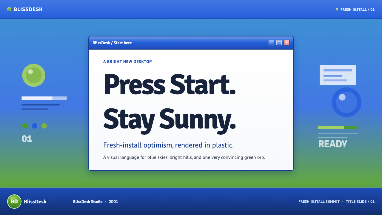
For presentation covers, use the style as a mood-setting system rather than a screenshot imitation. Begin with an open blue field or an expansive pastoral image, then place a rounded title panel or luminous badge where it can feel clearly foregrounded. Let the title be direct and optimistic, with enough empty sky or open space around it to preserve the sense of a desktop waiting to be used. For content slides, establish a family of rounded containers, visible title strips, and clearly separated control-like labels. The aim is not to make a slide look like an old operating system, but to make information feel welcoming, organized, and immediately actionable.
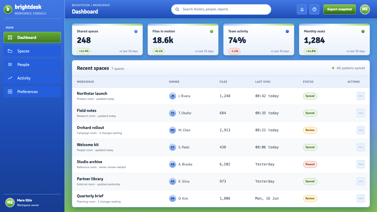
Data slides benefit when charts inherit the theme’s sense of readable, tactile hierarchy. Use bright blue and green as broad environmental signals, then introduce warmer accents only where attention needs to move. Chart cards can appear slightly raised through crisp highlights and controlled shadow, while legends and filters can resemble small interface controls. Avoid making every part glossy. A single polished chart frame, a highlighted total, or an active filter is enough to establish the visual language while keeping the data itself easy to inspect.
For web interfaces, the style is especially effective for beginner-friendly dashboards, onboarding flows, status pages, and pricing pages where reassurance matters. Use a light, open background; group information into rounded, visibly bounded areas; and make primary actions look substantial enough to be recognized at a glance. A green action element can imply entry or progress, while blue can hold the overall environment together. Navigation should have a clear landmark quality, as the XP Start area did: users should never need to guess where the next useful action lives.
Editorial and marketing applications work best when the Bliss landscape is treated as a tonal reference rather than mandatory decoration. A product story can use broad skies, rolling fields, rounded image frames, and polished callout modules to suggest renewal or ease. Marketing sections can alternate between calm open areas and denser information panels, making the page feel like a journey from landscape into interface. Keep copy warm and practical. This aesthetic succeeds when it promises that technology will make an ordinary task feel more manageable, not when it uses nostalgia as a substitute for explanation.
The common mistake is to equate Windows XP Bliss with indiscriminate gradients, bright green, and arbitrary rounded corners. Its coherence comes from a specific relationship: vivid nature in the background, tactile interface surfaces in the foreground, and a consistently upbeat emotional message connecting them. If every panel glows, every button bevels, and every color competes, the result becomes visual noise. Reserve gloss for interactive or focal elements, keep the larger environment open, and let optimism emerge from clarity as much as from decoration.
Windows XP Bliss (2001) — FAQ
Is Windows XP Bliss only a wallpaper aesthetic?
No. The hillside photograph is central, but the style depends on its pairing with Luna: rounded window forms, glossy button surfaces, colored title bars, illuminated controls, and the green Start landmark. Using only a green hill may evoke the reference, but it does not recreate the design logic. The recognizable effect comes from the contrast between open nature and visibly tactile software.
Why does the style feel so optimistic?
Its optimism comes from the agreement between landscape and interface. The Bliss image offers an open sky, vivid grass, and soft clouds, while Luna makes every action appear clear, bright, and approachable. Nothing is visually hidden behind severe minimalism or ambiguous controls. The desktop presents technology as a friendly environment with obvious destinations, which closely matches the emotional experience of a fresh installation.
Can this style work without copying Windows XP directly?
Yes. Preserve the underlying qualities rather than specific interface artifacts: an open and uplifting background, clear separation between layers, rounded interactive forms, restrained gel-like highlights, and color that identifies action or place. A contemporary design can use these principles without reproducing a Start button, title bar, or historical window frame. The strongest reinterpretations carry forward the emotional promise of approachable computing.
Where does the style struggle in contemporary product design?
It can struggle where dense information, serious restraint, or quiet visual authority is the primary goal. Extensive gloss and strong dimensional cues may distract from complex analytical work if they are applied indiscriminately. It can also feel overly nostalgic when a product has no connection to personal computing, renewal, or approachable technology. In those contexts, borrow its clarity and warmth selectively instead of carrying over its full decorative surface language.
How should imagery be handled in a Windows XP Bliss-inspired layout?
Use imagery that feels expansive, clear, and emotionally legible. Broad skies, rolling terrain, soft clouds, and clean daylight align naturally with the Bliss reference, but the essential requirement is openness rather than a literal hill. Crop photographs so they provide breathing room for interface-like elements, and avoid dark, crowded, or visually distressed scenes that fight the fresh-install mood. Images should make the interface feel brighter, not compete with it for drama.
Related design styles
 Angry Birds (2009)Adorable aggression takes flight. Candy primaries, chunky outlines, and a dot…
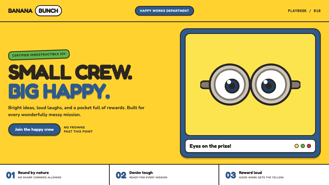 Minions (Despicable Me, 2010)Indestructibly cheerful. Minion yellow, denim blue, and chunky goggle geometr…
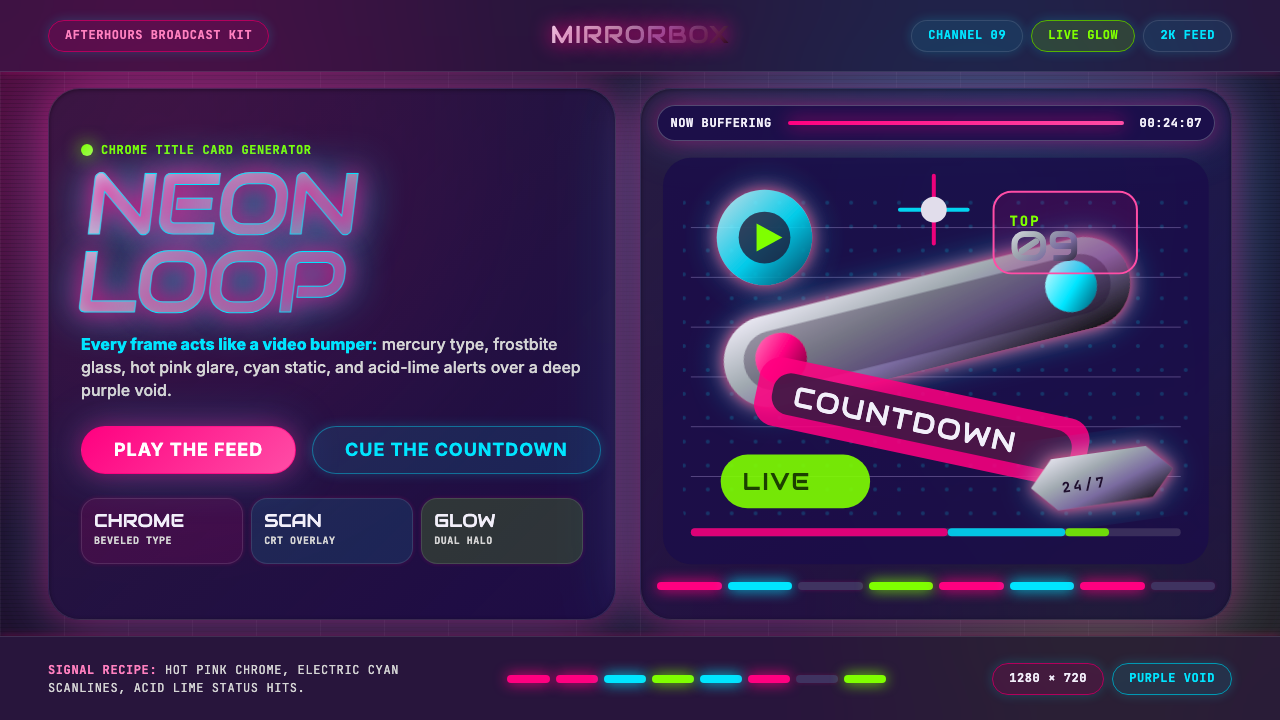 MTV Y2K (2000s)Maximum-volume Y2K. Hot pink chrome, cyan scanlines, and lime hits burn over…
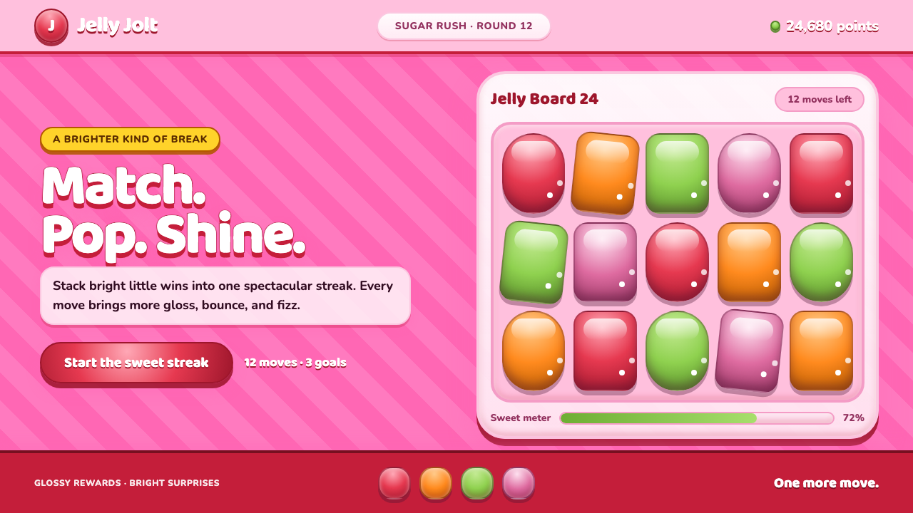 Candy Crush (2012)Sugar rush without restraint. Glossy candy tiles pulse across a striped bubbl…
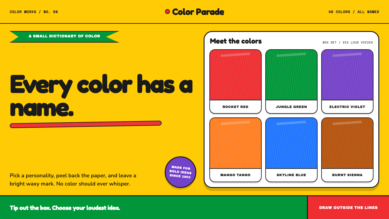 Crayola (1903)Color never whispers. Golden yellow, a green slash, and waxy swatches make ev…
 Emoji & Sticker DesignJoy goes glossy. Blob-yellow spheres pop on charcoal with brown sticker outli…