What is Candy Crush (2012)?
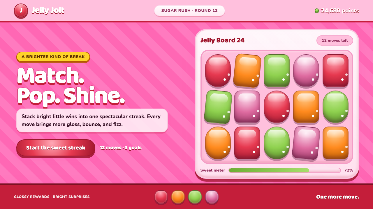
Candy Crush turned the match-three board into a sugar-coated spectacle: glossy sweets, pink stripes, and buttons that seem to ask for one more move.
Candy Crush (2012) in brief
Candy Crush is King’s interface language for Candy Crush Saga, released in 2012. Its visual world is deliberately excessive: jelly-bright candy tiles cascade down a bubblegum-pink board while every surface catches a polished highlight, swells forward, and throws a generous shadow. The game does not disguise its sweetness or its commercial energy. It turns each match into a small stage event.
The style belongs to the casual free-to-play game boom, but it is more than a generic mobile-game look. Match-three rules require players to read a dense field quickly, so candy shapes are made highly distinct, colors are separated decisively, and interactions are framed as rewards. The board remains legible because each piece has a recognizable silhouette even while the surrounding interface is loud.
Visually, Candy Crush combines skeuomorphic rendering with confectionery fantasy. Buttons resemble edible plaques, tiles resemble hard candy under studio lights, and striped surfaces recall peppermint wrappers. The result is a pink-on-pink universe where dimensionality, shine, and celebration all work toward a single behavioral message: touching the screen should feel immediately gratifying.
Where does Candy Crush (2012) come from?
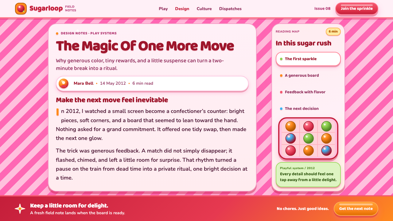
Candy Crush emerged from King Digital Entertainment, working across Stockholm and London. It launched on Facebook in April 2012 and reached mobile platforms in November of the same year. That sequence matters: the game carried a social, browser-era puzzle experience into the device people kept within reach, while preserving the immediate readability required by a fast, repeatable match-three loop.
Its visual foundation sits within the match-three puzzle lineage. A board full of interchangeable pieces can easily become visually repetitive, so the candy theme gives every tile a material identity: rounded sweets, striped pieces, jelly-like surfaces, and brightly lit forms. The theme is not merely decorative; it helps make cascades and successful matches feel richer than abstract symbols moving on a grid.
The design also reflects skeuomorphic candy rendering. Rather than treating game pieces as flat signs, it gives them simulated volume, reflective highlights, and thick drop shadows. This makes the interface resemble a toy display or sweets counter, creating a tactile promise even though the player encounters it through a screen.
At peak virality during 2013 and 2014, the language became closely associated with freemium interface design and casual mobile gaming. Sebastian Knutsson, Riccardo Zacconi, Tommy Palm, and Lars Jörnow are the key figures named in the game’s source context. Together with King’s Stockholm and London presence, the style became a defining example of how a simple puzzle loop could be wrapped in an unmistakably exuberant visual system.
What defines the Candy Crush (2012) look?
Candy Gloss
Tiles appear polished, translucent, and almost edible. Bright specular highlights sit on rounded surfaces to imply a hard shell or jelly coating. The shine is intentionally theatrical rather than realistic: it announces sweetness, value, and touchability before a player has made a move.
Inflated Depth
Nearly every important object bulges forward through rounded edges, radial-looking light, and thick shadows. Depth is not subtle atmosphere; it is an interaction cue. A button looks raised because it is meant to be pressed, while a candy tile looks separated from the board because it is meant to be moved.
Bubblegum Board
The board is a striped pink field rather than a neutral game surface. Diagonal peppermint-like bands keep the background active while remaining subordinate to the candies. The pink-on-pink environment rejects restraint and gives the game a continuous, branded emotional temperature.
Rounded Lettering
Lettering is fat, soft, and friendly, matching the inflated forms around it. It avoids the severity of technical interfaces and makes labels feel like part of the confectionery world. The type does not stand apart as neutral information; it joins the game’s invitation to play.
Rewarding Motion
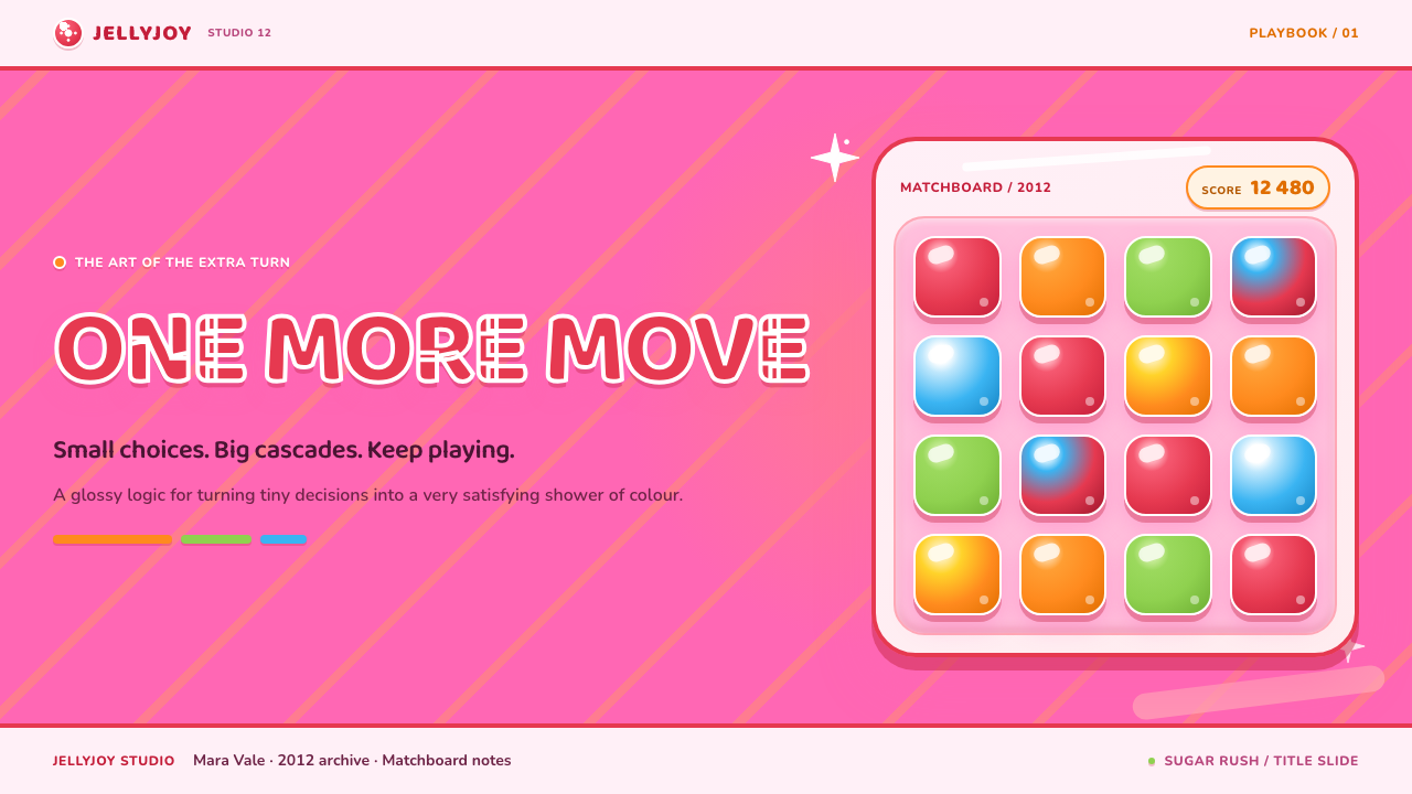
Cascading candies give the board a sense of continuing possibility. Even when the player is not acting, the composition suggests that a match can trigger a chain reaction. This visual momentum supports the game’s core promise that a single move may unlock an unexpectedly satisfying outcome.
Unapologetic Loudness
Candy Crush does not use restraint as a sign of sophistication. Gloss, stripes, shadows, bright candy color, and celebratory surfaces accumulate into a deliberately loud system. Its discipline lies in thematic consistency: every exaggerated element belongs to the same sugar-rush fantasy.
Who shaped Candy Crush (2012)?
Knutsson is listed among the key figures connected to Candy Crush. Within the game’s Stockholm and London context, the name belongs to the group associated with a puzzle experience whose visual identity made every tile and interaction feel like part of a sugary reward system.
Zacconi is named as a key figure in the Candy Crush source context. The game’s emergence through King Digital Entertainment connected its distinctive candy rendering to a broader casual free-to-play game environment, where clarity, repetition, and immediate appeal had to coexist.
Palm appears among the key figures associated with Candy Crush. The game’s lasting visual lesson is that a familiar match-three structure can acquire a distinct personality when its pieces, board, lettering, and rewards all speak the same material language.
Jörnow is included in the source material’s list of key figures. Candy Crush became especially visible during its viral peak because its exuberant interface made the puzzle instantly recognizable, whether players encountered it through Facebook or on mobile devices.
How do you use Candy Crush (2012) today?
For presentation covers, use the style as a concentrated burst rather than a complete game-board imitation. Place one oversized glossy object against a pink striped field, then let a rounded title overlap the scene with a clear shadow. Content slides need more restraint: keep the candy framing at the edges and allow the central information area to remain calm enough to read.
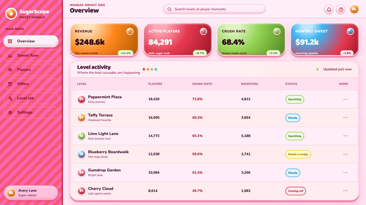
For content and data slides, borrow the style’s reward logic instead of covering every chart with decoration. Give the primary result the brightest, most dimensional treatment, and let supporting values recede. A cascade can become a visual metaphor for conversion, progress, or a sequence of wins, while rounded labels can mark milestones without turning the entire slide into a novelty graphic.
For web interfaces, the approach works best in game-like dashboards, achievement views, loyalty programs, and playful pricing flows. Controls should look obviously pressable, statuses should feel collectible, and success states should visibly celebrate completion. The board-like striped background is strongest when contained to a panel or campaign area rather than used beneath long-form reading.
For editorial and marketing work, Candy Crush-inspired design is useful when the subject genuinely benefits from abundance, momentum, and cheerful excess. Campaign pages can make an offer feel like a prize, while social graphics can use glossy objects and confectionery depth to create immediate recognition. Pair it with concise copy; a busy visual field needs language that lands quickly.
The common mistake is copying the pink palette and shiny surfaces without preserving hierarchy. If every badge, button, card, and heading receives the same glow, shadow, and saturation, nothing feels rewarding because nothing stands out. Use the strongest gloss and dimensionality for the action, result, or collectible that matters most, and leave quieter surfaces to support it.
Candy Crush (2012) — FAQ
Is Candy Crush style just pink and glossy buttons?
No. Pink and gloss are visible signals, but the system depends on a more specific relationship between shape, depth, and reward. Objects are rounded because they should feel touchable, highlights make them feel valuable, and shadows separate actions from the board. The style works when every visual cue strengthens the promise of immediate playful feedback.
Why are the shadows so important?
The shadows make the interface feel layered and pressable. They distinguish candy tiles from the board and buttons from passive decoration, helping the player recognize what can be moved or tapped. In Candy Crush, shadow is not a quiet realism effect; it is part of the game’s deliberately exaggerated material vocabulary.
Can this style work for a serious product?
Only selectively. Its strongest values are delight, abundance, collectibility, and visible reward, so it fits playful engagement moments better than dense professional workspaces. A serious product can borrow its clear pressability and celebratory completion states, but an uninterrupted candy-coated interface may compete with trust, concentration, or long-form analysis.
How should imagery be handled in a Candy Crush-inspired layout?
Treat imagery as a collectible object rather than a neutral photograph. Crop it into a rounded, raised, brightly lit form, or place it inside a framed reward panel. The important rule is consistency: an image should participate in the same sugary material world as the buttons and tiles, not arrive as an unrelated realistic window.
Related design styles
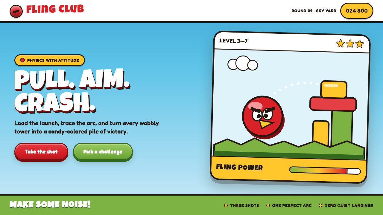 Angry Birds (2009)Adorable aggression takes flight. Candy primaries, chunky outlines, and a dot…
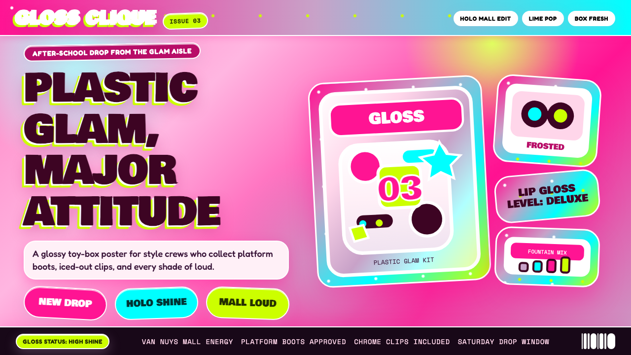 Bratz Doll 2003Y2K maximalism, mall-glossy. Hot-pink gradients, holographic lavender, chunky…
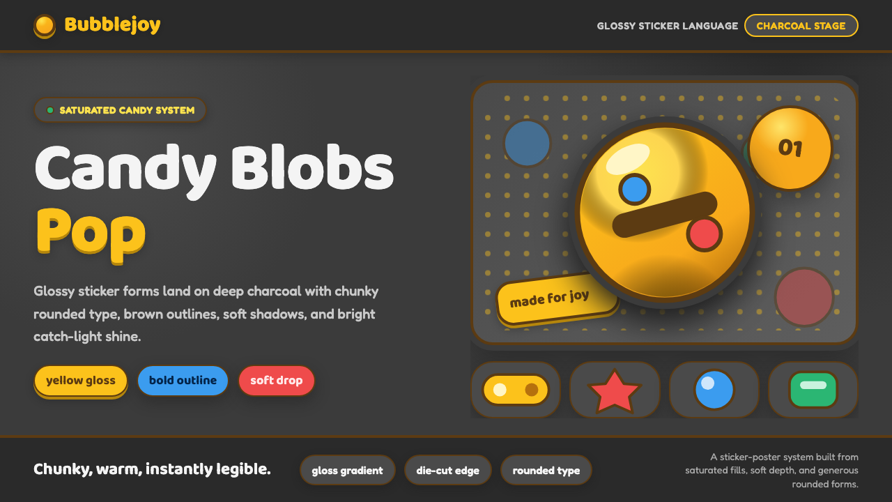 Emoji & Sticker DesignJoy goes glossy. Blob-yellow spheres pop on charcoal with brown sticker outli…
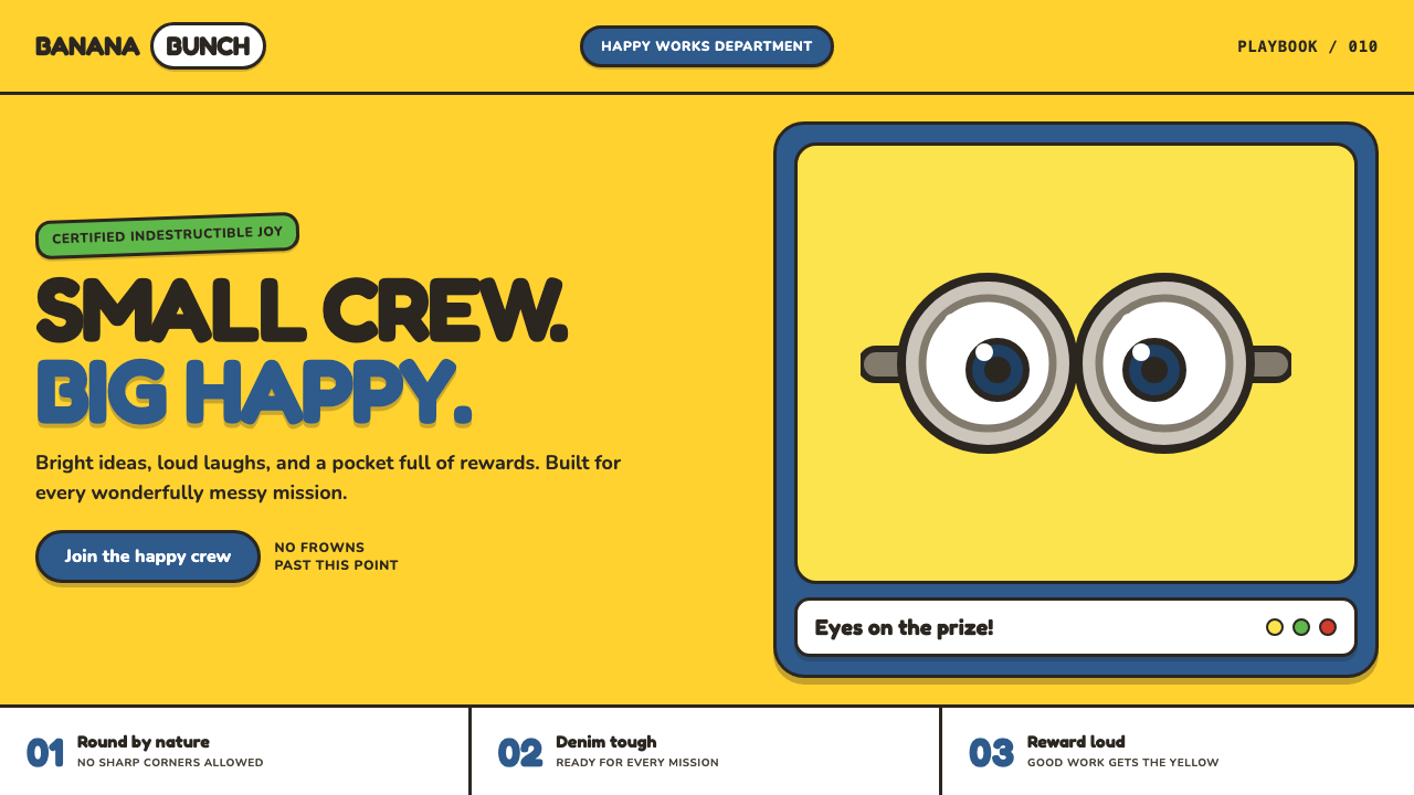 Minions (Despicable Me, 2010)Indestructibly cheerful. Minion yellow, denim blue, and chunky goggle geometr…
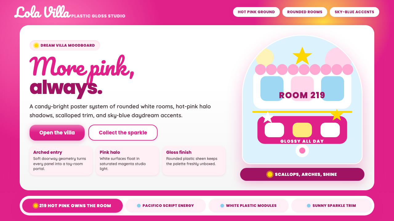 Barbie DreamhousePink is the whole world. Hot magenta ground, Pacifico script, scallops and gl…
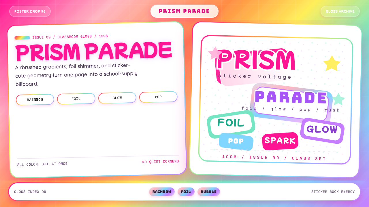 Lisa Frank Rainbow (90s)Pure sticker-saturation. Rainbow gradient, magenta glow, foil shimmer, bubbly…