What is Minions (Despicable Me, 2010)?
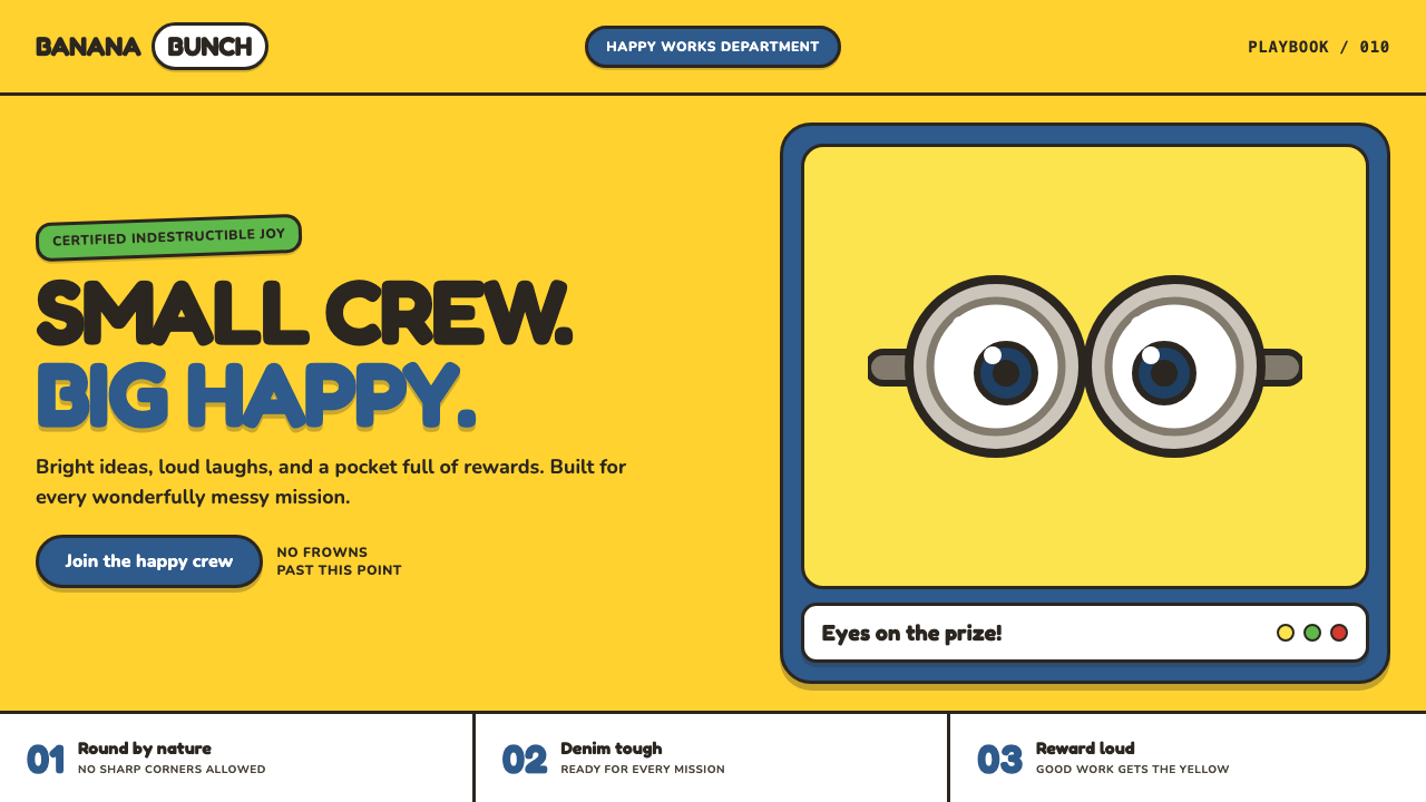
Minions turns family-animation chaos into a design system: yellow joy, denim-blue sturdiness, oversized goggle geometry, and a reward loop powered by bananas.
Minions (Despicable Me, 2010) in brief
The Minions style translates Illumination’s pill-shaped yellow characters into an interface language built for immediate emotional recognition. Its world is loud, rounded, and physically reassuring: every major shape feels inflated, touchable, and resilient. Bright Minion yellow carries the mood, while worn denim-overall blue gives the system a practical counterweight. Soft charcoal outlines keep the exuberance legible, making panels, buttons, illustrations, and badges feel like parts of the same toy-like object.
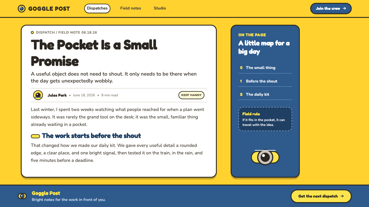
The goggle is the style’s central graphic device. A single or double steel-rimmed lens placed on a yellow field can become an avatar, status marker, empty-state illustration, notification badge, or playful focal point. This is more than a recognizable reference: the goggle provides a ready-made visual grammar of looking, reacting, waiting, and discovering. One eye can feel curious or surprised; two lenses can suggest companionship, attention, or an audience.
Its typography and layout favor cheerful exaggeration over restraint. Type should feel fat, buoyant, and highly visible, while containers take on chunky pill-like silhouettes. Contrast is intentionally strong, spacing is generous enough for shapes to bounce without colliding, and rewards are tangible rather than abstract. A banana is not merely an icon in this system; it is a tiny narrative promise that effort will be noticed.
Where does Minions (Despicable Me, 2010) come from?
The visual source is Despicable Me, released in 2010. The theme belongs to the wave of 2010s CG family animation, where character recognition had to work quickly across film, promotional material, toys, and digital touchpoints. Its origin is tied to Santa Monica in the United States, while the animation was produced in Paris, France, giving the style a transatlantic production context without diluting its direct, universal visual appeal.
The Minions began as supporting yellow capsule characters, but their design was already unusually portable. Their silhouette reads before facial detail does: a compact yellow body, denim-overall association, and a goggle configuration that turns the face into a bold symbol. That economy made the characters well suited to mascot branding, where a mark must remain recognizable when it is cropped, simplified, enlarged, or reduced to a single expressive feature.
The style developed across the period from Despicable Me in 2010 through the 2015 spin-off and the 2022 Rise of Gru. Rather than relying on a refined or understated visual identity, it embraced continuity through recurring materials and gestures: yellow fields, denim-blue anchors, steel-rimmed lenses, rounded volume, and exuberant reward imagery. The result is a design language that can expand into many contexts while still feeling attached to the same character universe.
The source identifies Chris Meledandri, Pierre Coffin, Chris Renaud, Sergio Pablos, and Kyle Balda as key figures within this origin story. It also places the theme at the intersection of 2010s CG family animation, mascot branding, and capsule-character design. Those three contexts explain its unusual usability: it is cinematic enough to carry comic emotion, branded enough to survive repetition, and simple enough to become an interface system without losing its personality.
What defines the Minions (Despicable Me, 2010) look?
Yellow and Denim Blue
Minion yellow is the emotional engine: direct, sunny, and impossible to ignore. Worn denim-overall blue supplies visual ballast, preventing the interface from becoming an uninterrupted field of excitement. Use yellow for the world’s mood and blue for garments, navigation, supporting surfaces, or dependable actions. The relationship should feel like a cheerful character standing inside a practical uniform.
Goggle Geometry
The single or double goggle lens is a compact system for personality. Steel rims create a sturdy boundary around the eye, while the circular lens interrupts the yellow field with immediate focus. Repeat the motif selectively in avatars, badges, illustrations, and empty states. It works best as a characterful signal, not as decoration pasted onto every component.
Rounded Volume
Corners, containers, icons, and illustrations should all favor pill-like volume. The goal is not generic softness; it is the feeling of a compact, durable character made from simple rounded parts. Avoid sharp, fragile-looking forms unless they serve a clear contrast. Even utility elements should appear friendly enough to be handled without hesitation.
Soft Charcoal Outline
Soft charcoal outlines organize the exuberant palette without making it severe. They resemble the contour of a coloring-book toy: visible enough to separate forms, gentle enough to preserve plushness. Use them to define lenses, symbols, illustrated edges, and important controls. The line should support the silhouette rather than compete with it.
Bouncy Type
Typography should be fat, bouncy, and confident rather than sleek or editorially detached. Headlines can carry comic emphasis and expressive rhythm; supporting copy should remain plain enough to be read quickly. The contrast comes from scale, shape, and placement, not from piling on decorative effects. A sentence should feel like it has landed with a soft thump.
Banana Reward Logic
The banana is the universal reward symbol. It gives success states, progress moments, and small celebrations a concrete object of desire, turning completion into a tiny comic scene. Use it sparingly and only where a user has genuinely achieved something. If every click earns a banana, the symbol stops feeling like a reward and becomes background noise.
Who shaped Minions (Despicable Me, 2010)?
Chris Meledandri is identified in the source material as a key figure in the Minions origin context. His inclusion places the theme within the production world that carried the yellow capsule characters from Despicable Me into a durable family-animation and mascot-design language.
Pierre Coffin appears among the source material’s key figures for the theme. Within this article’s design frame, that association matters because Minions depends on instantly readable expression: eye geometry, rounded body language, and comic reaction are asked to communicate before detailed explanation arrives.
Chris Renaud is named as a key figure in the provided Minions background. The theme’s interface potential follows the same broad requirement as family animation: a visual cue must be legible quickly, emotionally clear, and resilient when repeated across many different moments.
Sergio Pablos is included in the source list of key figures. His presence belongs to the wider origin account behind a style that joins capsule-character design with mascot branding, allowing a small set of simple visual signals to carry disproportionate recognition and energy.
Kyle Balda is named among the key figures associated with the theme’s period, extending from Despicable Me through the 2015 spin-off and the 2022 Rise of Gru. That continuity is central to the style: repeated yellow, blue, goggle, and banana cues create recognition across changing story contexts.
How do you use Minions (Despicable Me, 2010) today?
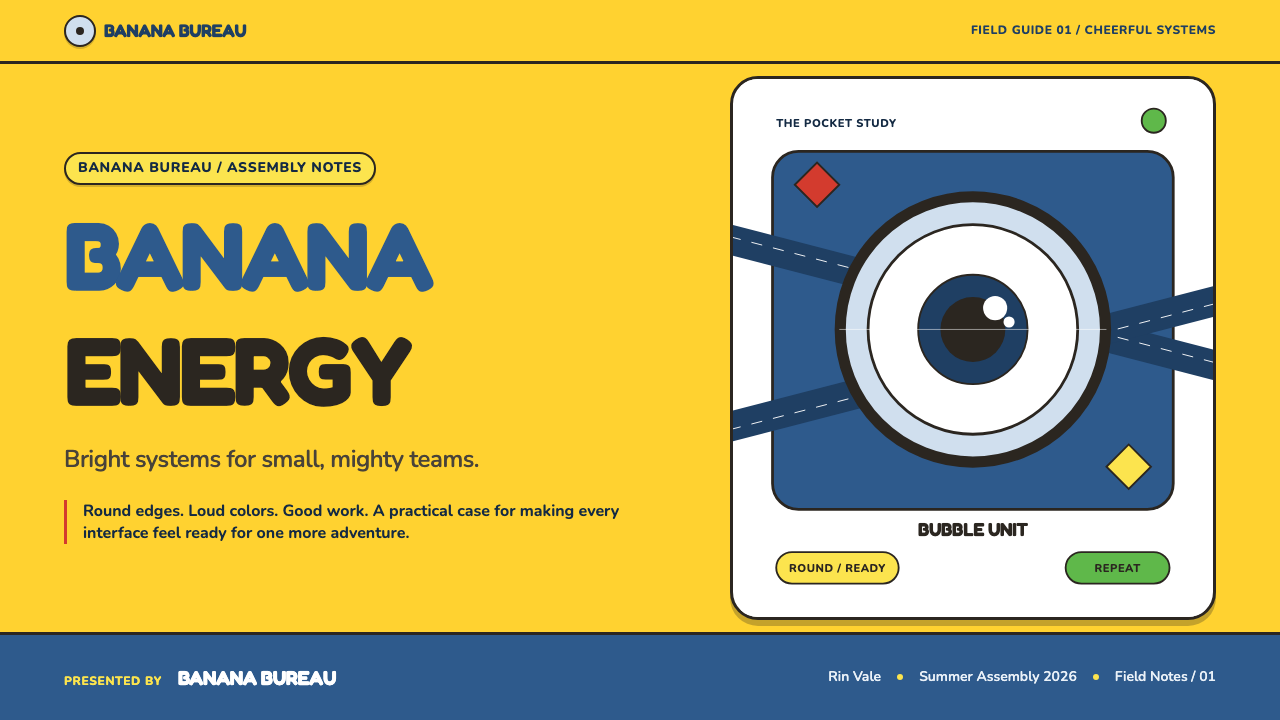
For presentation covers, use the style as a single bold comic premise. Let a broad yellow field, a large goggle motif, or a rounded character-like silhouette establish the scene, then place the title in buoyant high-contrast type. Keep the cover readable at a glance; its purpose is to deliver optimism and recognition before it delivers detail. Content slides should become calmer companions, using denim blue and soft charcoal structure to hold headings, short copy, and simple rounded callouts.
Data slides benefit when charts are treated as playful objects rather than sterile diagrams. Use yellow for the primary story, denim blue for comparison, and charcoal contours to preserve category boundaries. Progress can be shown through a goggle gaze, a banana milestone, or rounded accumulations, but only when the metaphor clarifies the result. The data itself must remain more visible than the joke.
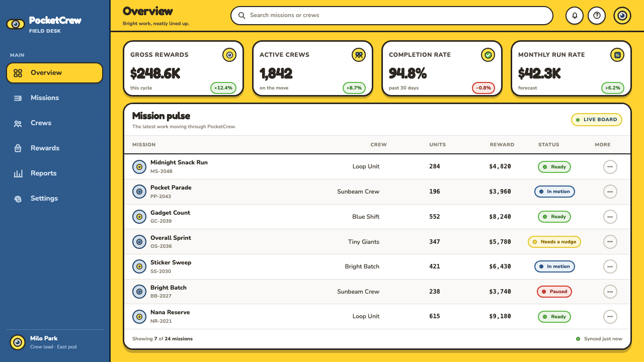
In web interfaces, Minions is particularly effective for onboarding, family-oriented learning tools, task completion, waiting states, and lightweight dashboards. Use the goggle as an attention marker where a person would naturally look, such as an empty state or a success checkpoint. For pricing pages, the style can distinguish plans with large rounded blocks and practical blue structure, while yellow guides the main decision. Preserve clear labels and quiet reading areas so the character language supports, rather than interrupts, comparison.
For editorial and marketing work, the style performs best when a campaign needs visible optimism, momentum, or shared participation. Feature sections can alternate between bright character-led moments and calmer denim-blue information zones. Illustration should privilege silhouettes, goggles, bananas, and rounded object clusters over intricate scenery. Calls to action should sound encouraging and concrete, as though a cheerful sidekick is inviting the reader into the next small mission.
The common mistake is to confuse loudness with clutter. Covering every surface in yellow, adding goggles to every component, or turning every interaction into a banana reward exhausts the system’s charm. The stronger approach creates a rhythm: bright moments of character, quieter surfaces for reading and decision-making, then a clear reward at meaningful milestones. Minions works when its cheerfulness feels earned, not when it demands attention continuously.
Minions (Despicable Me, 2010) — FAQ
Is Minions style only suitable for children’s products?
No, but it is strongly mood-specific. It can work for family services, beginner education, team rituals, playful productivity tools, and campaigns that need immediate friendliness. It is less suitable where calm authority, luxury, privacy, or serious reflection is the primary message. The key question is whether irrepressible cheer supports the product’s emotional promise rather than trivializing it.
How should the goggle motif be used without becoming repetitive?
Give it a job. Use a goggle when the interface needs attention, personality, observation, or reaction: an empty state, a profile cue, a progress checkpoint, or a celebratory message. Do not use it as a default bullet, divider, button decoration, and logo substitute at the same time. Alternating between full goggles, partial crops, and plain rounded surfaces keeps the motif recognizable without making every screen identical.
Can the visual language work on information-dense dashboards?
Yes, if the character layer remains secondary to the information hierarchy. Let denim blue and charcoal organize navigation, labels, tables, and boundaries; reserve yellow for priority, progress, or the one result that matters most. Goggles and bananas belong at meaningful states rather than inside every row of data. The dashboard should feel cheerful on arrival and efficient during sustained use.
Why is the banana more effective as a reward than as a general icon?
Because its meaning is emotional rather than neutral. A banana suggests desire, comic motivation, and a completed mini-adventure; it makes sense after progress, not before every action. Used as a generic navigation symbol, it forces users to decode a joke before understanding a function. Used after a genuine achievement, it turns an otherwise ordinary confirmation into a memorable moment.
Related design styles
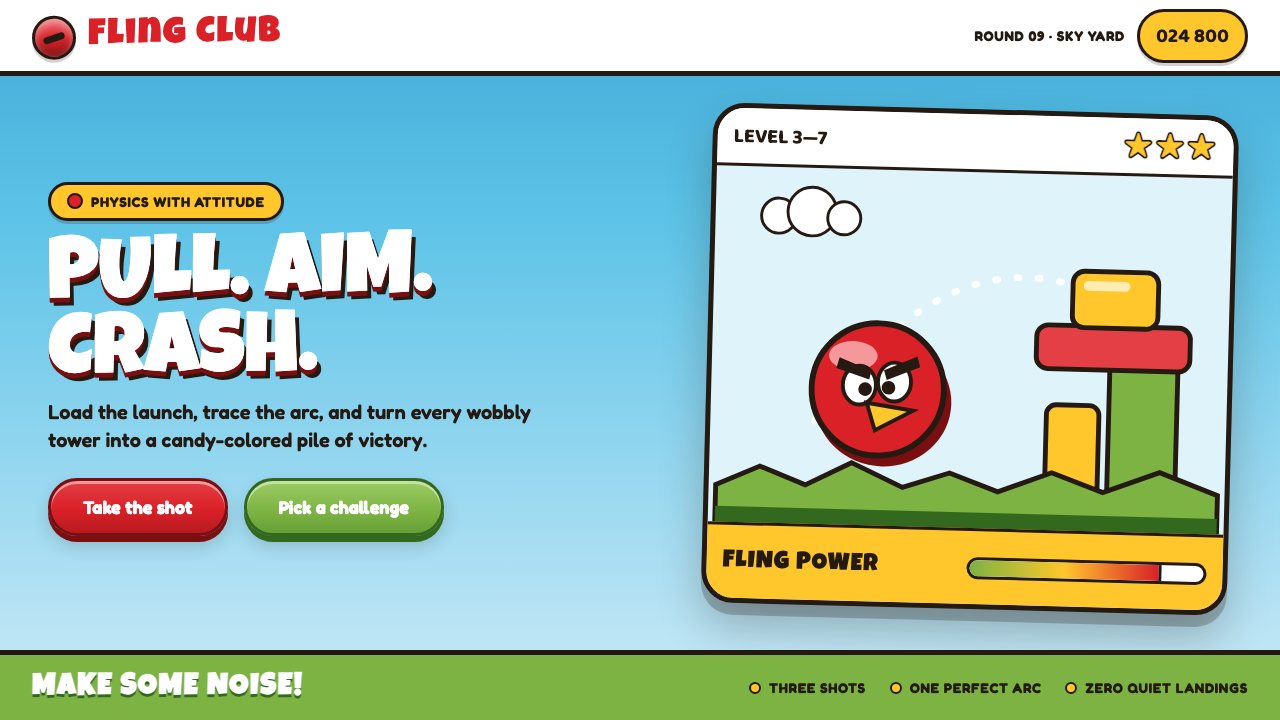 Angry Birds (2009)Adorable aggression takes flight. Candy primaries, chunky outlines, and a dot…
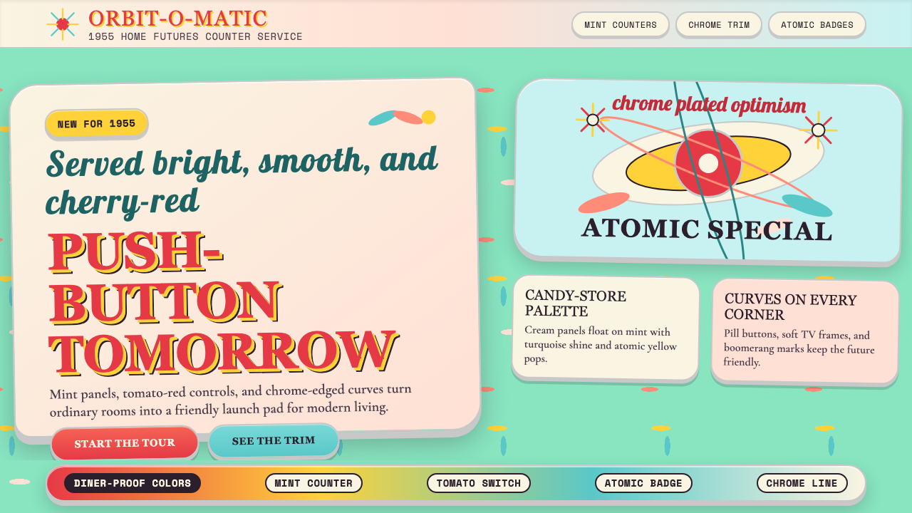 Populuxe Atomic AgeThe future grins. Mint Formica, tomato-red pills, Cooper Black, and atomic st…
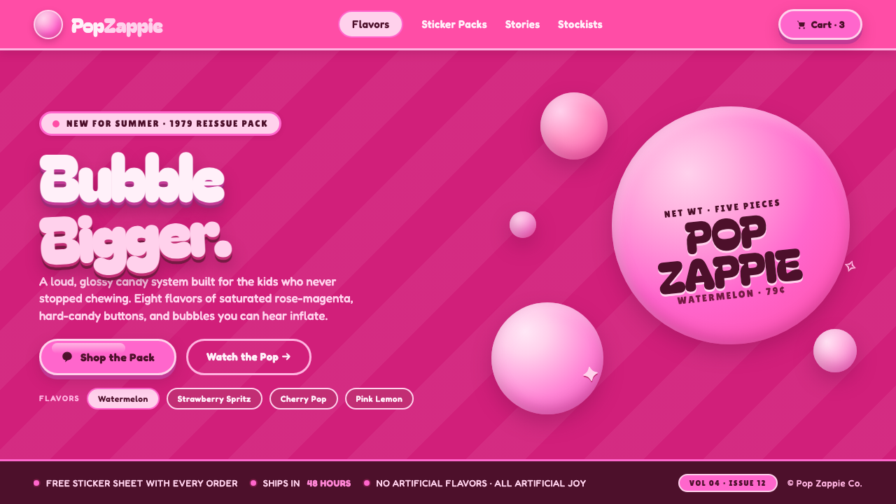 Watermelon Bubblegum Pink80s candy maximalism. Neon pink on rose-magenta, sugar-shine highlights, infl…
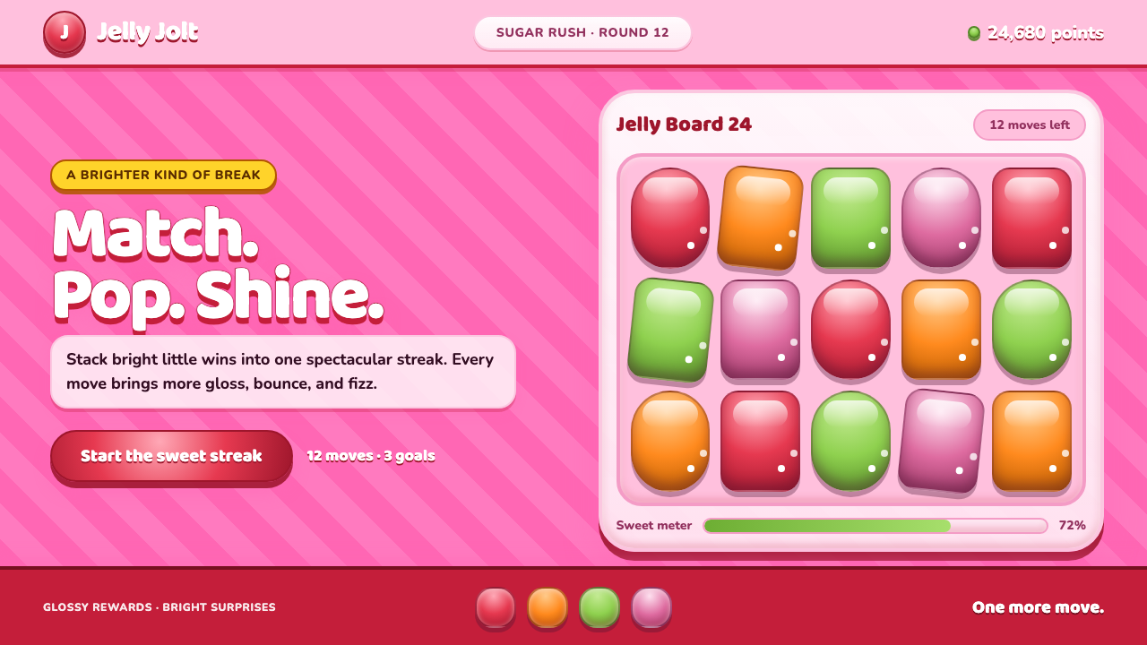 Candy Crush (2012)Sugar rush without restraint. Glossy candy tiles pulse across a striped bubbl…
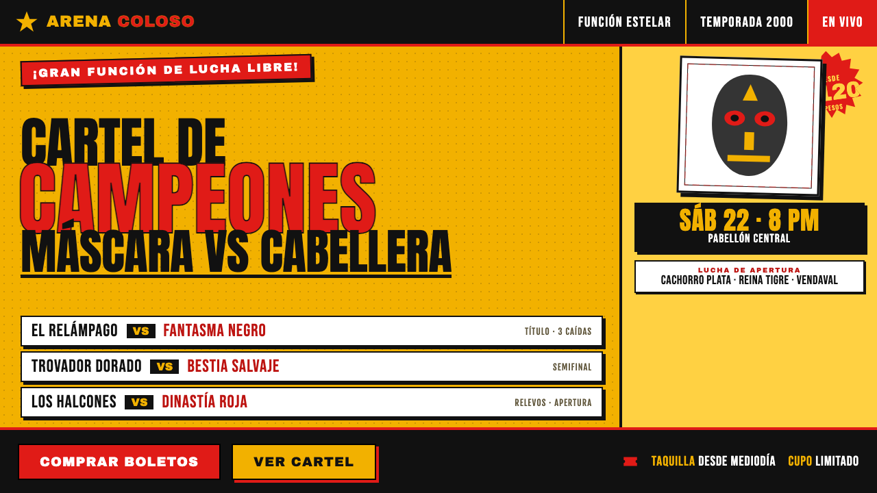 Lucha Libre Fight CartelTwo inks, maximum volume. Blood red on chrome-yellow, fat condensed type, sta…
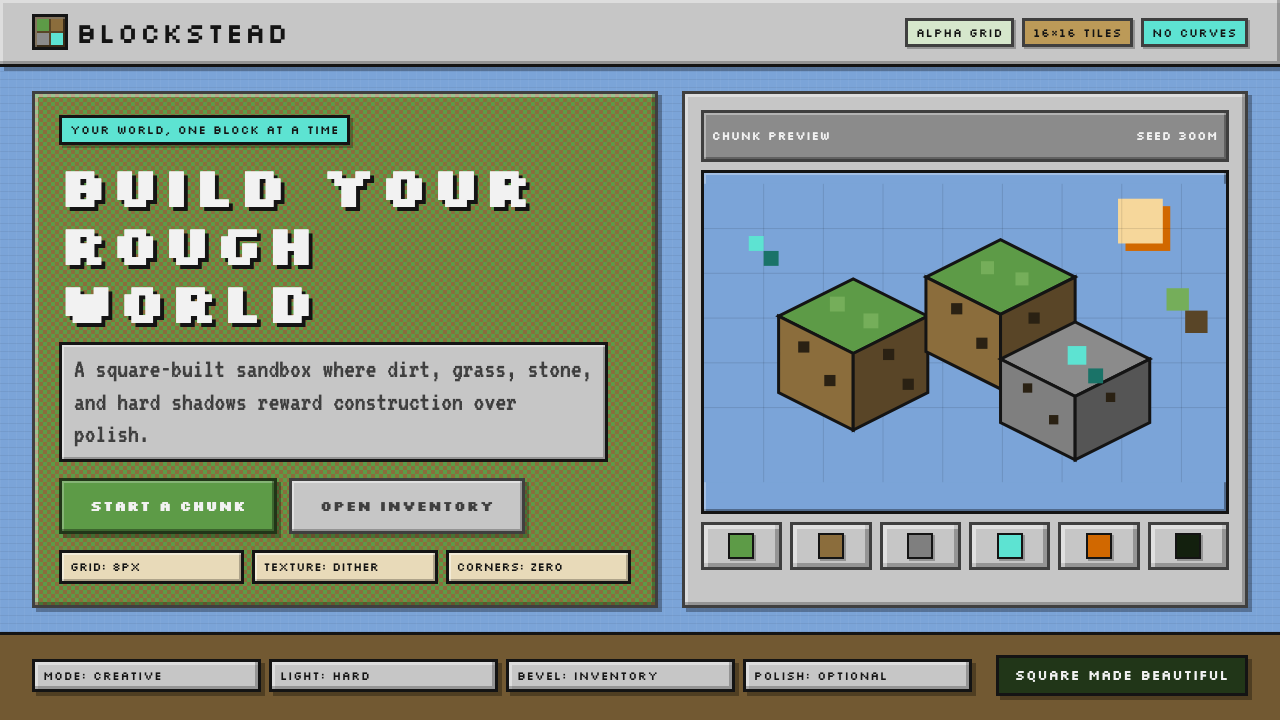 Minecraft VoxelUgly becomes buildable. Grass green, dirt brown, hard bevels, and 16×16 grids…