What is Lucha Libre Fight Cartel?
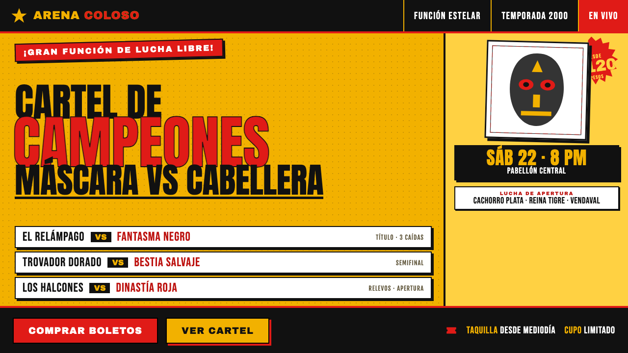
Lucha Libre Fight Cartel turns two cheap inks into maximum public volume: chrome-yellow ground, blood-red type, black rules, masked bodies, and price bursts built to stop a street.
Lucha Libre Fight Cartel in brief
Lucha Libre Fight Cartel is the visual language of Mexican arena-bill posters for lucha libre: inexpensive offset-printed sheets pasted onto walls to announce a major wrestling function. Its job is immediate public communication, not refinement. A saturated yellow field carries red overprint, while heavy black rules, wrestler cut-outs, and explosive date or price markers compete for attention at street-reading distance.
The style is built from constraint rather than understatement. Two inks create a forceful color collision; condensed display lettering packs large names and announcements into dense blocks; black-and-white masked-wrestler photographs provide human drama without interrupting the poster’s limited print system. The result feels loud because every device is designed to announce, repeat, frame, or amplify.
In digital form, the cartel becomes a deliberately flat and crowded graphic system. Red-on-yellow headlines stack in commanding bands, rough halftone imagery interrupts the type, and slightly displaced layers recall imperfect offset registration. It rejects polished spaciousness in favor of urgency, overlap, and the persuasive energy of a bill pasted among many other bills.
Where does Lucha Libre Fight Cartel come from?
The reference tradition belongs to Mexico, centered on Arena México and echoed by wrestling arenas nationwide. It is identified with the decades-long arena-cartel practice associated with EMLL and Consejo Mundial de Lucha Libre, commonly known as CMLL. The source period foregrounded here is 1990–2010, while the poster language itself clearly reaches back earlier through the established arena-bill tradition.
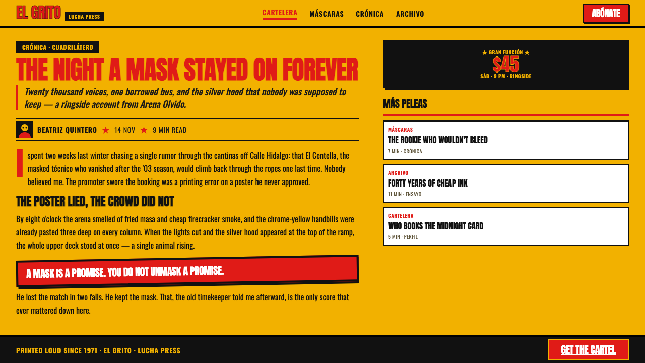
Its production conditions explain its appearance. These were cheap offset-printed announcements intended to be posted in public, where an image had to survive visual noise from walls, traffic, and competing notices. A limited ink setup made the yellow ground and red overprint economically direct, while black supplied rules, photographic contrast, and the strongest structural edges. What might look excessive in a gallery is practical when the poster must announce itself instantly.
Masked luchadores are the poster’s essential stars. Their cut-out black-and-white photographs turn recognizable wrestling personas into graphic silhouettes, while their masks give the composition a sharp, iconic face even at a quick glance. Around them, oversized type and starburst bursts identify the event, its price, or its date. The poster does not politely guide a reader through information; it stages a visual bout in which every message demands to be seen first.
What defines the Lucha Libre Fight Cartel look?
Two-Ink Impact
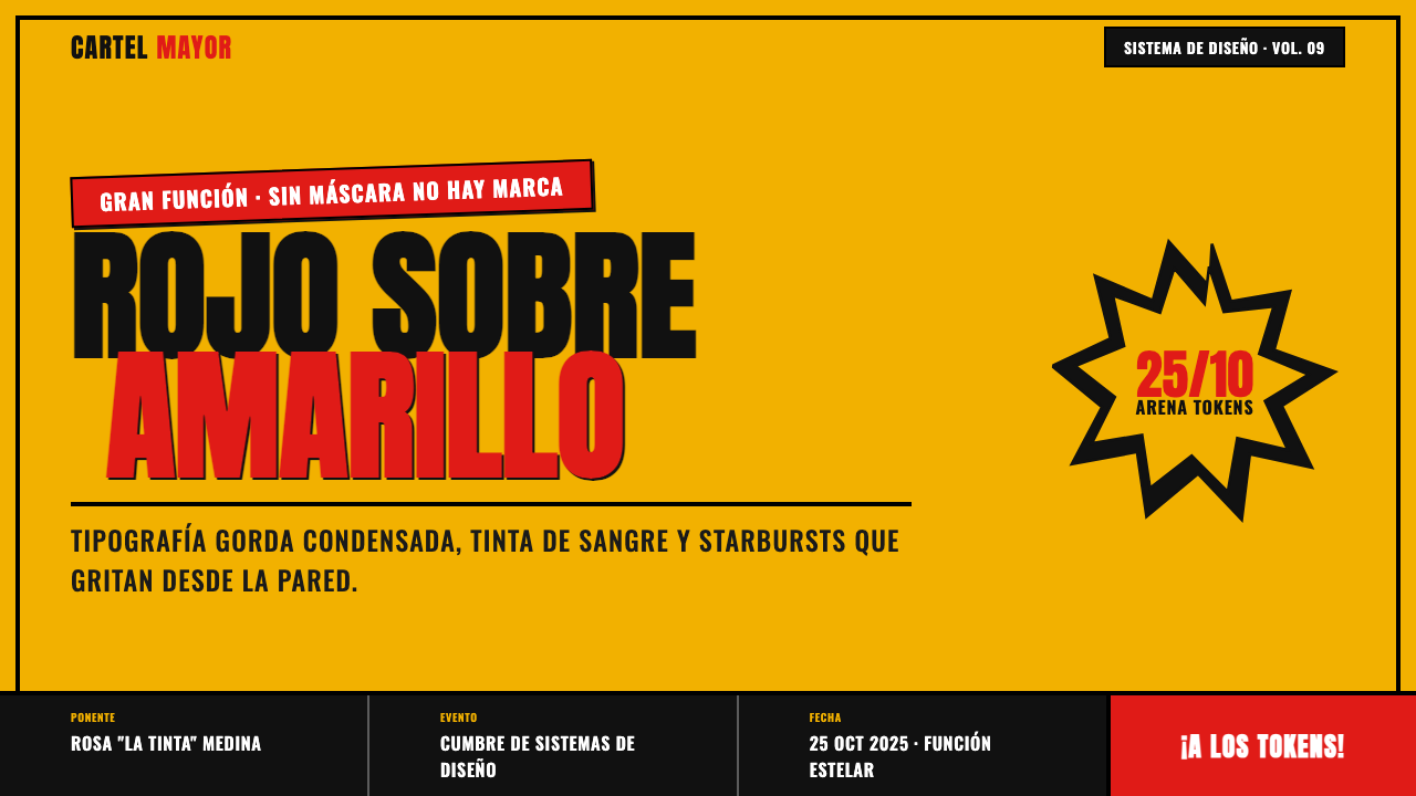
The system begins with chrome yellow and blood red, not a broad palette. Yellow supplies a blazing public field; red carries the loudest announcements and creates immediate friction against it. Black is used as a functional structural force for rules, imagery, and emphatic details. The restricted printing logic is visible rather than concealed, giving the poster its blunt, economical authority.
Condensed Display Type
Tall, fat condensed lettering is the primary voice. Its narrow width permits names and event language to become huge without abandoning density, while its heavy mass makes each line read as a block of sound. Headlines are stacked, tightly grouped, and allowed to crowd the frame. Elegance comes from compression and repetition, not from delicate letterform detail.
Starburst Announcements
Starburst shapes turn practical details into visual alarms. Prices, dates, and special notices belong in these spiked forms because the form itself interrupts the surrounding type blocks. A burst should feel pasted into the composition with force, not carefully integrated as a quiet badge. Its irregular perimeter is a signal that something urgent has entered the page.
Rules and Boxing
Heavy black rules divide, underline, trap, and escalate information. They create a hard arena-like structure around otherwise unruly stacked type and imagery. These lines should remain visibly blunt and graphic: they are not subtle separators for polished content but active marks that force the eye into the next announcement.
Halftone Wrestler Cut-outs
Black-and-white masked-wrestler photographs are treated as cut-out graphic matter rather than seamless pictures. Halftone texture connects them to cheap print reproduction, and hard cropping lets a body, mask, or gesture collide directly with type. The image brings spectacle, but it must remain subordinate to the poster’s loud ink-and-letter system.
Offset Misregistration
Slightly off-kilter registration is part of the digital translation of the arena bill. Layers may appear to have slipped just enough to introduce agitation and hand-produced imperfection. This is not soft blur or decorative distress. It is a visible reminder that the poster was made through forceful printing operations, and that precision is less important than impact.
Who shaped Lucha Libre Fight Cartel?
Consejo Mundial de Lucha Libre is one of the organizations explicitly tied to the source tradition. In this visual system, CMLL represents the arena context in which cartel posters function as direct public announcements: they gather event language, wrestlers, dates, and prices into a single loudly printed call to attend.
EMLL is named alongside CMLL as part of the cartel tradition that runs back decades before the period emphasized here. Its relevance is not a single stylistic signature but continuity: the recurring arena bill, pasted in public and built for instant notice, established the conditions in which this compressed, ink-heavy language could persist.
Masked luchadores are the poster stars rather than background decoration. Their masks make faces legible as symbols, while their bodies supply posture, confrontation, and spectacle. Rendered as black-and-white cut-outs within a yellow, red, and black field, they become graphic actors in the same visual contest as the headline and the starburst.
How do you use Lucha Libre Fight Cartel today?
For presentation slides, use the cartel most confidently on the cover and section-divider pages. A yellow field, one stacked red headline, a masked-wrestler cut-out, and a single starburst can establish the event immediately. Content slides need more discipline: keep the same rules and type hierarchy, but reserve the loudest burst for one takeaway. Data slides can treat comparisons as bouts, using black rules to organize categories and red marks to identify the decisive value without turning every number into a shout.
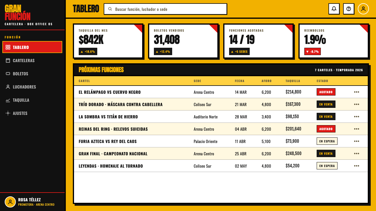
For web interfaces, the style suits promotional landing pages, event dashboards, ticketing surfaces, and pricing pages more naturally than quiet utility software. Let the yellow ground and red headline establish the primary action, then use black boxed modules to separate schedules, participants, or tiers. Navigation can be assertive and typographic, while starbursts should be limited to genuinely time-sensitive or high-priority information. The interface should scan like a poster before it asks users to read like a document.
For editorial and marketing work, use cropped wrestlers and headline bands to create poster-like rhythm across a campaign, story package, or social sequence. A feature page can alternate large announcement blocks with compact factual modules, allowing halftone imagery to break the grid at key moments. The strongest outcome comes when each page has a clear public message: an event, a lineup, an offer, or a challenge. Dense decoration without a concrete announcement loses the tradition’s communicative purpose.
The common mistake is to borrow the yellow, red, and starburst while removing the pressure that makes them necessary. If every item receives a burst, every headline is oversized, and every photograph is distressed, the hierarchy collapses into noise. Do not soften the language into generic retro nostalgia, but do give one message the lead, one image the role of star, and the remaining elements the job of making that lead impossible to ignore.
Lucha Libre Fight Cartel — FAQ
Is this style simply a retro Mexican poster look?
No. Its visual force comes from a specific arena-bill function: announcing lucha libre events in public with cheap offset printing and immediate legibility. The colors, condensed type, rules, cut-outs, and bursts are not interchangeable vintage ornaments. They are a communication system shaped by limited inks, crowded walls, wrestler spectacle, and the need to make an event feel urgent.
Can the style use more than red, yellow, and black?
Additional color weakens the two-ink premise unless it has a clear operational reason. The defining contrast is blood red over chrome yellow, with black giving the page its rules and photographic weight. A restrained extension may be possible in a digital campaign, but the eye should still recognize the original limited-ink collision as the poster’s organizing event.
How should photography be handled?
Treat photography as a hard-edged black-and-white wrestler cut-out, often with visible halftone character, rather than as a full-color scene. Crop for mask, stance, or gesture and allow the figure to overlap headline bands and rules. The photograph should intensify the printed poster language, not create a polished cinematic depth that competes with it.
Where does Lucha Libre Fight Cartel struggle?
It struggles wherever calm reading, sustained concentration, or a quiet emotional tone is the primary requirement. The system is intentionally crowded, urgent, and confrontational. It works best when a product or campaign genuinely has an event-like message to announce; it becomes exhausting when applied unchanged to dense documentation, subdued editorial reading, or interfaces that ask users to compare many fine distinctions at once.
Related design styles
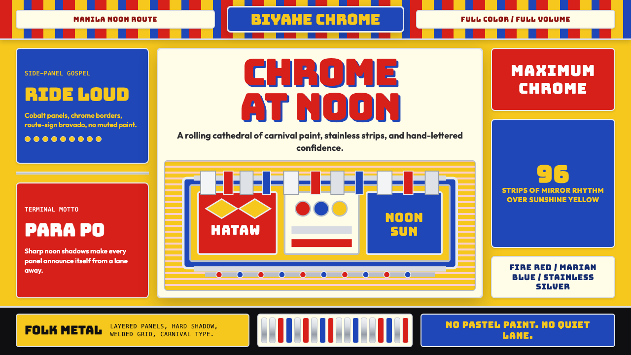 Filipino Jeepney (Chrome & Streamer)Maximalism has wheels. Sunshine yellow, chrome strips, Bungee route-sign type.
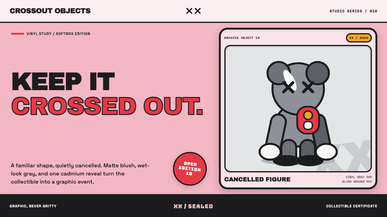 KAWS Companion (2010)Playful, with its eyes crossed out. Blush fields frame glossy gray vinyl and…
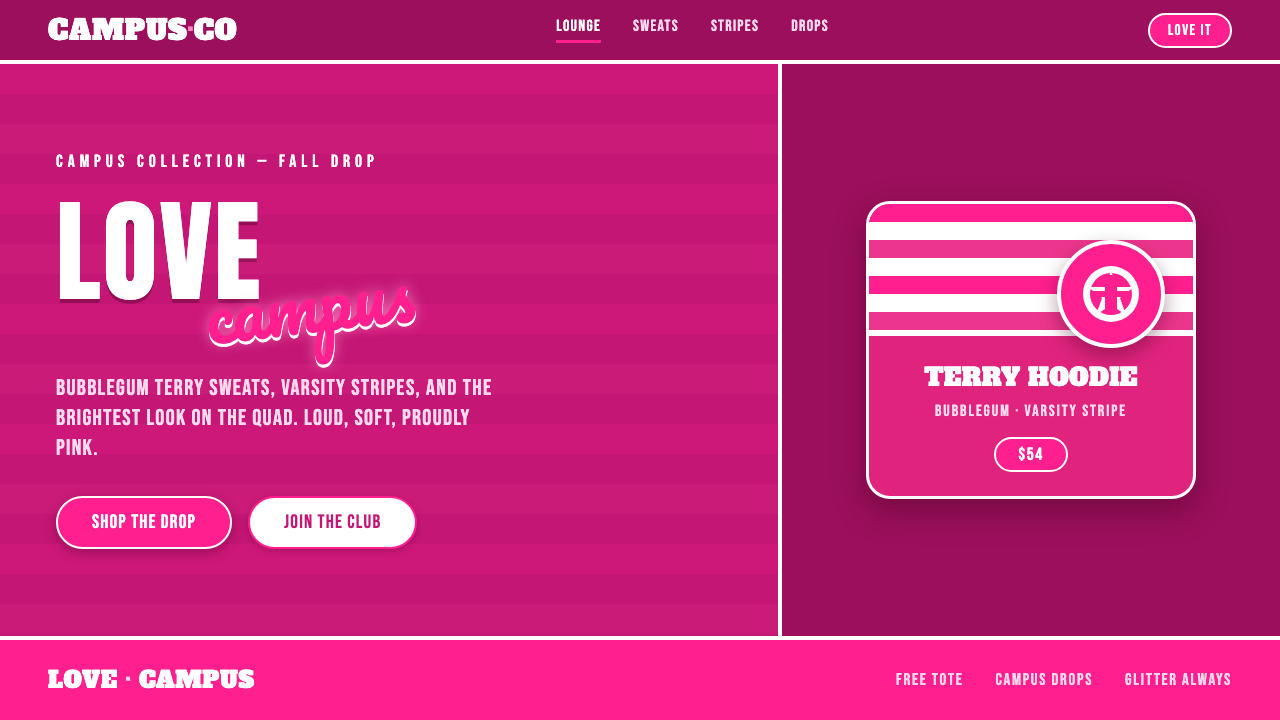 Victoria's Secret PINK 2004Proudly, relentlessly pink. Bubblegum magenta, varsity caps under cursive scr…
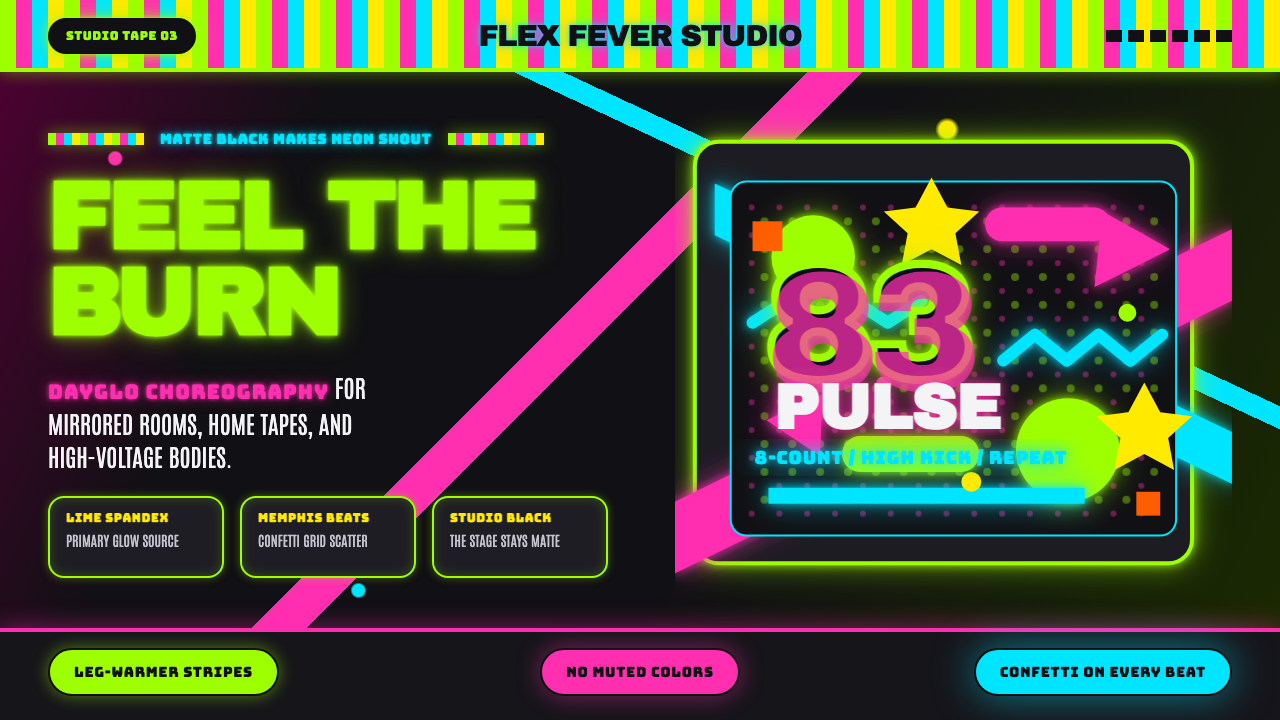 80s Aerobics Fluoro SpandexNeon refuses restraint. Lime spandex, pink-cyan confetti, and black-stage typ…
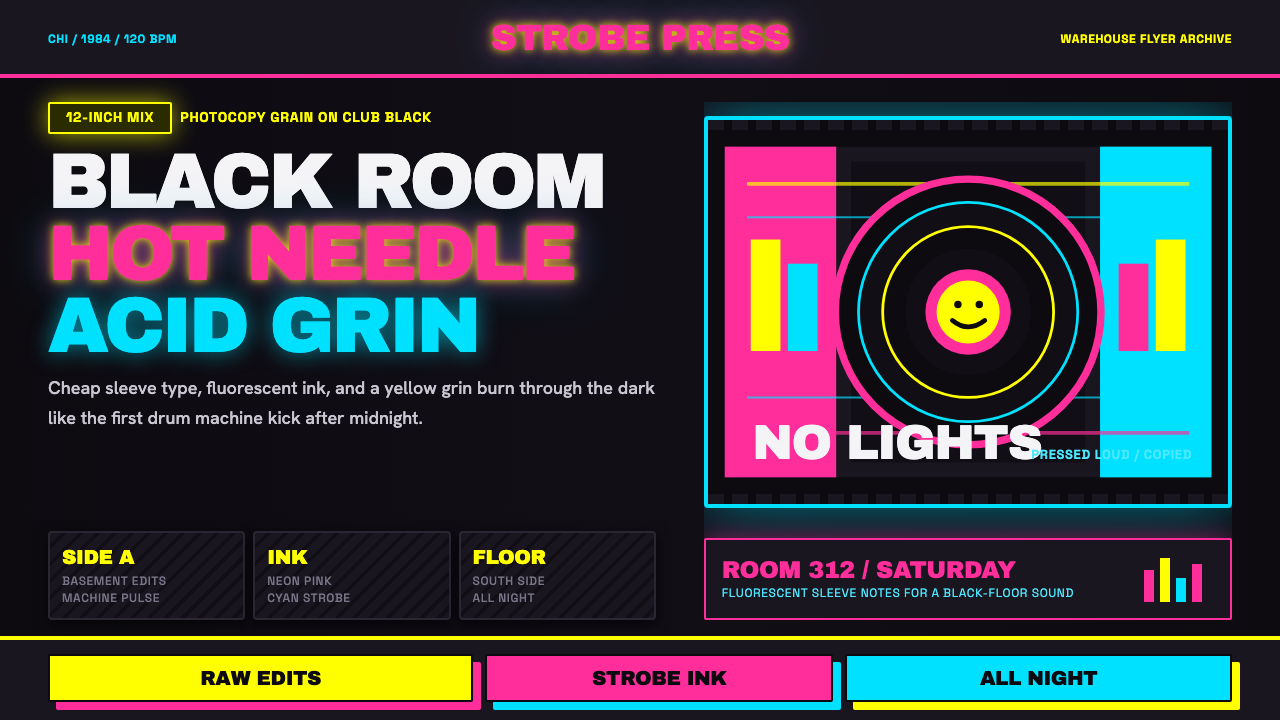 Chicago HouseDarkness starts the track. Neon pink, yellow and cyan hit black like Xerox st…
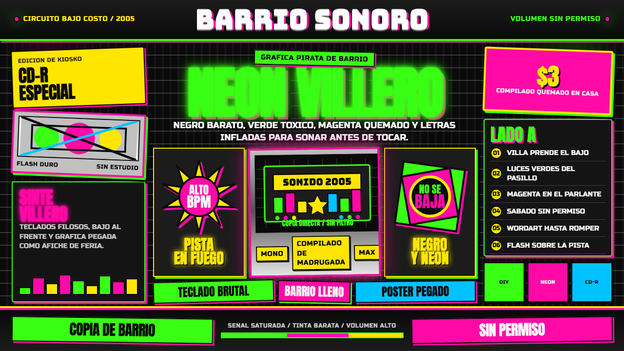 Cumbia VilleraLow-budget defiance. Neon green and hot magenta crowd black with chrome inlin…