What is KAWS Companion (2010)?
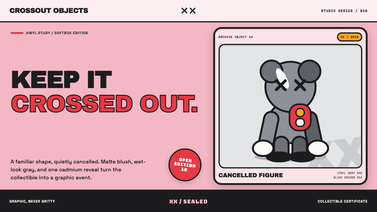
KAWS Companion took a Mickey Mouse-shaped cartoon skeleton, crossed out its eyes, and cast it in candy-glossy resin — turning a private joke about grief into one of the most collected objects in contemporary art.
KAWS Companion (2010) in brief
This is a toy-shelf system built from flat cartoon color and one unmistakable joke: the eyes are always crossed out. Fields of candy-bright blush, gray, or black sit as pure flat color, outlined in fat, uniformly weighted black lines — the visual grammar of classic rubber-hose animation rather than fine-art illustration. Nothing is textured or hand-shaded; every surface behaves like vinyl or resin under a studio light.
The figure itself borrows its anatomy wholesale from 1930s cartoon characters — tube-shaped limbs, oversized white four-fingered gloves, a rounded skull — and then quietly cancels the source material's cheerfulness by striking an X through both eyes. That single gesture turns a mascot into a memorial, a toy into a comment on the character it's built from, without ever raising its voice.
The overall staging is collectible-object photography, not gallery painting: a soft matte ground, a glossy hero object catching studio-softbox highlights, and small edition or authenticity badges nearby. It reads as merchandise elevated to art object rather than art brought down to merchandise — playful in surface, deadpan in gesture.
Where does KAWS Companion (2010) come from?
Brian Donnelly, working under the name KAWS, began as a graffiti artist in the 1990s known for subvertising — painting over advertisements in bus shelters and phone booths with his own characters layered into the original ad imagery. This background in appropriating existing commercial and cartoon imagery, rather than inventing figures from scratch, carried directly into his later sculptural work.
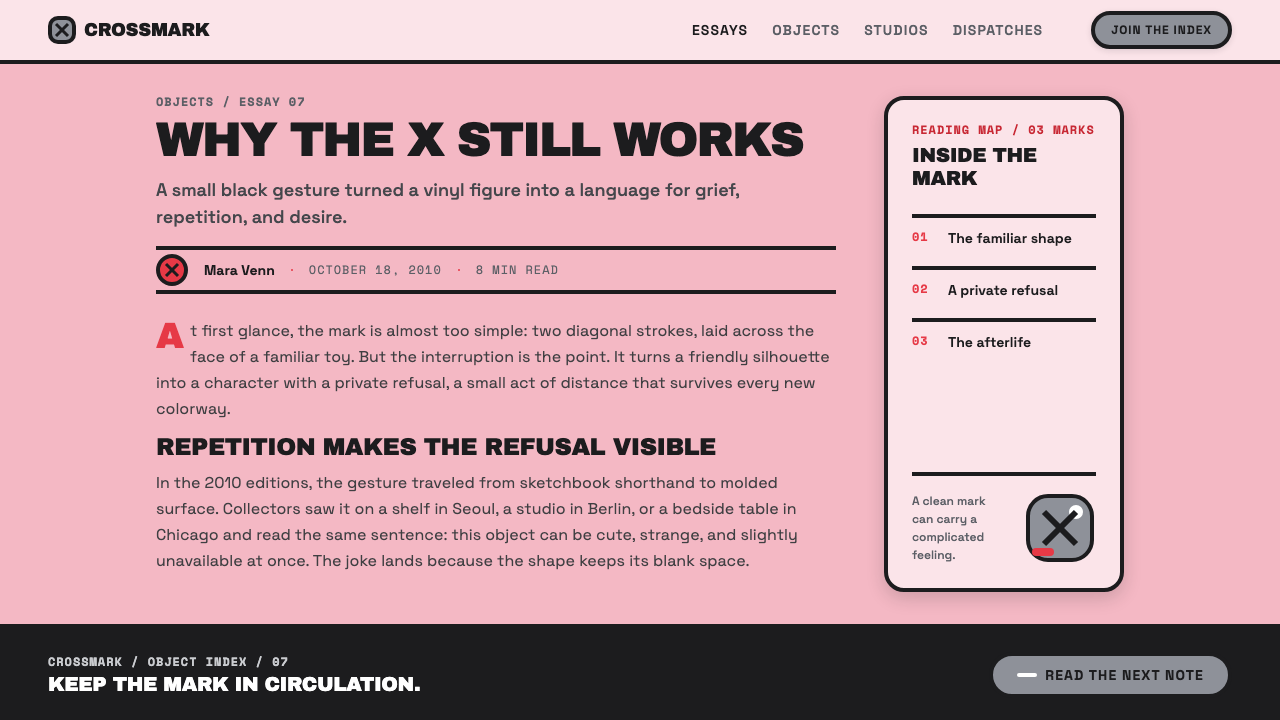
The Companion figure, with its rubber-hose limbs, four-fingered gloves, and skull motif, is a direct descendant of 1930s American cartoon anatomy — the visual language of characters built for early animation, when simple tube-shaped limbs were easier to draw frame by frame. Donnelly's crossed-out eyes, applied to this borrowed anatomy, became his signature move: a small, quiet mark of cancellation stamped onto cheerful source material.
Donnelly produced the Companion through OriginalFake, his Tokyo-connected retail venture, working with the Japanese collectible-toy manufacturer Medicom Toy, whose vinyl production techniques and toy-collector market gave the Companion its glossy, mass-producible finish. The open-edition 'Dissected' variants — which exposed a cutaway view of the figure's insides — extended the toy into a kind of anatomical display object, collectible at a range of price points from mass vinyl to fine-art bronze.
The Companion's rise paralleled the broader urban vinyl and designer-toy movement, in which figures produced through toy-manufacturing methods and sold through limited-run drops came to be treated as legitimate art objects, exhibited and priced accordingly. Figures like Emmanuel Perrotin and Hikari Yokoyama helped move Donnelly's work from streetwear and toy-collector circles into gallery and auction contexts, cementing the Companion as a bridge between street-pop appropriation and post-graffiti fine art.
What defines the KAWS Companion (2010) look?
Color
Fields are flat and candy-bright — a soft blush ground paired with glossy figure colors like gray, black, or brown. Color is applied as pure, unmodulated planes, the same approach used in classic cel animation, with no gradient or texture breaking up a surface.
Outline
Every form is bound by a fat, uniformly weighted black outline, never thin or variable. This is the defining trait of rubber-hose cartoon drawing carried into three dimensions — the line does the job of separating one flat color field from another, the way a coloring-book outline does.
The Crossed-Out Eyes
The single most identifying mark of the system: an X where a cheerful cartoon eye would normally sit. It is applied consistently and without variation, turning any borrowed cartoon anatomy into recognizably KAWS-derived work. The gesture reads simultaneously as mourning, cancellation, and branding.
Rubber-Hose Anatomy
Limbs are simple, tube-shaped and boneless-looking, hands are oversized four-fingered gloves, and the skull is rounded and slightly oversized relative to the body — the exact proportional logic of 1930s cartoon character design, chosen for how easily it reads at any scale, from a small vinyl figure to a monumental public sculpture.
Glossy Studio Finish
Surfaces are rendered as if freshly cast in resin or vinyl and photographed under studio softboxes — sharp specular highlights, a wet-lacquer sheen, and a soft, matte, out-of-focus background that keeps all visual attention on the glossy hero object.
Edition Markers
Small badges, numbers, or stamps signaling limited-edition status sit unobtrusively near the figure, borrowing the visual vocabulary of collectible authentication rather than gallery wall text — a reminder that the object's value is tied to scarcity and production run as much as to imagery.

Who shaped KAWS Companion (2010)?
Working as KAWS, Donnelly began in 1990s graffiti and subvertising before developing the Companion figure by grafting crossed-out eyes onto rubber-hose cartoon anatomy. His practice deliberately blurs the line between street art, mass-produced collectible toy, and fine-art object, and the Companion remains his most widely recognized and reproduced character.
Akashi, associated with the Medicom Toy production side of Donnelly's work, represents the Tokyo collectible-toy manufacturing infrastructure that gave the Companion its glossy vinyl finish and mass-producible form, connecting Donnelly's street-art sensibility to Japanese designer-toy craftsmanship.
Perrotin, a prominent gallerist, helped move Donnelly's work from toy-collector and streetwear circles into the contemporary art gallery system, exhibiting and representing Companion-related sculpture at a scale and price point associated with established fine art rather than collectible merchandise.
Yokoyama, active in curating and connecting contemporary art with fashion and design-toy culture, is associated with the broader effort to situate KAWS's toy-derived work within serious contemporary art conversation, helping bridge OriginalFake-era street-pop appropriation with post-graffiti fine art contexts.
How do you use KAWS Companion (2010) today?
This system works because it is graphic and instantly legible, not because it is subtle — applying it well means leaning into flat color, fat outlines, and one unmistakable signature gesture rather than trying to soften any of it into something more painterly.
For presentation slides, the style suits cover pages built around a single bold character or icon rendered in flat cartoon color with a heavy black outline, set against a soft blush or neutral ground. Content slides should keep color blocking simple — two or three flat fields per slide — and reserve the glossy-highlight treatment for a single hero image or product shot rather than scattering it across every element.
For web interfaces, the palette and outline logic suit playful consumer brands, collectible-drop commerce, and youth-culture products where a bold graphic mascot or icon can anchor the page. Buttons and cards read well as flat color blocks with heavy borders rather than soft shadows; a single glossy 'hero' product image benefits from the same studio-softbox treatment described above.
For editorial and marketing work, the crossed-out-eyes gesture and collectible-object photography style suit drop announcements, limited-edition campaigns, and any content built around scarcity and desirability. Treat the hero image the way a toy catalog treats its flagship figure: centered, glossy, softly lit, badge nearby.
The most common mistake is applying the flat cartoon color and outlines without the single signature gesture that gives the system its edge — without a consistent 'cancelled' or subverted detail, the result reads as generic children's-cartoon styling rather than the specific, deadpan wit this style depends on.
KAWS Companion (2010) — FAQ
Why are the eyes always crossed out?
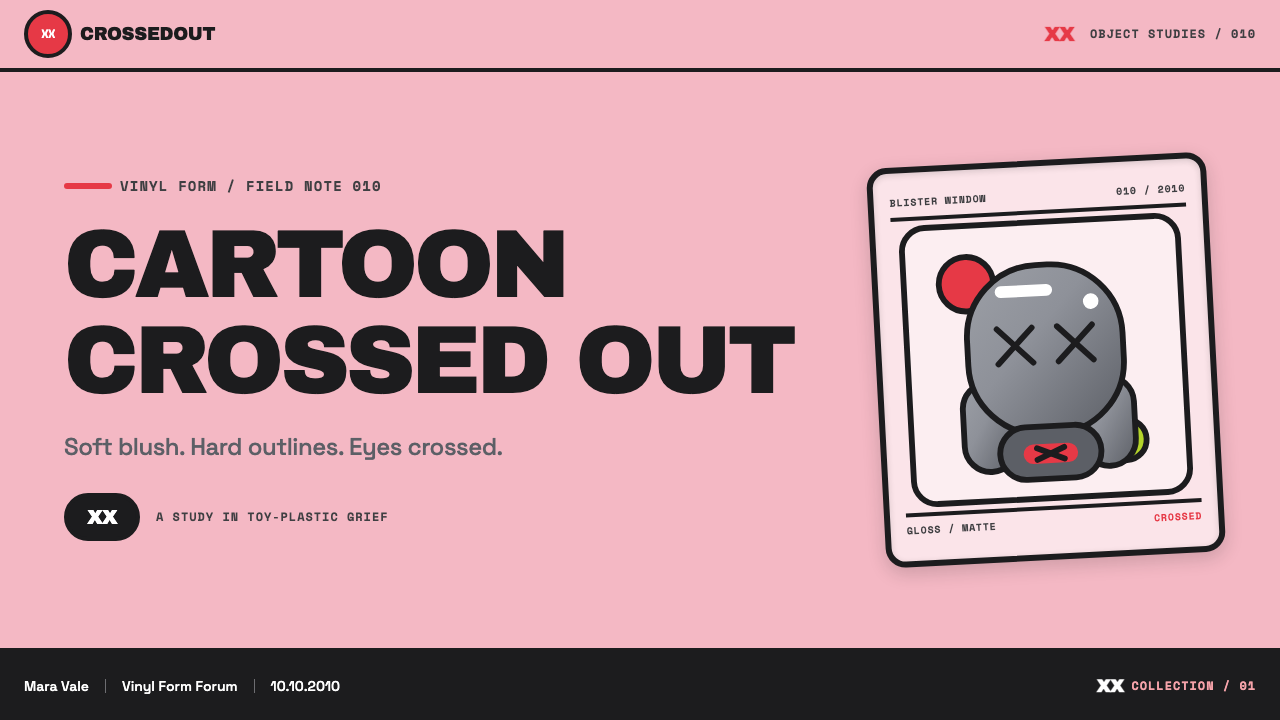
The crossed-out eyes are Donnelly's signature gesture, applied consistently across his cartoon-derived figures. It functions as a quiet cancellation of the source character's cheerfulness — turning a mascot into something closer to a memorial object — while also acting as an instantly recognizable brand mark across every scale of production, from small vinyl toys to large public sculpture.
Is the Companion figure based on an existing cartoon character?
It borrows its proportional logic — tube-shaped limbs, oversized four-fingered gloves, a rounded skull — from the general anatomy of 1930s rubber-hose cartoon characters, a style used across early animation because it was simple to draw frame by frame. Donnelly transformed this shared visual vocabulary into an original figure through the crossed-out eyes and his own proportions, rather than copying any single existing character.
Why does this system rely so heavily on flat color and thick outlines rather than shading?
Flat color and uniform outlines are the visual grammar of classic cel animation, chosen originally for production efficiency — flat fields were faster to paint and reproduce frame by frame. This system inherits that grammar deliberately, because it reads instantly at any scale and reinforces the toy-like, mass-producible quality that is central to the Companion's identity as both art object and collectible merchandise.
How does the collectible-object photography style differ from typical product photography?
Typical product photography aims for neutral clarity. This style instead borrows the specific staging of high-end collectible photography — a soft matte ground, dramatic studio-softbox highlights catching a glossy resin or vinyl surface, and small edition badges nearby — treating the object less like inventory and more like a museum piece under glass.
Does this style suit serious, non-playful brands?
It is not a natural fit. The style's power comes from treating a graphic, cartoon-derived character with the reverence usually reserved for fine art — a tension that only works when the underlying subject is playful to begin with. Applied to a genuinely serious or institutional brand, the flat cartoon color and crossed-out eyes read as an odd mismatch rather than a deliberate contrast.
Related design styles
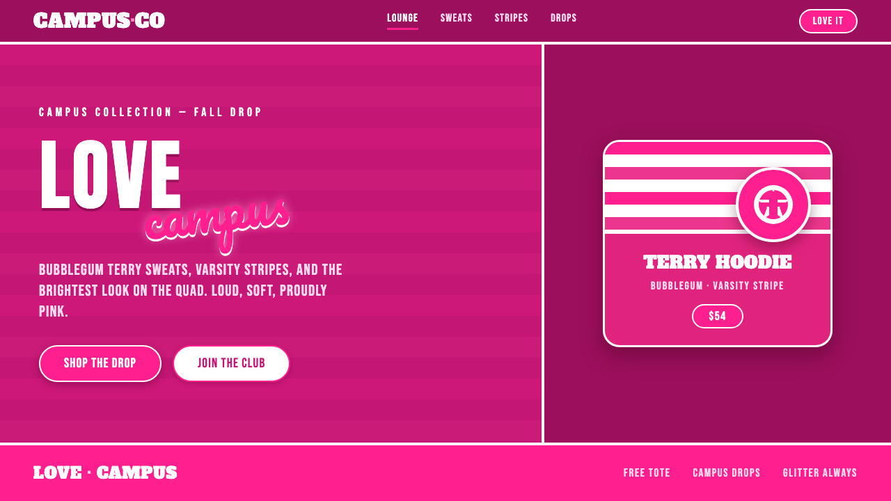 Victoria's Secret PINK 2004Proudly, relentlessly pink. Bubblegum magenta, varsity caps under cursive scr…
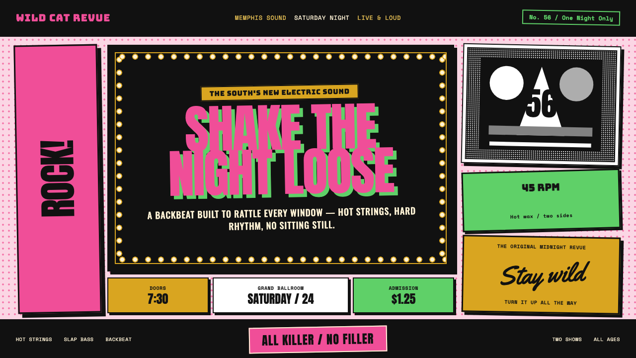 Elvis Presley (1956)Rock learned to shout. Bubblegum pink, acid green and jailhouse type land wit…
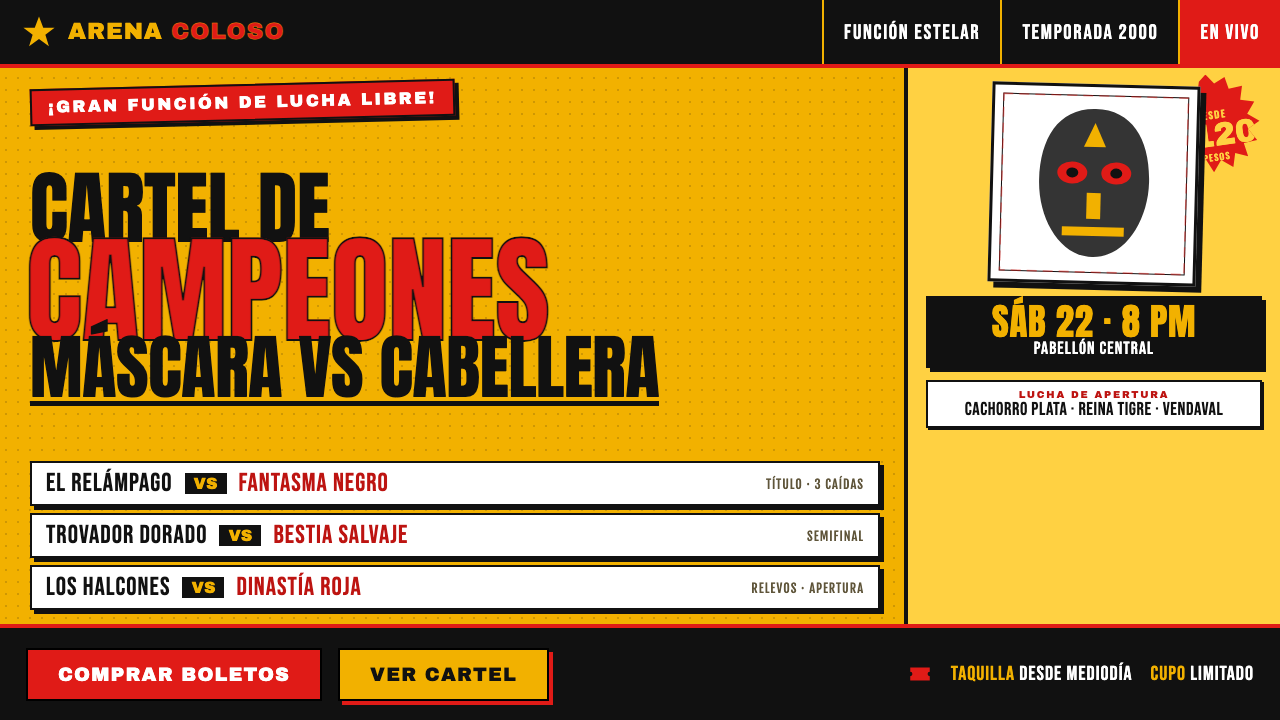 Lucha Libre Fight CartelTwo inks, maximum volume. Blood red on chrome-yellow, fat condensed type, sta…
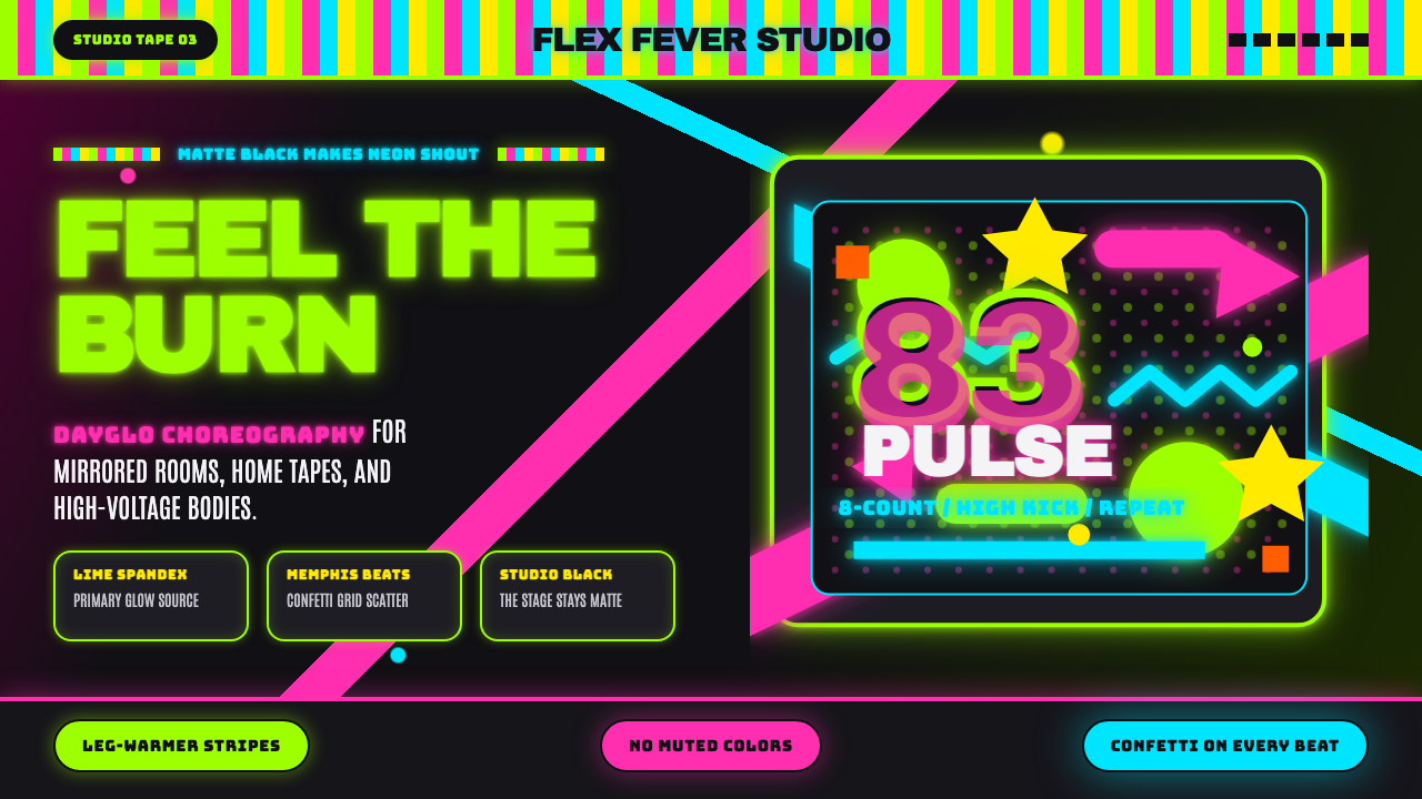 80s Aerobics Fluoro SpandexNeon refuses restraint. Lime spandex, pink-cyan confetti, and black-stage typ…
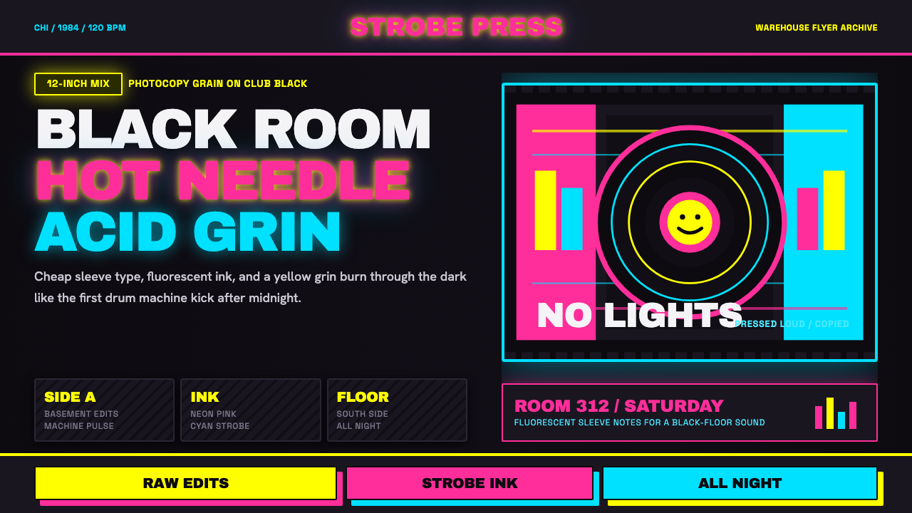 Chicago HouseDarkness starts the track. Neon pink, yellow and cyan hit black like Xerox st…
 Las Vegas Neon (1960)Night refuses to dim. Hot-pink tubes, cyan bloom and amber bulbs turn black i…