What is Victoria's Secret PINK 2004?
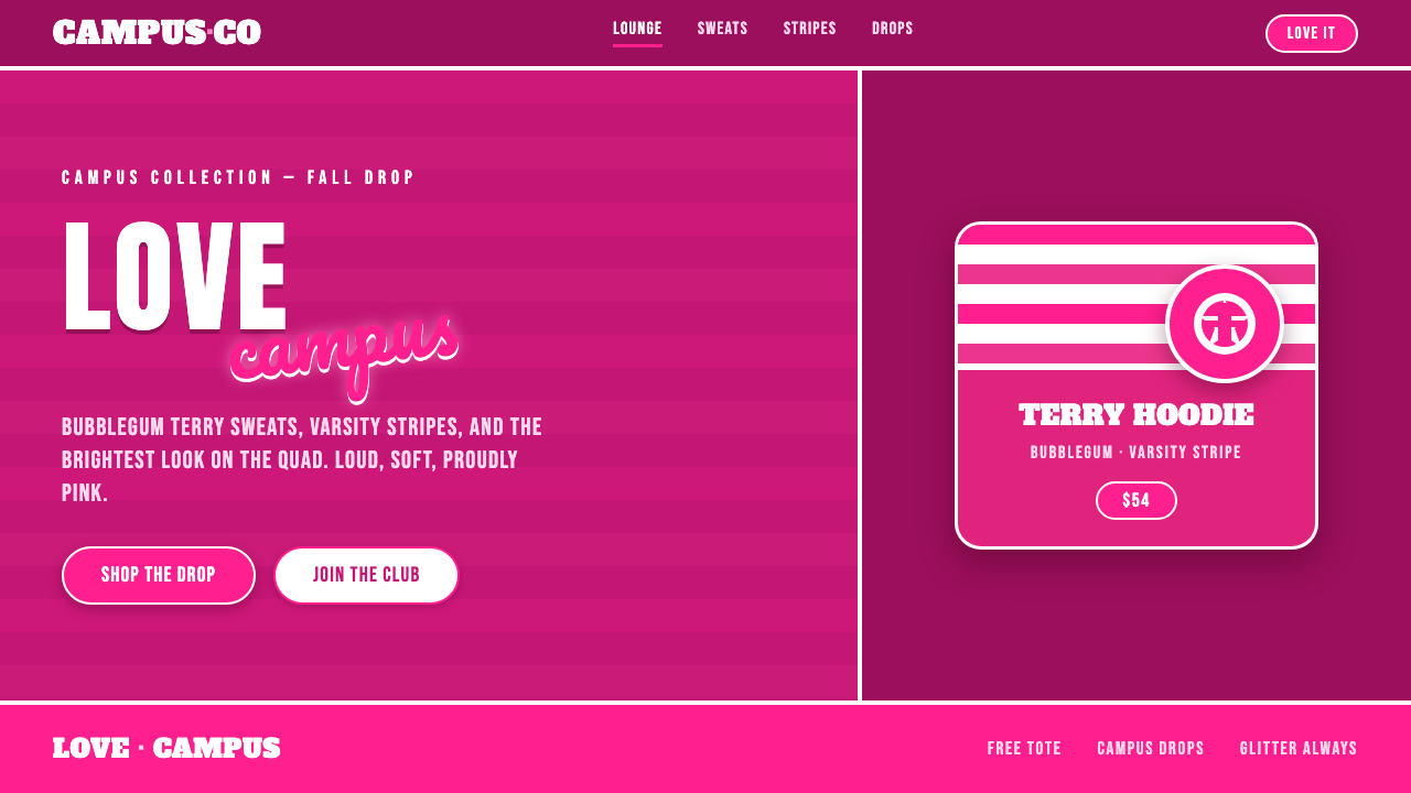
Victoria's Secret PINK 2004 turned campus-cute into a full-volume identity: bubblegum magenta, varsity confidence, loose script, and lounge clothes made to be seen.
Victoria's Secret PINK 2004 in brief
Victoria's Secret PINK launched around 2004 as a younger, sportier sub-brand aimed at the college campus. Its world was saturated, casual, and deliberately extroverted: bubblegum magenta, terry-cloth loungewear, drawstring waistbands, bold stripe bands, and the wide-eyed scottie-dog mascot. Rather than borrowing the restrained language of lingerie, PINK made comfort, playfulness, and visible brand allegiance central to the look.
The visual identity depends on collision. Collegiate block lettering supplies the broad, athletic, campus-facing structure; loose cursive script interrupts it with a more personal, flirtatious gesture. Across sporty-casual apparel, these voices appear with glittery treatments, varsity panels, and emphatic wordmarks such as LOVE PINK. The result is not polished understatement. It is a graphic system that treats enthusiasm as a visual material.
PINK 2004 is best understood as a mall-retail youth identity with a strong wearable surface. The style is built to read quickly across sweats, lounge separates, caps, bands, and mascot graphics. Pink is not an accent tucked into a neutral wardrobe; it is the atmosphere. Sporty references keep the sweetness from becoming delicate, while script and sparkle keep collegiate lettering from becoming severe.
Where does Victoria's Secret PINK 2004 come from?
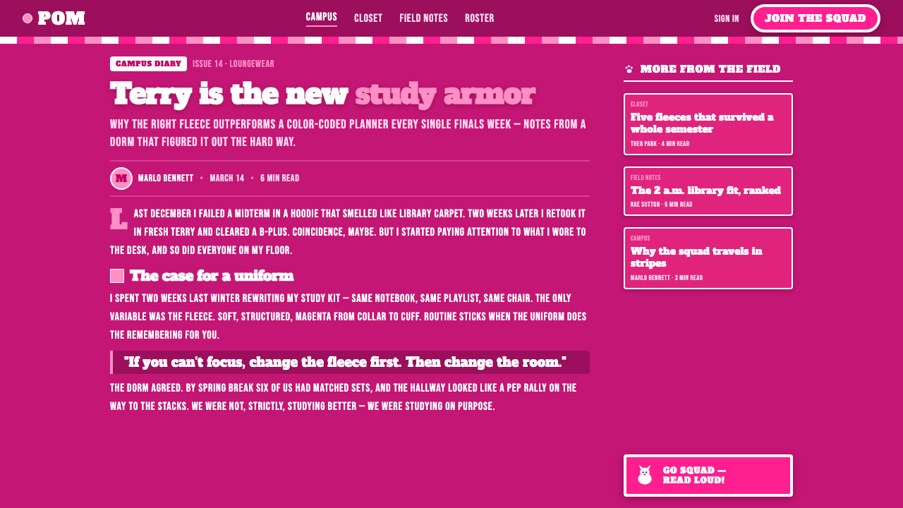
PINK entered the North American mall-retail era around its 2004 launch as a Victoria's Secret sub-brand from Columbus, Ohio, under Victoria's Secret and Limited Brands. Its stated territory was the college campus, a setting that gave the line an immediate vocabulary: varsity associations, sporty-casual clothing, casual lounge silhouettes, and language designed to be worn publicly rather than kept private.
The brand emerged within a broad 1990–2010 retail band in which youth marketing, collegiate-casual loungewear branding, and sub-brand identities built around mascots were closely aligned. PINK assembled those available codes into a highly concentrated world. The campus reference did not require academic seriousness; it supplied a recognizable blend of team spirit, relaxed dress, social visibility, and graphic familiarity.
Victoria's Secret marketing, Limited Brands brand designers, and the PINK line identity team are the approved key figures behind this direction. The source material presents them as collective brand-making forces rather than as a single auteur. That is fitting for an identity whose power lies in repetition across apparel and retail-facing signals: a shared color mood, recurring lettering contrast, stripe language, and a mascot that can carry recognition without explanation.
The resulting sub-brand transformed a lingerie giant's spinoff into a youth-culture phenomenon through its unapologetic visual stance. Its message was direct: proudly pink, playful, sporty, and loud. The identity did not seek distance from commercial visibility; it used the familiar conditions of campus-oriented mall retail as the stage for a vivid, easily repeated style.
What defines the Victoria's Secret PINK 2004 look?
Proud Pink Atmosphere
Bubblegum magenta is the identity's emotional field, not a minor highlight. It creates an immediate, high-energy first impression and makes even casual loungewear feel declarative. Supporting tones should preserve that sense of saturation and contrast rather than mute the palette into generic femininity. The governing idea is visibility: pink must feel chosen, public, and impossible to mistake for an afterthought.
Varsity Block Lettering
Collegiate block lettering gives PINK its sportier backbone. The forms should feel broad, sturdy, and easy to recognize from a distance, as though they belong on a campus garment rather than a delicate label. This typographic voice carries group energy and casual confidence. It works especially well for names, declarations, panel text, and large garment-scale graphics.
Loose Cursive Contrast
Loose cursive script softens and personalizes the varsity structure. It should read as a quick, expressive sweep rather than formal calligraphy: playful beside block type, a little glittery in spirit, and comfortable with imperfection. The tension between the two typographic voices is essential. Without script, the look becomes only athletic; without block lettering, it loses its campus framework.
Terry and Stripe Surface
Terry-cloth loungewear and bold stripe bands make texture and garment construction part of the visual language. Stripes are not quiet trim; they function like athletic signals that organize a sleeve, waistband, or panel. Terry suggests softness and downtime, while the stripe keeps that softness visible and sporty. Together they make comfort look branded rather than anonymous.
Glittery Sporty-Casual Energy
Glittery treatments add exuberance to a sporty-casual base. Their purpose is not luxury restraint or refined shine; it is to keep the graphic language cheerful, performative, and slightly over-the-top. Used around lettering or familiar apparel motifs, sparkle turns a simple campus reference into a louder youth-culture signal while preserving the relaxed spirit of sweats and lounge pieces.
Scottie-Dog Mascot
The wide-eyed scottie dog gives the identity a compact, repeatable character. A mascot-led sub-brand can communicate warmth and recognition without relying on a full wordmark every time. Here the dog belongs to the same campus-cute world as the stripes, scripts, and saturated pink. It should feel playful and instantly legible, never detached from the apparel-focused personality around it.
Who shaped Victoria's Secret PINK 2004?
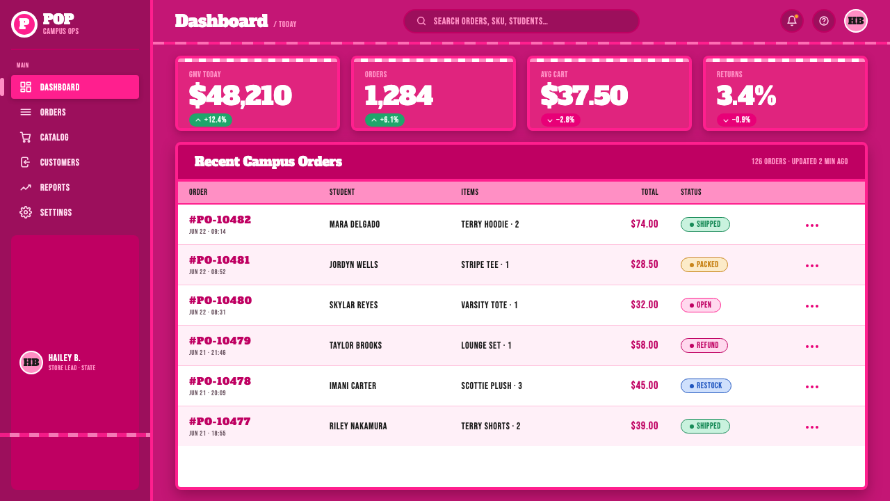
The Victoria's Secret marketing team is identified as a key collective behind PINK's direction. In the approved material, its role is inseparable from positioning the line as younger, sportier, and college-campus oriented. The visual outcome depends on that clear audience stance: clothing, slogan-like graphics, and mascot recognition all work as outward-facing youth signals rather than as a continuation of a more private lingerie identity.
Limited Brands brand designers are named among the people shaping the line's identity. Their contribution is best read through the system's wearable coherence: collegiate panels, broad lettering, cursive interruption, stripe bands, terry surfaces, and saturated color all point toward a single sporty-casual world. The style succeeds because these elements reinforce one another across a retail-ready apparel range.
The PINK line identity team represents the focused sub-brand perspective within the larger organization. The source material links that perspective to mascot-led identity and to the unapologetically loud, proudly pink character of the line. Its importance is not a single signature artifact but the sustained consistency that lets a scottie dog, a stripe, a cursive gesture, or a block word all feel like parts of the same campus-cute proposition.
How do you use Victoria's Secret PINK 2004 today?
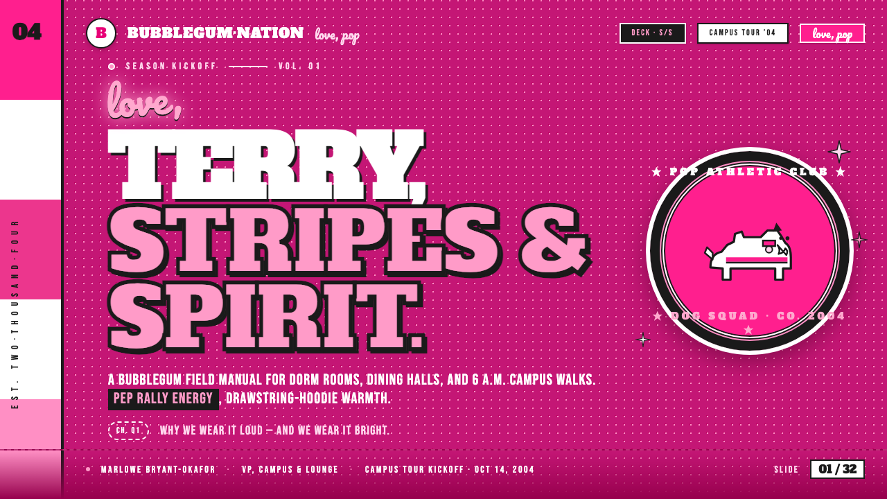
For presentation covers, let the PINK 2004 mood arrive immediately. Use a dark field or a saturated pink-led field, then create a bold collision between collegiate block lettering and a loose script gesture. A stripe band, scottie-dog motif, or apparel-like panel can establish the sporty setting. Keep the title assertive and public-facing; the cover should feel like a campus garment graphic enlarged into a first impression.
On content slides, retain the contrast between disciplined varsity structure and playful cursive release. Use block lettering for section names and essential statements, then reserve script for a small emotional lift: a short note, a label, or a celebratory phrase. Repeated bands and panel divisions can organize information without making the slide feel corporate. The layout should remain easy to scan, because the style's energy comes from clear signals rather than clutter.
For data slides, translate stripes, panels, and wordmark confidence into the chart system. Treat major categories as bold apparel-like blocks, use saturated pink as the unmistakable focal signal, and allow a supporting dark field to hold the composition together. The data must remain legible before it becomes decorative. Script is best kept outside the analytical core, where it can frame a takeaway without competing with labels or values.
In web interfaces, this style suits youth-facing dashboards, membership areas, campaign pages, and pricing experiences when the product genuinely benefits from high-energy campus-cute branding. A dark base paired with pink-led emphasis can make navigation, status, and calls to action feel decisive. Block typography should carry hierarchy, while cursive is used sparingly for personality. Cards and sections can borrow varsity panels and stripe bands, but functional content still needs a calm reading path.
For editorial and marketing work, use the system as a loud but coherent campaign language: oversized collegiate headlines, script as a human counterpoint, mascot appearances as recognition beats, and stripe bands as transitions between stories. The common mistake is to scatter pink, cursive, glitter, dogs, and varsity lettering everywhere at once. Authentic use needs a lead signal. Choose the dominant gesture for each composition, then let the remaining cues support its campus-cute confidence rather than compete for attention.
Victoria's Secret PINK 2004 — FAQ
Is PINK 2004 simply a pink version of collegiate style?
No. Collegiate block lettering is only one side of the identity. PINK 2004 also depends on loose cursive script, terry-cloth loungewear, bold stripe bands, glittery sporty-casual treatments, drawstring details, and the scottie-dog mascot. Pink supplies the atmosphere, but the style becomes recognizable through the friction between athletic campus codes and openly playful, feminine expression.
Can the style work without the scottie-dog mascot?
Yes, because the core system also includes saturated pink, varsity lettering, cursive contrast, stripes, and lounge-sport construction. But removing the mascot changes the tone. The scottie dog provides a quick, friendly recognition cue and supports the mascot-led sub-brand identity described in the source material. Without it, the work should make the remaining signals especially coherent rather than attempting to replace the character with unrelated imagery.
How should block lettering and cursive script be balanced?
Let block lettering establish the message, hierarchy, and collegiate confidence. Let cursive interrupt that structure with a more casual, expressive note. When both voices are equally dominant everywhere, the composition can become noisy and difficult to read. The most convincing balance gives each voice a distinct job: block type for public declaration, script for personality and playful lift.
Is a dark layout essential to the PINK 2004 look?
A dark presentation can strongly support the supplied dark-theme direction by making saturated pink and glittery sporty-casual elements feel more emphatic. It is not the only possible setting, however. The essential requirement is that pink remains proud and visible, while stripes, lettering contrast, and campus-cute cues stay legible. A lighter field can work if it preserves the same unapologetic energy instead of softening the identity into something restrained.
Where does this style struggle in contemporary design?
It struggles when the desired tone is quiet, neutral, highly formal, or visually anonymous. PINK 2004 is designed around saturation, overt branding, youth-culture playfulness, and visible apparel references. Applying every cue to a dense information task can also overwhelm the content. The solution is not to remove the personality, but to decide whether the context can genuinely support a proudly pink, campus-cute voice before making it the governing language.
Related design styles
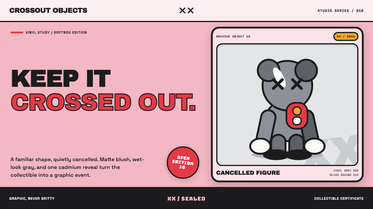 KAWS Companion (2010)Playful, with its eyes crossed out. Blush fields frame glossy gray vinyl and…
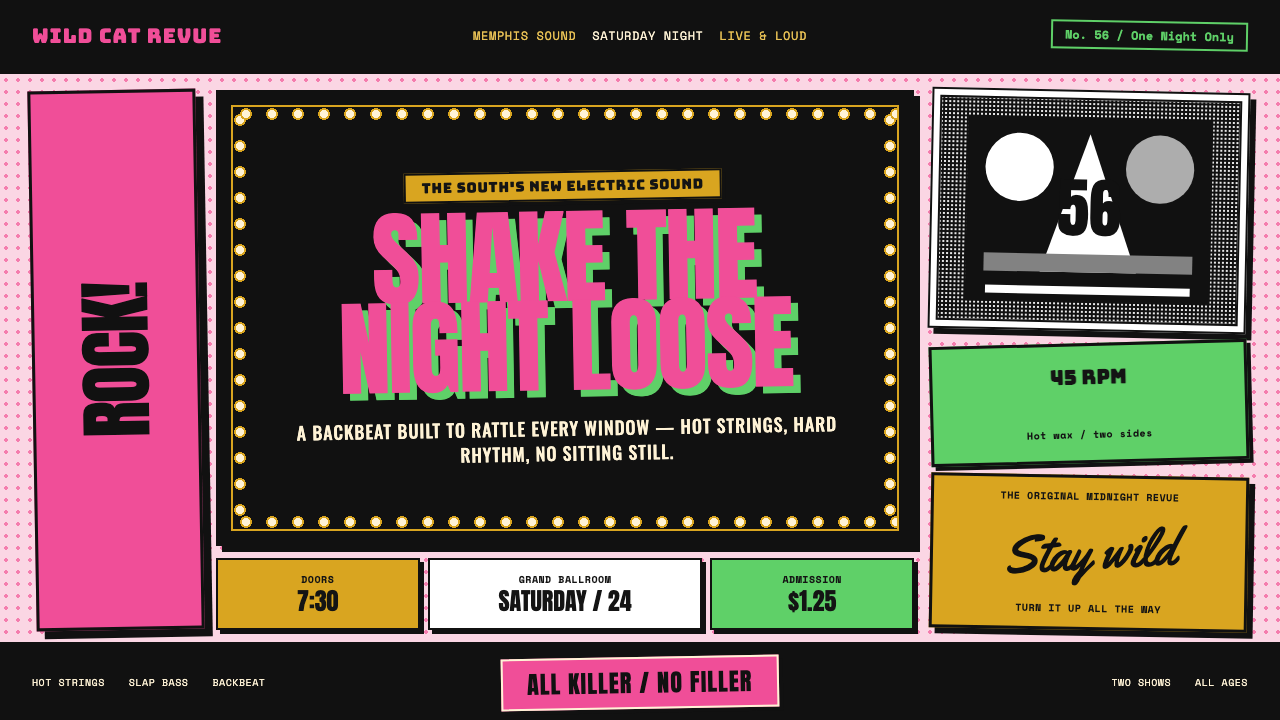 Elvis Presley (1956)Rock learned to shout. Bubblegum pink, acid green and jailhouse type land wit…
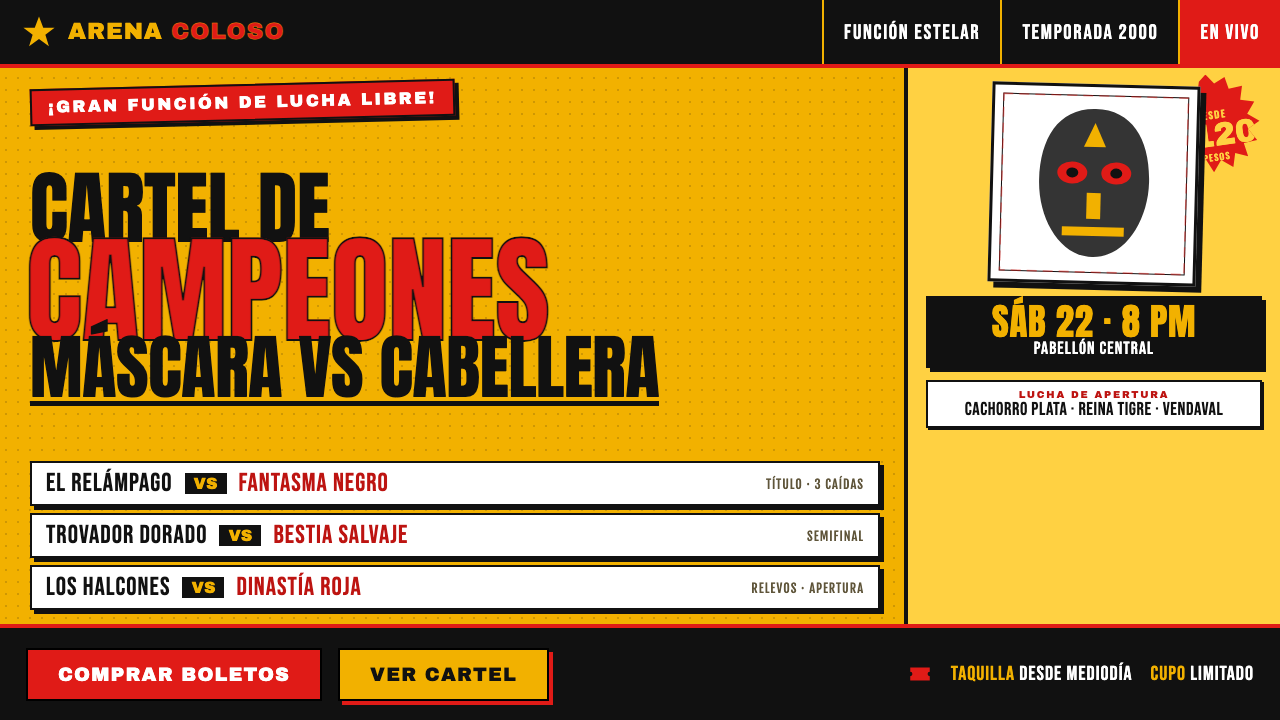 Lucha Libre Fight CartelTwo inks, maximum volume. Blood red on chrome-yellow, fat condensed type, sta…
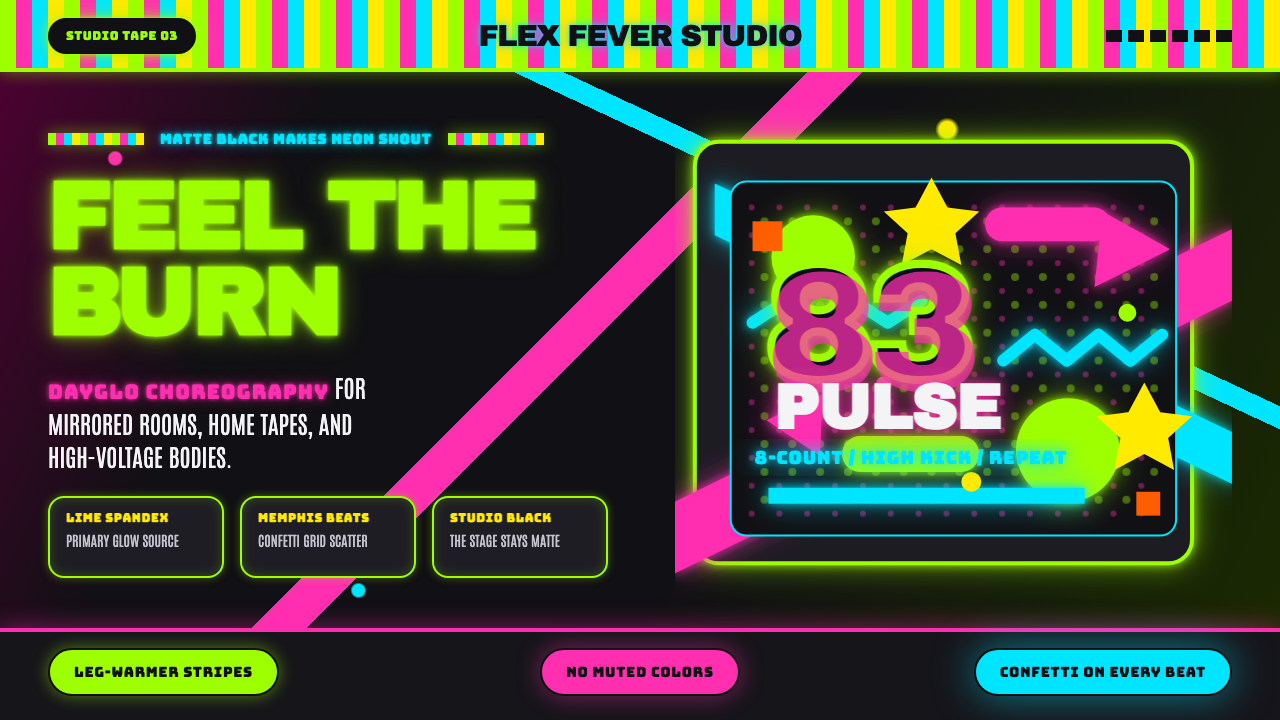 80s Aerobics Fluoro SpandexNeon refuses restraint. Lime spandex, pink-cyan confetti, and black-stage typ…
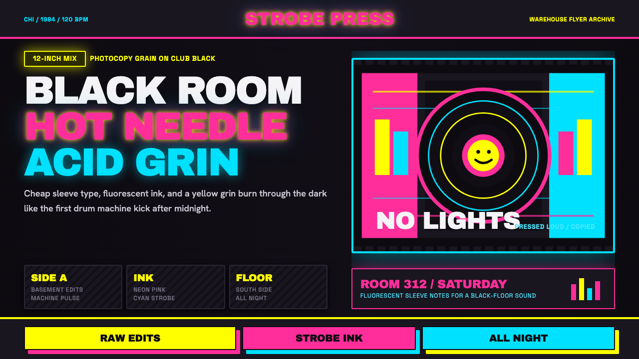 Chicago HouseDarkness starts the track. Neon pink, yellow and cyan hit black like Xerox st…
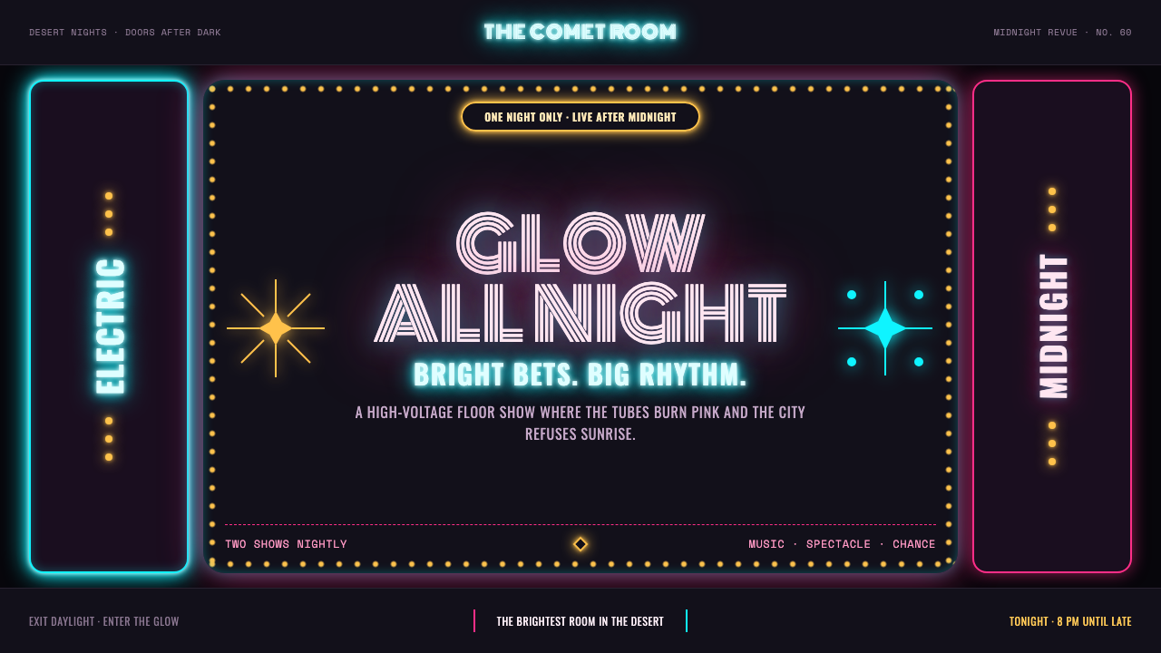 Las Vegas Neon (1960)Night refuses to dim. Hot-pink tubes, cyan bloom and amber bulbs turn black i…