What is Cumbia Villera?
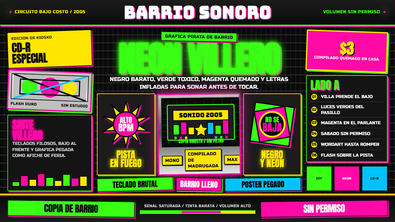
Cumbia Villera takes the CD covers that Buenos Aires's shantytowns pressed on whatever budget they had — searing neon crammed against black, bulging chrome lettering, over-flashed snapshots — and turns that defiance into a design system that refuses to apologize for being loud.
Cumbia Villera in brief
Cumbia Villera is the design language of a specific, real CD-cover economy: the packaging that bands from Buenos Aires's villas miseria — informal shantytown settlements — produced and sold almost entirely outside the mainstream record industry around the turn of the millennium. The look was not a stylistic choice made in a studio; it was what was actually available to a neighborhood with a home computer, clip-art software, and a cheap printer, and it looked exactly like that: blown-out neon green and hot magenta shapes slammed over a flat, near-black field, bulging chrome-and-bevel lettering, and over-flashed snapshot photography standing in for professional portraiture.
As a system, it is built on contrast pushed to its limit rather than restraint. The ground is flat and dark, almost never anything but near-black. Against it, neon green and hot magenta are applied at full, blown-out saturation, with no gradient softening and no attempt to make the combination tasteful. Headline lettering is heavy, condensed, and set entirely in capitals, chosen for maximum visibility across a market stall rather than typographic nuance, while band names and titles get a shiny, dimensional chrome-and-emboss treatment — the kind of 'fancy text' effect that ordinary consumer software of the era made available for free, and that a scene with no design budget used without embarrassment.
The overall composition is maximal and cramped on purpose: every inch is filled with text, clip art, or photography, and negative space is treated as a missed opportunity rather than a virtue. This is the opposite of a design system built on quiet good taste — it is one built on refusing to be quiet, wearing its low budget as a badge rather than hiding it, because the culture that produced it had nothing to prove to anyone demanding polish.
Where does Cumbia Villera come from?
Cumbia villera emerged in the late 1990s from the villas miseria in and around Buenos Aires, against the backdrop of a worsening Argentine economic crisis that would culminate in the catastrophic collapse of 2001. Its origin is usually credited to Pablo Lescano, at the time a keyboard and keytar player in Amar Azul, a mainstream tropical-cumbia band. Lescano began writing rawer, more confrontational songs, and in Villa La Esperanza, in the San Fernando district of Greater Buenos Aires, he formed what is generally cited as the first cumbia villera outfit, Flor de Piedra, around 1999.
Lescano's decisive move was importing the blunt, first-person, often deliberately vulgar narrative style of Argentine rock chabón and punk into the sunny, danceable rhythm of tropical cumbia, and aiming the lyrics squarely at daily life in the villas: police harassment, drug use, poverty, petty crime, parties, and casual sex — subject matter mainstream Argentine pop had studiously avoided. Around 2000, by most accounts during a period of recovery after a serious motorcycle accident, Lescano wrote the songs that became his defining project, Damas Gratis, whose debut album turned the raw new sound into a genre with an identifiable center.
Other bands followed quickly and helped define the sound's rougher edges, among them Yerba Brava and Pibes Chorros — the latter's name, roughly 'kid crooks,' signaling the genre's unapologetic relationship to its own stigmatized subject matter rather than any attempt to soften it for outside listeners. The genre's breakout into a mass phenomenon coincided almost exactly with Argentina's 2001 economic collapse, when the music's raw testimony of villa life resonated with an audience for whom that collapse was not an abstraction but daily reality.
The packaging that came to define the genre's look was a direct consequence of how it was distributed: almost entirely outside the mainstream record industry, on discs pressed as cheaply as possible and sold in villa markets, kiosks, and informal stalls rather than record store chains. Cover art followed the same economics — whoever in the neighborhood had access to a computer, clip-art libraries, and consumer photo-editing software made the covers, working with whatever effects and images were actually available rather than what a trained designer might have chosen. What began as a budget constraint hardened, over the genre's peak years through the mid-2000s, into a recognizable and defiantly unrefined visual signature that the scene wore on purpose, long after some of its acts could have afforded better.
What defines the Cumbia Villera look?
Color
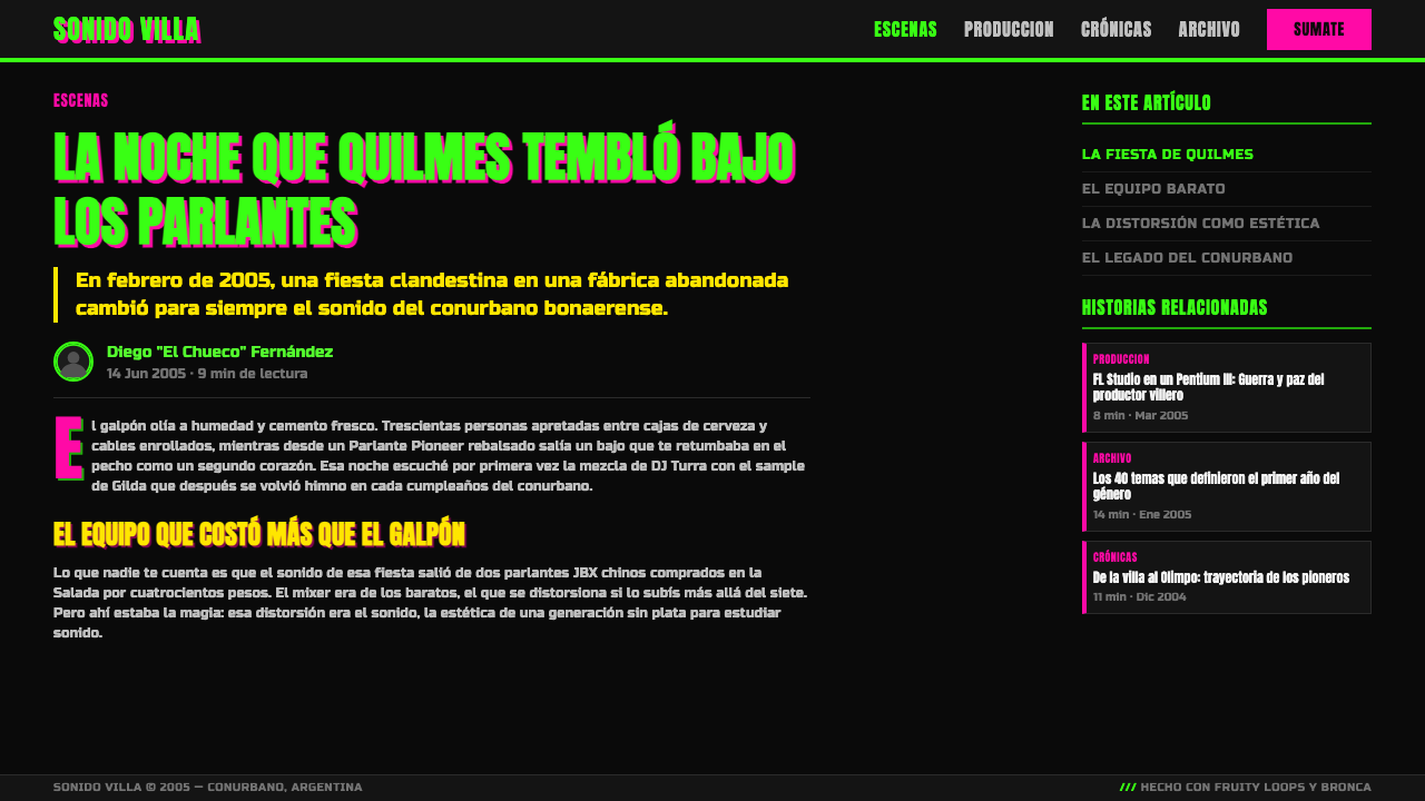
Searing neon green and hot magenta are applied at full, blown-out saturation against a flat near-black ground, with no gradient softening and no attempt at a tasteful combination. The palette functions as a shout rather than a mood — its job is to be seen from across a crowded market stall, not to feel considered.
Cramped Maximalism
Every inch of the composition is filled with text, clip art, or photography; negative space is treated as a missed opportunity rather than a virtue. Elements overlap and crowd against each other on purpose, producing a density that reads as energy rather than clutter within the system's own logic.
Chrome-and-Bevel Text
Logo and headline lettering gets a bulging, dimensional chrome-and-emboss treatment reminiscent of the default 'fancy text' effects built into ordinary consumer word-processing and image-editing software of the era. Deployed without irony, it gives type a shiny, inflated, almost physical presence rather than a flat printed one.
Heavy Condensed Display Lettering
Headlines are set in a heavy, condensed, all-caps display style chosen for maximum shout-from-a-distance visibility rather than typographic refinement. The letterforms are dense and blunt, built to survive a low-resolution photocopy or a cheap print run rather than to look elegant up close.
Over-Flashed Snapshot Photography
Photography is close, over-flashed, and unpolished, standing in for professional portraiture that the scene could not afford and, in most cases, never wanted. The imagery reads as document rather than production — a real snapshot of a real scene rather than a staged, lit photo shoot.
DIY Defiance
The whole system reads as consumer software and cheap printing pushed to their limit and put on display rather than concealed. Roughness is not a flaw to be hidden but the entire point — a visual refusal of the shame that a polished, well-funded aesthetic would otherwise imply about the culture that made it.
Who shaped Cumbia Villera?
Widely credited as the father of cumbia villera, Lescano was a keyboard and keytar player in the mainstream band Amar Azul before writing rawer, more confrontational songs that became the genre's founding sound. He formed the pioneering group Flor de Piedra around 1999 before founding his defining project, Damas Gratis, the following year.
Pablo Lescano's defining band, formed around 2000, by most accounts during a period of recovery after a serious motorcycle accident. Its debut album turned Lescano's raw new sound into a genre with an identifiable center and remains the act most closely associated with cumbia villera's breakout into mass popularity.
One of the genre's pioneering bands, active alongside Damas Gratis in defining cumbia villera's sound and its blunt, unpolished visual presentation during the style's peak years in the early-to-mid 2000s.
A pioneering and deliberately provocative band whose name — roughly 'kid crooks' — signals the genre's unapologetic relationship to its own stigmatized subject matter, embracing rather than softening the themes of petty crime and villa life that made cumbia villera controversial in mainstream Argentine culture.
Generally cited as the first cumbia villera outfit, formed by Pablo Lescano around 1999 in Villa La Esperanza before he went on to found Damas Gratis. The band represents the genre's earliest moment, when the sound and its accompanying low-budget visual language were still taking shape.
How do you use Cumbia Villera today?
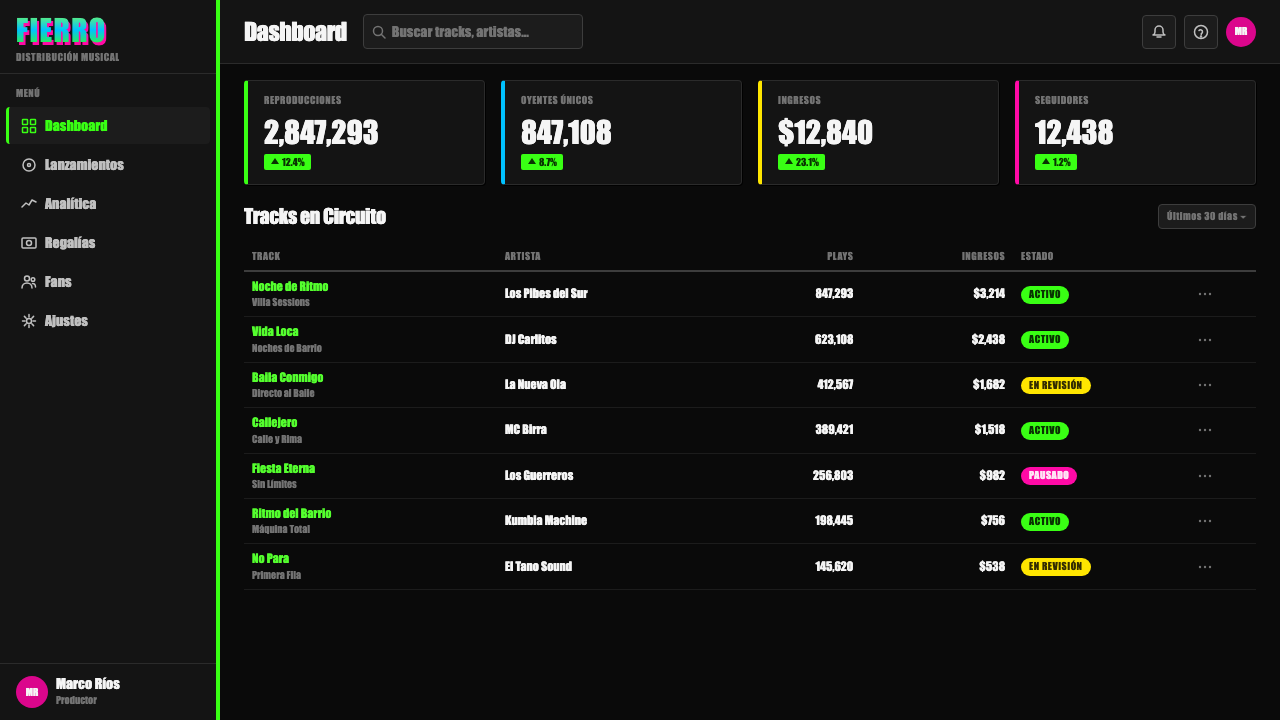
On a presentation cover slide, this style announces itself immediately: a flat near-black ground crowded with neon-green and hot-magenta shapes, a chrome-and-bevel wordmark treatment for the title, and a heavy condensed all-caps headline. It works when a deck genuinely wants to read as loud, energetic, and unpretentious rather than corporate-polished — a pitch about street culture, music, youth marketing, or nightlife, where a restrained cover would undercut the subject.
Applying the same maximalism to content slides takes discipline: dense, cramped layouts with neon-on-black contrast work for section headers or key callouts, and the chrome-bevel treatment is best reserved for the single most important word or number per slide rather than spread across every headline. Data slides can render bars or values in the neon palette against near-black, but the system's entire logic depends on contrast, not on a hierarchy of restraint — decide in advance which one data point gets the loudest treatment, or the slide collapses into noise.
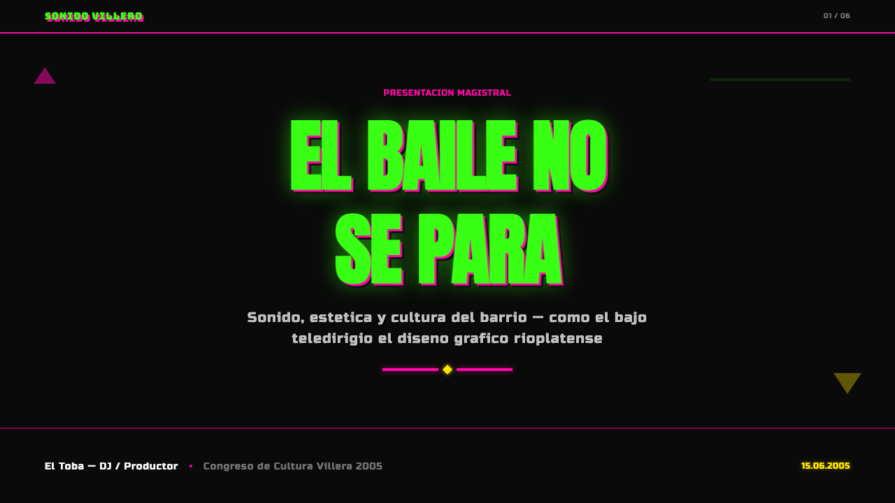
In web interfaces, this is not a natural fit for calm dashboards or trust-signaling SaaS pricing, but it works for youth-facing products, nightlife and event platforms, music apps, or any brand explicitly selling energy and rebellion rather than reliability. A pricing page could reserve the neon-on-black contrast for the single most aggressive discount or limited-time badge and the chrome-bevel treatment for a 'hot' or 'popular' tag — used sparingly and with intent, since the system resists exactly the polished calm most pricing pages are built to project.
Editorial and marketing work suits the style well for music journalism, streetwear, festivals, and any brand built around raw authenticity and working-class pride rather than aspirational luxury. A long-read about music subcultures or social history can use the system for pull quotes or section breaks styled as this raw poster-and-cover aesthetic, letting the reader feel the era's actual visual texture rather than a tidied-up illustration of it.
The most common mistake is 'cleaning it up' — softening the neon into pastel, adding gradient polish, or reducing the clutter into a minimalist layout, which erases exactly the qualities (unrefined, low-budget, maximal) that make the style legible as itself. A second mistake is deploying it purely as a joke or an ironic wink without acknowledging the real economic and cultural conditions it comes from, which flattens a genuine visual language into empty kitsch. A third is treating the chrome-bevel text as occasional decoration rather than the default treatment for anything that needs to shout — used only once or twice, it reads as a mistake rather than a style.
Cumbia Villera — FAQ
Is cumbia villera the same thing as cumbia in general?
No. Cumbia is a broad family of Latin American music with roots going back to Colombia, encompassing many regional styles. Cumbia villera is a specific, harder-edged Argentine subgenre that emerged around 2000, tied tightly to Buenos Aires villa culture and to a very particular DIY cover-art look. The neon-and-chrome visual language described here belongs to cumbia villera specifically, not to cumbia as a whole.
Why lean into blown-out, clashing color instead of something more tasteful?
Because the roughness is the point, not an accident to be corrected. The look was a deliberately unrefined visual signature born from real budget constraints and worn proudly as defiance against any expectation that villa culture should look polished or apologize for itself. Taming the palette into something tasteful removes the exact quality that gives the style its meaning.
What is the chrome text effect, and where does it come from?
It is a bevel-and-emboss, chrome-look lettering treatment that mimics the default 'fancy text' effects available for free in ordinary consumer word-processing and image-editing software of the era. Bands and neighborhood designers used it because it was available and cost nothing, not because it was a considered typographic choice — and that constraint, applied consistently, became one of the style's clearest signatures.
Is this style meant to be used ironically?
Not inherently — it originated as a sincere, resourceful visual language for a real music scene with real economic constraints, not as a joke. Applying it well means channeling its actual defiant, unapologetic energy rather than laughing at it from a distance; used as pure mockery, it flattens a genuine culture into an empty stereotype.
What kinds of products suit this style, and which struggle with it?
It suits music, nightlife, streetwear, and youth-culture brands that want raw energy and unapologetic maximalism. It struggles for anything that needs to project calm trust, luxury restraint, or corporate professionalism — a fintech dashboard or an enterprise pricing page built with this system's clashing neon and chrome text would undercut its own message before a user reads a word.
Related design styles
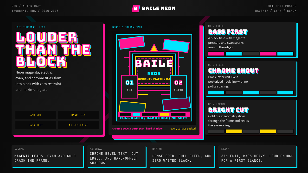 Funk Carioca FavelaMaximalist and unruly. Magenta, cyan, and chrome slam into black at thumbnail…
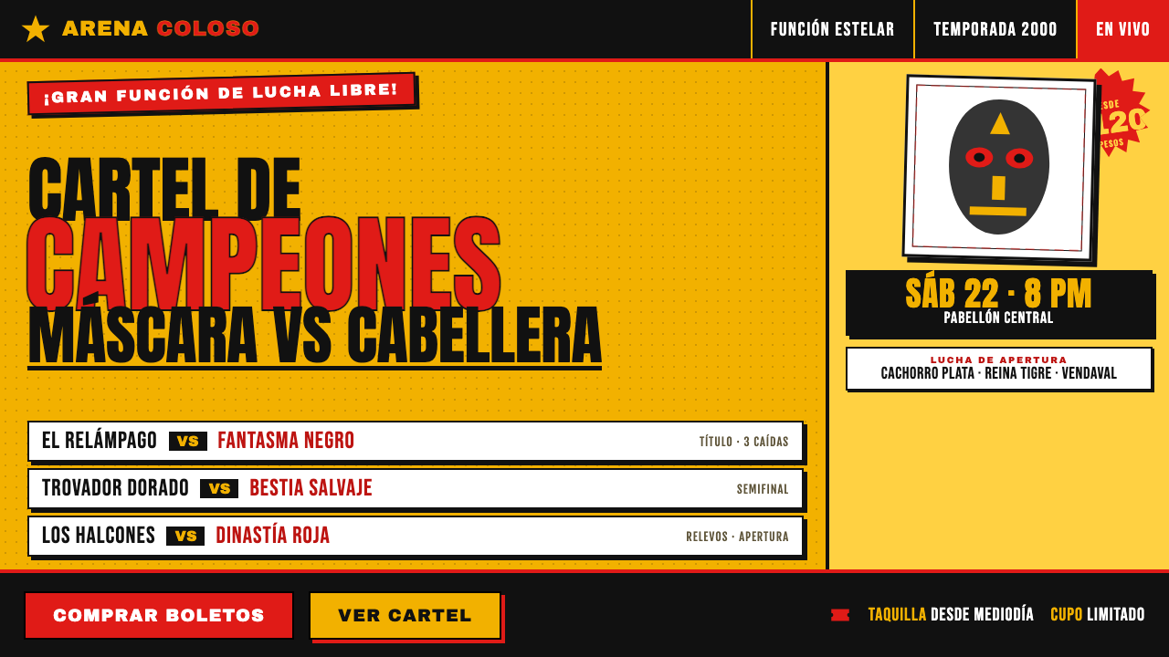 Lucha Libre Fight CartelTwo inks, maximum volume. Blood red on chrome-yellow, fat condensed type, sta…
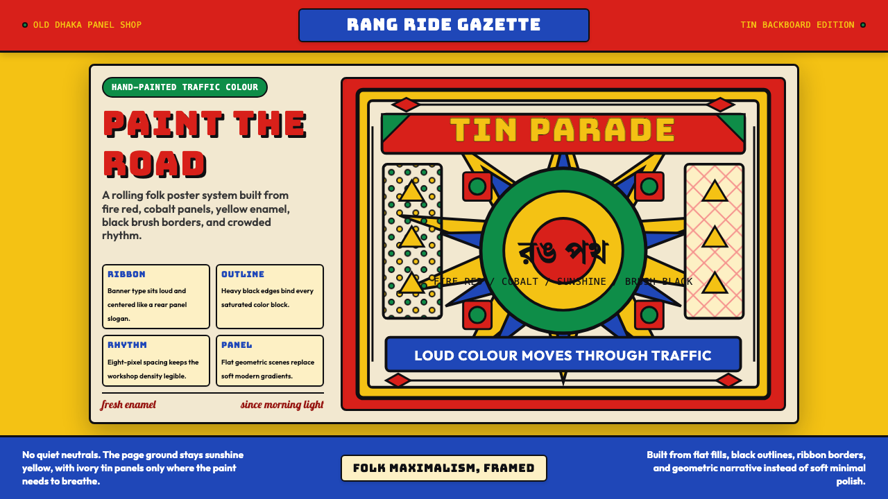 Bangladeshi Rickshaw Painting (Dhaka)Traffic shouts in color. Fire red, cobalt blue, and yellow panels lock into b…
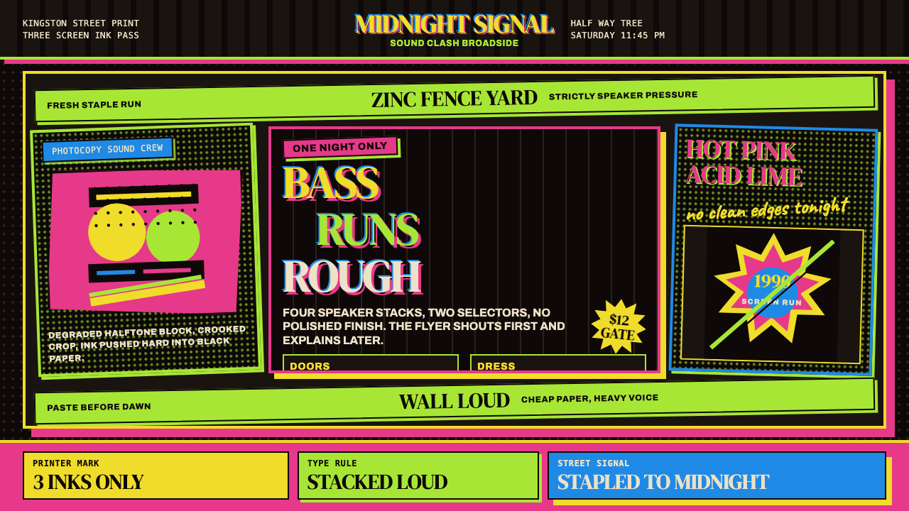 Jamaican Dancehall 1990 PosterMidnight volume. Acid lime and hot pink type stack like screenprint ink on bl…
 Nigerian Nollywood DVD Poster (2010)Market-stall cinema shouts. Tomato red type and yellow burst collide on jet b…
 Rude Boy Jamaica Ska (1960)Street swagger hits hard. Hot pink and yellow blocks, checker trim, chunky ty…