What is Watermelon Bubblegum Pink?
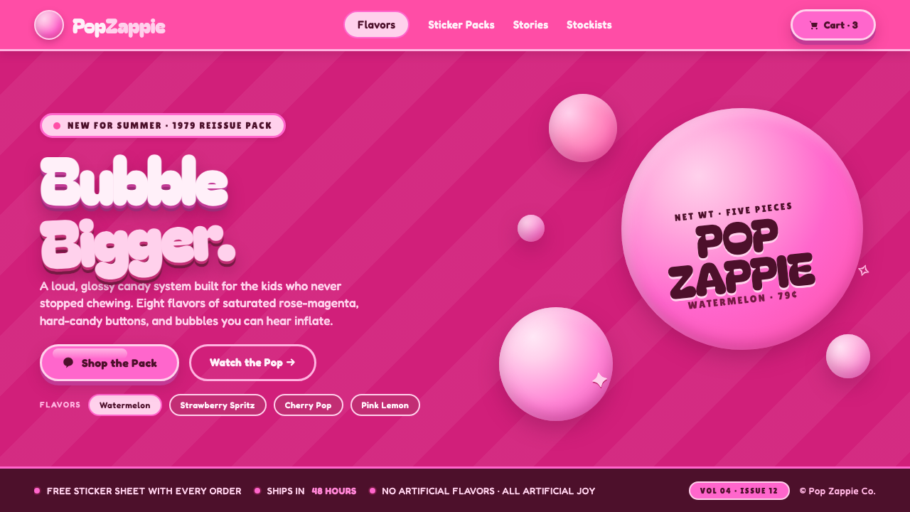
Watermelon Bubblegum Pink turns the visual memory of late-seventies and eighties gum wrappers into a world of neon candy color, inflated lettering, shining sugar surfaces, and exuberant consumer kitsch.
Watermelon Bubblegum Pink in brief
Watermelon Bubblegum Pink is a light, saturated maximalist style derived from North American bubblegum packaging, especially the glossy wrappers associated with Hubba Bubba after its 1979 launch. Its defining relationship is not pink alone, but bright bubblegum pink placed against a deeper rose-magenta field. The darker ground gives the candy color enough contrast to appear luminous, while blown-bubble circles and sharp highlights make flat graphics feel swollen, sticky, and freshly unwrapped.
The style communicates through appetite and exaggeration. Letterforms are broad, rounded, and visibly inflated, as though pressure from inside has pushed them outward. Circles suggest bubbles in different stages of expansion; stretched shapes imply chewiness; glossy highlights turn ordinary panels, labels, and buttons into pieces of hard candy. Rather than hiding its commercial origins, the style celebrates the persuasive directness of mass-market packaging: immediate recognition, intense flavor cues, and cheerful visual abundance.
Its mood belongs to eighties consumer kitsch, with a kawaii-adjacent sweetness but a louder North American packaging voice. It is playful rather than delicate, nostalgic rather than historically restrained, and polished without becoming luxurious. The design succeeds when everything appears to share the same candy physics: type, containers, decorative bubbles, and interactive elements should all feel soft-edged, elastic, saturated, and coated in the same sugar shine.
Where does Watermelon Bubblegum Pink come from?
The roots of Watermelon Bubblegum Pink lie in the expansion of North American bubblegum culture between 1950 and 1990. Gum was sold not merely as a flavor but as a compact entertainment product: portable, inexpensive, brightly wrapped, and associated with the physical spectacle of blowing bubbles. Packaging therefore had to communicate sweetness, elasticity, and fun before the wrapper was opened. Rounded lettering, emphatic pink, and circular motifs translated the product's material behavior into an immediately legible visual language.
Hubba Bubba, launched by Wrigley in 1979, provides the central brand reference for the style. Its identity belonged to a crowded mass-market candy environment in which wrappers needed to distinguish themselves quickly. A vivid bubblegum pink gained greater impact when paired with a deeper rose-magenta ground, while large, friendly lettering gave the name the visual volume of an inflated bubble. The package did not present gum with restraint; it performed the experience of chewing, stretching, and blowing it.
During the 1980s, this packaging logic became part of a broader sugar-pop vocabulary. Candy graphics favored intense saturation, simplified shapes, glossy surface cues, and conspicuous friendliness. Bubble forms could multiply across a wrapper, while bright highlights suggested smoothness and sweetness without requiring realistic illustration. The result was commercial maximalism built from a small set of repeatable signals: pink-on-magenta contrast, rounded mass, elastic contours, and shine.
Contemporary use treats that language as retro consumer kitsch rather than as a neutral packaging convention. The association with eighties gum wrappers supplies nostalgia, while kawaii-adjacent sugar-pop graphics make the style compatible with newer forms of playful branding. Its survival does not depend on reproducing a particular historical wrapper. What persists is the underlying promise that a designed surface can look flavored, chewable, and buoyant—that typography can behave like gum and color can create an almost physical sensation of sweetness.
What defines the Watermelon Bubblegum Pink look?
Candy Color
Neon bubblegum pink is the active foreground color, while a richer rose-magenta supplies depth and contrast behind it. Supporting tones should remain within the same sweet, warm family rather than introducing unrelated hues. Light accents behave like reflected sugar shine, and darker accents define contours or separate overlapping forms. The palette is saturated by design: its purpose is to trigger flavor, excitement, and instant shelf-level recognition.
Inflated Typography
Typography carries the personality of the style. Bagel Fat One, Fredoka, Baloo 2, and Lilita One exemplify its preference for thick, rounded, friendly letterforms. Headlines should feel pressurized and buoyant, with soft internal spaces and generous visual mass. The lettering may appear stretched or closely packed, but it should never become sharp, formal, or mechanical. Supporting text needs greater calm so the inflated display voice remains legible as the dominant flavor.
Bubble Geometry
Circles and rounded blobs are not neutral decoration; they refer directly to blown gum. Variation in scale suggests bubbles growing, drifting, clustering, or pressing against one another. Containers inherit the same swollen corners and convex silhouettes, so even rectangular information areas feel soft and chewable. Perfect repetition should be avoided: slight differences in size and overlap give the composition the lively instability of bubbles that may expand or burst.
Sugar-Shine Highlights
Highlights are crisp, concentrated marks that describe a smooth candy coating. They appear on the upper curve of a bubble, along the shoulder of a letter, or near the edge of a glossy panel. Their role is symbolic rather than physically exact: a small bright streak can make a flat shape read as sticky, polished, and dimensional. Excessive scattered sparkle weakens the illusion; shine should follow the major forms and reinforce their volume.
Elastic Composition
Layouts feel crowded with energy but not randomly filled. Large type establishes the central mass, while smaller bubbles, labels, and highlights stretch outward around it. Elements may overlap or press against boundaries to suggest expansion beyond the frame. Negative space still matters, but it is treated as breathing room between inflated objects rather than as austere emptiness. The rhythm should alternate between dense candy clusters and calmer areas that preserve reading order.
Playful Kitsch
The style openly embraces the theatrical sweetness of retro consumer packaging. It does not seek tasteful neutrality, handcrafted authenticity, or restrained luxury. Its charm comes from turning commercial excess into a coherent fantasy of flavor: louder pink, rounder type, shinier surfaces, and more buoyant shapes. The exaggeration must remain friendly. If it becomes abrasive, cynical, or visually chaotic, the design loses the innocent promise that made gum-pack graphics inviting.
Who shaped Watermelon Bubblegum Pink?
Wrigley provides the corporate setting from which the theme's central historical reference emerged. Through its place in United States bubblegum culture and the 1979 launch of Hubba Bubba, the company connected gum with a highly visible mass-market packaging language. In this style, Wrigley matters less as an individual design author than as the producer that placed saturated bubblegum graphics into everyday consumer circulation.
The Hubba Bubba brand is the style's clearest visual anchor. Its gum-pack identity condensed the product experience into color, volume, and friendliness: emphatic pinks suggested flavor, rounded lettering suggested softness, and bubble imagery advertised the act of blowing gum. The brand supplies both the period reference and the emotional register—confident, youthful, humorous, and unconcerned with visual restraint.
The anonymous or collectively credited designers of mass-market candy wrappers established the repeatable conventions on which Watermelon Bubblegum Pink depends. Working for quick recognition in crowded retail environments, they joined saturated color, large rounded names, simplified product cues, and glossy highlights into compact persuasive surfaces. Their importance lies in a shared commercial practice rather than a single signature: they made sweetness into a graphic system that could be recognized before it was tasted.
How do you use Watermelon Bubblegum Pink today?
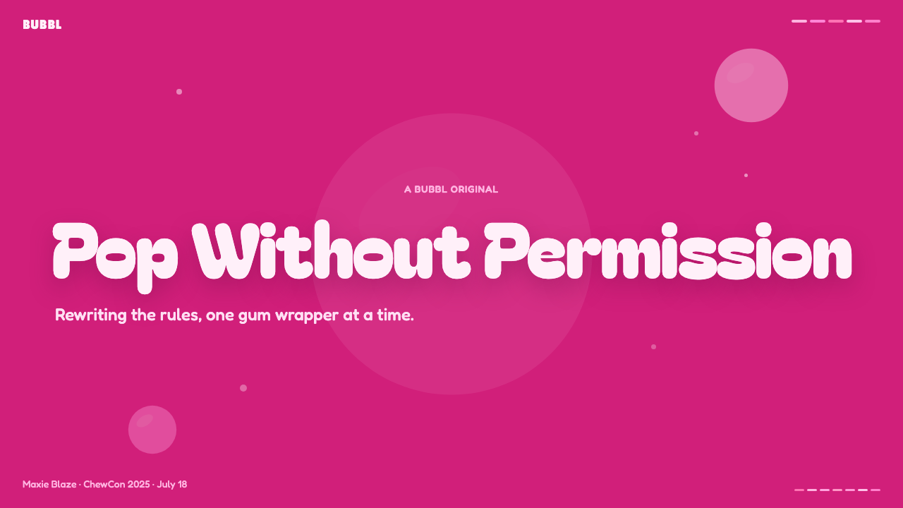
On presentation covers, the style works best when one oversized title behaves like the main piece of gum: broad, rounded, and surrounded by a small constellation of bubbles and highlights. A rose-magenta field can hold the composition together while brighter pink lettering advances toward the viewer. Content slides should preserve that voice without turning every paragraph into display type. Use calm reading text inside rounded panels, then reserve the inflated face for section names, key claims, and short numerical statements.
Data slides benefit from translating information into candy geometry. Rounded bars, bubble clusters, and swollen labels can make comparisons feel playful, while a darker rose ground keeps bright marks distinct. Hierarchy should remain unambiguous: one dominant pink carries the primary series, quieter related tones support secondary information, and shine is added only to major data objects. Decorative bubbles must not masquerade as values; every quantitative form should be visibly separated from atmospheric candy graphics.
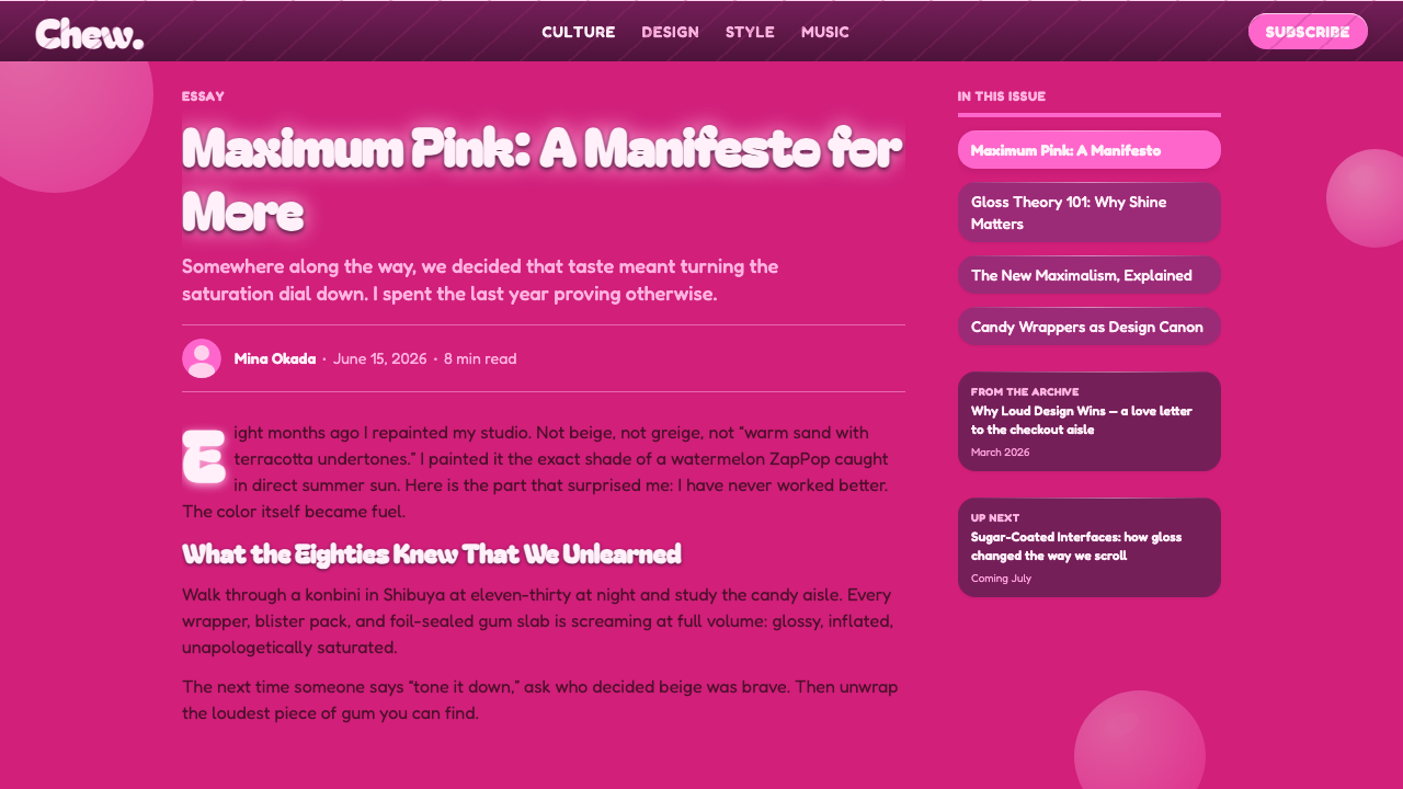
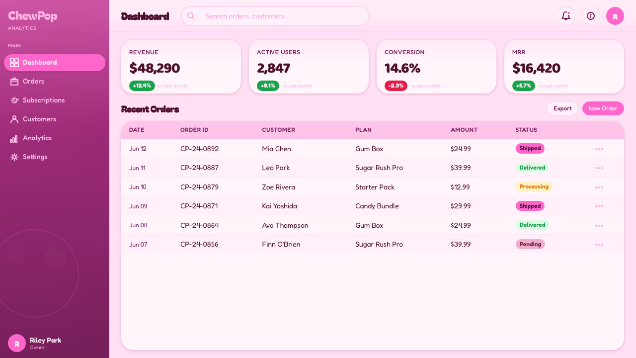
For web interfaces, Watermelon Bubblegum Pink is especially effective on promotional dashboards, pricing pages, playful membership products, and consumer experiences built around rewards or delight. Pricing tiers can resemble wrapped candy panels, with the featured option appearing more inflated and luminous than its neighbors. Buttons should feel substantial and pressable, labels should be short, and navigational structure should remain simple beneath the expressive surface. Dense operational tools require restraint because constant saturation and shine can compete with scanning.
Editorial and marketing layouts can use the style as a framing voice rather than coating every line in gloss. An article opener might combine a swollen headline, a cluster of bubble forms, and a quieter body column. Marketing sections can alternate between rich rose fields and lighter candy surfaces, using stretched labels or circular callouts to maintain momentum. Product photography or illustration, when present, should be integrated as another glossy shape rather than placed inside a formal neutral frame.
The most common mistake is reducing the style to arbitrary pinkness. A successful result needs contrast between bright bubblegum pink and deeper rose-magenta, typography with convincing inflated mass, and highlights that describe a shared glossy surface. Another frequent error is applying shine, bubbles, and rounded corners to every element equally. Without hierarchy, the candy world becomes visual foam. Choose a primary gum-like object, support it with fewer secondary forms, and keep essential reading areas calmer.
Watermelon Bubblegum Pink — FAQ
Is Watermelon Bubblegum Pink simply a pink color palette?
No. Color is essential, but the style depends equally on material suggestion and form. Bright pink must be supported by deeper rose-magenta, rounded inflated typography, blown-bubble circles, elastic silhouettes, and concentrated sugar-shine highlights. Remove those relationships and the result may still be pink, but it will no longer evoke gum-pack graphics. The aesthetic is a coordinated fiction in which every major element appears flavored, soft, glossy, and capable of expansion.
How is this style different from a delicate pastel or romantic pink aesthetic?
Delicate pink systems typically rely on softness, air, restraint, and gentle tonal transitions. Watermelon Bubblegum Pink is louder and more physical. Its pink is saturated, its background is richer, its type occupies conspicuous volume, and its highlights suggest a coated candy surface. The emotional goal is not tenderness or elegance but appetite, amusement, and youthful confidence. Even when the layout is spacious, the individual objects should feel bold enough to belong on mass-market gum packaging.
Can the aesthetic support long-form reading?
Yes, if its most expressive devices are concentrated around navigation and hierarchy. Inflated display faces are effective for titles and short statements but tiring in long paragraphs. Body text should therefore be calmer, with comfortable spacing and clear contrast against a relatively stable surface. Bubble forms can mark sections or hold callouts, while the reading column remains visually quiet. The style should introduce and organize the article, not interrupt every sentence with packaging-level intensity.
Does every object need a glossy highlight?
No. Highlights are most convincing when they establish a hierarchy of material emphasis. The primary title, featured panel, or largest bubble may receive the clearest shine, while secondary elements remain flatter. If every label and icon gleams equally, the eye loses its path and the surface becomes noisy. Think of shine as evidence that selected objects share a candy coating, not as a universal decorative stamp applied wherever space is available.
Where does Watermelon Bubblegum Pink work poorly?
It struggles where sobriety, neutrality, or dense analytical reading is the primary expectation. Its saturated contrast, swollen lettering, and overt sweetness can undermine contexts that need institutional reserve or prolonged concentration. It is better suited to candy-like consumer products, playful campaigns, rewards, entertainment, and nostalgic marketing. Even there, accessibility and information order remain essential: the style's exuberance should amplify a message, not force users to chew through decoration before finding it.
Related design styles
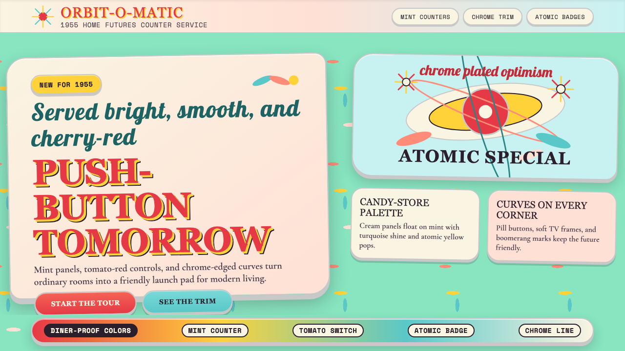 Populuxe Atomic AgeThe future grins. Mint Formica, tomato-red pills, Cooper Black, and atomic st…
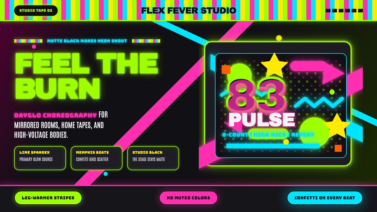 80s Aerobics Fluoro SpandexNeon refuses restraint. Lime spandex, pink-cyan confetti, and black-stage typ…
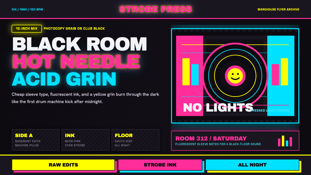 Chicago HouseDarkness starts the track. Neon pink, yellow and cyan hit black like Xerox st…
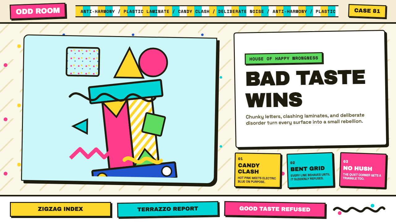 Memphis (Sottsass 1981)Joy weaponizes bad taste. Hot pink, turquoise, yellow and terrazzo specks bre…
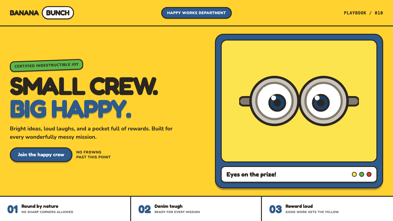 Minions (Despicable Me, 2010)Indestructibly cheerful. Minion yellow, denim blue, and chunky goggle geometr…
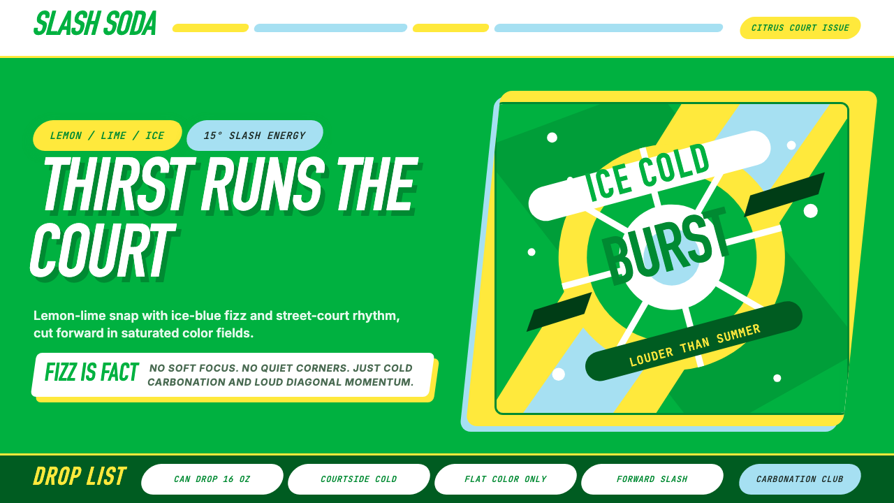 Sprite — Obey Your ThirstCitrus hits like asphalt heat. Saturated green, lemon yellow, and 15° slashes…