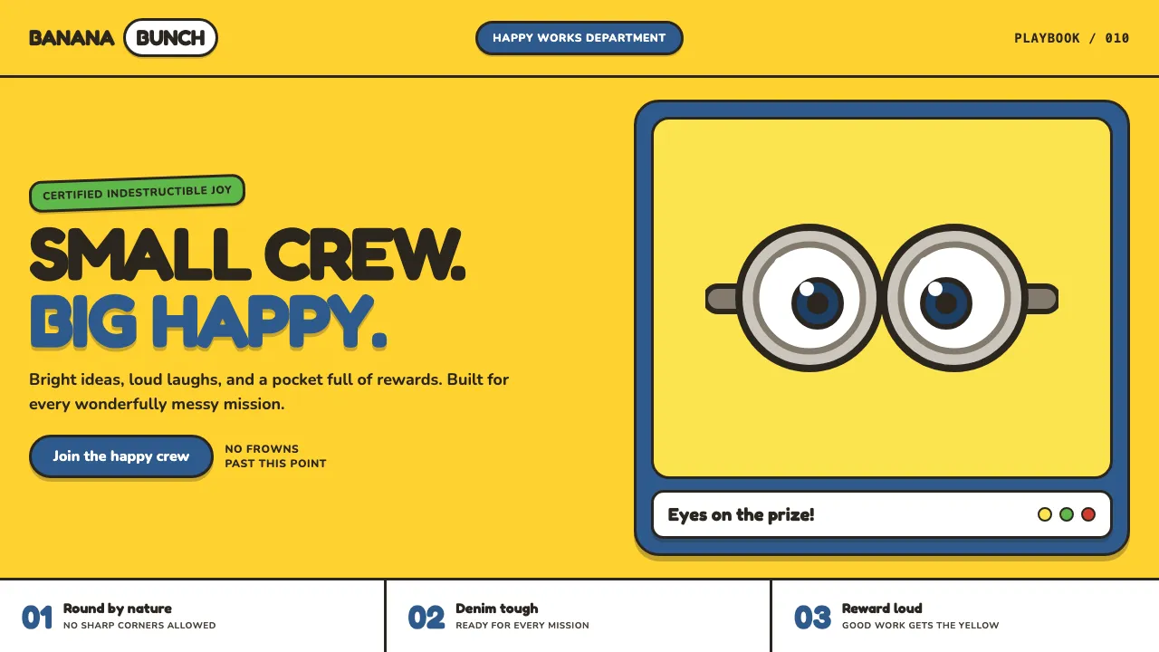
About Minions (Despicable Me, 2010)
The Minions design language turns Illumination's pill-shaped yellow henchmen into an interface. It runs on the two loudest, happiest colors in family animation — eye-searing minion yellow and worn denim-overall blue — with every shape rounded, chunky, and outlined in soft charcoal like a coloring-book toy.
The signature move is the goggle: a single or double steel-rimmed lens sitting on a yellow field, used as avatar, badge, and empty state. Type is fat and bouncy, contrast is cranked, corners are pill-round, and a banana lurks as the universal reward. It is deliberately loud, plush, and indestructibly cheerful.
- Origin
- Santa Monica, United States (animation in Paris, France)
- Era
- 2010 (Despicable Me) through the 2015 spin-off and 2022 Rise of Gru
- Key figures
- Chris Meledandri · Pierre Coffin · Chris Renaud · Sergio Pablos · Kyle Balda
- Movements
- 2010s CG family animation · mascot branding · capsule-character design
Minions (Despicable Me, 2010) design spec
Colors
Typography
The other 11 sections — buttons, cards, spacing, motion, techniques and more — open once you unlock. Download the DESIGN.md or send it to your AI in one click. Unlock once, yours forever.
Sign up nowStyles similar to Minions (Despicable Me, 2010)
Also inspired by film, games & music, with a close feel.
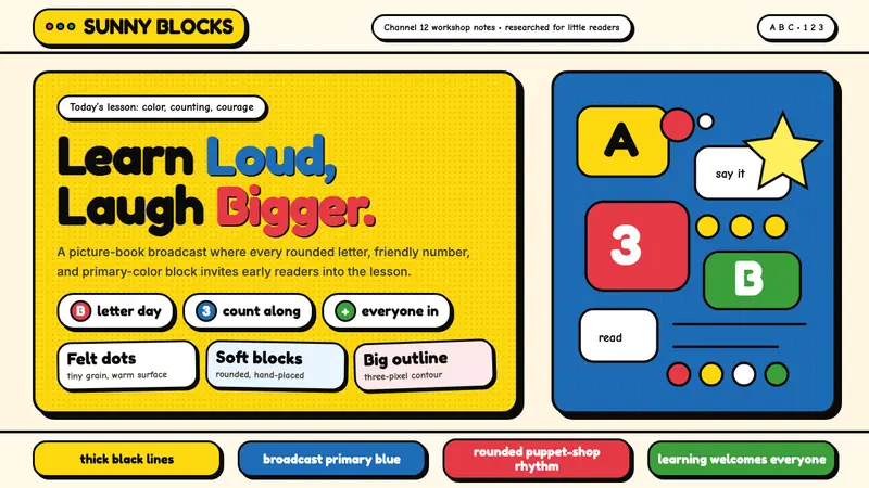 Sesame Street (1969)Learning feels handmade. Big yellow, monster blue, chunky outlines, and rounded letters teach aloud.
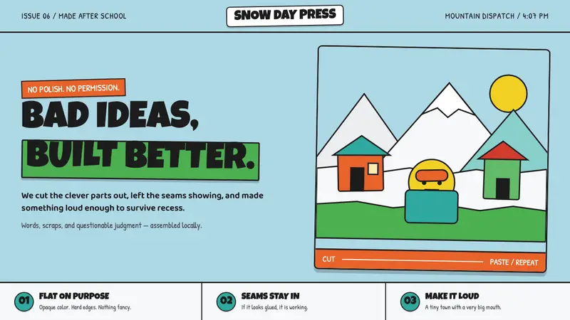 South Park Cutout (1997)Crude is the charm. Opaque paper shapes, marker-black seams, and snow-bright color stay loud.
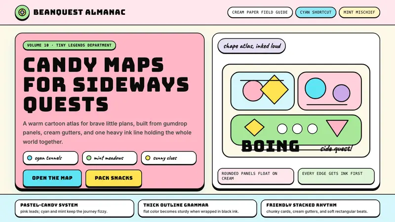 Adventure TimeCartoon warmth, inked loud. Cream gutters, candy pink, cyan and mint lock into thick outlines.
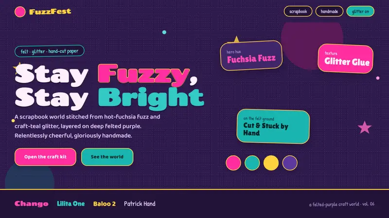 Trolls Poppy Magenta 2016Relentlessly cheerful, gloriously handmade. Fuchsia fuzz and craft-teal glitter on felted purple.