What is Angry Birds (2009)?
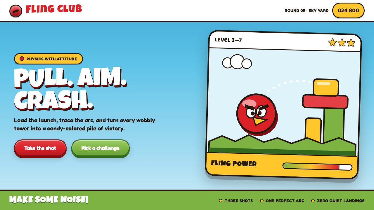
Angry Birds turned a simple act of release into a visual event: adorable rage, candy-bright impact, and a trajectory that promises chaos before the bird even leaves the slingshot.
Angry Birds (2009) in brief
Angry Birds is the visual language of a casual mobile game released for iOS in December 2009, during the early mobile-gaming boom. Its world is a bright cartoon diorama: a round red bird, visibly scowling, is loaded into a wooden slingshot and launched across a clear blue sky toward precarious forts occupied by grinning green pigs. The premise is immediately legible because the visual system makes every role unmistakable. The bird is compact, expressive, and forceful; the slingshot is tactile and directional; the pigs are cheerful targets; the structures are unstable enough to invite impact.
The style makes aggression approachable by rendering everything with toy-like generosity. Shapes are fat, soft, and rounded rather than sharp or realistic. A heavy warm-brown outline holds characters, props, and environmental forms together, creating a unified illustrated world in which thin or delicate marks would feel out of place. The result is not restrained cartoon minimalism. It is a deliberately loud, tactile, childlike visual language in which destruction is framed as satisfying play.
Its palette is unapologetically primary and candy-loud, while its display typography is swollen, rounded, and comic in character. Pill-shaped controls, glossy toy-like highlights, plump shadows, and the famous dotted launch arc all reinforce the same instruction: pull back, release, and watch the scene react. The visual vocabulary does more than decorate a physics puzzle. It explains the game’s rhythm, emotional stakes, and physical logic before a player needs to read a tutorial.
Where does Angry Birds (2009) come from?
Angry Birds emerged in Espoo, Finland, in 2009, at the meeting point of casual mobile gaming, physics-puzzle games, cartoon flat illustration, and character-mascot branding. Its December iOS release placed it within a moment when a small-screen game needed to communicate quickly, survive brief attention spans, and remain readable through touch-driven play. The visual language answers those conditions with unusual directness: the playable object is a bird, the action mechanism is a slingshot, the target is a fort, and the intended result is visible collapse.
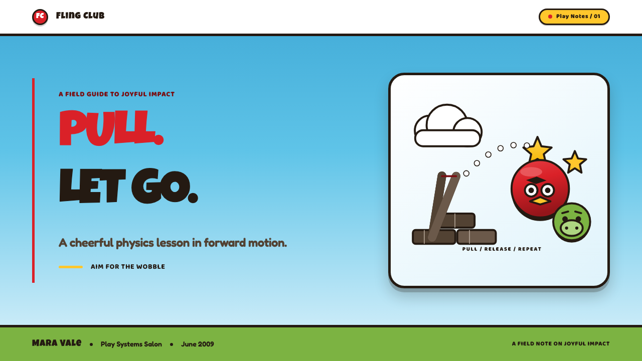
The game’s central image carries its entire system. A scowling round red bird is not merely a protagonist; it is a compressed expression of force. One raised, angry eyebrow supplies the emotional premise, while the bird’s circular body keeps that emotion comic rather than threatening. The green pigs establish an equally clear counterpoint. Their grins make them mischievous rather than frightening, so the conflict reads as theatrical misbehavior inside a cartoon world rather than realistic hostility.
The slingshot and dotted parabola translate a physics-puzzle interaction into an easily understood visual ritual. The player sees tension accumulate while pulling back, sees a path through the dotted arc, and anticipates the release before it happens. This is why the interface language and the game world feel continuous. Buttons, outlines, shadows, highlights, and trajectory marks all speak with the same loud, rounded voice instead of separating game mechanics from decoration.
Its lasting identity also depends on mascot thinking. The birds and pigs are not neutral game pieces; they are expressive characters built for immediate recognition. Their rounded silhouettes, oversized facial cues, and thick outlines allow the style to carry across scenes, prompts, icons, menus, and promotional contexts without losing its basic emotional signal. The approach belongs to the early-2010s mobile-gaming boom, yet its core lesson remains durable: a casual game can become memorable when every visual decision makes the central action easier to feel.
What defines the Angry Birds (2009) look?
Adorable Aggression
The defining emotional contrast is fury rendered as charm. The red bird scowls, but its body is round, compact, and soft enough to remain lovable. A single forceful eyebrow can carry more emotion than a detailed facial expression because the rest of the face is kept simple. This compression makes the character readable at a glance and turns anger into a playful promise of impact rather than a threatening mood.
Rounded Silhouette
Every major form is inflated and friendly: birds, pigs, buttons, environmental pieces, and floating interface elements all favor broad curves over narrow angles. Roundness gives the world a toy-like physicality and makes destruction feel resilient rather than harsh. Even when a fort is about to collapse, the scene remains buoyant because its visual mass is soft, plump, and easy to parse.
Warm Heavy Outline
A heavy warm-brown outline is the system’s strongest unifying device. It keeps bright shapes from dissolving into one another, makes separate objects feel cut from the same illustrated material, and preserves readability against a vivid sky. The outline is emphatic rather than technical: it contributes warmth, comic force, and a hand-drawn sense of containment. Thin strokes would weaken the game’s toy-box certainty.
Candy-Loud Color
The palette uses bright primary color with no apology for visibility. Blue sky, red bird, green pigs, wooden slingshot, and lively environmental accents establish immediate contrast between action, character, target, and setting. Color is not treated as subtle atmosphere. It is a fast classification system that amplifies energy and gives the game the bright emotional temperature associated with casual play.
Toy Gloss and Plump Depth
Glossy highlights and plump drop shadows make flat cartoon elements feel handled rather than merely drawn. The depth is intentionally simple and graphic, closer to a polished toy surface than to realistic lighting. Pill buttons become inviting objects, while floating characters and props gain enough separation from the background to feel ready for touch. The effect supports both playfulness and perceived responsiveness.
Trajectory as Instruction
The dotted launch arc is both a graphic signature and a teaching device. It turns an invisible future movement into a visible path, helping the player understand aim, release, and consequence in one glance. Because the mark is dotted rather than mechanically technical, it stays inside the cartoon world. The arc does not interrupt the illustration; it becomes another playful character in the composition.
Who shaped Angry Birds (2009)?
Jaakko Iisalo is named among the key figures associated with Angry Birds. Within the style’s public identity, the relevant lesson is the power of a character system built around instant silhouette recognition, compressed facial emotion, and a visual language that can remain clear across play and branding contexts.
Niklas Hed is listed as a key figure in the Angry Birds origin context. The game demonstrates how a casual mobile-game identity can make a single interaction feel dramatic through a coherent combination of character, slingshot, target, trajectory, and reaction.
Mikael Hed appears among the key figures connected to Angry Birds. The visual language associated with the game shows why mascot branding matters in casual entertainment: a bird and a pig can carry conflict, tone, recognition, and promotional continuity without requiring complex narrative exposition.
Peter Vesterbacka is included among the key figures associated with Angry Birds. In the context of the style, the important public-facing insight is consistency: its bright characters, heavy outlines, rounded forms, and playful destruction form a recognizable package rather than a collection of unrelated game assets.
How do you use Angry Birds (2009) today?
For presentation slides, Angry Birds works best when the cover treats the title as an action scene. Place a large rounded mascot-like form near a slingshot, let a dotted arc establish direction, and reserve generous blue-sky space for the headline. The content slide should simplify that drama into a reliable system: thick outlined callouts, rounded section markers, and a clear path from one point to the next. The goal is not to recreate a game screen, but to make explanation feel energetic, direct, and friendly.
For data slides, use the style’s physics-puzzle logic to give charts a sense of consequence. Rounded bars, circular markers, chunky labels, and warm outlines can make categories feel like visible objects rather than abstract marks. A trajectory can connect a starting condition to an outcome, while stacked forms can suggest a fragile structure whose relationships matter. Keep the data legible first; the cartoon language should clarify movement, hierarchy, and impact, never convert a chart into visual noise.
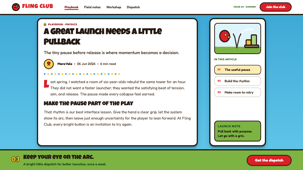
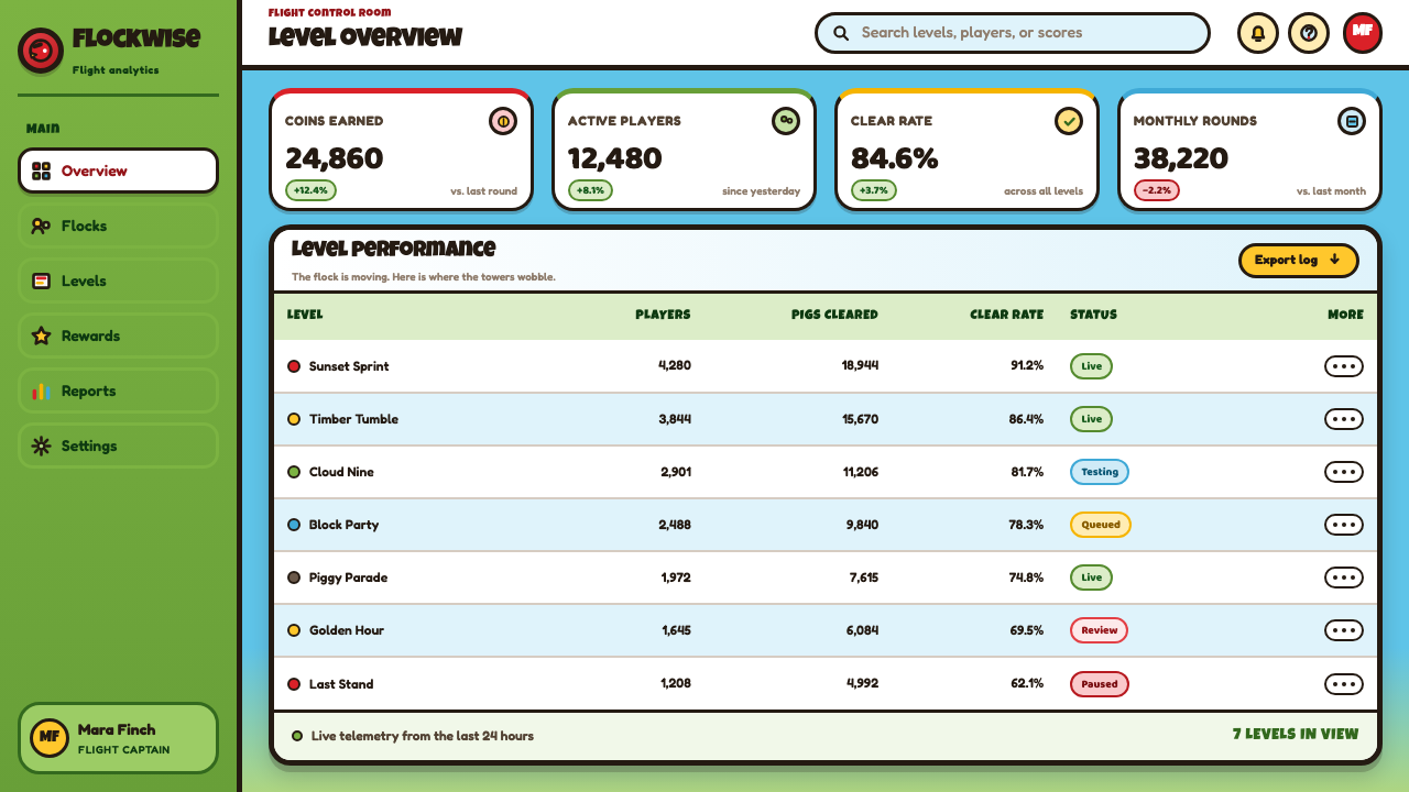
For web interfaces, this aesthetic suits playful dashboards, game-adjacent products, onboarding flows, challenge pages, and pricing experiences that need immediate emotional lift. Use rounded containers, substantial outlines, bright primary accents, tactile buttons, and expressive status characters. A dashboard can frame progress as a sequence of launches and impacts, while pricing can make each option feel like a distinct collectible object. The interface should remain easy to scan, with the style concentrated on action points, rewards, alerts, and primary choices.
For editorial and marketing work, Angry Birds is useful when a campaign needs accessible momentum rather than polished seriousness. A feature story can pair wide blue fields with large illustrated expressions, dense outlined captions, and a directional arc that guides reading through the page. Marketing pages can turn product benefits into a playful chain of setup, launch, collision, and result. The voice should stay concise and energetic, matching the image of a game where the central pleasure is immediate cause and effect.
The common mistake is copying only the red bird, green pig, or candy-bright palette while abandoning the underlying interaction logic. The style becomes shallow when every surface is equally glossy, every object is equally outlined, or every screen is crowded with decorative curves. Angry Birds works because visual emphasis follows the player’s action: tension gathers at the slingshot, direction appears in the arc, impact lands on the fort, and the characters provide emotional reward. Preserve that sequence, use rounded forms selectively, and let each vivid element have a job.
Angry Birds (2009) — FAQ
Is Angry Birds style only appropriate for games?
No, but it is strongest where play, momentum, immediate feedback, or approachable competition are genuine product values. It can work for learning experiences, playful onboarding, challenge-driven communities, and youth-facing campaigns. It is less convincing for contexts that require restraint, solemnity, or a quiet sense of trust, because its thick outlines, exaggerated emotion, and destructive energy are intentionally attention-seeking.
Why is the dotted launch arc so important?
It makes the central interaction visible before the outcome occurs. The arc communicates direction, anticipated movement, and the relationship between aiming and release without a written explanation. It also gives a static composition a sense of time. In a style derived from Angry Birds, removing the arc can remove the visual evidence that the scene is about action rather than simply character illustration.
Can the style use muted colors?
Muted color can be used as a supporting background or a temporary contrast, but it should not replace the style’s candy-loud emotional center. Angry Birds depends on immediate separation between bird, pigs, sky, slingshot, and target. If every color is softened equally, the system loses the buoyant urgency that makes release and impact feel rewarding. Preserve a vivid focal relationship even when the surrounding palette is quieter.
How should typography behave in an Angry Birds-inspired layout?
Headlines should feel inflated, rounded, comic, and physically present, as though they belong beside the characters rather than above them. Supporting text should remain clearer and calmer so the interface or page is still easy to use. The key is contrast of role: expressive display type carries the shout, while ordinary reading information provides the landing place. Overusing comic display lettering turns every message into the same volume.
What makes an Angry Birds-inspired design feel authentic rather than generic cartoon?
Authenticity comes from connecting the visual language to a clear physical action. Rounded characters, warm heavy outlines, glossy highlights, bright color, and plump shadows are only the surface. Beneath them must be a visible setup, direction, tension, collision, or reward. The style is a cartoon diorama built around launch and consequence. When the composition gives users something to pull toward, aim at, or knock down, the visual choices begin to work as a system.
Related design styles
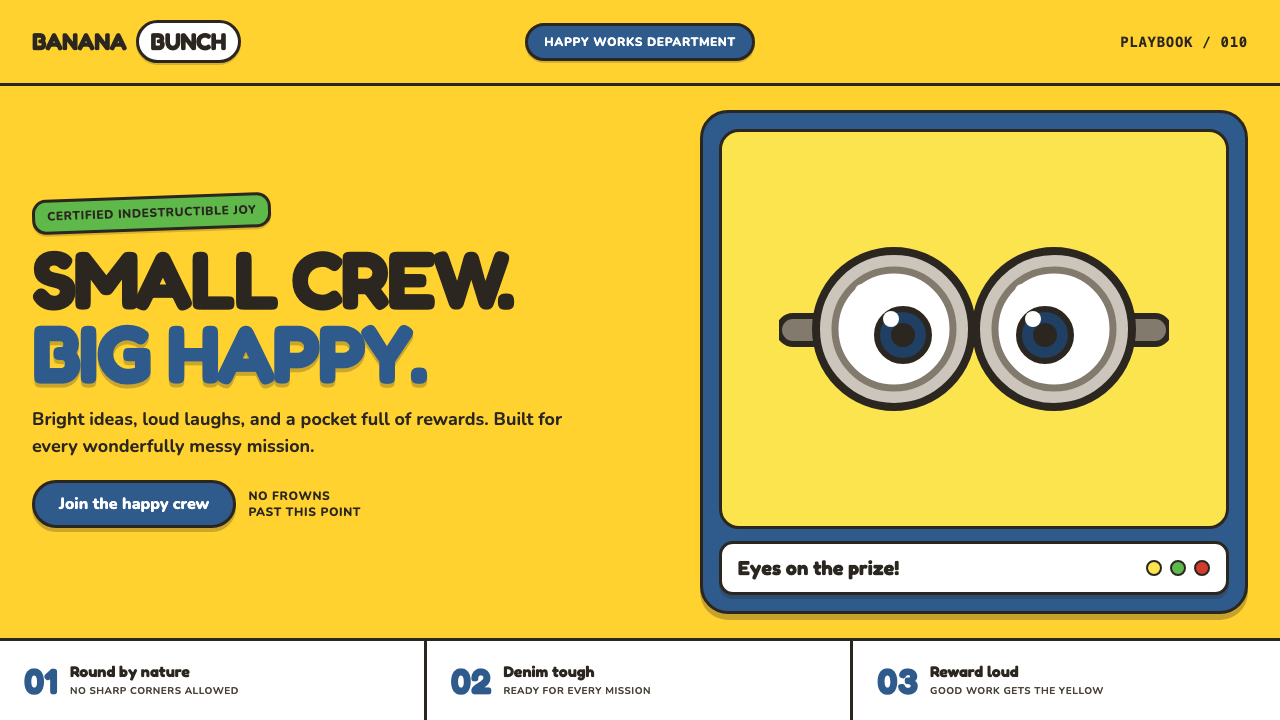 Minions (Despicable Me, 2010)Indestructibly cheerful. Minion yellow, denim blue, and chunky goggle geometr…
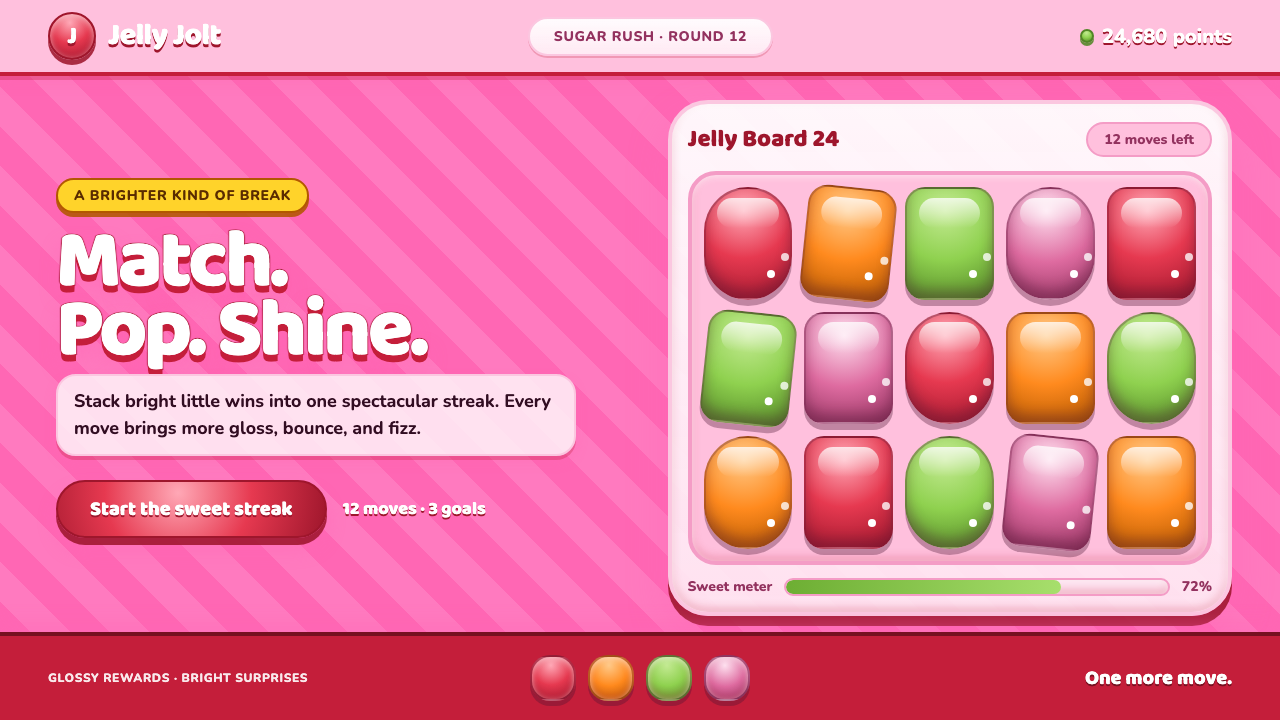 Candy Crush (2012)Sugar rush without restraint. Glossy candy tiles pulse across a striped bubbl…
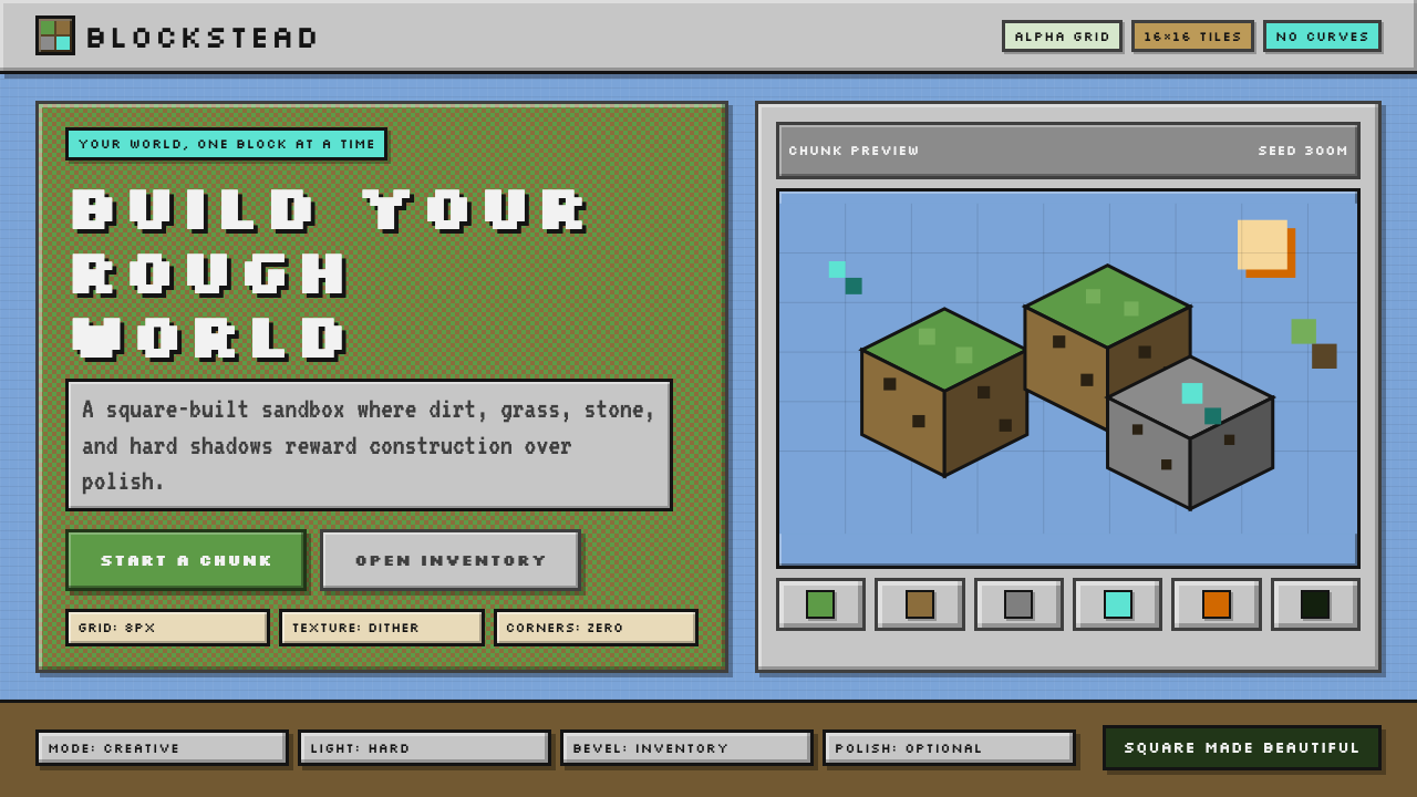 Minecraft VoxelUgly becomes buildable. Grass green, dirt brown, hard bevels, and 16×16 grids…
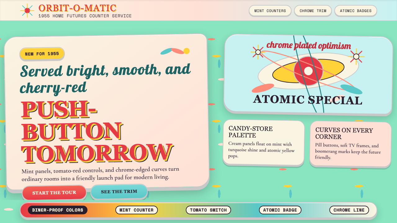 Populuxe Atomic AgeThe future grins. Mint Formica, tomato-red pills, Cooper Black, and atomic st…
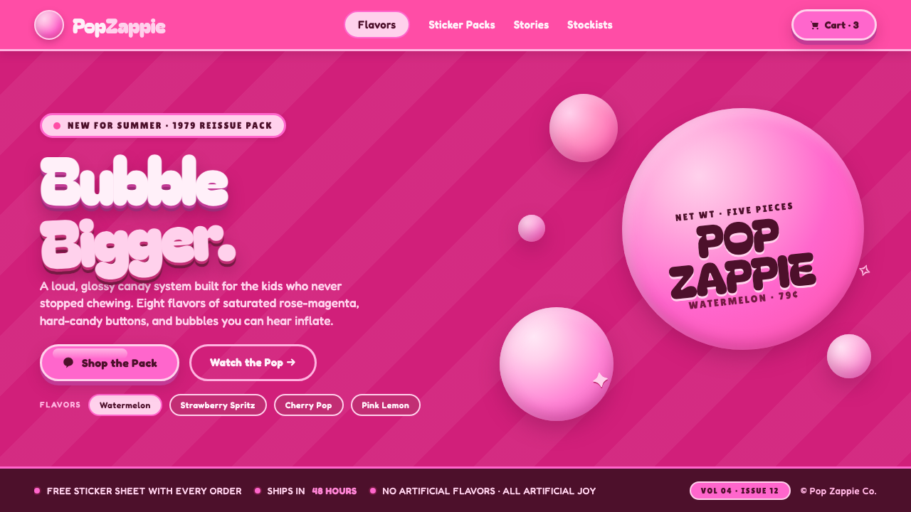 Watermelon Bubblegum Pink80s candy maximalism. Neon pink on rose-magenta, sugar-shine highlights, infl…
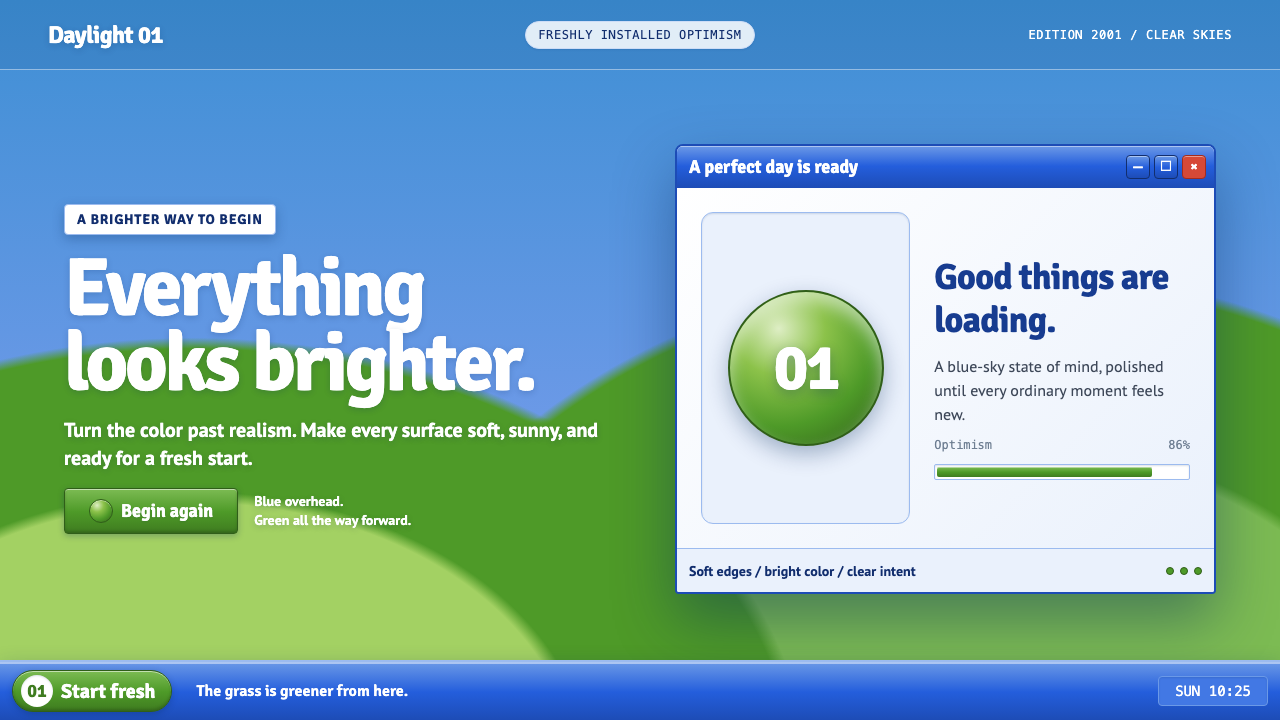 Windows XP Bliss (2001)Fresh-install optimism. Sky blue, hill green, and glossy gel chrome turn real…