What is Emoji & Sticker Design?
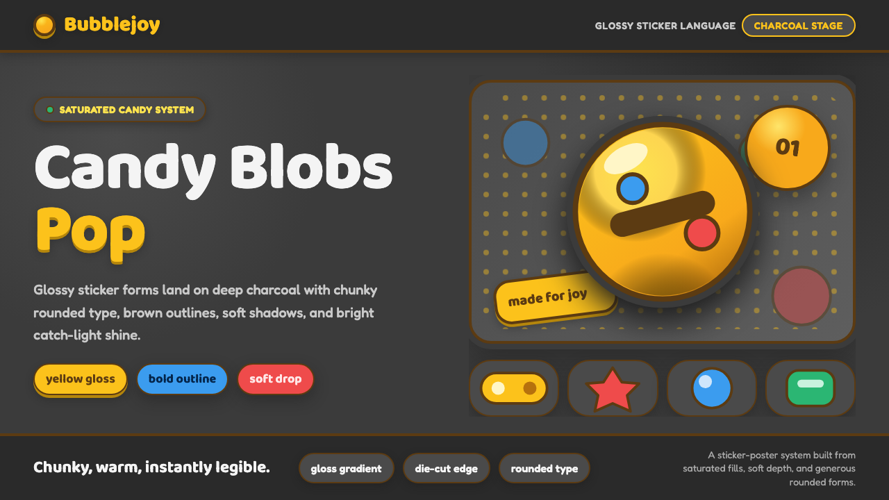
Emoji and sticker design turns joy into a glossy object — a bright yellow face, outlined like a collectible decal and made to pop against charcoal.
Emoji & Sticker Design in brief
Emoji and sticker design is a global visual language shaped by Unicode standardization, vendor-specific emoji sets, cross-platform sticker art, and friendly vector iconography. Its central figure is the glossy yellow smiley: a rounded face modeled with a transition from bright highlight to deeper shade, enclosed by a bold dark outline, and lifted by a soft, playful shadow. The result is instantly legible at a glance yet substantial enough to feel like a tiny illustrated object rather than a flat symbol.
The style is chunky, saturated, and openly cheerful. Yellow spheres and irregular blob forms sit against deep neutral charcoal, where their candy-like fills achieve maximum visual force. Brown or dark sticker outlines keep each silhouette clear, while generous rounding removes sharpness from type, containers, and supporting graphics. Every part of the system reinforces friendliness: shapes are soft, expressions are direct, shadows feel buoyant, and contrast is strong without becoming severe.
Although the smiley supplies the emotional center, the sticker treatment supplies the physical metaphor. A dark contour separates the image from its surroundings as though it could be peeled from the screen, while gloss suggests a polished surface catching light. This combination allows an abstract digital expression to feel tactile, collectible, and personal. The aesthetic therefore bridges standardized emoji and more expressive sticker art: one provides immediate recognition, while the other provides character and visual presence.
Where does Emoji & Sticker Design come from?
The modern history of this language begins with the global standardization of emoji. Unicode made it possible for the same encoded expression to travel across the internet, while Google, Apple, and other vendors interpreted that expression through their own visual sets. This created a productive tension between consistency and personality: the underlying symbol needed to remain recognizable across platforms, but its surface, proportions, shading, and emotional tone could carry the identity of a particular vendor.
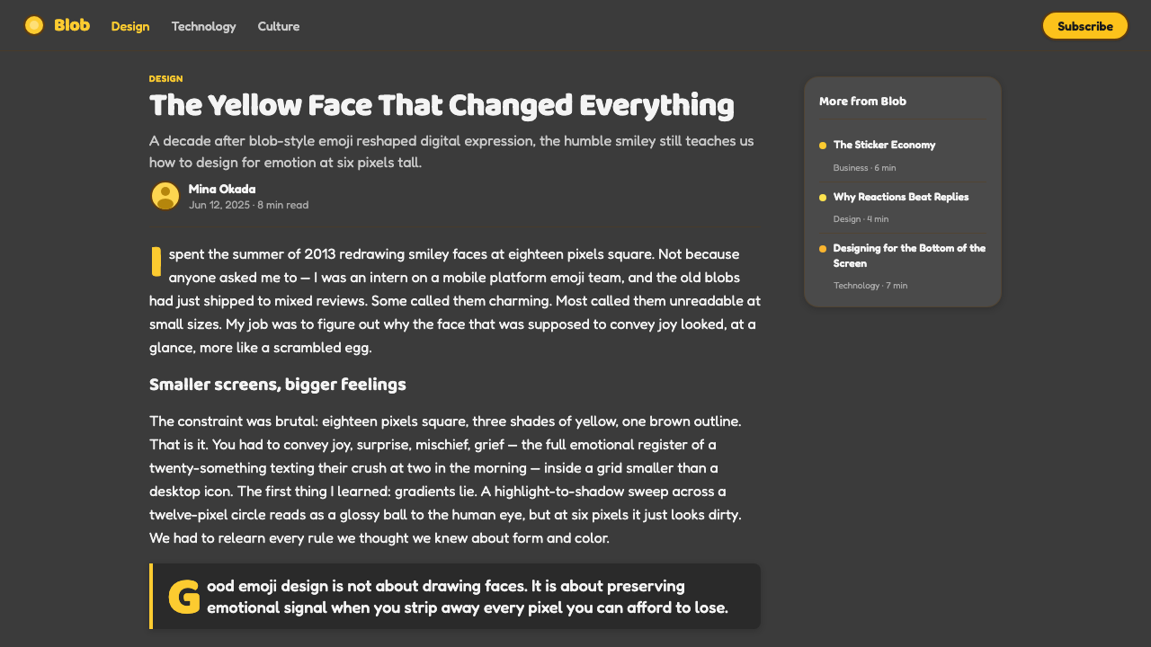
Google's blob emoji debuted with Android 4.4 KitKat in 2013. Instead of treating every face as a strict circular badge, the blobs used soft, yielding forms whose silhouettes could feel almost elastic. Their yellow bodies, readable expressions, and friendly vector construction gave standardized symbols an unusually personable presence. The blob was not merely a container for facial features; its shape became part of the emotion, allowing a digital face to appear buoyant, awkward, excited, or relaxed through the character of the body itself.
The blobs were retired in 2017, but the visual idea did not disappear. Noto Color Emoji carried forward the broader language of bold, saturated, highly legible emoji illustration, preserving the importance of clear silhouettes and immediate emotional reading. Meanwhile, cross-platform sticker art expanded the expressive possibilities around standardized emoji. Strong outlines, polished fills, playful shadows, and exaggerated forms made reactions feel more like miniature character illustrations while remaining simple enough for rapid communication.
A revival arrived through Emoji Kitchen in 2021, reconnecting contemporary emoji culture with the appeal of the earlier blobs. The return demonstrated that users valued more than technical recognition: they also responded to softness, personality, and the sense that a familiar symbol could behave like a character. IC4DESIGN and the Noto Color Emoji team belong to this wider ecosystem of illustrated expression, in which standardized signs, vendor interpretations, and sticker-like combinations continually reshape one another for a global internet audience.
What defines the Emoji & Sticker Design look?
Candy Color
Saturated blob yellow is the emotional anchor, set against deep neutral charcoal so it appears luminous and immediate. Supporting hues should retain the same candy-like clarity rather than becoming dusty or subdued. Dark brown and near-black belong primarily to outlines, facial features, and structural contrast. Color is expected to feel edible, polished, and optimistic, with the background acting as a quiet stage rather than a competing attraction.
Gloss and Volume
The characteristic face is not a flat yellow disc but a glossy sphere or yielding blob. A bright highlight rolls into a deeper shaded region, suggesting a smooth, rounded surface. The modeling should remain broad and readable rather than intricate or realistic. Its purpose is to make the expression feel touchable and lively, not to simulate a physically exact material.
Sticker Outline
A bold dark or brown contour encloses the main silhouette and gives it sticker-like independence from the background. The outline must feel confident and continuous, following the character of the blob rather than forcing it into mechanical geometry. It also protects legibility when an emoji or reaction is reduced, allowing the outer shape to remain recognizable before individual facial details are noticed.
Rounded Typography
Typography shares the same emotional temperature as the characters. Rounded letterforms, open counters, and friendly proportions complement the swollen spheres and generous curves. Headlines can feel chunky and buoyant, while supporting text should remain simple and highly readable. Severe contrast, narrow forms, and sharp terminals tend to introduce a formality that conflicts with the style's warm, informal voice.
Playful Shadow
Soft drop shadows separate stickers from the charcoal field and give them a light, bouncing presence. The shadow should support the silhouette without becoming smoky, dramatic, or cinematic. It works as a cue that the object is hovering just above the surface, reinforcing the peelable sticker metaphor while preserving the clarity needed for small-scale communication.
Expressive Simplicity
Emotions are communicated through a small number of decisive features: eyes, mouth, body tilt, and the yielding contour of the blob. Details are simplified so the reaction reads immediately, but simplification does not require emotional neutrality. Slight exaggeration and elastic form give each symbol character. The best results feel unmistakable before they feel clever.
Who shaped Emoji & Sticker Design?
IC4DESIGN represents the illustration-led side of the emoji and sticker ecosystem, where compact forms must combine immediate communication with a distinct character. Its relevance lies in treating tiny reaction graphics as complete illustrated objects rather than disposable interface marks. That perspective supports the style's bold silhouettes, saturated surfaces, and ability to carry narrative energy within a very small visual unit.
The Noto Color Emoji team carries forward a cross-platform visual language built around clarity, saturation, and friendly iconography. Its work sits at the practical meeting point between standardization and illustration: each symbol must preserve an agreed meaning while remaining visually coherent with a much larger family. That discipline underlies the style's consistent contours, direct expressions, and dependable recognition.
Google introduced the blob emoji with Android 4.4 KitKat in 2013, retired the forms in 2017, and revived their appeal through Emoji Kitchen in 2021. Across those moments, the blob demonstrated how a vendor interpretation could become memorable through silhouette and personality rather than meaning alone. Its soft yellow body remains the clearest historical reference for this design language.
How do you use Emoji & Sticker Design today?
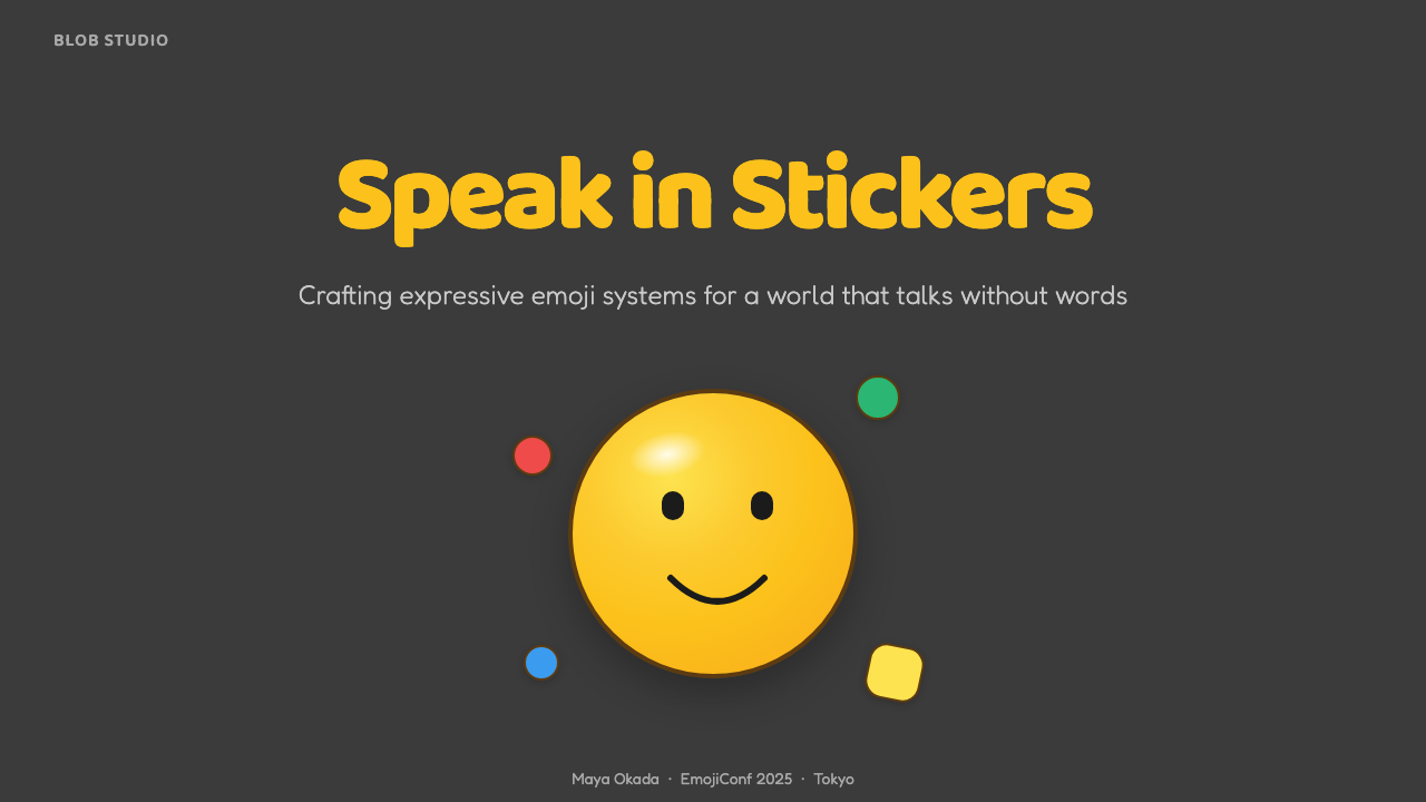
For presentation covers, use one oversized glossy smiley or blob as the emotional anchor and let the charcoal field provide dramatic breathing room. A rounded, buoyant title can sit nearby without competing with the face. Content slides should translate the sticker logic into hierarchy: place each key idea inside a rounded, outlined unit, keep paragraphs concise, and use expressive reactions as navigational cues rather than scattering them as decoration.
Data slides benefit from the style when information is framed as approachable rather than clinical. Rounded charts, candy-colored categories, and sticker-like labels can make comparisons feel inviting, while dark contours preserve separation on the charcoal background. The smiley should comment on the result or mark a meaningful state, not replace the data itself. Consistent silhouettes and restrained supporting colors prevent the page from becoming a tray of unrelated sweets.
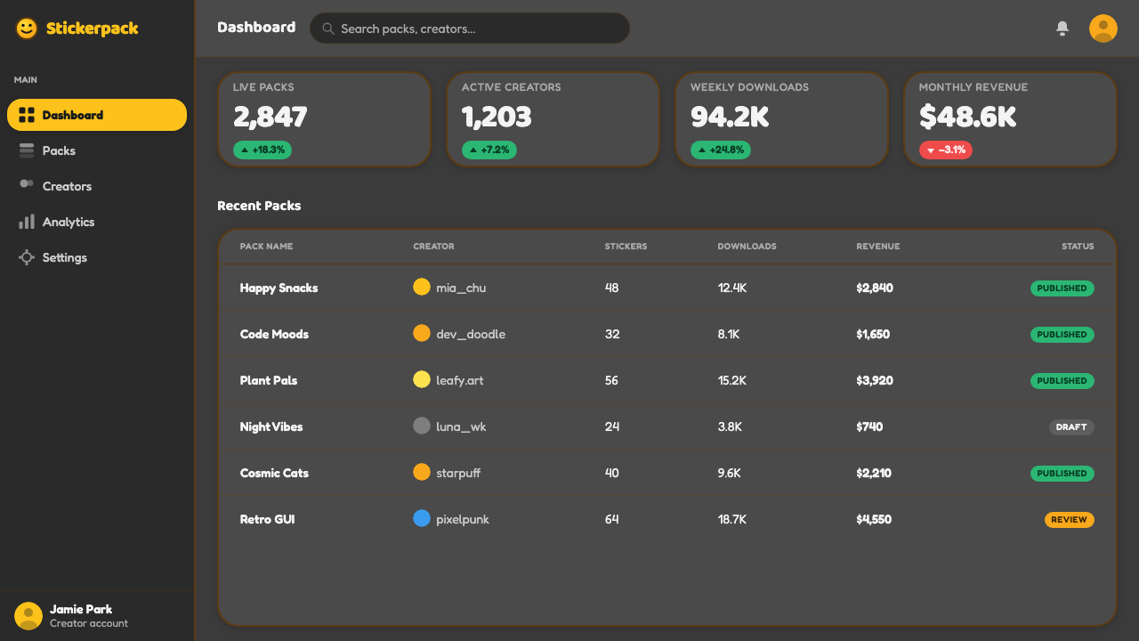
For web interfaces, the language works especially well in friendly dashboards, community tools, and pricing pages that need immediate state recognition. Rounded panels can behave like large stickers, while yellow highlights identify the primary action or most important status. Pricing tiers may use distinct reactions or blob personalities to express differences in tone, but labels and features must remain explicit. Emotional illustration should strengthen scanning, never force users to decode a face before understanding an option.
Editorial and marketing applications can use the style's collectible quality to build rhythm. Articles may assign a recurring sticker reaction to each section, while campaign pages can alternate dark fields with glossy character moments and short, rounded headlines. Sticker clusters are effective for social graphics or playful calls to action, but the strongest composition usually gives one expression a clear starring role. Repetition should create a recognizable cast rather than visual noise.
The most common mistake is equating joy with maximum quantity. Filling every gap with faces, gloss, shadows, bright colors, and irregular blobs destroys the instant legibility that makes emoji useful. Another error is separating the effects from the form: a generic icon with a shiny gradient and thick outline does not automatically become expressive sticker art. Begin with a readable emotion and a memorable silhouette, then add gloss, contour, and shadow only where they reinforce that character.
Emoji & Sticker Design — FAQ
Is emoji and sticker design simply a collection of yellow smileys?
No. The yellow smiley is the most recognizable anchor, but the system depends on a broader relationship among expressive silhouettes, bold outlines, glossy volume, rounded typography, and immediate emotional reading. A successful set can include many forms and reactions as long as they share the same visual grammar. Consistency comes from how shapes, contours, light, and emotion are handled, not from making every symbol an identical circle.
How is a sticker different from a standard emoji in this style?
A standard emoji begins with cross-platform recognition: it must communicate a familiar encoded idea quickly. A sticker has more room for personality, exaggeration, and a sense of physical independence from the interface. Bold outer contours, soft shadows, and polished fills make it seem peelable and collectible. The two categories overlap, especially when standardized expressions are recombined or illustrated with stronger character.
Why does the style use a charcoal background?
Deep neutral charcoal gives saturated yellow and candy-like supporting colors a strong stage without introducing another competing hue. It also makes highlights, dark contours, and soft shadows visible at the same time. The background contributes mood by making joy appear illuminated from within, but remains neutral enough that the expressive face, rather than the surrounding field, carries the message.
Must every emoji or sticker use glossy shading?
Gloss is central to this particular interpretation, but it should be treated as a shared material cue rather than an obligation to render every surface elaborately. Small or secondary symbols may use simpler modeling if their silhouettes and expressions remain clear. The important distinction is coherence: when gloss appears, its highlight and shade should describe the same soft, polished world across the set.
Where does this style struggle?
It struggles when a product requires emotional restraint, formal neutrality, or dense information with little room for expressive imagery. Its saturated color, rounded forms, and playful shadows can make grave or highly technical material feel inappropriately casual. Even in friendly products, excessive character art can compete with controls and data. The style works best when warmth and rapid emotional recognition are genuine product values rather than a decorative layer added afterward.
Related design styles
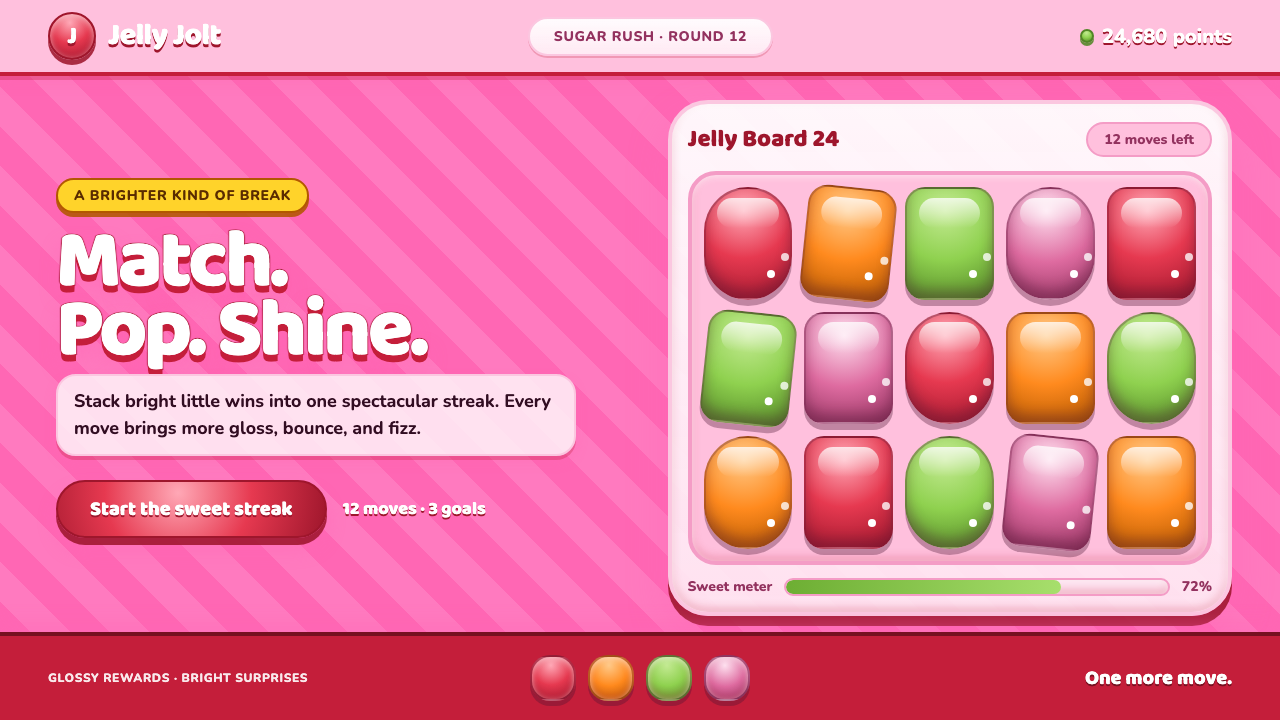 Candy Crush (2012)Sugar rush without restraint. Glossy candy tiles pulse across a striped bubbl…
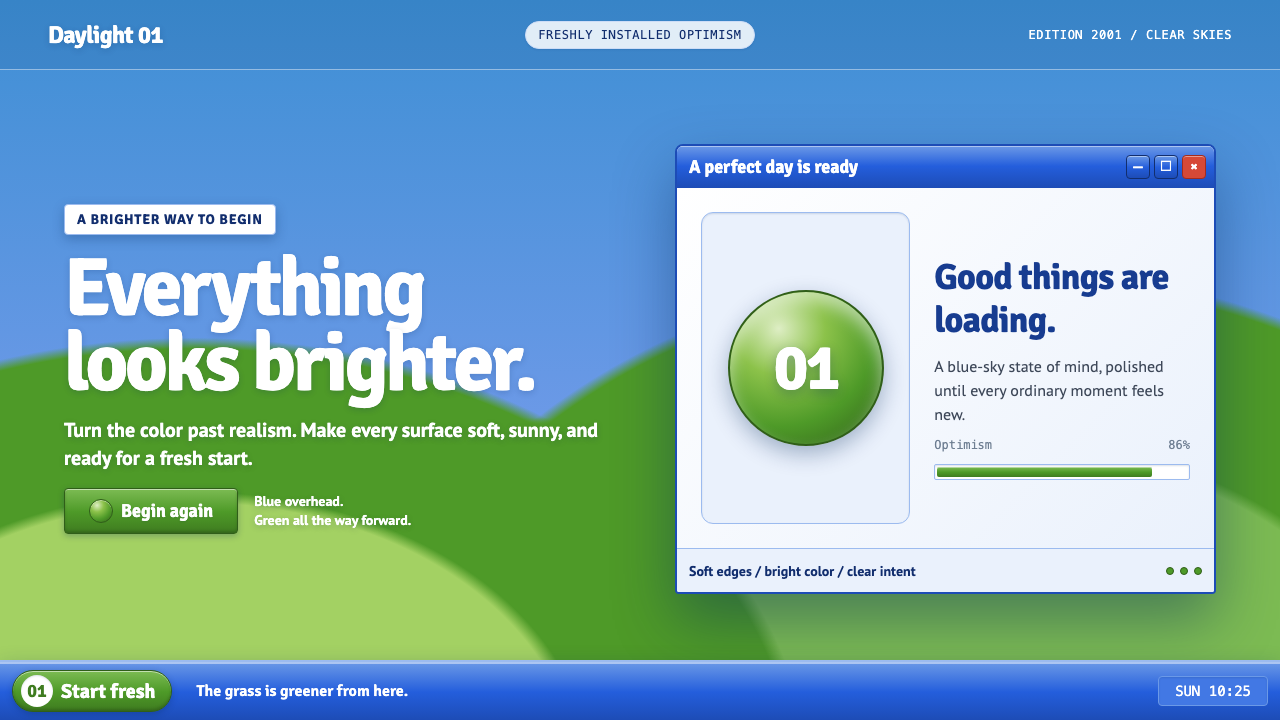 Windows XP Bliss (2001)Fresh-install optimism. Sky blue, hill green, and glossy gel chrome turn real…
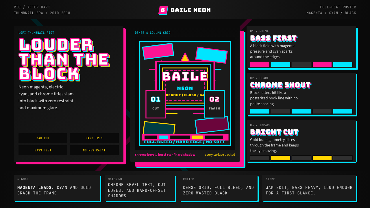 Funk Carioca FavelaMaximalist and unruly. Magenta, cyan, and chrome slam into black at thumbnail…
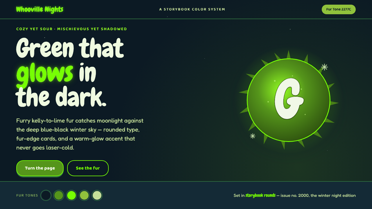 The Grinch Green Fur 2000Green that glows in the dark. Kelly-to-lime fur on blue-black Whoville night,…
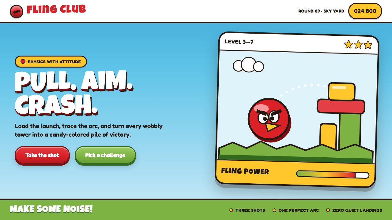 Angry Birds (2009)Adorable aggression takes flight. Candy primaries, chunky outlines, and a dot…
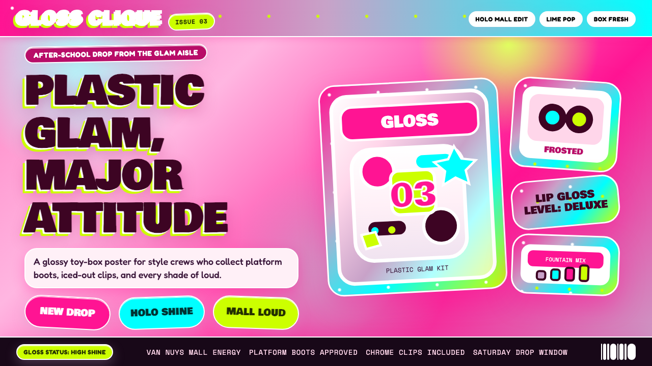 Bratz Doll 2003Y2K maximalism, mall-glossy. Hot-pink gradients, holographic lavender, chunky…