What is The Grinch Green Fur 2000?
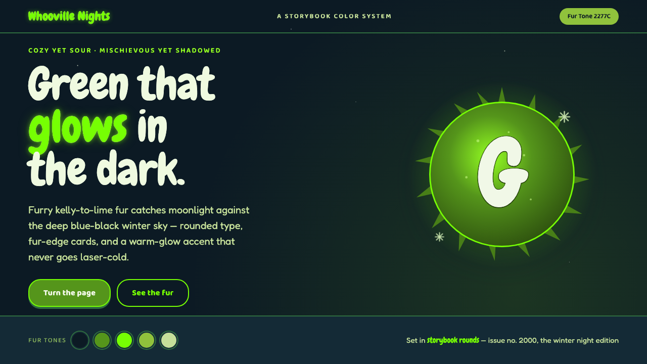
The Grinch Green Fur 2000 turns a snowy blue-black holiday night into creature comedy: luminous sour green, plush edges, and curling forms that feel mischievous rather than polished.
The Grinch Green Fur 2000 in brief
The Grinch Green Fur 2000 is a dark, playful visual language drawn from Ron Howard’s 2000 live-action How the Grinch Stole Christmas. Its defining image is Jim Carrey’s furry green Grinch set against Whoville at night: saturated kelly-to-lime green emerging from snow, shadow, and deep blue-black winter darkness. The contrast is immediate and theatrical. Green is not a calm botanical neutral here; it is the character entering the room.
The style is shaped by Seussian whimsy rather than conventional holiday refinement. Forms curl, swell, lean, and feel slightly overgrown. Typography should appear rounded and chewy, with a hand-shaped personality that can carry comic exaggeration without becoming childish. Surfaces retain a sense of fur, soft pile, or irregular creature edges, making the interface feel inhabited rather than mechanically assembled.
Its mood depends on a productive contradiction: cozy yet sour, festive yet shadowed, charming yet a little unruly. Dark grounds create the winter-night setting; warm lime accents provide the grin, the spark, and the joke. Applied well, the system does not imitate a literal movie still. It translates creature-comedy energy into a readable hierarchy where glowing green appears as an expressive interruption inside a deep, snowy world.
Where does The Grinch Green Fur 2000 come from?
The immediate source is Ron Howard’s 2000 film How the Grinch Stole Christmas, produced in North America through Universal Pictures and Imagine Entertainment. The film placed Jim Carrey in a furry green creature costume and staged that figure against the blue-black, snow-covered night of Whoville. That pairing supplies the visual system’s central tension: a vivid, tactile protagonist framed by cold darkness and winter atmosphere.
Its deeper source is Dr. Seuss, the pen name of Theodor Geisel, whose 1957 story established the Grinch and the Whoville world. The relevant inheritance is not a catalog of decorative motifs but a way of treating form. Seussian visual thinking favors curl, roundness, exaggeration, and a slightly unstable storybook logic. Straightforward realism gives way to objects and letters that seem capable of bending, swelling, or grinning back at the viewer.
The 2000 live-action treatment translated that storybook energy into character-fur creature design. Fur matters because it makes the green feel physical: not merely a flat seasonal accent, but a surface with unruly direction and comic presence. In a digital interpretation, this does not require covering everything in texture. It means allowing selected edges, panels, and focal surfaces to feel soft, irregular, and character-led.
Holiday film design completes the system. Snowy darkness makes the luminous green legible, while the Whoville setting prevents the result from becoming severe or hostile. The visual language therefore operates through contrast rather than minimal restraint: deep night against warm green, soft fur against crisp snow, mischief against comfort. Its most convincing contemporary uses retain all three forces at once.
What defines the The Grinch Green Fur 2000 look?
Night Green Contrast
The foundation is blue-black winter darkness interrupted by kelly-to-lime green. The green should appear luminous because its surroundings are dark and cold, not because it is pushed toward a sterile electronic glow. Use the brightest green where the interface needs character, action, or narrative focus; let the dark field carry the atmosphere and preserve rest for the eye.
Fur as Edge Language
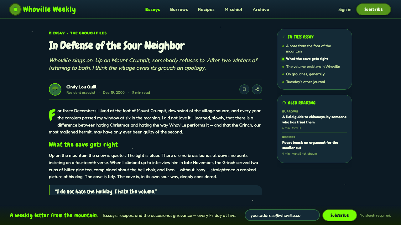
Fur is best understood as an edge condition, not a blanket texture. Card borders, cutouts, illustration contours, and selected dividers can soften, feather, or become slightly irregular. This creates creature presence without sacrificing information clarity. Dense content areas should remain calm enough to read; the fur belongs at transitions and moments of emphasis.
Chewy Rounded Type
Typography carries Seussian personality through rounded, curling, and generously shaped letterforms. Headlines can feel bouncy or theatrical, but their silhouette must remain readable at a glance. Supporting text should be simpler and steadier, creating a useful contrast between the Grinch-like voice of the title and the practical clarity of the message beneath it.
Whimsical Curvature
Straight lines and rigid rectangles can appear, but they should not define the personality of the composition. Curved cuts, swelling containers, looped accents, and gently leaning arrangements suggest a world that obeys storybook rather than bureaucratic logic. The curves need intent: they should guide attention, frame content, or create comic tension, never merely decorate empty space.
Cozy Sour Mood
This is not a purely cheerful holiday palette. Its charm comes from pairing warmth with a faintly sour, mischievous note. Snow, dark night, soft fur, and lime all play different emotional roles. If every element becomes cute and bright, the shadowed comic tension disappears; if everything becomes dark and sharp, the Whoville warmth disappears with it.
Selective Glow
Glow should behave like a mischievous highlight rather than a universal effect. It can gather around a call to action, a key number, a badge, or a creature-like focal form. The glow stays warm and organic, with enough softness to suggest fur catching light in snow-darkness. Repeating it on every component weakens both hierarchy and magic.

Who shaped The Grinch Green Fur 2000?
Howard directed the 2000 live-action How the Grinch Stole Christmas. For this visual language, the film is important because it placed a furry, saturated green character inside a snow-covered blue-black Whoville night, creating the contrast between creature warmth and winter shadow that defines the system.
Carrey played the Grinch in the 2000 film. His green furry appearance gives the palette its physical and comic dimension: the green is inseparable from an expressive creature rather than functioning as a detached holiday color. That performance-led presence is why the style benefits from exaggeration, rounded forms, and visible texture.
Dr. Seuss created the 1957 source story. Theodor Geisel’s Seussian whimsy provides the visual logic behind curling forms, rounded silhouettes, and a storybook world that is playful without needing to be neat. The film-era system carries that inheritance into dark holiday creature comedy.
How do you use The Grinch Green Fur 2000 today?
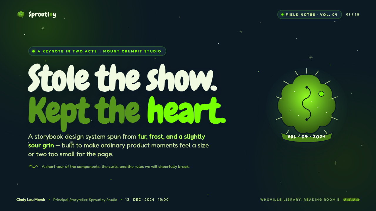
For presentation covers, treat the blue-black ground as a winter stage rather than empty background. A large furry or curling green form can enter from an edge, while the title uses rounded, high-presence typography with generous breathing room. Keep the cover’s joke singular: one expressive green interruption is stronger than a collection of competing seasonal symbols. The result should feel like a mischievous character has already stepped into the deck before the audience reaches the first slide.
Content slides benefit from a clearer, quieter version of the system. Use the dark ground to group material, reserve green for section signals and key ideas, and keep body copy stable enough to scan. Rounded cards can carry supporting content, with fur-like treatment limited to their outer edge or a selected corner. This lets the style remain atmospheric while the slide continues to behave as an explanation rather than a movie poster.
Data slides work when charts are treated as part of the storybook set. One green series can take the lead, while subdued dark and snowy neutral elements provide comparison and structure. Rounded bars, soft creature-like markers, or gently curved chart containers can echo the theme without obscuring the data. Avoid making every value glow. The brightest treatment belongs to the result the audience should notice first.
For web interfaces, the style is especially useful for dashboards, campaign pages, memberships, and seasonal pricing experiences that need personality without losing a dark-mode sense of focus. Navigation and controls should remain familiar and highly legible; the Grinch influence belongs in the accent behavior, panel silhouette, and emotional framing. A lime action state, a fur-edged featured panel, or a curling progress indicator can carry the theme more effectively than a literal character image on every screen.
The common mistake is confusing the style with generic neon green on black. That produces a cold, technical look and loses the fur, winter, and comic warmth that make the system specific. Another mistake is applying fuzzy texture and curling type everywhere, which turns expressive material into visual noise. Build the dark snowy stage first, choose a small number of green hero moments, and let rounded whimsy support hierarchy rather than compete with it.
The Grinch Green Fur 2000 — FAQ
Is this simply a holiday version of neon dark mode?
No. Neon dark mode usually reads as electronic, sharp, and technical. The Grinch Green Fur 2000 system needs cold winter darkness, but its green is warm, furry, and comic rather than laser-like. Rounded type, soft irregular edges, and a hint of Whoville storybook absurdity are essential to keeping the look creature-led instead of cybernetic.
How much fur texture should a layout use?
Use it as a framing device, not as a background covering. Fur works best around hero imagery, selected cards, badges, or transitions between dark fields and luminous accents. Information-dense areas need cleaner surfaces so the hierarchy remains trustworthy. If texture competes with copy or charts, it has exceeded its role.
Can the style work without a literal Grinch image?
Yes. The transferable system is the relationship among blue-black night, saturated warm green, fur-like edge behavior, and Seussian roundness. A literal character image can make an experience feel promotional or overly referential. For most interfaces, an abstract curling green silhouette or a tactile featured panel communicates the mood while giving the product its own identity.
Which interface moments deserve the lime glow?
Use it where attention needs an emotional nudge: a primary action, an active status, a highlighted plan, a key result, or a single narrative focal point. It should feel like the green has caught light in the dark rather than like an always-on visual effect. When several elements need hierarchy, brightness should follow importance rather than repetition.
Where does this style struggle?
It struggles where a neutral, institutional, or highly restrained tone is required. Formal documents, sober operational tools, and products that cannot support theatrical personality may find the creature-comedy framing distracting. It also needs care in dense workflows: the dark mood and expressive contours should never make navigation, comparison, or sustained reading harder than they would be in a calmer system.
Related design styles
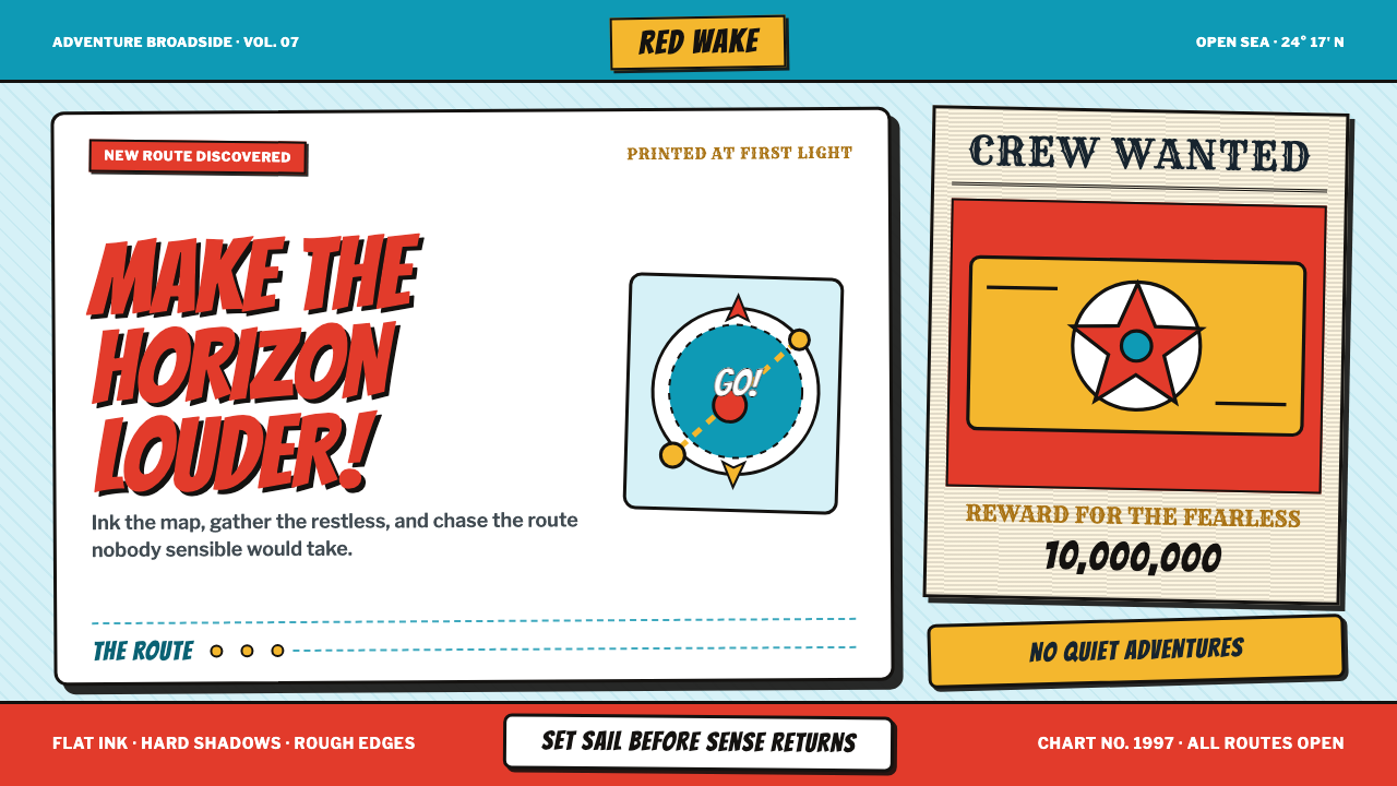 One Piece (Grand Line Adventure)Adventure shouts first. Vermilion splash type and cyan charts collide in hard…
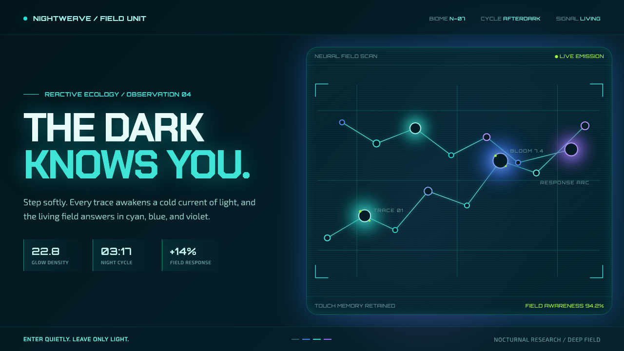 Avatar — Pandora Bioluminescence (2009)The forest knows you are there. Cyan light blooms across a deep-teal living f…
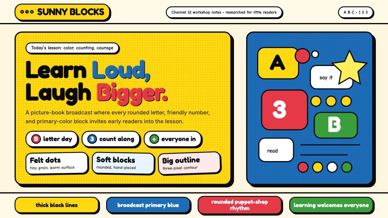 Sesame Street (1969)Learning feels handmade. Big yellow, monster blue, chunky outlines, and round…
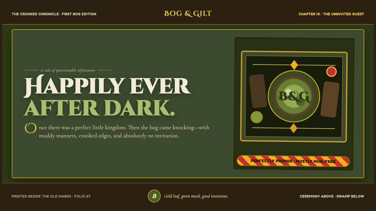 Shrek Swamp (2001)Fairy-tale ceremony gets muddy. Gilt frames collide with moss green and candy…
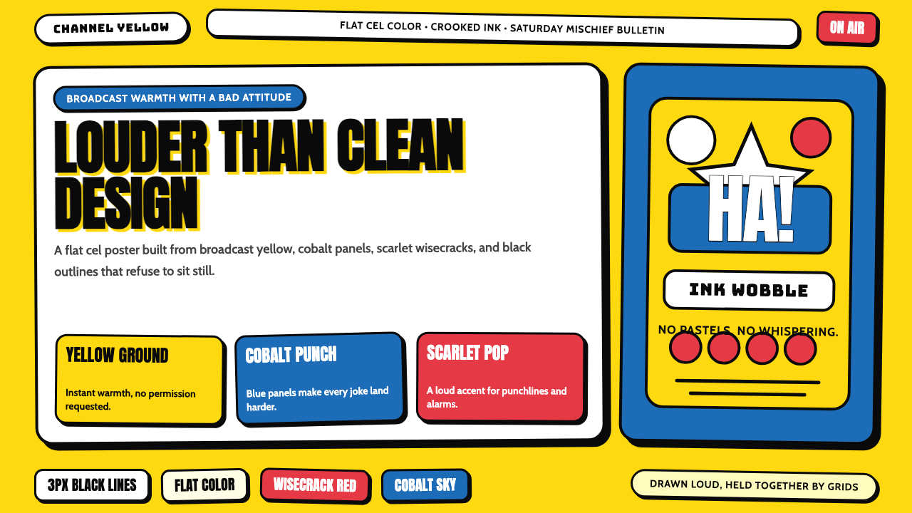 The Simpsons YellowCartoon warmth misbehaves. Yellow ground, cobalt panels, thick wobbly black l…
 Champeta Picó SoundLoud after dark. Orange-green banners and fat Bungee type glow like a speaker…