What is Shrek Swamp (2001)?
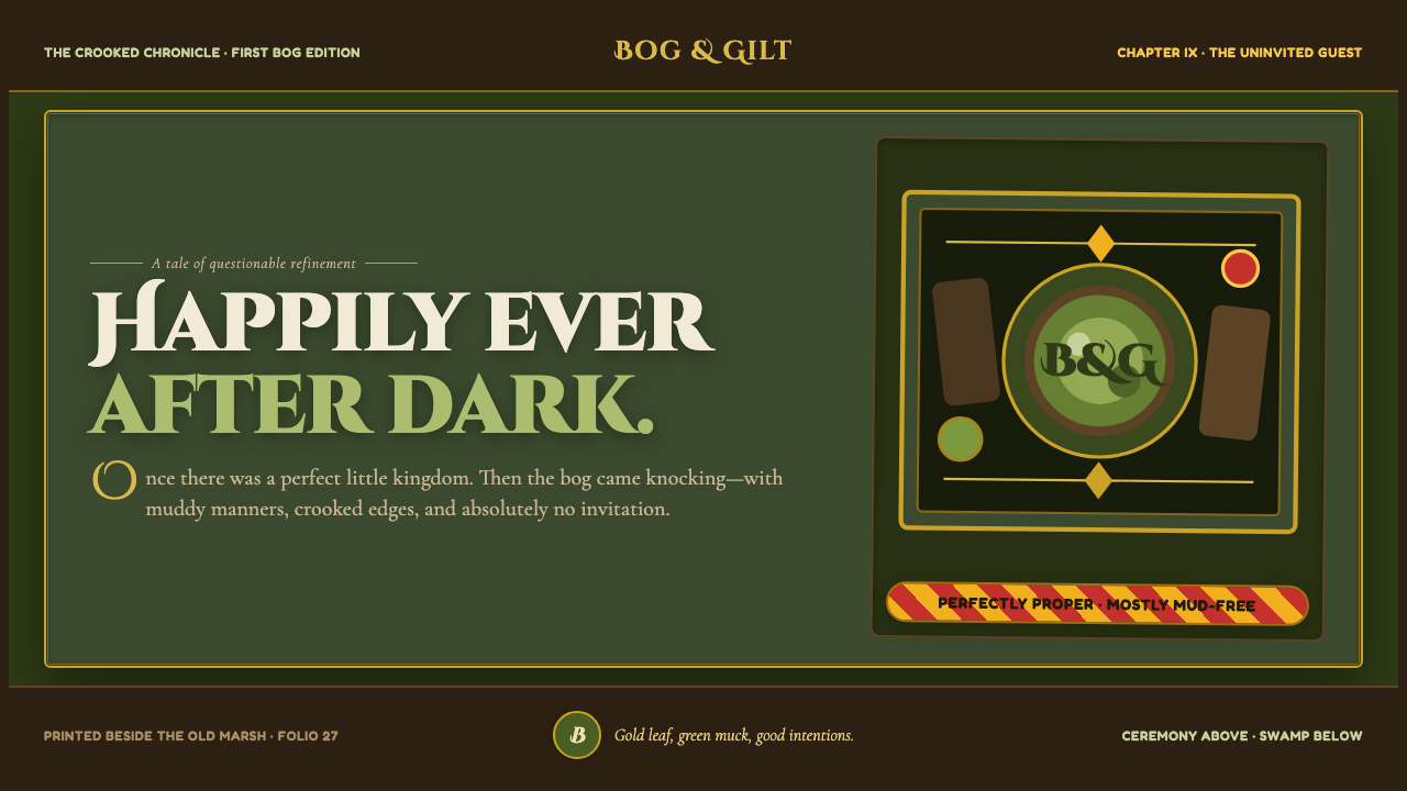
Shrek Swamp turns fairy-tale ceremony into a muddy joke: gilt storybook grandeur, bog-dark earth, and candy-colored civic cheerfulness all tracking through the same pair of dirty boots.
Shrek Swamp (2001) in brief
Shrek Swamp is a dark, storybook-derived visual language built around a productive collision. One register is ceremonial: illuminated-manuscript ornament, decorative frames, ornate initial letters, warm parchment-like grounds, and the promise of an old tale beginning properly. The other is physical and unruly: moss, bark, mud, crooked painted signs, damp textures, and an ogre-sized disregard for neatness. Its appeal comes from allowing both registers to remain visible instead of smoothing their disagreement away.
The palette begins in the swamp. Bog greens, murky earth tones, bark browns, and shadowed natural surfaces establish a warm but faintly gross world. Against that grounded field, gilt ornament reads as a deliberately excessive gesture, while Duloc brings a sharper interruption through marigold, candy red, and gleaming brochure white. These brighter notes should feel manufactured, polished, and slightly too eager beside the handmade dampness of the swamp.
The style is painterly rather than pristine. Borders look brushed, signs look hand-painted, and visual elements should retain a sense of grain, weight, and imperfect handling. It does not pursue rustic authenticity alone, nor does it simply parody fairy tales. Instead, it treats beauty as something that can survive being scuffed up: a handsome page, an ornate ceremony, or a charming sign made funnier and more memorable because it has been exposed to mud.
Where does Shrek Swamp (2001) come from?
The visual language belongs to Shrek, whose first film arrived in 2001 and whose franchise ran through 2010. Its source material identifies Glendale, California, as its region and places the style within computer-animated fairy-tale satire, DreamWorks house style, and storybook-illustration pastiche. That combination matters: this is not a neutral fantasy world. It is a fairy-tale world designed to notice its own costumes, ceremonies, promises, and absurdities.
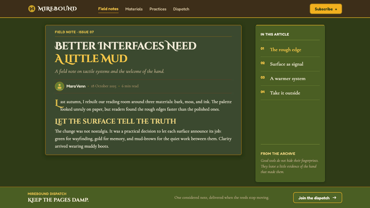
The system was built on William Steig's 1990 picture book. That origin helps explain why the style keeps returning to the language of a page: framed declarations, illustrated surfaces, decorative initials, warm grounds, and the feeling that a narrator might be just outside the image. Yet the resulting visual world refuses the cleanliness often associated with a precious children’s book. The storybook reference is continually interrupted by swamp matter and comic physicality.
Andrew Adamson, Vicky Jenson, William Steig, James Hegedus, and Guillaume Aretos are the key figures named in the approved material. Taken together as the credited creative constellation for this theme, their presence anchors Shrek Swamp in a specifically cinematic and illustrated pastiche rather than a historical medieval revival. The aim is not archaeological reproduction of manuscript art; it is a contemporary fairy-tale language that can recognize grandeur and immediately put mud on it.
The franchise frame also explains the role of Duloc. In the supplied visual description, Duloc’s candy-colored kitsch crashes into the swamp’s mossy, bark-brown world. This opposition supplies the style’s central dramatic mechanism: the swamp is earthy, painterly, crooked, and bodily; Duloc is bright, polished, brochure-like, and ceremonially cheerful. A successful Shrek Swamp composition lets those values argue, rather than making either side entirely dominant.
What defines the Shrek Swamp (2001) look?
Swamp Palette
The base is mossy green, bark brown, and damp, shadowed earth. These colors should feel absorbed by organic matter rather than selected from a clean commercial palette. Warmth is essential, but so is murk: the world needs enough darkness and muddiness to make gilded ornament and candy-bright interruptions feel theatrically out of place.
Gilt Ceremony
Gold-leaf filigree, framed storytelling, and ornamental initials establish the formality of a traditional fairy tale. The ornament should be sincere enough to create grandeur, but never so immaculate that the joke disappears. It works best as a ceremonial layer placed over an earthier ground: an invitation to believe in once-upon-a-time, made unstable by the world around it.
Painterly Imperfection
Surfaces should look painted, brushed, worn, or manually assembled. A crooked sign has more authority here than a perfectly regulated one because it belongs to the world’s physical humor. Avoid sterile polish. Slight awkwardness, unevenness, and visible handling make the design feel inhabited, as though it was built from wood, mud, paper, and a stubborn desire to decorate.
Crooked Signage
Lettering should feel hand-painted and slightly irregular, with a willingness to lean, wobble, or crowd the available space. This is not casual sloppiness. The imbalance is expressive: it gives the sign a voice and makes typography part of the environment. Formal decorative lettering can sit beside it, but the contrast must remain legible as a clash between ceremony and swamp practicality.
Candy-Colored Kitsch
Marigold, candy red, and brochure white belong to the Duloc side of the system. They should arrive as an overconfident contrast to the bog rather than blending quietly into it. Their polished cheerfulness is useful because it exposes how controlled, promotional, and artificial a fairy-tale promise can look when placed beside an actual muddy habitat.
Warm Grossness
The tonal target is neither horror nor clean nostalgia. It is storybook-warm and faintly gross at once. Organic texture, mud, bark, and murky greens provide the grossness; decorative framing, warm grounds, and fairy-tale composition provide the welcome. If the result is only cute, it loses its bite. If it is only dirty, it loses the comic tenderness that makes the collision work.

Who shaped Shrek Swamp (2001)?
Andrew Adamson is named among the key figures for the Shrek Swamp theme. Within this visual language, the important takeaway is the cinematic fairy-tale frame: a world where ornamental storybook expectation and muddy comic disruption can occupy the same image without resolving into a single polite register.
Vicky Jenson appears in the approved list of key figures. The theme associated with this material depends on a sustained visual contrast between warmth and mockery, using a recognizable fairy-tale surface not as a fixed rule but as a setup that can be interrupted by crookedness, earthiness, and comic discomfort.
William Steig is the creator named in connection with the 1990 picture book on which the visual language was built. That picture-book foundation is central to the style’s use of framed scenes, decorative beginnings, and illustrated warmth, even as the swamp setting makes every elegant device feel physically vulnerable to mud.
James Hegedus is included among the theme’s listed key figures. The supplied material positions Shrek Swamp as a computer-animated fairy-tale satire and storybook-illustration pastiche, a framing that favors deliberate contrast over seamless realism and gives the style its knowingly theatrical character.
Guillaume Aretos is named among the key figures for the theme. The relevant visual lesson is the coexistence of incompatible finishes: earthy and painterly surfaces can support gilded framing, while polished candy-colored civic imagery can become funnier when it is held against the bog rather than allowed to stand alone.
How do you use Shrek Swamp (2001) today?
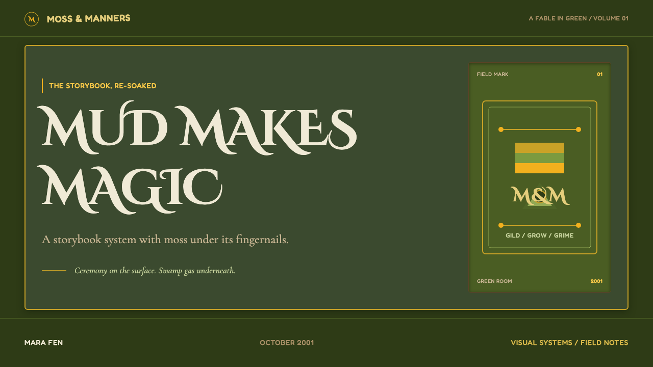
For presentation covers, use the ceremony-and-swamp conflict as the entire composition. Set a formal title within a gilt or manuscript-like frame, then interrupt the surrounding field with mossy, bark-like, or muddy painterly material. Let one brighter Duloc-like accent appear as an intrusive note rather than a general palette. A cover should feel like an old tale has been announced somewhere damp, not like a generic fantasy invitation.
For content and data slides, keep the storybook frame functional. Use ornament to mark major sections, label a narrative shift, or hold a memorable opening line; do not repeat it around every small block of information. Content areas can rely on warm paper-like fields, hand-painted directional marks, and irregular labels. Data should remain readable, with earthy categories as the base and candy-bright color reserved for the comparison or outlier that needs attention. The result should be illustrative and comic without sacrificing interpretation.
For web interfaces, Shrek Swamp suits narrative dashboards, playful pricing pages, event microsites, and products that benefit from an anti-polished fairy-tale voice. Build the interface around a dark, mossy or bark-toned atmosphere, then use framed modules and carefully chosen bright Duloc-like moments for announcements, calls to action, or deliberately promotional areas. Navigation and controls should remain clear, but they can carry hand-painted personality through uneven-looking signs, tactile surfaces, and decorative framing at meaningful transitions.
For editorial and marketing work, treat the page as a fairy-tale artifact that has had a difficult journey. Long-form pages can use ornate initials at true beginnings, painterly dividers between chapters, and framed pull quotes that briefly restore ceremony before the next muddy interruption. Campaign pages can alternate between swamp warmth and brochure-bright theatricality, making polished claims look intentionally comic when they sit next to bark, moss, and imperfect lettering.
The common mistake is making the style merely green, medieval, or whimsical. A mossy background plus random gold decoration does not produce Shrek Swamp, and neither does a clean candy palette with an ogre-like joke pasted on top. The style needs the conflict to remain active: earnest fairy-tale page craft, earthy painterly ugliness, and polished Duloc kitsch must each have a role. If every element is equally decorative, equally dirty, or equally cute, the satire disappears.
Shrek Swamp (2001) — FAQ
Is Shrek Swamp simply a medieval or fantasy style?
No. Medieval manuscript references are only one part of the system. The defining feature is their collision with boggy, painterly, deliberately awkward swamp material and with Duloc’s candy-colored polish. A conventional fantasy treatment tries to make its world coherent and immersive; Shrek Swamp keeps the seams visible because the contrast itself carries the humor.
How should gold ornament be used without making the result too luxurious?
Use it as ceremony, not as general decoration. Gold works when it frames a beginning, a title, a declaration, or a moment of exaggerated importance. Place it against damp greens, bark browns, or imperfect painted surfaces so it looks slightly overqualified for its surroundings. If gilded ornament appears everywhere, it becomes luxury styling and loses its comic fairy-tale tension.
Can the Duloc-like candy palette dominate a Shrek Swamp layout?
It can, but the swamp must remain present enough to give that brightness an opponent. Duloc’s marigold, candy red, and brochure white are effective because they feel polished and promotional beside moss, bark, and mud. If the earthy register vanishes, the palette becomes cheerful kitsch without the satire. If the bright register vanishes, the work becomes a different kind of rustic storybook.
Does the style work for serious information?
Yes, provided the theatrical elements organize rather than obscure. Use manuscript framing for major hierarchy, crooked signs for labels with personality, and swamp texture as atmosphere around readable content. The contrast can make an analytical dashboard, a pricing page, or an editorial argument more memorable. It fails when every label becomes a joke or every surface is textured enough to compete with the information.
What is the fastest way to tell whether an application has missed the style?
Ask whether the image contains an active disagreement. If every part looks polished, it has lost the swamp. If every part looks muddy and handmade, it has lost the fairy-tale ceremony and Duloc interruption. Shrek Swamp should feel like a lovely illustrated promise being tested by earthy reality: warm, decorative, physical, faintly gross, and knowingly comic at the same time.
Related design styles
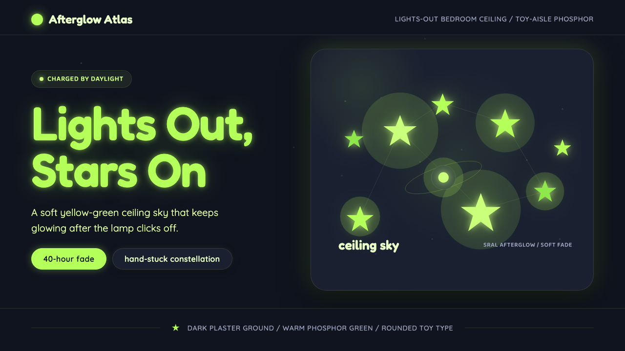 Glow-in-Dark Ceiling StarsTurns lights-out into wonder. Yellow-green stars glow across a dark blue-gray…
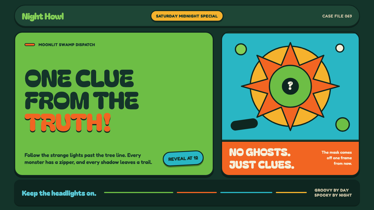 Mystery Machine (Scooby-Doo 1969)Groovy by day, spooky by night. Balloon type and acid-green panels hide the n…
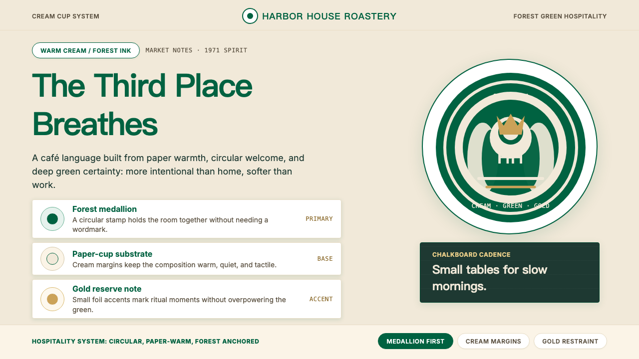 Starbucks (Siren)Hospitality becomes an emblem. Forest green medallion on cream paper, with re…
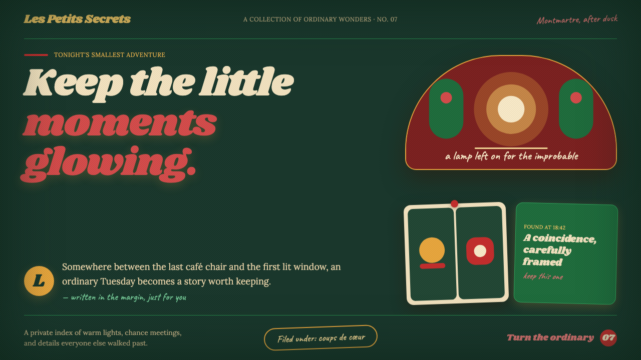 Amélie (Montmartre 2001)Ordinary moments glow like secrets. Storybook green, carmine accents, and cre…
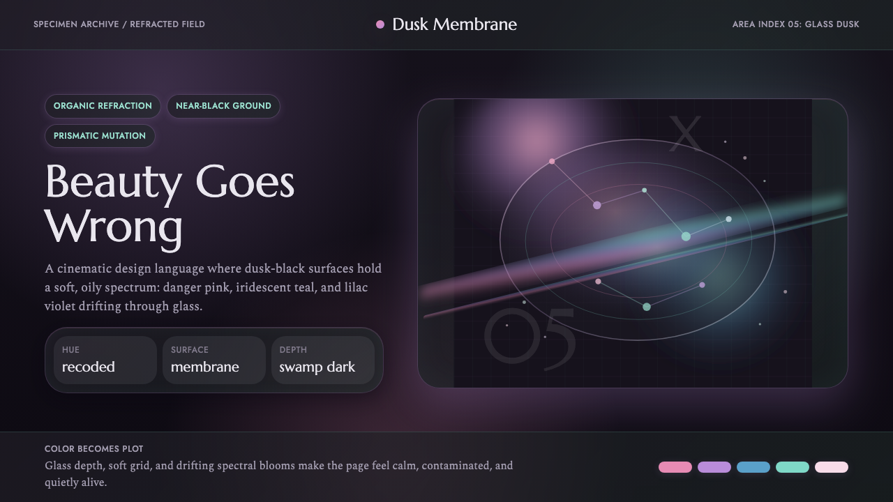 Annihilation (The Shimmer)Beautifully wrong. Dusk black carries pink, teal, and lilac refraction throug…
 Prey (2017)Luxurious horror in orbit. Gold Deco sunbursts glint out of near-black Typhon…