What is Annihilation (The Shimmer)?
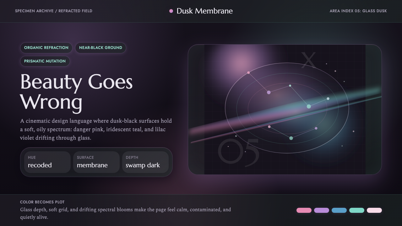
A soap-bubble dome swallowed a swamp and refracted everything inside it — this style renders that beautiful wrongness as an interface.
Annihilation (The Shimmer) in brief
Annihilation (The Shimmer) is a design system drawn from the 2018 film's central visual device — an iridescent, dome-shaped anomaly that envelops a dark Florida swamp at dusk and subtly refracts every color passing through it into something recognizable but off. The system captures that specific quality: not a rainbow explosion, but a quiet, oily prismatic shift layered over near-total darkness.
The palette sits on a dusk-black ground and introduces color only as refracted accent — recoded pinks, iridescent teals, and lilac-violets that bleed softly at the edges of shapes rather than filling solid fields. Where a conventional dark theme might use a single bright accent color for emphasis, this system treats color itself as unstable and diffractive, shifting subtly depending on where it sits relative to other elements, much like light passing through a soap film.
Typography stays disciplined and editorial even as the color language destabilizes — refined serif letterforms hold the composition steady, providing a calm, legible anchor against the shimmering, mutating field around them. The tension between typographic order and chromatic instability is the entire point: this is a world that looks orderly at first glance and reveals its wrongness only on closer inspection.

Where does Annihilation (The Shimmer) come from?
Annihilation, released in 2018, was written and directed by Alex Garland, adapting the first novel of Jeff VanderMeer's Southern Reach trilogy. The story follows a biologist entering Area X, a stretch of Florida coastline enclosed by a slowly expanding, iridescent field nicknamed the Shimmer, where DNA from different organisms recombines in unpredictable and often beautiful ways. The film's premise gave its visual design team a rare mandate: build an anomaly that reads as gorgeous rather than simply monstrous, because the horror of the story lies precisely in how appealing the mutation looks.
Cinematographer Rob Hardy BSC developed the Shimmer's look around the physics of thin-film interference — the same optical phenomenon that produces the rainbow sheen on a soap bubble or an oil slick on water, where light waves reflecting off two very close surfaces interfere with each other and split into shifting color bands. Rather than treating the anomaly as a simple color filter over the footage, the production built physical and digital effects around genuine diffraction behavior, so that the color shift would feel optically real rather than like an arbitrary stylistic tint.
VanderMeer's source novels emphasized Area X's uncanny beauty specifically because it undermines a reader's instinct to treat strangeness as automatically threatening — the swamp inside the Shimmer is often described as more vivid and alive than the world outside it, which is part of what makes the story's body horror so effective; the danger arrives dressed as loveliness. Garland's film translates that literary tension directly into the visual grammar: every frame inside the Shimmer looks like something a person might want to photograph, right up until it doesn't.
The film's visual effects team combined practical lighting, prism and glass elements on set, and digital compositing to achieve the layered, oily refraction effect across skin, foliage, and water within the anomaly. The result became one of the most distinctive uses of iridescent color grading in 2010s science fiction cinema, influential enough that 'Shimmer-like' has since become informal shorthand in visual effects and design circles for a controlled, dusk-toned, prismatic color treatment applied over near-darkness.
What defines the Annihilation (The Shimmer) look?
Dusk-Black Ground
The base of every composition is a near-black, dusk-toned dark — never a pure neutral black, but one carrying the faintest suggestion of the swamp's deep green-blue shadow. This ground is what makes the refracted color accents legible; without near-total darkness underneath, the prismatic shifts would read as garish rather than eerie.
Prismatic Refraction
Color enters the system as a diffractive shift rather than a solid accent — edges of shapes carry a soft rainbow-adjacent bleed, mimicking thin-film interference where light splits into shifting bands rather than remaining a single fixed hue. No two instances of the effect should look identical; the instability is the point.
Recoded Pink, Teal, Lilac
The core accent trio — a soft recoded pink, an iridescent teal, and a lilac-violet — replaces the more common single-accent approach of most dark themes. These three colors are meant to appear in shifting proximity to one another rather than in isolated blocks, echoing the way the Shimmer's refraction never settles on one stable hue.
Refined Editorial Serif
Typography stays classical and restrained — a refined serif carries headlines and body copy alike, providing a stable, legible anchor against the chromatically unstable field. This typographic calm is deliberate: it lets the color instability read as an environmental quality rather than a legibility problem.
Oily Diffraction Gradients
Where gradients appear, they behave like oil on water rather than a conventional smooth color ramp — bands of color that shift unevenly and interrupt each other, rather than a clean linear blend from one hue to another. This gives surfaces a faintly liquid, unstable quality even when the underlying shape is static.
Organic, Mutating Forms
Where shape appears beyond typography, it favors organic, slightly irregular contours over rigid geometry — echoing the film's central conceit of recombinant, mutating biology. Nothing should look perfectly symmetrical or mechanically repeated; a slight irregularity signals that the underlying material is alive and shifting.
Restrained Eeriness
Despite the mutating color language, the overall composition remains calm and quiet rather than chaotic or aggressive — the horror of the source material is subtle and atmospheric, not loud. Compositions should feel unsettlingly beautiful rather than overtly frightening; a screen using this style should invite a second look before the wrongness registers.

Who shaped Annihilation (The Shimmer)?
Garland wrote and directed Annihilation, translating VanderMeer's literary premise — that Area X's danger is inseparable from its beauty — directly into the film's visual grammar. His direction insisted the Shimmer read as gorgeous rather than simply monstrous, a mandate that shaped every subsequent design choice around color and light.
Hardy served as cinematographer and developed the Shimmer's signature look around genuine thin-film interference physics rather than a simple color filter, giving the anomaly's refraction an optically grounded, believable quality that became the film's most imitated visual signature.
VanderMeer authored the source novel Annihilation, the first book in the Southern Reach trilogy, establishing the literary premise that Area X's mutated ecosystem is uncannily beautiful rather than simply monstrous — the conceptual root from which the film's entire visual approach grew.
How do you use Annihilation (The Shimmer) today?
This style suits any product wanting to feel atmospheric, unsettling in a beautiful rather than aggressive way, and distinctly cinematic — it is not a general-purpose dark theme, and works best when the product genuinely wants a sense of quiet mystery rather than urgency.
For presentation slides, the dusk-black ground and prismatic accents work well on a cover slide that wants to feel like the opening frame of a film — a single organic shape carrying a soft rainbow-adjacent bleed at its edge, serif title type set calmly against the dark field. Content slides should use the refraction sparingly, on one focal element per slide, keeping most of the composition in the stable dark ground with restrained serif type so the eerie color accent retains its impact.
For web interfaces, this system suits atmospheric storytelling products, entertainment or streaming marketing pages, and any brand built around mystery, exploration, or the uncanny — nature documentaries, speculative fiction platforms, immersive audio experiences. Buttons and interactive states can use the recoded pink or teal as a soft glow rather than a solid fill, keeping the diffractive quality even in functional UI elements.
For editorial and marketing content, the style is well suited to film or book marketing, atmospheric brand storytelling, and any content built around transformation, mutation, or the blurred line between beauty and danger. Pull quotes and section breaks can use the lilac-violet accent sparingly to mark a shift in tone within a longer piece.
A common mistake is treating the prismatic palette as a bright, saturated rainbow gradient applied liberally across a page — the effect only works when it stays subtle and is grounded in near-total darkness. Another mistake is dropping the serif typography for something more casual or geometric; the tension between calm, classical type and unstable color is what keeps the style eerie rather than merely colorful.

Annihilation (The Shimmer) — FAQ
Is this the same as a generic 'holographic' or 'iridescent' UI trend?
No. Generic holographic trends typically use bright, saturated rainbow gradients across large fields on a light or neutral ground. This style is grounded in near-total darkness with the refraction appearing only as a subtle edge effect on specific elements, and it pairs that restraint with calm, classical serif typography — the combination produces an eerie, cinematic mood rather than a decorative sheen.
How much of the prismatic color should appear on a typical screen?
Sparingly — typically as an edge treatment on one or two focal elements, not as a background wash. The style depends on the contrast between vast dark, quiet space and small, unstable pockets of refracted color; overusing the effect flattens that contrast and turns the atmosphere generic.
Can this style work in a light-mode product?
Not authentically. The near-total darkness of the ground is what makes the refraction read as eerie rather than merely decorative; light modes would need an entirely different treatment and would lose the specific dusk-swamp mood the style is built around.
Does this style suit a playful or lighthearted brand?
Not well. The mood is deliberately eerie and atmospheric rather than fun — it is built around the specific tension of something beautiful that is also quietly wrong. Brands wanting bright, cheerful energy should look elsewhere; this style rewards products that want mystery, depth, or a sense of transformation.
Related design styles
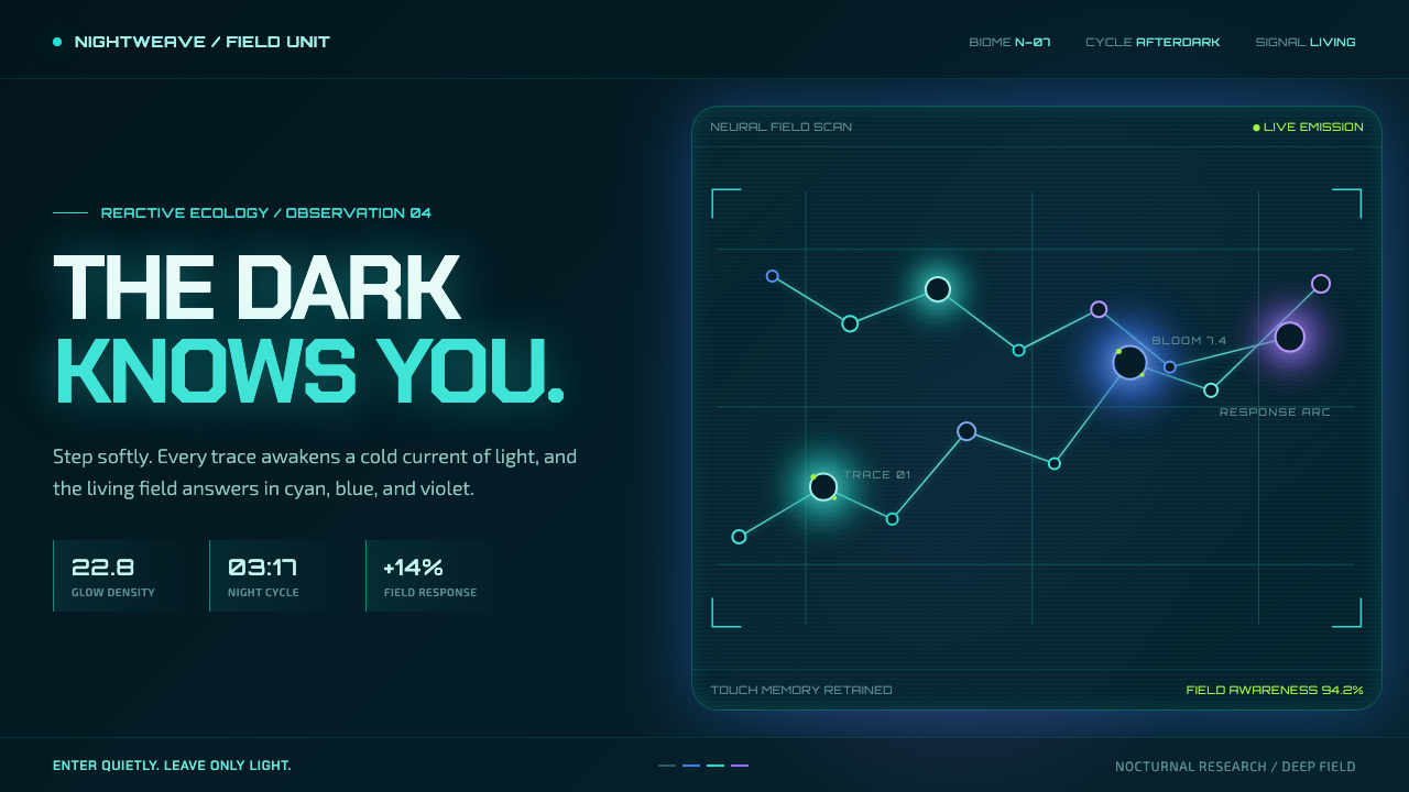 Avatar — Pandora Bioluminescence (2009)The forest knows you are there. Cyan light blooms across a deep-teal living f…
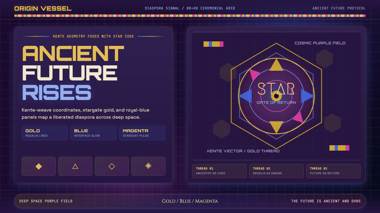 AfrofuturismAncient future, fully luminous. Gold kente grids cut through cosmic purple an…
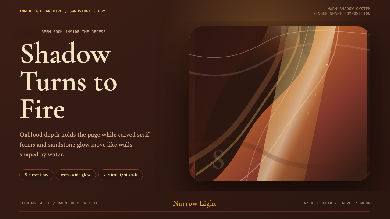 Antelope Slot CanyonGlows from shadow. Oxblood ground, sandstone S-curves, and one warm gold shaf…
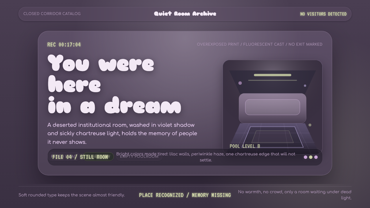 Dreamcore LiminalEmpty rooms feel remembered. Washed violet, Sniglet curves, and chartreuse tu…
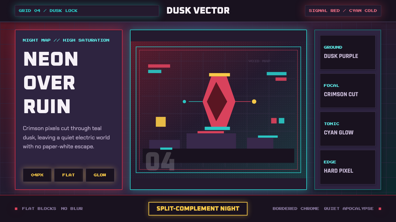 Hyper Light DrifterBeautiful ruin glows. Dusk purple holds crimson pixels and cyan grid light.
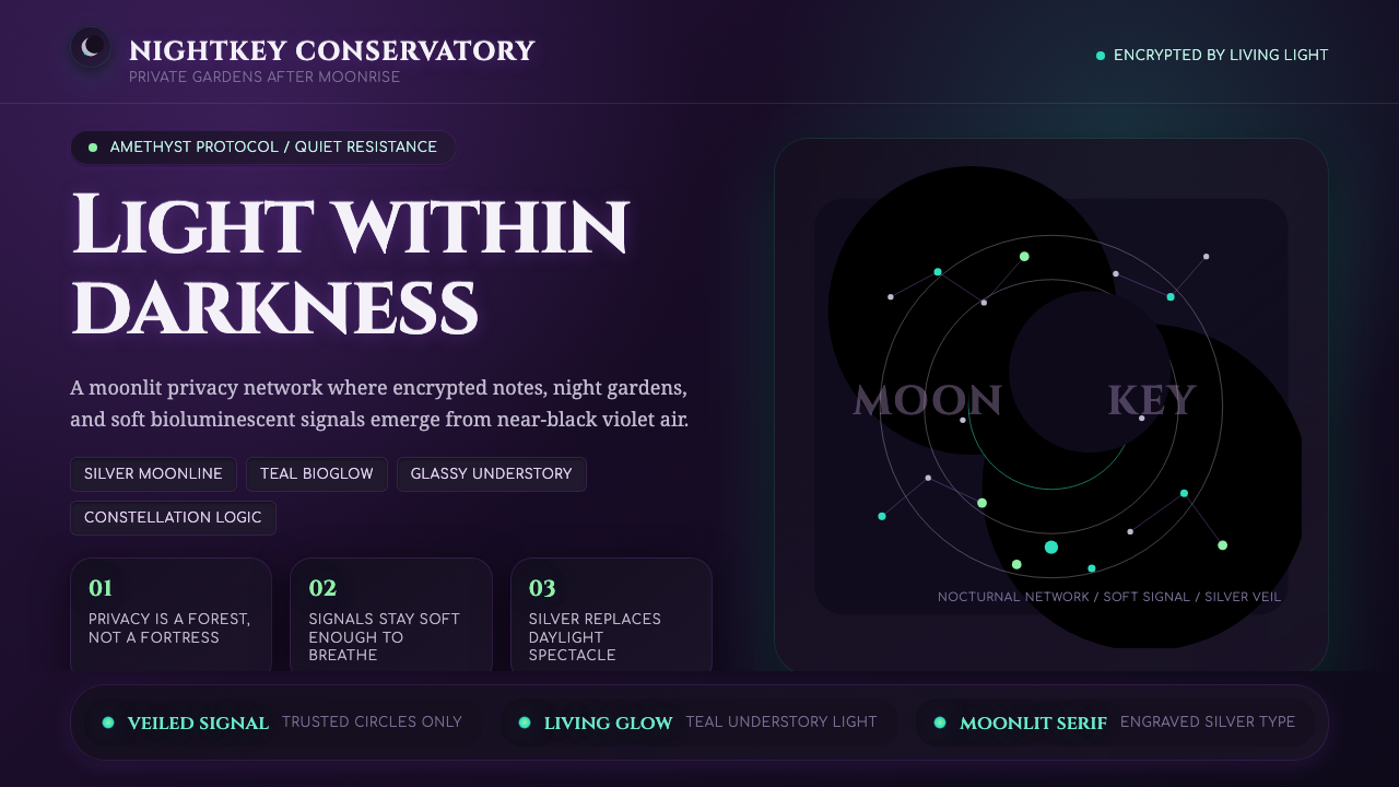 LunarpunkLight hides in darkness. Amethyst night, silver serif, and teal bioglow surfa…