What is Dreamcore Liminal?
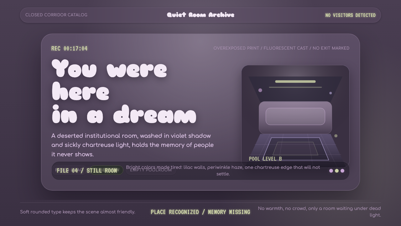
Dreamcore Liminal turns the empty institutional room into a half-remembered dream, where washed violet, rounded Sniglet curves, and chartreuse tube glow make familiarity feel quietly wrong.
Dreamcore Liminal in brief
Dreamcore Liminal is an early-2020s internet aesthetic built from empty institutional spaces: closed pools, fluorescent corridors, carpeted stairwells, and rooms that appear designed for crowds but have been stripped of every person. It renders these places as uncanny stage sets, neither ruined nor fully ordinary. The scene feels remembered before it feels observed, as though the viewer has arrived inside a dream that began elsewhere.
Its visual language comes from the over-exposed snapshot. Light lies flat and dead across the image, walls drift toward washed violet and pink, and bright colors appear faded rather than vivid. Lilac, rose, periwinkle, and chartreuse remain recognizable, but they seem bleached by sun or weakened by old digital memory. The dark washed-violet ground keeps the palette nocturnal even when the pictured space is brightly lit.
The emotional effect depends on contradiction. The rooms are clean enough to seem safe, yet empty enough to feel staged; the colors are bright enough to suggest play, yet drained enough to suggest illness or distance. Rounded lettering introduces softness without comfort. Dreamcore Liminal is not nostalgia for a particular decade or building. It is the sensation of recognizing a place never visited and sensing that something is quietly wrong.

Where does Dreamcore Liminal come from?
Dreamcore Liminal emerged from the early-2020s internet, when global online communities circulated images of places that felt suspended between use and abandonment. The aesthetic belongs to a networked culture rather than a single school or studio. Its references moved through Reddit, TikTok, and image-board culture, where anonymous creators, photographers, and artists could establish a shared atmosphere without a central authority.
One important source was the Backrooms mythos. The Backrooms gave cultural form to the idea that an ordinary interior could become terrifying when removed from its expected human context. A hallway, pool, or stairwell did not need visible danger; its wrongness came from repetition, vacancy, and the sense that the viewer had crossed into a space not meant to be inhabited in this way. Dreamcore Liminal adopts that spatial unease while making it more faded, colorful, and dreamlike.
A parallel source was the liminal-space photography wave. These images treated transitional or institutional environments as subjects in their own right: places designed for movement, recreation, education, or passage, photographed after their social purpose had disappeared from view. Over-exposure, flat fluorescent light, and washed color became expressive tools. The photograph no longer simply documented a room; it suggested a memory whose owner could not be identified.
Dreamcore, weirdcore, liminal spaces, and poolcore overlap within this broader online field. Their shared vocabulary is not a fixed historical canon but a recurring set of sensations: familiarity without biography, brightness without cheer, and architecture without occupants. Dreamcore Liminal gathers those sensations into a coherent visual system, using washed violet grounds, rounded type, and chartreuse glow to make institutional emptiness feel both artificial and strangely intimate.
What defines the Dreamcore Liminal look?
Faded Bright Color
The palette is built from colors that remain bright while appearing weakened by exposure: lilac, washed rose, periwinkle, and chartreuse. Their cool undertones prevent cheerfulness from taking over. Chartreuse is especially effective as a tube-like glow or warning accent, while violet and pink establish the bleached architectural atmosphere. Color should feel discovered in an old image, not freshly selected from a pristine paint box.
Dead Fluorescent Light
Light is flat, exposed, and emotionally indifferent. It does not model objects with gentle gradients or create a welcoming pool of warmth. Instead, it spreads evenly across corridors, tiled rooms, and stairwells, making every surface equally visible and equally vacant. The result resembles a snapshot taken under institutional lighting: clear enough to inspect, too lifeless to inhabit.
Rounded Display Type
Sniglet curves bring a soft, almost childlike shape language into an environment that offers no comfort. The lettering should feel inflated, friendly, and slightly out of place beside empty pools or endless corridors. This contrast is structural to the style: the type promises approachability while the setting withdraws it. Rounded forms work best when the words remain clear and the softness is never allowed to become cute.
Institutional Emptiness
Composition begins with architecture that was built for collective use but is shown without its collective body. Pools, hallways, stairwells, and similar interiors should retain signs of function while losing visible activity. Repetition, long sightlines, tiled surfaces, and carpeted transitions create a sense of continuation without destination. The emptiness is not a lack of content; it is the main subject.
Washed Violet Ground
A dark washed-violet ground gives the style its nocturnal depth without turning it into a conventional horror palette. Against it, faded pinks and chartreuse light appear suspended, like weak signals preserved inside a dream. The ground should feel bleached and atmospheric rather than richly luxurious. It holds the composition together while keeping the viewer slightly outside the depicted room.
Unresolved Familiarity
The strongest compositions balance recognition with uncertainty. A viewer should know what a pool, corridor, or stairwell is, yet be unable to place the specific room or explain why it feels remembered. Familiar objects are therefore kept ordinary and under-described. The unease comes from context, vacancy, and atmosphere rather than from monsters, explicit decay, or theatrical threat.

Who shaped Dreamcore Liminal?
Anonymous Backrooms creators supplied the central spatial idea: an ordinary interior becomes uncanny when its human context is removed. Their contribution is less a signature style than a shared premise, allowing hallways, rooms, and service spaces to function as psychological environments rather than neutral backgrounds.
Liminal-space photographers turned transitional and institutional places into subjects worthy of attention. By presenting empty architecture under flat or over-exposed light, they made vacancy, repetition, and suspended use legible as visual qualities. Their images form the photographic foundation from which Dreamcore Liminal borrows its sense of accidental memory.
Dreamcore artists pushed liminal architecture toward a more colored and emotionally unstable register. Washed violet, faded pink, rounded lettering, and sickly yellow-green accents allow the empty room to feel dreamlike without becoming soft or safe. Their work gives the style its tension between visual sweetness and quiet alarm.
Reddit, TikTok, and image-board culture provided the circulation system through which these images, references, and moods became recognizable across regions. The communities are not a single author, but they shape the vocabulary by repeating, remixing, and identifying the same kinds of spaces as strangely familiar.
How do you use Dreamcore Liminal today?
For presentation covers, Dreamcore Liminal works best when the title appears to have been placed inside an abandoned institutional scene. A dark washed-violet field can hold a cropped pool edge, hallway, or stairwell, while chartreuse glow provides a single uneasy point of attention. The title should use rounded, friendly lettering whose softness conflicts with the vacant architecture. Leave enough darkness around the scene for the cover to feel suspended rather than crowded.
Content slides should preserve the sense of a remembered location instead of filling every area with decoration. Use architectural fragments, repeated corridors, tiled surfaces, or empty carpeted transitions as quiet visual anchors. Data slides can turn charts into fluorescent signs or pool markings, but the information must remain legible and calm. The visual tension should come from the setting and color treatment, not from distorting the data or burying it in effects.
For web interfaces, the style suits dashboards and pricing pages that want to feel atmospheric, experimental, or slightly uncanny. A dark washed-violet background can organize the page, with faded lilac and periwinkle separating panels and chartreuse reserved for active states, warnings, or a single important action. Rounded type can soften labels and controls, but navigation should remain clear. Empty space is useful here: it creates the feeling of an interface located inside a larger, unoccupied building.
Editorial and marketing work can use the style to frame essays, campaigns, and product stories about memory, digital culture, architecture, or altered states of attention. Full-width image blocks may alternate between fluorescent interiors and broad areas of washed violet. Captions should feel observational rather than dramatic, while a small amount of rounded type introduces the unsettling mismatch between friendliness and vacancy. Marketing messages benefit from restraint; the room should remain more memorable than the slogan.
The common mistake is treating Dreamcore Liminal as a collection of spooky images, neon colors, and random distortion. Too much darkness turns it into ordinary horror, while saturated color makes it playful and energetic. Too many decorative glitches destroy the quietness that gives the style its force. Keep the architecture recognizable, let the light stay flat, use chartreuse selectively, and protect the contradiction between faded brightness and emotional unease.

Dreamcore Liminal — FAQ
Is Dreamcore Liminal the same as Dreamcore or Weirdcore?
They occupy overlapping territory, but Dreamcore Liminal places unusual emphasis on institutional emptiness and recognizable architecture. It draws from Dreamcore, Weirdcore, liminal spaces, and poolcore, yet gathers their shared sensations into a specific visual atmosphere: over-exposed light, washed violet and pink surfaces, faded bright color, rounded type, and chartreuse glow. The room remains legible, but its emotional context becomes unstable.
Why do the colors look bright and faded at the same time?
That contradiction is central to the style. Lilac, rose, periwinkle, and chartreuse are visually present, but their cool undertones and washed treatment remove ordinary cheerfulness. They resemble colors seen through an over-exposed image or a weak digital memory. The palette should suggest that brightness has survived while intensity, warmth, and certainty have been drained away.
Can the style work with a light background?
It can, but a fully light treatment changes the emotional balance. Dreamcore Liminal depends strongly on the dark washed-violet ground to create distance and nocturnal depth. A lighter variation should therefore keep the fluorescent flatness, faded cool colors, and institutional emptiness intact. Without those elements, the result may become a cheerful pastel interface rather than an uncanny remembered place.
What kind of imagery belongs in Dreamcore Liminal?
The strongest imagery shows spaces built for people without showing the people themselves: closed pools, fluorescent hallways, carpeted stairwells, and similar institutional interiors. The image should feel over-exposed, flat, and slightly bleached. Avoid relying on explicit threats or theatrical decay. The unease should come from the ordinary architecture, its vacancy, and the sense that the camera arrived after something important had already happened.
Where does this style struggle?
It struggles when a product needs warmth, reassurance, or a strong sense of active human presence. The palette and empty architecture naturally create distance, ambiguity, and quiet alarm. That makes the style effective for experimental culture, digital-memory projects, atmospheric editorial work, and interfaces that want a distinctive mood, but less suitable when clarity must feel welcoming or when the central message depends on direct emotional comfort.
Related design styles
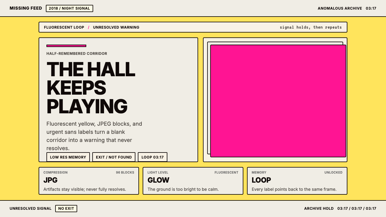 Weirdcore Internet (2018)Wrongness in fluorescent yellow. JPEG blocks and warning labels do the damage.
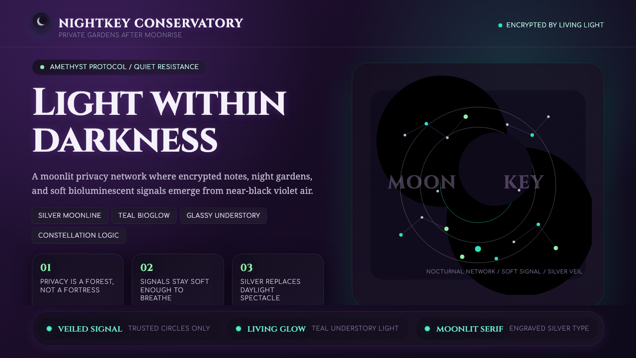 LunarpunkLight hides in darkness. Amethyst night, silver serif, and teal bioglow surfa…
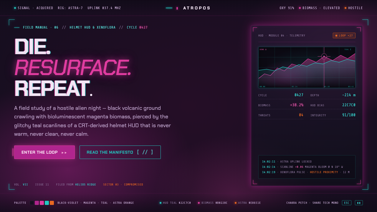 ReturnalNever warm, never clean, never calm. Magenta biomass on a violet night, pierc…
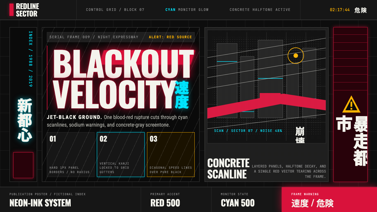 Akira (Otomo)Cyberpunk at impact. Kaneda red, cyan kanji, halftone concrete, and diagonal…
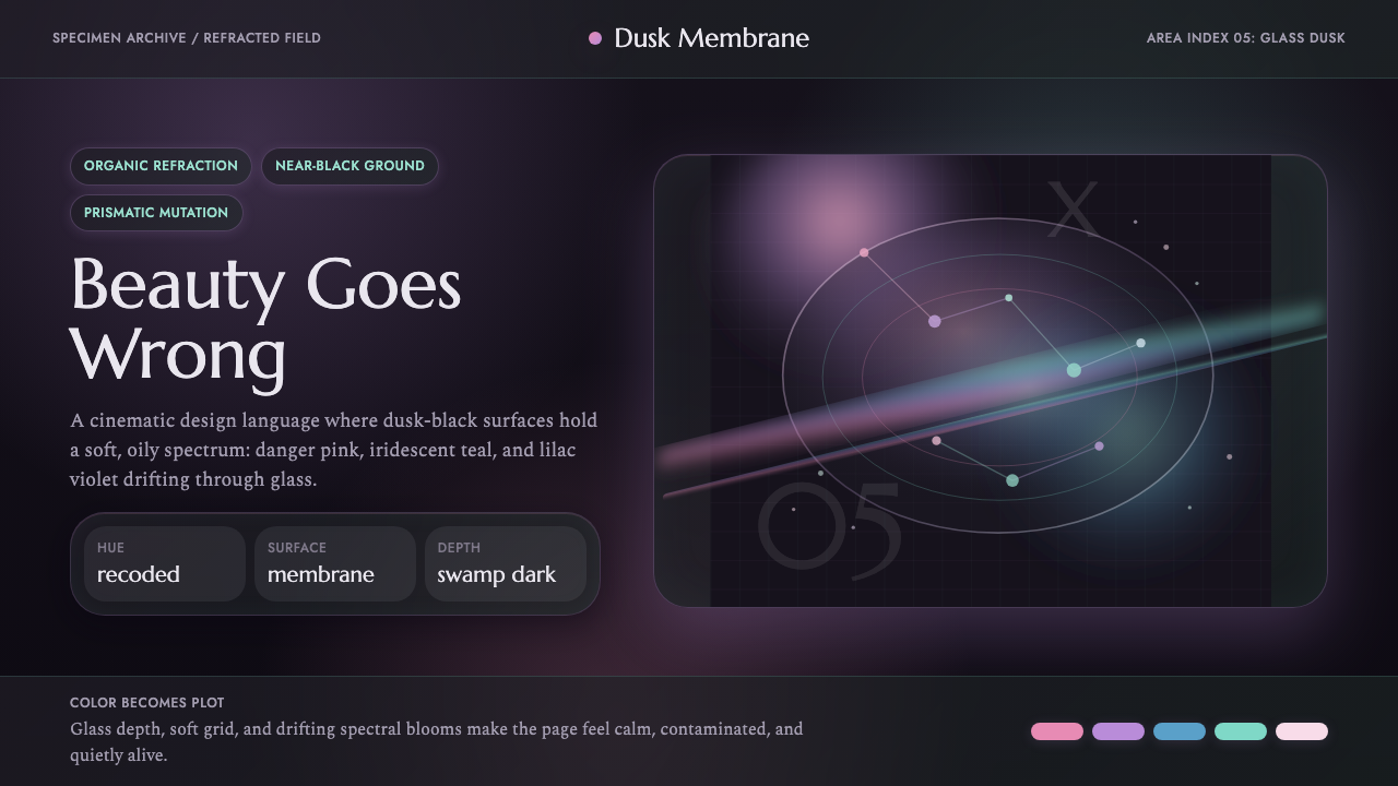 Annihilation (The Shimmer)Beautifully wrong. Dusk black carries pink, teal, and lilac refraction throug…
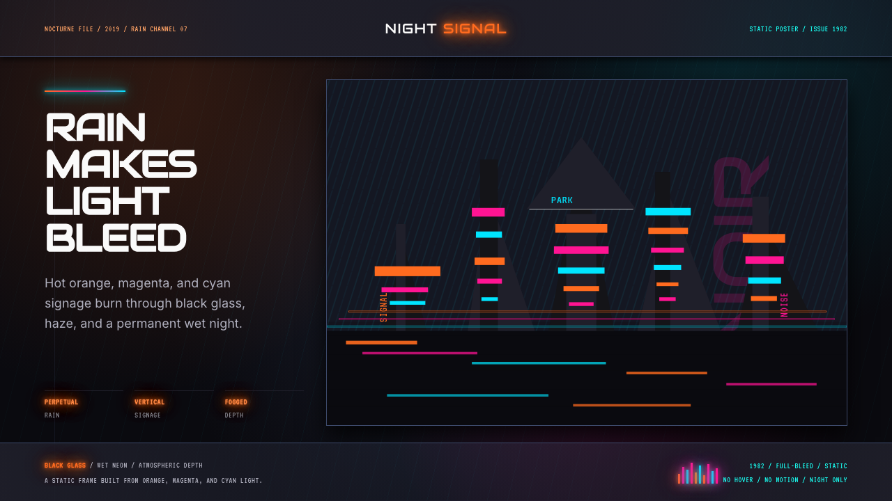 Blade Runner 1982 Neon NoirRain-soaked noir. Orange, magenta, and cyan neon cut black glass.