What is Weirdcore Internet (2018)?什么是 Weirdcore Internet (2018)?
Weirdcore is the internet's native anxiety aesthetic — fluorescent-lit mundanity made genuinely unsettling through JPEG decay, wrong-era typography, and the specific dread of a familiar place at 3 AM.Weirdcore是互联网原生的焦虑美学——荧光灯照亮的日常场景经由JPEG降质、错时代字体和凌晨三点熟悉之地特有的恐惧感,被改造成真实的不安。
Weirdcore Internet (2018) in briefWeirdcore Internet (2018) 速览
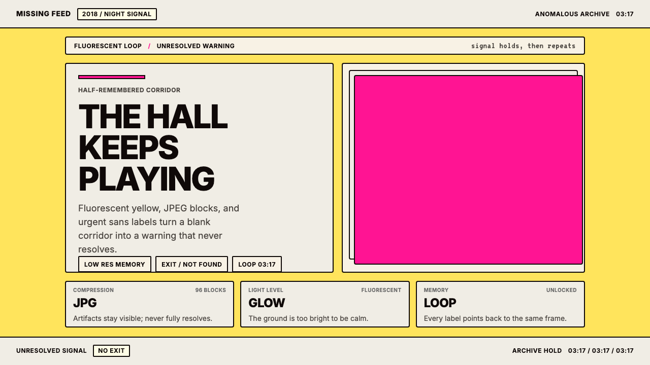
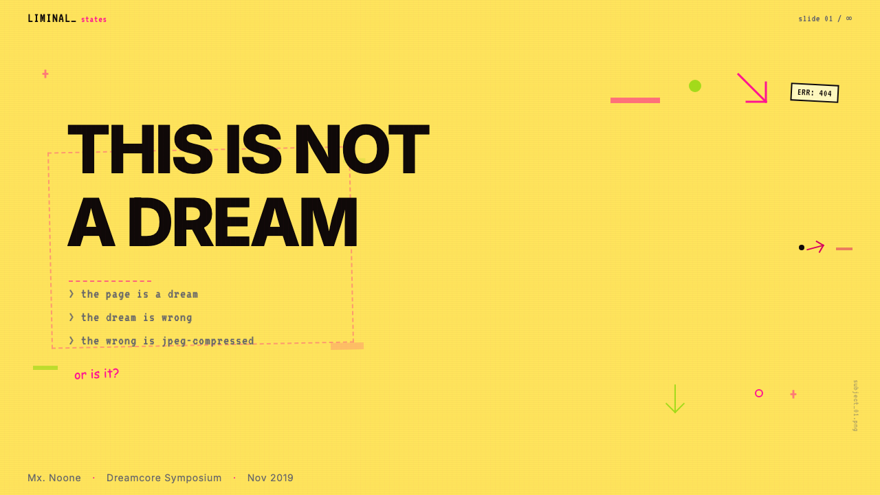
Weirdcore is an internet-native visual aesthetic defined by deliberate wrongness: colors that belong to institutional spaces rendered at sickly intensity, imagery degraded past the threshold of comfort, and typography that alternates between clinical urgency and childhood nostalgia. Where most design systems seek to resolve tension, Weirdcore engineers it — every choice is calibrated to produce a low-grade, persistent unease that viewers struggle to name or dismiss.Weirdcore是一套以刻意的「不对劲」为定义的互联网原生视觉美学:属于机构空间的色彩被渲染至病态强度,图像被降质至令人不适的临界点,排版在临床紧迫感与童年怀旧感之间交替。大多数设计体系试图消解张力,Weirdcore却在制造张力——每一个选择都被精确校准,以产生一种低强度、持续性的不安,令观看者无法准确命名,也无法轻易消解。
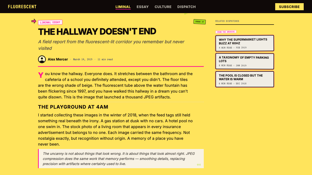
The aesthetic draws its power from the uncanny valley of the mundane. A school hallway, a fluorescent-lit bathroom, a playground photographed at dusk — these are spaces everyone has inhabited, yet Weirdcore renders them subtly wrong. The compression artifacts are a little too heavy, the colors a few degrees too saturated or too washed out, the text a little too urgent for its context. The result is not horror in any conventional sense but something closer to the feeling of a half-remembered dream that cannot be fully recalled.这套美学的力量来自日常事物的恐惑谷。学校走廊、荧光灯照亮的洗手间、黄昏时拍摄的游乐场——这些是每个人都曾置身其中的空间,然而Weirdcore将它们呈现得微妙地「不对」。压缩失真稍微太重,色彩稍微太饱和或太褪色,文字的紧迫感稍微太强,与其所处的语境格格不入。结果并非传统意义上的恐怖,而更接近于半记半忘、无法完全唤回的梦境感。
Visually, the system works through controlled violation of design norms. Fluorescent yellow-green grounds replace neutral backgrounds. JPEG block patterns are allowed to remain or are deliberately reintroduced. Comic Sans appears not as irony but as a genuine psychological instrument — its associations with childhood and institutional messaging colliding against unsettling subject matter. Electric pink or acid green accents punctuate compositions the way a migraine aura interrupts ordinary vision: brief, sharp, and impossible to ignore.在视觉上,这套体系通过对设计规范的可控违反来运作。荧光黄绿色底面取代了中性背景;JPEG块状图案被允许留存,甚至被刻意重新引入;Comic Sans不以反讽姿态出现,而是作为真实的心理工具被部署——它与童年和机构宣传相关联的记忆,与令人不安的主题内容发生碰撞。电光粉红或酸性绿色强调元素点缀构图,如同偏头痛先兆打断正常视觉:短暂、尖锐、无法忽视。
See the Weirdcore Internet (2018) design system查看 Weirdcore Internet (2018) 完整设计系统
Where does Weirdcore Internet (2018) come from?Weirdcore Internet (2018) 从何而来?
Weirdcore as a named aesthetic emerged on Tumblr around 2018, though its constituent elements had been accumulating in internet culture for years before anyone applied a label. The early Tumblr community responsible for codifying it were largely anonymous archivists and image collectors drawn to a specific category of photograph: empty institutional spaces, overexposed playgrounds, school corridors at unusual hours, domestic rooms lit entirely by screens. These images circulated in communities that would later spawn the liminal space photography movement, and the two aesthetics share DNA — but Weirdcore adds typographic and compositional aggression that liminal space imagery typically withholds.Weirdcore作为一种被命名的美学,大约在2018年在Tumblr上出现,但其构成元素早在任何标签被确立之前,已在互联网文化中积累多年。负责将其编码为体系的早期Tumblr社区,主要是匿名档案员和图像收藏者,他们被一类特定的照片所吸引:空旷的机构空间、过曝的游乐场、非寻常时间的学校走廊、完全被屏幕照亮的家居房间。这些图像在后来催生了「阈限空间摄影」运动的社区中广泛流传,两种美学共享基因——但Weirdcore增加了阈限空间图像通常刻意省略的排版和构图上的攻击性。
The aesthetic is inseparable from the technical conditions of early internet image culture. Images shared on forums and social platforms in the late 2000s and early 2010s were routinely compressed, resized, and re-uploaded until their original clarity was lost. JPEG artifacts — the blocky, ringing distortions that compression introduces — were not bugs to be corrected but textures that accumulated meaning. They signaled age, circulation, and a kind of democratic degradation: the image had traveled, been seen, been passed on. Weirdcore aestheticizes this degradation deliberately, treating it as a carrier of unease rather than a technical defect to be corrected.这套美学与互联网早期图像文化的技术条件密不可分。2000年代末至2010年代初,在论坛和社交平台上分享的图像经常被压缩、重新调整尺寸、反复上传,直至原始清晰度丧失。JPEG失真——压缩引入的块状、振铃式扭曲——并非需要被纠正的缺陷,而是积累着意义的质感。它们传递着年代感、流传轨迹,以及一种民主式的降质:这张图像旅行过,被看见过,被传递过。Weirdcore刻意将这种降质审美化,将其视为不安的载体,而非需要修正的技术瑕疵。
The broader cultural context was the rising awareness, roughly from 2015 onward, that internet platforms were not neutral spaces but psychologically engineered environments — optimized for engagement, surveillance, and behavioral modification. Weirdcore images and edits function as a kind of dark mirror to this realization: they take the visual vocabulary of institutional trust — warning labels, safety signage, educational materials, fluorescent office environments — and destabilize it. The familiar becomes alien. The reassuring becomes threatening. This inversion carries genuine critical content about how designed environments shape perception.更广泛的文化背景是:大约从2015年起,人们逐渐意识到互联网平台并非中立空间,而是经过心理工程设计的环境——为参与度、监控和行为修正而优化。Weirdcore图像和编辑作品就像这一认识的黑暗镜像:它们取用机构信任的视觉词汇——警告标签、安全标识、教育材料、荧光办公环境——并将其去稳定化。熟悉的变得陌生,令人安心的变得令人威胁。这种反转携带着关于被设计的环境如何塑造感知的真实批判性内容。
Cross-platform spread accelerated after 2020, when TikTok and Reddit exposed the aesthetic to audiences far beyond Tumblr. Kane Pixels, a creator whose Backrooms-adjacent found-footage series drew on similar visual grammar, introduced many viewers to the aesthetics of uncanny institutional space through narrative rather than still imagery. The r/weirdcore and r/liminalspace communities on Reddit grew substantially during this period, developing shared visual conventions and vocabulary. By 2022 and 2023, the aesthetic had begun influencing commercial design — appearing in album covers, fashion editorials, and experimental brand campaigns willing to trade comfort for memorability.2020年后,TikTok和Reddit将这套美学推广至远超Tumblr的受众群体,跨平台传播加速。创作者Kane Pixels以其近似《后室》世界观的伪纪录片系列,通过叙事而非静态图像将许多观众引入了诡异机构空间美学。Reddit上的r/weirdcore和r/liminalspace社区在这一时期显著成长,发展出共享的视觉惯例和词汇。到2022至2023年,这套美学开始影响商业设计——出现在唱片封面、时尚大片,以及愿意以舒适感换取记忆度的实验性品牌营销活动中。
What defines the Weirdcore Internet (2018) look?Weirdcore Internet (2018) 的视觉特征是什么?
Institutional Color Grounds机构色底面
The backgrounds in Weirdcore work are drawn from the color vocabulary of institutional environments: the specific yellow-green of fluorescent overexposure, the pallid cream of government office walls, the sickly mint of school gymnasium paint. These colors are not abstract choices — they carry embodied memory of particular spaces and specific psychological states associated with being managed, evaluated, or contained. The ground color does most of the affective work before any other element is introduced.Weirdcore作品中的背景色取自机构环境的色彩词汇:荧光过曝的特定黄绿色调、政府办公室墙壁的苍白奶油色、学校体育馆涂料的病态薄荷绿。这些颜色并非抽象选择——它们承载着对特定空间的身体记忆,以及与被管理、被评估或被关禁相关联的特定心理状态。底面色彩在任何其他元素引入之前,已完成了大部分情感性工作。
JPEG Degradation as TextureJPEG降质作为质感
Compression artifacts — the blocky mosaic patterns and color bleeding that JPEG encoding introduces — are not corrected in Weirdcore but preserved or amplified. An image that has been compressed and recompressed accumulates a particular visual noise that signals age and transmission history. Weirdcore uses this degradation as an expressive texture: the artifact-heavy image feels like a recovered memory rather than a captured moment, distant and unreliable in a way that digital clarity is not.JPEG编码引入的块状马赛克图案和色彩渗出——压缩失真——在Weirdcore中不被修正,而是被保留或放大。经过多次压缩的图像积累了一种特定的视觉噪声,传递着年代感和传输历史。Weirdcore将这种降质作为表现性质感使用:失真严重的图像感觉像是被唤回的记忆,而非被捕捉的瞬间——以一种数字清晰度所没有的方式显得遥远而不可靠。
Wrong-Register Typography错位字体排印
Typography in Weirdcore works through deliberate register mismatch. Comic Sans — culturally coded as childlike and non-serious — appears on urgent or disturbing content. Helvetica, the typeface of corporate and governmental authority, delivers messages that are half-formed, grammatically strange, or addressed to no clear reader. The choice of typeface carries social and institutional memory, and Weirdcore exploits the gap between a typeface's expected context and its actual deployment to generate cognitive dissonance.Weirdcore中的排版通过刻意的语域错位来运作。Comic Sans——被文化编码为幼稚和非正式的字体——出现在紧迫或令人不安的内容上。Helvetica——企业与政府权威的字体——传递的是半成形的、语法奇异的、或写给不明确读者的信息。字体选择承载着社会和机构记忆,Weirdcore利用字体预期语境与实际部署之间的落差,制造认知失调。
Liminal Imagery阈限图像
Source imagery favors spaces that exist between states: hallways leading nowhere apparent, waiting rooms without occupants, playgrounds photographed in the absence of children, swimming pools drained of water. These spaces are architecturally familiar but temporally wrong — they are designed for occupation and activity, but the images catch them vacant. This vacancy transforms the familiar into the uncanny: the designed-for-people space that has been vacated by people acquires a quality of expectation and latent threat.原始图像偏向存在于状态之间的空间:通向不明之处的走廊、无人使用的候诊室、没有孩子的游乐场照片、抽空了水的游泳池。这些空间在建筑上是熟悉的,但在时间上是错误的——它们是为占用和活动而设计的,而图像却捕捉到它们的空置状态。这种空置将熟悉的转变为恐惑的:为人而设计、却被人所离开的空间,获得了一种期待感和潜在威胁。
Acid and Neon Accents酸性与霓虹强调色
Against the sickly or washed-out grounds, Weirdcore deploys electric accents — hot pink, acid green, screaming orange — at full intensity. These colors do not harmonize with their surroundings; they conflict. The effect resembles a migraine aura: a sudden, sharp intrusion of extreme color against a subdued field. Used for text, borders, or overlaid shapes, these accents function as visual alarms — they demand attention in a way that cannot be filtered out, mimicking the involuntary response to danger signals in designed environments.在病态或褪色的底面上,Weirdcore以全强度部署电光强调色——亮粉红、酸性绿、刺眼橙。这些颜色与周围环境不和谐;它们产生冲突。效果类似于偏头痛先兆:在抑制的视觉场域中,极端色彩突然、尖锐地闯入。用于文字、边框或叠加形状时,这些强调色作为视觉警报发挥作用——它们以一种无法被过滤的方式要求注意力,模仿对被设计环境中危险信号的非自愿反应。
Text as Psychological Pressure文字作为心理压力
When text appears in Weirdcore compositions, it typically carries the form of instruction, warning, or address — but the content is either deliberately opaque, grammatically malformed, or addressed to a subject position that the viewer cannot cleanly occupy. Phrases like warning labels or institutional notices are deployed but made strange by context. The form of authority is retained while its semantic content is destabilized, producing an ambient sense of being spoken to in a language one almost but does not quite understand.当文字出现在Weirdcore构图中时,它通常带有指示、警告或称呼的形式——但内容要么刻意不透明,要么语法不规则,要么针对观看者无法清晰占据的主体位置。警告标签或机构公告的形式被保留,但其语义内容被去稳定化,产生一种模糊的感觉:被人用一种几乎但并不完全能理解的语言所言说。
Controlled Overload可控过载
Unlike maximalist aesthetics that overwhelm through sheer density, Weirdcore achieves its effect through precise calibration of wrongness. A single element displaced from its expected context — a familiar typeface on unfamiliar content, a familiar space at an unfamiliar hour — is enough to activate unease. The most effective Weirdcore compositions are not cluttered but targeted: one or two deliberate violations of visual expectation, surrounded by enough normalcy to make the violation land.与通过绝对密度来压倒一切的极大主义美学不同,Weirdcore通过精确校准「不对劲」来实现效果。将一个单一元素从其预期语境中移置——在陌生内容上使用熟悉字体,在陌生时间呈现熟悉空间——就足以激活不安感。最有效的Weirdcore构图并不杂乱,而是有的放矢:一两处对视觉期待的刻意违反,被足够多的正常性所包围,使违反能够真正落地。
See the Weirdcore Internet (2018) design system查看 Weirdcore Internet (2018) 完整设计系统
Who shaped Weirdcore Internet (2018)?谁塑造了 Weirdcore Internet (2018)?
The aesthetic was not launched by a single creator but by a loose collective of anonymous Tumblr users who began tagging and cross-posting images of empty institutional spaces, degraded photographs, and text-overlay edits under shared vocabulary. These archivists established the initial visual canon — what counted as weirdcore and what did not — through collective curation rather than individual authorship. Their anonymous, collaborative character is itself part of the aesthetic's identity: it emerged from the internet's distributed image culture rather than from any individual artistic vision.这套美学并非由单一创作者发起,而是由一群松散的匿名Tumblr用户共同形成的——他们开始在共享词汇下标记和交叉发布空旷机构空间的图像、降质照片和文字叠加编辑作品。这些档案员通过集体策展而非个人创作,建立了最初的视觉经典——确立了什么构成Weirdcore,什么不构成Weirdcore。他们匿名、协作的性质本身就是这套美学身份的一部分:它从互联网的分布式图像文化中涌现,而非来自任何个人的艺术愿景。
Kane Pixels is a video creator whose Backrooms found-footage series, begun in 2022, brought the visual grammar of uncanny institutional spaces to a mainstream audience through short-form narrative video. Working with fluorescent-lit corridors, carpet patterns associated with public spaces, and the specific quality of surveillance or VHS footage, Kane Pixels developed a cinematic language adjacent to Weirdcore and helped establish shared visual references that influenced static image creators working in the aesthetic. The series demonstrated that the aesthetic's power was not format-specific — it worked as well in motion as in still image.Kane Pixels是一位视频创作者,其于2022年开始的《后室》伪纪录片系列,通过短片叙事将诡异机构空间的视觉语法带给了主流受众。Kane Pixels以荧光灯走廊、与公共空间相关联的地毯图案,以及监控录像或VHS录像的特定质感为材料,发展出一套毗邻Weirdcore的电影语言,并帮助建立了影响从事这套美学的静态图像创作者的共享视觉参照。这个系列证明了这套美学的力量并不局限于特定媒介格式——它在运动影像中与在静态图像中同样有效。
The Reddit community r/weirdcore, growing substantially from 2020 onward, became the primary platform for Weirdcore's post-Tumblr development. Community contributors posted original edits, debated aesthetic criteria, and developed shared vocabulary distinguishing Weirdcore from adjacent aesthetics like dreamcore, traumacore, and liminal space photography. This community-driven definitional work gave the aesthetic unusual conceptual clarity for an internet-native style: contributors could articulate not just what Weirdcore looks like but what psychological and cultural work it is doing.Reddit社区r/weirdcore从2020年起显著成长,成为Weirdcore在后Tumblr时代发展的主要平台。社区成员发布原创编辑作品,辩论美学标准,并发展出共享词汇,将Weirdcore与相邻美学(如dreamcore、traumacore和阈限空间摄影)区分开来。这种社区驱动的定义性工作,为这套互联网原生风格赋予了不寻常的概念清晰度:成员们能够阐明的不只是Weirdcore看起来是什么样子,还有它在完成什么样的心理和文化工作。
The liminal space community developed partly in parallel and partly in dialogue with Weirdcore, focusing on the photography of transitional or empty spaces without Weirdcore's typographic and chromatic aggression. Liminal space imagery tends toward stillness and melancholy rather than dread; Weirdcore borrows the spatial vocabulary but injects visual urgency. The two communities influenced each other's development of shared criteria for what makes a space feel uncanny, and contributors to r/liminalspace frequently cross-posted or commented in Weirdcore contexts, making the boundary between the aesthetics porous and productive.阈限空间社区的发展部分与Weirdcore平行,部分与之对话,专注于过渡性或空置空间的摄影,但不带有Weirdcore的排版和色彩上的攻击性。阈限空间图像倾向于静止和忧郁,而非恐惧;Weirdcore借用了空间词汇,但注入了视觉紧迫感。两个社区相互影响,共同发展出关于什么使一个空间感到恐惑的标准,r/liminalspace的成员经常在Weirdcore语境中交叉发布或评论,使两种美学之间的边界变得多孔而富有生产力。
How do you use Weirdcore Internet (2018) today?今天怎么用 Weirdcore Internet (2018)?
Weirdcore is a high-commitment aesthetic that rewards specificity. Using it well means understanding what it is communicating — disorientation, institutional unease, the specific dread of familiar spaces made strange — and ensuring that the product or content actually benefits from evoking those states. It is not an aesthetic of ambient moodiness; it has sharp psychological edges that should be pointed deliberately. The first question before applying it to any project is whether generating unease serves the audience and purpose.Weirdcore是一种高投入度的美学,回报的是精准性。有效使用它意味着理解它在传达什么——迷失方向、机构式不安、熟悉空间被陌生化的特定恐惧——并确保产品或内容真正受益于唤起这些状态。它不是一种营造模糊情绪的美学;它有着锋利的心理边缘,应当被刻意指向目标。在将其应用于任何项目之前,首先要问的问题是:制造不安是否服务于受众和目的。
For presentation slides, Weirdcore is most effective in contexts where the subject matter itself carries tension: security briefings, cultural commentary decks, exhibition materials for work exploring anxiety, digital identity, or institutional critique. A cover slide benefits from a fluorescent ground color, a single degraded or artifact-heavy image placed off-center, and a title set in a deliberately wrong typeface — not stylized wrongness but actually wrong, the wrong register for the content. Content slides should avoid conventional data visualization templates; data becomes more unsettling when presented in formats that mimic institutional signage or warning documentation rather than polished charts.对于演示文稿,Weirdcore在主题本身带有张力的语境中最为有效:安全简报、文化评论内容、探索焦虑、数字身份或机构批判的展览材料。封面幻灯片适合使用荧光底面色、一张偏置且带有大量失真的图像,以及用刻意错误的字体排印的标题——不是风格化的错误,而是真实的错位,是与内容不匹配的语域。内容幻灯片应避免常规的数据可视化模板;当数据以模仿机构标识或警告文件的格式呈现,而非光鲜的图表时,它会变得更令人不安。
For web interfaces and digital products, Weirdcore is rare in commercial contexts for good reason — it is not a comfort-building aesthetic. Where it does appear commercially, it is typically in contexts where the brand wants to signal authenticity and edge rather than trustworthiness and efficiency. Landing pages for music releases, fashion editorials, and cultural institutions with experimental mandates can carry the aesthetic's fluorescent grounds, artifact-heavy imagery, and aggressive accent colors. Navigation should remain functional; the wrongness should be atmospheric rather than disruptive of basic usability. Avoid deploying the aesthetic on any interface where the user needs to complete a transaction or enter sensitive data — the aesthetic reads as untrustworthy in high-stakes UX contexts.对于网页界面和数字产品,Weirdcore在商业语境中出现甚少,这是有充分理由的——它不是一种建立舒适感的美学。在商业场合确实出现时,通常是品牌希望传递真实感和锋芒,而非可信度和效率。音乐发行落地页、时尚大片,以及具有实验任务的文化机构,能够承载这套美学的荧光底面、大量失真图像和攻击性强调色。导航应保持功能性;「不对劲」应是氛围性的,而非破坏基本可用性的。避免在任何用户需要完成交易或输入敏感数据的界面上部署这套美学——在高风险用户体验语境中,这套美学传递出不可信任的信号。
For editorial and marketing work, Weirdcore's strongest application is in contexts where memorability matters more than warmth — album artwork, poster campaigns for performances or exhibitions, zine covers, and editorial spreads for publications covering internet culture, mental health, gaming, or the aesthetics of digital life. The approach: establish the institutional ground color early and consistently, use imagery that is slightly temporally wrong (empty where occupied is expected, lit wrong for the time of day), and let the typographic choice do as much work as the image. A single Comic Sans headline above a JPEG-degraded photograph of an empty hallway does more than a complex composed layout.对于编辑和营销工作,Weirdcore最强的应用是在记忆度比温暖感更重要的语境中——唱片封面、演出或展览的海报活动、杂志封面,以及涵盖互联网文化、心理健康、游戏或数字生活美学的出版物编辑专题。方法:尽早且一致地确立机构底面色,使用时间上略微错误的图像(在预期有人占据的地方呈现空旷,在不符合时间的光线下拍摄),让字体选择与图像承担同等工作量。一个Comic Sans标题置于一张空走廊的JPEG降质照片之上,比复杂的合成版面更有力。
A common mistake when working with Weirdcore is mistaking visual complexity for effectiveness. Because the aesthetic uses multiple wrong elements — unusual color, degraded imagery, strange typography, aggressive accents — practitioners sometimes pile all of these together simultaneously, producing visual noise rather than unease. The most effective Weirdcore compositions are disciplined: one or two deliberate violations of expectation set against a visually coherent background. Similarly, attempting to apply Weirdcore to conventionally positive or reassuring content — wellness, consumer product launches, family-oriented services — produces confused messages rather than interesting tension. The aesthetic requires subject matter that can sustain the psychological weight it applies.使用Weirdcore时最常见的错误是将视觉复杂性误认为有效性。因为这套美学使用多种错误元素——非常规色彩、降质图像、怪异排版、攻击性强调色——实践者有时将所有这些同时叠加,产生视觉噪音而非不安感。最有效的Weirdcore构图是有纪律的:一两处对预期的刻意违反,置于视觉上连贯的背景之上。同样,试图将Weirdcore应用于常规上积极或令人安心的内容——健康、消费品发布、面向家庭的服务——会产生混乱的信息,而非有趣的张力。这套美学需要能够承受它所施加的心理重量的主题内容。
See the Weirdcore Internet (2018) design system查看 Weirdcore Internet (2018) 完整设计系统
Weirdcore Internet (2018) — FAQWeirdcore Internet (2018) · 常见问题
What distinguishes Weirdcore from liminal space photography?Weirdcore与阈限空间摄影有什么区别?
Both aesthetics draw on images of empty, transitional, or institutionally coded spaces, but they diverge in register and intent. Liminal space photography tends to be melancholic and contemplative — the empty space is dreamlike, peaceful in its wrongness, an invitation to reflection. Weirdcore is more aggressive: it adds typographic intrusion, chromatic violence, and deliberate degradation that transforms the contemplative vacancy into something more actively threatening. Liminal space images ask you to pause; Weirdcore images make you want to leave.两种美学都依赖对空旷、过渡性或机构编码空间的图像,但它们在语域和意图上存在分歧。阈限空间摄影倾向于忧郁和沉思——空置的空间是梦幻般的,在其错误性中是平静的,是一种反思的邀请。Weirdcore更具攻击性:它增加了排版上的侵入、色彩上的暴力,以及刻意的降质,将沉思性的空旷转变为更主动地具有威胁性的东西。阈限空间图像邀请你停留;Weirdcore图像让你想要离开。
Can Weirdcore be used in a light, non-threatening way — as an ironic reference rather than a committed aesthetic?Weirdcore能以轻松、非威胁性的方式使用吗——作为反讽参考而非完整的美学承诺?
It can, but the results are usually weak. Weirdcore's effectiveness depends on commitment to its psychological logic — the wrongness has to feel sincere to land. When it is applied ironically or superficially — borrowing Comic Sans or JPEG artifacts as a knowing wink rather than as genuine instruments of unease — the result reads as nostalgia for early internet culture rather than as anything psychologically resonant. The aesthetic references are recognizable without the effect being achieved. If ironic nostalgia is the actual goal, a lighter approach to early internet visual culture will serve that goal more cleanly.可以,但结果通常是无力的。Weirdcore的有效性依赖于对其心理逻辑的承诺——「不对劲」必须感觉是真诚的,才能真正落地。当它被反讽性或表面性地应用时——借用Comic Sans或JPEG失真作为心照不宣的玩笑,而非作为真实的不安工具——结果被解读为对早期互联网文化的怀旧,而非任何具有心理共鸣的东西。美学参照是可识别的,但效果并未实现。如果反讽性怀旧才是真正的目标,对早期互联网视觉文化的更轻盈处理,能够更干净地服务于那个目标。
Why is Comic Sans so central to Weirdcore rather than just one option among many?为什么Comic Sans在Weirdcore中如此核心,而不只是众多选项之一?
Comic Sans carries a very specific cultural charge: it is the typeface of good intentions deployed badly — institutional communications where someone tried to seem approachable and failed. It was widely used in educational settings, small-business signage, and early websites during the 1990s and early 2000s, giving it strong associations with a particular era of institutional amateurism. In Weirdcore, this loaded history is the point: the typeface activates cultural memory of spaces and contexts — schools, clinics, community centers — that the imagery is already evoking. The combination produces a specific and recognizable psychological flavor that a neutral or conventional typeface would not achieve.Comic Sans承载着非常特定的文化荷载:它是好意被拙劣部署的字体——机构传播中某人试图显得平易近人却失败了。它在1990年代至2000年代初期被广泛用于教育场所、小商业标识和早期网站,使其与特定时代的机构业余主义产生强烈关联。在Weirdcore中,这段被负载的历史正是关键所在:这种字体激活了对空间和语境的文化记忆——学校、诊所、社区中心——而图像已经在唤起这些。两者的结合产生了一种特定且可识别的心理味道,这是中性或常规字体所无法实现的。
How should color be balanced in Weirdcore — are all these intense colors meant to be used together?Weirdcore中的色彩应如何平衡——所有这些强烈的色彩都应同时使用吗?
No — and this is a common point of confusion. The palette has range, but its strength comes from contrast between the ground and the accent, not from using all available colors simultaneously. The institutional ground color — fluorescent yellow-green, pallid cream, washed-out mint — should dominate, typically covering the majority of the composition. The acid or neon accent appears at high intensity but in small, targeted areas: a border, a word, a shape. Deploying multiple neon accents simultaneously collapses the contrast that makes each one alarming. One ground, one accent, and perhaps a secondary neutral for typography is enough to achieve the aesthetic's full psychological effect.不是——这是一个常见的混淆点。调色板有其宽度,但其力量来自底面与强调色之间的对比,而非同时使用所有可用色彩。机构底面色——荧光黄绿、苍白奶油、褪色薄荷绿——应当占主导,通常覆盖构图的大部分面积。酸性或霓虹强调色以高强度出现,但只在小范围、有针对性的区域:一条边框、一个词、一个形状。同时部署多种霓虹强调色会瓦解使每一种都令人警觉的对比关系。一种底面色、一种强调色,也许再加上一种用于排版的次级中性色,就足以实现这套美学的全部心理效果。
Is Weirdcore appropriate for audiences outside internet-native culture — older users or non-digital contexts?Weirdcore适合互联网原生文化之外的受众吗——年长用户或非数字语境?
The aesthetic's references are most legible to audiences who grew up with early internet culture — the JPEG artifact has cultural meaning only for people who experienced it as a sign of image circulation and age. For audiences without that reference, the degraded imagery may read as simply low quality rather than as a deliberate choice, and Comic Sans may trigger its general association with poor taste rather than its specific institutional nostalgia. This does not make the aesthetic unusable across all contexts, but it means the communicative precision that Weirdcore achieves within its native audience is not guaranteed to transfer. In non-digital contexts — print, environmental installation, physical spaces — the institutional color and spatial vocabulary can carry the aesthetic's uncanny quality independently of digital-specific references.这套美学的参照对于成长于早期互联网文化的受众最为可读——JPEG失真只对那些曾将其经历为图像流传和年代感标志的人才具有文化意义。对于没有这种参照的受众,降质图像可能被单纯解读为低质量,而非刻意选择;Comic Sans可能触发其关于品味低劣的一般联想,而非其特定的机构怀旧感。这并不意味着这套美学在所有语境中都不可用,但它意味着Weirdcore在其原生受众中实现的传达精准性,并不保证能够转移。在非数字语境中——印刷、环境装置、实体空间——机构色彩和空间词汇可以独立于特定于数字的参照,承载这套美学的恐惑品质。
Related design styles相关设计风格
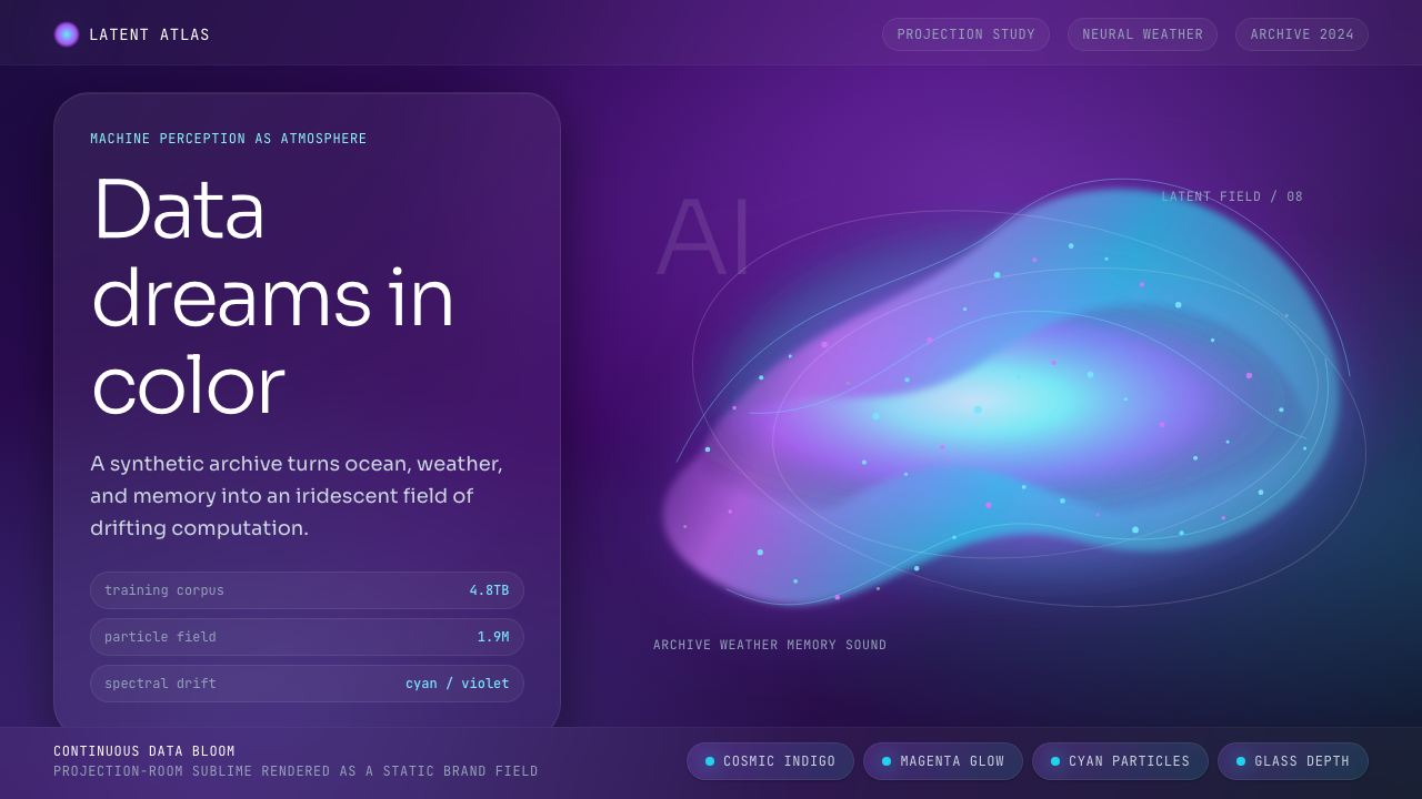 Generative AI Data Art (Refik Anadol era)Computational sublime. Indigo gradients and cyan-magenta particles make data…计算崇高。靛紫渐变与青品红粒子让数据有生命。
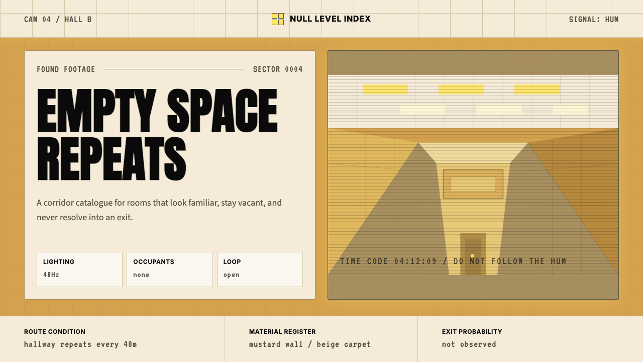 Liminal Space BackroomsUncanny vacancy. Mustard walls, fluorescent grids, and corporate sans trap th…诡异空置。芥末黄墙面、荧光灯格与冷淡无衬线困住视线。
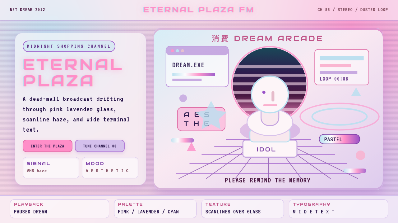 Vaporwave (Tumblr 2012)Dead-mall nostalgia glows. Pink-lavender glass, VHS scanlines, and wide retro…废墟商场的柔光怀旧:粉紫玻璃、VHS 扫描线与宽字距复古字体。
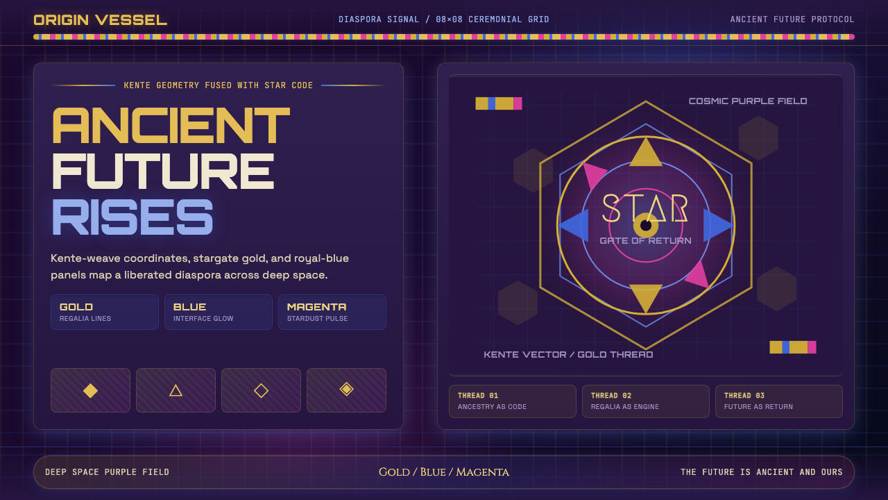 AfrofuturismAncient future, fully luminous. Gold kente grids cut through cosmic purple an…古老未来自带光芒:金色肯特网格切开宇宙紫与蓝色辉光。
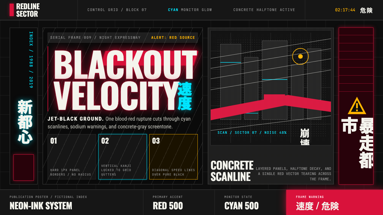 Akira (Otomo)Cyberpunk at impact. Kaneda red, cyan kanji, halftone concrete, and diagonal…冲击式赛博朋克:金田红、青色汉字、混凝土网点与斜向速度线。
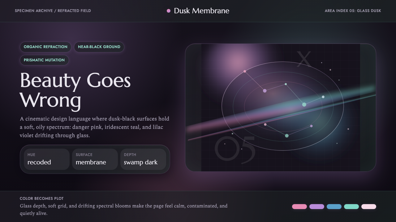 Annihilation (The Shimmer)Beautifully wrong. Dusk black carries pink, teal, and lilac refraction throug…美丽而失常:暮黑底上,粉、青与丁香紫在玻璃膜中折射。