What is Liminal Space Backrooms?什么是 Liminal Space Backrooms?
A single anonymous photograph of an empty fluorescent-lit hallway in 2019 spawned an entire internet mythology — and a design language built on wrongness, vacancy, and the uncanny weight of spaces that should not exist.2019年,一张匿名拍摄的空旷荧光走廊照片催生了一整套互联网神话,也孕育出一套建立在错位感、空置与诡异存在之重上的设计语言。
Liminal Space Backrooms in briefLiminal Space Backrooms 速览
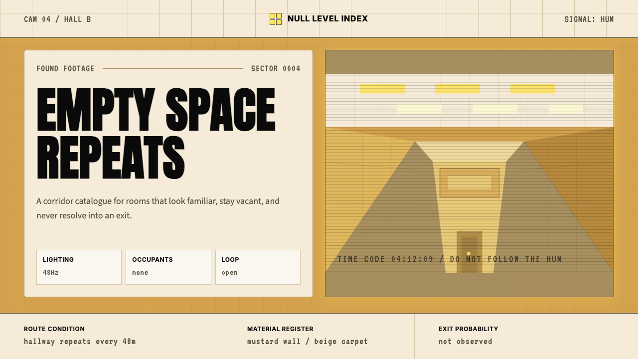
Liminal Space Backrooms is a design aesthetic rooted in the internet subculture of liminal spaces — transitional zones like empty parking garages, vacant hotel corridors, and shuttered malls photographed at hours when no human presence should be expected. Within that broader culture, the Backrooms became the defining mythology: an infinite series of interconnected fluorescent-lit rooms clad in saturated mustard-yellow wallpaper, covered in institutional carpet, humming with the low electric note of overhead tube lights, and entirely devoid of people. The discomfort is architectural. Nothing is broken, nothing is threatening in any legible way — and yet everything feels profoundly wrong.阈限空间后室(Liminal Space Backrooms)是一种植根于互联网阈限空间亚文化的设计美学——那些过渡性区域,如空旷的停车场、无人的酒店走廊、歇业的购物中心,在不该有人出现的时刻被拍摄下来。在这一更广泛的文化中,「后室」成为核心神话:无数相互连通的房间,铺满饱和芥末黄墙纸,覆盖着机构式地毯,头顶荧光灯管发出低沉的电气嗡鸣,完全没有人的踪迹。那种不安是建筑性的——没有任何东西破损,没有任何可辨认的威胁,然而一切都感觉深刻地不对劲。
As a design system, Liminal Space Backrooms translates that uncanny institutional vocabulary into a coherent visual language. The palette centers on warm mustard yellows and carpet beiges — colors associated with mid-century corporate interiors, with the specific shade of optimism that aged poorly. Against those grounds, fluorescent white light bleeds in soft grids, casting the slightly washed-out tonal quality of a space lit entirely from above. Text and structural elements favor cold institutional sans-serif letterforms, echoing the signage of offices, schools, and public-sector buildings. The overall effect is not horror in a cinematic sense — it is the more specific discomfort of a familiar place made subtly alien by the removal of all human life.作为一套设计系统,阈限空间后室将那种诡异的机构化语汇转化为连贯的视觉语言。色板以温暖的芥末黄和地毯米色为核心——这些颜色与中世纪企业内饰相关联,带着那种特定的、已然褪色的乐观气息。在这些底色上,荧光白光以柔和的网格状渗入,投下那种被完全来自上方的光源照亮的空间所特有的、略显褪白的色调品质。文字与结构性元素偏好冷淡的机构式无衬线字形,呼应办公室、学校与公共事业建筑的指示标牌。整体效果并非影院意义上的恐惧——而是更为特定的不适:一个熟悉的地方因为所有人类生命的缺席而变得隐约陌生。
What separates this aesthetic from simple nostalgia or retro pastiche is its relationship to wrongness as a deliberate design intention. A Backrooms-inflected composition does not merely evoke the 1970s or 1980s — it evokes a version of those decades that feels looped, recursive, stripped of narrative or exit. The eye looks for a door, a person, a reason, and finds none. Applied carefully, this produces design work with unusual psychological presence: layouts that command sustained attention precisely because something about them refuses to resolve.将这种美学与简单的怀旧或复古仿制品区别开来的,是它与「错误感」作为刻意设计意图之间的关系。一个带有后室色彩的构图不仅仅唤起1970或80年代——它唤起的是那些年代的某个版本,感觉像是在循环、递归,被剥夺了叙事或出口。眼睛寻找一扇门、一个人、一个理由,却什么都找不到。谨慎运用时,这能产生具有不寻常心理存在感的设计作品:那些版面因为其中某些东西拒绝化解而获得持续的注意力。
See the Liminal Space Backrooms design system查看 Liminal Space Backrooms 完整设计系统
Where does Liminal Space Backrooms come from?Liminal Space Backrooms 从何而来?
The Backrooms mythology began on May 12, 2019, when an anonymous user posted a single photograph to the paranormal board of 4chan (/x/). The image showed an empty interior — yellow-tinted walls, commercial carpet, fluorescent ceiling grid, no windows, no exits visible — with the caption describing the sensation of having "noclipped" out of reality, like a glitch in a video game that drops a player into geometry that was never meant to be seen. The post's resonance was immediate and disproportionate. Within days it had circulated far beyond 4chan, accumulating thousands of replies and spawning the first attempts at fan-written lore.后室神话始于2019年5月12日,一名匿名用户在4chan的超自然板块(/x/)发布了一张照片。图像显示一处空旷内部空间——泛黄的墙壁、商业地毯、荧光天花板格栅、没有窗户、没有可见的出口——配文描述了一种「穿越」(noclip)出现实的感觉,如同视频游戏中的故障将玩家落入从未被设计为可见的几何空间。这条帖子的反响是即时的、超出比例的。几天之内它便流传到远超4chan的范围,积累了数千条回复,并催生了第一批粉丝撰写的世界设定。
The cultural context that made the image land so precisely was the broader liminal space aesthetic already developing on Tumblr and Reddit through the late 2010s. Accounts dedicated to photographs of empty malls, closed swimming pools, and deserted hotel corridors had accumulated large followings by 2018, tapping into a collective unease about late capitalism, pandemic-adjacent emptiness, and the specific loneliness of public spaces designed for crowds but photographed without them. The Backrooms gave this diffuse aesthetic a mythology — a name, a narrative framework, and crucially, an internal logic. It was not just an empty place; it was an infinite system of empty places, governed by its own rules of access and escape.使这张图像如此精准地击中人心的文化背景,是2010年代末期已在Tumblr和Reddit上发展的更广泛阈限空间美学。专注于空旷购物中心、关闭的游泳池和无人酒店走廊的摄影账号,到2018年已积累了大量追随者,触及了一种集体性的不安——关于晚期资本主义、接近疫情的空洞感,以及那些为人群而设计却在无人时被拍摄的公共空间所特有的孤独。后室为这种弥散的美学提供了一套神话——一个名称、一个叙事框架,以及最关键的,一套内在逻辑。它不只是一个空旷的地方;它是一个无限的空旷地方系统,受制于自己的进入与逃离规则。
The mythology expanded rapidly through wiki documentation and fan fiction. The Backrooms Wikidot, later succeeded by the Backrooms Wiki on Fandom (significantly shaped by the contributor known as Hashland), codified the canonical levels — Level 0 being the original mustard-yellow office space, with subsequent levels introducing different institutional environments: swimming pools with humming pumps, endless parking structures, fluorescent-lit warehouses. Each level carried its own emotional texture, its own rules about entities and exits, its own relationship to dread. The wiki form itself became part of the aesthetic: dry, bureaucratic, written as if describing something mundanely real.这套神话通过维基文档和同人小说迅速扩张。后室Wikidot,后来由Fandom上的后室维基(由贡献者Hashland大量塑造)继承,编纂了规范性的层级:第0层是最初的芥末黄办公空间,后续层级引入不同的机构性环境:水泵嗡鸣的游泳池、无尽的停车结构、荧光照明的仓库。每个层级都有自己的情绪质感,自己关于实体与出口的规则,自己与恐惧的关系。维基的形式本身也成为美学的一部分:干燥、官僚式的,仿佛在描述某种平凡真实之物。
In 2022, Kane Parsons — known online as Kane Pixels — released a found-footage short film set in the Backrooms on YouTube. Produced with remarkable craft for a then-teenager, the film used practical effects and digital compositing to make the mythology feel three-dimensionally real. It accumulated tens of millions of views and established the Backrooms as a mainstream cultural reference, no longer contained to subcultural imageboards. Parsons subsequently developed the concept into an ongoing series. The visual vocabulary he established — handheld camera, underexposed fluorescent wash, the specific weight of institutional silence — became the definitive cinematic grammar of the aesthetic, and directly influenced how designers and digital artists began to apply the style deliberately rather than ironically.2022年,网名Kane Pixels的凯恩·帕森斯在YouTube上发布了一部以后室为背景的伪纪录片短片。以当时仅为青少年的他所拥有的水准而言,影片展现了卓越的制作工艺,综合运用实体特效与数字合成,使神话感觉具备了三维的真实性。影片积累了数千万次播放量,并将后室确立为一种主流文化参照,不再局限于亚文化图板。帕森斯随后将这个概念发展为持续系列。他所确立的视觉语汇——手持摄影机、曝光不足的荧光光洗、机构性寂静的特定重量——成为这种美学确定性的电影语法,并直接影响了设计师与数字艺术家如何开始刻意而非反讽地运用这种风格。
What defines the Liminal Space Backrooms look?Liminal Space Backrooms 的视觉特征是什么?
Color: Mustard, Beige, and Fluorescent Wash色彩:芥末黄、米色与荧光漂白
The defining palette is a narrow band of warm, slightly sickly yellows — the specific shade associated with 1970s interior design, institutional wallpaper, and the inside of public buildings that were last renovated before personal computers existed. Against these walls, floor tones are muted beiges and grays, the color of commercial carpet that has absorbed decades of use. Over everything, fluorescent lighting imposes a bleaching quality: whites are not crisp but slightly blown-out, shadows are shallow and directionless, and the overall tonal range is compressed toward the middle. There is no darkness in the Backrooms, which is its own form of wrongness.定义性色板是一段窄窄的温暖、略显病态的黄色——那种与1970年代室内设计、机构壁纸和在个人电脑出现之前最后一次翻修的公共建筑内部相关联的特定色调。衬着这些墙面,地面色调是静默的米色与灰色,是吸收了数十年使用痕迹的商业地毯的颜色。在一切之上,荧光灯强加了一种漂白品质:白色不清脆而是略微过曝,阴影浅薄而无方向,整体色调范围被压缩向中间值。后室里没有黑暗,而这本身就是一种错误感的形式。
Texture: Institutional Surfaces质感:机构性表面
Where most design aesthetics either embrace or reject texture, Backrooms aesthetics deploy a very specific subset: the textures of maintained-but-not-loved institutional spaces. Low-pile carpet with a repeating geometric pattern worn smooth in the high-traffic paths. Wallpaper with a subtle embossed grain, the kind that was chosen by committee for inoffensiveness. Acoustic ceiling tile with its regular grid of perforations. These textures are present but never prominent — they recede into the background as they do in real institutional spaces, creating environments that are technically detailed but experientially blank.当大多数设计美学明确拥抱或拒绝质感时,后室美学部署了一个非常特定的子集:那些被维护但未被珍爱的机构性空间的质感。低绒地毯带着被高流量路径磨平的重复几何图案;壁纸带着微妙的压花纹理,那种由委员会以不冒犯性为由选定的种类;吸音天花板砖带着规律的穿孔网格。这些质感存在但从不突出——它们如同在真实机构空间中一样退入背景,创造出技术上有细节但体验上空白的环境。
Light: Fluorescent Grid Logic光线:荧光网格逻辑
Lighting in the Backrooms aesthetic comes exclusively from above — a grid of fluorescent tubes or recessed panels that casts even, directionless illumination across every surface. There are no pools of warmth, no dramatic angles, no natural light intrusion. The light is comprehensive and evacuating: it removes shadow as a meaningful spatial element, flattening the environment into a sequence of equally-lit planes. In design applications, this translates to layouts where illumination effects, if used, are diffuse and overhead rather than directional, and where the overall tonal key sits in a compressed mid-register rather than spanning the full range from deep shadow to bright highlight.后室美学中的光线完全来自上方——荧光灯管或嵌入式面板的网格在每个表面上投下均匀、无方向的照明。没有温暖的光晕,没有戏剧性的角度,没有自然光的闯入。光线是全面而抽空性的:它将阴影作为有意义的空间元素去除,将环境压平为一系列等量照明的平面。在设计应用中,这转化为:若使用照明效果,应是漫射而来自上方而非有方向性的,整体色调基调处于压缩的中间值区域,而非跨越从深影到亮高光的完整范围。
Typography: Cold Institutional Sans字体排印:冷淡的机构式无衬线
The letterforms that feel native to this aesthetic are the utilitarian sans-serifs of public institutions — the kind of type that appeared on exit signs, office directories, and government forms throughout the second half of the twentieth century. These are not the humanist sans-serifs of contemporary tech design, with their warmth and optical compensation; they are constructed, neutral, designed to communicate without personality. Weight is typically regular to medium — not bold enough to command, not light enough to whisper. Set at a size that is functional without being generous, they create the typographic equivalent of a corridor: directed, purposeful, offering nothing beyond navigation.感觉原生于这种美学的字形,是公共机构的实用无衬线字体——那种出现在二十世纪下半叶出口标识、办公室指引和政府表格上的字体类型。这不是当代科技设计中带有温度与视觉补偿的人文主义无衬线字体;它们是构造性的、中性的,被设计为无个性地传达信息。字重通常是常规到中等——不够粗重到发号施令,又不够纤细到低语耳边。设置在功能性而非慷慨的尺寸上,它们创造了走廊的排版等价物:有方向、有目的,除导航之外什么都不提供。
Spatial Logic: Infinite Repetition空间逻辑:无限重复
The defining spatial quality of the Backrooms is the corridor or room that appears to extend infinitely — where the pattern of ceiling tiles, carpet, and wall panels repeats without variation into a distance that the eye cannot resolve. This is not emptiness in the minimalist sense; minimalism uses space expressively, with intention. Backrooms space is space that simply continues, without the relief of a focal point or an edge. In design, this translates to layouts that foreground repetition and rhythm: tiled patterns, repeated structural modules, grids that extend to all four edges of the composition without suggesting a boundary.后室最具定义性的空间品质,是那条看似无限延伸的走廊或房间——天花板砖、地毯与墙板的图案无变化地重复进入眼睛无法分辨的远处。这不是极简主义意义上的空旷;极简主义有意图地运用空间作为表达。后室的空间只是简单地延续,没有焦点或边缘带来的缓解。在设计中,这转化为强调重复与节奏的版面:平铺图案、重复的结构模块、延伸至构图四条边缘而不暗示边界的网格。
Wrongness as Aesthetic Signal错误感作为美学信号
Perhaps the most distinctive and difficult-to-articulate quality of this aesthetic is what might be called deliberate wrongness: the introduction of a subtle, unresolvable element of unease into an otherwise coherent composition. A proportion that is almost right but not quite. A color relationship that is nearly familiar but slightly off. A spatial relationship that implies a room that could not physically exist. This is not random error or carelessness — it is a precise calibration. Too much wrongness and the work becomes horror; too little and it becomes simple retro nostalgia. The target register is the threshold between recognition and disorientation.这种美学最具独特性也最难言说的品质,或许可以被称为「刻意的错误感」:向一个否则连贯的构图中引入一种微妙的、无法化解的不安元素。一个几乎正确但并不完全的比例。一种几乎熟悉但略微偏离的色彩关系。一种暗示着物理上不可能存在的房间的空间关系。这不是随机错误或粗心大意——它是精确的校准。错误感太多,作品变成恐怖;太少,又只是简单的复古怀旧。目标区域是认知与迷失方向之间的阈值。
Absence of Human Presence人类存在的缺席
The Backrooms are defined by what is missing more than by what is present. In photographic source material, this means images shot to emphasize the void — no people, no objects left by people, no evidence that the space is used or awaiting use. In design, this translates to a careful restraint around warmth signals: no rounded corners implying approachability, no organic shapes suggesting hand-made care, no warm tonal adjustments softening the institutional palette. The space is complete in itself, not awaiting anyone. This creates a paradox useful for certain design contexts: the work commands attention while withholding the warmth that normally invites engagement.后室更多地被缺少的东西而非存在的东西所定义。在摄影素材中,这意味着拍摄以强调虚空的图像——没有人,没有人留下的物品,没有这个空间被使用或等待使用的证据。在设计中,这转化为对温暖信号的谨慎克制:没有暗示亲近性的圆角,没有暗示手工关怀的有机形态,没有柔化机构性色板的温暖色调调整。空间本身是完整的,不等待任何人。这为某些设计语境创造了一个有用的悖论:作品命令注意力,同时拒绝通常邀请参与的温度。
See the Liminal Space Backrooms design system查看 Liminal Space Backrooms 完整设计系统
Who shaped Liminal Space Backrooms?谁塑造了 Liminal Space Backrooms?
The origin point of the Backrooms mythology is a single anonymous post — its author never identified — on the paranormal board of 4chan in May 2019. The post paired an image of an empty yellow-walled interior with a brief description of the noclipping sensation, and in doing so crystallized an aesthetic that had been diffusely developing across the internet into a specific, named mythology. The anonymity is integral to the cultural meaning: the Backrooms emerged without an author, which fits its logic of a place that exists outside human intention.后室神话的原点是一条匿名帖子——作者从未被确认——发布于2019年5月4chan的超自然板块。这条帖子将一张空旷黄墙内部的图像与对「穿越」感觉的简短描述配对,由此将一种已在互联网上弥散发展的美学结晶为一套具体的、有命名的神话。匿名性是文化意义的组成部分:后室在没有作者的情况下诞生,这契合了它作为一个存在于人类意图之外的地方的逻辑。
Kane Parsons, working under the name Kane Pixels, released a found-footage short film set in the Backrooms in 2022 that became the definitive cinematic interpretation of the aesthetic. Created while he was still a teenager, the film demonstrated an unusually developed sense of atmospheric composition — pacing, sound design, the specific visual grammar of institutional space under fluorescent light — that moved the Backrooms from text-and-image subcultural content to a genuinely cinematic form. His subsequent series established the visual conventions that now define how the aesthetic is understood: the particular quality of light, the sound of ventilation systems, the specific horror of corridors that do not end.凯恩·帕森斯以Kane Pixels之名,于2022年发布了一部以后室为背景的伪纪录片短片,成为这种美学决定性的电影诠释。这部影片在他还是青少年时制作完成,展现了对大气构图异常成熟的感知——节奏、声音设计、荧光灯下机构性空间的特定视觉语法——将后室从文字与图像的亚文化内容转化为真正的电影形式。他后续的系列作品确立了视觉惯例,定义了这种美学今日被理解的方式:光线的特定品质、通风系统的声音、不会终结的走廊的特定恐惧。
The expansion of the Backrooms from a single image into a richly detailed cosmology required systematization, and that work was done primarily through wiki communities. The contributor known as Hashland played a significant role in codifying the canonical level structure of the Backrooms on the Fandom wiki — establishing the rules that govern what each level looks, feels, and behaves like, and creating the bureaucratic-documentary writing style that became as much a part of the aesthetic as the visual elements. This wiki-as-worldbuilding approach, written in the dry register of an institutional manual, is itself a formal choice that reinforces the aesthetic's core logic.将后室从单张图像扩展为丰富详尽的宇宙体系,需要系统化,而这项工作主要通过维基社区完成。以Hashland为名的贡献者在Fandom维基上发挥了重要作用,编纂了后室的规范性层级结构——确立了规定每个层级看起来、感觉起来和行为方式的规则,并创造了官僚-文献式的写作风格,这种风格与视觉元素一样,成为美学的组成部分。这种作为世界构建方式的维基写作,以机构手册的干燥语域写就,本身就是一种形式选择,强化了这种美学的核心逻辑。
Before the Backrooms had a name, a distributed community of photographers and image collectors had been developing the visual vocabulary of liminal space aesthetics across Tumblr, Reddit, and Twitter through the mid-to-late 2010s. Accounts dedicated to empty malls, deserted airports, and vacant hotel corridors accumulated substantial followings and established the compositional conventions — centered perspective, overhead fluorescence, the deliberate exclusion of people — that the Backrooms mythology then absorbed and systematized. This community represents the aesthetic's connection to documentary photography and to the broader cultural mood of late-2010s ambient unease.在后室有名字之前,一个分散的摄影师与图像收藏者社群,已在2010年代中后期的Tumblr、Reddit和Twitter上发展着阈限空间美学的视觉词汇。专注于空旷购物中心、废弃机场和无人酒店走廊的账号积累了大量追随者,并确立了构图惯例——居中透视、头顶荧光、刻意排除人物——后室神话随后吸收并系统化了这些惯例。这个社群代表了这种美学与纪录摄影,以及2010年代末期广泛文化情绪中弥漫不安之间的连接。
A significant vector for the Backrooms aesthetic has been independent game development, where the style's spatial logic maps naturally onto interactive environments. Games set in liminal-space-adjacent interiors — whether explicitly Backrooms-themed or drawing on the same vocabulary of institutional corridors and fluorescent dread — have extended the aesthetic into three-dimensional interactive space and introduced its conventions to audiences who encountered it first through gameplay rather than photography or film. These games have also pushed the aesthetic toward specific interaction design patterns: the loop, the exit that leads back to the beginning, the map that cannot be trusted.独立游戏开发是后室美学的重要传播向量,这种风格的空间逻辑天然地映射到交互式环境中。以阈限空间相邻内部为背景的游戏——无论是明确以后室为主题,还是汲取同样的机构走廊与荧光恐惧词汇——将美学延伸入三维交互空间,并将其惯例介绍给首先通过游戏而非摄影或电影接触到它的受众。这些游戏也将美学推向特定的交互设计模式:循环、通向起点的出口、不可信任的地图。
How do you use Liminal Space Backrooms today?今天怎么用 Liminal Space Backrooms?
Liminal Space Backrooms is an unusual design choice: psychologically potent, visually distinctive, and genuinely difficult to apply well. Its power comes from dissonance — from the mismatch between familiar institutional forms and the specific unease they generate when stripped of human presence. Used without understanding, it reads as random retro. Used with precision, it creates work that occupies the reader's attention in an unusually sustained way. The starting point for any application is a clear answer to the question: what should this material make the viewer feel, and is institutional uncanniness actually the right register for that purpose?阈限空间后室是一种不寻常的设计选择:心理上有力量,视觉上有辨识度,并且真正难以运用得好。它的力量来自不协调——来自熟悉的机构性形式与它们在剥离人类存在后所产生的特定不安之间的落差。不加理解地使用,它读起来像随机的复古风。精确地使用,它创造出以异常持久的方式占据读者注意力的作品。任何应用的起点,是对以下问题的清晰回答:这个素材应该让观者感受什么,机构性的诡异感是否真的是达到那个目的的正确基调?
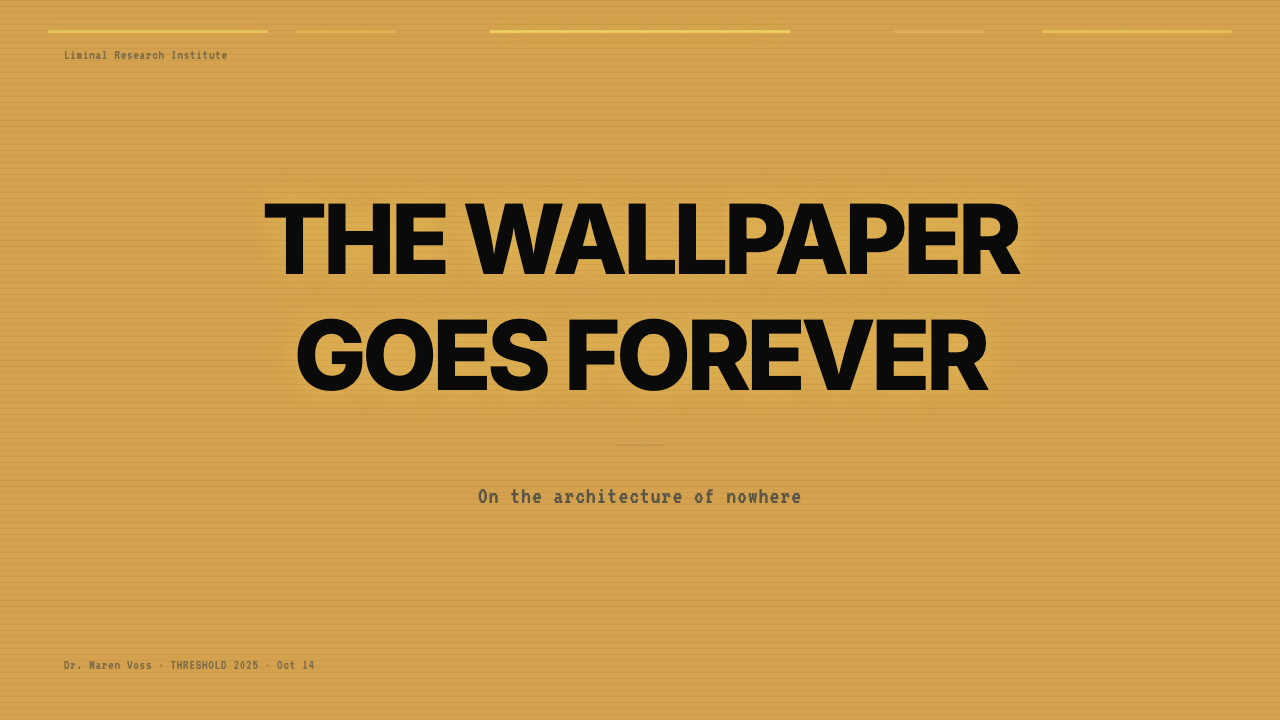
For presentation slides, the style works most effectively in contexts where authority needs to be communicated alongside an edge of strangeness — speculative design, future-facing strategy work, design fiction, or presentations about topics that involve genuine institutional weight (infrastructure, systems, architecture, urban environments). A cover slide in this aesthetic uses a centered or slightly off-center perspective view of a tiled corridor or empty room as the full bleed background, with a title set in a cold institutional sans-serif at medium weight, positioned neither at the compositional center nor the conventional top-left. Content slides work best when they lean into the grid: text aligned to a strict invisible structure, pulled quotes formatted as institutional signage, data displayed in tables that recall ledger paper rather than contemporary dashboard design.对于演示文稿,这种风格在需要同时传递权威感与一丝陌生感的语境中最为有效——推测性设计、面向未来的战略工作、设计虚构,或关于具有真实机构分量的主题(基础设施、系统、建筑、城市环境)的演示。这种美学的封面幻灯片,以铺满整张幻灯片的平铺走廊或空旷房间的居中或略偏中透视视图作为背景,标题用冷淡机构式无衬线字体以中等字重设置,放置位置既不在构图中心,也不在惯常的左上角。内容幻灯片在倾向于网格时效果最佳:文字严格对齐不可见的结构,引语格式化为机构标牌,数据显示在让人想起账簿纸而非当代仪表板设计的表格中。
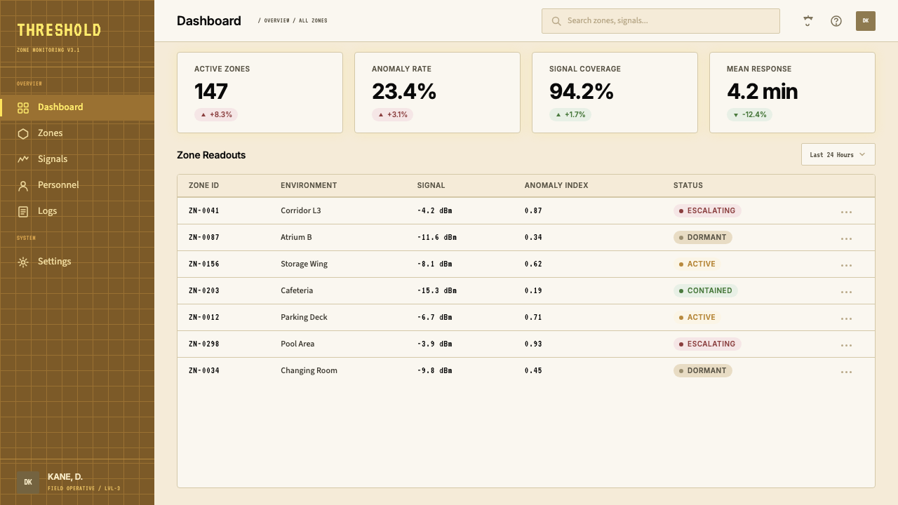
For web interfaces, the aesthetic is genuinely rare but has found traction in specific contexts: games and interactive fiction, speculative technology products, independent cultural institutions with a taste for the uncanny, and brands deliberately positioning themselves as inhabiting an alternative cultural space. Dashboard and informational layouts in this style use the fluorescent mid-yellow as a background rather than white, with text in a dark brown-black rather than pure black, creating a warmer-but-still-wrong tonal relationship. Navigation patterns should feel like wayfinding in an institutional building: functional labels, no decoration, corridors rather than rooms. Avoid any component that signals approachability — rounded cards, soft shadows, friendly iconography — unless the intent is specifically to create dissonance between the form and its institutional context.对于网页界面,这种美学真正罕见,但在特定语境中找到了立足点:游戏与互动小说、推测性科技产品、对诡异感有品味的独立文化机构,以及刻意将自身定位为占据另类文化空间的品牌。这种风格的仪表板与信息版面,以荧光中黄而非白色作为背景,用深棕黑而非纯黑色的文字,创造出更温暖但仍然「不对」的色调关系。导航模式应该感觉像在机构建筑中寻路:功能性标签,无装饰,走廊而非房间。避免任何表示亲近性的组件——圆角卡片、柔和阴影、友好图标——除非意图是专门在形式与其机构性语境之间创造不协调感。
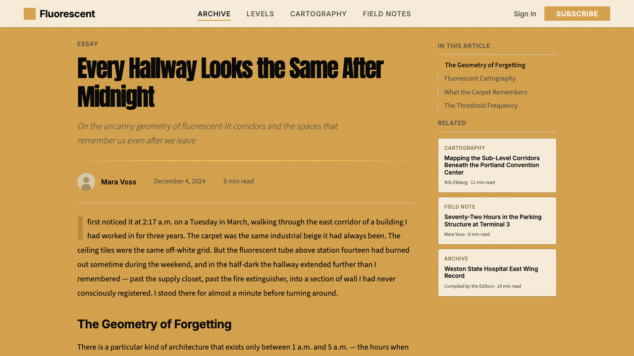
For editorial and marketing applications, the style reads most successfully when the content itself justifies the uncanniness — writing about infrastructure, vacancy, late capitalism, the experience of anonymous public space, or anything that genuinely involves the themes the aesthetic embodies. An editorial spread in this style might use the full-bleed tiled background as a section break, with body text set in a narrow column at a size that feels slightly too small for comfort, pull quotes formatted as institutional notices. Marketing applications are the most treacherous territory: if the product or service has nothing to do with the aesthetic's emotional register, the style reads as cynical or hollow. The exception is deliberately ironic use — a brand that adopts the aesthetic with clear self-awareness — but this requires a very particular audience and product context to land.对于编辑与营销应用,当内容本身证明了诡异感的合理性时,这种风格读起来最为成功——关于基础设施、空置、晚期资本主义、匿名公共空间体验,或任何真正涉及这种美学所体现主题的写作。这种风格的编辑版面可能将铺满版面的平铺背景用作章节分隔,正文在略感偏小的尺寸下设置在窄栏中,引语格式化为机构通知。营销应用是最危险的领域:如果产品或服务与这种美学的情感基调毫无关系,这种风格读起来就是虚伪或空洞的。例外是刻意的反讽使用——一个以清晰自我意识采用这种美学的品牌——但这需要非常特定的受众和产品语境才能奏效。
The most common mistake in applying Backrooms aesthetics is reaching for the wrong kind of wrongness. The style's uncanniness is not grimy, not decayed, and not explicitly horrifying — it is maintained, clean, orderly, and nevertheless wrong. Designers who add physical decay, mold-like textures, explicit horror motifs, or darkened shadows are applying a different aesthetic entirely: haunted house rather than liminal space. The Backrooms are lit, swept, and humming with electricity. The wrongness is the absence of people in a place designed entirely for people. A second common mistake is overuse of the mustard yellow as a background at full saturation across all surfaces — in the source material, walls are never the only element; the carpet, the ceiling, the light all modulate the palette. A monochrome mustard application loses the spatial logic that makes the aesthetic work.应用后室美学时最常见的错误,是抓错了「错误感」的类型。这种风格的诡异感不是肮脏的、不是衰败的、不是明确骇人的——它是被维护的、干净的、有秩序的,然而仍然不对。加入物理衰败、霉菌般的质感、明确的恐怖母题或加深的阴影的设计师,正在应用一种完全不同的美学:鬼屋而非阈限空间。后室是被照亮的、被清扫的、嗡鸣着电气的。错误感在于:一个完全为人而设计的地方里没有人。第二个常见错误是过度使用全饱和芥末黄作为所有表面的背景——在原始素材中,墙壁从来不是唯一的元素;地毯、天花板、光线都在调节色板。单色芥末黄的应用失去了使这种美学有效的空间逻辑。
See the Liminal Space Backrooms design system查看 Liminal Space Backrooms 完整设计系统
Liminal Space Backrooms — FAQLiminal Space Backrooms · 常见问题
Is Liminal Space Backrooms the same as vaporwave or retrowave?阈限空间后室与蒸汽波或复古波是同一种东西吗?
They share a preoccupation with the built environment of the late twentieth century but are emotionally and formally distinct. Vaporwave is nostalgic and ironic — it processes the aesthetics of 1980s consumer capitalism through a lens of melancholy affection, using saturated purples and teals, smooth gradients, and classical statuary as recurring motifs. Retrowave is energetic and aspirational, borrowing the neon palette and grid-horizon compositions of 1980s science fiction. Liminal Space Backrooms is neither nostalgic nor aspirational — it is uncanny. Its relationship to the past is not affection or excitement but disorientation: these are spaces that should be familiar but are not. The palette is warmer and more muted than either vaporwave or retrowave, and the absence of human life is the whole point rather than a compositional choice.它们都痴迷于二十世纪末的建成环境,但在情感和形式上截然不同。蒸汽波是怀旧而反讽的——它通过忧郁爱恋的透镜处理1980年代消费资本主义的美学,以饱和的紫色和蓝绿色、流畅的渐变、古典雕像作为反复出现的母题。复古波是充满能量而充满抱负的,借用了1980年代科幻小说的霓虹色板和网格地平线构图。阈限空间后室既不怀旧也不充满抱负——它是诡异的。它与过去的关系不是爱恋或兴奋,而是迷失方向:这些空间应该是熟悉的,但并不是。它的色板比蒸汽波或复古波都更温暖、更低饱和,而人类生命的缺席是整个重点,而非构图选择。
Can Backrooms aesthetics work for a brand that wants to appear welcoming?后室美学能用于一个希望显得热情好客的品牌吗?
It is the wrong tool for that job. The entire aesthetic logic of the Backrooms depends on the removal of warmth and human presence as a source of tension. A brand that deploys this style while also trying to communicate warmth, approachability, or community will find that the two registers actively cancel each other out — neither the uncanny quality nor the warmth will register clearly. The exception is deliberate contrast: a brand could use the cold institutional visual language of the Backrooms as a foil — a before-state, an environment the product exists to escape — but this requires the escape to be visually represented too. As a primary, continuous identity system for a welcoming brand, it should not be used.这是用错了工具。后室的整套美学逻辑依赖于将温暖与人类存在的去除作为张力来源。一个在部署这种风格的同时试图传达温暖、亲近性或社群感的品牌,会发现这两种基调会主动相互抵消——诡异品质和温暖感都无法清晰地传达。例外是刻意的对比:一个品牌可以将后室冷淡的机构视觉语言用作对照——一种前置状态,一种产品旨在逃脱的环境——但这要求「逃脱」也要被视觉呈现。作为一个热情好客品牌的首要持续身份系统,它不应被使用。
How does the Backrooms style handle photography and real imagery?后室风格如何处理摄影与真实图像?
Photography is central to the aesthetic's origins and most powerful when used according to its source logic: images of real institutional spaces shot to emphasize vacancy, flatness, and overhead fluorescent quality. The most effective Backrooms photography uses a centered perspective that implies infinite continuation, eliminates all human presence (including any trace of human objects), and captures the specific tonal compression of fluorescent-only lighting. In design applications, photography should be color-graded toward the mustard-and-beige palette rather than corrected for naturalness, and should be cropped to suggest that the space continues beyond the frame. Photographs of people, organic objects, or natural light should not appear — their presence immediately dissolves the effect.摄影是这种美学起源的核心,当按照其来源逻辑使用时最为有力:拍摄真实机构空间的图像,强调空置感、平面性和头顶荧光品质。最有效的后室摄影使用暗示无限延续的居中透视,消除所有人类存在(包括任何人类物品的痕迹),并捕捉仅靠荧光照明的特定色调压缩。在设计应用中,摄影应被调色朝向芥末黄与米色色板而非校正为自然感,并应被裁切以暗示空间在画框之外延续。人物、有机物体或自然光的照片不应出现——它们的存在会立即溶解这种效果。
What makes Backrooms different from ordinary retro-institutional design?后室与普通的复古机构设计有什么不同?
Ordinary retro-institutional design borrows the surface markers of mid-century institutional aesthetics — the colors, the typefaces, the material textures — and deploys them with affection or irony, typically to signal authenticity, craft, or a kind of principled anti-trend stance. It is warm in its relationship to the past. Backrooms aesthetics uses the same surface markers but deliberately strips them of the warmth of the human activities they originally housed. The result is not retro charm but retro wrongness: a space that looks like the 1970s but feels like a loop, a glitch, an institutional environment running without its institutional purpose. The key diagnostic is presence and absence: retro-institutional design suggests a world of people; Backrooms design suggests a world from which all the people have been quietly removed.普通的复古机构设计借用中世纪机构美学的表面标记——颜色、字体、材料质感——以爱恋或反讽的方式部署它们,通常是为了传达真实性、工艺感或一种有原则的反潮流立场。它与过去的关系是温暖的。后室美学使用同样的表面标记,但刻意剥离了它们最初所容纳的人类活动的温暖。结果不是复古魅力,而是复古错误感:一个看起来像1970年代但感觉像循环、像故障、像一个正在运行但没有其机构目的的机构环境的空间。关键的诊断性区别是存在与缺席:复古机构设计暗示一个有人的世界;后室设计暗示一个所有人都被悄悄移除的世界。
Does this aesthetic work in dark mode?这种美学在深色模式下有效吗?
Dark mode is formally incorrect for the Backrooms aesthetic in its canonical form. The defining horror of the Backrooms is that they are fully lit — fluorescent light eliminates shadow, removes darkness as a refuge, and makes the space feel exposed and inescapable rather than threatening through concealment. A dark-background variant loses precisely this quality and slides toward more conventional horror or gothic aesthetics. If a dark variant is necessary for product reasons, the more defensible approach is not to go to a near-black background but to shift to a dark desaturated brown or institutional gray — dark enough to imply a degraded or failing fluorescent environment, light enough to retain the sense of exposure rather than concealment. This preserves something of the source logic while accommodating the practical constraint.深色模式在形式上与规范形态的后室美学相悖。后室最具定义性的恐惧在于它们是完全照亮的——荧光灯消除了阴影,将黑暗作为庇护所去除,使空间感觉暴露而无法逃脱,而非通过遮蔽制造威胁。深色背景的变体恰恰失去这种品质,滑向更为惯常的恐怖或哥特美学。如果出于产品原因必须使用深色变体,更合理的方法不是采用接近黑色的背景,而是转向深度去饱和的棕色或机构灰色——深到足以暗示一个退化或失效的荧光环境,但又足够亮以保留暴露感而非遮蔽感。这在适应实际限制的同时保留了原始逻辑的某些内容。
Related design styles相关设计风格
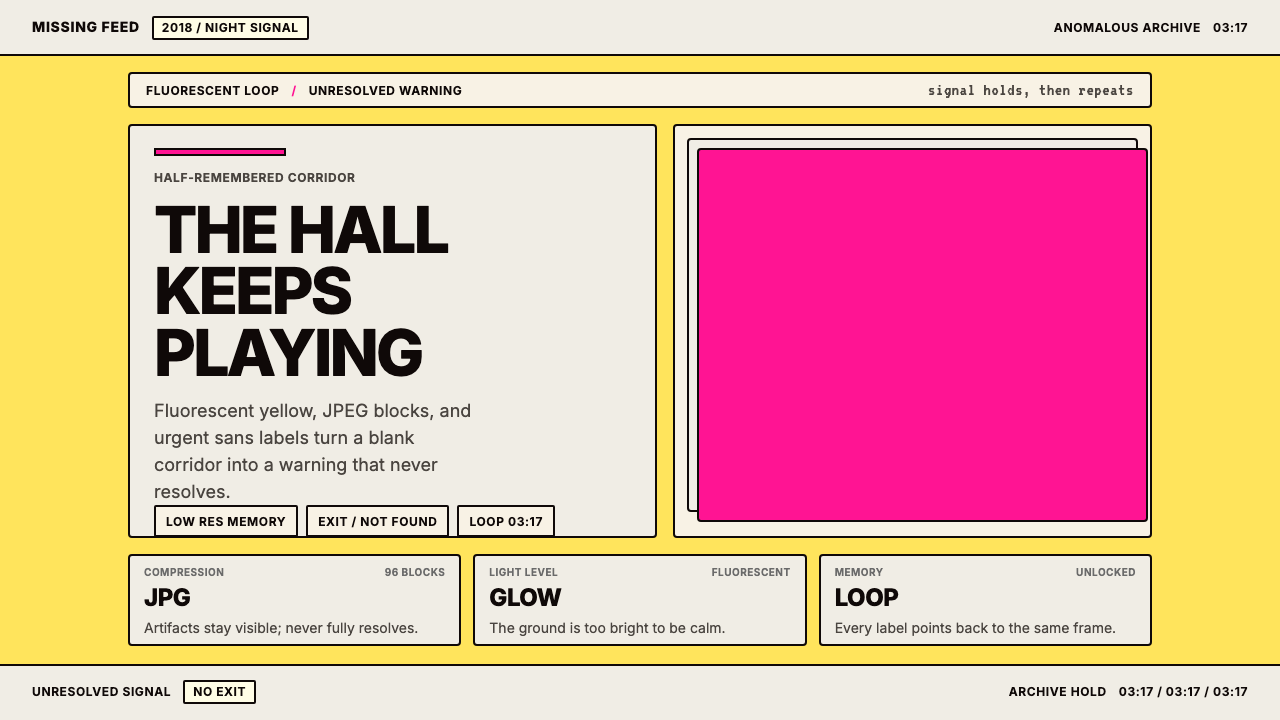 Weirdcore Internet (2018)Wrongness in fluorescent yellow. JPEG blocks and warning labels do the damage.荧光黄里的错位感。JPEG块和警告标签把不安钉住。
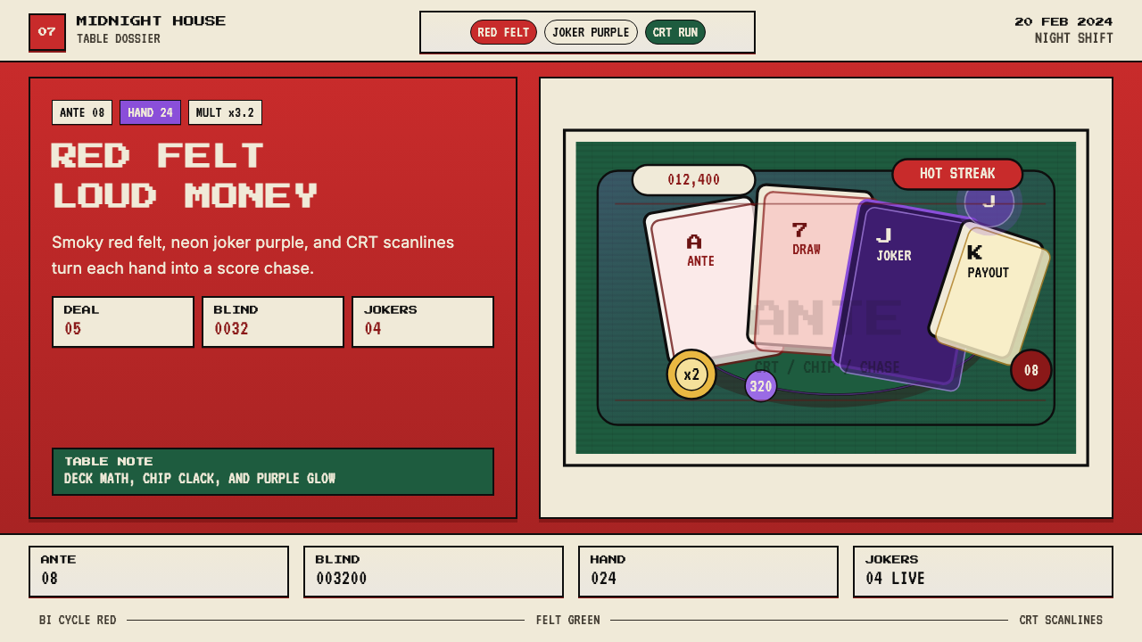 Balatro Poker RoguelikeLate-night poker math with a grin. Bicycle red, felt green, and CRT scanlines.深夜扑克数学感。自行车牌红、毛毡绿和CRT扫描线。
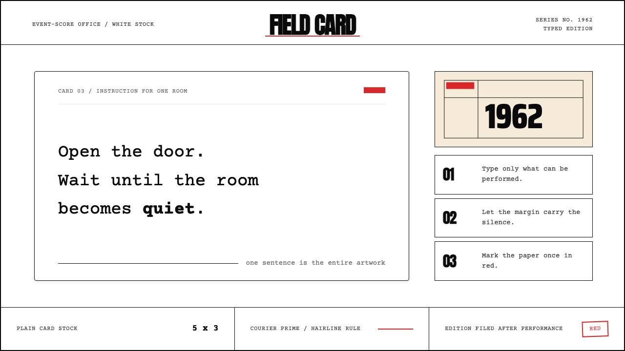 Fluxus Event Score (1962)Instruction becomes art. Courier on white card, hairline rules, one sharp red…指令即艺术:白卡上的Courier、细线框与一记红色标记。
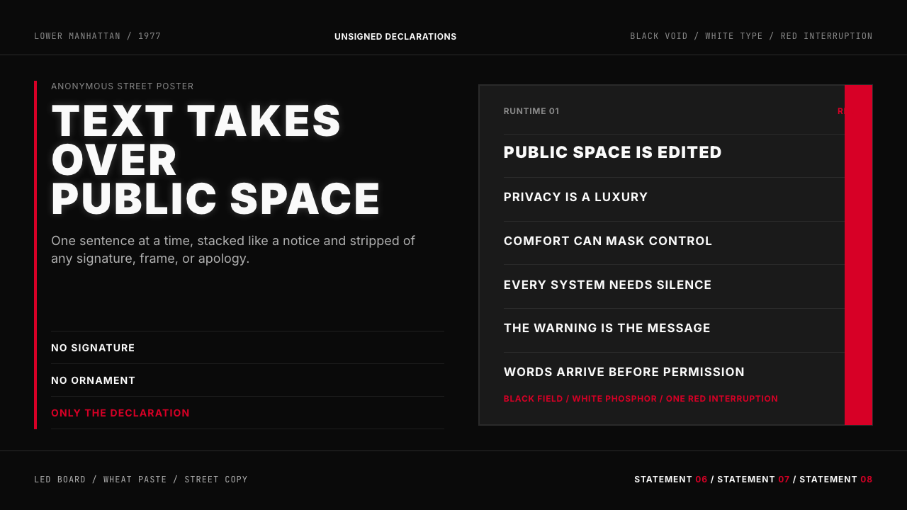 Jenny Holzer Truisms (1977)Austere declarations. White all-caps on black, cut by a single red warning.克制宣言。黑底白字,全大写排成LED板,红色只作警示。
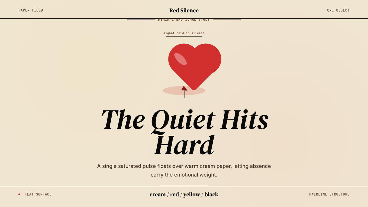 Kanye — 808s & HeartbreakGrief in restraint. Cream paper, one red heart, yellow heat, and a black hair…克制承载悲伤:奶油纸、红心、热黄与黑色细线。
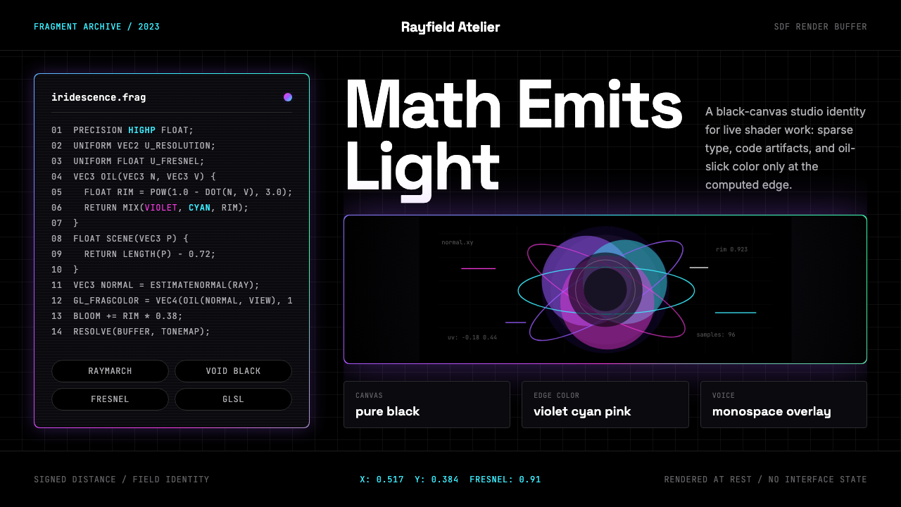 WebGL Shader Iridescent (2023)GPU math turns luminous. Black canvas, mono code, and violet-cyan-pink Fresne…GPU数学发光。黑底、等宽代码与紫青粉菲涅尔光晕。