What is Generative AI Data Art (Refik Anadol era)?什么是 Generative AI Data Art (Refik Anadol era)?
Generative AI Data Art transforms raw datasets into living cosmic spectacles — fluid particle oceans and iridescent gradient clouds that make computation feel like nature itself breathing.生成式 AI 数据艺术将原始数据集化为流动的宇宙奇观——粒子海洋与虹彩渐变云雾让计算本身呼吸如自然。
Generative AI Data Art (Refik Anadol era) in briefGenerative AI Data Art (Refik Anadol era) 速览
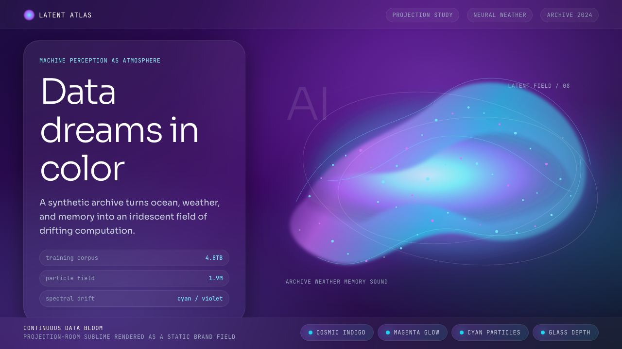
Generative AI Data Art is a visual movement defined by large-scale machine-learning systems trained on real-world datasets — weather patterns, ocean currents, archival imagery, sound recordings — and made visible as fluid, organic, continuously shifting forms. The aesthetic vocabulary is deep and cosmic: near-black or very dark indigo grounds, multi-stop gradient flows arcing through cool blues, electric cyans, hot magentas, and spectral purples, all animated by dense swarms of luminous particles. Every composition feels both alien and familiar, like a satellite image of a nebula that somehow encodes a memory.生成式 AI 数据艺术是一场由大规模机器学习系统驱动的视觉运动。这些系统以真实世界的数据集为食——天气模式、洋流、档案图像、声音记录——并将其以流体的、有机的、持续变化的形态呈现出来。它的视觉词汇深邃而宇宙性:接近纯黑或深靛蓝的底色,穿越冷蓝、电气青、热品红与光谱紫的多节点渐变流,以及由密集发光粒子群构成的动态漩涡。每一幅构图既陌生又熟悉,犹如一张卫星拍摄的星云照片,其中某处编码着一段记忆。
Unlike earlier data visualization traditions that translated numbers into charts or graphs, this movement treats data as raw material for an almost sculptural experience. The machine-learning model is not a tool that draws the data — it is a mind that has dreamed on the data, and what it renders is closer to hallucination than report. The resulting images and installations have a painterly depth: gradients that are not clean transitions between two hues but dense, multi-layered atmospheric passages, particle clouds that cluster and disperse with organic logic rather than algorithmic rigidity.与早期将数字翻译为图表或折线的数据可视化传统不同,这场运动将数据视为近乎雕塑体验的原材料。机器学习模型不是一个「画出」数据的工具——它是一个曾在数据上做梦的心智,它所渲染的产物更接近幻象而非报告。由此产生的图像与装置拥有绘画般的深度:渐变不是两种色调之间干净的过渡,而是浓密、多层的大气段落;粒子云以有机逻辑而非算法刚性聚集与扩散。
Typography in this system is ultra-light, almost translucent — letterforms chosen for their near-invisibility, receding behind the visual spectacle rather than competing with it. Every text element whispers rather than announces. The design sensibility is one of sublime immersion: the viewer is not reading information but inhabiting it.这套系统中的字体排印极为纤细,近乎半透明——字形因其接近隐形而被选用,退让于视觉奇景之后,而非与之竞争。所有文字元素低语而非宣告。其设计感受是崇高的沉浸:观看者不是在阅读信息,而是栖居其中。
Where does Generative AI Data Art (Refik Anadol era) come from?Generative AI Data Art (Refik Anadol era) 从何而来?
The movement's roots reach back to the computational art practices of the late twentieth century — Processing sketches, early generative graphics, and the tradition of artists like Casey Reas who built entire visual worlds from nothing but code and mathematical rules. But the decisive shift arrived when machine learning moved from academic papers into accessible creative tools, roughly between 2014 and 2018. Training a neural network on a corpus of images and then asking it to generate new images from that latent space produced something qualitatively different from what any rule-based generator could achieve: forms that felt genuinely discovered rather than designed.这场运动的根源可追溯至二十世纪末的计算艺术实践——Processing 草图、早期生成图形,以及 Casey Reas 等艺术家的传统:他们仅凭代码与数学规则构建出完整的视觉世界。但决定性的转变发生在机器学习从学术论文走向可用创作工具之际,大约在 2014 至 2018 年间。将一个神经网络在图像语料上训练,然后令其从那个潜在空间中生成新图像,产生的结果在质量上与任何基于规则的生成器都截然不同:那些形态感觉是被真正发现的,而不是被设计出来的。
Refik Anadol, a Turkish-American media artist and architect based in Los Angeles, became the central figure of this era by working at the intersection of architecture, machine intelligence, and public spectacle. His studio began training machine-learning models on datasets provided by cultural institutions — the archive of the Museum of Modern Art in New York, NASA satellite imagery, decades of melting glacier photographs — and projecting the resulting hallucinations at architectural scale. Works like 'Machine Hallucination' (2019), 'Melting Memories' (2018), and 'Unsupervised' (2022–2023) defined the visual canon: vast dark surfaces alive with flowing light, color, and particle motion that seemed to breathe with the data they encoded.土裔美国媒体艺术家兼建筑师 Refik Anadol 定居洛杉矶,在建筑学、机器智能与公共奇观的交汇处工作,成为这个时代的核心人物。他的工作室开始在文化机构提供的数据集上训练机器学习模型——纽约现代艺术博物馆的档案、NASA 卫星图像、数十年间消融冰川的照片——并将由此产生的「幻觉」投影至建筑尺度。《机器幻觉》(2019年)、《融化的记忆》(2018年)、《无监督》(2022—2023年)等作品界定了视觉范式:广阔的暗色表面上涌动着流光、色彩与粒子运动,仿佛正以它们所编码的数据在呼吸。
Parallel developments expanded the movement. Casey Reas, co-creator of Processing and a pioneer of software art, brought the rigorous conceptual lineage of algorithmic art into dialogue with machine learning. Memo Akten, a British-Turkish artist and researcher, used neural networks to find unexpected visual correspondences between disparate datasets — fire behaving like water, crowds behaving like flocking birds — introducing a philosophical dimension about perception and pattern. Tyler Hobbs, working on-chain with generative algorithms on blockchain platforms, brought a different audience into contact with the aesthetic through the NFT moment of 2021, when generative art achieved unprecedented public visibility.平行发展扩充了这场运动的边界。Processing 的联合创始人、软件艺术先驱 Casey Reas 将算法艺术严谨的概念传承引入与机器学习的对话。英裔土耳其艺术家兼研究者 Memo Akten 利用神经网络在不同数据集之间发现意外的视觉对应关系——火焰行为如流水,人群行为如鸟群——为运动引入了一个关于感知与模式的哲学维度。Tyler Hobbs 在区块链平台上以链上生成算法创作,借助 2021 年 NFT 浪潮中生成艺术前所未有的公众曝光度,将另一批受众带入了这套美学。
The visual language consolidated into recognizable conventions during the period from approximately 2018 to 2024. Deep dark grounds — navy, near-black, rich indigo-violet — became the near-universal base. Gradient flows through multiple stops of blue, cyan, magenta, purple, and occasionally warm amber became the primary expressive gesture. Particle systems, rendered as fine glowing dots or short luminous streaks, provided a sense of density and life within the gradient fields. Ultra-light, almost hairline weight type was adopted as the only kind of text that could coexist with such visually dense environments without destroying the atmosphere. This was the moment a lab aesthetic became a design language.视觉语言在大约 2018 至 2024 年间凝固成可辨识的惯例。深暗的底色——深海蓝、近黑、浓郁的靛紫——成为近乎普遍的基底。穿越蓝、青、品红、紫以及偶尔暖琥珀色的多节点渐变流,成为主要的表达姿态。粒子系统以细腻的发光点或短促的光迹呈现,在渐变场中提供密度与生命感。极细、近乎发丝粗细的字体,成为唯一能与如此视觉浓度的环境共存而不破坏氛围的文字形式。正是在这一刻,一套实验室美学演变为一套设计语言。
What defines the Generative AI Data Art (Refik Anadol era) look?Generative AI Data Art (Refik Anadol era) 的视觉特征是什么?
Ground and Atmosphere底色与氛围
The foundational color field is always very dark — deep navy, rich indigo-violet, or near-black — chosen to make luminous particle and gradient elements read as light against darkness rather than pigment on a surface. This dark ground is not flat; it typically holds subtle tonal variation, as if lit from within at the edges. The overall impression is of space rather than paper, atmosphere rather than canvas.基础色场始终是极深的色调——深海蓝、浓郁靛紫或接近纯黑——使发光粒子与渐变元素呈现为暗中之光,而非表面上的颜料。这片深色底面并非平整的;它通常在边缘保有微妙的色调变化,仿佛从内部被点亮。整体印象是空间感而非纸感,是大气层而非画布。
Gradient Flows渐变流动
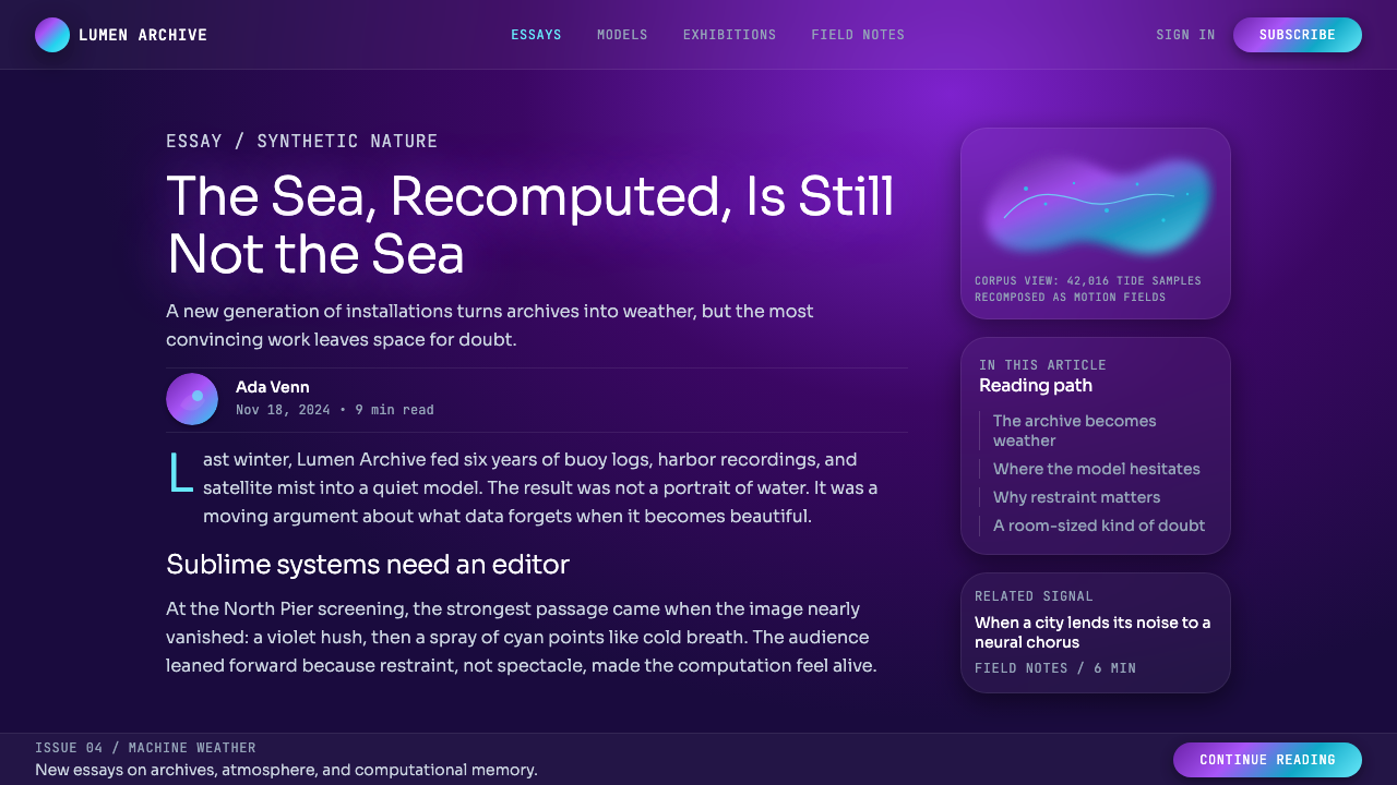
Color in this system is expressed primarily through multi-stop gradient meshes rather than flat fills. These gradients arc across the composition through cool blues, electric cyans, vivid magentas, deep purples, and occasional warm accent hues, creating the sense of a spectrum in motion. The transitions are never mechanical — they are irregular and painterly, suggesting weather systems or undersea currents rather than designed color ramps. Each gradient passage implies that some underlying data structure is being made visible.这套系统中的色彩主要通过多节点渐变网格而非平面色块来表达。这些渐变弧线跨越整个构图,穿越冷蓝、电气青、鲜亮品红、深紫,以及偶尔出现的暖调强调色,制造出光谱运动的感觉。过渡从不机械——它们是不规则且绘画性的,暗示气象系统或海底洋流,而非人工设计的渐变斜坡。每一段渐变通道都暗示着某种底层数据结构正在被可见化。
Particle Systems粒子系统
Fine luminous dots and short glowing streaks populate the gradient fields, forming clouds, vortices, and filaments that follow fluid dynamics rather than geometric rules. These particle systems create a sense of micro-scale texture within macro-scale flows — zoom into any region and there is always more detail. The particles read collectively as atmosphere or fog, individually as sparks or data points. Their density, direction, and clustering behavior carry most of the composition's sense of life and motion.细腻的发光点与短促的光迹分布于渐变场中,形成遵循流体动力学而非几何规则的云团、漩涡与丝缕。这些粒子系统在宏观流动内部制造出微观尺度的质感——放大任意区域都有更多细节。粒子群体性地读作大气或雾气,个体地读作火花或数据点。它们的密度、方向与聚集行为承载了构图中生命感与运动感的绝大部分。
Typography as Whisper字体排印如低语
Text in this aesthetic system is ultra-light in weight — the thinnest strokes the chosen typeface offers — and often rendered in a near-white or very pale cool tone that allows it to float above the visual field without asserting dominance. Letterforms are typically wide-tracked, giving each character room to breathe and preventing the text from pooling into a dense block. Headlines are restrained in size relative to the visual elements; labels and metadata are even smaller. The effect is of text that annotates rather than commands.这套美学系统中的文字字重极为纤细——所选字体能提供的最细笔画——通常以近白或极淡的冷调色呈现,使其漂浮于视觉场之上而不争夺主导权。字符间距通常较宽,给每个字符以呼吸空间,防止文字聚集成密集的块状。标题相对于视觉元素的尺寸是克制的;标签与元数据更小。效果是文字在注释,而非命令。
Organic Asymmetry有机非对称
Compositions generated by machine-learning processes are inherently asymmetric — the latent space from which they are drawn has no axis of symmetry. The resulting forms spread across the frame in organic, irregular ways: a gradient bloom offset to one quadrant, a particle filament curving diagonally through the center, a dense cluster anchoring one edge while the opposite edge breathes open. This asymmetry feels discovered rather than designed, which is central to the style's claim of authenticity.由机器学习过程生成的构图本质上是非对称的——它们所提取的潜在空间没有对称轴。由此形成的形态以有机、不规则的方式铺展于画面:渐变晕染偏向某一象限,粒子丝缕斜向穿越中心,密集的簇群锚定一侧边缘,而对侧边缘则呼吸般地敞开。这种非对称感觉像是被发现而非被设计,这正是这种风格声称真实性的核心所在。
Data as Subject数据作为主体
The content of the underlying dataset is never merely decorative — it shapes the visual character of the output in ways that are not always legible but are always present. A model trained on ocean temperature data produces different gradient contours from one trained on archival music recordings. This indexical relationship between source data and visual form is philosophically central to the movement: the image is evidence of its own process, a visualization not of what the data means but of what the model learned to dream from it.底层数据集的内容从不只是装饰性的——它以并非总是可读但始终在场的方式塑造输出的视觉性格。一个在海洋温度数据上训练的模型,产生的渐变轮廓与一个在档案音乐录音上训练的模型截然不同。这种源数据与视觉形式之间的指示性关系是这场运动哲学上的核心:图像是其自身过程的证据——不是数据意味着什么的可视化,而是模型学会从中做梦的证据。
Luminosity Over Opacity发光性胜于不透明
Visual elements in this system behave like light sources rather than painted marks. Gradient areas glow rather than sit flat; particle clusters bloom at their centers with near-white intensity and fade into the surrounding atmosphere. Color mixing follows the additive logic of light — overlapping regions become brighter rather than murkier. The overall luminosity of the composition creates a screen-native quality that feels fundamentally different from print-based design traditions and is inseparable from the digital medium in which this work lives.这套系统中的视觉元素表现得像光源,而非涂抹的笔触。渐变区域发光而非平铺;粒子簇在中心以近白的强度绽放,然后消散入周围的氛围。色彩混合遵循光的叠加逻辑——重叠区域变得更亮而非更浑浊。构图整体的发光性制造出一种屏幕原生的质感,与基于印刷的设计传统有着根本性的不同,并与这类作品所栖居的数字媒介不可分割。
Who shaped Generative AI Data Art (Refik Anadol era)?谁塑造了 Generative AI Data Art (Refik Anadol era)?
Anadol is the defining practitioner of this aesthetic era. Born in Istanbul in 1985 and trained in both architecture and media arts, he founded Refik Anadol Studio in Los Angeles and went on to create immersive installations for institutions including MoMA New York, the Serpentine Gallery, and Google. His methodology — training machine-learning models on institution-provided archives and projecting the resulting hallucinations at architectural scale — gave the visual language its most recognizable expression. Works such as 'Melting Memories' (2018), 'Machine Hallucination' (2019), and 'Unsupervised' (2022–2023) became landmark documents of the movement, and his appointment as the first Artist in Residence at Google Arts and Machine Intelligence cemented his central role. Anadol also founded DATALAND, conceived as the world's first museum of AI, reflecting his conviction that data-generated imagery belongs not in commercial contexts alone but in the cultural institution.Anadol 是这一美学时代最具决定性的实践者。1985年出生于伊斯坦布尔,在建筑与媒体艺术两个领域接受训练,他在洛杉矶创立了 Refik Anadol Studio,并为纽约现代艺术博物馆、蛇形画廊、谷歌等机构创作了沉浸式装置。他的方法论——在机构提供的档案上训练机器学习模型,并将由此产生的「幻觉」投影至建筑尺度——赋予了这套视觉语言最具辨识度的表达。《融化的记忆》(2018年)、《机器幻觉》(2019年)、《无监督》(2022—2023年)等作品成为这场运动的里程碑文献,而他被任命为谷歌艺术与机器智能首位驻留艺术家,进一步巩固了他的核心地位。Anadol 还创立了 DATALAND,构想为全球首个 AI 博物馆,这反映了他的信念:数据生成的图像不仅属于商业语境,更属于文化机构。
Reas is a foundational figure in computational art and the co-creator of Processing, the open-source programming language and environment that democratized generative graphics for artists and designers worldwide. His own artistic practice — which spans software, video, print, and installation — explores how simple computational rules generate visual complexity, and how the boundary between order and chaos produces aesthetic meaning. Reas brought the rigorous intellectual lineage of algorithmic art into the machine-learning era, advocating for code as a medium with its own cultural history. His academic work at UCLA and his collaborations with the broader software-art community helped establish the conceptual framework within which artists like Anadol are understood.Reas 是计算艺术的奠基人物,也是 Processing 的联合创始人——这一开源编程语言与环境让生成图形向全球艺术家与设计师民主化开放。他自身的艺术实践横跨软件、影像、印刷与装置,探索简单的计算规则如何生成视觉复杂性,以及秩序与混沌之间的边界如何产生美学意义。Reas 将算法艺术严谨的知识谱系带入了机器学习时代,倡导将代码视为拥有其自身文化历史的媒介。他在 UCLA 的学术工作以及与更广泛软件艺术社区的合作,帮助建立了理解 Anadol 等艺术家的概念框架。
Akten is a British-Turkish artist and researcher whose practice sits at the intersection of artificial intelligence, perception science, and live performance. His work uses neural networks not to generate images for their own sake but to reveal unexpected structural correspondences between seemingly unrelated phenomena — the visual similarity between fire and turbulent water, between human crowd flow and murmuration. This approach introduces a philosophical dimension that distinguishes the movement from mere spectacle: machine learning as a tool for perceiving pattern and relationship across categories that human cognition normally keeps separate. Akten's performances and installations create a sense of wonder specifically about the nature of perception itself.Akten 是一位英裔土耳其艺术家兼研究者,其实践处于人工智能、感知科学与现场表演的交汇处。他的作品使用神经网络,不是为了生成图像本身,而是为了揭示看似无关的现象之间意外的结构对应关系——火焰与湍流之间的视觉相似性,人群流动与椋鸟群舞之间的呼应。这种方法引入了一个哲学维度,将这场运动与纯粹的奇观区别开来:机器学习作为一种工具,用于感知人类认知通常分隔于不同范畴的事物之间的模式与关联。Akten 的表演与装置制造了一种专门关于感知本身性质的惊奇感。
Hobbs is an American generative artist whose practice focuses on long-form algorithmic systems that produce series of works with internal coherence and variation — each output is unique but clearly kin to the others. His breakthrough work 'Fidenza' (2021), generated using flow-field algorithms and released on the Art Blocks platform, reached an enormous audience during the height of the generative NFT moment and introduced hundreds of thousands of people to the visual language of algorithmic art. Hobbs operates somewhat differently from Anadol's machine-learning approach, relying on classical computational geometry rather than neural networks, but his work shares the movement's conviction that code-driven process is a legitimate and rich source of aesthetic discovery.Hobbs 是一位美国生成艺术家,其实践专注于产生内部连贯性与变化的长格式算法系统——每件输出都是独一无二的,但明显与其他作品同属一脉。他的突破性作品《Fidenza》(2021年),使用流场算法生成并在 Art Blocks 平台发布,在生成 NFT 浪潮的高峰期触达了庞大的受众,将数十万人引入了算法艺术的视觉语言。Hobbs 的工作方式与 Anadol 的机器学习方法有所不同,依赖的是经典计算几何而非神经网络,但他的作品与这场运动共享同一信念:代码驱动的过程是美学发现的合法而丰富的来源。
How do you use Generative AI Data Art (Refik Anadol era) today?今天怎么用 Generative AI Data Art (Refik Anadol era)?
Generative AI Data Art translates naturally into presentation contexts when the goal is to convey scale, sophistication, or a sense that something immense is being made comprehensible. Applied correctly, the style communicates that the organization behind the slides handles complexity at a high level — it is the visual equivalent of a confident understatement. Applied carelessly, it becomes noise: gradient overload, unreadable ultra-light text, and particle effects that distract rather than support.当演示的目标是传达规模感、复杂性,或让观众感受到某种庞大的事物正在被理解时,生成式 AI 数据艺术能够自然地融入幻灯片语境。正确应用时,这种风格传递出一个信号:制作这些幻灯片的组织在高水平上驾驭复杂性——它是视觉上的自信轻描淡写。草率应用时,它变成噪音:渐变过载、难以辨认的极细文字,以及分散而非支撑注意力的粒子效果。
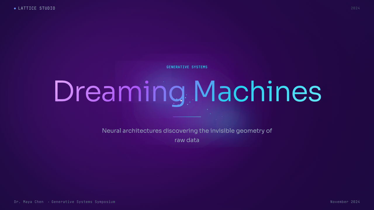
For slide covers, the approach works best when a single dominant visual — a gradient bloom or particle cloud — occupies most of the frame, with the title set in ultra-light type at the upper or lower third, generously spaced, and given enough contrast against the dark ground to remain legible. A brief subtitle or date in an even smaller weight completes the hierarchy. Resist the temptation to add logos or supplementary graphic elements to a cover built in this style — the visual field should breathe, not accumulate. For content slides, keep the dark ground but pull back on the particle density so that data, text, and diagrams can occupy the center without fighting the atmosphere. Charts in this system work best when their structural lines are hairline-weight and their data fills borrow from the gradient palette — bars that shift from cool blue to magenta across their length, area fills that glow rather than sit flat.对于封面幻灯片,最佳做法是让单一的主导视觉——一个渐变晕染或粒子云——占据画面的大部分,标题以极细字体置于上三分之一或下三分之一处,间距充裕,并与深色底面保持足够的对比度以保证可读性。极小字重的简短副标题或日期完成层级结构。在以这种风格构建的封面上,请克制添加徽标或辅助图形元素的冲动——视觉场需要呼吸,而非积累。对于内容幻灯片,保留深色底面,但降低粒子密度,使数据、文字与图表能够在不与氛围争夺注意力的情况下占据中心。这套系统中的图表在结构线为发丝粗细、数据填充借用渐变色板时效果最佳——柱条沿长度方向从冷蓝渐变至品红,面积填充发光而非平铺。
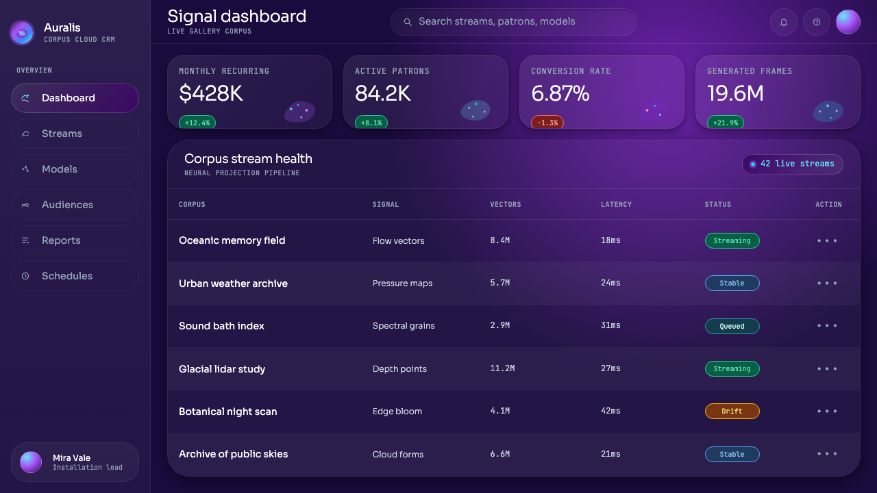
For web interfaces, this aesthetic is most appropriate for dashboards, data product landing pages, and any context where the audience expects to see large volumes of information rendered elegantly. The key adaptation for interactive use is restraint in animation: constant motion fatigues the eye in ways that a projection installation — experienced for minutes — does not. Reserve particle animation and gradient shifts for hero sections and loading states; static dark-ground layouts with luminous accent colors handle content areas more sustainably. Navigation and controls should be in the lightest possible weight of the chosen typeface, set against the dark ground with sufficient contrast for accessibility. Pricing pages and feature grids can use the gradient palette for tier differentiation — a free tier in a cooler blue register, a premium tier in a warmer magenta-violet one.对于网页界面,这套美学最适合仪表板、数据产品落地页,以及任何受众期望看到大量信息被优雅渲染的场景。交互使用的关键适配是克制动效:持续运动使眼睛疲劳的方式,与人们观看投影装置几分钟的体验截然不同。将粒子动画和渐变移动保留给主视觉区域与加载状态;以发光强调色点缀的静态深色底面布局更可持续地承载内容区域。导航与控件应使用所选字体最细的字重,以足够的对比度置于深色底面上以满足可访问性要求。定价页面与功能网格可用渐变色板区分等级——免费层级使用更冷的蓝色调,高级层级使用更暖的品红-紫罗兰调。
For editorial and marketing uses, this style performs well in contexts that need to communicate technological ambition, scientific rigor, or a connection to cutting-edge research. Conference keynote decks, annual reports for technology and data companies, and brand campaigns in the artificial intelligence space all find natural alignment here. A marketing page in this style uses a very dark background for the hero section, transitions to a slightly lighter dark for content sections, and uses luminous gradient accents exclusively for calls to action, key statistics, or pull quotes. The ultra-light type convention works at display size but should be reconsidered for body text — at reading size, hairline type on a dark ground can fall below comfortable legibility thresholds, and stepping up to a slightly heavier weight is the correct adaptation.对于编辑与营销用途,这种风格在需要传达技术雄心、科学严谨性,或与前沿研究关联的场景中表现出色。会议主题演讲幻灯片、科技与数据公司的年度报告,以及人工智能领域的品牌宣传活动,都能在这里找到自然的对应。这种风格的营销页面对主视觉区使用极深的背景,过渡到略浅一些的深色用于内容区,并专门将发光渐变强调色用于行动号召、关键统计数据或引用语。极细字体惯例在展示尺寸下有效,但正文字体应重新考量——在阅读尺寸下,深色底面上的发丝体可能低于舒适可读性阈值,适当加粗是正确的适配。
The most common mistake when applying this aesthetic is treating the gradient and particle effects as decoration to be layered on top of an otherwise conventional layout. This produces a result that is simultaneously overwhelming and unconvincing — the dark ground and flowing light fight with the content rather than framing it. The style demands that content be designed for it from the ground up: type chosen for its behavior at ultra-light weights, visual hierarchy established through luminosity contrast rather than size alone, and data elements treated as first-class visual objects with the same care given to the gradient fields. A second frequent error is using this style in contexts that call for warmth, approachability, or human texture — consumer wellness brands, children's platforms, community-focused products. The aesthetic of the computational sublime is genuinely cold, and forcing it into warm-communication contexts produces a tonal mismatch that no amount of craft can fully resolve.应用这套美学时最常见的错误,是将渐变与粒子效果视为叠加于常规版面之上的装饰。这会产生一种既令人不知所措又缺乏说服力的结果——深色底面与流动光线和内容相互争夺,而非框架内容。这种风格要求内容从一开始就为它而设计:字体以其在极细字重下的表现为标准选取,视觉层级通过发光度对比而非仅靠尺寸建立,数据元素被视为一等视觉对象,与渐变场同等用心对待。第二个常见错误是在需要温暖感、亲近感或人文质感的场景中使用这种风格——消费者健康品牌、儿童平台、社区导向的产品。计算崇高的美学是真实意义上的冷峻,将其强行植入温暖传达的语境,会产生一种无论多少工艺都无法完全弥合的语调错位。
Generative AI Data Art (Refik Anadol era) — FAQGenerative AI Data Art (Refik Anadol era) · 常见问题
Is this style only appropriate for technology and AI companies?这种风格只适合科技和 AI 公司吗?
Not exclusively, though that is its strongest native context. The aesthetic has been adopted successfully by cultural institutions presenting research or archival projects, by scientific publishers visualizing complex datasets, and by premium consumer brands in categories like automotive and luxury that want to communicate precision and forward-looking ambition. The connective tissue is not industry but attitude: the style suits any organization that wants to signal that it operates at the frontier of something. Where it fails is in contexts that require warmth, accessibility, or cultural specificity — it is a universalizing aesthetic that deliberately subordinates the human to the computational.并非专属,尽管那是它最强的原生语境。这套美学已被文化机构成功采用于呈现研究或档案项目,被科学出版商用于可视化复杂数据集,也被汽车和奢侈品等品类中希望传达精准与前瞻雄心的高端消费品牌所采纳。联结纽带不是行业,而是态度:这种风格适合任何想要表达自身处于某一前沿的组织。它失效的地方,是那些需要温暖感、可达性或文化特殊性的语境——它是一种故意将人类从属于计算的普世化美学。
How do you prevent the gradient and particle effects from overwhelming the content?如何防止渐变与粒子效果压倒内容?
The key is treating the visual field as a background system and the content as a foreground system, with a genuine compositional gap between them. In practice, this means: reduce particle density in areas where text or data will sit; create a tonal hierarchy in the gradient so that the brightest, most active areas are at the edges or in dedicated visual zones rather than behind primary reading content; use the type size and weight to ensure that even ultra-light letterforms have enough surface area and contrast to read cleanly. The golden test is whether the content can be read comfortably without squinting — if not, the visual field needs to be pulled back, not the type pushed harder.关键在于将视觉场视为背景系统,将内容视为前景系统,两者之间保持真实的构图间距。实践中,这意味着:在文字或数据将要落座的区域降低粒子密度;在渐变中建立色调层级,使最亮、最活跃的区域位于边缘或专属视觉区域,而非主要阅读内容的背后;利用字体尺寸与字重确保即便是极细字形也有足够的面积与对比度清晰可读。黄金测试标准是:内容是否能在不眯眼的情况下舒适阅读——如果不能,需要收敛视觉场,而非强推字体。
Can this style work in a light-background or print context?这种风格能在浅色背景或印刷语境中使用吗?
The foundational visual logic of this style — luminous elements glowing against dark — is inseparable from its dark ground. Transposing it to a white or light background does not produce a light variant of the same aesthetic; it produces a different aesthetic entirely. The gradients lose their sense of glowing, the particles lose their luminous quality, and the ultra-light type becomes difficult to read against pale surfaces without losing the intended delicacy. If a light-background format is required, the better approach is to carry only the color palette — the blues, cyans, and magentas — into a more conventional compositional system, treating the palette as the reference point while building the rest of the layout according to the target medium's own logic.这种风格的基础视觉逻辑——发光元素在暗色中闪耀——与其深色底面不可分割。将其移植到白色或浅色背景,并不会产生同一美学的浅色变体;它会产生一种完全不同的美学。渐变失去发光感,粒子失去发光质地,极细字体在浅色表面上难以阅读而又失去预期的精致感。如果必须使用浅色底面格式,更好的做法是只将色板——蓝色、青色与品红——带入更传统的构图系统,以色板作为参照点,其余版面则依照目标媒介自身的逻辑来构建。
What distinguishes authentic work in this style from superficial imitation?这种风格中真实的作品与表面模仿之间有何区别?
Authentic work in this style carries an internal logic that traces back to data: the visual forms feel generated, not arranged. The gradient passages have an atmospheric irregularity — they do not follow predictable sweep directions or perfectly even progressions. The particle fields have local variation in density and direction that suggests underlying flow rather than random scatter. The most common superficial imitation uses a dark background, adds a pre-made gradient overlay and a particle texture, then places conventional content on top. The result looks like this style from a distance but reads as costume rather than conviction when examined closely, because the elements are decorating rather than constituting the image.这种风格中真实的作品携带着一种可追溯至数据的内在逻辑:视觉形态感觉像是被生成的,而非被安排的。渐变通道具有大气般的不规则性——它们不遵循可预测的扫掠方向或完美均匀的进程。粒子场在密度与方向上有局部变化,暗示着底层流动而非随机散点。最常见的表面模仿是:使用深色背景,添加预设渐变叠层与粒子纹理,然后在上面放置常规内容。结果从远处看像这种风格,但近看时读作戏服而非信念,因为这些元素是在装饰图像,而非构成图像。
How does this style handle data visualization specifically — charts, graphs, maps?这种风格具体如何处理数据可视化——图表、曲线图、地图?
Data visualization in this aesthetic system works best when the chart types themselves are treated as generative rather than conventional. Network graphs, flow diagrams, geographic heatmaps, and particle-based scatterplots are native to the style and require minimal adaptation. Conventional chart types — bar charts, pie charts, line graphs — can be used but should be stripped of all decorative scaffolding: no chart borders, no background fill, no grid lines heavier than hairline, no legend boxes. Structural lines should be near-invisible; data fills should borrow from the gradient palette and be treated as glowing color rather than flat fill. The axis labels and data callouts follow the ultra-light type convention. The goal is for the chart to feel like it grew from the same data-driven aesthetic as the surrounding gradient field, not like a spreadsheet dropped into an art installation.在这套美学系统中,数据可视化在图表类型本身被视为生成性而非常规性时效果最佳。网络图、流程图、地理热力图与基于粒子的散点图原生于这种风格,几乎不需要适配。常规图表类型——柱状图、饼图、折线图——可以使用,但应去除所有装饰性脚手架:无图表边框,无背景填充,网格线不超过发丝粗细,无图例框。结构线应接近不可见;数据填充应借用渐变色板,以发光色彩而非平面填充呈现。坐标轴标签与数据标注遵循极细字体惯例。目标是让图表感觉像是从与周围渐变场同一数据驱动美学中生长出来的,而非一个被放入艺术装置的电子表格。
Related design styles相关设计风格
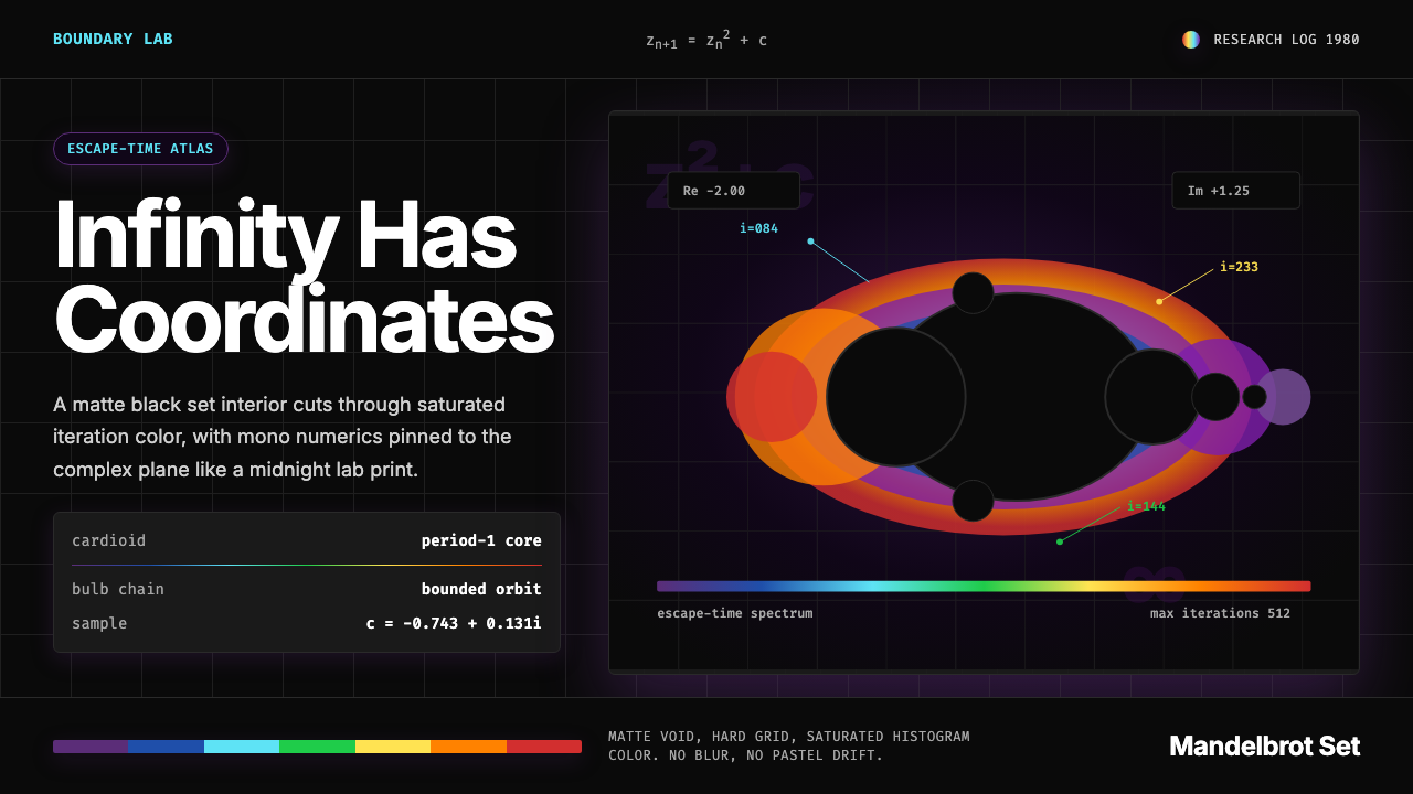 Mandelbrot FractalMath turns electric. Deep purple void, cyan mono type, and a rainbow iteratio…数学通电:深紫虚空、青色等宽字与彩虹迭代光环。
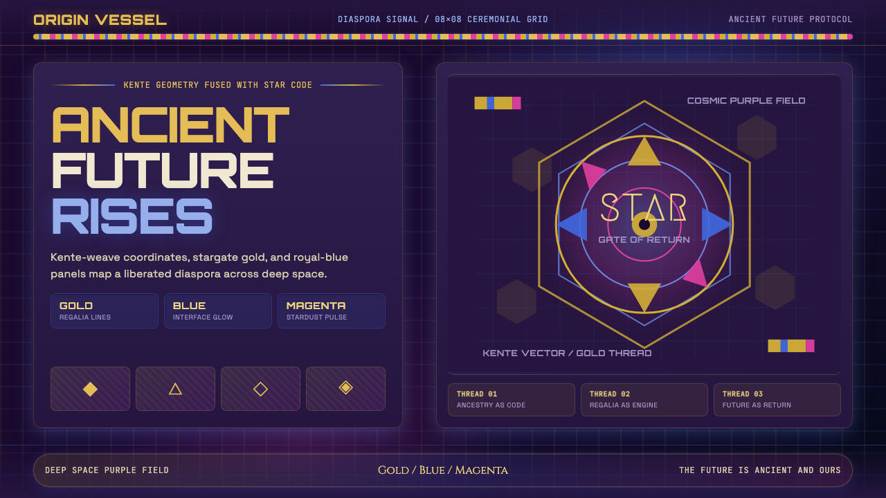 AfrofuturismAncient future, fully luminous. Gold kente grids cut through cosmic purple an…古老未来自带光芒:金色肯特网格切开宇宙紫与蓝色辉光。
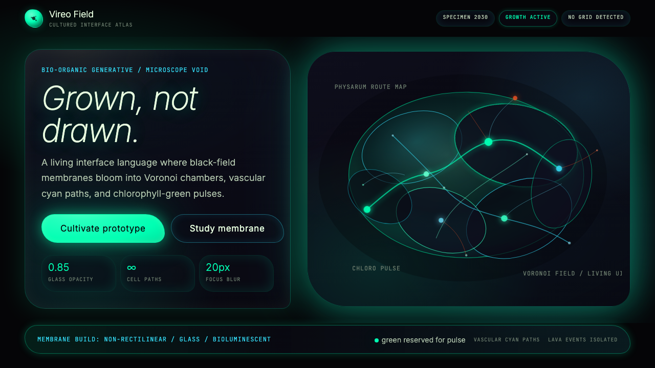 Bio-Organic GenerativeInterfaces feel cultured. Void black, Voronoi membranes, and neon chlorophyll…界面像被培育:黑场、维诺诺伊膜与叶绿素霓光一起呼吸。
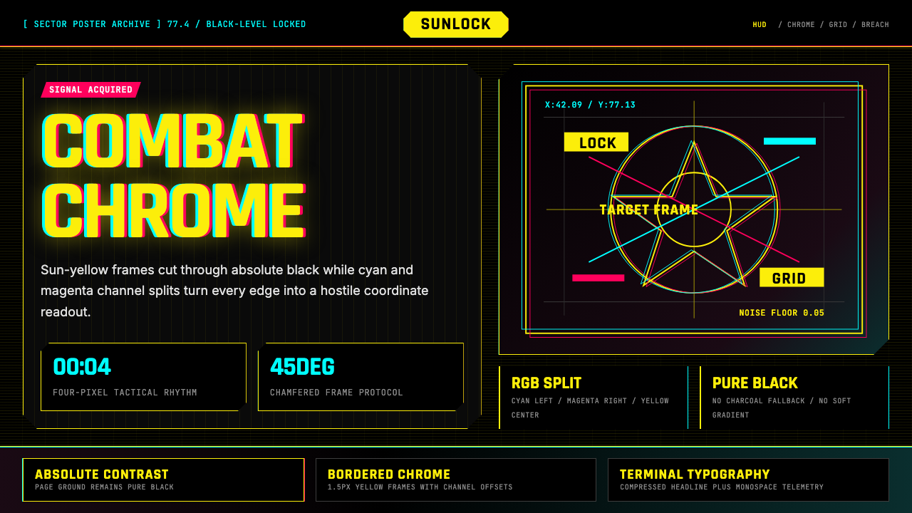 Cyberpunk 2077 Night City YellowCombat HUD on black. Sun-yellow chrome splits into magenta-cyan coordinate gr…黑底战斗HUD:太阳黄框架裂出品红与青色坐标网。
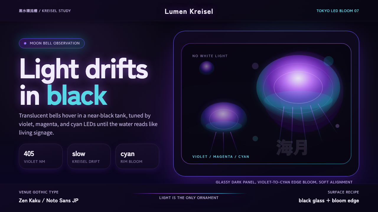 Jellyfish Aquarium StudyLight is the ornament. Violet-cyan glow floats in black glass with venue-goth…光是唯一装饰。紫青冷光漂浮于黑色玻璃,配日式哥特字。
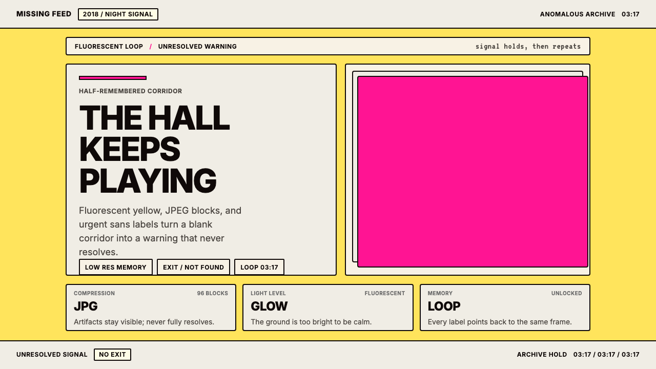 Weirdcore Internet (2018)Wrongness in fluorescent yellow. JPEG blocks and warning labels do the damage.荧光黄里的错位感。JPEG块和警告标签把不安钉住。