What is Mandelbrot Fractal?什么是 Mandelbrot Fractal?
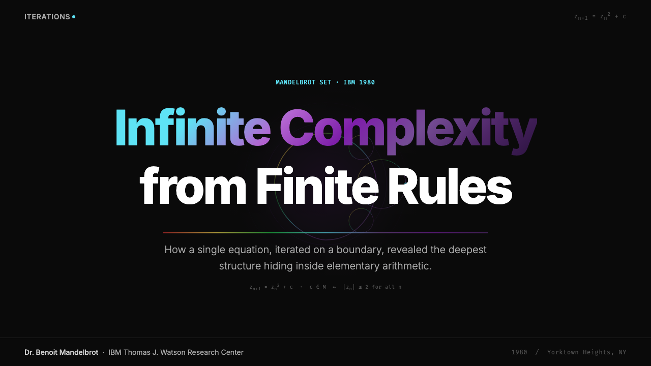
In 1980, a single equation rendered on a laboratory display became the founding image of generative art — and the most recognizable mathematical object ever drawn.1980年,一个方程在实验室显示器上成像,成为生成式艺术的母图,也是人类史上最广为人知的数学形象。
Mandelbrot Fractal in briefMandelbrot Fractal 速览
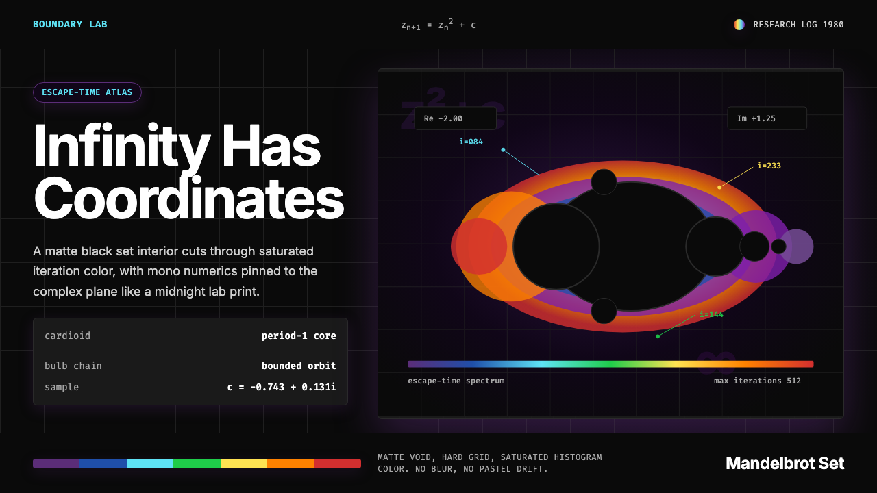
Mandelbrot Fractal is a design aesthetic rooted in the visual language of the Mandelbrot set — the famous mathematical object defined by iterating a simple complex-number formula and recording whether each point escapes to infinity or remains bounded. The signature image is a deep, near-black void (the bounded interior of the set) surrounded by a luminous halo of saturated color bands, where each band maps a range of iteration counts before escape. The overall effect is simultaneously scientific and psychedelic: precision at the core, wild spectral energy at the boundary.曼德博分形是一套根植于曼德博集合视觉语言的设计美学。曼德博集合由一个简单的复数迭代公式定义:对每个点记录它是否逃逸至无穷,或永远保持有界。其标志性图像是一片深沉近乎纯黑的虚空——集合的有界内部——外围环绕着饱和色带构成的发光光环,每条色带对应一个逃逸前的迭代次数区间。整体效果既科学又迷幻:核心处是精准,边界处是狂野的光谱能量。
The aesthetic is organized around contrast — black against maximum saturation, hard geometric edges against infinitely complex fractal curves, the monospaced numerics of computation against the organic sprawl of iterative mathematics. Color is deployed as data, not decoration: the rainbow progression from deep violet through cyan, green, yellow, orange, and red encodes mathematical information about how quickly a region diverges. This is a palette that earns its vibrancy rather than applying it arbitrarily.这套美学围绕对比组织而成——黑色对抗极度饱和,硬朗的几何边界对抗无限复杂的分形曲线,计算机等宽数字的冷静对抗迭代数学的有机蔓延。色彩在此是数据,不是装饰:从深紫经由青色、绿色、黄色、橙色到红色的彩虹渐进,编码的是数学信息——某个区域以多快的速度发散。这套色板的鲜艳是被赚取的,不是任意施加的。
Because the Mandelbrot set is self-similar at every scale — zooming into any part of the boundary reveals structures that echo the whole — the aesthetic carries an implied sense of infinite depth. Design work that draws on this vocabulary naturally suggests complexity beneath the surface, systematic order underlying apparent chaos, and the idea that looking closer always reveals more rather than less.曼德博集合在每个尺度上都具有自相似性——放大边界的任意局部,都会显现出与整体呼应的结构——因此这套美学天然携带着无限深度的暗示。援引这套视觉词汇的设计作品,自然传递出表面之下的复杂性、表观混沌之中的系统秩序,以及「越看越深、永无底止」的认知体验。
See the Mandelbrot Fractal design system查看 Mandelbrot Fractal 完整设计系统
Where does Mandelbrot Fractal come from?Mandelbrot Fractal 从何而来?
The Mandelbrot set was not invented so much as discovered. Benoit Mandelbrot, working at IBM's Thomas J. Watson Research Center in Yorktown Heights, New York, had spent decades developing a mathematics of roughness — arguing that the irregular, fragmentary forms that classical geometry ignored (coastlines, clouds, market fluctuations, tree branching) were in fact the dominant geometry of the natural world. He coined the term 'fractal' in 1975, derived from the Latin 'fractus' meaning broken or irregular, to describe these self-similar structures at every scale.曼德博集合与其说是被发明的,不如说是被发现的。本华·曼德博在纽约约克顿海茨的IBM托马斯·J·沃森研究中心工作,此前数十年间他一直致力于建立一套「粗糙性数学」——他主张,经典几何忽视的那些不规则、碎片化形态(海岸线、云朵、市场波动、树木分枝)实际上是自然界占主导地位的几何形式。1975年,他创造了「分形」(fractal)一词,源自拉丁语「fractus」,意为破裂或不规则,用以描述这些在每个尺度上自相似的结构。
The set that bears his name was first described mathematically by Pierre Fatou and Gaston Julia in the early twentieth century, but it could not be visualized without a computer. In 1980, Mandelbrot used the computing resources at IBM Yorktown Heights to generate the first printed image of the set on a Tektronix display — a coarse but unmistakable rendering of the cardioid-and-bulbs silhouette that would become one of the most reproduced scientific images in history. The following year, Mandelbrot published his landmark book 'The Fractal Geometry of Nature' (1982), which brought fractal mathematics to a broad audience and established the visual identity of the field.以他命名的这个集合,在数学上最早由皮埃尔·法托和加斯东·朱利亚于二十世纪初描述,但没有计算机就无法将其可视化。1980年,曼德博利用IBM约克顿海茨的计算资源,在Tektronix显示器上生成了该集合的第一张印刷图像——一幅粗糙但无可误认的心脏曲线与圆球串轮廓,此后成为历史上被复制最多的科学图像之一。次年,曼德博出版了里程碑式著作《自然的分形几何》(1982年),将分形数学带给广泛受众,也确立了这一领域的视觉身份。
The aesthetic development of fractal imagery accelerated rapidly through the 1980s as personal computing became more powerful. Programmers discovered that with a home computer and sufficient patience, they could generate their own Mandelbrot explorations. The introduction of color monitors transformed the images: what had been black-and-white mathematical diagrams became vivid, almost overwhelming spectacles. The iteration-count coloring algorithm — assigning a distinct hue to each escape-speed band — was not Mandelbrot's own invention but emerged from the broader community of fractal enthusiasts who shared algorithms through early bulletin board systems and magazines like Scientific American.随着1980年代个人计算机算力的快速提升,分形图像的美学发展也急速加速。程序员们发现,用一台家用电脑和足够的耐心,就能自行生成曼德博探索图像。彩色显示器的引入彻底改变了这些图像:原本的黑白数学图解变成了生动、几乎令人目眩的视觉奇观。迭代次数着色算法——为每个逃逸速度区间赋予一种独特色相——并非曼德博本人的发明,而是从更广泛的分形爱好者社群中涌现出来,通过早期电子公告板系统和《科学美国人》等杂志流传扩散。
By the late 1980s and early 1990s, Mandelbrot fractal imagery had migrated into popular culture. It appeared on album covers, in film title sequences, in science fiction illustration, and as the canonical image of chaos theory in popular science books. The 1980s fractal aesthetic — deep dark backgrounds, rainbow iteration halos, monospaced coordinate readouts — became strongly associated with a particular moment in computing culture: the transition from purely textual interaction to visual computation, the excitement of seeing mathematics made visible for the first time.到1980年代末至1990年代初,曼德博分形图像已迁移进入流行文化。它出现在唱片封面上、电影片头序列中、科幻插图里,以及作为混沌理论在科普书籍中的标准图像。1980年代的分形美学——深暗背景、彩虹迭代光环、等宽坐标读出——与计算文化的一个特定时刻产生了强烈关联:从纯文本交互向视觉计算的过渡,以及第一次看见数学被具象呈现时那种震撼与兴奋。
What defines the Mandelbrot Fractal look?Mandelbrot Fractal 的视觉特征是什么?
Color as Data色彩即数据
The defining characteristic of the Mandelbrot aesthetic is that color is not decorative but informational. The rainbow spectrum — progressing from deep violet and indigo through cyan, green, yellow-green, yellow, orange, and red — maps the speed at which points near the set's boundary escape to infinity. Each band represents a measurable mathematical quantity. This means the palette is both visually extreme and rigorously justified: the saturation is earned by the underlying computation, not applied for effect.曼德博美学最核心的特征是:色彩不是装饰,而是信息。彩虹光谱——从深紫和靛蓝,经由青色、绿色、黄绿色、黄色、橙色,直至红色——映射的是集合边界附近的点逃逸至无穷的速度。每条色带代表一个可测量的数学量。这意味着这套色板在视觉上是极端的,同时又是严格合理的:那种饱和度来自底层的计算,不是为了效果而施加的。
The Deep Dark Interior深暗的集合内部
The bounded interior of the Mandelbrot set — the region of points that never escape — is rendered as a pure, near-featureless black or deep-space dark. This interior functions as the visual anchor of any composition that draws on the aesthetic: a hard, polished darkness against which the spectral halo radiates outward. In design applications, this translates to a dark background philosophy where the background is not merely unlit but actively absorptive — a void that makes surrounding color luminous by contrast.曼德博集合的有界内部——那些永远不会逃逸的点所构成的区域——被渲染为纯粹、近乎无特征的黑色或深空暗色。这片内部在任何援引此美学的构图中都充当视觉锚点:一种坚硬、抛光的暗沉,光谱光环从这里向外辐射。在设计应用中,这转化为一种深色背景哲学——背景不仅仅是未被照亮的,而是主动吸收光线的——一片虚空,令周围的色彩以对比的方式发光。
Self-Similar Complexity自相似的复杂性
The Mandelbrot set is infinitely complex at its boundary: zooming in reveals new tendrils, spirals, and miniature copies of the whole set nested within the detail. This self-similarity at every scale gives fractal-derived design its distinctive quality of implied depth — the sense that the image rewards closer inspection indefinitely. In practice, this characteristic is evoked through layered detail, nested repetition of motifs at multiple scales, and compositions where the eye can travel from broad structure to fine detail without exhaustion.曼德博集合在其边界处具有无穷复杂性:放大之后会显现新的触须、螺旋,以及整个集合嵌套在细节之中的微型副本。这种在每个尺度上的自相似性,赋予分形衍生设计一种独特品质——暗示深度的感知,即图像会无限回报更仔细的观察。在实践中,这一特征通过分层细节、多个尺度上母题的嵌套重复,以及让视线能够从宏观结构游走至精微细节而不感疲倦的构图来唤起。
Monospace and the Computational Voice等宽字与计算机语境
Typography in the Mandelbrot aesthetic draws from the computer terminal tradition: monospaced letterforms that carry the visual authority of machine output, numerical readouts of coordinates and iteration parameters, and a general sense that the text is data rather than prose. This typographic vocabulary signals scientific precision and computational origin. Numbers are treated as design elements — coordinates, zoom levels, and iteration counts rendered in a size and weight that makes them part of the composition rather than incidental labels.曼德博美学中的字体排印源于计算机终端传统:等宽字形携带着机器输出的视觉权威感,坐标与迭代参数的数字读出,以及文字整体上是数据而非散文的氛围。这套字体词汇传递科学精准与计算起源。数字被当作设计元素对待——坐标、缩放级别和迭代次数以特定的大小和字重呈现,使它们成为构图的一部分,而非附带的标签。
Spectral Luminosity光谱发光性
The color halo surrounding the Mandelbrot set's interior is not merely colorful but actively luminous: the hues appear to emit light rather than reflect it. This quality arises from the extreme contrast between the near-black background and fully saturated foreground colors. In design work, this effect is achieved by pairing deep, absorptive backgrounds with colors pushed to the limit of their saturation — creating the impression that the light source is internal to the design rather than falling on it from outside.环绕曼德博集合内部的色彩光环不仅仅是多彩的,而是主动发光的:这些色相看起来是在发射光而非反射光。这种品质来自近乎纯黑的背景与全饱和前景色之间的极端对比。在设计工作中,这种效果通过将深沉的、吸收性的背景与被推至饱和极限的颜色配对来实现——制造出光源在设计内部而非从外部照射的印象。
Precision at Infinite Scale无限尺度上的精准
The Mandelbrot set is defined by perfect mathematical precision — the same formula, applied recursively, generates all the complexity. This underlying precision gives the aesthetic its authority: despite the apparent wildness of the imagery, everything is the product of a deterministic rule. Design that draws on this quality combines visual intensity with structural rigor — elements that appear complex or energetic should have an underlying organizational logic, not be chaotic for its own sake.曼德博集合由完美的数学精准性定义——同一个公式递归应用,生成所有的复杂性。这种底层精准性赋予了这套美学以权威:尽管图像表面上看似狂野,一切都是确定性规则的产物。援引这种品质的设计将视觉强度与结构严谨相结合——看似复杂或充满能量的元素应有底层的组织逻辑,而非为了混沌而混沌。
Dark Mode as Native State深色模式即原生状态
Unlike many historical design aesthetics that were adapted for dark contexts from an original light-ground conception, the Mandelbrot aesthetic is natively dark. The CRT displays of 1980 emitted light against darkness; the set's interior is mathematically black; the rainbow halo only achieves its full luminous effect against a dark surround. Any light-background application of this aesthetic is a translation rather than a native expression, and it requires significant adjustment to the color relationships to preserve the sense of luminosity and depth.与许多历史设计美学从浅色底面原始构思出发、再适配深色语境不同,曼德博美学天然是深色的。1980年的CRT显示器在黑暗中发射光线;集合的内部在数学上是纯黑的;彩虹光环只有在深色背景下才能实现其完整的发光效果。任何浅色背景的应用都是一种翻译,而非原生表达,需要对色彩关系做出重大调整,以保留那种发光感与深度感。

See the Mandelbrot Fractal design system查看 Mandelbrot Fractal 完整设计系统
Who shaped Mandelbrot Fractal?谁塑造了 Mandelbrot Fractal?
Mandelbrot (1924–2010) was a Polish-born French-American mathematician who spent most of his research career at IBM. His foundational insight was that irregular, fragmented shapes — long dismissed as mathematical curiosities or noise — were in fact a coherent geometry describing much of the natural world. His 1982 book 'The Fractal Geometry of Nature' synthesized decades of research and introduced the term 'fractal' to a popular audience. The Mandelbrot set, though described by earlier mathematicians, became the public face of his ideas because it so vividly demonstrated that enormous visual complexity could emerge from an elementary rule.曼德博(1924—2010年)是波兰裔法裔美国数学家,研究生涯大部分时间在IBM度过。他的核心洞见是:那些长期被视为数学奇观或噪声而遭到忽视的不规则、碎片化形状,实际上构成了一套连贯的几何学,描述着自然界的大部分面貌。他1982年出版的《自然的分形几何》综合了数十年研究,将「分形」一词引入大众语境。曼德博集合尽管早于他就被数学家描述过,却成为他思想的公众面孔,因为它如此生动地展示了极简规则如何涌现出无穷视觉复杂性。
IBM's Thomas J. Watson Research Center provided Mandelbrot with the computational resources — rare and costly in 1980 — needed to generate the first high-resolution renderings of the set. IBM's institutional support was essential to the aesthetic's birth: without access to mainframe computing power and high-resolution plotters, the images would have remained purely mathematical abstractions. The center's culture of supporting fundamental research alongside commercial development made it one of the few places where this kind of exploratory visualization could happen in 1980.IBM托马斯·J·沃森研究中心为曼德博提供了1980年极为稀缺昂贵的计算资源,使第一批高分辨率集合图像的生成成为可能。IBM的机构支持对这套美学的诞生至关重要:没有大型机算力和高分辨率绘图仪的支持,这些图像将只能停留在纯数学抽象层面。该中心支持基础研究与商业开发并行的文化,使其成为1980年少数几个能够发生这类探索性可视化的场所之一。
The mathematical foundations for the Mandelbrot set were laid by French mathematicians Pierre Fatou and Gaston Julia in the years around the First World War. Working independently, both studied the iteration of complex functions and discovered the strange, infinitely intricate boundary regions — now called Julia sets — that appear when such functions are iterated. Julia, who had been severely wounded in the war and conducted much of his work while recovering, published his foundational memoir in 1918. Their work was largely forgotten until computers made visualization possible, at which point Mandelbrot's images brought their ideas to global attention.曼德博集合的数学基础由法国数学家皮埃尔·法托和加斯东·朱利亚在第一次世界大战前后奠定。两人各自独立研究复函数的迭代,发现了在迭代过程中出现的那些奇异、无限精细的边界区域——现称为朱利亚集合。朱利亚在战争中身受重伤,大部分研究工作在康复期间完成,于1918年发表了奠基性论著。他们的工作在计算机使可视化成为可能之前几乎被遗忘,此后曼德博的图像将他们的思想带入了全球公众的视野。
Loren Carpenter was a Boeing engineer who in 1980 — the same year Mandelbrot rendered the set — demonstrated that fractal mathematics could generate photorealistic mountain landscapes for computer graphics. His short film 'Vol Libre,' shown at the SIGGRAPH conference, used recursive subdivision based on fractal principles to create terrain no artist had drawn. This demonstration helped establish that fractal geometry was not just a mathematical curiosity but a practical tool for synthetic imagery, opening a branch of computer graphics that influenced film, video games, and eventually generative design for decades.洛伦·卡彭特是波音公司的工程师,在曼德博渲染出集合图像的同一年(1980年),他展示了分形数学可以为计算机图形学生成照片级逼真的山地景观。他在SIGGRAPH大会上展映的短片《Vol Libre》,使用基于分形原理的递归细分创造出无需艺术家手绘的地形。这次展示确立了分形几何不仅是数学奇观,更是合成图像的实用工具,由此开辟了一个影响电影、视频游戏乃至生成式设计长达数十年的计算机图形学分支。
A single article in Scientific American's 'Computer Recreations' column, written by A.K. Dewdney in August 1985, democratized fractal image generation. Dewdney provided a simple algorithm that readers could implement on home computers to generate Mandelbrot and Julia set images. The response was overwhelming: the magazine received more reader mail for this article than for almost any other in its history. This moment — when the fractal aesthetic became reproducible by anyone with a home computer — established the visual vocabulary that the 1980s computing culture would associate with mathematical beauty and generative art.1985年8月,A·K·德德尼在《科学美国人》「计算机娱乐」专栏发表的一篇文章,使分形图像生成走向大众。德德尼提供了一个简单算法,读者可在家用电脑上自行实现,生成曼德博和朱利亚集合图像。反响之热烈令人震惊:这篇文章收到的读者来信比杂志历史上几乎任何其他文章都多。正是这一时刻——分形美学变得可以被任何拥有家用电脑的人复现——确立了1980年代计算文化与数学之美、生成式艺术相关联的视觉词汇。
How do you use Mandelbrot Fractal today?今天怎么用 Mandelbrot Fractal?
Mandelbrot Fractal is a high-intensity aesthetic that rewards deliberate application. Its power lies in its visual authority — the combination of scientific precision and overwhelming spectral energy communicates complexity, depth, and intelligence. These qualities make it well-suited to specific contexts: data science and analytics platforms, generative art and creative technology presentations, scientific visualization products, and any project where signaling computational sophistication is a core goal.曼德博分形是一套强度极高的美学,需要有意识地应用才能发挥其力量。它的力量在于视觉权威感——科学精准与压倒性光谱能量的结合,传递复杂性、深度与智识。这些品质使它特别适合特定语境:数据科学与分析平台、生成式艺术与创意技术演示、科学可视化产品,以及任何以传递计算专业度为核心目标的项目。
For presentation slides, the aesthetic works best on full-bleed dark backgrounds where the spectral color can achieve its full luminous effect. A cover slide should embrace the depth: a zoomed fractal detail as the background image, with a title set in monospaced or geometric type, light against the dark. The title can sit near the cardioid center or in a clear region of the fractal — the mathematical image provides natural compositional structure. Content slides benefit from restraint: pull back to a near-black background with a single luminous accent color rather than the full rainbow, using the spectral palette to highlight key data or call-outs rather than fill the entire field. Data visualizations — charts, graphs, network diagrams — fit naturally in this aesthetic when rendered with the iteration-count color logic: ordered categorical data mapped to a portion of the spectral progression, with the background dark and labels in a cool, light neutral.在演示文稿中,这套美学在出血式深色背景上表现最佳,光谱色彩在此才能实现完整的发光效果。封面页应当拥抱那种深度:以一幅放大的分形细节作为背景图像,标题用等宽或几何字体设置,明色调浮于暗底之上。标题可以置于心脏曲线附近或分形图像的清晰区域——数学图像本身提供了天然的构图结构。内容页则受益于克制:退回到近乎纯黑的背景,配以单一的发光强调色,而非完整彩虹,用光谱色板突出关键数据或引述,而非填满整个版面。数据可视化——图表、图形、网络图——在以迭代次数色彩逻辑渲染时,自然契合这套美学:有序的分类数据映射至光谱渐进的某一段,背景深暗,标签用冷调淡色中性色。
For web interfaces, the aesthetic is well-matched to dashboards, analytics platforms, terminal-style developer tools, and computational or scientific products. The approach: commit to a dark-mode-first design, use deep space tones for backgrounds and surface layers, and introduce the spectral accent colors with discipline — one or two hues at a time, deployed to indicate activity, status, or hierarchy rather than applied broadly. Interactive elements can use the rainbow progression to encode states or data dimensions, maintaining the data-as-color logic of the source material. Text should stay in cool neutrals or near-white to remain legible against dark backgrounds; avoid warm whites that fight the cool spectral palette.对于网页界面,这套美学与仪表板、分析平台、终端风格的开发者工具,以及计算或科学产品高度契合。方法如下:坚持以深色模式优先的设计,背景和表面层使用深空色调,有节制地引入光谱强调色——每次只用一到两种色相,用来指示活动、状态或层级,而非大面积铺开。交互元素可以用彩虹渐进来编码状态或数据维度,保持原始材料的「色彩即数据」逻辑。文字应保持冷调中性色或近白色,以确保在深色背景上的可读性;避免与冷调光谱色板相冲突的暖白色。
For editorial and marketing applications, the style suits contexts that want to evoke the edge between science and art: technology companies, AI products, data infrastructure, generative creative tools, and scientific publishing. A feature section designed in this aesthetic might use a dark full-width background with a fractal-inspired radial gradient or interference pattern, overlaid with clean geometric type. The rainbow accent should be used sparingly and consistently — perhaps reserved for a single product feature callout or a navigational highlight — rather than scattered across the page. Print applications such as posters or book covers can lean fully into the spectral depth: the combination of deep black and maximum-saturation spectral color prints with striking physical presence when production quality is high.在编辑与营销应用中,这种风格适合希望唤起科学与艺术交界感的语境:科技公司、人工智能产品、数据基础设施、生成式创意工具和科学出版。以这套美学设计的功能区块,可以使用深色全宽背景配以分形启发的径向渐变或干涉图案,叠加干净的几何字体。彩虹强调色应当节制而一致地使用——也许只保留给某个产品功能高亮或导航重点——而非散布全页。海报或书籍封面等印刷应用可以充分沉浸于光谱深度:深黑与极度饱和光谱色的组合在印刷品质较高时具有震撼的实体存在感。
The most common mistake when applying Mandelbrot Fractal aesthetics is mistaking the rainbow palette for permission to use every hue simultaneously at full blast. The original images are compelling precisely because the color is ordered — a smooth, mathematically determined progression where each hue occupies its correct place in a sequence. Random multicolor combinations, neon palettes assembled by feel, or warm colors mixed into the spectral progression all break the underlying logic and produce noise rather than depth. Similarly, applying the dark background and spectral colors to a design that lacks structural rigor will feel chaotic rather than complex — the aesthetic requires clean underlying geometry, clear hierarchy, and disciplined use of space to communicate its characteristic sense of ordered infinity.应用曼德博分形美学最常见的错误,是将彩虹色板误解为同时全力使用所有色相的许可。原始图像之所以引人入胜,恰恰在于色彩是有序的——一种平滑的、数学上确定的渐进,每种色相在序列中占据其正确位置。随机的多色组合、凭感觉拼凑的霓虹色板,或将暖色混入光谱渐进,都会打破底层逻辑,产生噪声而非深度。同样,将深色背景与光谱色彩施加于缺乏结构严谨性的设计上,会让人感到混乱而非复杂——这套美学需要干净的底层几何、清晰的层级和有纪律的空间使用,才能传递其标志性的「有序无穷」之感。
See the Mandelbrot Fractal design system查看 Mandelbrot Fractal 完整设计系统
Mandelbrot Fractal — FAQMandelbrot Fractal · 常见问题
Is this aesthetic only appropriate for dark backgrounds?这套美学只适合深色背景吗?
The Mandelbrot aesthetic is natively dark — the set's interior is mathematically black, and the spectral halo was first seen glowing against the darkness of a CRT screen. Light-background applications are possible but require significant adjustment. On a white or light ground, the spectral colors lose their luminous quality and can read as garish rather than radiant. If you must work light, reduce the palette to one or two spectral hues used as accent colors against a near-white field, treat the remaining elements in deep neutral tones, and avoid the full rainbow progression entirely. The result will be a softer interpretation that retains the computational vocabulary without the full depth effect.曼德博美学天然是深色的——集合内部在数学上是纯黑的,光谱光环最初在CRT屏幕的黑暗中发光而被人所见。浅色背景的应用是可能的,但需要重大调整。在白色或浅色底面上,光谱色彩会失去其发光品质,可能显得刺眼而非光芒四射。如果必须使用浅色背景,可将色板缩减为一到两种光谱色相作为强调色,置于近白色底面上,其余元素保持深沉的中性色调,完全避免完整的彩虹渐进。结果将是一种更柔和的诠释,保留计算词汇,但不具备完整的深度效果。
How is Mandelbrot Fractal different from generic 'cyberpunk' or 'neon' aesthetics?曼德博分形与一般的「赛博朋克」或「霓虹」美学有何不同?
The superficial similarities — dark backgrounds, saturated bright colors — can make these aesthetics look related, but their underlying logics are entirely different. Cyberpunk and neon aesthetics are primarily atmospheric: they use color for mood, cultural signaling, and visual excitement without an underlying structural rationale. Mandelbrot Fractal derives its color from a precise mathematical rule — each hue encodes a quantity, and the progression is ordered and determined. This means authentic Mandelbrot aesthetic has an internal rigor that distinguishes it from neon decoration: the color is never arbitrary, the dark background is never just fashionable, and the complexity is always organized rather than chaotic.表面上的相似性——深色背景、饱和亮色——可能使这些美学看起来相互关联,但其底层逻辑截然不同。赛博朋克和霓虹美学主要是氛围性的:它们用色彩营造情绪、传递文化信号和视觉刺激,没有底层的结构理由。曼德博分形的色彩来源于一套精确的数学规则——每种色相编码一个量,渐进是有序且确定的。这意味着真正的曼德博美学具有内在严谨性,将其与霓虹装饰区别开来:色彩从不任意,深色背景从不只是时髦,复杂性永远是被组织的,而非混乱的。
Can the fractal image itself be used literally, or should the aesthetic be abstracted?分形图像本身可以直接使用,还是应该将这套美学加以抽象化?
Both approaches are valid and serve different purposes. Using a literal fractal rendering — a zoom image of the Mandelbrot set or a Julia set — provides immediate scientific legibility and direct visual authority. It works best when the reference to fractal mathematics is intentional and meaningful, such as for mathematical software, a science communication project, or a generative art context. An abstracted approach — borrowing the dark background, the spectral color progression, and the sense of layered complexity without showing an actual fractal — is more versatile and avoids the risk of looking like a 1990s screensaver. The abstracted version suits commercial products that want to evoke mathematical depth without committing to a literal scientific aesthetic.两种方法都是有效的,服务于不同目的。使用字面意义上的分形渲染图——曼德博集合或朱利亚集合的缩放图像——能提供即时的科学可读性和直接的视觉权威感。它在对分形数学的引用是有意且有意义的情况下表现最佳,例如数学软件、科学传播项目或生成式艺术语境。抽象化的方法——借用深色背景、光谱色彩渐进和分层复杂性的感知,而不展示实际分形图像——更具通用性,也避免了看起来像1990年代屏幕保护程序的风险。抽象版本适合希望唤起数学深度、而不必采用字面科学美学的商业产品。
What kinds of products or brands should avoid this aesthetic?哪些类型的产品或品牌应该避免这套美学?
The Mandelbrot aesthetic signals precision, complexity, and scientific authority — qualities that are virtues in some contexts and liabilities in others. Products that depend on warmth, approachability, or organic sensory appeal should avoid it: food and beverage brands, children's educational products, wellness and healthcare applications, fashion and lifestyle products, and anything whose user relationship depends on emotional intimacy rather than intellectual authority. The aesthetic's inherent darkness and spectral intensity can also make it inaccessible in contexts that require high legibility for diverse audiences, or where the visual intensity might create cognitive overload for users who are not already primed for a technical environment.曼德博美学传递精准、复杂和科学权威感——这些品质在某些语境中是优点,在另一些语境中则是负担。依赖温暖感、亲切感或有机感官吸引力的产品应当避免它:食品和饮料品牌、儿童教育产品、健康和医疗应用、时尚和生活方式产品,以及任何用户关系依赖情感亲密感而非智识权威的场合。这套美学固有的暗沉与光谱强度,也可能在需要为多样受众提供高可读性的场景中形成障碍,或在用户尚未准备好进入技术环境时造成认知超载。
How should this aesthetic handle text legibility given the complexity of the backgrounds?面对背景的复杂性,这套美学应如何处理文字可读性?
Text legibility is the primary practical challenge of working with fractal-inspired backgrounds, which are inherently variable in local contrast. The solution is zoning: separate the text from the complex imagery rather than overlaying them. Techniques include using the pure-black interior region of the fractal as the text zone, applying a semi-transparent dark panel behind text that sits over a complex region, and treating full-bleed fractal imagery as background-only while keeping layout content in clear, dark fields. Type should be set in cool light neutrals — blue-tinged whites or pale grays — rather than pure white, which can vibrate unpleasantly against highly saturated neighboring colors. Monospaced or geometric sans-serif letterforms echo the aesthetic's computational origins while maintaining the clean edges needed for legibility against complex surrounds.文字可读性是使用分形启发背景时最主要的实践挑战,因为背景在局部对比度上天然是变化的。解决方案是分区:将文字从复杂图像中分离出来,而非直接叠加。技术方案包括:使用分形纯黑内部区域作为文字区域;在覆盖复杂区域的文字后方应用半透明深色面板;以及将出血式分形图像仅用作背景,将版面内容保持在清晰的深色区域中。字体应设置为冷调淡中性色——偏蓝调的白色或浅灰——而非纯白,后者在极度饱和的相邻色彩旁容易产生令人不舒服的视觉震动。等宽或几何无衬线字形呼应了这套美学的计算起源,同时保持了在复杂背景旁保持可读性所需的清晰边缘。
Related design styles相关设计风格
 Generative AI Data Art (Refik Anadol era)Computational sublime. Indigo gradients and cyan-magenta particles make data…计算崇高。靛紫渐变与青品红粒子让数据有生命。
 Processing / GenerativeCode becomes image. Cyan hairlines trace black-grid flowfields with mono coor…代码即图像:青色细线、黑网格流场与等宽坐标显影。
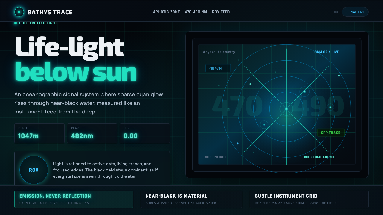 Abyssal BioluminescenceDark carries the signal. Electric cyan pins and Exo 2 readouts surface from a…黑暗承载信号。电青光点与 Exo 2 读数从声呐网格浮现。
 Detroit TechnoCold machines dream. Electric cyan circuits and chrome display type lock to a…冷机器在做梦。电青线路与铬感字形锁进黑色网格。
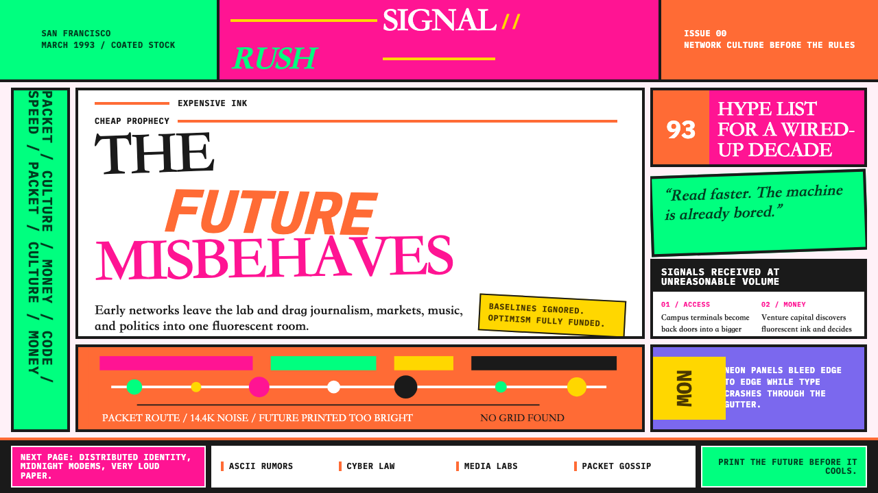 Wired Magazine (1993)Neon rejects restraint. Hot pink, orange, and electric green crash through br…荧光拒绝克制:粉红、橙色与电绿撞进破碎排版。
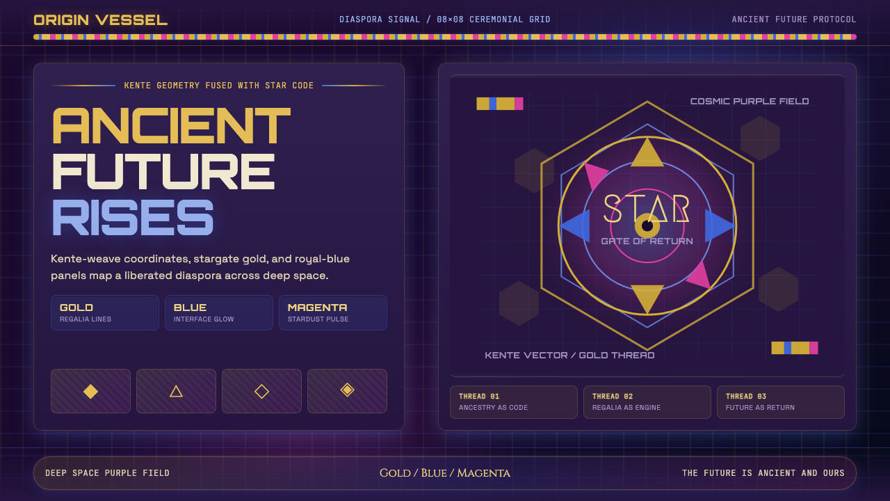 AfrofuturismAncient future, fully luminous. Gold kente grids cut through cosmic purple an…古老未来自带光芒:金色肯特网格切开宇宙紫与蓝色辉光。