What is Wired Magazine (1993)?什么是 Wired Magazine (1993)?
Wired 1993 was the typographic earthquake that announced the digital age in print — neon ink, broken grids, and four mismatched typefaces crammed onto a single spread.《连线》1993年创刊号是印刷媒体向数字时代发出的荧光宣言——霓虹墨水、破碎网格,四种互不相干的字体挤满一个跨页。
Wired Magazine (1993) in briefWired Magazine (1993) 速览
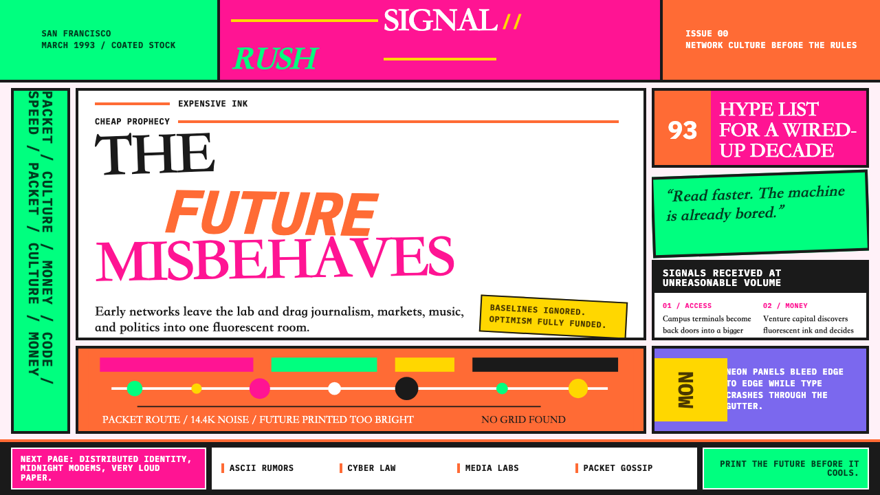
Wired Magazine 1993 is a design style born from the founding issues of Wired, the San Francisco technology publication that launched in January 1993. Creative director John Plunkett and design director Barbara Kuhr built a visual language that treated every page spread as a neon-soaked collision: fluorescent orange layered on hot pink, headlines fragmented across four mismatched typefaces, body copy rotated off the baseline, and columns that broke mid-word. The aesthetic read like the early internet looked — chaotic, dense, and radically optimistic about digital futures.《连线》1993年创刊设计风格诞生于这本旧金山科技出版物的创刊号——1993年1月出版。创意总监约翰·普朗克特与设计总监芭芭拉·库尔构建了一套将每一个跨页都处理成霓虹碰撞实验的视觉语言:荧光橙叠在粉红上,标题在四种互不搭调的字体中破碎散落,正文旋转偏离基线,栏目在词中断裂。这套美学读起来就像早期互联网的样子——混沌、密集、对数字未来充满不可救药的乐观。
The style occupies a unique position in design history as the moment print journalism attempted to visually embody the energy of networked computing before the web had a face of its own. It fused the raver underground's fluorescent palette with the ambitions of Silicon Valley venture capital, landing on expensive coated stock with the confidence of a manifesto. Every editorial convention — legibility, restraint, hierarchy — was interrogated and frequently discarded. The result was simultaneously exhausting and electric.这种风格在设计史上占据独特地位:它是印刷新闻业试图在网络计算机时代视觉化体现数字能量的历史时刻,彼时万维网尚无自己的面孔。它将锐舞地下文化的荧光色板与硅谷风险资本的野心融为一体,以宣言的自信落印在昂贵的铜版纸上。每一条编辑惯例——可读性、克制、层级——都受到审问,且往往被弃置一旁。结果是令人筋疲力尽却又充满电流感的视觉体验。
Visually, Wired 1993 is defined by excess as a deliberate philosophy. Color is maximal: neon Pantone inks bleed edge to edge with no safe zone or breathing margin. Typography is confrontational: display text arrived in stacked, colliding, and rotated configurations that treated the headline as an image rather than information. Photographic imagery was processed into halftone extremes or posterized into flat zones of shrieking color. The style is not chaos without intention — it is controlled overload, the visual equivalent of a fiber-optic data surge.在视觉上,《连线》1993风格以过剩作为一种刻意的哲学来定义自身。色彩是极致的:潘通荧光墨水满版出血,没有安全区,没有呼吸边距。字体是对抗性的:展示文字以堆叠、碰撞、旋转的方式出现,将标题视为图像而非信息载体。摄影图像被处理成极端网点或海报化的尖叫色块。这种风格并非没有意图的混乱——它是受控的过载,是光纤数据洪流的视觉等价物。
See the Wired Magazine (1993) design system查看 Wired Magazine (1993) 完整设计系统
Where does Wired Magazine (1993) come from?Wired Magazine (1993) 从何而来?
Wired Magazine was founded by Louis Rossetto and Jane Metcalfe, who conceived it as the Rolling Stone of the digital revolution — a publication whose form would embody the content. Their pitch to investors described a magazine for the people redesigning the world with digital tools. When the first issue appeared in January 1993, it immediately established that this would not look like any magazine that had come before. Rossetto hired Plunkett and Kuhr, partners in a small San Francisco design firm, to realize that vision.《连线》杂志由路易斯·罗塞托与简·梅特卡夫创办,他们将其构想为数字革命的《滚石》——一本形式本身即为内容的出版物。他们向投资者的融资方案将其描述为面向那些用数字工具重塑世界之人的杂志。1993年1月第一期面世时,它立刻确立了一件事:这本杂志的面貌将与此前任何杂志截然不同。罗塞托聘请了普朗克特与库尔——旧金山一家小型设计事务所的合伙人——来实现这一愿景。
John Plunkett arrived at the project with experience in information design and a conviction that editorial design could function as a form of argument. Barbara Kuhr brought a sensibility shaped by late-1980s West Coast underground publishing, where Pantone fluorescents and photocopier-warped type had already begun to challenge the conventions of print. Together they drew on a specific set of influences: the chaotic typographic experiments of Émigré magazine, which had been pushing digital type tools to their limits since the mid-1980s; the raw, saturated aesthetics of the UK rave scene's flyer culture; and the layered visual density of Mondo 2000, the Bay Area counterculture publication that had preceded Wired in covering cyberpunk and digital culture.约翰·普朗克特带着信息设计的从业经验与一个信念来到这个项目:编辑设计可以作为一种论证形式运作。芭芭拉·库尔的感性则由1980年代末西海岸地下出版文化塑造——在那里,潘通荧光色与复印机扭曲字体早已开始挑战印刷惯例。两人共同汲取了一组特定的影响来源:Émigré杂志自1980年代中期以来将数字字体工具推至极限的混乱排印实验;英国锐舞场景传单文化的原始、饱和美学;以及《蒙多2000》的分层视觉密度——这本湾区反文化出版物早于《连线》报道了赛博朋克与数字文化。
The technical context shaped the design in ways that are easy to overlook in retrospect. In 1993, digital typesetting and page layout software — primarily QuarkXPress and early PostScript — gave designers the ability to do things that would have been prohibitively expensive to achieve with traditional phototypesetting: rotating type to arbitrary angles, precisely overlapping elements at any scale, mixing typefaces freely without physical constraint. Wired's designers used these tools not to achieve the clean modernist layouts that other publications were pursuing with the same software, but to push toward maximal complexity. The digital crash of forms was enabled by digital tools.技术背景以回望时容易被忽略的方式塑造了这种设计。1993年,数字排版与页面布局软件——主要是QuarkXPress与早期PostScript——赋予设计师一种能力:做出那些用传统照相排版将造价高昂的事情。任意角度旋转文字、在任何尺度上精确叠压元素、不受物理约束地自由混排字体。《连线》的设计师用这些工具不是为了实现其他出版物正在用同样软件追求的简洁现代主义版面,而是朝着最大化的复杂度推进。形式的数字崩塌,由数字工具所促成。
Erik Spiekermann, the German type designer and typographic systems thinker, served as a typographic consultant to Wired in its early years. His involvement is significant because it suggests that Wired's apparent chaos was more deliberately constructed than its surface energy implied. Spiekermann's work has always been grounded in systematic thinking about type hierarchy and legibility — his presence at Wired indicates that even the most anti-systematic-looking pages were the product of considered decisions about what to break and how far to push each break. The result was a style that influenced an entire decade of editorial, interactive, and brand design, visible from MTV idents to web browser interfaces of the late 1990s.德国字体设计师、排印系统思想家埃里克·斯皮克曼在《连线》早年担任排印顾问。他的介入意义深远:它暗示《连线》的表面混乱比其能量所呈现的更具刻意构建的性质。斯皮克曼的工作历来植根于关于字体层级与可读性的系统性思考——他在《连线》的存在说明,即便是最反系统外观的页面,也是关于打破什么、每处打破推进多远的深思熟虑之结果。最终形成的风格影响了整整十年的编辑、互动与品牌设计,在1990年代末的MTV视觉识别到网络浏览器界面上清晰可见。
What defines the Wired Magazine (1993) look?Wired Magazine (1993) 的视觉特征是什么?
Fluorescent Color Overload荧光色过载
The Wired 1993 palette is built around Pantone fluorescent inks — the kind that glow with an almost physical intensity under bright light. Hot pink, electric orange, acid yellow-green, and cyan are used not as accents but as dominant fields, layered directly on top of one another with no neutral ground to mediate the collision. Color is used at maximum saturation throughout, with combinations chosen for maximum visual heat rather than harmonic relationship. The effect is intentionally aggressive: the eye cannot rest anywhere because nowhere is safe.《连线》1993风格的色板建立在潘通荧光墨水之上——那种在强光下发出近乎物理性光芒的墨水。粉红、电橙、酸性黄绿与青色不作为强调色使用,而是作为主导色域,直接相互叠压,没有任何中性底色来调解碰撞。色彩全程以最大饱和度使用,组合的选择以制造最大视觉热度为准,而非追求和谐关系。效果是刻意的攻击性:目光无处安歇,因为没有一处是安全地带。
Typographic Collision字体碰撞排印
Headlines in Wired do not sit; they collide. A single display treatment might combine a condensed grotesque, an italic serif, a decorative face, and a geometric sans in the same line — each at a different scale, some rotated, some set in color, some reversed out of a color field. Type is treated as image material with the same compositional rights as a photograph or an abstract shape. Body text occasionally inherits the same treatment: columns set at slight angles, copy that wraps around intrusions of color, line breaks that prioritize visual rhythm over reading flow.《连线》的标题不是安放的,而是碰撞的。一个展示性排印处理可能在同一行内组合一款压缩怪诞体、一款意大利衬线体、一款装饰字体与一款几何无衬线体——每款尺度不同,有些旋转,有些着色,有些从色域中反白显出。字体被当作图像材料处理,享有与照片或抽象形态同等的构图权利。正文有时也承袭同样处理:栏目以微小角度排布,文字绕着色彩入侵物换行,断行优先视觉节奏而非阅读流畅。
Edge-to-Edge Bleed满版出血
Margins in Wired 1993 are treated as obstacles to be eliminated rather than breathing room to be preserved. Color fields bleed to all four edges; photographs extend to the gutter and beyond; type runs to within a sliver of the trim. The rejection of margin is both visual and ideological — it signals a rejection of the conservative editorial restraint that characterizes legacy print publishing. There is nowhere outside the design; the page is always completely occupied.在《连线》1993年的设计中,页边距被当作需要消除的障碍,而非需要保留的呼吸空间。色域出血至四边;照片延伸至装订线乃至更远;文字跑到距裁切线仅一线之隔。对页边距的拒绝既是视觉的,也是意识形态的——它标志着对传统印刷出版所特有的保守编辑克制的拒绝。设计没有外部;页面始终被完全占据。
Halftone and Posterization Extremes极端网点与色调分离
Photographic images in Wired 1993 are rarely reproduced naturalistically. They are pushed to extremes: enlarged to the point where the halftone dot pattern becomes a visible graphic element, reduced to high-contrast silhouettes, or posterized into two or three flat zones of saturated color. This treatment removes photography's claim to neutral documentation and forces it to participate in the same aggressive graphic language as the typography and color fields around it. The image becomes another surface rather than a window.《连线》1993年的摄影图像很少以自然主义方式复制。它们被推向极端:放大到网点图案成为可见图形元素,压缩至高对比度剪影,或色调分离成两三个饱和色的平面区域。这种处理消除了摄影作为中立记录的主张,迫使其参与与周围排印和色域同样激进的图形语言。图像成为另一个表面,而非一扇窗。
Broken Grid and Off-Axis Rotation破碎网格与轴外旋转
Wired uses underlying column grids — the editorial discipline is not entirely abandoned — but elements routinely escape them. Text blocks sit at angles to the baseline grid. Dividing rules bisect columns diagonally. Pull-quotes land at forty-five degree rotations. The grid serves as a structure to violate rather than a structure to inhabit: its presence can be inferred from the violations, but the violations are always the point. This controlled disobedience distinguishes Wired from purely random layouts and is what makes the style reproducible.《连线》使用底层栏目网格——编辑规范并未被完全抛弃——但元素常常从中逃脱。文字块相对于基线网格倾斜放置。分割线斜向切穿栏目。引用语以四十五度角旋转。网格作为一种被违反的结构,而非一种被栖居的结构:它的存在可以从违反行为中推断,但违反行为始终才是重点。这种受控的不服从使《连线》区别于纯粹随机的版面,也是这种风格可以被复现的原因。
Density as Hospitality密度即款待
Where most editorial design uses white space to signal importance and guide attention, Wired 1993 treats maximum density as a form of generosity — the assumption that the reader is hungry, capable, and wants everything at once. Sidebars compete with body text which competes with infographics which compete with pull-quotes, all within the same spread. Nothing is subordinated into invisibility. The result is a reading experience that rewards sustained attention and repeated visits, behaving more like a web page than a magazine spread — which, in 1993, was precisely the point.大多数编辑设计用留白来标示重要性、引导注意力,而《连线》1993年则将最大密度视为一种慷慨——一种假设:读者是饥渴的、有能力的,且希望同时得到一切。侧栏与正文竞争,正文与信息图表竞争,信息图表与引用语竞争,全在同一个跨页内。没有任何元素被降格至隐形。结果是一种奖励持续注意力与反复阅读的阅读体验,其行为更像一个网页而非一个杂志跨页——1993年时,这正是题中之义。
Neon as Ideology荧光即意识形态
The fluorescent palette is not merely decorative — it carries an ideological charge. In 1993, neon color signaled youth culture, rave scenes, urban nightlife, and the energy of subcultural communities that had not yet been absorbed by mainstream media. Wired's use of these colors was a claim of kinship with those communities and a rejection of the earth tones, muted palettes, and conservative color systems of established print media. The neon said: this is not the Wall Street Journal; this is not Time magazine; this is something new from a new coast of a new culture.荧光色板不仅仅是装饰性的——它承载着意识形态的重量。1993年,霓虹色彩标志着青年文化、锐舞场景、都市夜生活,以及那些尚未被主流媒体吸纳的亚文化社区的能量。《连线》对这些色彩的使用,是对这些社区血缘关系的主张,也是对既有印刷媒体大地色调、静默色板和保守配色系统的拒绝。那些荧光色在说:这不是《华尔街日报》,这不是《时代》杂志,这是来自新文化新海岸的新事物。
See the Wired Magazine (1993) design system查看 Wired Magazine (1993) 完整设计系统
Who shaped Wired Magazine (1993)?谁塑造了 Wired Magazine (1993)?
Plunkett served as creative director of Wired from its founding in 1993 through the late 1990s and is the primary architect of the style's visual language. Working with his partner Barbara Kuhr, he developed the approach of treating each spread as an independent design experiment rather than a module in a consistent system. Plunkett's background in information design meant that even his most chaotic-looking pages had underlying structural logic — the apparent disorder was the product of deliberate decision-making about which conventions to explode and how. He received numerous design awards and helped establish Wired as a defining publication of its decade.普朗克特自1993年创刊起担任《连线》创意总监至1990年代末,是这种风格视觉语言的主要架构者。他与合伙人芭芭拉·库尔共同发展出一种方法:将每个跨页视为独立的设计实验,而非一致系统中的模块。普朗克特在信息设计方面的背景意味着,即便是他看起来最混乱的页面也有潜在的结构逻辑——表面的无序是关于爆破哪些惯例、爆破至何种程度的刻意决策之产物。他获得了众多设计奖项,并帮助《连线》成为那个十年的标志性出版物。
Kuhr co-directed Wired's design alongside Plunkett and brought a sensibility shaped by West Coast underground publishing. Her contribution was crucial in establishing the fluorescent palette and the magazine's approach to typographic rule-breaking as a sustained editorial philosophy rather than an occasional gesture. Kuhr's influence is most visible in the magazine's use of color as the primary structural signal — the way that a specific neon ink could define a section, establish a voice, or mark a transition in a way that overrode conventional hierarchy. Her partnership with Plunkett produced one of the most distinctive editorial design collaborations of the decade.库尔与普朗克特共同主持《连线》的设计,带来了由西海岸地下出版文化塑造的感性。她的贡献在于将荧光色板以及杂志对排印规则的打破确立为一种持续的编辑哲学,而非偶发的姿态。库尔的影响在杂志以色彩作为主要结构信号的方式上最为可见——某种特定荧光墨水定义一个栏目、确立一种声音、或以凌驾于传统层级之上的方式标记一次转换。她与普朗克特的合作成为那个十年最具辨识度的编辑设计协作之一。
Rossetto co-founded Wired with Jane Metcalfe and articulated the editorial vision that the magazine's design was built to serve. His conviction that digital technology was producing the most significant cultural shift since the Renaissance gave the design team license to be as radical as they wished — the content demanded a form equal to its ambitions. Rossetto's editorial voice was maximalist, utopian, and contentious, and those qualities shaped the visual culture of the publication directly. He left Wired in 1998 when the magazine was sold to Condé Nast, and the design began its gradual evolution toward more conventional editorial standards.罗塞托与简·梅特卡夫共同创办了《连线》,并阐明了杂志设计所服务的编辑愿景。他坚信数字技术正在制造自文艺复兴以来最重大的文化转变,这一信念赋予设计团队充分的授权去尽可能激进——内容要求一种与其野心等量的形式。罗塞托的编辑声音是最大化主义的、乌托邦式的、充满争议的,这些品质直接塑造了出版物的视觉文化。1998年杂志出售给康泰纳仕集团时,他离开了《连线》,设计随之开始向更为常规的编辑标准逐渐演变。
The German type designer and information design theorist served as a typographic consultant to Wired in its early years. Spiekermann is best known for systematic, legibility-focused work — FF Meta, the German postal system's typeface family — which makes his involvement with Wired's deliberately anti-legibility aesthetic interesting and somewhat paradoxical. His presence at the magazine suggests that the typographic chaos was more intentional than instinctive: the decision about exactly how far to push illegibility, which typeface combinations would still function as communication and which would collapse entirely, required the judgment of someone who understood the rules being broken.这位德国字体设计师与信息设计理论家在《连线》早年担任排印顾问。斯皮克曼以系统性、注重可读性的工作而闻名——FF Meta、德国邮政系统的字体家族——这使他与《连线》刻意反可读性美学的合作显得有趣而略带悖论色彩。他在杂志的存在暗示排印混乱比直觉性更具意图性:关于将不可读性推进到恰好多远、哪种字体组合仍能作为传达而运作、哪种将彻底崩溃的判断,需要一位深谙所破规则之人。
Though not directly associated with Wired, VanderLans and Licko — founders of Émigré magazine and the Émigré type foundry — provided the typographic vocabulary and the conceptual permission that Wired's design built upon. Émigré, which began publication in 1984, had spent nearly a decade demonstrating that digital type tools could produce radical, expressionist letterforms and layouts that were incompatible with traditional typesetting standards. By the time Wired launched in 1993, Émigré typefaces and Émigré-adjacent experimental typography had become the signal vocabulary of an entire generation of designers who wanted to do something that looked like the digital age felt.尽管与《连线》没有直接关联,范德兰斯与利奇科——Émigré杂志与Émigré字体铸造厂的创始人——提供了《连线》设计所建立其上的字体词汇与概念许可。Émigré自1984年创刊,已花近十年时间证明数字字体工具能够产生与传统排版标准不兼容的激进、表现主义字形与版面。到1993年《连线》创刊时,Émigré字体与Émigré相邻的实验排印已成为整整一代渴望创作出数字时代感觉之物的设计师的信号词汇。
How do you use Wired Magazine (1993) today?今天怎么用 Wired Magazine (1993)?
Wired 1993 is among the most context-sensitive styles in contemporary design. Its defining qualities — fluorescent color overload, typographic collision, maximum density — are not universally applicable and require a clear strategic justification before deployment. The style works best when the product, brand, or message is explicitly positioned at the intersection of technology, culture, and youthful energy, and when the audience has sufficient visual literacy to read deliberate rule-breaking as intentional rather than incompetent.《连线》1993风格是当代设计中对语境最敏感的风格之一。它的定义性品质——荧光色过载、字体碰撞、最大密度——并非普遍适用,在部署前需要明确的策略理由。这种风格在产品、品牌或信息明确定位于科技、文化与青年能量交汇处时效果最佳,且受众需要具备足够的视觉素养,能将刻意的规则打破读作有意为之,而非能力不足。
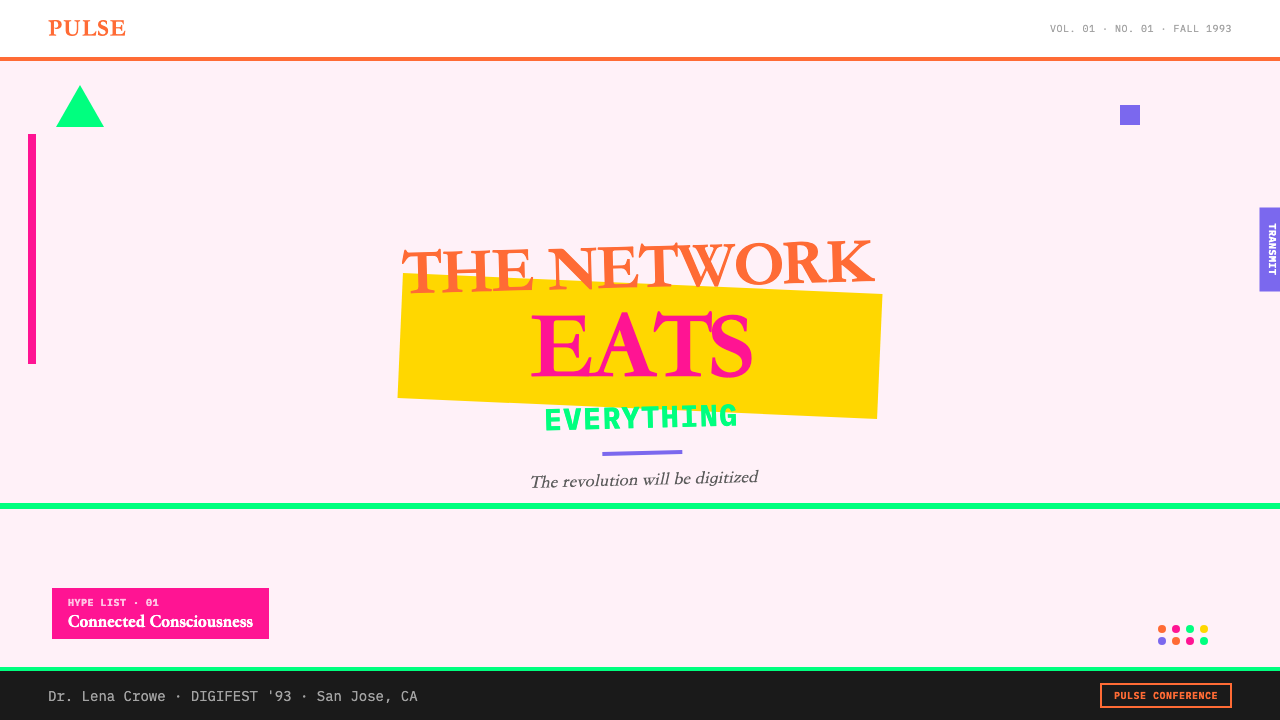
For presentation slides, Wired 1993 works powerfully on cover and section-divider slides but demands restraint on content slides. A cover built in this style uses a single dominant fluorescent color as a full-bleed background field, with headline type in a contrasting neon — not black, not white — set at maximal scale, colliding with a secondary smaller typeface in a complementary color. Section dividers can echo this energy at reduced intensity. Content slides, however, must pull back significantly: dense information cannot compete with maximum visual noise. The approach for data slides is to adopt the color system — using the fluorescent palette to differentiate data series — while applying it within a clean grid with sufficient breathing room around each element.对于演示文稿,《连线》1993风格在封面页与章节分隔页上效果强劲,但在内容页上需要克制。以这种风格构建的封面使用单一主导荧光色作为满版出血背景域,标题文字以对比性的霓虹色——不是黑,不是白——以最大尺度排布,与另一款更小的字体以互补色碰撞。章节分隔页可以以降低强度的方式呼应这种能量。然而内容页必须显著收敛:密集信息无法与最大视觉噪声竞争。数据页的处理方式是采用色彩系统——用荧光色板区分数据系列——但在干净的网格内应用,每个元素周围保留充足的呼吸空间。
For web interfaces and dashboards, the style translates most effectively as a signal system rather than a total environment. Using one fluorescent color as the primary interactive accent — for buttons, alerts, active states, and hover effects — against a near-black or very dark background creates the visual energy of Wired 1993 without the cognitive overload of full fluorescent fields. Navigation and pricing pages benefit from the style's hierarchy-through-collision approach: a pricing tier name at maximum scale in a neon color, with feature lists in a much smaller neutral typeface, creates the kind of visual contrast that guides attention without formal rules of proportion.对于网页界面与仪表板,这种风格最有效的翻译方式是作为信号系统而非整体环境。在近黑或深色背景上使用一种荧光色作为主要交互强调——用于按钮、警示、激活状态与悬停效果——能创造《连线》1993的视觉能量,而不带来满版荧光域的认知过载。导航与定价页面受益于这种风格的碰撞层级方法:以最大尺度的霓虹色显示定价层级名称,配以更小的中性字体显示功能列表,创造出无需正式比例规则即可引导注意力的视觉对比。
For editorial and marketing work — brand campaigns, event communications, launch announcements — Wired 1993 is most effective when used in short bursts of high intensity. A poster or social card in this style can sustain full fluorescent overload because the viewing time is short and the goal is immediate attention capture. A long-form article or multi-page report cannot, because the sustained density becomes fatiguing. For editorial applications, the practical approach is to use the style's palette and typographic aggression for chapter openers, pull-quotes, and section headers, while reverting to clean readable type for body text. The contrast between the intense moments and the quiet passages actually amplifies both.对于编辑与营销工作——品牌活动、活动传播、发布公告——《连线》1993风格在短暂的高强度爆发中最为有效。海报或社交卡片可以承受完整的荧光过载,因为观看时间短暂,目标是即时吸引注意力。长篇文章或多页报告则不能,因为持续的密度会令人疲惫。对于编辑应用,实用的方法是将这种风格的色板与排印攻击性用于章节开篇、引用语与小节标题,而正文回归干净可读的字体。高强度时刻与安静段落之间的对比实际上会放大两者。
The most common mistake when applying Wired 1993 is treating it as a color problem rather than a structural one. Slapping fluorescent colors onto a conventional grid produces neither the energy of the original nor a functional layout — it produces visual noise without the controlled disorder that makes the style legible. Successful application requires committing to the typographic logic: actually setting type at competing scales, actually letting elements overlap, actually eliminating margins where the composition calls for it. The second most common mistake is applying the style to products or audiences where its ideological associations — youth, disruption, techno-optimism — are misaligned with the actual brand values. Wired 1993 announces radicalism; if your product is not prepared to own that claim, a different style will serve it better.应用《连线》1993风格时最常见的错误,是将其视为色彩问题而非结构问题。将荧光色叠在传统网格上,既不能产生原作的能量,也不能形成有效版面——只会制造没有受控无序的视觉噪声,而正是那种受控的无序使这种风格可读。成功的应用需要真正投入排印逻辑:真正将字体排布在相互竞争的尺度上,真正让元素叠压,真正在构图要求的地方消除页边距。第二常见的错误是将这种风格应用于其意识形态关联——青年、颠覆、技术乐观主义——与实际品牌价值错位的产品或受众。《连线》1993宣告的是激进主义;如果你的产品没有准备好承担这一主张,另一种风格将更好地服务它。
See the Wired Magazine (1993) design system查看 Wired Magazine (1993) 完整设计系统
Wired Magazine (1993) — FAQWired Magazine (1993) · 常见问题
Is Wired 1993 style the same as 1990s grunge typography?《连线》1993风格与1990年代垃圾摇滚排印是同一回事吗?
They share roots but are distinct. Both emerged from the same moment of digital type experimentation and drew on Émigré and West Coast underground publishing. Grunge typography — associated with designers like David Carson and publications like Ray Gun — tends toward destroyed, deconstructed, and illegibility-maximizing treatments with a rawer, more analog texture. Wired 1993 is more fluorescent, more information-dense, and more explicitly tech-optimist in its ideology. Grunge typography wears nihilism; Wired wears utopianism. The color palettes are also different: grunge favors distressed tones and desaturated treatments; Wired favors Pantone neons at full saturation.两者同根但截然不同。两者都诞生于同一数字字体实验时刻,都汲取了Émigré与西海岸地下出版的养分。垃圾摇滚排印——与大卫·卡森等设计师及《Ray Gun》等出版物相关联——倾向于破坏性、解构性、以不可读性最大化为目标的处理,带有更原始、更模拟质感。《连线》1993更荧光、信息更密集、意识形态上更明确地倾向于技术乐观主义。垃圾摇滚排印身着虚无主义;《连线》身着乌托邦主义。色板也不同:垃圾摇滚偏爱破旧色调与低饱和处理;《连线》偏爱满饱和度的潘通霓虹色。
Can this style work for a dark-background digital product?这种风格能用于深色背景的数字产品吗?
Yes, and it may be the most natural contemporary translation of the original. The original Wired ran fluorescent inks on white coated stock, but the fluorescent palette — electric pink, neon green, acid yellow — actually reads with even more intensity against dark backgrounds, which approximate the black of a screen at night. A dark Wired 1993 interpretation works best when it commits to one or two fluorescent accents against the dark field rather than attempting to replicate the full color overload of the printed original. The typographic collision can be fully preserved regardless of background choice.可以,而且这可能是对原作最自然的当代翻译。原版《连线》在白色铜版纸上印刷荧光墨水,但荧光色板——电粉红、霓虹绿、酸性黄——在深色背景上实际上会以更强的强度显现,接近夜间屏幕的黑色。深色《连线》1993诠释最有效的做法是在深色域上专注于一两种荧光强调色,而非试图复制印刷原版的完整色彩过载。排印碰撞可以完全保留,无论背景选择如何。
How do you make this style readable without losing its character?如何在不失去风格特质的情况下让这种风格保持可读性?
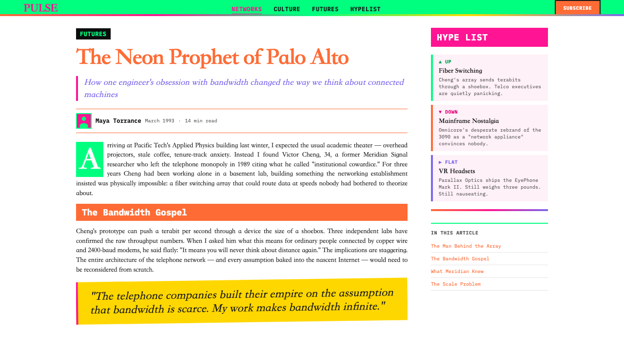
The key is separating the decorative layer from the information layer. In Wired's original pages, the fluorescent color fields and typographic collisions functioned as a visual environment that attracted and retained attention; the actual editorial content was often set in body text that, while unconventionally placed, was internally readable. In contemporary applications, the same principle applies: use the style's fluorescent colors and collision typography for display elements — headlines, labels, section markers, call-outs — and reserve a functional, high-contrast typeface for any text that needs to be read completely. The reader's eye learns quickly to navigate between the expressive layer and the informational layer.关键在于将装饰层与信息层分离。在《连线》的原始页面中,荧光色域与排印碰撞作为视觉环境运作,吸引并留住注意力;实际的编辑内容往往设置在正文中,虽然位置非常规,但内部是可读的。在当代应用中,同样的原则适用:将这种风格的荧光色与碰撞排印用于展示元素——标题、标签、章节标记、引用语——并为任何需要完整阅读的文字保留功能性的高对比度字体。读者的目光会很快学会在表现层与信息层之间导航。
Why did Wired eventually move away from this design style?《连线》为何最终放弃了这种设计风格?
Wired's visual language evolved gradually after the magazine was acquired by Condé Nast in 1998 and Plunkett and Kuhr departed. The full fluorescent overload style was the product of a specific moment: a small, independent publication with a radical editorial mission, operating in a pre-web media landscape where print had to carry the full energy of a movement that had no other visual home. As the web matured and established its own visual vocabulary, the urgency of Wired's original visual argument diminished. Commercial publishing pressures at Condé Nast also favored legibility, advertiser-friendly layouts, and newsstand readability over avant-garde experimentation. The evolution was not a failure of the style but a change in context.1998年杂志被康泰纳仕集团收购、普朗克特与库尔离开后,《连线》的视觉语言逐渐演变。完整的荧光过载风格是特定时刻的产物:一本拥有激进编辑使命的小型独立出版物,在前网络时代的媒体格局中运营,在那里印刷品必须承载一场运动的全部能量,而这场运动没有任何其他视觉栖息地。随着网络成熟并建立起自己的视觉词汇,《连线》原版视觉论证的紧迫性减弱了。康泰纳仕的商业出版压力也倾向于可读性、对广告商友好的版面与报刊亭可读性,而非先锋实验。演变不是风格的失败,而是语境的改变。
What kinds of projects should avoid this style entirely?哪些类型的项目应当完全回避这种风格?
Any project where the primary user experience goal is calm, trust, or authority should avoid Wired 1993 entirely. Financial services, healthcare, legal platforms, enterprise software, and products serving older demographics all depend on visual environments that signal stability and competence — qualities that Wired 1993's visual aggression actively undermines. Similarly, luxury brands whose positioning depends on restraint and quiet confidence will find the style's maximalism in direct contradiction with their values. The style is also poorly suited to long-form reading environments: a full book, a long research report, or a multi-chapter course presented entirely in Wired 1993 would be functionally exhausting. Short, high-impact, single-goal contexts are where it excels.任何主要用户体验目标是平静、信任或权威的项目都应当完全回避《连线》1993风格。金融服务、医疗健康、法律平台、企业软件,以及服务年长用户群的产品,都依赖标示稳定性与能力的视觉环境——而《连线》1993的视觉攻击性会主动破坏这些品质。同样,定位依赖克制与沉静自信的奢侈品牌,会发现这种风格的最大化主义与其价值观直接矛盾。这种风格也不适合长篇阅读环境:一本完整的书、一份长篇研究报告,或一门完全以《连线》1993呈现的多章节课程,在功能上将令人精疲力竭。短暂的、高冲击力的、单一目标的语境,才是它大放异彩之处。
Related design styles相关设计风格
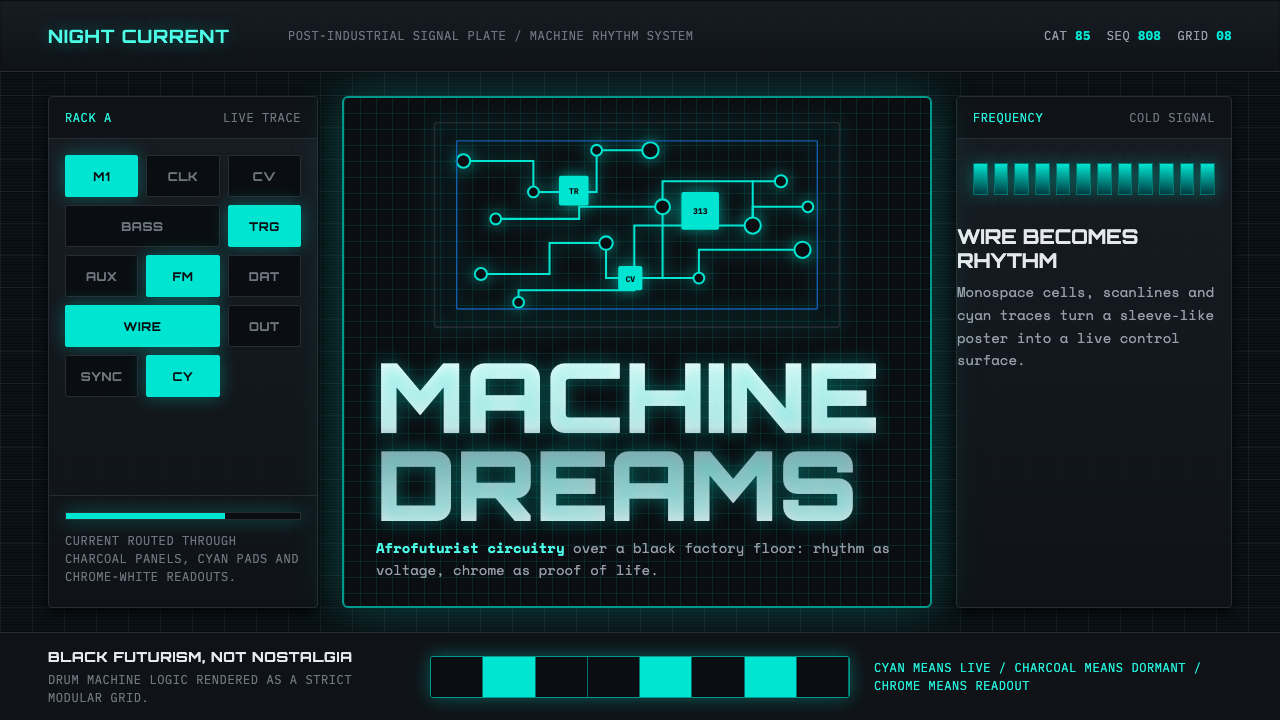 Detroit TechnoCold machines dream. Electric cyan circuits and chrome display type lock to a…冷机器在做梦。电青线路与铬感字形锁进黑色网格。
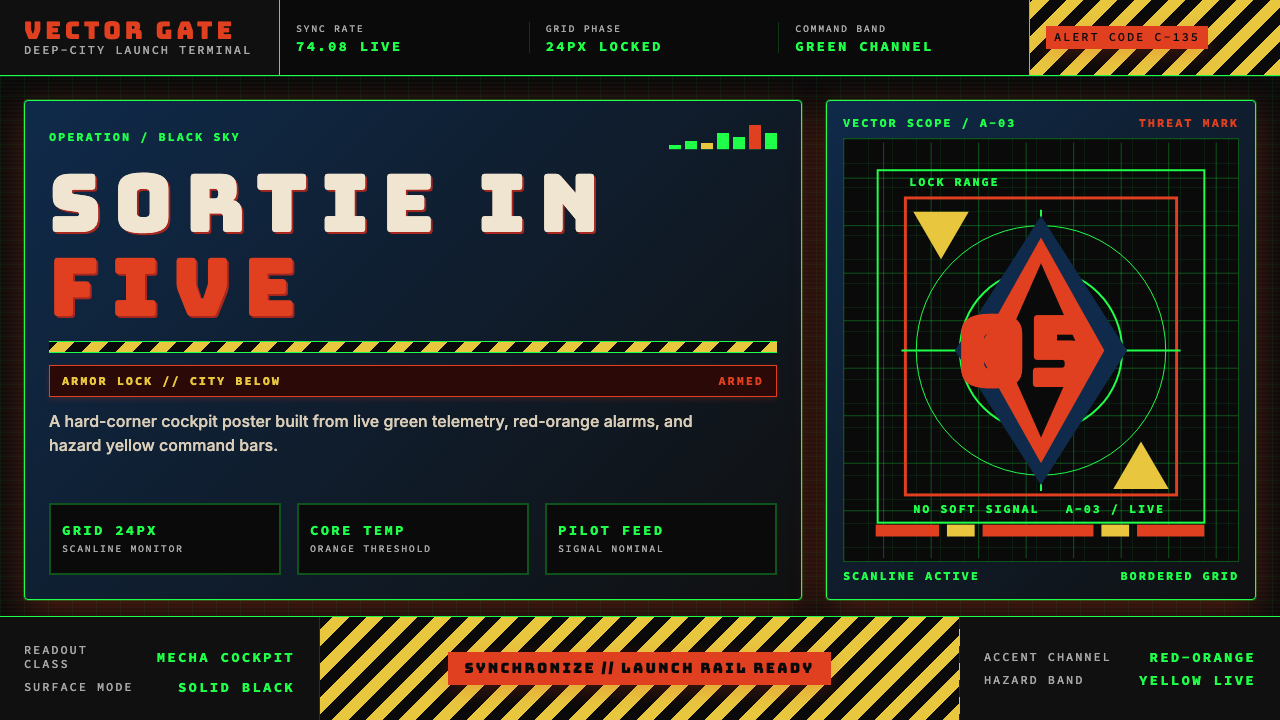 Neon Genesis EvangelionCockpit dread at launch. Tech-green grids, red-orange alarms, and hazard yell…出击前的驾驶舱压迫感。科技绿网格、橙红警报与危险黄条。
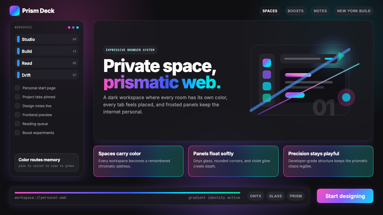 Arc Browser Prismatic (2023)Color is architecture. Pink-violet-cyan ribbons glow over onyx glass and roun…颜色即架构:粉紫青光带浮在黑曜石玻璃面板上。
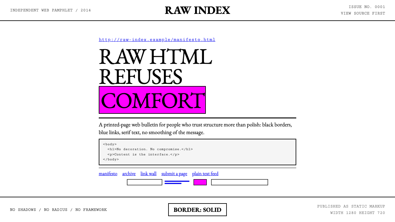 Brutalist Web 2014Browser defaults, weaponized. Times New Roman, electric-blue links — raw HTML…把浏览器默认样式当武器:Times New Roman、电蓝链接——HTML…
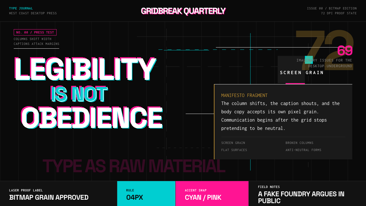 Emigre Magazine (1984–2005)Defies the tidy grid. Cyan, ochre, and hot-pink bitmap type collides on black.拒绝整齐网格:黑底上的青色、赭色与热粉像素字相撞。
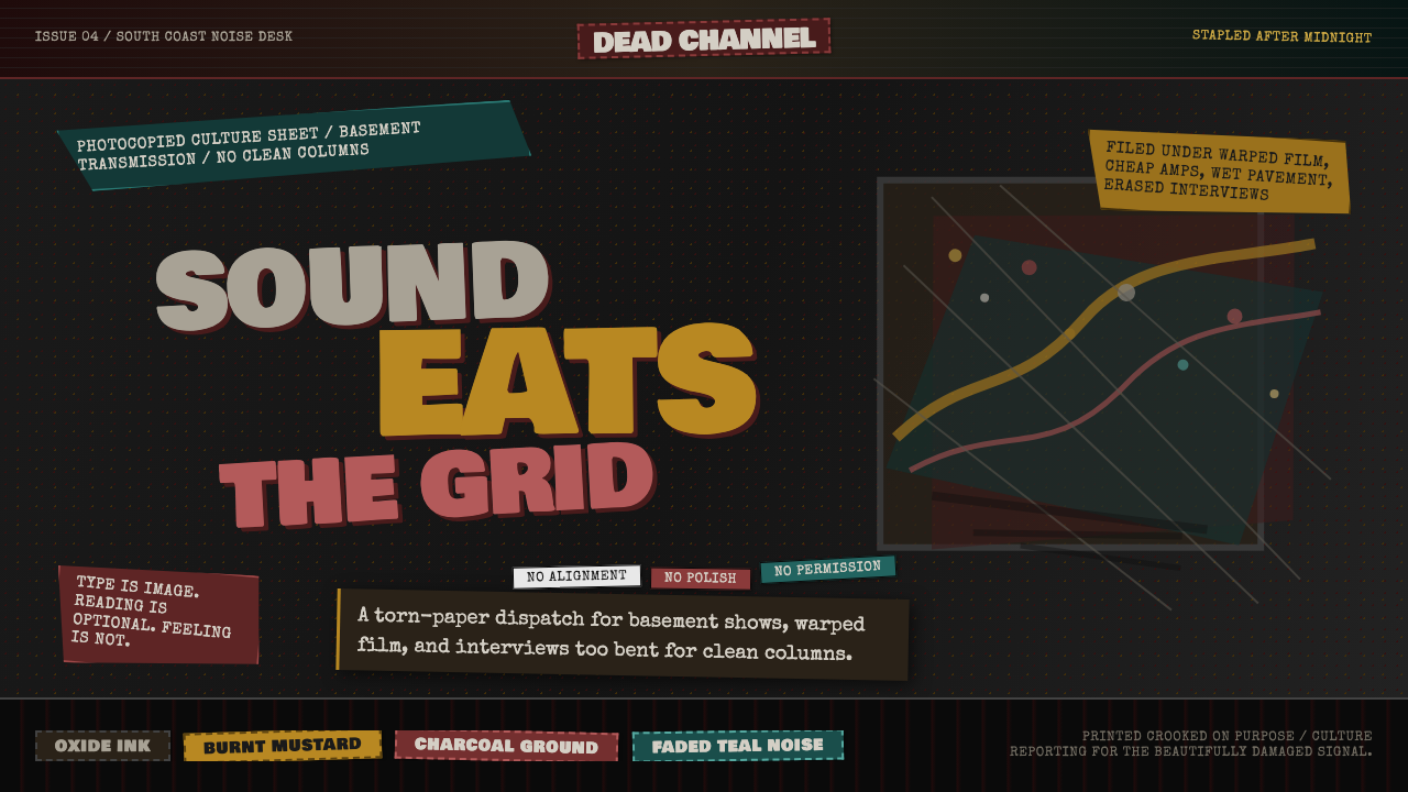 Grunge (Carson 1993)Carson's anti-rules, photocopied. Oxblood on charcoal, distressed type, delib…大卫·卡森颠覆现代主义排版的粗粝美学:暗红与焦黄、炭灰底、刻意打破的网格、油墨…