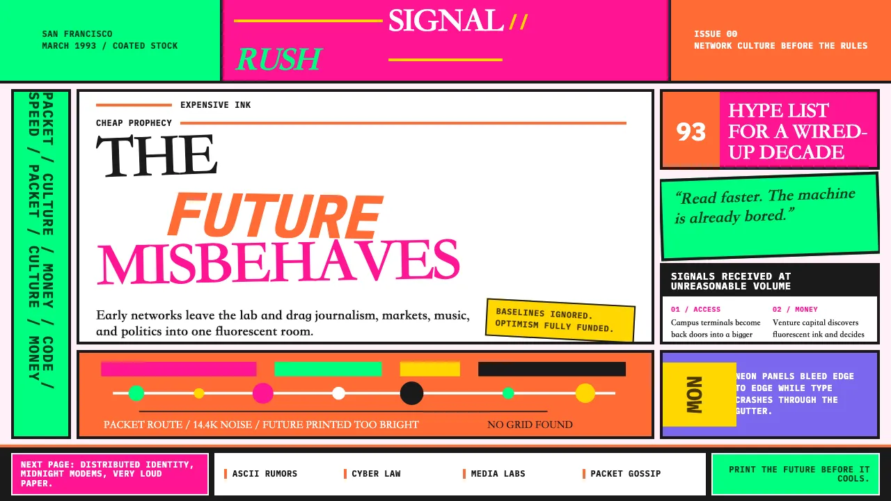
About Wired Magazine (1993)
Wired 1993 is the typographic earthquake that announced the digital age in print. John Plunkett and Barbara Kuhr's founding design treated every spread as a neon-soaked collision — fluorescent orange on hot pink, headlines in four mismatched typefaces, body copy rotated off-axis — reading like the early internet looked: chaotic, dense, and unapologetically optimistic about the future.
The magazine rejected every rule of editorial restraint. Pantone neons bled edge-to-edge, baselines were ignored, and columns split mid-word. It was Mondo 2000 with venture capital — raver aesthetics meeting Silicon Valley ambition on expensive coated stock.
- Origin
- San Francisco, California
- Era
- 1993 launch; Plunkett/Kuhr direction through ~2000
- Key figures
- John Plunkett · Barbara Kuhr · Louis Rossetto · Erik Spiekermann
- Movements
- Post-grunge magazine experimentalism · 90s digital-print hybrid · neon Pantone abuse
Wired Magazine (1993) design spec
Colors
Typography
The other 11 sections — buttons, cards, spacing, motion, techniques and more — open once you unlock. Download the DESIGN.md or send it to your AI in one click. Unlock once, yours forever.
Sign up nowStyles similar to Wired Magazine (1993)
Also inspired by brands & products, with a close feel.
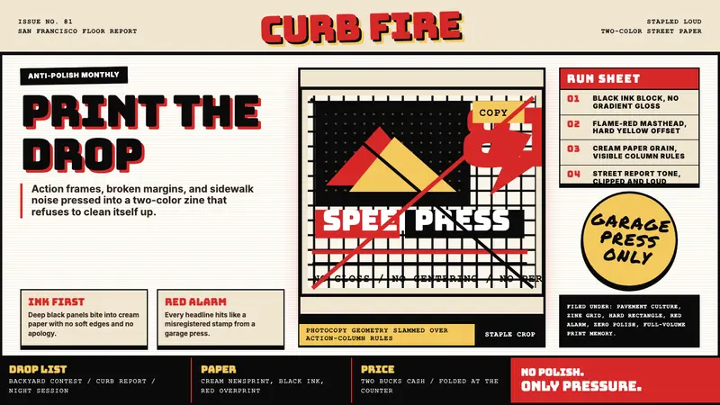 Thrasher Skate Zine (1981)Loud without polish. Flame red type, black ink blocks, and cream zine grids hit hard.
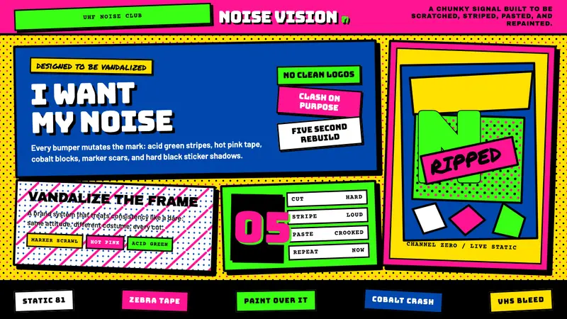 MTV Launch Identity (1981)Built to be vandalized. Hot pink, acid green, Bungee blocks, and crooked sticker borders.
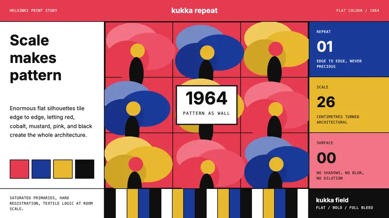 Finnish Marimekko Unikko (1964)Scale becomes pattern. Poppy red, cobalt, mustard, and Inter tile flat silhouettes.
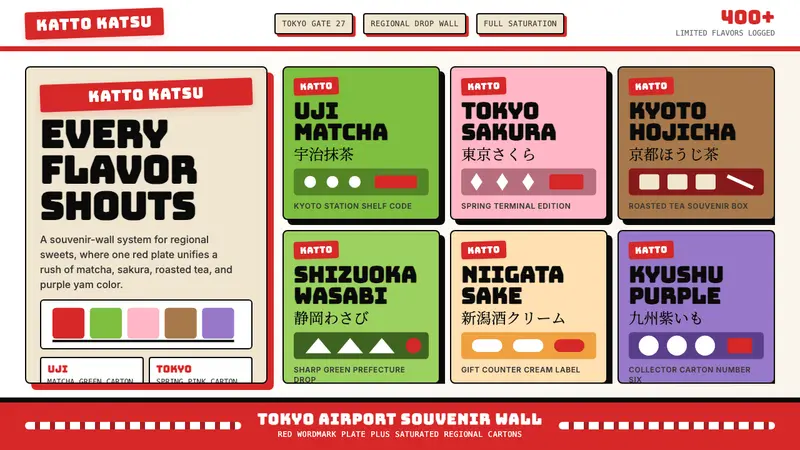 Kit Kat Japan CollectorSouvenir wall joy. Red plates and saturated flavor tiles turn regional sweets into collectibles.