What is Jellyfish Aquarium Study?
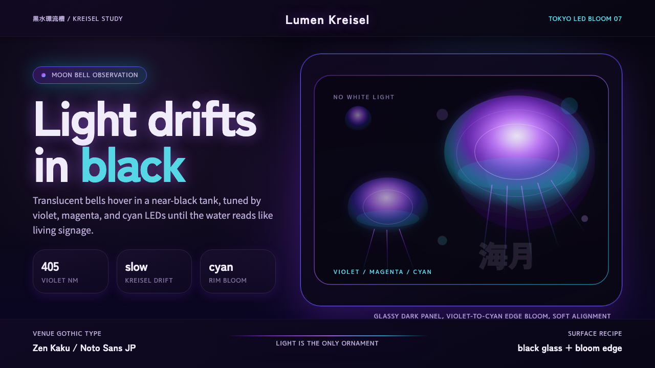
Jellyfish Aquarium Study turns light itself into the only decoration — violet-to-cyan gradients pulsing against a near-black void, venue-gothic type, and the hushed grandeur of a modern East-Asian immersive aquarium.
Jellyfish Aquarium Study in brief
Jellyfish Aquarium Study is a dark, luminous aesthetic drawn directly from the visual language of contemporary East-Asian immersive aquariums — particularly the kreisel tank displays perfected at Tokyo's Sumida Aquarium and Enoshima Aquarium, where translucent Aurelia moon jellyfish drift in programmable LED-lit black water. The signature palette runs from deep violet through magenta to cool cyan, always glowing against backgrounds so dark they read as absolute black.
The style belongs to the broader family of bioluminescent-inspired dark design, but it is unusually disciplined in its restraint. It never reaches for pastel softness or bleached-out white. The darkness is load-bearing: it creates the immersive void that makes the glowing jellyfish bells — and, by extension, any luminous content element — appear to float. Remove the dark ground and the entire effect collapses into an ordinary neon aesthetic.
Typographically, the style reaches for what might be called venue gothic — the clean, slightly condensed Japanese sans-serif letterforms used in premium cultural institutions: aquariums, museums, concert halls. The type is cool and authoritative, never decorative. It functions as a calm scientific label hovering in front of the spectacle, reminding the viewer that what they are seeing is both wondrous and precisely observed.
Where does Jellyfish Aquarium Study come from?
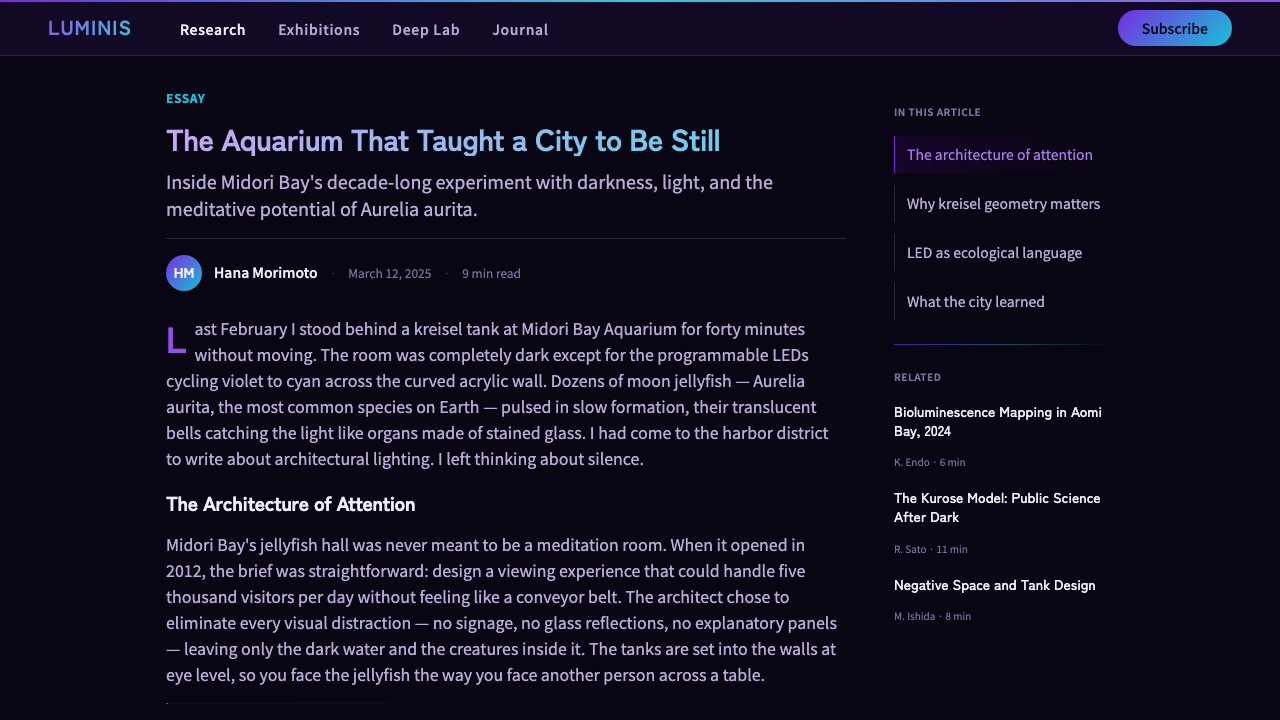
The aesthetic context for Jellyfish Aquarium Study is the programmable-LED era of aquarium exhibition design, which took shape in Japan from roughly 2010 onward. Earlier aquarium displays relied on fluorescent tubes and fixed lamp arrays, producing a generic greenish underwater ambience. The shift to programmable LED rigs — capable of cycling through the full visible spectrum and synchronizing with ambient sound — allowed exhibit designers to create precisely choreographed light environments for individual species. Jellyfish, which are nearly transparent and take on whatever color is shone through them, became the canonical LED showcase subject.
The Sumida Aquarium, which opened in Tokyo Skytree Town in 2012, and the renovated Enoshima Aquarium were early adopters of this approach. Both institutions invested heavily in cylindrical kreisel tanks — gentle-flow circular tanks designed specifically for jellyfish, which are physically fragile — and surrounded them with programmable LED lighting rigs. The experience they produced was unlike anything in previous aquarium design: a room-scale void broken only by drifting bioluminescent forms, with visitor movement and ambient audio choreographed into the whole.
The visual language that emerged from these installations translated quickly into exhibition graphics, merchandise, digital experiences, and eventually broader graphic design. The dark-field, glowing-gradient signature — violet to cyan, with magenta as a hot midpoint — became associated with the premium end of Japanese popular science culture: the kind of visual register used in museum special exhibitions, science communication for the general public, and high-production event promotion.
Venue gothic typography entered this world through the intersection of Japanese institutional graphic design and the influence of mid-century European modernism on Japanese public signage. Major Japanese cultural venues developed a refined typographic house style that borrowed the clarity of Swiss rationalism while retaining distinctly Japanese optical spacing preferences. Applied to aquarium contexts, this typographic sensibility produces text that reads as calm and authoritative against even the most dramatic visual background — an effect that has become a recognizable marker of Japanese cultural institution identity.
What defines the Jellyfish Aquarium Study look?
Dark Void Ground
The background is not merely dark — it aspires to the quality of a kreisel tank's black-painted interior: a total absence of ambient reflected light. This deep, near-absolute darkness is the stylistic anchor from which everything else radiates. Gradients and glowing elements derive their luminous effect entirely from this background contrast. Without it, the palette becomes just another dark mode; with it, the visual field becomes a controlled void in which light objects appear to float rather than rest.
Bioluminescent Gradient Palette
The signature color movement runs from deep violet through magenta to cool cyan — the chromatic arc traced by a jellyfish bell as it drifts through a cycling LED array. These are not the warm neons of nightclub aesthetics or the saturated brights of synthwave. They are cooler, slightly blue-shifted, and they carry an association with natural marine light phenomena: bioluminescence, the blue zone of deep water, the ultraviolet edge of visible light. The gradients are always radial or vertical — emanating outward from a center or rising from the bottom — never horizontal bands, which would read as digital rather than organic.
Venue Gothic Typography
Type in this style is clean, slightly condensed, and visually cool — the typographic register of a Japanese natural history museum or premium aquarium. Headlines are set with generous tracking and moderate weight, never at extreme heaviness. Body text is minimal: captions, taxonomic labels, dates. The type never competes with the visual ground; it floats as annotation, providing scientific calm in front of biological spectacle. Latin typefaces that harmonize with this aesthetic tend toward the geometric humanist — clear terminals, tight apertures, understated ink traps.
Diffused Glow and Soft Bloom
Where Bauhaus uses hard-edged shadows as structural elements, Jellyfish Aquarium Study uses soft luminous bloom: edges of glowing elements dissolve into the dark background rather than terminating cleanly. This bloom mimics the optical behavior of luminescent organisms in water — light scattering through a translucent medium — and produces an effect of physical depth even in flat digital contexts. The bloom is controlled and intentional, not a photographic lens artifact; it reads as a property of the illuminated object rather than a limitation of the capture medium.
Minimal Structural Ornamentation
Unlike dark aesthetics that reach for layered textures, distressed surfaces, or ornamental detail, this style maintains extreme surface purity. The only permissible decorative elements are those that echo the physical geometry of the subject — concentric rings suggesting jellyfish bell ripples, radial filaments suggesting tentacle trails, horizontal rules as thin as a diving depth marker. Every structural element that appears should be justifiable as either scientific notation or environmental reference.
Spatial Hierarchy through Luminosity
In conventional light-background design, hierarchy is established through scale and contrast. In Jellyfish Aquarium Study, the primary organizing tool is luminosity: the brightest element is always the most important, and elements recede into the dark ground as they decrease in informational weight. This mirrors how the eye actually perceives jellyfish in a tank — attention is drawn magnetically to the most luminous organism. The result is a system where visual hierarchy is felt rather than read, operating below the threshold of conscious analysis.
Restraint with Color Range
Despite the drama of its gradients, the palette is surprisingly narrow. The full chromatic arc from violet to cyan spans roughly the cool half of the visible spectrum, and the style rarely introduces warm hues — no amber, no warm white, no red-orange. This tonal restraint is what distinguishes the aesthetic from generic dark-mode design or nightclub visual identity. Introducing warm tones disrupts the association with marine bioluminescence and tips the palette toward something more electronic and less organic.
Who shaped Jellyfish Aquarium Study?
The team behind Sumida Aquarium's opening in 2012 established what became the template for the modern immersive jellyfish display in Japan. Their approach — cylindrical kreisel tanks, programmable LED rigs cycling through the violet-cyan spectrum, and graphic communication that borrowed from museum design rather than theme-park spectacle — created a new category of cultural experience that spread rapidly to other institutions. The Sumida installation remains a benchmark for the aesthetic balance between scientific rigor and sensory immersion.
Enoshima Aquarium, located on the Kanagawa coast south of Tokyo, developed a complementary approach to jellyfish display that emphasized the temporal dimension — choreographing color cycles to suggest the organism's life cycle and the seasonal rhythms of marine environments. Their exhibition graphics developed the venue-gothic typographic dimension of the aesthetic, applying Japanese institutional type sensibility to signage that had to be simultaneously legible to domestic visitors, international tourists, and the scientific community.
The moon jellyfish is not a designer, but it is the principal formal inspiration for the style. Aurelia's translucent bell — fringed with short tentacles and internally patterned with four horseshoe-shaped gonads visible through the mesoglea — provides the style's organizing geometry: radial symmetry, concentric rings, soft edges, and the quality of luminescence-through-translucency. Every design decision in the aesthetic can be traced back to the optical and biological properties of this single organism under programmable light.
The typographic and spatial sensibility that frames the Jellyfish Aquarium Study aesthetic is rooted in a tradition of Japanese institutional graphic design that developed through the postwar decades. Influenced by Swiss International Style but adapted to the visual demands of Japanese script and the cultural values of Japanese public institutions — precision, humility, the subordination of design ego to communicative purpose — this tradition produced a distinctive approach to signage, exhibition graphics, and printed matter that prioritizes spatial generosity, tonal restraint, and a quality of calm authority.
The programmable LED array — the hardware infrastructure that made the modern jellyfish display possible — is the technological origin point of the style. These systems, capable of producing precise color at variable intensity across a wide spectrum, transformed jellyfish from difficult-to-display animals requiring specialized care into spectacular living light installations. The color palette of the Jellyfish Aquarium Study style is not a post-hoc design choice; it is literally the spectral range that programmable aquarium LED rigs cycle through when optimized for jellyfish display.
How do you use Jellyfish Aquarium Study today?
Jellyfish Aquarium Study is a highly specific aesthetic with a clear emotional register — wonder, scientific calm, luminous depth. Applied correctly, it produces work that feels simultaneously premium and approachable, technically rigorous and sensory. The key discipline is maintaining the dark void: every layout decision should protect the near-black background and resist the temptation to add lightness, texture, or warm tones that erode the immersive effect.
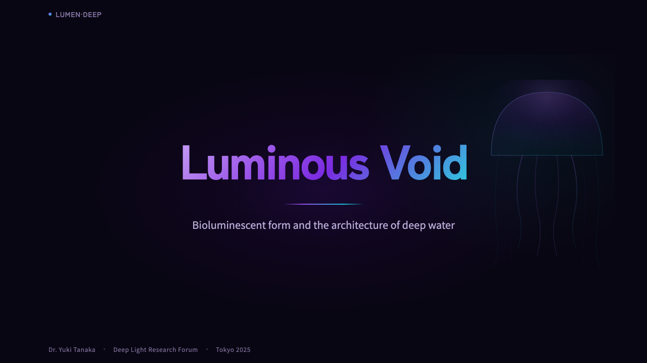
For presentation slides, the style works best on covers and full-bleed section dividers. A cover slide built on this aesthetic commits to near-total darkness, with the primary visual element — a gradient shape, an illuminated photograph, a typographic element with light bloom — floating in the upper or central field. The title should be set in a clean, slightly tracked-out sans-serif in pale cool white or pale cyan, small enough not to crowd the visual but large enough to anchor. Content slides require more care: the style does not support the information density of conventional presentation design, so slides should be written spare — one idea per slide, generous margins, and any data visualization treated as a luminous diagrammatic object rather than a conventional chart.
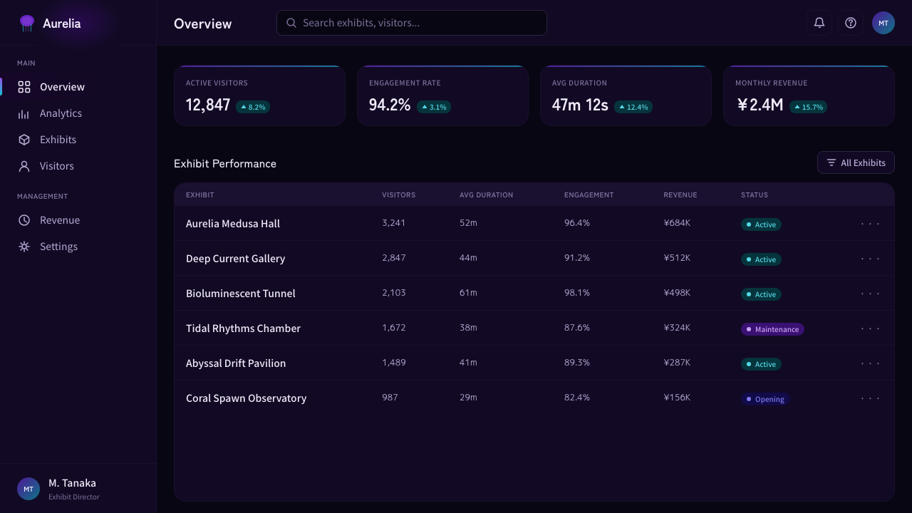
For web UI, the style is well-suited to full-page immersive landing pages, product reveals, or category hero sections where the primary goal is emotional impact rather than information density. It is not appropriate as a persistent UI style for dashboards or productivity tools — the darkness becomes fatiguing in sustained use, and the narrow palette makes semantic color coding difficult. Where it works best is as a contrast environment: a dark, glowing hero section above a conventional light-background content section creates a dramatic entry experience that resolves into readable, functional space.
For editorial and marketing work, the style functions beautifully for event promotion, museum exhibition materials, science communication aimed at a general audience, and any context where the subject matter itself has a quality of spectacle or discovery. Poster formats are natural: a single visual element — a photographed jellyfish, an abstract gradient form, a radial geometric — floating against the void, with minimal type. In digital editorial contexts, full-width dark sections within otherwise light-background articles create moments of visual immersion without requiring the entire piece to sustain the aesthetic.
The most common mistake when applying Jellyfish Aquarium Study is warming the palette. Introducing cream, warm white, amber, or warm gray immediately breaks the association with marine bioluminescence and pushes the work toward a generic dark-mode aesthetic. A second common error is crowding the dark ground with too many elements — the style depends on generous empty space between luminous objects, just as the kreisel tank depends on the expanse of black water around each jellyfish. A layout that fills every quadrant with glowing content has misunderstood the fundamental principle: darkness is not a background, it is the subject.
Jellyfish Aquarium Study — FAQ
How is Jellyfish Aquarium Study different from general dark mode or cyberpunk aesthetics?
The differences are temperamental and associative, not just chromatic. Dark mode UI is a functional inversion — dark backgrounds with light text for reduced eye strain — and its palette tends toward neutral grays with blue-gray accents. Cyberpunk aesthetics are maximalist and confrontational: neon grids, layered distressed textures, hot magentas and acid greens at high saturation. Jellyfish Aquarium Study is neither. Its darkness is void-like rather than graphically textured. Its palette is cool and narrow — violet through cyan — without hot neons or aggressive contrast ratios. And its emotional register is calm wonder rather than technological anxiety. The closest comparison is to the visual language of premium natural history exhibitions, not to digital subcultures.
Can this style work for content that isn't about marine biology or aquariums?
Yes, and this is where the style's depth becomes apparent. The bioluminescent gradient palette and dark void ground create an emotional register — scientific wonder, luminous mystery, the sense of observing something rare and fragile — that applies to any subject matter invoking those feelings. Space exploration, medical imaging, premium perfume, conceptual architecture, experimental music, luxury travel to unusual destinations: these are all contexts where the style's visual language resonates authentically without any literal marine reference. The prerequisite is that the subject genuinely has a quality of wonder or discovery, not that it has gills.
The style is explicitly dark — is there any way to adapt it for light-background contexts?
A full inversion destroys the style — there is no Jellyfish Aquarium Study without the dark void, just as there is no kreisel tank display without the black water. What is possible is selective dark embedding: a light-background document or website that contains full-width dark sections where the jellyfish aesthetic lives. These dark zones become windows of immersion within a larger readable structure. This is actually how Japanese aquarium exhibition designers use the aesthetic in printed materials — the catalog is mostly white pages with a few pages of full-bleed dark spreads that reproduce the tank experience in print.
How should motion and animation work in this style?
Motion in Jellyfish Aquarium Study should be slow, buoyant, and never mechanical. The reference is always the actual movement of jellyfish in water: pulsing bell contractions at roughly one cycle per second, slow vertical drift, gentle lateral oscillation in ambient current. UI animations based on this model use long durations — two to four seconds for entrance animations rather than the conventional quarter-second — and easing curves that have a subtle rebound or float-out at the end, suggesting neutral buoyancy rather than friction. Abrupt or snappy motion breaks the register immediately. Even transitions between screens should dissolve through darkness rather than sliding or flipping.
Does Jellyfish Aquarium Study work equally well for Chinese and Japanese audiences compared with international audiences?
The style may actually carry stronger immediate recognition for East-Asian audiences, particularly Japanese and Chinese viewers who have direct cultural familiarity with the immersive aquarium as a leisure and cultural experience. In Japan and China, the immersive jellyfish aquarium has become a mainstream popular culture touchstone — it appears in travel content, social media aesthetics, and creative photography with high frequency. International audiences recognize the aesthetic as beautiful and premium but may not have the same depth of associative reference. This does not make the style less effective for international contexts — luminous beauty is universal — but it does mean the associative resonance is denser for audiences who have actually stood in front of a kreisel tank.
Related design styles
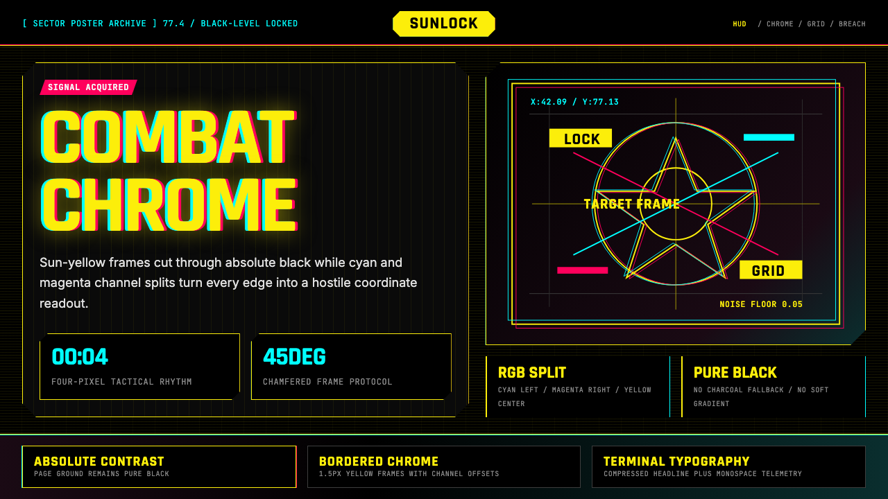 Cyberpunk 2077 Night City YellowCombat HUD on black. Sun-yellow chrome splits into magenta-cyan coordinate gr…
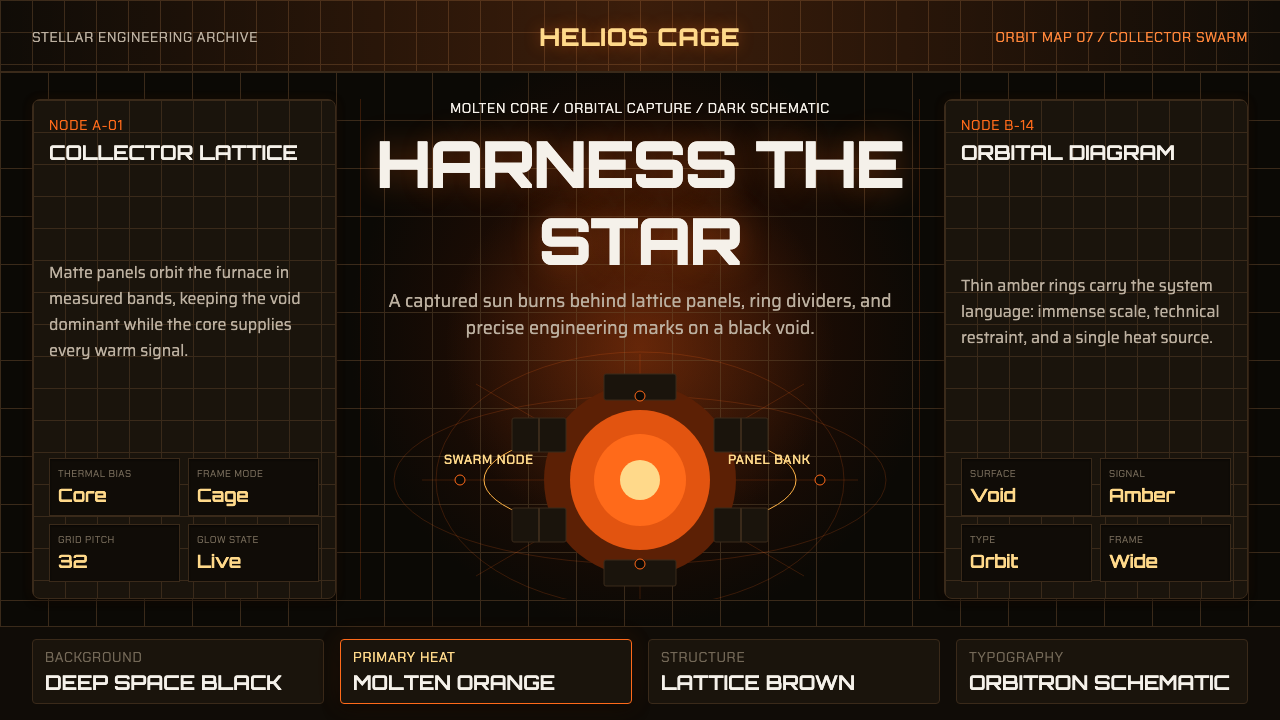 Dyson Sphere MegastructureCold void, captive heat. Molten orange core caged by brown lattice and orbita…
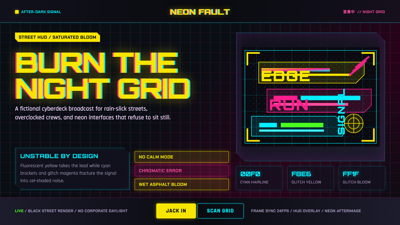 Edgerunners NeonNeon overload. Fluorescent yellow, cyan HUD grids, and magenta glitches burn…
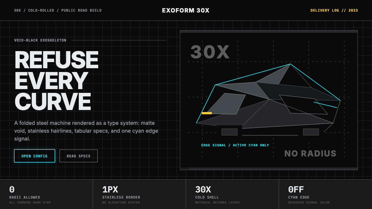 Tesla Cybertruck Stainless (2023)Refusal made material. Void black, stainless hairlines, cyan edges, faceted I…
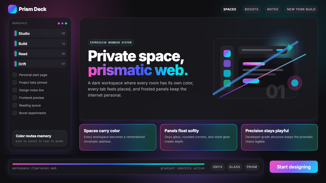 Arc Browser Prismatic (2023)Color is architecture. Pink-violet-cyan ribbons glow over onyx glass and roun…
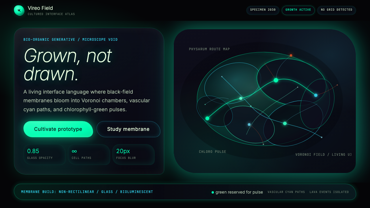 Bio-Organic GenerativeInterfaces feel cultured. Void black, Voronoi membranes, and neon chlorophyll…