What is F1 Formula One Livery?什么是 F1 Formula One Livery?
Ten saturated team colors, one black asphalt canvas — F1 livery design turns engineering identity into the fastest visual language on earth.十种饱和的车队色,一块沥青黑画布——F1 涂装设计把工程师的身份证明,变成了地球上速度最快的视觉语言。
F1 Formula One Livery in briefF1 Formula One Livery 速览
Formula One livery design is the visual identity system of international motorsport: ten competing constructors, each defined by a signature color so distinctive it must read in under a second at racing speeds exceeding three hundred kilometres per hour. Ferrari-red, McLaren-papaya, Mercedes-silver, and Red Bull-navy are not accent choices — they are institutional identities, applied with engineering precision to sidepods, halos, helmets, pit walls, hospitality suites, and broadcast graphics alike.F1 涂装设计是国际赛车运动的视觉识别体系:十支相互竞争的车队,每支各以一种标志性颜色定义自身,这种颜色必须在时速超过三百公里的赛场上,于不足一秒内被辨认出来。法拉利红、迈凯伦木瓜橙、梅赛德斯银、红牛深蓝——这些都不是装饰性的配色选择,而是机构身份本身,以工程级的严谨被印在侧箱、光环结构、头盔、维修区墙壁、接待套房和转播图形上。
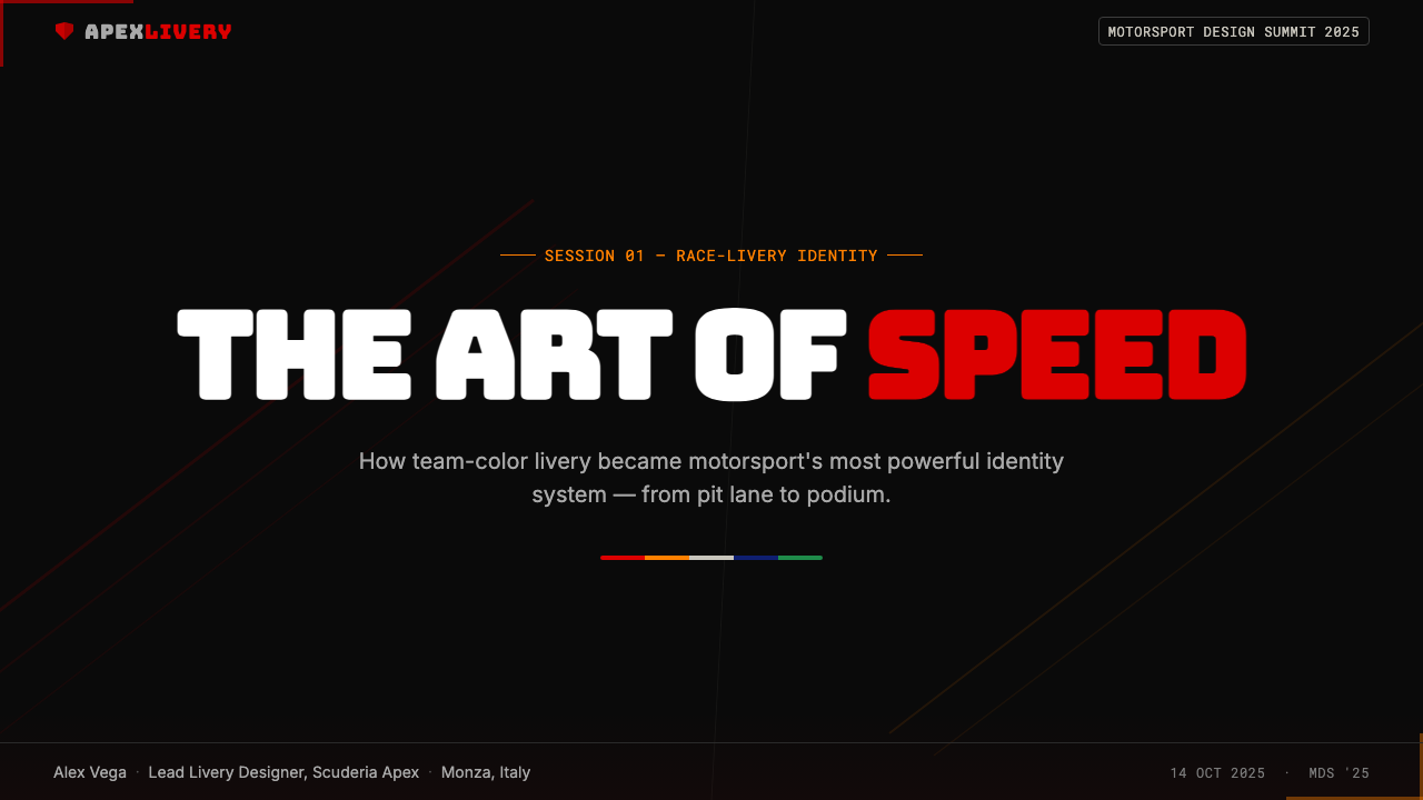
The aesthetic is built on extreme contrast. A saturated, almost aggressive team hue is set against the deep near-black of tarmac photography and dark panel backgrounds. Speed lines — thin diagonal stripes or sweeping aerodynamic curves — cut across livery surfaces to suggest motion even in a static image. Typography is chunky, tight-tracked, and purposeful: display letterforms that read at a glance from grandstand altitude, paired with monospaced numerals that recall telemetry readouts and pit-wall data screens.这套美学建立在极端对比之上。一种饱和度极高、近乎进攻性的车队主色,被置于沥青摄影与深色面板背景所营造的近乎纯黑的底色上。速度线——细窄的斜向条纹或弧形的空气动力学曲线——斜切过涂装表面,让静止的图像也散发出运动感。字体粗壮、字距紧凑、目的明确:用于在看台高度一瞥即读的展示字形,搭配令人联想到遥测数据和围墙数据屏的等宽数字。
Since Liberty Media's acquisition of the championship in 2017 and the accompanying 2018 rebrand by Wieden+Kennedy, the overarching Formula One brand has unified what was once a fragmented visual ecosystem. The new wordmark — aerodynamic, condensed, with an implied sense of forward thrust — set a typographic standard that the sport's marketing and broadcast graphics now follow consistently. The result is a design language that feels simultaneously technical and theatrical: the precision of a wind-tunnel report presented with the drama of a stadium event.自从自由传媒集团于 2017 年收购这项赛事,并委托 Wieden+Kennedy 在 2018 年完成整体品牌重塑之后,F1 主品牌将原本碎片化的视觉生态整合为一个统一的语言系统。新的标志——空气动力学的、压缩的、带有隐含前冲感的字形——为这项运动的营销与转播图形确立了排版标准。结果是一套同时具有技术感与戏剧性的设计语言:风洞报告的精确度,加上体育场活动的视觉张力。
See the F1 Formula One Livery design system查看 F1 Formula One Livery 完整设计系统
Where does F1 Formula One Livery come from?F1 Formula One Livery 从何而来?
Formula One's visual culture has its roots in the sport's founding in 1950, when the FIA World Championship was established and national racing colors — British racing green, Italian red, French blue, German silver — defined team identities before commercial sponsorship entered the picture. These colors were not designed; they were inherited from pre-war grand prix conventions and encoded into the sport's earliest iconography. Ferrari's rosso corsa, for instance, was the assigned national racing color of Italy and predated the Scuderia Ferrari identity by decades.F1 的视觉文化根植于 1950 年这项运动的创立时刻——国际汽联世界锦标赛正式成立,英国赛车绿、意大利红、法国蓝、德国银等国家赛车色,在商业赞助进入这项运动之前便已定义了各队的身份。这些颜色并非经过设计,而是从二战前的大奖赛惯例中传承下来,被编码进这项运动最早期的视觉图像志。法拉利的赛车红(rosso corsa)便是意大利的指定国家赛车色,其历史比法拉利车队的品牌身份早了数十年。
The sponsorship era that began in the late 1960s and expanded through the 1970s and 1980s transformed livery design from national heraldry into commercial media. When the Lotus team accepted tobacco sponsorship from Gold Leaf in 1968, the cars became rolling billboards, and the livery became a designed artifact for the first time — a negotiated surface where brand visibility, aerodynamic form, and racing heritage had to coexist. Through the 1980s, iconic liveries like McLaren's Marlboro-red and white, and Williams's Canon-blue, established the template of a dominant team color anchored by a primary sponsor's identity.从二十世纪六十年代末开始、并在七八十年代持续扩张的赞助时代,将涂装设计从国家徽章学转化为商业媒介。1968 年莲花车队接受金叶香烟赞助时,赛车成了滚动的广告牌,涂装第一次成为被刻意设计的产物——一个谈判出来的表面,品牌曝光度、空气动力学形态与赛车传统必须在其上共存。整个八十年代,迈凯伦的万宝路红白与威廉姆斯的佳能蓝等标志性涂装,确立了以一种主色锁定主赞助商身份的设计模板。
The 1990s introduced a generation of designers who treated liveries as total identity systems rather than sponsor collages. Jordan Grand Prix, Williams, and Benetton each developed liveries with distinctive graphic character — bold curves, high-contrast color blocking, and typographic discipline that held up across helmet, car, and paddock branding simultaneously. This era coincided with the global television broadcast explosion, which made the visual coherence of team identity a competitive commercial advantage.九十年代引入了一批将涂装作为整体识别系统而非赞助拼贴画来对待的设计师。乔丹、威廉姆斯和贝纳通各自发展出具有鲜明图形个性的涂装——大胆的曲线、高对比度的色块分割,以及能够同时在头盔、赛车和围场品牌上保持一致的排版纪律。这一时代与全球电视转播的爆炸式扩张同步,使车队视觉识别的连贯性成为具有竞争价值的商业优势。
The Liberty Media era beginning in 2017 and the Wieden+Kennedy rebrand of 2018 marked a structural shift. For the first time, Formula One itself — not just individual teams — invested in a unified visual language. The new F1 wordmark, the typographic system, the speed-line motif, and the telemetry-dashboard aesthetic of broadcast graphics created a coherent frame within which individual team liveries could express their own identities. The Drive to Survive documentary series, launched in 2019, brought this visual language to a mainstream audience of tens of millions globally, accelerating F1 livery aesthetics from motorsport niche to mainstream design reference.自 2017 年自由传媒接管赛事,以及 2018 年 Wieden+Kennedy 主导的品牌重塑,标志着一次结构性转变。这是 F1 品牌本身——而非仅仅是各支车队——首次投资于统一视觉语言。新的 F1 标志、排版体系、速度线母题,以及转播图形的遥测仪表盘美学,共同创造了一个连贯的框架,各车队的涂装得以在其中表达各自的个性。2019 年推出的纪录片《一级方程式:疾速争胜》将这套视觉语言带给了全球数千万普通观众,将 F1 涂装美学从赛车运动的小众圈子加速推进为主流设计参考。
What defines the F1 Formula One Livery look?F1 Formula One Livery 的视觉特征是什么?
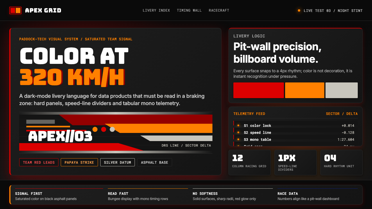
Saturated Team Color饱和车队主色
Each team owns a single dominant hue dialed to near-maximum saturation — a color choice made not for subtlety but for instant recognition under broadcast lighting, across digital displays, and against the grey or dark backdrop of a racing circuit. The team color functions as a brand signature with the same logic as a national flag: it must be unambiguous at distance and at speed. Secondary colors play a strictly supporting role, usually confined to trim, sponsor panels, or typographic elements.每支车队拥有一种单一的主导色调,饱和度被推至接近极限——这种色彩选择并非追求细腻,而是为了在转播灯光下、数字屏幕上、赛道灰色或深色背景前实现即时识别。车队色的运作逻辑与国旗相同:必须在远距离和高速移动中做到毫无歧义。辅助色严格处于从属地位,通常仅限于装饰线条、赞助商面板或字体元素。
Deep-Black Contrast Ground深黑对比底色
The team hue always performs against a dark anchor — the near-black of tarmac in racing photography, the dark carbon-fibre panels of modern cars, and the black backgrounds standard in F1 broadcast graphics and editorial design. This contrast maximizes the visual impact of the saturated team color and creates the high-drama, cinematic quality associated with F1 visual identity. Dark grounds also emphasize the reflective, metallic surface treatments frequently used on modern liveries.车队主色始终在深色锚底之上呈现——赛车摄影中沥青的近黑色调、现代赛车的深色碳纤维面板,以及 F1 转播图形和编辑设计中标准化的黑色背景。这种对比将饱和车队色的视觉冲击力发挥到极致,并创造出与 F1 视觉身份相关联的高戏剧性、电影质感。深色底面同样凸显了现代涂装上频繁使用的反光金属表面处理效果。
Speed-Line Motif速度线母题
Thin diagonal or sweeping curved lines — borrowed from the aerodynamic flow patterns visible in CFD visualizations and wind-tunnel smoke tests — function as the connective tissue of F1 livery composition. Speed lines suggest directional momentum even in still images, divide color zones without hard edges, and scale elegantly from a full car body to a social media thumbnail. In the overarching F1 brand, speed lines appear as dividers, background textures, and graphic transitions between content sections.细窄的斜向线条或弧形曲线——借鉴自 CFD 流场可视化和风洞烟流测试中可见的空气动力学流线——是 F1 涂装构图的结缔组织。速度线在静止图像中就能传递出方向性动势,在无硬边的情况下划分色彩区域,并能从整车车身到社交媒体缩略图进行优雅的尺度缩放。在 F1 的整体品牌中,速度线被用作分隔线、背景纹理以及内容区块之间的图形过渡。
Aerodynamic Display Typography空气动力学展示字体
F1 typography favors condensed, high-weight display letterforms — shapes that feel like they have been sculpted for minimum drag, with tight horizontal tracking that makes headlines read as a single solid mass. The W+K-designed wordmark established this standard: a letterform that tilts forward by implication, whose proportions feel engineered rather than calligraphic. Alongside this display style, monospaced numerals reminiscent of digital readouts and telemetry data appear in timing graphics, race standings, and data-heavy layout contexts.F1 的字体设计偏好压缩、高字重的展示字形——这些形状仿佛经过最小阻力雕塑,紧致的水平字距让标题读来如同一个实心整体。Wieden+Kennedy 设计的标志建立了这一标准:一个从视觉上向前倾斜、比例感更像工程产物而非书法作品的字形。与这种展示风格并存的,是令人联想起数字读出器和遥测数据的等宽数字,出现在计时图形、赛事积分榜和数据密集的版式语境中。
Precision Color Blocking精准色块分割
Where two colors meet on a livery surface — or in associated graphic design — the boundary is typically hard and precise, not blended or gradated. This precision mirrors the engineering tolerance culture of motorsport, where surfaces are measured and components fitted to fractions of a millimetre. In graphic applications, hard color boundaries create a bold, poster-like quality: sections of a composition read as distinct flat planes, each with its own tonal weight, rather than as a continuous tonal field.在涂装表面——或相关图形设计中——两种颜色相遇的边界通常是硬朗而精确的,而非渐变或融合的。这种精确性折射出赛车运动的工程公差文化:表面被以毫米级精度测量,零部件以极小误差装配。在图形应用中,硬边色彩边界创造出大胆的海报质感:构图的各个区段被读作独立的平面色块,每块具有各自的色调重量,而非融为一片连续的色调场。
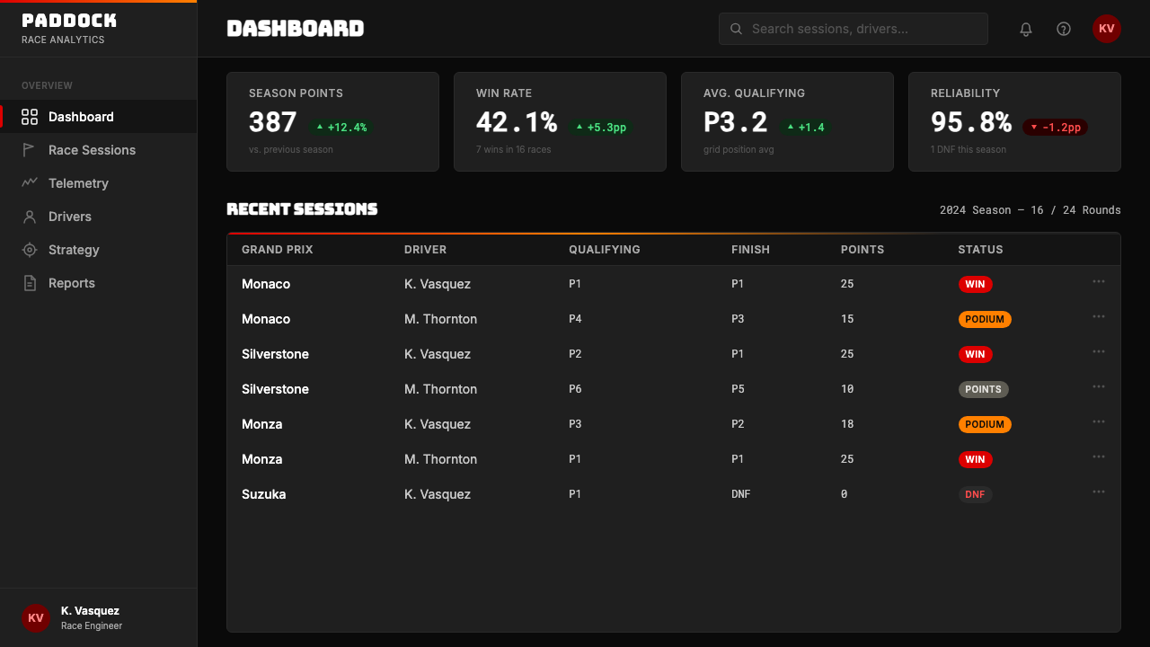
Telemetry and Data Aesthetics遥测与数据美学
A distinctive sub-language within F1 visual identity draws directly from the dashboards, readouts, and data visualization tools that populate the technical operations of a race weekend. Tabular data with minimal borders, thin rule lines organizing information into zones, blinking indicator states, and numerical hierarchies all recur in F1 editorial and marketing design. This aesthetic positions data not as documentation but as drama — the raw numbers of a sport where hundredths of a second separate outcomes.F1 视觉身份中有一套独特的子语言,直接取材于填满赛事周末技术操作区的仪表盘、数据读出器和数据可视化工具。边框极简的表格数据、将信息组织成区块的细线条、闪烁的指示状态、数字层级——这些元素反复出现在 F1 的编辑与营销设计中。这套美学将数据定位为戏剧,而非文档——这项运动中,百分之一秒的差距就能决定胜负。
Metallic and Reflective Surface Treatment金属与反光表面处理
Modern F1 liveries frequently incorporate chrome, metallic paint, and holographic foil treatments that shift in hue and intensity as the viewing angle changes. In two-dimensional design contexts — slides, editorial layouts, digital advertising — this surface quality is evoked through high-contrast gradients applied to specific graphic elements rather than to backgrounds, metallic color choices in a muted-to-bright range, and image treatments that emphasize reflective surfaces in photography. The effect signals premium production value and technical sophistication.现代 F1 涂装频繁融入电镀铬、金属漆和全息箔等随观察角度改变而变换色相与亮度的表面处理。在二维设计语境——幻灯片、编辑版面、数字广告——中,这种表面质感通过以下方式被召唤:高对比度渐变仅施加于特定图形元素而非背景,从哑光到亮面范围内的金属色选择,以及强调摄影中反光表面的图像处理手法。这种效果传递出顶级制作水准与技术精密感。
See the F1 Formula One Livery design system查看 F1 Formula One Livery 完整设计系统
Who shaped F1 Formula One Livery?谁塑造了 F1 Formula One Livery?
As the commercial rights holder of Formula One from the 1970s through 2017, Ecclestone shaped the economic structure within which F1 visual identity developed. His insistence on consistent, high-production broadcast presentation — global television deals, standardized circuit signage, and team uniform requirements — created the conditions under which team liveries became global brand assets rather than race-day practicalities. The commercial architecture he built made F1 team colors visible in over a hundred countries simultaneously, giving livery design an international stage matched by few other visual identities in sport.作为 F1 商业版权从七十年代至 2017 年的持有人,埃克莱斯顿塑造了 F1 视觉身份发展所在的商业结构。他对高水准制作转播呈现的坚持——全球电视授权协议、标准化赛道标识和车队制服要求——为车队涂装从赛事日实用品演变为全球品牌资产创造了条件。他构建的商业架构使 F1 车队颜色得以在逾百个国家同步呈现,赋予涂装设计一个在体育领域几乎无可匹敌的国际舞台。
Hamilton's seven world championships span two of the most distinctive livery eras in recent history: the silver Mercedes W-series cars that dominated the hybrid era from 2014 onward, and his own practice of personalizing his racing helmet each Grand Prix weekend. The helmet as rotating, event-specific graphic design object — a one-weekend limited edition applied at the scale of a wearable sculpture — has influenced how designers and fans understand livery as an expressive rather than purely functional identity system. Hamilton's championing of a matte black livery for the 2020 season, connected to his public advocacy, also demonstrated that livery choices could carry cultural and political weight beyond sponsorship.汉密尔顿的七届世界冠军横跨近年历史上两个最具辨识度的涂装时代:从 2014 年起主导油电混合动力时代的银色梅赛德斯 W 系列赛车,以及他本人在每个大奖赛周末为赛车头盔进行个性化设计的实践。头盔作为一个轮换的、针对特定赛事的图形设计对象——以可穿戴雕塑尺度呈现的单周末限量版——影响了设计师和球迷理解涂装的方式:涂装是一套表达性的而非纯粹功能性的身份系统。汉密尔顿在 2020 年赛季推动哑光黑涂装,并将其与他的公开倡导相联系,也表明涂装选择能够承载超越赞助功能的文化与政治分量。
Verstappen's dominance across the 2021–2024 seasons brought Red Bull's navy and yellow livery to global ubiquity during the sport's period of maximum mainstream expansion. The Red Bull livery — bold diagonal color split, heavily logotyped, with a graphic energy closer to extreme sports branding than traditional motorsport — became one of the most widely reproduced color combinations in contemporary sports design. Its influence can be observed in the visual language of gaming, energy drink marketing, and esports, demonstrating how a winning livery's aesthetic logic migrates far beyond its original motorsport context.维斯塔潘在 2021 至 2024 赛季的统治地位,在这项运动主流扩张最盛的时期,将红牛的深蓝与黄色涂装推向了全球性的无处不在。红牛涂装——大胆的对角分色、大量标识覆盖、更接近极限运动品牌而非传统赛车运动的图形能量——成为当代体育设计中被复制最广泛的配色组合之一。它的影响可在游戏视觉语言、能量饮料营销和电子竞技中被观察到,印证了一套成功涂装的美学逻辑如何在其原始赛车语境之外广泛迁移。
Senna's visual identity across his career at Lotus, McLaren, and Williams established the template for driver-as-brand within motorsport. His distinctive yellow helmet — derived from the Brazilian national flag — became one of the most recognizable objects in twentieth-century sport, demonstrating that a driver's personal livery element could achieve iconic status independent of the team identity it appeared alongside. The Senna brand, managed posthumously, remains active in licensing and design collaboration, and his yellow is now so historically charged that it functions as a form of shorthand for F1's golden era in contemporary editorial and documentary contexts.塞纳在莲花、迈凯伦和威廉姆斯的职业生涯中所建立的视觉身份,确立了赛车运动中「车手即品牌」的模板。他那顶标志性的黄色头盔——源自巴西国旗的配色——成为二十世纪体育界最具辨识度的物件之一,证明车手的个人涂装元素能够独立于它并列出现的车队身份之外,达到图标级别的地位。身后由遗产团队管理的塞纳品牌在授权和设计合作领域至今仍然活跃,而他的黄色如今已承载如此厚重的历史分量,以至于在当代编辑和纪录片语境中,它作为 F1 黄金时代的速记符号而运作。
How do you use F1 Formula One Livery today?今天怎么用 F1 Formula One Livery?
F1 livery aesthetics translate into designed artifacts — presentations, interfaces, editorial layouts, and marketing pages — most successfully when the core logic is understood rather than merely the surface appearance. The system works through three interlocking principles: a dominant saturated color establishes immediate identity, a deep-dark ground maximizes its visual impact, and speed-line or data-grid motifs provide compositional structure. Copying the colors without deploying the contrast logic, or adding speed lines without a coherent color hierarchy, produces work that reads as imitation rather than application.F1 涂装美学迁移到设计产物——演示文稿、界面、编辑版面和营销页面——最成功的前提是理解其核心逻辑,而非仅仅复制其表面外观。这套系统通过三个相互咬合的原则运作:一种主导的饱和色建立即时身份感,一块深暗底色将其视觉冲击力最大化,速度线或数据网格母题提供构图结构。如果只是照搬颜色而不部署对比逻辑,或在没有连贯色彩层级的情况下添加速度线,产出的作品只会被读作模仿而非应用。
For presentation slides, the style suits both cover and content pages with distinct approaches. A cover benefits from the poster-like boldness of the system: the team color fills a substantial portion of the layout — a large diagonal or full bleed — while the title appears in condensed display weight against the dark remainder. The relationship should feel asymmetric and kinetic, as if the color is moving through the frame. Content slides should take a more restrained approach, treating the dark ground as the base, using the team color sparingly for headings or accent bars, and organizing data into telemetry-style tabular arrangements with thin rule lines and monospaced numerals. Data and chart slides find their natural home here: treat bar charts and graph elements as graphic objects in the team color against dark grounds, with annotation in a lighter neutral.在演示文稿中,这种风格以各异的方式适配封面页与内容页。封面适合发挥这套系统的海报式大胆感:车队色填充版面的主要区域——大面积对角或全出血——标题以压缩展示字重出现在其余的深色区域上。这种关系应该感觉非对称而富有动感,仿佛颜色正在穿越画框运动。内容页应采取更为克制的方式,以深色底面为基础,将车队色节制地用于标题或强调条,并将数据组织进遥测风格的表格布局,配以细线条和等宽数字。数据与图表页在这里找到自然归宿:将柱状图和图表元素作为深色底上的车队色图形对象来处理,注释使用较浅的中性色。
For web interfaces, F1 aesthetics work exceptionally well in dashboards, analytics platforms, leaderboards, and any product where technical authority and real-time data are the primary value proposition. Apply the deep-dark background consistently across the interface, use the saturated accent color exclusively for interactive states, highlights, and primary calls to action, and structure content into tight grid zones separated by thin rule lines rather than card outlines or heavy borders. Pricing pages benefit from the system's natural capacity for tier differentiation: each tier occupies a color-coded zone, with the recommended tier in the dominant team color and alternatives in progressively muted variants. Navigation should be typographic and tight-tracked.在网页界面中,F1 美学在仪表板、分析平台、排行榜以及任何以技术权威感和实时数据为核心价值主张的产品中表现出色。在整个界面中一致地应用深暗背景,将饱和强调色专属地用于交互状态、高亮和主要行动号召,用细线条而非卡片轮廓或粗重边框将内容组织进紧凑的网格区块。定价页面受益于这套系统天然的等级区分能力:每个等级占据一个色彩编码的区域,推荐等级使用主导车队色,其余选项使用逐渐降低饱和度的变体。导航应当是字体化的、字距紧致的。
For editorial and marketing work, the F1 system delivers highest impact in hero sections, campaign headers, and event promotion — contexts where immediate visual authority is more valuable than sustained readability. Full-width feature blocks alternating between the team color on dark and dark on the team color create a rhythm that reads like a race weekend's visual language. For body text and longer reading contexts, pull back to a near-black or very dark neutral ground with light type, reserving the saturated team color for pull quotes, section markers, or data callouts. Marketing pages work best when the speed-line motif is used as a graphic divider between sections rather than as a background texture across the entire page.在编辑与营销工作中,F1 体系在主视觉区块、活动标题和赛事推广中产生最高冲击力——这些语境中,即时的视觉权威感比持续的可读性更有价值。在车队色配深色和深色配车队色之间交替的全宽特性区块,制造出一种读起来像赛事周末视觉语言的节奏感。对于正文和较长的阅读语境,退回到近黑或非常深的中性底色配浅色文字,将饱和车队色保留给引语、段落标记或数据标注。营销页面在以速度线母题作为区块之间的图形分隔线、而非将其铺满整个页面作为背景纹理时效果最佳。
A common mistake when applying F1 livery aesthetics is treating the style as pure color and ignoring the structural role of contrast and proportion. Using the saturated team color as a background for body text — rather than as a focal color against dark — immediately collapses the visual hierarchy that makes the style legible. A second common error is applying speed-line motifs at excessive density, which produces visual noise rather than the sense of precision and forward momentum the motif is meant to convey. The style rewards restraint in decoration and boldness in color commitment: one strong hue, one deep ground, and compositional elements used at scale rather than in busy accumulation.应用 F1 涂装美学时最常见的错误,是将这种风格视为纯粹的颜色问题而忽略对比度和比例的结构性作用。将饱和车队色用作正文的背景——而非在深色上作为焦点色——会立即瓦解让这种风格清晰可读的视觉层级。另一个常见错误是以过高的密度应用速度线母题,产生的是视觉噪声,而非这个母题本应传达的精确感与前冲感。这种风格奖励装饰上的克制与色彩承诺上的大胆:一种强烈的色调,一块深暗的底色,以及以大尺度而非繁复堆积方式使用的构图元素。
See the F1 Formula One Livery design system查看 F1 Formula One Livery 完整设计系统
F1 Formula One Livery — FAQF1 Formula One Livery · 常见问题
Does F1 livery style require a dark background, or can it work on light grounds?F1 涂装风格是否必须使用深色背景,还是浅色底面也能适用?
The dark ground is structural, not optional. The entire contrast logic of F1 livery aesthetics depends on a saturated, high-energy team color reading against a dark anchor. On a white or light ground, the same saturated colors lose the dramatic edge-contrast that makes them feel fast and authoritative — they begin to read as ordinary brand colors. A light variant is possible in secondary contexts (long-form editorial body text, documentation) but the hero, cover, and featured elements of any F1-styled work should commit to a deep dark ground. If light is required throughout, consider whether this style is the right fit.深色底面是结构性的,不是可选的。F1 涂装美学的整体对比逻辑,依赖于饱和、高能量的车队色在深色锚底上被读取。在白色或浅色底面上,同样的饱和色会失去让它们感觉快速而权威的戏剧性边缘对比——它们开始被读作普通的品牌色。浅色变体在次要语境中是可行的(长篇编辑正文、文档类内容),但任何 F1 风格作品的主视觉区、封面和特色元素都应当坚定地承诺一个深暗底色。如果通篇要求浅色,请考虑这种风格是否适合这个应用场景。
Can I use multiple team colors in one design, or should I commit to one?我可以在一个设计中使用多支车队的颜色,还是应该只选一种?
Commit to one dominant team color. The power of F1 livery design comes from the singular, territorial commitment to one hue — there is no ambiguity about which team you are looking at. Mixing multiple saturated hues at comparable intensity produces a carnival effect rather than the focused authority the style is built on. The exception is when designing a multi-team context — a race program, a comparative analytics dashboard — where each entity's color is systematically assigned to that entity alone and does not bleed across zones. Even then, each individual section reads as a single-color commitment against the shared dark ground.只选一种主导车队色并坚定承诺它。F1 涂装设计的力量来自对单一色调的领地式承诺——关于你正在看哪支车队,不存在任何歧义。以相近强度混用多种饱和色,产生的是嘉年华效果,而非这种风格所建立的聚焦权威感。例外情况是在设计多车队语境时——如赛事手册、比较性分析仪表板——其中每个实体的颜色被系统地专属分配给该实体,不跨越区块渗透。即便如此,每个独立区块依然是在共享的深色底面上读作单一颜色的承诺。
How does F1 livery aesthetics differ from general sports branding?F1 涂装美学与一般体育品牌设计有何不同?
General sports branding tends toward bold, friendly, and community-oriented visual expression — it is designed to be worn in crowds, celebrated in social contexts, and accessible to broad fan demographics. F1 livery aesthetics are technical, precise, and oriented toward performance authority. Where team sports branding emphasizes warmth and belonging, F1 aesthetics emphasize engineering discipline and speed. The telemetry data references, the hard color boundaries, the condensed technical typography — these signal a world of marginal gains and scientific precision rather than fan community. Designers should be aware that the F1 aesthetic can read as cold or inaccessible in contexts where human warmth is a design goal.一般体育品牌设计倾向于大胆、友好、以社群为导向的视觉表达——它被设计为在人群中穿戴、在社交语境中庆祝,对广泛的球迷群体具有亲和力。F1 涂装美学是技术性的、精确的、以性能权威感为导向的。团队运动品牌强调温暖与归属感,F1 美学强调工程纪律与速度感。遥测数据参照、硬边色彩边界、压缩的技术性字体——这些传递的是一个以微小增益和科学精确性为主轴的世界,而非球迷社群。设计师应当意识到,在人文温度是设计目标的语境中,F1 美学可能被解读为冷漠或难以接近。
How should speed lines be used — and when do they become a mistake?速度线应该如何使用——什么时候会用错?
Speed lines work best as compositional elements used at a specific, intentional location: as a divider between two content zones, as a single directional accent crossing a cover image, or as a subtle grid texture confined to a background panel. They become a mistake when applied across the entire layout as a repeating background pattern — this reads as wallpaper rather than motion. They also fail when used at varying angles within the same composition, which undermines the sense of singular directional momentum. The correct application is sparse: one or two speed lines per spread, at a consistent angle, cutting across a defined zone rather than flooding the layout.速度线最有效的用法是作为构图元素,被置于特定的、有意图的位置:两个内容区块之间的分隔线、横跨封面图像的单一方向性强调线,或限定在背景面板内的细腻网格纹理。当它们被作为重复背景图案铺满整个版面时,就成了错误——这被读作壁纸而非运动感。在同一构图中以不同角度使用时同样失效,这会瓦解单一方向动势的感觉。正确的用法是稀疏的:每个跨页一两条速度线,保持一致角度,切穿一个明确的区域,而非漫溢整个版面。
Is F1 livery style appropriate for luxury or fashion brand contexts?F1 涂装风格适合奢侈品或时尚品牌语境吗?
There is a natural intersection between F1 aesthetics and premium positioning, since both worlds share an emphasis on technical excellence, precision, and aspirational exclusivity. The style works in luxury contexts when the product's identity is genuinely connected to performance, engineering, or speed — premium automotive, high-end watchmaking, technical sportswear, or professional equipment brands. It is less successful in luxury contexts defined by heritage craftsmanship, softness, or feminine sensibility — jewellery, couture, fragrance, or home goods — where the technical coldness of F1 aesthetics reads as a category mismatch. The key question is whether the luxury positioning is rooted in performance or in tradition.F1 美学与高端定位之间存在天然的交汇地带,因为两个世界都强调技术卓越、精确性和充满向往感的稀缺性。当产品身份与性能、工程或速度有真实关联时,这种风格在奢侈品语境中奏效——顶级汽车、高端制表、技术运动服,或专业设备品牌。在以传统工艺、柔和感或女性气质定义的奢侈品语境中则较难成立——珠宝、高定时装、香氛或家居品——在这些场景中,F1 美学的技术性冷感会被读作品类错位。关键问题在于:这个奢侈品定位的根基是性能,还是传统。
Related design styles相关设计风格
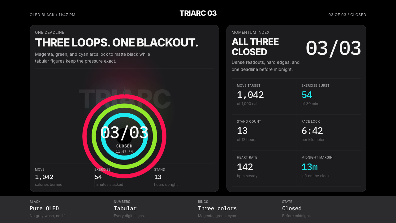 Apple Fitness Rings Closed (2024)Midnight feels exact. Magenta, green, and cyan rings lock onto OLED black.午夜像被校准。洋红、绿、青三环锁在黑底上。
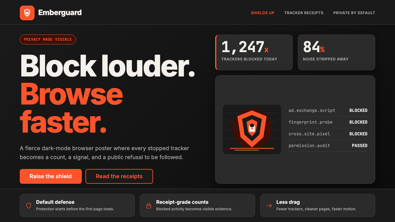 Brave Browser Lion OrangePrivacy gets loud. Lion-orange counters and shield geometry cut through warm…隐私变成宣言:狮橙计数与盾牌几何刺破暖炭黑。
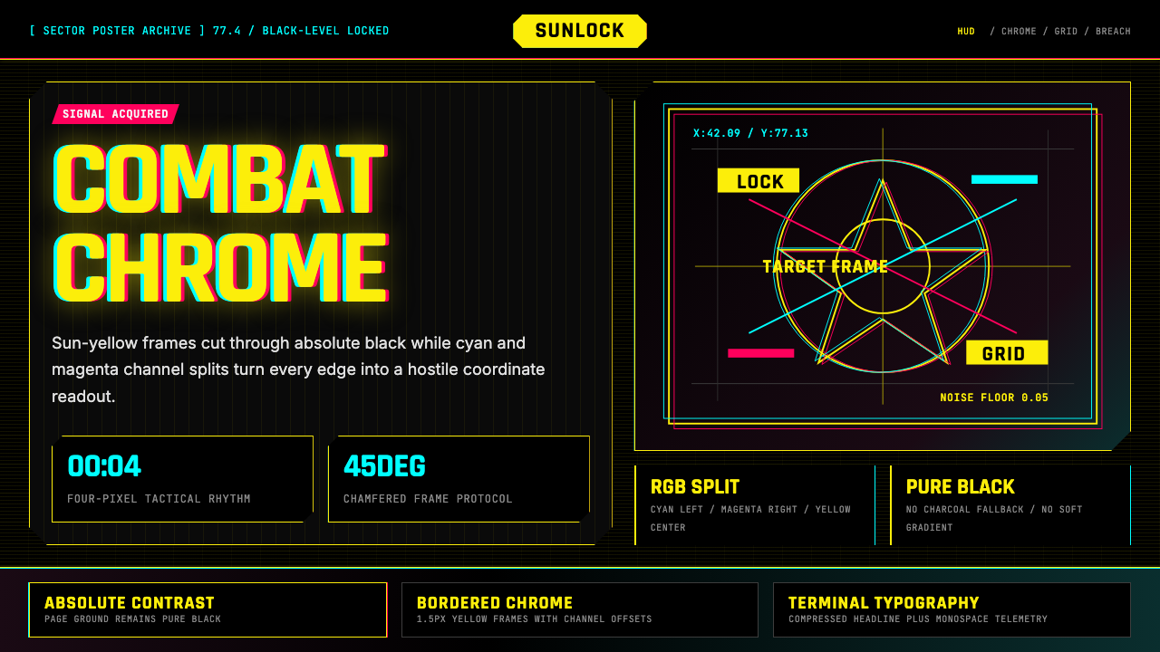 Cyberpunk 2077 Night City YellowCombat HUD on black. Sun-yellow chrome splits into magenta-cyan coordinate gr…黑底战斗HUD:太阳黄框架裂出品红与青色坐标网。
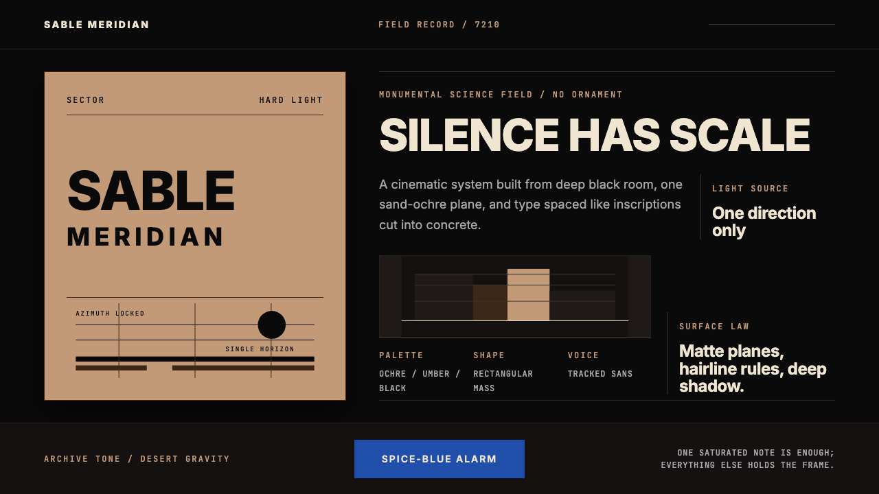 Dune Arrakis (Villeneuve)Silence has scale. Sand-ochre slabs, spice-blue alarm, and tracked Inter on b…沉默自有尺度:沙赭巨块、香料蓝警讯与黑底宽字距 Inter。
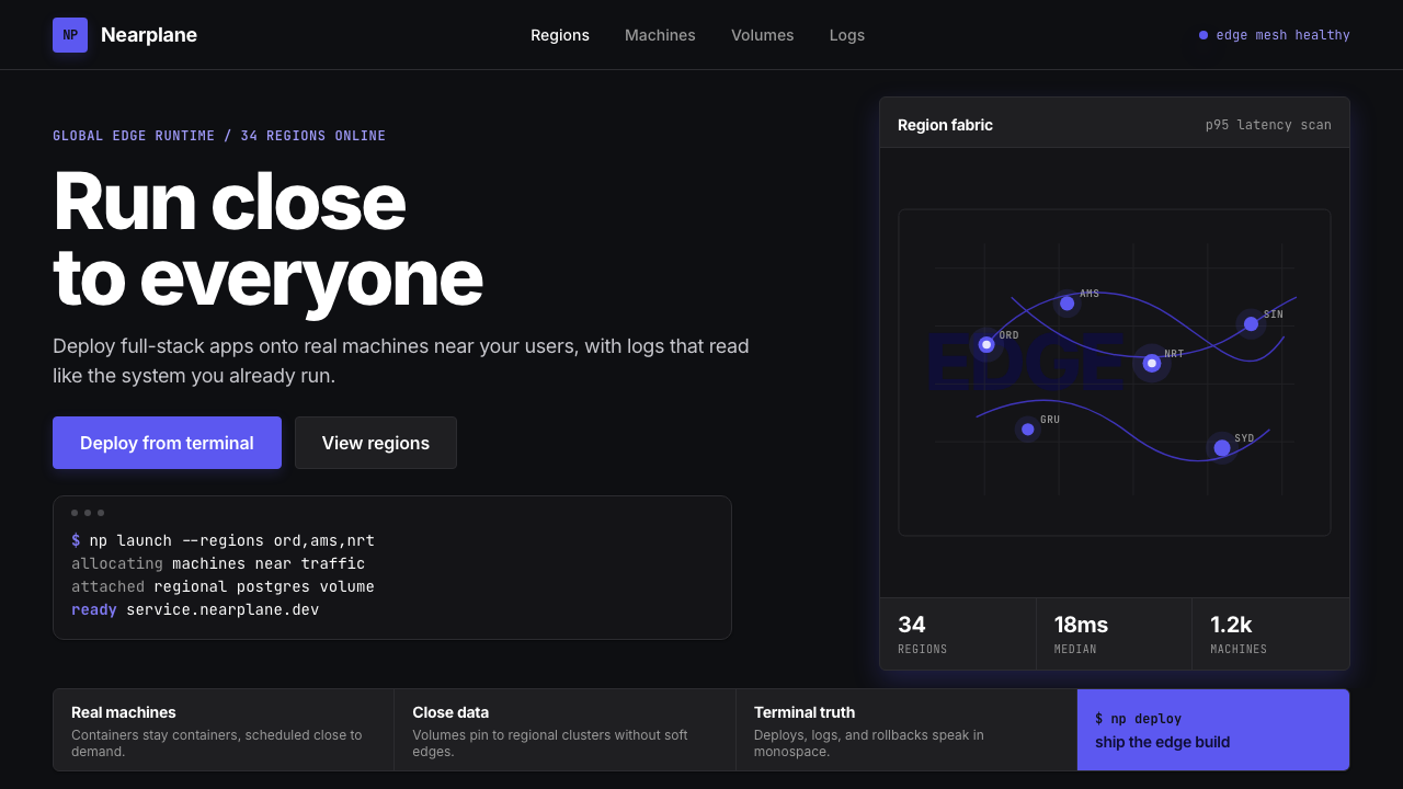 Fly.io Edge-Compute PurpleEdge-cloud with discipline. Electric purple nodes, Inter type, and terminal b…克制的边缘云:深黑底、电紫节点、Inter 字体与终端块。
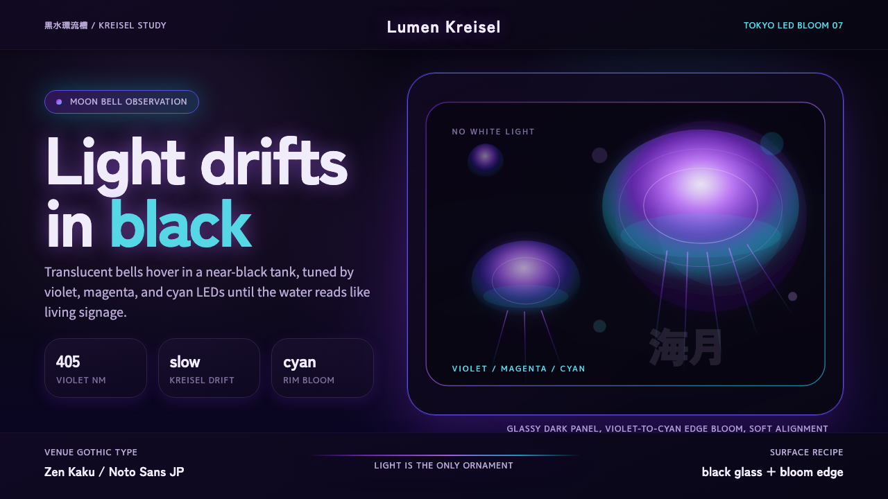 Jellyfish Aquarium StudyLight is the ornament. Violet-cyan glow floats in black glass with venue-goth…光是唯一装饰。紫青冷光漂浮于黑色玻璃,配日式哥特字。