What is Brave Browser Lion Orange?
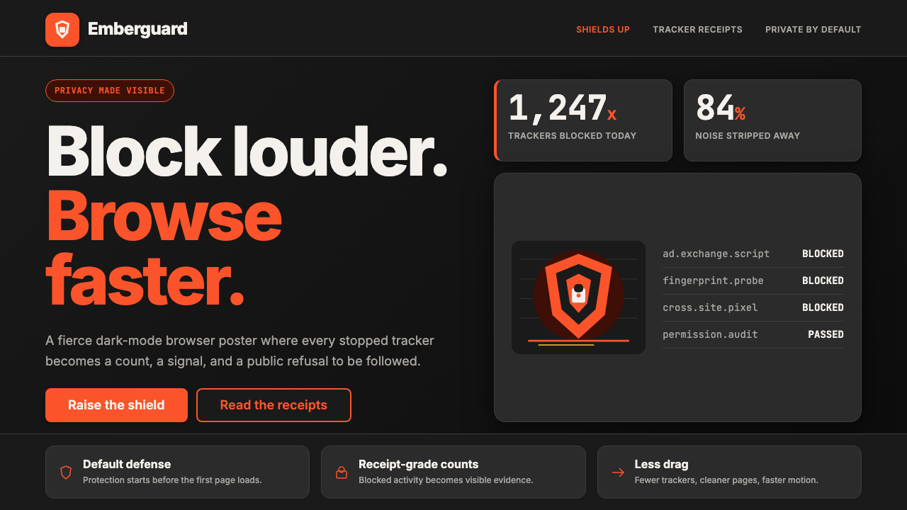
Brave turned privacy from a buried settings toggle into a roaring visual declaration — saturated lion-orange on warm charcoal, counting every blocked tracker in plain sight.
Brave Browser Lion Orange in brief
Brave Browser Lion Orange is the visual identity system of Brave Software, a privacy-focused browser built on the conviction that tracking and surveillance advertising are not just annoyances but structural harms. The aesthetic translates that conviction into color and form: a fierce lion mark in saturated orange set against warm charcoal backgrounds, sharp shield geometry, and stat counters that surface blocked trackers as a point of pride rather than a hidden backend metric.
What sets this style apart from typical dark-theme browser UIs is its deliberate loudness. Where most privacy tools lean into anonymity and quiet restraint, Brave leans into spectacle. Every new tab page announces a running total of ads and trackers blocked — a ticker of defiance made into a design element. The orange lion becomes a mascot for data sovereignty, not merely a logo. The visual system is engineered to make the invisible work of privacy protection visible and dramatic.
The result is a design language that sits at the intersection of bold tech branding and activist poster aesthetics. It carries both the product confidence of mature Silicon Valley companies and the combative energy of a challenger brand. Lion-orange as the primary accent gives the system warmth and aggression simultaneously — traits rarely combined in enterprise software design.
Where does Brave Browser Lion Orange come from?
Brave Software was founded in San Francisco in 2016 by Brendan Eich, the creator of JavaScript and former CEO of Mozilla, and Brian Bondy, a former Mozilla engineer. Eich had been forced out of Mozilla in 2014 over political controversy, and he returned to the browser space with a pointed agenda: build a browser that treats privacy as a first-class engineering constraint rather than an optional feature layer bolted onto a surveillance-funded business model.
The lion as mascot arrived with the browser's earliest public identity. It was chosen for its associations with courage, ferocity, and guardianship — qualities the product wanted to claim against the dominant browsers that monetized user data. Orange as the lion's primary color pushed against the cooler, more neutral palettes favored by Chrome, Firefox, and Safari, signaling a brand willing to be loud about its values. The charcoal-and-orange pairing became canonical by the time the browser reached its major 1.0 milestone in 2019.
Yan Zhu, Brave's Chief Information Security Officer, played a formative role in shaping the product's adversarial stance toward the ad tech industry. Her engineering work and public advocacy reinforced the brand's identity as a technical and political challenger, not merely a faster browser. Luke Mulks, who joined from the ad industry itself, helped design the Brave Rewards system — the mechanism that lets users opt into privacy-respecting ads and receive payment in the Basic Attention Token (BAT) cryptocurrency — adding a layer of economic counter-narrative to the visual one.
The visual identity matured through the 2020s as Brave grew from a niche privacy browser into a mainstream product with hundreds of millions of downloads. By the 2023–2025 period, the design system had consolidated around Inter as its primary typeface — a choice aligned with both the tech industry standard of that era and Brave's San Francisco engineering culture — while the lion-orange and shield motifs became increasingly refined. The stat counter on the new tab page, which by the mid-2020s could display billions of blocked trackers across the user base, transformed what might have been a dry data point into the brand's most powerful emotional hook: proof of work, rendered in orange.
What defines the Brave Browser Lion Orange look?
Color System
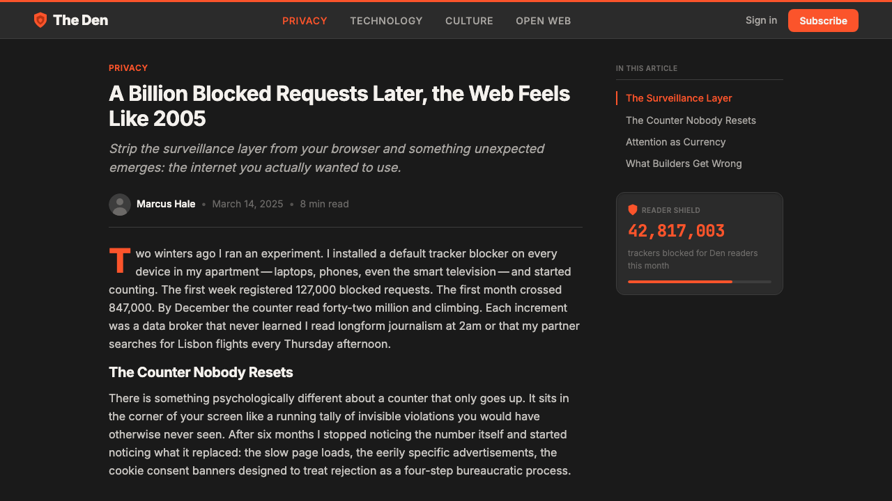
The palette anchors on a single dominant accent — a vivid, warm orange reminiscent of a lion's coat — deployed against a deep charcoal ground that reads as near-black without being fully black. This warm charcoal is itself a considered choice: cooler blacks would strip the system of the organic energy that distinguishes Brave from the colder utilitarian dark themes common in developer tools. White and light grays appear only for typography and fine structural elements, never as background fields. The orange carries all the emotional and brand weight, used with restraint across surfaces so that when it appears it registers immediately.
Shield and Lion Iconography
The lion mark — stylized into a geometric emblem with angular mane geometry — functions as both brand mascot and symbolic guardian. The accompanying shield motif recurs throughout the UI as a marker for privacy-related features: blocking indicators, security confirmations, and settings related to data protection. Both forms are treated with hard edges and flat fills, avoiding the soft gradients or beveled treatments that might soften their assertive character. The combination of animal courage and heraldic protection creates a visual argument: this software has a stance.
Stat Counter as Design Element
The most distinctive feature of the Brave visual system is the elevation of the tracker-and-ad block counter from a technical readout to a primary design element. On new tab pages, these numbers are displayed in large, prominent numerals that command attention the way a headline does in editorial design. The counter does not hide in a status bar or a settings panel — it is the first thing the eye finds. This typographic choice transforms auditing data into an ongoing narrative of defiance, and it requires that the number itself be visually expressive: large enough to be read at a glance, bold enough to feel like an achievement.
Typography as Product Voice
Inter serves as the primary typeface throughout — a humanist sans-serif chosen not for personality but for legibility and neutrality at small sizes, which lets the orange accent and the counter numerals carry the brand personality without typographic competition. Headlines and counter figures use heavier weights that give structural statements physical weight; body text and UI labels stay in lighter weights that recede appropriately. The type system is functional first, expressive through scale and weight contrast rather than through letterform character.
Dark Ground with Warm Undertone
The charcoal background is warm rather than neutral or cool, which fundamentally changes the emotional register of the dark theme. Cool dark backgrounds — common in developer tools, code editors, and many privacy-adjacent products — suggest rationality, seriousness, and detachment. A warm charcoal instead creates a sense of contained energy, as if the surface is lit from within. Against this ground, orange does not feel like a warning or an alert but like heat — something alive and present. This warmth also ensures the design does not tip into the cold severity that would undermine the brand's messaging about creating a more human internet.
Flat Geometry with Hard Edges
UI components across the Brave design system favor flat fills and hard-edged geometry over the soft-shadow, rounded-everything aesthetic that has dominated mainstream consumer software since the mid-2010s. Buttons, panels, and iconographic elements maintain crisp boundaries. Where shadows appear, they are understated — used for layering and depth perception rather than for warmth or tactility. This geometric austerity reinforces the brand's engineering credibility: the visual language says the product is precise and intentional, not decorative.
Badge and Counter Culture
Beyond the main new-tab counter, the Brave UI embeds small count badges and shield indicators throughout the browser chrome — in the address bar, on extension icons, within the Brave Shields panel. This creates a culture of visible accounting: every surface that can carry a number does, because numbers here are not bureaucratic data but proof that something is being done on the user's behalf. The visual effect is of a system that is actively working, constantly tallying, and transparently reporting. This repeating motif of quantified protection is arguably the most original contribution of the Brave visual identity.
Who shaped Brave Browser Lion Orange?
As co-founder and CEO, Eich established the foundational premise that privacy should be technically enforced by default, not offered as a settings choice. Having created JavaScript in 1995 and built much of the infrastructure that made modern web advertising possible, his decision to build against that same infrastructure gave Brave's brand an unusual authority: the inventor of the web's scripting layer choosing to subvert the tracking economy built on top of it. The lion-and-orange identity reflects his conviction that the product's mission deserved a visual language as assertive as its engineering stance.
Bondy's background as a systems engineer at Mozilla shaped Brave's technical architecture — a Chromium-based browser with aggressive default ad and tracker blocking baked into the engine rather than added as an extension. This architectural choice is what made the stat counter meaningful: the numbers it displays represent blocks performed at the network level, before content is even loaded, which is qualitatively different from extension-based blocking. The visual emphasis on the counter is only credible because the underlying technical achievement justifies it.
As Chief Information Security Officer, Yan Zhu's public profile — a security researcher and cryptographer who had previously worked at the Electronic Frontier Foundation and the Tor Project — lent the brand intellectual credibility beyond its marketing claims. Her presence signaled that Brave's privacy guarantees were grounded in serious cryptographic and security engineering, not just aggressive defaults. This technical authority reinforced the visual identity's posture of defiance: the style claims something, and the people behind it can defend those claims technically.
Mulks joined Brave after years working inside the digital advertising industry, giving the Brave Rewards program an insider's understanding of how attention markets actually function. His work on the Basic Attention Token ecosystem and the opt-in advertising model created a counter-narrative to the surveillance economy: users could be paid for their attention rather than having it harvested. This economic proposition added a layer of visual meaning to the orange accent — the color of an economy being reclaimed — beyond its role as an aggressive brand signal.
The refinement of the lion-orange system through the 2020s involved an internal design team whose choices consolidated the visual language from its rougher early-days identity into the polished, Inter-anchored system of the 2023–2025 era. Key decisions — the precise warmth of the charcoal background, the weight hierarchy of the counter display, the extent to which shield iconography permeates the browser chrome — were made by this team in response to both user research and the brand's growing mainstream ambitions. Their work represents the maturation of an activist visual identity into a consumer product design system without losing the original combative energy.
How do you use Brave Browser Lion Orange today?
Brave Browser Lion Orange is a high-conviction style with a clear emotional register: defiance, transparency, and technical credibility. Applying it well requires matching that register — it works for products that have something to stand against, something to count, something to prove. It is not a neutral professional style; it is a stance.
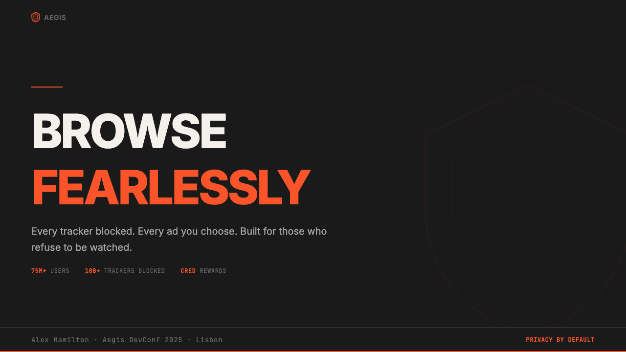
For presentation slides, the style is most effective when it embraces the counter-culture logic of the original. A cover page built in this language should lead with one bold claim — a number, a contrast, a declaration — set in large, heavy type against the warm charcoal ground with the orange accent used for the single most important word or figure. Content slides work best as high-contrast panels where data is the visual protagonist: statistical callouts, comparison tables with orange-accented differentiators, and minimal body text that never competes with the numbers. Avoid decorative flourishes entirely; the style's authority comes from austerity, not embellishment.
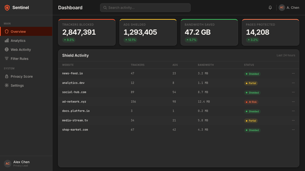
For web UI and dashboards, the Brave style translates directly into admin interfaces and analytics products where users want to feel informed and in control. Use the charcoal ground as the primary surface, reserve near-white for content areas requiring sustained reading, and deploy orange exclusively for primary actions, live status indicators, and metrics the user should feel proud of. Hard-edged card components, crisp data tables, and icon badges carrying counts all feel native to this system. The style struggles in transactional flows requiring warmth — checkout, onboarding, support — where the combative energy can read as cold.
For marketing and editorial work, the style's poster-like boldness suits campaign materials for technical audiences who are skeptical of traditional advertising aesthetics. Full-width sections alternating between warm charcoal with orange type and lighter grounds with dark type create a rhythm of declaration and evidence. Infographics rendered in this system benefit from treating every data point as a counter — a number that proves something — rather than as decoration. Shield and lion motifs can appear sparingly as graphic punctuation rather than as primary illustration.
A common mistake when applying this style is treating the orange as a general accent color to be sprinkled throughout the design for visual interest. In the Brave system, orange earns its appearances by marking things that matter: things blocked, things achieved, primary actions. Using it decoratively dilutes this semantic weight and makes the design feel like a pastiche rather than a conviction. The second common mistake is using a neutral or cool dark background rather than the warm charcoal — a cool dark ground turns the system into just another developer-tool dark theme, losing the organic energy that makes the lion-orange feel alive rather than clinical.
Brave Browser Lion Orange — FAQ
Is this style appropriate for non-privacy products?
It can be adapted, but the adaptation requires honesty about what the visual language is actually claiming. The lion-orange system's emotional power comes from its alignment with a genuine product stance: Brave really does block trackers, and the counters really do display real numbers. When you use this aesthetic for a product that does not have a comparable technical mission or adversarial stance, the defiance reads as posturing rather than proof. The style works best when there is something real to count, something real to stand against, and the design can function as visible evidence of that work rather than as borrowed attitude.
How does this style differ from other dark-theme tech aesthetics?
Most dark-theme tech aesthetics — developer tools, code editors, terminal emulators — use cool or neutral dark backgrounds, desaturated accent colors, and typography optimized for extended reading. The emotional register is calm, rational, and quietly powerful. Brave's lion-orange system departs from this in three ways: the warm charcoal ground gives the dark surface organic energy rather than cool authority; the saturated orange accent is emotionally aggressive rather than quietly competent; and the counter-forward layout prioritizes dramatic data display over ambient readability. It is the only major browser design system that reads as activist rather than utilitarian.
Can this style work in a light-background context?
Yes, but the inversion changes the character significantly. On a light or white ground, lion-orange behaves more like a conventional brand accent — energetic and warm, but without the dramatic contrast that makes it feel like heat against the charcoal. The shield and lion iconography still translate well in light contexts, as does the counter-forward information hierarchy. What is lost is the sense of a dark stage on which orange is a spotlight: the quality of something glowing in the dark, which is arguably the most distinctive sensory attribute of the Brave visual system. A light-mode Brave is viable but is missing its most powerful atmospheric quality.
How should data visualization work within this style?
Data visualization in the Brave system should treat the data itself as the graphic hero, not as a decorative element. Bar charts, counters, and metrics should be large enough to be read from a distance, set in heavy type, and colored with the orange accent reserved for the single most important figure or bar. Supporting data should appear in lighter tones of warm gray. Avoid decorative chart chrome — gridlines, if they appear at all, should be barely visible; axes should be typographic only. The ideal Brave data visualization is one where a single number or comparison is so dominant that it functions as a headline rather than as a chart.
What kinds of photography or imagery fit this visual system?
Photography in the Brave system works best when it reinforces the style's quality of evidence and transparency rather than functioning as atmospheric decoration. High-contrast images — whether product screenshots, interface mockups, or conceptual photography of surveillance infrastructure and data centers — are more appropriate than lifestyle or aspirational photography. Where the lion or shield iconography appears alongside photographic content, the graphic elements should dominate rather than float over the image. Avoid soft-focus, warm-lifestyle imagery; it contradicts the technical credibility the system is built to project. Abstract or diagrammatic imagery — network topologies, data flows, lock-and-key motifs rendered geometrically — aligns naturally with the style's technical worldview.
Related design styles
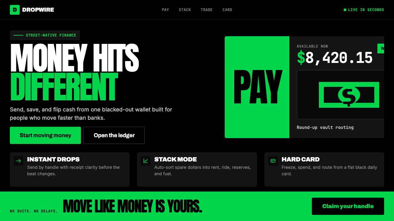 Cash App 2024Fintech that talks like a record label. Pure black, dollar-bill green, type a…
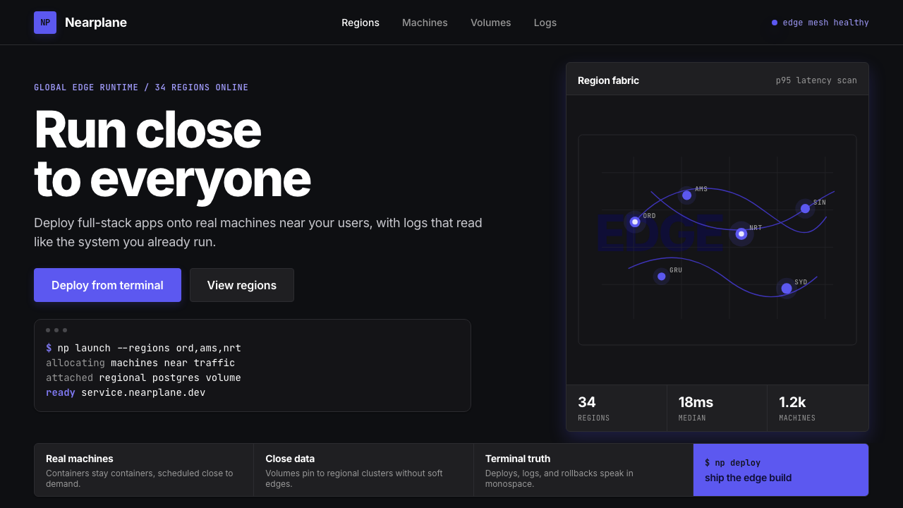 Fly.io Edge-Compute PurpleEdge-cloud with discipline. Electric purple nodes, Inter type, and terminal b…
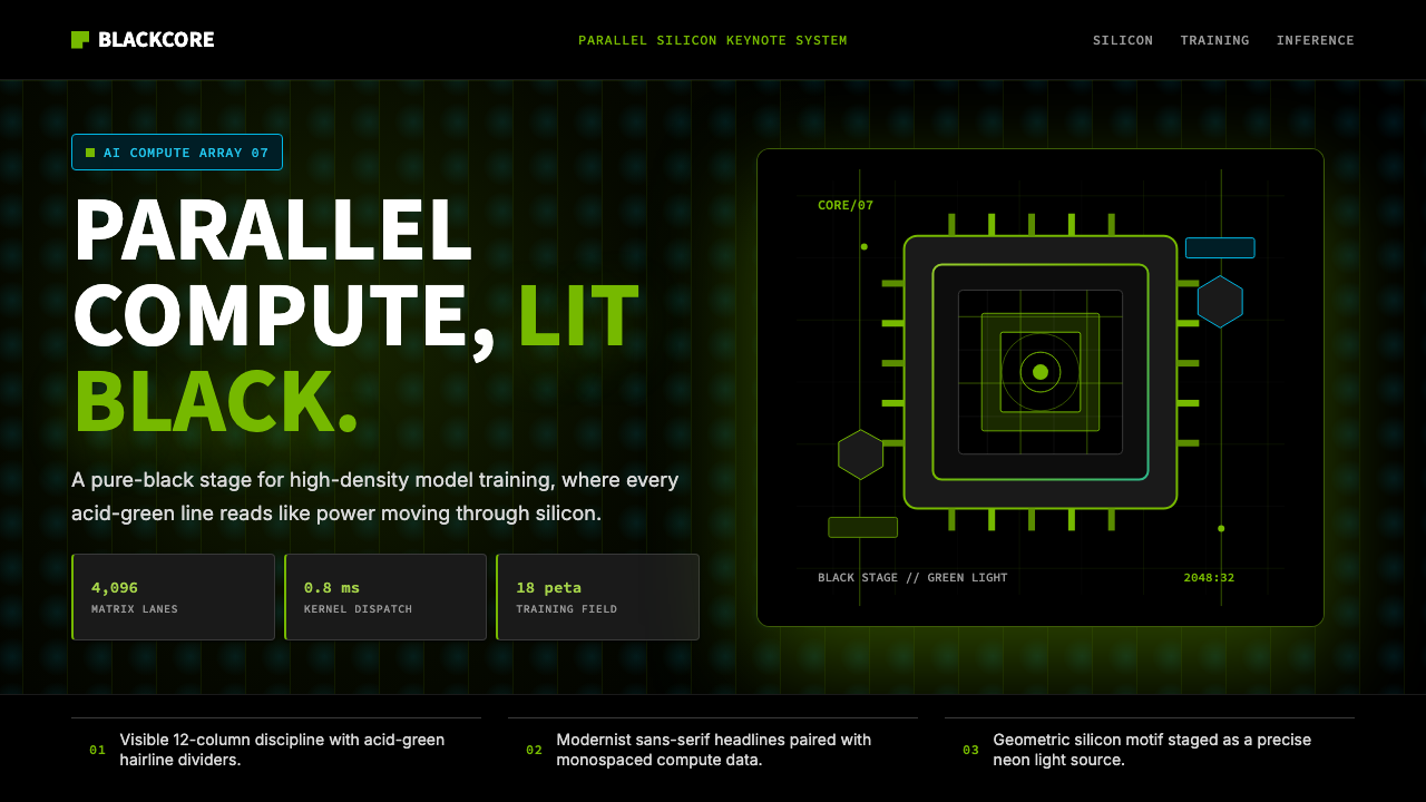 NVIDIA GPU Green-BlackPure black turns compute theatrical. Acid green hairlines and chip geometry s…
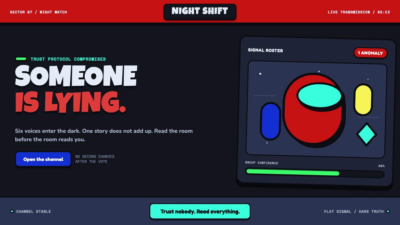 Among Us (crewmate space)Trust is ready to break. Loud capsule colors cut through a navy void with har…
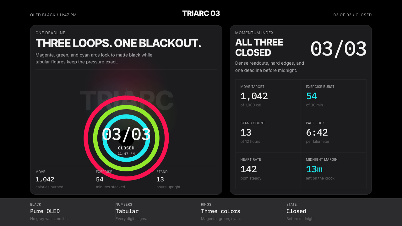 Apple Fitness Rings Closed (2024)Midnight feels exact. Magenta, green, and cyan rings lock onto OLED black.
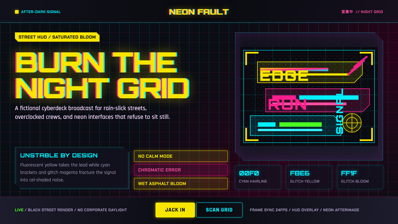 Edgerunners NeonNeon overload. Fluorescent yellow, cyan HUD grids, and magenta glitches burn…