What is Gojek Superapp?什么是 Gojek Superapp?
Gojek turned the chaos of Jakarta's streets into a single green tile grid — and in doing so invented the visual language of Southeast Asian superapp design.Gojek 将雅加达街头的喧嚣压缩进一张绿色瓷砖网格——由此创造出东南亚超级应用设计的视觉语言。
Gojek Superapp in briefGojek Superapp 速览
Gojek Superapp design is the visual and interaction system developed by and for Gojek, Indonesia's dominant multi-service platform. At its core, the style organizes dozens of heterogeneous services — rides, food delivery, payments, logistics, healthcare bookings — behind a single, scannable interface built from colored tile grids, flat iconography, and a palette anchored by a vivid, saturated green. The system's central promise is that complexity can be made navigable without being made smaller: all the services remain present, but the grid imposes a calm, rhythmic order on what would otherwise be overwhelming.Gojek 超级应用设计体系,是印度尼西亚最具影响力的多服务平台 Gojek 为自身开发的视觉与交互系统。其核心逻辑在于:将出行、外卖、支付、物流、医疗预约等数十项异质服务,整合在一套由彩色方块网格、扁平图标和标志性亮绿色主色构成的单一界面之后。这套系统的核心承诺是——复杂性可以被整理得井然有序,而无需被简化或删减:所有服务依然完整呈现,但网格赋予了它一种平静而有韵律的秩序感。
The visual identity draws from two intertwined sources: the practical demands of serving an enormous, mobile-first user base across diverse Android and iOS devices, and the specific cultural and linguistic context of Indonesia. The typeface chosen for the 2019 brand refresh — Plus Jakarta Sans — was purpose-built for Bahasa Indonesia, accommodating the language's diacritical range and vertical rhythm while remaining highly legible at the small scales required by densely packed mobile interfaces. This localization runs deeper than font choice: the tile grid itself reflects the visual culture of Indonesian street markets and wayfinding signage, where dense grids of colored panels are a familiar organizing device.这套视觉体系源自两股交织的力量:一是为数亿移动端优先用户跨越多样 Android 与 iOS 设备提供服务的现实需求;二是印度尼西亚特定的文化与语言语境。2019年品牌焕新中采用的字体 Plus Jakarta Sans,专为印尼语量身设计,能够容纳该语言的变音符范围与纵向节奏,同时在移动端密集界面所要求的小字号下保持出色的可读性。这种本地化比字体选择更为深入——方块网格本身折射出印尼街头市场与导视标牌的视觉文化,彩色方格密集排列的组织方式在当地是再熟悉不过的视觉经验。
What distinguishes Gojek's design system from generic material-influenced flat design is its specific balance between density and calm. The interface is information-rich — it must be, given the breadth of services — but the consistent tile sizing, the restrained secondary palette, and the disciplined use of the Gojek green as a primary anchor prevent the density from tipping into visual noise. The result reads less like a cluttered marketplace and more like a well-organized transit map: a system where finding anything is fast because everything is in its place.Gojek 设计系统之所以有别于泛化的 Material Design 扁平风格,在于它对密度与平静感之间那种特定平衡的把握。界面信息密度很高——考虑到服务的广度,这是必要的——但统一的方块尺寸、克制的辅助色板,以及 Gojek 绿作为主锚点的纪律性运用,使得这种密度始终未曾滑入视觉噪音。最终效果更像一张组织得井井有条的交通地图,而不像一个杂乱的集市:在这个系统里,找到任何东西都很快,因为一切都在它应在的位置。
See the Gojek Superapp design system查看 Gojek Superapp 完整设计系统
Where does Gojek Superapp come from?Gojek Superapp 从何而来?
Gojek was founded in Jakarta in 2010 by Nadiem Makarim and Kevin Aluwi as a motorcycle-taxi dispatch service operating through a telephone call center. In its earliest form there was no app, no visual system — just a phone number connecting passengers to the vast informal fleet of ojek (motorcycle taxi) drivers already woven into the fabric of Jakarta's traffic. The informality was the point: Gojek was formalizing something that already existed, giving it a name, a number, and eventually a color.Gojek 由纳迪姆·马卡里姆(Nadiem Makarim)与凯文·阿卢维(Kevin Aluwi)于2010年在雅加达创立,最初是一家通过电话呼叫中心调度摩托车出租车的服务公司。在最早期的形态里,没有应用程序,没有视觉系统——只有一个电话号码,将乘客与早已融入雅加达交通肌理的庞大非正式 ojek(摩托车出租车)司机群体连接起来。这种非正式性正是重点所在:Gojek 是在将一种已然存在的事物正规化,赋予它一个名字、一个号码,以及最终一种颜色。
The move to a smartphone application in 2015 forced the creation of a scalable visual identity for the first time. Early versions of the app were functional but visually unremarkable — green was established as the brand color from the outset, linked to the green helmets and jackets that uniformed Gojek drivers, but the interface borrowed heavily from generic flat-design conventions of the period. As the platform expanded — adding GoPay (its digital payment system), GoFood, GoSend, and eventually more than twenty service verticals — the early visual system began to strain. A brand architecture designed for a ride-hailing app could not gracefully accommodate a superapp.2015年向智能手机应用的转型,迫使公司第一次建立可规模化的视觉识别体系。早期版本的应用在功能上可用,但视觉上缺乏辨识度——绿色从一开始就作为品牌色确立下来,与将 Gojek 司机统一起来的绿色头盔和夹克相呼应,但界面大量借用了同时期通行的扁平设计惯例。随着平台不断扩张——加入 GoPay 数字支付系统、GoFood、GoSend,最终发展至二十余个服务垂直板块——早期视觉系统开始承压。一套为网约车应用设计的品牌架构,无法优雅地容纳一个超级应用。
The decisive moment came in 2019, when Gojek commissioned the London-based brand consultancy Wolff Olins to lead a comprehensive brand and identity refresh, internally called 'Solv.' The brief was to create a visual system that could hold dozens of services in coherent relationship without privileging any single one, while also communicating Gojek's ambition to operate beyond Indonesia into broader Southeast Asia. Wolff Olins worked with Indonesian type designer Gumpita Rahayu to develop Plus Jakarta Sans — the custom typeface that became the typographic backbone of the new identity. The typeface's name deliberately honored Jakarta, grounding the international brand in its local origin.决定性时刻发生在2019年。Gojek 委托伦敦品牌咨询公司 Wolff Olins 主导一次全面的品牌与识别焕新,内部代号为「Solv」。设计任务书的核心是:创造一套能够将数十项服务维系在连贯关系中而不偏重任何单一服务的视觉系统,同时传达 Gojek 走向更广泛东南亚市场的战略抱负。Wolff Olins 与印度尼西亚字体设计师 Gumpita Rahayu 合作,开发了 Plus Jakarta Sans——这款定制字体成为新识别系统的字体骨干。字体名称刻意向雅加达致敬,将这个国际化品牌锚定于它的本地起点。
The Solv refresh also resolved the tension between the helmet silhouette — Gojek's most recognizable brand mark, evoking the ojek driver who remains the company's founding image — and the demands of a multi-service digital platform that had long outgrown its motorcycle-taxi origins. The solution was to retain the silhouette as an anchor while building around it a flexible tile system that could accommodate any service category through consistent iconographic logic. By 2020, the refreshed system was fully deployed across the app, marketing materials, and physical touchpoints such as driver uniforms and delivery packaging. The visual language that resulted is now the de facto reference point for superapp design across the region.Solv 焕新同时化解了一个长期的张力:一方面是头盔剪影——Gojek 最具辨识度的品牌符号,唤起那位始终是公司创始意象的 ojek 司机;另一方面是一个多服务数字平台的需求,这个平台早已远远超越了它的摩托车出租车起点。解决方案是:保留剪影作为锚点,围绕它建构一套灵活的方块系统,通过一致的图标逻辑容纳任何服务类别。到2020年,焕新后的系统已全面部署于应用程序、营销物料以及司机制服、配送包装等实体触点。由此形成的视觉语言,如今已成为整个地区超级应用设计的事实参照。
What defines the Gojek Superapp look?Gojek Superapp 的视觉特征是什么?
Gojek Green as Structural AnchorGojek 绿:结构性锚点
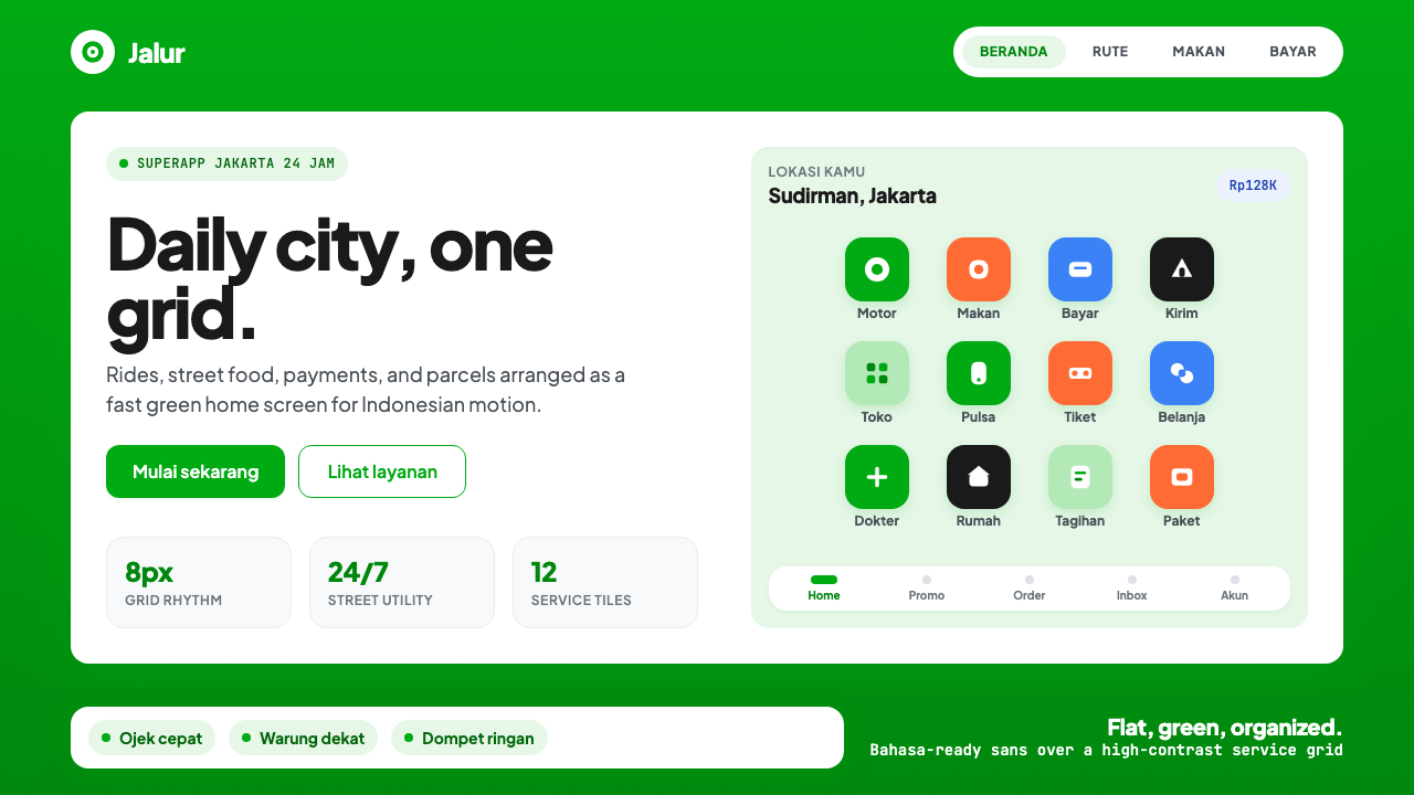
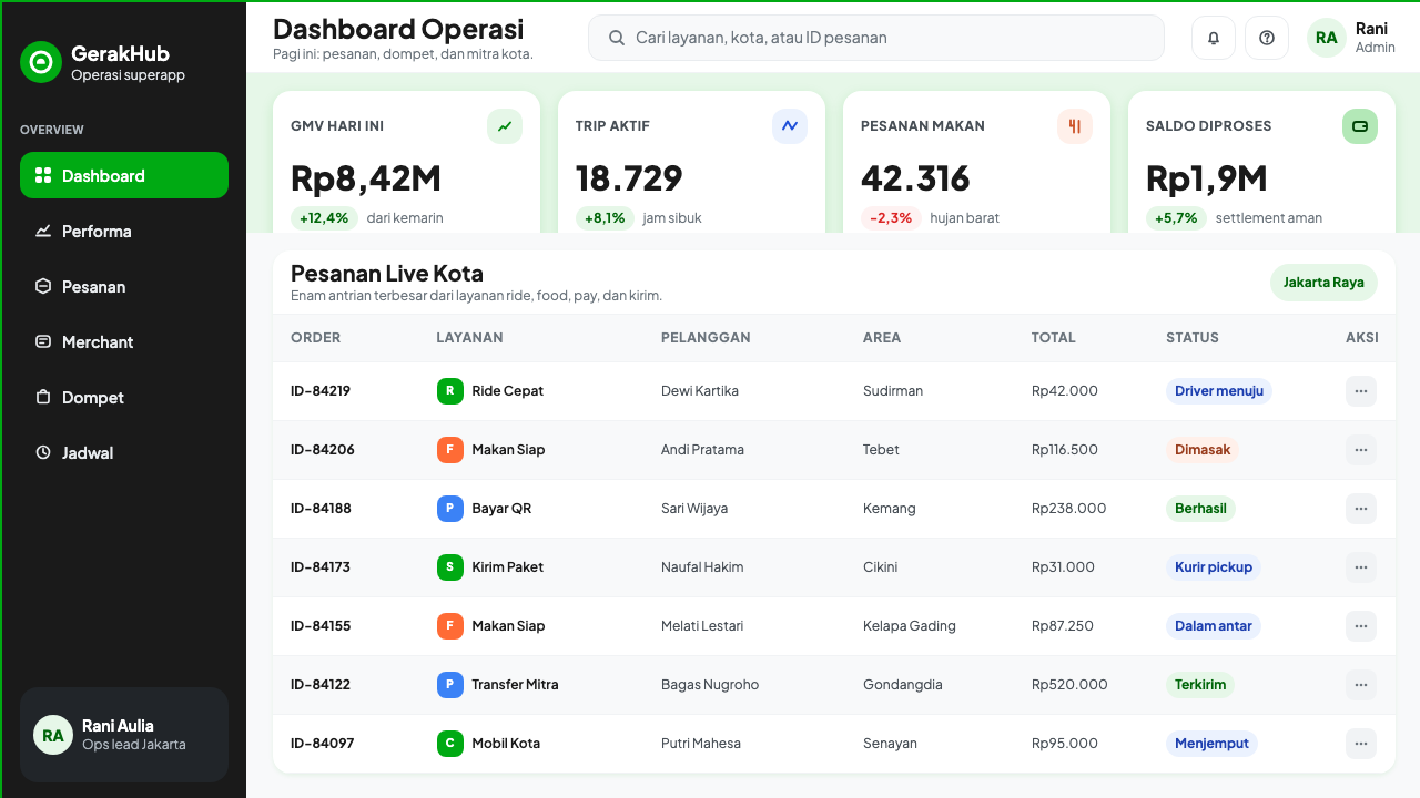
The brand green — vivid, warm-leaning, and distinctly saturated — functions not merely as a color but as the primary organizing signal of the entire interface. It appears on the navigation bar, key call-to-action buttons, active states, and the app icon, creating a consistent thread that runs through every screen. The green is never used decoratively; it marks decision points and primary actions. Secondary colors within service tiles are allowed more variety — warm oranges for food, cooler blues for logistics — but all defer to the green hierarchy. The overall effect is that of a transit system with clear line colors: the green is always the main line.品牌绿——鲜亮、偏暖、饱和度显著——不仅仅是一种颜色,而是整个界面最主要的组织信号。它出现在导航栏、关键行动按钮、激活状态和应用图标上,形成贯穿每一个屏幕的一致线索。绿色从不用于装饰性目的;它标记决策点与主要操作。服务方块内部的辅助色允许更多变化——餐饮类暖橙,物流类冷蓝——但所有辅助色都服从绿色确立的层级。整体效果如同一套有清晰线路色彩的轨道交通系统:绿色永远是主线。
Tile Grid Navigation方块网格导航
The signature structural element of Gojek's interface is the tile grid: a regular array of equally sized, rounded-corner squares, each containing a flat icon and a short label, through which users access the full breadth of services. The tile system solves the superapp's central design problem — how to surface dozens of services without overwhelming the user — by using size consistency and visual rhythm to create a browseable map rather than a long scrollable list. Tiles are grouped by category into logical clusters but maintain identical proportions, so scanning the grid feels like reading a well-indexed reference rather than searching through unorganized inventory.Gojek 界面的标志性结构元素是方块网格:一组等大小、圆角的正方形方块均匀排列,每个方块包含一个扁平图标和简短标签,用户通过它访问全部服务。这套方块系统解决了超级应用设计的核心难题——如何在不令用户不知所措的前提下呈现数十项服务——方法是利用尺寸一致性和视觉节奏,创造一张可浏览的地图,而非一份无尽的滚动列表。方块按类别分组成逻辑簇,但保持相同比例,因此扫视网格的感觉更像阅读一份索引清晰的参考文献,而非翻找无序的货物清单。
Flat Iconography with Cultural Specificity具有文化特异性的扁平图标
The icon system is fully flat — no gradients, no simulated depth, no illustrative detail beyond what is necessary for recognition. Each service icon is reduced to its most immediately legible silhouette: a motorcycle helmet, a bag of food, a wallet, a box. But the iconography carries cultural specificity that differentiates it from generic platform design: the food icons reference Indonesian street food conventions, the transportation icons reflect the ojek motorcycle rather than the generic taxi car, and the overall register is warm and approachable rather than clinical. The icons are designed to work at very small sizes without losing identity, a necessity in the densely packed tile grid.图标系统完全扁平——无渐变,无模拟深度,不包含任何超出识别所需之外的插图细节。每个服务图标被简化为最直接可读的剪影:摩托车头盔、装食物的袋子、钱包、包裹。但图标体系承载着将其与泛化平台设计区别开来的文化特异性:食物图标引用印度尼西亚街头食物的视觉惯例,交通图标呈现的是 ojek 摩托车而非通用出租车,整体基调温暖亲切而非冷峻临床。图标设计在极小尺寸下依然不失识别度——这在密集排列的方块网格中是必要条件。
Plus Jakarta Sans TypographyPlus Jakarta Sans 字体排印
Plus Jakarta Sans, the custom typeface developed for Gojek's 2019 refresh, is the typographic voice of the entire system. It is a humanist sans-serif — meaning its letterforms retain subtle human-drawn qualities rather than being purely geometric — making it legible and approachable at body text sizes while remaining authoritative at display scale. Designed specifically to accommodate Bahasa Indonesia's linguistic requirements, it handles diacriticals and the language's longer compound words with composure. In the interface, type is used at high contrast between labels and backgrounds, with size and weight doing the work of hierarchy rather than decorative styling. The typeface is not varied — one family, controlled weights — which gives the system its typographic consistency.Plus Jakarta Sans——为 Gojek 2019年品牌焕新专门开发的定制字体——是整套系统的字体之声。它是一款人文主义无衬线字体,字形保留了细微的手绘质感,而非纯粹几何化,使其在正文字号下可读而亲切,在大标题下依然具有权威感。这款字体专为适应印尼语的语言要求而设计,能够从容处理变音符和该语言较长的复合词。在界面中,字体在标签与背景之间以高对比度使用,以尺寸和字重承担层级建构的职责,而非借助装饰性样式。字体不作变换——单一字体家族、受控字重——这赋予了系统一致的字体性格。
Restrained Depth and Elevation克制的深度与层级感
Gojek's interface uses soft elevation cues rather than the hard-shadow aesthetic of older flat-design revivals. Cards and modal sheets lift very slightly from the background — enough to signal interactivity and layer separation, but never so dramatically that the interface begins to feel three-dimensional. This restraint is functional: on diverse mobile hardware and variable ambient light conditions, subtle elevation reads better than extreme depth contrasts. The approach means the system belongs to the tradition of material-influenced flat design — depth is acknowledged but never performed.Gojek 界面使用柔和的层级提示,而非旧版扁平设计复兴潮流中常见的硬边阴影美学。卡片与底部弹窗从背景中轻微浮起——足以传达交互性和图层分离,但绝不显著到令界面产生三维感。这种克制具有功能理由:在多样的移动设备硬件和变化的环境光条件下,微妙的层级感比极端的深度对比更易识读。这种处理方式意味着该系统归属于受 Material Design 影响的扁平设计传统——深度被承认,但从不被表演。
Warm, Approachable Micro-Interactions温暖亲切的微交互
Motion in the Gojek interface is purposeful and warm rather than spectacular. Loading states, confirmation animations, and state transitions use simple, quick motions that feel responsive without being distracting — a brief scale-up on tile tap, a smooth fade for content loading, a gentle bounce on order confirmation. The emotional register of these interactions is friendly and reassuring: appropriate for an app whose most frequent use case is a transaction involving trust — a stranger delivering your food, a driver carrying you through the city. The micro-interaction language avoids the mechanical coldness that can accompany highly geometric visual systems.Gojek 界面中的动效是有目的且温暖的,而非炫技性的。加载状态、确认动画和状态切换使用简洁快速的动作,感觉响应迅速而不令人分心——轻触方块时的短暂放大,内容加载时的平滑淡入,订单确认时的轻柔弹跳。这些交互的情感基调友善而安心:这很适合一款最频繁使用场景涉及信任交易的应用——一个陌生人为你送来食物,一位司机载你穿越城市。微交互语言刻意回避了高度几何化视觉系统可能伴随的机械冷感。
Helmet Silhouette as Brand Anchor头盔剪影:品牌锚点
Gojek's most durable visual symbol is the ojek helmet silhouette — a simple, rounded form derived from the motorcycle helmet worn by the platform's founding driver-partners. The silhouette functions as a brand compact: it acknowledges the gig-economy workers whose labor underpins the platform, while simultaneously serving as a bold, scalable logomark. In the Wolff Olins refresh, the silhouette was retained and refined into a more geometrically resolved form that works cleanly across every scale — from app icon to billboard. Its presence across the system is a reminder that under the sophistication of the superapp interface, the brand's identity remains grounded in the street.Gojek 最持久的视觉符号是 ojek 头盔剪影——一个圆润的简洁形态,源自平台创始司机合作伙伴所佩戴的摩托车头盔。这个剪影充当品牌契约:它向支撑平台运转的零工经济工作者致敬,同时作为一个大胆、可缩放的品牌标志发挥作用。在 Wolff Olins 的品牌焕新中,剪影被保留并提炼为更具几何精确性的形态,在从应用图标到广告牌的每一种尺寸下都清晰有力。它在整个系统中的存在提醒人们:在超级应用界面的精致表象之下,这个品牌的身份依然扎根于街头。
See the Gojek Superapp design system查看 Gojek Superapp 完整设计系统
Who shaped Gojek Superapp?谁塑造了 Gojek Superapp?
Makarim co-founded Gojek in 2010 in Jakarta, beginning with a motorcycle-taxi dispatch call center before transforming the company into Southeast Asia's most expansive superapp platform. His vision of aggregating Indonesia's fragmented informal service economy behind a single digital interface shaped the fundamental design problem that the Gojek visual system was built to solve: how to make radical complexity navigable for a mass, mobile-first audience. He served as CEO until 2019, when he was appointed Indonesia's Minister of Education — a departure that marked the end of the founding chapter and coincided with the brand's Wolff Olins refresh.马卡里姆于2010年在雅加达联合创立 Gojek,从摩托车出租车调度呼叫中心起步,将公司发展为东南亚规模最大的超级应用平台。他将印度尼西亚分散的非正式服务经济整合在单一数字界面之后的愿景,界定了 Gojek 视觉系统被构建来解决的根本设计问题:如何让以移动端为先的大众用户能够驾驭极度复杂的服务矩阵。他担任 CEO 直至2019年,随后被任命为印度尼西亚教育部长——这一离任标志着创始章节的终结,也恰好与品牌的 Wolff Olins 焕新同步发生。
Aluwi co-founded Gojek alongside Makarim and led the company as co-CEO through its most consequential growth phase — the transition from a ride-hailing service to a multi-vertical superapp. His operational leadership during the scaling of GoPay, Gojek's digital payments system, was central to establishing the financial infrastructure that makes the superapp model work: when payment is embedded in the platform, every service category becomes more coherent. The GoPay visual integration within the Gojek tile system reflects this architectural decision, giving financial services the same visual weight as transportation or food.阿卢维与马卡里姆共同创立 Gojek,并在公司最具决定性意义的成长阶段以联席 CEO 身份领导公司——即从网约车服务向多垂直超级应用的转型期。他在 GoPay(Gojek 数字支付系统)规模扩张期间的运营领导,对于建立超级应用模式运作所依赖的金融基础设施至关重要:当支付被嵌入平台时,每一个服务类别都变得更为连贯。GoPay 在 Gojek 方块系统中的视觉整合,体现了这一架构决策——金融服务与交通或餐饮获得了同等的视觉权重。
The London-based brand consultancy Wolff Olins led the 2019 identity refresh — internally named 'Solv' — that transformed Gojek from a ride-hailing brand into a visual system capable of supporting a superapp. Their work resolved the central tension of the brief: how to create a brand architecture flexible enough to hold more than twenty service categories while still feeling like a single, coherent product. The tile grid, the refinement of the helmet silhouette, and the commissioning of Plus Jakarta Sans were all outcomes of this engagement. Wolff Olins had previously led transformative brand work for companies including Google, Uber, and the London 2012 Olympics; the Gojek project stands among their most contextually specific, given its deliberate grounding in Indonesian visual culture.伦敦品牌咨询公司 Wolff Olins 主导了2019年内部代号为「Solv」的品牌识别焕新,将 Gojek 从一个网约车品牌转化为能够支撑超级应用的视觉系统。他们的工作化解了设计任务书的核心张力:如何创造一套品牌架构,既足够灵活以容纳超过二十个服务类别,又让人感觉是一个单一的连贯产品。方块网格、头盔剪影的精炼,以及 Plus Jakarta Sans 的委托开发,都是这次合作的成果。Wolff Olins 此前曾为谷歌、Uber 和2012年伦敦奥运会等主导过变革性品牌工作;Gojek 项目因其刻意扎根于印度尼西亚视觉文化的特异性,在其作品序列中显得尤为独特。
Indonesian type designer Gumpita Rahayu collaborated with Wolff Olins to develop Plus Jakarta Sans, the custom typeface that became the typographic foundation of Gojek's refreshed identity. The design brief required a sans-serif that could serve Bahasa Indonesia's specific linguistic needs — accommodating its diacritical range and the visual rhythm of its longer compound words — while remaining highly legible at the small sizes required by mobile interfaces and retaining a warmth and approachability appropriate for a consumer platform. Rahayu's contribution represents the project's most deliberate act of local grounding: an Indonesian typeface, named for Jakarta, at the heart of an internationally ambitious brand.印度尼西亚字体设计师 Gumpita Rahayu 与 Wolff Olins 合作开发了 Plus Jakarta Sans——这款定制字体成为 Gojek 焕新身份的字体基础。设计要求是:一款无衬线字体,能够服务于印尼语的特定语言需求——容纳其变音符范围和较长复合词的视觉节奏——同时在移动界面所要求的小字号下保持高度可读性,并保留适合消费者平台的温暖亲切感。Rahayu 的贡献代表了这个项目最刻意的本土化举措:一款印度尼西亚字体,以雅加达命名,置于一个国际野心勃勃的品牌的核心之中。
The Gojek visual system did not emerge in isolation — it was shaped by and contributed to the broader Southeast Asian superapp paradigm that also produced Grab (Singapore/Malaysia), Sea Group's Shopee, and others. This regional design context differs from Western app design in key ways: mobile-first as a baseline assumption, extremely diverse device ecosystems including many budget Android handsets, very high information density expected by users accustomed to dense markets and signage, and the coexistence of multiple languages and scripts within single markets. Gojek's tile grid and clear iconographic logic represent the region's best-known solution to this specific design environment, and the system's influence can be traced in subsequent superapp design efforts across Vietnam, the Philippines, and Thailand.Gojek 视觉系统并非孤立产生——它形成于并反过来塑造了更广泛的东南亚超级应用范式,这一范式还催生了 Grab(新加坡/马来西亚)、Sea Group 旗下的 Shopee 等平台。这一地区性设计语境与西方应用设计在若干关键维度上存在差异:以移动优先为基础假设,极为多样的设备生态系统(包括大量入门级安卓手机),用户基于对密集市场和标牌的熟悉而期待极高的信息密度,以及单一市场内多语言多文字的共存。Gojek 的方块网格与清晰的图标逻辑,代表了该地区对这一特定设计环境最广为人知的解决方案,其系统的影响力可在越南、菲律宾、泰国后续的超级应用设计实践中得到追溯。
How do you use Gojek Superapp today?今天怎么用 Gojek Superapp?
Gojek Superapp style translates well into a range of contemporary design contexts because its core logic — dense information organized by a consistent grid and a strong single-color anchor — is structurally sound and broadly applicable. Applying it correctly requires understanding the system as an information architecture decision first and an aesthetic decision second: the style emerges from organizing real complexity, and applying it to artificially sparse content produces work that feels borrowed rather than purposeful.Gojek 超级应用风格能很好地迁移到当代多种设计场景中,因为它的核心逻辑——以一致网格和强单色锚点组织密集信息——在结构上是稳健的,具有广泛适用性。正确应用它,需要首先将其理解为一种信息架构决策,其次才是美学决策:这种风格源于对真实复杂性的整理,将其应用于人为稀疏的内容,只会产生一种借用感而非目的感的作品。
For presentation slides, the style works strongest on covers and service-overview pages. A cover built in this language uses a bold field of Gojek green or a deep contrasting tone as background, the headline in high-weight Plus Jakarta Sans or a humanist sans equivalent, and a grid of simple flat icons previewing the content ahead. Service or feature overview slides should use the tile grid directly: equal-sized cards, each with an icon and a label, grouped into logical rows. Data slides translate naturally into the system's visual logic — charts and diagrams are treated as tile-like modules, with a green accent marking the primary data series and warm or cool secondaries marking supporting series.在演示文稿中,这种风格在封面和服务概览页上表现最为强劲。用这套语言制作的封面,以大面积的 Gojek 绿或深色对比调为底,标题采用高字重的 Plus Jakarta Sans 或相近的人文主义无衬线字体,并用一组简单扁平图标预告后续内容。服务或功能概览页应直接使用方块网格:等大的卡片,每张配一个图标和标签,按逻辑分组排列成行。数据页面自然地转化为系统的视觉逻辑——图表和示意图被处理为方块状模块,绿色强调色标记主数据系列,暖色或冷色辅助色标记支撑系列。
For web interfaces, the Gojek system is best suited to dashboards, product landing pages, and multi-service directories where breadth of information is a feature rather than a problem. The approach: establish a warm off-white or light neutral background, define a strong grid (twelve columns on wide screens, four on mobile), use the brand green exclusively for primary interactive elements such as buttons and active navigation states, and deploy category colors for service or data groupings. Cards should have slightly rounded corners and subtle elevation — enough to read as distinct units on the background, never so pronounced as to feel dimensional. Navigation should be flat and typographic; avoid icon-only navigation in contexts where service labels add clarity.对于网页界面,Gojek 系统最适合仪表板、产品着陆页,以及信息广度本身是特性而非问题的多服务目录。方法是:建立温暖的近白色或浅中性背景,定义强健的网格(宽屏十二列,移动端四列),将品牌绿专门用于按钮和激活导航状态等主要交互元素,为服务或数据分组部署类别色。卡片应有轻微的圆角和微妙的层级感——足以在背景上被识读为独立单元,但绝不显著到产生立体感。导航应扁平而字体化;在服务标签能增加清晰度的场景中,避免仅用图标的导航。
For editorial and marketing material — including social cards, event banners, and campaign pages — Gojek style supports bold, information-forward compositions. A marketing page in this language uses full-width alternating sections: Gojek green backgrounds for feature callouts, light backgrounds for supporting copy. Service grids can be adapted as feature matrices, with each cell highlighting a product capability. The tile logic also adapts well to pricing pages: each plan becomes a tile with consistent structure, differentiated by a secondary color accent rather than divergent layouts. The overall tone should feel kinetic and confident — evoking the sense of a city system that is moving and working — rather than quiet or contemplative.对于编辑和营销物料——包括社交卡片、活动横幅和推广页面——Gojek 风格支持大胆、信息前置的版面构成。用这套语言制作的营销页面,使用交替的全宽分区:Gojek 绿背景用于功能重点呼出,浅色背景用于辅助文案。服务网格可改编为功能矩阵,每个格子突出一项产品能力。方块逻辑同样适合定价页面:每个套餐成为一个方块,通过辅助色强调而非divergent版式加以区分。整体基调应感觉动感而自信——唤起一个城市系统运转起来的节奏感——而非安静或沉思性的。
A common mistake when applying this style is mistaking visual density for visual richness. The Gojek tile grid works because everything within it is consistent — same size, same corner radius, same icon style, same label treatment. Introducing variety within the grid (different tile sizes, mixed icon styles, inconsistent type scales) breaks the system's fundamental rhythm and produces visual noise rather than organized complexity. Similarly, overextending the green: the brand color functions as an anchor because it is used selectively. When green appears on every element, it loses its structural role and the interface flattens into undifferentiated brightness. Restraint in the primary color is what makes density readable.应用这种风格时常见的错误,是将视觉密度误解为视觉丰富性。Gojek 方块网格之所以有效,是因为其中的一切都是一致的——相同尺寸、相同圆角半径、相同图标风格、相同标签处理。在网格内引入变化(不同方块大小、混合图标风格、不一致的字体尺度)会打破系统的基本节奏,产生视觉噪音而非有组织的复杂性。同样,过度扩张绿色的使用范围也是常见错误:品牌色之所以能充当锚点,是因为它被选择性地使用。当绿色出现在每一个元素上时,它就失去了结构性角色,界面趋于无差别的亮眼。在主色上保持克制,才是让密度变得可读的关键。
See the Gojek Superapp design system查看 Gojek Superapp 完整设计系统
Gojek Superapp — FAQGojek Superapp · 常见问题
Is Gojek style the same as Material Design?Gojek 风格和 Material Design 是同一回事吗?
They share a common ancestor — both are flat-design systems that use elevation, color, and typography for hierarchy rather than skeuomorphic simulation — but Gojek style is a culturally specific evolution rather than a Material Design implementation. Material Design is a generic system designed for maximum adaptability across product types and geographies. Gojek's system is purpose-built for a specific use case: a superapp serving Indonesian and Southeast Asian users on predominantly mobile hardware. The tile grid, the helmet silhouette, the humanist typeface tuned for Bahasa Indonesia, and the warm register of the micro-interactions all distinguish it from a Material Design application. When applying Gojek style, drawing directly from Material Design components will produce something too generic; the specific warmth and cultural grounding must be introduced deliberately.两者有共同的祖先——都是以层级感、色彩和字体排印建立层次、而非依赖拟物模拟的扁平设计系统——但 Gojek 风格是一种具有文化特异性的演进,而非 Material Design 的一个实现版本。Material Design 是为跨产品类型和地区最大适应性而设计的通用系统。Gojek 系统则是为特定用例量身打造的:一款服务于印尼和东南亚用户、运行于以移动设备为主的硬件环境中的超级应用。方块网格、头盔剪影、为印尼语调校的人文主义字体,以及微交互的温暖基调,都将它与 Material Design 应用程序区别开来。应用 Gojek 风格时,直接套用 Material Design 组件会产生过于通用的结果;那种特定的温暖感和文化根基必须被刻意引入。
Can this style work for products outside Southeast Asia?这种风格能用在东南亚以外的产品上吗?
Yes, with appropriate adaptation. The core structural principles — single dominant color as system anchor, tile grid for service navigation, flat iconography with strong silhouettes, humanist typeface at controlled weights — are not geographically specific and transfer well to any multi-service or multi-category product. What does not automatically transfer is the cultural warmth: the specific green, the helmet icon, and Plus Jakarta Sans are identity elements rather than transferable design tokens. A product applying this style outside its original context should replace these culturally specific elements with equivalents that carry equivalent weight in the target context, while maintaining the underlying grid logic and color hierarchy. Applied without this substitution, the style risks feeling like a Gojek imitation rather than a considered design system.可以,但需要适当改编。核心结构原则——以单一主导色作为系统锚点、用方块网格导航服务、强剪影扁平图标、受控字重的人文主义字体——并不具有地理特异性,能够很好地迁移至任何多服务或多类别产品。不能自动迁移的是文化温度:特定的绿色、头盔图标和 Plus Jakarta Sans 是身份元素,而非可移植的设计令牌。在其原生语境之外应用这种风格的产品,应以在目标语境中具有同等分量的等价元素替换这些文化特异性元素,同时保持底层的网格逻辑和色彩层级。若不做这种替换就直接应用,风格可能看起来像是对 Gojek 的模仿,而非经过深思熟虑的设计系统。
How does Gojek handle dark mode?Gojek 如何处理深色模式?
Gojek's system is primarily designed for light backgrounds — the warm off-white or pure white ground is structural to how the tile grid reads, and the green is calibrated for light-mode contrast. A dark-mode inversion is technically possible but requires care. On a dark background, the saturated green must be desaturated or shifted in value to avoid becoming too dominant; the warm neutrals that give the light mode its approachable quality need dark equivalents that retain warmth rather than going cold grey. The tile grid in dark mode tends to work best when tiles carry a slightly elevated dark surface rather than being recessed — the distinction between tile background and page background must remain clear for the navigational logic to hold. In practice, dark mode for this style rewards restraint: fewer tiles, wider spacing, and a single well-placed green accent rather than green distributed across all interactive elements.Gojek 系统主要为浅色背景设计——温暖的近白色或纯白底面对于方块网格的识读方式具有结构性意义,绿色也是针对浅色模式下的对比度校准的。深色模式的反转在技术上是可行的,但需要谨慎处理。在深色背景上,高饱和度的绿色必须降低饱和度或调整明度,以避免过于强势;赋予浅色模式亲切质感的暖中性色,需要保留温暖感而非变成冷灰色的深色等价物。深色模式下的方块网格,通常在方块带有略微提升的深色表面(而非凹陷)时效果最佳——方块背景与页面背景之间的区别必须保持清晰,以维持导航逻辑的有效性。在实践中,这种风格的深色模式因克制而受益:更少的方块、更宽的间距,以及单个精心放置的绿色强调色,而非将绿色分散到所有交互元素上。
What kinds of products is this style unsuited for?这种风格不适合哪类产品?
Gojek style works best for products where comprehensiveness, speed of navigation, and systemic clarity are the primary user values. It struggles in contexts that require intimacy, editorial richness, or emotional resonance. A luxury goods platform, a mental health application, a premium editorial publication, or a children's learning product — all of these demand visual languages that prioritize sensory warmth, organic texture, or personal specificity over the organized efficiency that the tile grid communicates. The style also sits awkwardly in contexts where the brand identity is built on exclusivity or scarcity: the tile grid implies abundance and open access, which works for a superapp but contradicts the visual logic of a premium or highly curated product. Knowing the difference between where systemic clarity is a value and where it reads as impersonal efficiency is the key judgment when deciding whether to apply this style.Gojek 风格最适合以全面性、导航速度和系统性清晰度为主要用户价值的产品。它在需要亲密感、编辑丰富性或情感共鸣的场景中力不从心。奢侈品平台、心理健康应用、高端编辑刊物或儿童学习产品——这些都需要将感官温度、有机质感或个人特异性置于方块网格所传达的有序效率之上的视觉语言。这种风格在品牌身份建立于排他性或稀缺性的场景中也显得格格不入:方块网格暗示着丰盛与开放获取,这对超级应用有效,但与高端或高度策展产品的视觉逻辑相悖。判断系统性清晰度是一种价值还是被解读为非人格化效率,是决定是否应用这种风格时的关键判断。
How should the tile grid be adapted when there are only a few services or categories?当服务或类别很少时,方块网格应如何改编?
The tile grid derives its visual logic from density: the rhythm and order it creates depend on having enough tiles to fill the grid meaningfully. With very few categories — say, three or four — a full tile grid reads as sparse and arbitrary rather than organized. In this case, the tile logic should be adapted rather than directly applied: use the same sizing and corner-radius principles, but arrange tiles in a single row or as a small featured cluster rather than a full grid. Alternatively, expand each tile to become a larger card component that contains more information, preserving the grid's organizing logic while filling the available space purposefully. The underlying principle — consistent sizing, clear iconography, a dominant green accent on the most important action — remains, but the grid density is adjusted to match the actual content depth.方块网格的视觉逻辑来源于密度:它所创造的节奏与秩序,依赖于足够数量的方块有意义地填充网格。当类别非常少——比如三四个——时,完整的方块网格会显得稀疏而随意,而非有组织。在这种情况下,方块逻辑应被改编而非直接套用:使用相同的尺寸和圆角原则,但将方块排列为单行或小型精选簇,而非完整网格。或者,将每个方块扩展为包含更多信息的大型卡片组件,在有目的地填充可用空间的同时保留网格的组织逻辑。底层原则——一致的尺寸、清晰的图标、最重要操作上的主导绿色强调——不变,但网格密度根据实际内容深度加以调整。
Related design styles相关设计风格
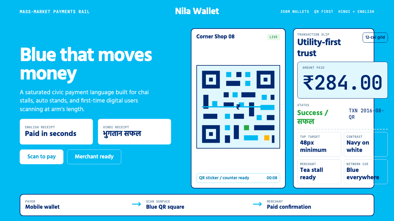 Paytm Indian FintechTrust at street scale. Saturated blue, Hind numerals, and QR grids make payme…街头级信任:饱和蓝、Hind数字与二维码方格让支付更清楚。
 Adobe Creative CloudUnified, not uniform. Red anchor, white space, and saturated app tiles organi…统一而不单一:红色锚点、留白与高饱和应用方块组织整套工具。
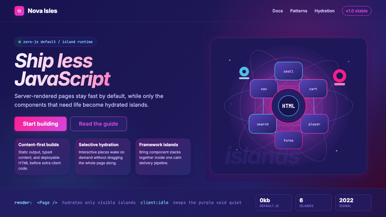 Astro Islands Architecture 2022Warm cosmic devtools. Deep violet, magenta glow, Inter clarity, and island ge…温暖的宇宙开发感:深紫底、洋红光、Inter 字体与岛屿几何。
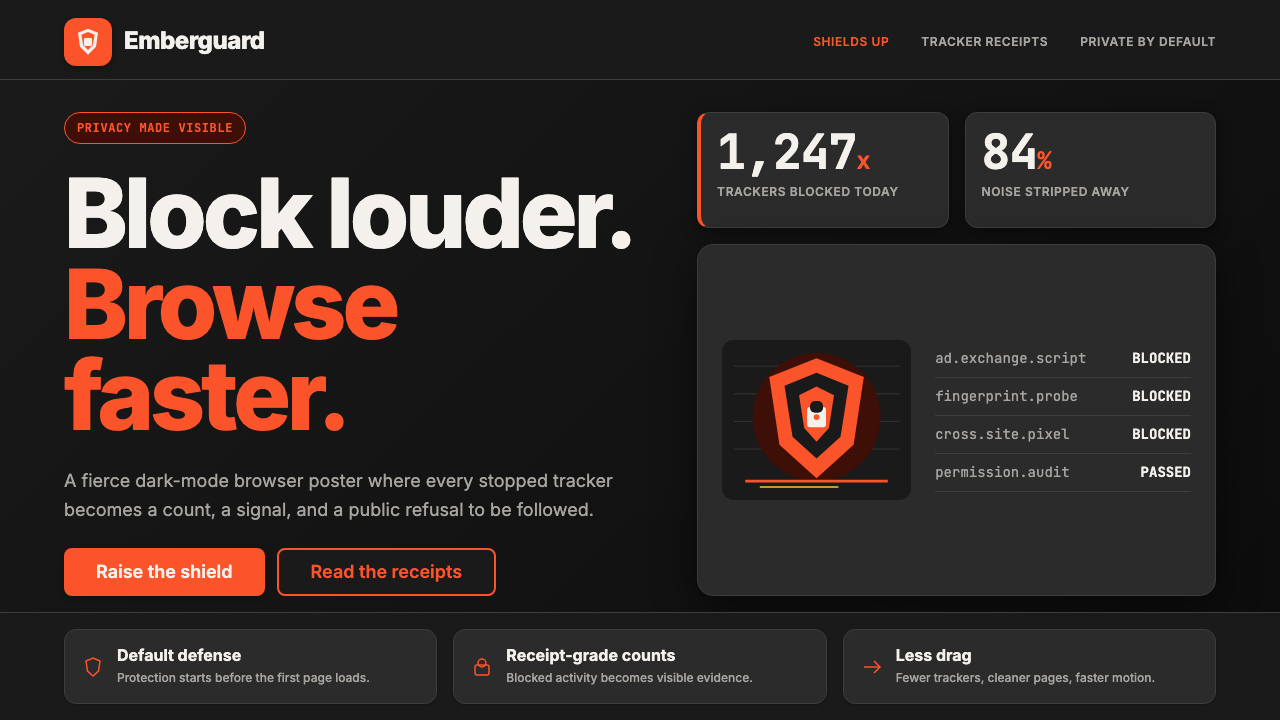 Brave Browser Lion OrangePrivacy gets loud. Lion-orange counters and shield geometry cut through warm…隐私变成宣言:狮橙计数与盾牌几何刺破暖炭黑。
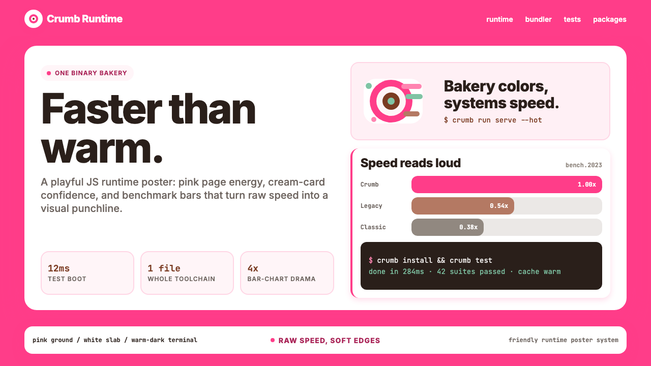 Bun JS Runtime Pink 2023Dev speed gets bakery-bright. Hot pink grounds white slabs, mono bars, and wa…开发速度像烘焙店一样明亮:热粉底、白卡片、等宽基准条与暖黑终端。
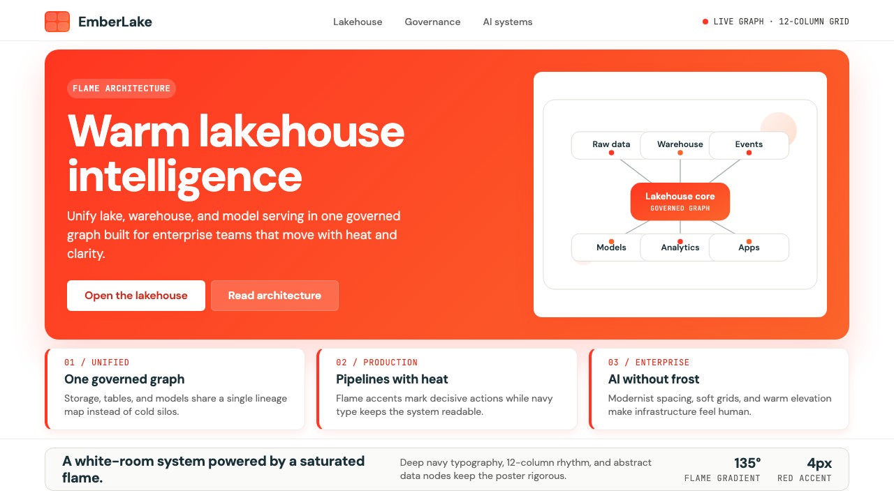 Databricks LakehouseWarm enterprise confidence. Flame red-orange gradients meet DM Sans and clean…温暖的企业信心:红橙火焰渐变配 DM Sans 与洁净数据图。