What is Paytm Indian Fintech?什么是 Paytm Indian Fintech?
A single saturated blue, bilingual numerals, and a QR-code square turned India's most chaotic street corners into a seamless digital payment network.一抹饱和品牌蓝、双语数字排版与二维码方块,将印度最嘈杂的街头角落变成了无缝的数字支付网络。
Paytm Indian Fintech in briefPaytm Indian Fintech 速览
Paytm Indian Fintech is a visual design language born from the specific constraints of bringing digital payments to a population of hundreds of millions of first-time smartphone users. It combines a dominant brand blue — deeply saturated and unwavering in identity — with numeric-first typography, bilingual Hindi-English legibility, and the functional directness of an ATM interface. The result is a system that communicates trustworthiness and clarity to users regardless of literacy level or prior experience with technology.Paytm印度金融科技是一套视觉设计语言,诞生于将数字支付带给数亿初次使用智能手机的用户这一具体约束之中。它将一抹主导性的品牌蓝——深度饱和、身份感坚定——与数字优先的排版、印地语-英语双语可读性,以及ATM界面般的功能直觉相结合。这套系统向用户传递可信度与清晰感,无论其识字水平或科技使用经验高低。
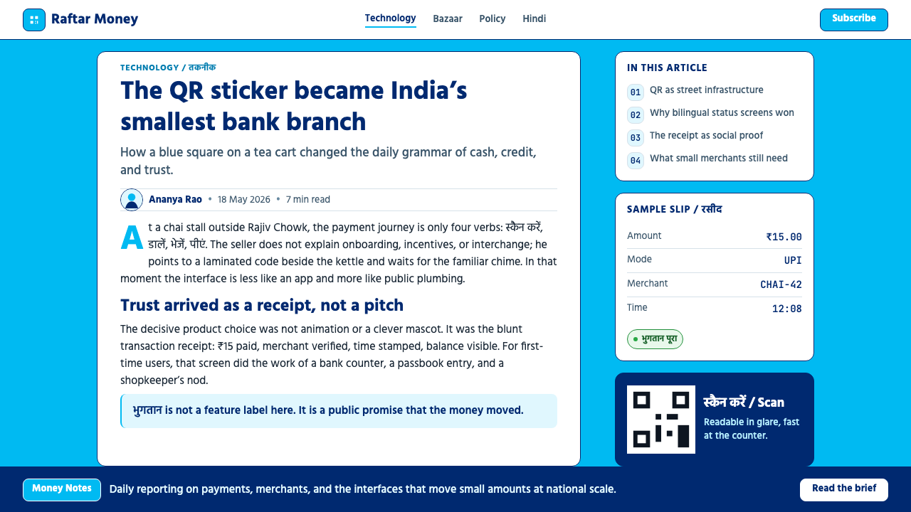
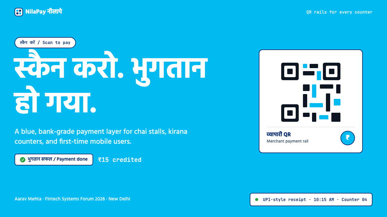
The aesthetic is not minimalism in the Western sense. Where Scandinavian or Swiss-derived minimalism removes elements to achieve elegance, Paytm's design language removes ambiguity to achieve confidence. Transaction amounts appear large and unambiguous. Status messages are brief and declarative. Icons are concrete rather than metaphorical. The QR-code square — reproduced on stickers affixed to chai stalls, auto-rickshaws, and corner pharmacies across the subcontinent — became the system's most iconic element: a dense grid of machine-readable blocks that paradoxically reads as warmly familiar because of how ubiquitously it appeared during the demonetization crisis of 2016.这种美学并非西方意义上的极简主义。斯堪的纳维亚或瑞士风格的极简主义通过删减元素来实现优雅,而Paytm的设计语言则通过消除歧义来建立信心。交易金额显示得大而清晰,状态消息简短且断言式,图标具象而非隐喻。二维码方块——贴在茶摊、嘟嘟车和街角药房上的贴纸——成为这套系统最具标志性的元素:一片密集的机器可读方块,在2016年废钞令危机期间因无处不在的出现而吊诡地读来倍感亲切。
What distinguishes this style from generic 'app-style fintech' is its regional authenticity. The color temperature, the way numerals are sized relative to surrounding text, the embrace of dense information without sacrificing clarity — these choices reflect a design sensibility shaped by India's visual culture: the bright, saturated signage of bazaars; the direct, high-contrast communication of railway timetables; the trustworthy visual weight of government-issued identity documents.将这种风格与通用「应用风格金融科技」区别开来的,是其地域真实性。色温的选择、数字相对于周围文字的尺寸比例、在不牺牲清晰度的前提下拥抱信息密度——这些决策反映了一种被印度视觉文化塑造的设计感性:集市上明亮饱和的招牌;火车时刻表直接、高对比度的传达;政府颁发的身份证件那种令人信任的视觉分量。
See the Paytm Indian Fintech design system查看 Paytm Indian Fintech 完整设计系统
Where does Paytm Indian Fintech come from?Paytm Indian Fintech 从何而来?
Paytm was founded in 2010 in Noida, Uttar Pradesh, by Vijay Shekhar Sharma as a prepaid mobile recharge platform. The early product had no distinctive visual identity — it looked like thousands of other Indian utility apps of the era. The design trajectory changed fundamentally in 2016, when the Indian government's demonetization policy — the overnight withdrawal of high-denomination banknotes — created an emergency demand for cashless payment alternatives. Paytm's user base expanded from tens of millions to over three hundred million within months. The design system had to scale at the same pace as the network, and it had to work for users who had never before made a digital transaction.Paytm由维杰·谢卡尔·夏尔马于2010年在北方邦诺伊达创立,起初是一个预付费手机话费充值平台。早期产品没有鲜明的视觉身份——看起来与那个时代数以千计的印度工具类应用并无二致。设计轨迹在2016年发生了根本性转变:印度政府的废钞令——一夜之间废止大面额纸币——制造了对无现金支付替代方案的紧急需求。Paytm的用户规模在数月内从数千万扩张至逾三亿。设计系统必须与网络同步扩张,并且必须适用于从未进行过数字交易的用户。
The blue that became Paytm's visual signature was not chosen for aesthetic reasons alone. In the Indian cultural context, blue carries associations with trust, authority, and institutional reliability — from the blue of government forms to the blue of school uniforms. Paytm's particular shade is deeply saturated, not the corporate cobalt of global tech giants but a warmer, more enveloping tone that reads as approachable at street scale. When reproduced on the small sticker affixed to a merchant's counter, this blue had to be immediately legible from several feet away, in varied lighting conditions, competing with the visual density of an Indian market street.成为Paytm视觉标志的蓝色,并非单纯出于美学考量。在印度文化语境中,蓝色承载着信任、权威与制度可靠性的联想——从政府表单的蓝色到校服的蓝色。Paytm的特定蓝调深度饱和,不是全球科技巨头惯用的企业钴蓝,而是一种更温暖、更具包容感的色调,在街头尺度上读来亲切。当这抹蓝被印在贴于商户柜台上的小贴纸上时,必须在数英尺之外、各种光线条件下、在印度市集街道的视觉密度竞争中即时可辨。
The QR code's centrality to the design system emerged from a specific infrastructural constraint: India's UPI (Unified Payments Interface) ecosystem, launched by the National Payments Corporation of India in 2016, made interoperable QR-based payments possible across apps. Paytm was among the earliest adopters, and the blue-bordered QR square — standardized, stackable, reproducible — became the visual symbol of the entire mobile payments revolution. Merchants who had never dealt with point-of-sale terminals could simply display a printed QR code and accept payments from any UPI-linked app. The design system was built around this artifact.二维码在设计系统中的核心地位,源于一个具体的基础设施约束:印度国家支付公司于2016年推出的统一支付接口(UPI)生态系统,使跨应用的二维码互通支付成为可能。Paytm是最早的采用者之一,蓝色边框的二维码方块——标准化、可叠用、可复制——成为整场移动支付革命的视觉符号。从未接触过销售终端机的商户,只需展示一张打印好的二维码,便可接受任何UPI关联应用的付款。这套设计系统正是围绕这一物件建立起来的。
The typographic and bilingual dimension of the design reflects the JAM Trinity — Jan Dhan bank accounts, Aadhaar identity numbers, and Mobile connectivity — the government initiative that created the infrastructure for financial inclusion at scale. For a platform serving users whose primary language might be Hindi, Punjabi, Tamil, or Bengali, the commitment to clear Hindi-English bilingual display was not a cosmetic choice but a functional requirement. Numerals, being largely language-agnostic in the context of currency amounts, became the most universal element of the interface — sized generously, weighted heavily, and centered in the visual hierarchy. Madhur Deora, who later led Paytm's financial services expansion, and Mahima Kaul, who shaped the platform's communications strategy, were among the figures who helped translate these product imperatives into a coherent public-facing identity.设计的排版与双语维度,折射出「JAM三位一体」的背景——Jan Dhan银行账户、Aadhaar身份号码与移动网络连接——这一政府倡议构建了大规模普惠金融的基础设施。对于服务对象母语可能是印地语、旁遮普语、泰米尔语或孟加拉语的平台而言,清晰的印地语-英语双语显示不是表面功夫,而是功能要求。数字因其在货币金额语境中的语言中立性,成为界面中最具普遍性的元素——被设计得尺寸慷慨、字重厚重,居于视觉层级的核心位置。后来主导Paytm金融服务扩张的马德胡尔·德奥拉,以及塑造平台传播策略的马希玛·考尔,是将这些产品要务转化为连贯公众身份的重要人物。
What defines the Paytm Indian Fintech look?Paytm Indian Fintech 的视觉特征是什么?
Dominant Brand Blue主导品牌蓝
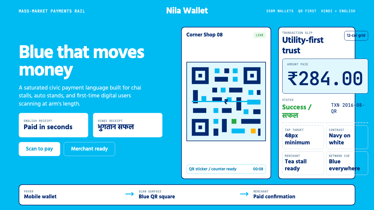
The defining color of this system is a deeply saturated, mid-spectrum blue that functions simultaneously as brand identifier, trust signal, and wayfinding device. Unlike the cool, desaturated blues common in global fintech, this blue is warm enough to avoid institutional coldness while remaining visually authoritative. It appears on primary action buttons, header bars, QR-code borders, and merchant stickers — always at full saturation, never tinted or toned down. White and light grey are used as the primary neutral grounds; pure black is reserved for high-priority numeric content and critical labels.这套系统的定义性色彩是一抹深度饱和的中谱段蓝,同时扮演品牌标识、信任信号与寻路装置三重角色。不同于全球金融科技惯用的冷调、低饱和蓝,这抹蓝足够温暖以避免机构式的冷淡,同时保持视觉权威感。它出现在主要操作按钮、顶栏、二维码边框与商户贴纸上——始终保持满饱和,从不被调浅或降调。白色与浅灰色用作主要中性底面;纯黑保留给高优先级的数字内容与关键标签。
Numeric-First Typography数字优先的排版
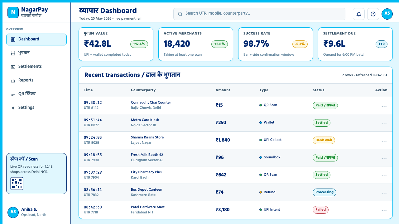
In a payment interface, the transaction amount is the single most important piece of information on screen. Paytm's typographic system treats numerals as primary visual objects — set at a size significantly larger than surrounding text, weighted heavily for immediate legibility, and positioned at the optical center of each screen or card. Supporting text — labels, currency codes, status messages — is subordinate in size and weight. This hierarchy is not negotiable: even on dense informational screens listing multiple transactions, each amount is visually separated and immediately parseable. The system accommodates both Latin numerals and the Devanagari numeral forms used in Hindi contexts.在支付界面中,交易金额是屏幕上最重要的单一信息。Paytm的排版系统将数字视为首要视觉对象——尺寸明显大于周围文字,字重厚重以实现即时可读性,位于每个屏幕或卡片的视觉中心。辅助文字——标签、货币代码、状态消息——在尺寸与字重上居于从属地位。这种层级是不可妥协的:即便在列出多笔交易的密集信息屏幕上,每个金额也被视觉分隔、可即时解读。系统同时兼容拉丁数字与印地语语境中使用的天城文数字形式。
QR-Code Grid as Motif二维码网格作为母题
The QR code is not merely a functional element in this design language — it is the system's organizing visual symbol. The grid of black-and-white squares, bounded by a colored border and anchored by registration corner squares, has become so associated with the Paytm ecosystem that it functions as a logo-level identifier. In marketing and editorial applications, QR-code grid texture is referenced as a pattern motif, suggesting connectivity and the digital-physical bridge. The visual language extends this grid sensibility: data visualizations use dense tiled layouts, merchant onboarding screens organize information in square card grids, and the overall sense of structure evokes the ordered, systematic quality of a machine-readable code.在这套设计语言中,二维码不仅仅是一个功能性元素——它是系统的组织性视觉符号。被彩色边框围合、以定位角框锚定的黑白方块网格,已与Paytm生态系统高度关联,功能上等同于标志级识别符。在营销和编辑应用中,二维码网格纹理被作为图案母题引用,暗示连接性与数字-物理之桥。视觉语言将这种网格感性延伸:数据可视化使用密集的平铺布局,商户入驻屏幕以方形卡片网格组织信息,整体结构感令人联想到机器可读码那种有序、系统的品质。
Bilingual Visual Rhythm双语视觉节奏
Operating across a linguistically diverse market, the design system builds bilingual Hindi-English display directly into its structural logic rather than treating one language as a footnote to the other. Labels, button text, and onboarding instructions are sized and spaced to accommodate both scripts simultaneously — Devanagari's stacked diacritics and the dense vertical rhythm of Hindi text sit alongside Latin characters without visual collision. This bilingual rhythm gives the interface a layered, information-rich quality that distinguishes it from purely Latin-script fintech design. When only Latin numerals appear, the surrounding negative space compensates for the absence of Hindi content, maintaining the expected visual weight.在语言多元的市场中运营,这套设计系统将印地语-英语双语显示直接内建于结构逻辑中,而非将一种语言作为另一种的注脚处理。标签、按钮文字与入驻说明被设计成同时容纳两种文字——天城文的叠置变音符号和印地语文本密集的垂直节奏,与拉丁字母并存而不产生视觉冲突。这种双语节奏赋予界面一种分层、信息丰富的质感,使其区别于纯拉丁字母金融科技设计。当仅有拉丁数字出现时,周围的留白补偿了印地语内容的缺席,维持着预期的视觉分量。
Functional Flatness with Selective Depth功能性平面与选择性深度
The interface is predominantly flat — actions, information panels, and merchant cards exist on a single visual plane without decorative gradients or ornamental shadows. This flatness serves legibility in outdoor and low-quality screen contexts, where gradient rendering is inconsistent. However, the system uses selective, purposeful depth cues for critical affordances: a button may have a solid, slightly offset shadow to signal pressability; a modal confirmation dialog may sit on a clearly elevated plane to communicate its priority. These depth cues are structural and minimal — they indicate hierarchy and interaction state without importing the skeuomorphic richness of earlier mobile interfaces.界面以平面化为主——操作区域、信息面板和商户卡片存在于单一视觉平面上,无装饰性渐变或装饰性阴影。这种平面化服务于户外与低质量屏幕环境下的可读性,因为在那些场合渐变渲染往往不一致。然而,系统为关键操作可见性使用了选择性、有目的性的深度线索:按钮可能带有实心、轻微偏移的阴影以暗示可按压性;模态确认对话框可能位于明显抬高的平面上以传达其优先级。这些深度线索是结构性的、克制的——它们标示层级与交互状态,而不引入早期移动界面的拟物化丰富感。
High-Contrast Status Communication高对比度状态传达
Payment completion, failure, and pending states are communicated through bold, full-screen or full-card color fills — a vibrant green for success, a warm red for failure, the brand blue for processing — accompanied by a single large icon and one or two words of confirmation. This approach borrows from the visual language of traffic signals and public infrastructure signage: universally legible, immediately decisive, requiring no literacy to interpret. Transitional animations, where present, are brief and purposeful rather than decorative. The design assumes that the user needs certainty fast, and the visual system delivers it through color field and icon scale rather than verbal explanation.支付完成、失败与待处理状态,通过粗放的全屏或全卡片色彩填充来传达——成功用鲜亮绿色,失败用暖红色,处理中用品牌蓝——配以单个大图标和一两个字的确认文字。这种方式借鉴了交通信号与公共基础设施标牌的视觉语言:具有普遍可读性、即时决断性,无需识字即可理解。过渡动画(若有)简短而有目的性,而非装饰性的。设计预设用户需要快速获得确定性,视觉系统通过色域与图标尺寸而非文字解释来传递这种确定性。
Density Without Clutter密而不乱
Indian digital product design has historically been comfortable with information density that Western minimalism would consider overcrowded. Paytm's design system embraces this density deliberately: a home screen might display recent transactions, a promotional offer, a utility shortcut grid, and a balance indicator simultaneously. The system manages this complexity through consistent typographic hierarchy, strong color discipline, and card-based segmentation that groups related content into clearly bounded units. Each card is a self-contained visual module. The grid of cards reads coherently even when individual content varies widely, because the structural frame — size, border treatment, internal padding rhythm — is unwavering.印度数字产品设计历来能够接受西方极简主义会视为过于拥挤的信息密度。Paytm的设计系统有意拥抱这种密度:首页屏幕可能同时显示近期交易记录、促销优惠、工具快捷方式网格与余额指示。系统通过一致的排版层级、强烈的色彩纪律,以及将相关内容分组进有明确边界单元的卡片式分割来管理这种复杂性。每张卡片是一个自足的视觉模块。即便个别内容差异悬殊,卡片网格整体上仍读来连贯,因为结构框架——尺寸、边框处理、内部留白节奏——始终如一。
See the Paytm Indian Fintech design system查看 Paytm Indian Fintech 完整设计系统
Who shaped Paytm Indian Fintech?谁塑造了 Paytm Indian Fintech?
The founder and long-serving CEO of Paytm, Sharma launched the company in Noida in 2010 as a mobile recharge service before steering it through its transformation into India's dominant digital wallet and payments platform. His aggressive expansion strategy during the 2016 demonetization — deploying merchant QR stickers at unprecedented scale across India — was inseparable from the visual design decisions that made the Paytm blue and QR square into nationally recognized icons. Sharma's product philosophy emphasized accessibility for first-time digital users, which shaped the design system's prioritization of clarity, bilingual support, and the ATM-like directness of the transaction interface.Paytm创始人兼长期CEO,夏尔马于2010年在诺伊达创立公司,起初是手机话费充值服务,后将其引领转型为印度主导的数字钱包与支付平台。他在2016年废钞令期间的激进扩张战略——以前所未有的规模在全印度部署商户二维码贴纸——与使Paytm蓝和二维码方块成为全国知名图标的视觉设计决策密不可分。夏尔马的产品哲学强调面向初次使用数字工具的用户的可及性,这塑造了设计系统对清晰度、双语支持以及交易界面ATM式直接性的优先取向。
As President and later co-CEO of Paytm, Deora led the company's financial services expansion including Paytm Payments Bank, insurance distribution, and lending products. His tenure oversaw the period when Paytm's design system had to stretch from a consumer payments app into a full financial services platform — a transition that required the visual identity to communicate regulatory credibility and institutional gravity alongside its original street-level accessibility. The design language's evolution toward more formal information hierarchy and document-style layouts during this period reflects the product demands of serving both street vendors and institutional partners.作为Paytm总裁兼后来的联席CEO,德奥拉主导了公司金融服务的扩张,包括Paytm支付银行、保险分销与借贷产品。他的任期见证了Paytm设计系统从消费者支付应用延伸为完整金融服务平台的时期——这一转型要求视觉身份在保留原有街头级亲和力的同时,传达监管公信力与制度权重。这一时期设计语言向更正式的信息层级与文件式版面的演进,折射出同时服务街头摊贩与机构合作伙伴的产品需求。
Kaul led Paytm's public policy and communications, working at the intersection of government relations, media strategy, and public-facing brand identity. Her role was critical during the demonetization period when Paytm's communication had to operate at national scale — addressing government policy makers, merchant communities, and hundreds of millions of new users simultaneously. The clarity and accessibility that characterize the Paytm design language at the communication level — the decision to use plain declarative language, direct visual messaging, and minimal friction in onboarding materials — reflects the communications strategy that her team shaped.考尔主导Paytm的公共政策与传播工作,活跃于政府关系、媒体策略与公众品牌身份的交汇处。在废钞令期间,当Paytm的传播必须在全国层面运作——同时面向政府决策者、商户社群与数亿新用户——她的角色至关重要。在传播层面体现Paytm设计语言特征的清晰度与可及性——使用简洁断言式语言、直接视觉信息与入驻材料中的最低摩擦——折射出她的团队所塑造的传播策略。
Not an individual but the institutional actor whose UPI infrastructure made the entire Paytm design system's QR-code centrality possible. NPCI's standardization of the interoperable QR format and the UPI payment rail — launched in 2016 — created the technical substrate on which Paytm's visual language was built. The blue-bordered QR square that became Paytm's most iconic artifact is, at a technical level, a rendering of an NPCI-standardized payment address. This institutional relationship between a government payment authority and a private design language is one of the defining features of the Indian fintech aesthetic, distinguishing it from purely market-driven design systems.这不是一个个人,而是一个机构行动者——其UPI基础设施使整个Paytm设计系统以二维码为核心成为可能。印度国家支付公司对可互通二维码格式与UPI支付通道的标准化——于2016年推出——创造了Paytm视觉语言赖以构建的技术基底。成为Paytm最具标志性制品的蓝色边框二维码方块,在技术层面是一个NPCI标准化支付地址的渲染。政府支付机构与私人设计语言之间的这种制度关系,是印度金融科技美学的定义性特征之一,使其区别于纯粹市场驱动的设计系统。
A government decision rather than a person, but the single most significant design brief that the Paytm visual system ever received. When India's government announced on November 8, 2016 that high-denomination banknotes would cease to be legal tender the following day, it created an overnight mass-market demand for digital payments. Paytm's design team had to scale merchant onboarding materials, user communications, and the visual presence of the QR-code sticker across millions of retail locations within weeks. The constraint of that emergency — designing for millions of users who had never used a digital wallet, in multiple languages, on low-end devices, at street level — permanently shaped the design system's values: speed, trust, clarity, and accessibility above all.这是一项政府决定而非一个人,却是Paytm视觉系统有史以来收到的最重要的设计委托。2016年11月8日,当印度政府宣布大面额纸币次日起停止作为法定货币,一夜之间创造了大众市场对数字支付的需求。Paytm的设计团队必须在数周内将商户入驻材料、用户传播以及二维码贴纸的视觉存在扩展至数百万个零售地点。那场紧急事件的约束——为数百万从未使用过数字钱包的用户、以多种语言、在低端设备上、在街头层面进行设计——永久性地塑造了设计系统的价值取向:速度、信任、清晰与可及性,高于一切。
How do you use Paytm Indian Fintech today?今天怎么用 Paytm Indian Fintech?
Paytm Indian Fintech is a design language with strong cultural specificity, which is both its greatest strength and the key variable to manage when applying it. It works best when the goal is to communicate transactional trust, accessible authority, and the reassuring clarity of a public-facing financial service — particularly for products targeting South Asian markets or any context where first-time digital users form a significant portion of the audience. Applied outside its cultural context, the style's visual directness and information density read as confident rather than generic, provided the blue and QR motif are treated with restraint.Paytm印度金融科技是一套具有强烈文化特殊性的设计语言,这既是其最大优势,也是应用时需要管理的关键变量。它在目标是传达交易信任感、可及的权威性,以及公众金融服务令人安心的清晰度时效果最佳——尤其适合面向南亚市场的产品,或初次使用数字工具的用户占受众相当比例的任何语境。在其文化语境之外应用时,这种风格的视觉直接性与信息密度读来充满自信而非俗气,前提是蓝色与二维码母题被克制地使用。
For presentation slides, the style works especially well on financial or operational content. A cover slide benefits from the system's bold, centered numeric or icon composition: a large amount, percentage, or QR-derived grid pattern fills the dominant visual field, with the title in heavy, high-contrast type below or alongside. Content slides should use a card-based grid structure — each section of information contained in a clearly bordered module, with amounts and key metrics displayed at large scale relative to supporting text. Data slides translate naturally: bar charts and transaction flow diagrams rendered in the brand blue with white labels read with the same confident directness as an ATM confirmation screen.对于演示文稿,这种风格在金融或运营内容上尤为出色。封面页得益于系统大胆、居中的数字或图标构图:一个大面额、百分比或二维码衍生的网格图案填充主要视觉场,标题以厚重、高对比度的字体位于其下方或旁侧。内容页应使用基于卡片的网格结构——每段信息包含在有明确边框的模块中,金额与关键指标相对于辅助文字以大尺寸显示。数据页自然而然地转化:以品牌蓝渲染、带白色标签的柱状图与交易流程图,读来与ATM确认屏幕同样充满自信与直接感。
For web interfaces, the style suits dashboards, pricing pages, payment confirmation flows, and merchant-facing analytics panels. The approach: establish a clean white or very light background as the base; use the dominant blue exclusively for primary actions, active states, and key data highlights; reserve green and red strictly for success and error states. Card components should have clearly visible borders or subtle solid shadows rather than diffuse drop shadows. Navigation and labeling should be typographically heavy and direct — no ghost buttons, no outline-only icons, no ambiguous metaphors. Forms should display field labels above inputs, not as placeholder text that disappears on focus.对于网页界面,这种风格适合仪表板、定价页面、支付确认流程与面向商户的数据分析面板。方法如下:以干净的白色或极浅的背景作为基底;将主导蓝色专用于主要操作、激活状态与关键数据高亮;将绿色和红色严格保留给成功与错误状态。卡片组件应有清晰可见的边框或细微的实心阴影,而非漫散的投影。导航与标签应在排版上厚重而直接——无幽灵按钮,无仅轮廓线图标,无歧义隐喻。表单应在输入框上方显示字段标签,而非作为聚焦时消失的占位文字。
For editorial and marketing applications, the Paytm design language supports bold, poster-like layouts with strong information hierarchy. A marketing page works well with full-width blue header sections alternating with white content areas — the blue zones used for headlines and calls to action, white zones for supporting information and testimonials. QR-code grid texture, used sparingly as a background motif, immediately signals payment technology without requiring explicit iconography. For financial inclusion or social impact narratives, the style's inherent accessibility values — bilingual text, large numerals, clear status indicators — can be highlighted as deliberate design choices that reflect the product's values.对于编辑与营销应用,Paytm设计语言支持具有强烈信息层级的大胆、海报式版面。营销页面适合使用全宽蓝色头部区域与白色内容区域交替的布局——蓝色区域用于标题与行动号召,白色区域用于辅助信息与用户证言。二维码网格纹理作为背景母题节制地使用,可立即传递支付科技的信号,无需明确的图标说明。对于普惠金融或社会影响叙事,这种风格固有的可及性价值——双语文字、大尺寸数字、清晰的状态指示——可以作为反映产品价值观的刻意设计选择加以突出。
A common mistake when applying this style is overusing the saturated blue, letting it dominate the entire layout rather than anchoring specific elements. In the authentic Paytm system, most of the visual field is white or light grey; the blue appears at high impact on buttons, status bars, and the QR-code border. Flooding a slide or web page with blue background removes the contrast that makes the blue meaningful. A second common error is treating the QR-code motif as a decoration — tiling it across backgrounds at large scale or using it as a texture fill. The QR square works because it is functional; when reproduced at a scale where it cannot be scanned, it should appear only as a tight, small graphic element — never as wallpaper.应用这种风格时常见的错误,是过度使用饱和蓝色,让它主导整个版面而非锚定特定元素。在真实的Paytm系统中,大部分视觉场是白色或浅灰色;蓝色以高冲击力出现在按钮、状态栏与二维码边框上。用蓝色背景淹没幻灯片或网页,会抹去使蓝色具有意义的对比关系。第二个常见错误是将二维码母题当作装饰——以大尺寸铺满背景或用作纹理填充。二维码方块之所以有效,是因为它具有功能性;当以无法被扫描的尺寸复现时,它应当仅作为一个紧凑的小型图形元素出现——绝不应成为壁纸。
See the Paytm Indian Fintech design system查看 Paytm Indian Fintech 完整设计系统
Paytm Indian Fintech — FAQPaytm Indian Fintech · 常见问题
Is Paytm Indian Fintech style appropriate for non-Indian products?Paytm印度金融科技风格适合非印度产品吗?
Yes, with intentionality. The core design values of the style — transactional clarity, accessible authority, high-contrast numeric hierarchy, and the reassuring presence of the brand blue — are universally applicable to any product where financial trust is the primary communication goal. The QR-code motif is also now globally legible following its widespread adoption across payment systems worldwide. What requires care is avoiding a pastiche that borrows the surface aesthetic (the blue, the QR graphic) without the functional logic underneath. A financial dashboard, a ticketing interface, or a utility payments product from any market can legitimately adopt this vocabulary if those products share the style's core values: serving users who need fast, unambiguous confirmation that a transaction has succeeded.可以,但需要有意识地选择。这种风格的核心设计价值——交易清晰度、可及的权威性、高对比度数字层级,以及品牌蓝令人安心的存在感——普遍适用于任何以金融信任为主要传达目标的产品。随着二维码在全球支付系统中的广泛采用,二维码母题如今也具有全球可读性。需要注意的是,避免仅借用表面美学(蓝色、二维码图形)而缺乏其背后功能逻辑的仿制。来自任何市场的金融仪表板、票务界面或公用事业支付产品,如果与这种风格的核心价值——服务需要快速、明确地确认交易成功的用户——相契合,便可合理地采用这套词汇。
How does this style handle dark mode?这种风格如何处理深色模式?
The canonical Paytm design language is light-ground: the dominant background is white or very light grey, with the saturated blue and high-contrast black type reading against it. A dark inversion is technically possible but requires significant recalibration. On a dark background, the saturated blue tends to read as glowing or electric rather than trustworthy — which can undermine the style's primary emotional goal. The success green and failure red also shift in perceptual weight on dark grounds. If a dark mode is required, the most faithful approach is to move the dominant blue to a slightly lighter, less saturated variant on the dark ground, maintain high contrast for all numeric content, and keep the QR-code square bordered in a pale version of the blue rather than filled with it. Status color fills — the full-screen green or red — translate well to dark mode with minimal adjustment.标准的Paytm设计语言以浅色为底:主要背景是白色或极浅的灰色,饱和蓝与高对比度黑色文字在其上呈现。深色反转在技术上可行,但需要大幅重新校准。在深色背景上,饱和蓝往往读来发光或电气感,而非令人信任——这可能会削弱该风格的首要情感目标。成功绿和失败红在深色底面上的感知重量也会发生偏移。若需要深色模式,最忠实的做法是:在深色底面上将主导蓝移向稍浅、饱和度稍低的变体;为所有数字内容保持高对比度;二维码方块以蓝色的浅色版本作为边框而非以蓝色填充。全屏绿色或红色的状态色块无需大幅调整便能较好地适应深色模式。
What makes this style different from generic fintech blue?这种风格与通用金融科技蓝有何不同?
Generic fintech blue — the cobalt or navy that appears across thousands of Western banking and payments apps — is typically chosen for its associations with authority and corporate stability. It is usually cooler in tone, more desaturated, and applied with generous white space in a minimal layout. Paytm Indian Fintech blue is warmer, more fully saturated, and applied in a context of deliberate information density rather than minimalist restraint. The bilingual typography, the numeric-first hierarchy, the QR-code centrality, and the high-contrast status communication are not stylistic decorations — they are functional responses to specific market conditions. Generic fintech blue communicates 'we are institutional and trustworthy'; Paytm blue communicates 'your money is here, the transaction worked, you can trust this at street level'. The emotional register is different, and so is the design logic.通用金融科技蓝——出现在数千款西方银行与支付应用中的钴蓝或深蓝——通常因其与权威和企业稳定性的关联而被选用。它通常色调更冷、饱和度更低,在极简版面中配以充裕的留白使用。Paytm印度金融科技的蓝色更温暖、更充分饱和,应用于刻意密集的信息环境而非极简主义的克制中。双语排版、数字优先的层级、二维码的核心地位,以及高对比度的状态传达——这些不是风格装饰,而是对特定市场条件的功能性回应。通用金融科技蓝传达的是「我们是制度性的且值得信任的」;Paytm的蓝传达的是「你的钱在这里,交易成功了,你可以在街头层面信任这一切」。情感语域不同,设计逻辑亦然。
Can the QR-code motif be used decoratively without looking like a mistake?二维码母题能否用作装饰而不显得像是一个错误?
Yes, but with strict scale and placement discipline. The QR motif works decoratively when it appears at actual scannable size — small, tight, sharp — as a graphic element within a composition, not as a full-bleed background pattern. A single QR square in a corner of a slide, a small QR detail on a business card, or a row of QR codes representing different payment destinations in a merchant-facing document all read as intentional and contextually appropriate. The mistake occurs when the motif is scaled up as a texture or pattern — at large size, it loses both its functional meaning and its visual coherence, and reads as a misapplication of clipart. The rule of thumb: if someone looking at it could theoretically scan it with a phone camera, it is at the right scale for decorative use.可以,但需要严格的尺寸与位置纪律。二维码母题作为装饰使用时,应以实际可扫描的尺寸出现——小巧、紧凑、清晰——作为构图中的图形元素,而非全出血背景图案。幻灯片角落的单个二维码方块、名片上的小二维码细节,或面向商户的文件中代表不同支付目的地的一排二维码,都读来有意图且符合语境。错误发生在将这一母题放大为纹理或图案时——大尺寸下,它既丧失功能意义又失去视觉连贯性,读来是一种剪贴画式的误用。经验法则:如果看着它的人理论上可以用手机相机扫描,它就处于装饰用途的正确尺寸。
How should success and error states be handled in this style?在这种风格中,成功与错误状态应如何处理?
In the Paytm design language, success and error states are treated as moments of maximum visual clarity — not subtle indicators but full-field communications. A successful payment triggers a full-card or full-screen green fill with a large checkmark icon and one word of confirmation. A failed transaction triggers an equivalent red field with a clear failure icon and a brief, plain-language explanation. This approach comes from the ATM and public infrastructure design tradition: when something important has happened, the visual system shouts it clearly rather than whispering it in a toast notification. For digital products applying this style, the principle translates to: never rely on a small icon or muted color chip to communicate a completed transaction. Give success and failure their own visual moment, sized proportionally to the importance of the action.在Paytm的设计语言中,成功与错误状态被视为最高视觉清晰度的时刻——不是微妙的指示,而是全域传达。支付成功触发全卡片或全屏绿色填充,配以大勾选图标和一个确认词。交易失败触发等效的红色域,带有清晰的失败图标和简短的平实语言说明。这种方式源于ATM与公共基础设施设计传统:当重要的事情发生时,视觉系统大声清晰地宣告它,而不是在一个toast通知中低声耳语。对于应用这种风格的数字产品,原则转化为:绝不依赖小图标或低调的色彩块来传达已完成的交易。给成功与失败各自的视觉时刻,其尺寸与该操作的重要性成比例。
Related design styles相关设计风格
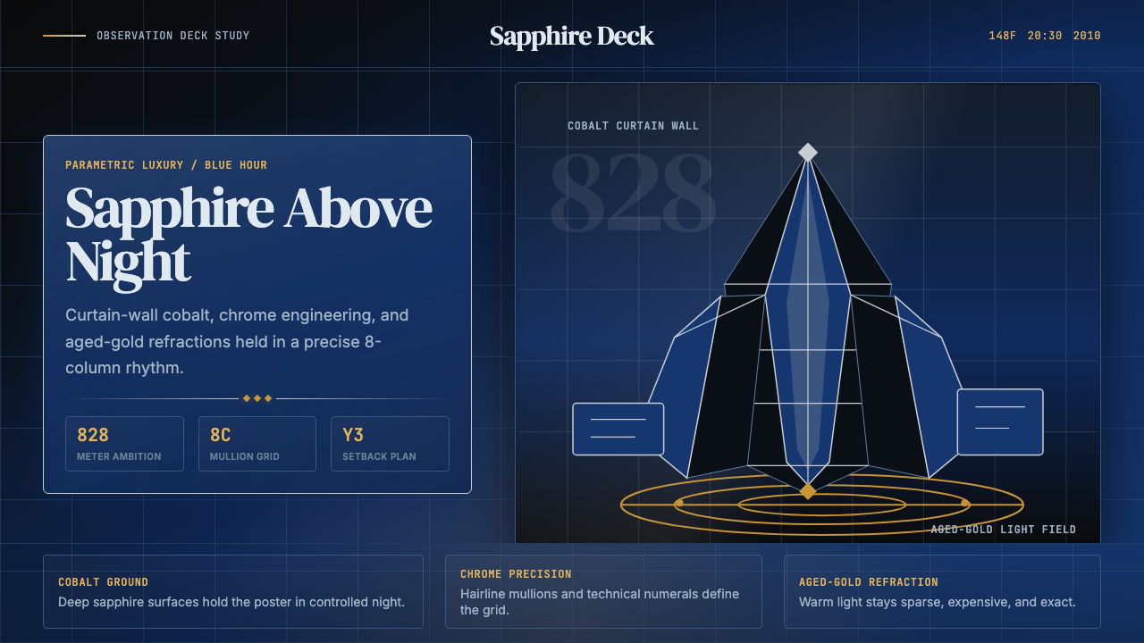 Emirati Burj Khalifa Sapphire (2010)Commanding height, controlled light. Sapphire glass, chrome grid, aged-gold g…高度压迫,光线克制。蓝宝石玻璃、铬色网格与陈金光。
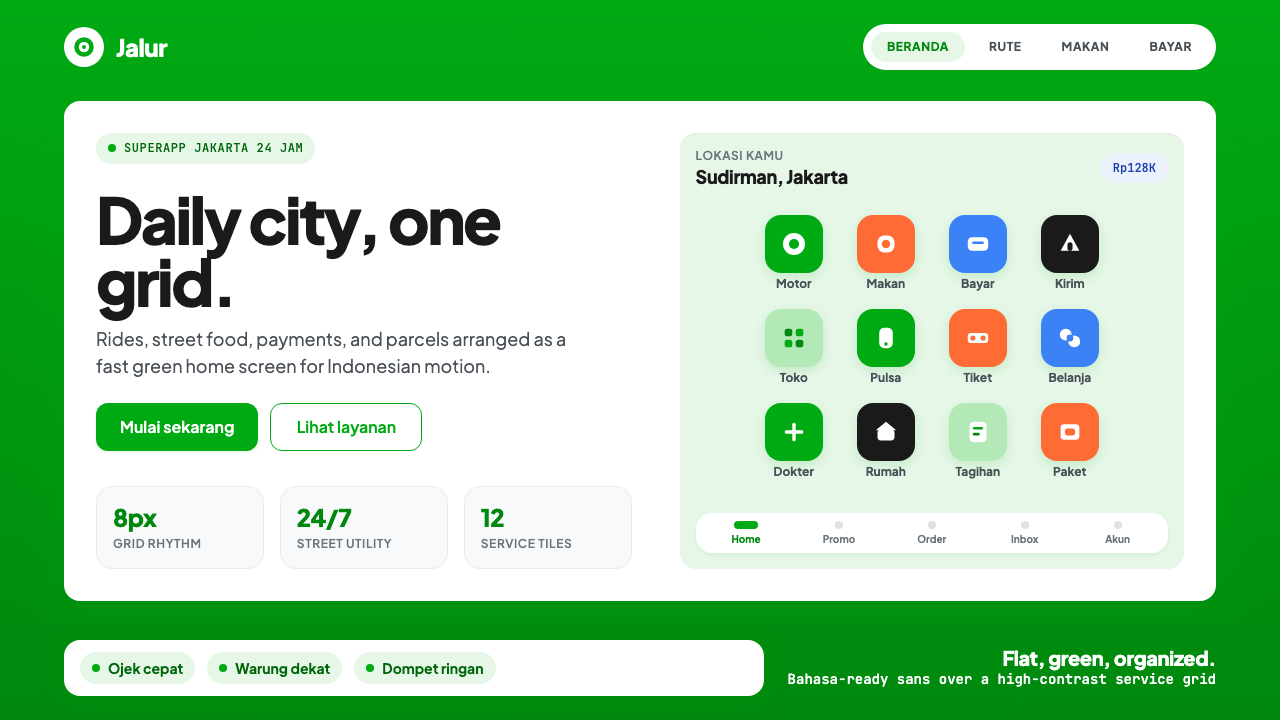 Gojek SuperappCity speed, ordered. Electric green tile grid turns rides, food, and pay into…城市速度被整理:亮绿瓷砖网格串起出行、餐食与支付。
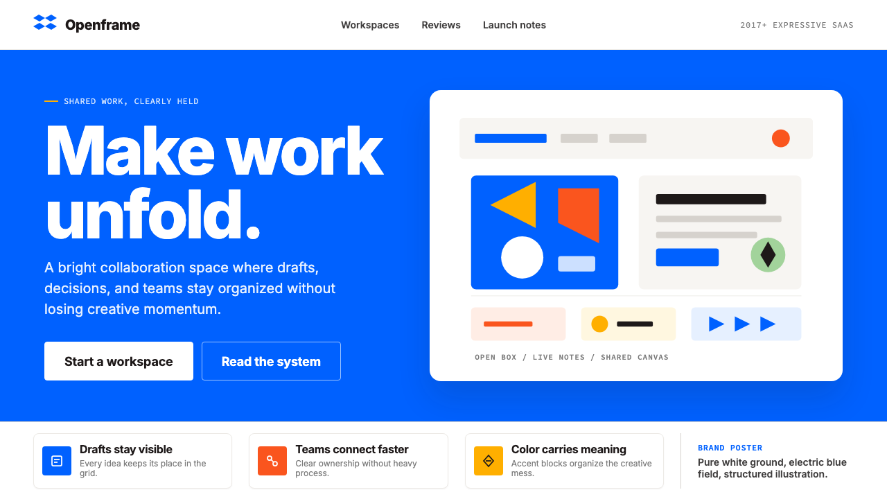 Dropbox ModernFriendly SaaS gets loud. Electric blue and Sharp Sans drive a structured geom…友好 SaaS 变响亮:电蓝与 Sharp Sans 推动几何网格。
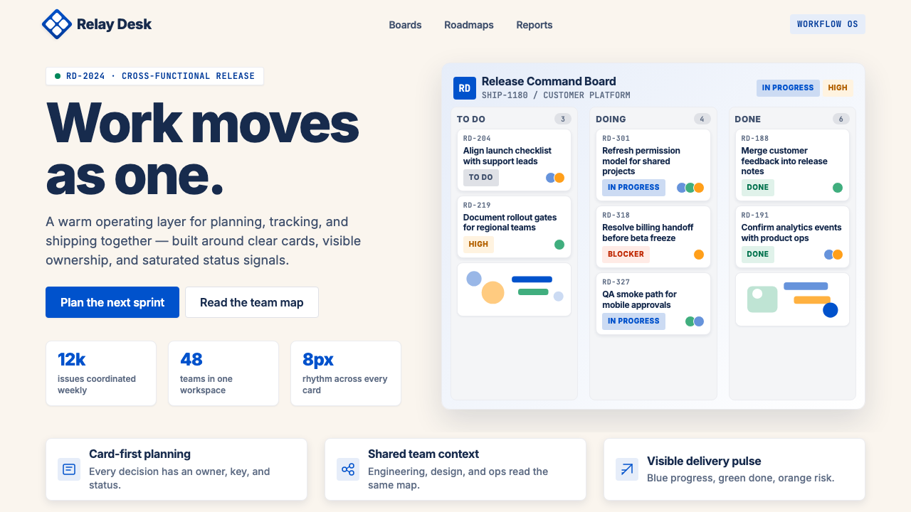 Atlassian Jira BlueWarm enterprise teamwork. Saturated blue cards on cream make status feel huma…温暖的企业协作:奶油底上的饱和蓝卡片,让状态更有人味。
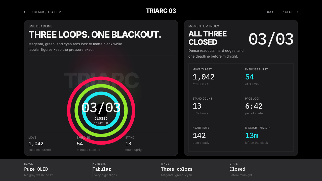 Apple Fitness Rings Closed (2024)Midnight feels exact. Magenta, green, and cyan rings lock onto OLED black.午夜像被校准。洋红、绿、青三环锁在黑底上。
 DatadogSerious telemetry, friendly pulse. Purple dark grids pack charts, badges, and…严肃监控也亲近:紫色暗网格塞满图表、徽章与追踪。