Design style guide设计风格指南
What is Emirati Burj Khalifa Sapphire (2010)?什么是 Emirati Burj Khalifa Sapphire (2010)?
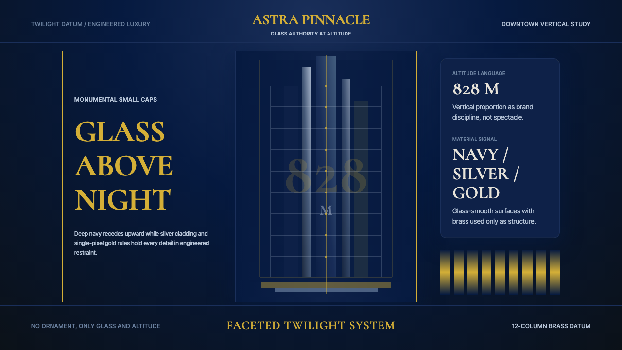
Burj Khalifa brought supertall architecture to its most theatrical extreme — a sapphire-and-steel shard rising 828 meters from the desert floor, whose design language turned engineering precision into an aesthetic of commanding, luminous darkness.哈利法塔将超高层建筑推向最戏剧化的极致——一枚828米的蓝宝石与钢铁碎片从沙漠地面拔起,将工程精度转化为一种慑人而璀璨的黑暗美学。
Emirati Burj Khalifa Sapphire (2010) in briefEmirati Burj Khalifa Sapphire (2010) 速览
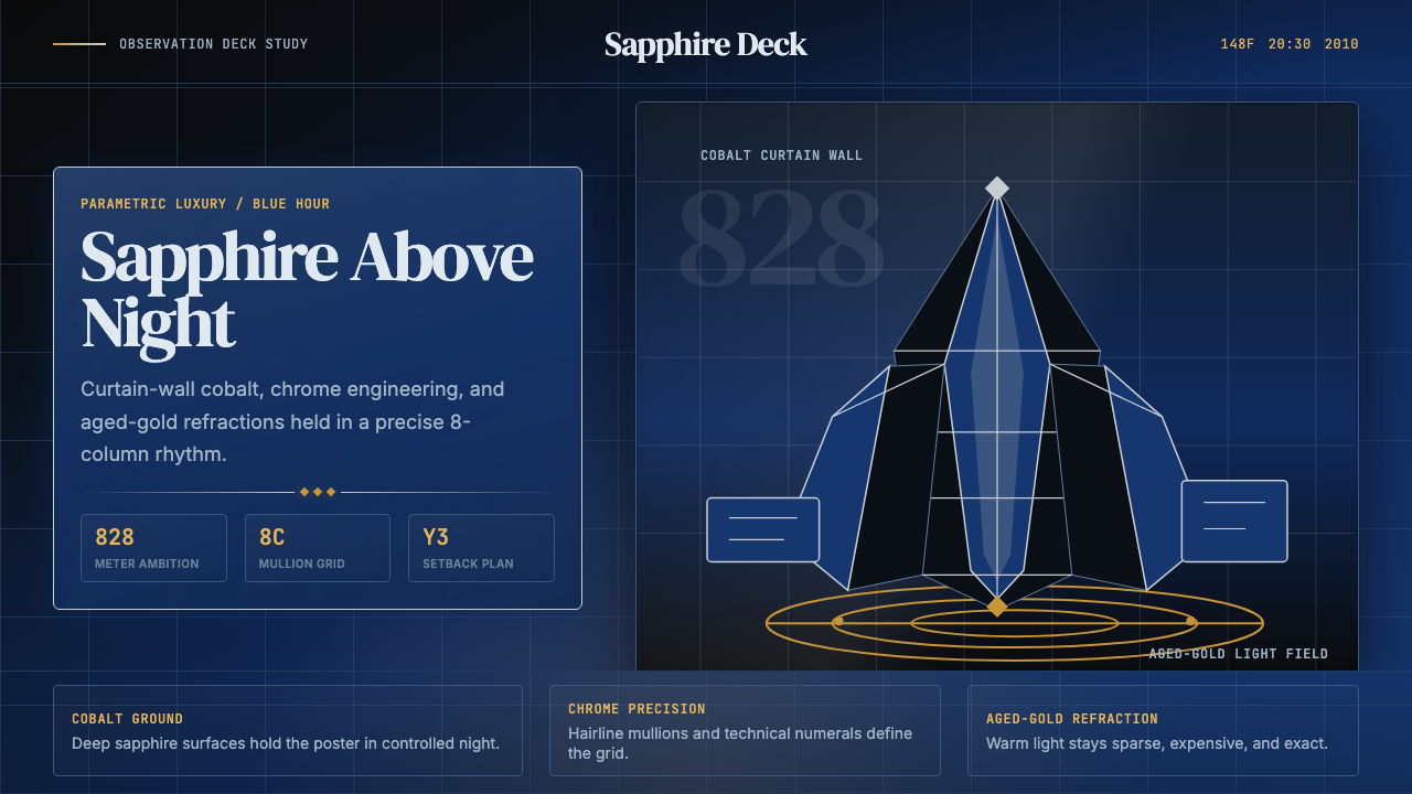
The Emirati Burj Khalifa Sapphire design system is drawn from the visual experience of the world's tallest structure at blue hour — the deep indigo moment between sunset and full night when Dubai's curtain wall shifts from cobalt-blue to jet-black, and the illuminated spire reads as a fragment of the night sky itself. It is a dark, jewel-toned visual language that fuses the precision of parametric engineering with the opulence of Gulf luxury.哈利法塔蓝宝石设计系统源自蓝色时刻(日落与完全入夜之间的深靛时分)观看这座世界最高建筑的视觉体验——此刻迪拜的幕墙从钴蓝转为漆黑,被照亮的尖顶宛如夜空本身的一块碎片。这是一套深邃的珠宝色调视觉语言,将参数化工程的精密与海湾地区奢华气质相融合。
At its core, the style pairs a deep sapphire ground — layered and refractive rather than flat — with chrome-silver structural accents and aged-gold light sources. These three values do not compete; they establish a hierarchy in which darkness dominates, metallic precision defines structure, and warm gold is deployed sparingly as the source of all luminous energy in the composition. The result reads as both architectural and atmospheric, simultaneously cold and rich.这套风格的核心是将深邃的蓝宝石底面——层次丰富、具有折射感而非平铺的单色——与铬银色结构性强调及陈金色光源配对。这三种色调不相互竞争,而是建立一种层级关系:暗色主导整体,金属性精度界定结构,温暖的金色被节制地用作构图中一切光辉能量的来源。最终效果既具建筑感又充满氛围,同时兼有冷峻与富丽。
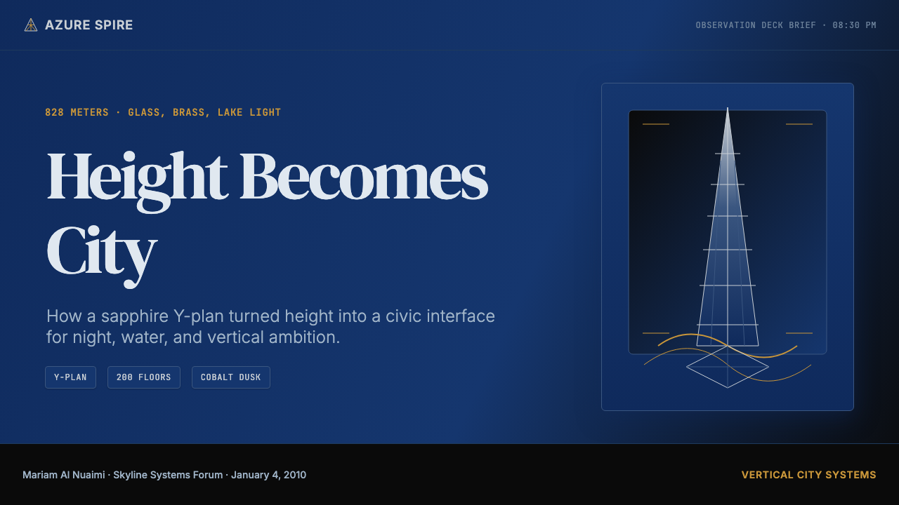
The system draws its authority from the Burj Khalifa's actual material and formal characteristics: the triple-lobed Y-plan derived from the Hymenocallis desert lily, the setback profiles that narrow the tower as it ascends, the reflective curtain-wall glass that absorbs and re-emits the sky, and the base-level choreography of the Dubai Fountain with its gold LED illumination dancing across the Burj Khalifa Lake. This is not an abstract style — it is a distillation of a specific building at a specific hour in a specific place.这套系统的权威性来自哈利法塔真实的材料与形式特征:从沙漠百合花(Hymenocallis)抽象而来的三叶Y形平面、随高度递减的退台轮廓、吸收并重新发射天空色彩的反光幕墙玻璃,以及底部迪拜喷泉与哈利法塔湖上金色LED光芒的舞台调度。这不是一种抽象风格——它是一座特定建筑在特定时刻、特定地点的视觉蒸馏。
Where does Emirati Burj Khalifa Sapphire (2010) come from?Emirati Burj Khalifa Sapphire (2010) 从何而来?
The Burj Khalifa's story begins with a political and economic imperative that shaped its every design decision. By the early 2000s, Dubai's leadership under Sheikh Mohammed bin Rashid Al Maktoum had embarked on an ambitious transformation of the emirate from an oil-dependent economy into a global hub for commerce, tourism, and real estate investment. A world-record skyscraper was understood not merely as a building but as a declaration — evidence that the UAE had arrived as a peer to New York, Shanghai, and London on the global stage. Mohamed Alabbar, chairman of Emaar Properties, championed the project and oversaw its development from conception through opening.哈利法塔的故事始于一项政治与经济上的迫切需求,这一需求塑造了它的每一个设计决策。21世纪初,谢赫穆罕默德·本·拉希德·阿勒马克图姆领导下的迪拜已启动雄心勃勃的转型计划,要将这个酋长国从依赖石油的经济体变为全球商业、旅游与房地产投资枢纽。一座打破世界纪录的摩天楼不仅仅被理解为一栋建筑,更是一次宣言——证明阿联酋已与纽约、上海、伦敦并驾齐驱,跻身全球舞台。伊玛尔地产董事长穆罕默德·阿拉巴尔力推这一项目,并从构思到竣工全程监督其开发。
Skidmore, Owings and Merrill was selected to design the tower, and the project was led by Adrian Smith, one of the firm's most accomplished tall-building designers, with structural engineering by William F. Baker, who invented the buttressed core system that made the height possible. Baker's solution — three structural wings arranged around a central hexagonal core, braced against one another to resist wind and torsion — is what gives the tower its distinctive triple-lobed silhouette in plan view. Smith drew the massing from the geometry of the Hymenocallis flower, a desert lily native to the Gulf region, both as a formal reference and as a symbolic gesture toward the place of origin.SOM建筑事务所(Skidmore, Owings and Merrill)获选承担设计,项目由该公司最出色的高层建筑设计师之一阿德里安·史密斯主导,结构工程由威廉·F·贝克负责——正是他发明了使这一高度成为可能的支撑核心体系。贝克的解决方案——围绕中央六边形核心布置三个结构翼,相互支撑以抵抗风力与扭转——赋予了这座塔楼俯视图上独特的三叶轮廓。史密斯从海湾地区原生沙漠百合(Hymenocallis)的几何形态中提取了建筑体量关系,既是形式上的引用,也是对建筑原产地的象征性致意。
Groundbreaking occurred in 2004, and the construction proceeded as one of the most technically demanding projects in the history of the built environment. The concrete and steel required pumping concrete to heights never previously achieved, solving thermal expansion challenges across an enormous temperature range, and managing wind effects at altitudes where a conventional building's structural logic begins to fail. The tower opened officially on January 4, 2010, named in honor of Sheikh Khalifa bin Zayed Al Nahyan, ruler of Abu Dhabi and president of the UAE, in recognition of Abu Dhabi's financial support during the 2008 financial crisis.奠基于2004年,随后的建设过程成为建成环境史上技术要求最为苛刻的项目之一。混凝土与钢材需要泵送至前所未有的高度,工程师须解决巨大温差范围内的热膨胀挑战,并应对常规建筑结构逻辑在极高海拔处开始失效的风力影响。这座塔楼于2010年1月4日正式开幕,以阿布扎比统治者、阿联酋总统谢赫哈利法·本·扎耶德·阿勒纳哈扬的名义命名,以感谢阿布扎比在2008年金融危机期间的财政支持。
The visual character of the system — deep sapphire, chrome steel, and aged gold — emerged from the building's material and contextual properties rather than from graphic decision-making. Dubai's desert atmosphere scatters light differently than a temperate climate: sunsets are abrupt and saturated, blue hour is compressed and intense, and nightfall in a city of high-contrast artificial illumination produces a visual environment unlike that of any other world capital. The curtain wall's cobalt-to-steel gradient at dusk, the tower's white spire catching the last visible light, and the Dubai Fountain's gold LED spectacle below are not incidental — they are the visual facts from which the entire system is derived.这套系统的视觉特征——深邃蓝宝石、铬银钢与陈金色——源自建筑的材料与环境属性,而非图形设计的主观抉择。迪拜的沙漠大气以不同于温带气候的方式散射光线:日落急促而饱和,蓝色时刻短促而强烈,一座以高对比度人工照明为特色的城市入夜后,呈现出与任何其他世界首都截然不同的视觉环境。黄昏时幕墙从钴蓝到钢蓝的渐变、塔尖白色轮廓捕捉最后一缕余光、以及底部迪拜喷泉金色LED光的奇观,都不是偶然的副产品——它们正是整套系统所由以派生的视觉事实。
What defines the Emirati Burj Khalifa Sapphire (2010) look?Emirati Burj Khalifa Sapphire (2010) 的视觉特征是什么?
Depth and Ground深度与底面
The foundational surface is not a flat dark field but a layered sapphire depth — suggesting the visual complexity of high-altitude glass that simultaneously reflects sky, absorbs color, and transmits light from within. This ground has variation rather than uniformity: darker at the base, lighter and more refractive toward the upper registers, as if the viewer is looking up from street level toward a sky that the tower has partially swallowed. The darkness is not empty; it has interior luminosity.这套系统的基础底面不是一片平坦的暗色,而是具有层次的蓝宝石深度——暗示高海拔玻璃幕墙的视觉复杂性:它同时反射天空、吸收色彩并从内部透射光线。这个底面有变化而非均匀:底部更暗,越向上越明亮、越具折射感,仿佛观者从街道仰视,而这座塔已将天空的一部分吞入自身。这种黑暗并非空洞——它有内在的光辉。
Structural Metallic Precision结构性金属精度
Chrome-silver and cool steel tones define the structural vocabulary — the grid lines, edge treatments, and delineating marks that articulate form within the deep ground. These metallic accents do not warm the composition; they cool and sharpen it. They reference the actual material reality of the curtain wall's aluminum framing and the tower's steel spine, imposing a sense of engineered exactitude. Lines are fine, precise, and purposeful — never decorative flourishes but load-bearing visual elements.铬银色与冷钢色调界定了结构性词汇——网格线、边缘处理与轮廓标记,在深邃底面中清晰呈现形体。这些金属性强调不会使构图变得温暖,而是使它更冷峻、更锋利。它们指向幕墙铝框架与塔楼钢骨架的真实材料现实,赋予构图一种工程精确感。线条细腻、精准、目的明确——不是装饰性的花饰,而是承载视觉重量的结构元素。
Aged-Gold Luminosity陈金色光辉
Gold is the single source of warmth in an otherwise cold system, used as the system's primary light energy — analogous to the Dubai Fountain's LED illumination reflected across the Burj Khalifa Lake at night. The gold is not bright or primary-saturated; it is aged, deep, and amber-tinted, suggesting precious metal rather than commodity decoration. It appears at focal points — as the terminal glow at the top of the spire, as the refractive flares across water surfaces, as the highlight edge catching illumination. Every other element recedes; the gold commands.金色是整套冷峻系统中唯一的温暖来源,作为系统的主要光能而存在——类似于夜间迪拜喷泉的LED光芒在哈利法塔湖面上的倒影。这里的金色并非明亮或高饱和的原色金;它是陈旧的、深沉的、带有琥珀色调的,令人联想到贵金属而非廉价装饰。它出现在焦点位置——作为塔尖顶端的余晖,作为水面上折射的光焰,作为捕捉照明的高光边缘。其他所有元素都在退隐;金色则在统领。
Tripartite Geometry三分几何
The Burj Khalifa's plan is a Y-shape — three wings radiating from a central core, a form derived from the three-petaled Hymenocallis flower. This tripartite logic permeates the design system: compositions favor three-register structures, elements are often grouped in threefold symmetries, and the vertical axis is divided into three ascending bands that mirror the tower's setback progression. The number three here carries both formal and symbolic weight — it is the geometry of the building, the flower, and the cultural context of the region.哈利法塔的平面是Y形——三个翼从中央核心向外延伸,这一形态源自三瓣花朵沙漠百合(Hymenocallis)。这种三分逻辑渗透进整套设计系统:构图倾向于三段式结构,元素常以三重对称形式分组,垂直轴被分为三个递升区段,呼应塔楼的退台进程。这里的数字「三」承载着形式与象征的双重重量——它是建筑的几何、花朵的几何,也是该地区文化语境的几何。
Verticality and Ascent垂直性与上升
The dominant visual direction is vertical, not horizontal. Compositional weight gathers at the base and attenuates toward the top, mirroring the tower's structural setbacks. Elements taper, fade, or compress as they ascend, creating a sense of height even within a bounded frame. This verticality is not aggressive — it is elegant and controlled, the visual equivalent of the building's extraordinary slenderness ratio, which at its upper reaches makes the structure appear almost dematerialized against the sky.主导性视觉方向是垂直的,而非水平的。构图重量聚集于底部,向顶端逐渐消减,呼应着塔楼的结构退台。元素在上升过程中逐渐收窄、淡化或压缩,即使在有限画框内也制造出高度感。这种垂直性并不具攻击性——它是优雅而克制的,是这座建筑非凡细长比例的视觉等价物:在最高处,结构在天空背景下显得几乎非物质化。
Refractive and Specular Surface折射与镜面表面
Where most dark systems flatten surfaces to matte, the Burj Khalifa Sapphire system insists on optical complexity — surfaces that catch and redirect light, suggesting glass and polished metal rather than stone or matte paint. This specularity is controlled, not chaotic: reflections appear as deliberate compositional elements, not accidental glare. The result is a surface that feels alive and atmospheric, shifting slightly depending on the angle of viewing, the way the actual building reads differently in morning haze, noon clarity, and blue-hour intensity.大多数深色系统会将表面压平为哑光,而哈利法塔蓝宝石系统则坚持光学复杂性——表面捕捉并重定向光线,令人联想到玻璃与抛光金属,而非石材或哑光涂料。这种镜面感是受控的,而非混乱的:倒影作为刻意的构图元素出现,而非意外的眩光。最终效果是表面充满生命力和氛围感,随观察角度而微妙变化——正如这座真实建筑在晨雾、正午清澈与蓝色时刻强度中呈现出截然不同的面貌。
Luxury Restraint奢华克制
Despite the richness of the source material — a record-breaking monument funded by Gulf oil wealth in one of the world's most extravagant cities — the design system is restrained rather than maximalist. Ornamentation is absent; decorative pattern is absent; any gesture toward arabesque or regional cultural motif is sublimated into pure form. The luxury is communicated through material quality and scale, not through applied decoration. This distinguishes the style from generic 'luxury dark' aesthetics and gives it the gravity of genuine architectural authority.尽管其来源素材极为奢靡——一座由海湾石油财富资助、矗立于全球最铺张城市之一的破纪录纪念碑——这套设计系统却是克制的而非极大主义的。装饰缺席,图案花纹缺席,任何向阿拉伯花纹或地域文化母题的姿态都被升华进纯粹的形式之中。奢华通过材料品质与尺度来传达,而非通过附加装饰。这使这种风格有别于通俗的「奢华深色」美学,赋予它真正建筑权威的庄重感。
Who shaped Emirati Burj Khalifa Sapphire (2010)?谁塑造了 Emirati Burj Khalifa Sapphire (2010)?
Adrian Smith was the design partner at Skidmore, Owings and Merrill who led the Burj Khalifa project through design development, overseeing the formal decisions that gave the tower its distinctive profile. His approach drew on the Hymenocallis flower's tripartite geometry as a guiding massing principle, and he was responsible for the curtain wall's visual language — the deep sapphire glass, the setback progressions, the tapered spire. After completing the Burj Khalifa, Smith founded his own firm and continued working on supertall projects, including the Jeddah Tower, which aims to surpass the Burj Khalifa's height.阿德里安·史密斯是SOM建筑事务所负责哈利法塔设计发展的设计合伙人,监督了赋予这座塔楼独特轮廓的所有形式决策。他的方法以沙漠百合花的三分几何作为体量关系的指导原则,并负责幕墙的视觉语言——深邃的蓝宝石玻璃、退台进程、收窄的塔尖。完成哈利法塔后,史密斯创立了自己的事务所,继续从事超高层项目,包括以超越哈利法塔高度为目标的吉达塔。
Baker is the structural engineering partner at SOM who invented the buttressed core system that enabled the Burj Khalifa's unprecedented height. His solution — three structural wings braced against a central hexagonal core, each wing acting as a buttress to stabilize the others — resolved the aerodynamic and load challenges that would have defeated conventional tube or outrigger systems. Baker's engineering work is inseparable from the building's aesthetic: the Y-plan that drives the visual system is directly a consequence of the structural logic he devised. He is widely regarded as one of the most influential structural engineers of the early twenty-first century.贝克是SOM的结构工程合伙人,他发明了使哈利法塔前所未有高度成为可能的支撑核心体系。他的解决方案——三个结构翼支撑一个中央六边形核心,每个翼作为支撑壁稳定其他两个翼——解决了常规筒体或外伸臂系统无法应对的空气动力学与荷载挑战。贝克的工程工作与建筑的美学不可分割:驱动整套视觉系统的Y形平面,直接是他所设计的结构逻辑的产物。他被广泛认为是21世纪初最具影响力的结构工程师之一。
As ruler of Dubai and Prime Minister of the UAE, Sheikh Mohammed was the ultimate client and strategic vision behind the Burj Khalifa project. His broader ambition — transforming Dubai from an oil economy into a global city — gave the tower its geopolitical meaning. The building was conceived as a flagship for the Downtown Dubai development and as a signal to international investors that the emirate offered world-class infrastructure, ambition, and permanence. The aesthetic system that surrounds the Burj Khalifa reflects his administration's preference for the dramatic and the superlative over the merely competent.作为迪拜统治者与阿联酋总理,谢赫穆罕默德是哈利法塔项目背后最终的委托方与战略愿景。他更宏观的抱负——将迪拜从石油经济转化为全球城市——赋予了这座塔楼地缘政治上的意义。这座建筑被构想为迪拜市中心开发项目的旗舰,并向国际投资者发出信号:这个酋长国提供世界级的基础设施、雄心与永久性。围绕哈利法塔形成的美学体系,反映了他的政府对戏剧性与极致超越一切的偏好。
Alabbar, chairman of Emaar Properties, was the developer who championed the Burj Khalifa from concept through completion. His insistence on the project at a moment of maximum ambition in Dubai's development history shaped the conditions under which the design team operated: height, spectacle, and global statement were non-negotiable priorities. Emaar's management of the surrounding Downtown Dubai district — including the Dubai Fountain, the Dubai Mall, and the broader waterfront design — created the visual and experiential context that the Burj Khalifa Sapphire system derives from.伊玛尔地产董事长阿拉巴尔是从概念到竣工全力推动哈利法塔的开发商。他在迪拜发展史上雄心最为高涨的时刻坚持推进这一项目,塑造了设计团队的工作条件:高度、奇观与全球声明是不可妥协的优先项。伊玛尔对周边迪拜市中心区域的管理——包括迪拜喷泉、迪拜购物中心与更广泛的滨水区设计——创造了哈利法塔蓝宝石系统所由以派生的视觉与体验语境。
The British engineering and design consultancy WS Atkins contributed to several aspects of the Burj Khalifa's technical and architectural detailing, particularly in the MEP and facade engineering systems that make the building's glass curtain wall perform in Dubai's extreme thermal and wind conditions. Their work on the facade is directly relevant to the visual identity: the curtain wall's specific spectral properties — its capacity to shift from reflective to absorptive across the day — are in part a result of the technical solutions developed for thermal performance, not purely aesthetic choices.英国工程与设计咨询公司WS阿特金斯参与了哈利法塔技术与建筑细节的多个方面,尤其是使这座建筑的玻璃幕墙在迪拜极端热工与风力条件下正常运作的机电与立面工程系统。他们在立面上的工作与视觉身份直接相关:幕墙特定的光谱属性——全天从反射到吸光的变化能力——在一定程度上是为热工性能开发的技术解决方案的结果,而非纯粹的美学选择。
How do you use Emirati Burj Khalifa Sapphire (2010) today?今天怎么用 Emirati Burj Khalifa Sapphire (2010)?
The Burj Khalifa Sapphire system is purpose-built for contexts where dark luxury, precision, and commanding presence are the intended values. It performs best when the product or communication needs to signal world-class quality, technical authority, and a kind of cool magnificence — without resorting to the warmer, more approachable registers of mainstream luxury. The system's natural territory includes premium technology products, financial services, high-end real estate, aerospace interfaces, and any product positioning itself as the highest point in its category.哈利法塔蓝宝石系统专为深色奢华、精度与统御性存在感是预期价值的场景而生。当产品或传播需要传递世界级品质、技术权威与一种冷峻壮丽感时,它表现最佳——而非诉诸主流奢华那种更温暖、更平易近人的调性。这套系统的天然领域包括高端科技产品、金融服务、高端房地产、航空航天界面,以及任何将自身定位为所在类别最高点的产品。
For presentation slides, the system works powerfully on covers and section breaks. A cover should use the deep sapphire ground almost full-bleed, with the presentation title set in a luxury display serif — tall, wide-set, and refined — placed in the lower third to evoke the tower's ground-level proportions. The gold accent should appear only once on the cover: at the typographic focal point, a single element catching light. Content slides require discipline: white or near-white body text on a deep ground, with chrome-silver for metadata and supporting text. Data visualizations take on an architectural quality when bars and lines are rendered in the steel-and-gold palette against the dark field — they read as structural diagrams, not decorative charts.对于演示文稿,这套系统在封面与章节分割页上具有强大表现力。封面应将深邃的蓝宝石底面几乎铺满出血,标题用奢华展示衬线字体——高挑、宽字距、精炼——置于下三分之一处,以唤起塔楼地面视角的比例感。金色强调在封面上应只出现一次:在排印焦点处,一个单一元素捕捉光线。内容页需要克制:深底面上的白色或接近白色的正文,以铬银色处理元数据与辅助文字。数据可视化在深色底面上以钢色与金色呈现柱条与线条时,会获得建筑性品质——它们读起来像结构图表,而非装饰性图表。
For web interfaces and digital dashboards, the system suits any product where the dark ground communicates seriousness and precision rather than consumer warmth. Navigation should be spare and metallic — no vivid accent colors competing with the gold, no decorative iconography. Card components work well when they carry the refractive surface quality: a subtle inner light at the top edge, a fine chrome-silver border, and a shadow that deepens the perceived distance from the ground. Pricing pages benefit from the system's natural hierarchy: the recommended tier should receive the gold accent treatment, while other tiers remain in the chrome-silver register.对于网页界面与数字仪表板,这套系统适合任何深色底面传递严肃性与精度而非消费者温度的产品。导航应简洁而具金属感——没有与金色竞争的鲜艳强调色,没有装饰性图标。卡片组件在承载折射表面品质时效果最佳:顶边微妙的内发光、细腻的铬银色边框,以及加深与底面感知距离的阴影。定价页面受益于这套系统天然的层级关系:推荐套餐应获得金色强调处理,而其他套餐保持在铬银色调域内。
For editorial and marketing work, the system's greatest strength is commanding visual silence — the deep ground reads as authority and restraint simultaneously. Full-bleed feature blocks in the deep sapphire anchored by a single gold headline create a gravity that lighter systems cannot match. The system works especially well for award announcements, annual reports, product launches in the premium technology or luxury real estate sector, and any communication that needs to say 'this is the best version of this thing that exists.' Avoid using it for content that requires warmth, invitation, or accessibility — the system's coldness is a deliberate feature, not a limitation to work around.对于编辑与营销内容,这套系统最大的优势是统御性的视觉沉默——深邃的底面同时传递权威与克制。深蓝宝石底面铺满出血的特性区块,以单一金色标题锚定,制造出更轻盈系统无法匹敌的重力感。这套系统尤其适合奖项公告、年度报告、高端科技或豪华房地产领域的产品发布,以及任何需要传达「这是此类事物最佳版本」的传播。避免将它用于需要温暖感、邀请感或亲和力的内容——这套系统的冷峻是刻意为之的特质,而非需要绕开的局限。
The most common mistake when applying this system is treating the gold as a general highlight color rather than as a singular light source. In authentic applications, the gold appears once or at most twice per composition, always at the primary focal point. Distributing gold across multiple elements — headers, borders, icons, interactive states simultaneously — destroys the hierarchy on which the system's power depends. The second common mistake is lightening the ground to improve legibility: the depth of the sapphire field is structural, not merely atmospheric. Introduce white or pale text generously, introduce gold sparingly, but do not dilute the ground itself.应用这套系统时最常见的错误,是将金色当作通用的高亮颜色而非单一光源来使用。在真实的应用中,金色在每个构图中只出现一次或至多两次,始终位于主要焦点处。将金色分散至多个元素——标题、边框、图标、交互状态同时出现——会摧毁这套系统的权力所依赖的层级关系。第二个常见错误是为改善可读性而淡化底面:蓝宝石底面的深度是结构性的,而非仅具氛围感。大方地引入白色或浅色文字,节制地引入金色,但不要稀释底面本身。
Emirati Burj Khalifa Sapphire (2010) — FAQEmirati Burj Khalifa Sapphire (2010) · 常见问题
Is this a UAE or Gulf regional style, or does it work universally?这是阿联酋或海湾地区的地域风格,还是具有普遍适用性?
The style's origin is specific — the Burj Khalifa in Downtown Dubai — but its visual language is universal. The deep sapphire, chrome steel, and aged gold palette does not read as culturally regional to most viewers; it reads as premium, architectural, and authoritative. This is by design: the Burj Khalifa was built to make a global statement, not a regional one, and its aesthetic registers accordingly. The system works as well for a Tokyo product launch or a London financial report as it does for a Dubai real estate presentation. That said, designers working in contexts where the Gulf region has specific resonance — architecture, luxury real estate, sovereign wealth investment — can leverage the source building's actual identity as an additional layer of meaning.这种风格的起源是特定的——迪拜市中心的哈利法塔——但其视觉语言具有普遍性。对大多数观者而言,深邃蓝宝石、铬银钢与陈金色色板不会被读解为文化上的地域性标记;它被读解为高端、建筑性与权威性。这是有意为之的:哈利法塔的建造是为了发出全球性声明,而非地域性声明,其美学也相应地具有普遍感召力。这套系统在东京产品发布或伦敦金融报告中与在迪拜房地产演示中同样有效。也就是说,在海湾地区具有特定共鸣的语境中工作的设计师——建筑、豪华房地产、主权财富投资——可以将这座建筑的真实身份作为额外的意义层次加以利用。
How does this system differ from generic dark luxury aesthetics?这套系统与通用的深色奢华美学有何区别?
Generic dark luxury typically relies on warm dark grounds — near-black with warm brown or burgundy undertones — combined with cream, champagne gold, or serif typography to signal high-end consumption. The Burj Khalifa Sapphire system is cooler, more architectural, and less sensory. The ground is cool blue-black rather than warm, the metallic accent is chrome-silver rather than warm brass, and the gold is aged and deep rather than bright and celebratory. The system communicates precision and height rather than warmth and pleasure. It is the difference between the aesthetic of a private jet interior and the aesthetic of the aircraft's instrumentation — both are luxury, but one is warm and inhabited, the other is exact and commanding.通用的深色奢华通常依赖暖调深色底面——带有暖棕或勃艮第底色的近黑色——配合奶油色、香槟金或衬线字体,以传递高端消费信号。哈利法塔蓝宝石系统则更冷峻、更具建筑感、感官刺激更少。底面是冷调蓝黑而非暖调,金属性强调是铬银而非暖黄铜,金色是陈旧而深沉的而非明亮而喜庆的。这套系统传递的是精度与高度,而非温度与愉悦。这是私人飞机内饰美学与飞机仪表盘美学之间的差别——两者都是奢华,但一个温暖而有人居住,另一个精确而统御一切。
Can the system accommodate color photography or illustration?这套系统能容纳彩色摄影或插画吗?
Photography works within the system when it is treated architecturally rather than naturalistically. Images shot at blue hour, in high-contrast industrial settings, or with a strong aerial or upward perspective integrate well. Photographs that carry warm daylight, human warmth, or organic outdoor texture fight against the system's values and disrupt the visual hierarchy. If photography must be used in contexts where the subject is warm or approachable, a cool-toned color grade that draws the image toward the sapphire-and-steel palette can preserve coherence. Illustration works when it adopts the system's geometry and palette rather than introducing competing visual logic — architectural diagrams, structural schematics, and data-driven infographics in the system's metallic tones integrate naturally.摄影在以建筑性而非自然主义方式处理时可以融入这套系统。在蓝色时刻拍摄的、处于高对比度工业场景的,或具有强烈航拍或仰视视角的图像能够良好融合。携带暖调日光、人文温暖或有机室外质感的照片会与系统的价值观相抗,破坏视觉层级。如果必须在主体温暖或平易近人的场景中使用摄影,冷调色彩分级将图像拉向蓝宝石与钢铁的色板,可以保持视觉连贯性。插画在采用系统的几何与色板而非引入竞争性视觉逻辑时同样可行——以系统金属色调呈现的建筑图表、结构示意图与数据信息图会自然融入。
How should typography be approached in this system?在这套系统中应如何处理排版?
The system calls for two contrasting type roles. Display headings should use a luxury serif — tall, high-contrast between thick and thin strokes, refined rather than heavy — which echoes the tower's own proportional elegance: extreme height, tapered toward the top, precise at every detail. Body and interface text should use a clean, engineering-grade sans-serif — neutral, highly legible at small sizes, without personality quirks — which echoes the curtain wall's structural precision. The contrast between these two roles is important: the serif carries aspiration and identity, the sans-serif carries information and function. Mixing them at the same scale undermines the system; keeping them in distinct typographic registers is what gives the hierarchy its authority.这套系统需要两种形成对比的字体角色。展示标题应使用奢华衬线字体——高挑、粗细笔画对比强烈、精炼而非沉重——呼应塔楼本身的比例优雅:极端高度、向上收窄、每处细节精确。正文与界面文字应使用干净、工程级的无衬线字体——中性、小尺寸下可读性极佳、无个性怪癖——呼应幕墙的结构精度。这两种角色之间的对比至关重要:衬线字体承载抱负与身份,无衬线字体承载信息与功能。在同一尺度上混用两者会破坏系统;将它们保持在各自明确的排版调域内,正是赋予层级关系权威性的方式。
What is the right context for the aged-gold accent, and when does it become too much?陈金色强调的正确使用场景是什么?何时会变得过度?
The aged-gold accent earns its authority precisely because it is rare within the composition. Think of it as the equivalent of the Burj Khalifa's lit spire at night: it is the single brightest point in an otherwise dark skyline, and its power comes entirely from contrast and singularity. Used at this register — once per composition, at the apex of the visual hierarchy — it commands without effort. Introduce it twice and it begins to compete with itself. Introduce it three or more times and the scarcity that generates its authority evaporates, leaving only decoration. The practical test: if you can identify more than two gold elements on a single composition without looking hard, the system has been over-applied.陈金色强调恰恰因为在构图中罕见而获得其权威性。可以将它类比为夜间哈利法塔被照亮的塔尖:它是否则黑暗天际线中唯一最亮的点,其力量完全来自对比与唯一性。以这种调性使用——每个构图一次,位于视觉层级的顶点——它无需努力便能统领全局。引入两次,它开始与自身竞争。引入三次或更多次,产生其权威性的稀缺感便消散,留下的只是装饰。实际检验:如果你无需仔细观察就能在单一构图中识别出两个以上的金色元素,说明这套系统已被过度使用。
Related design styles相关设计风格
 Burj Khalifa TowerAltitude becomes authority. Navy glass, silver facets, and hairline gold rule…高度即权威。夜蓝玻璃、银色切面与发丝金线向上攀升。
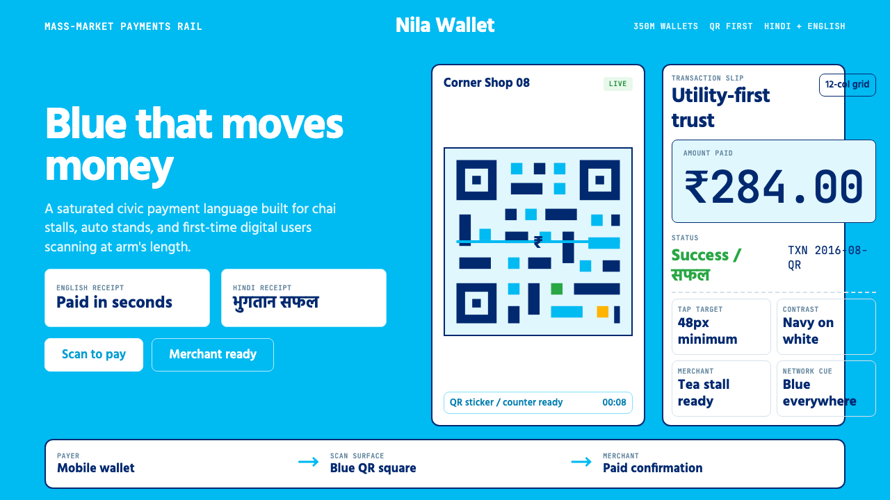 Paytm Indian FintechTrust at street scale. Saturated blue, Hind numerals, and QR grids make payme…街头级信任:饱和蓝、Hind数字与二维码方格让支付更清楚。
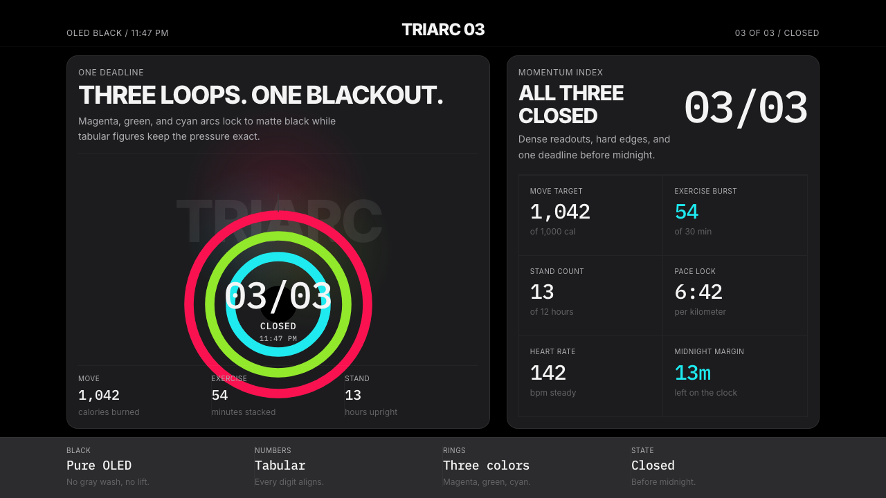 Apple Fitness Rings Closed (2024)Midnight feels exact. Magenta, green, and cyan rings lock onto OLED black.午夜像被校准。洋红、绿、青三环锁在黑底上。
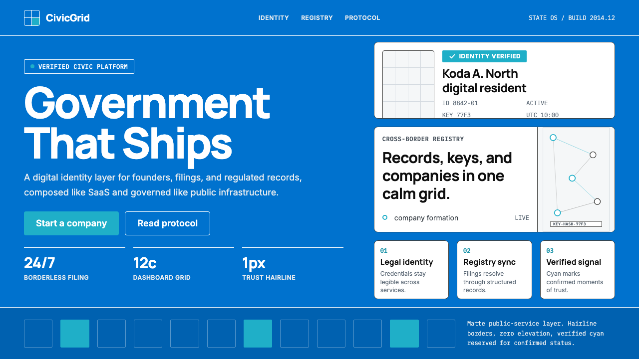 Estonia e-Residency Digital (2014)Trust without weight. Cornflower blue, 12-column grids, and cyan verified sig…信任不沉重。矢车菊蓝、十二栏网格与青色验证信号。
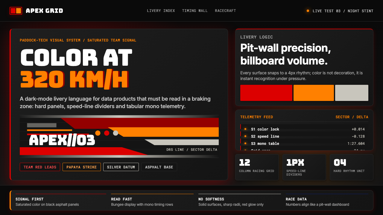 F1 Formula One LiverySpeed is legible. Ferrari red and papaya speed-lines cut through black teleme…速度清晰可读:红与木瓜橙速度线切开黑色遥测面板。
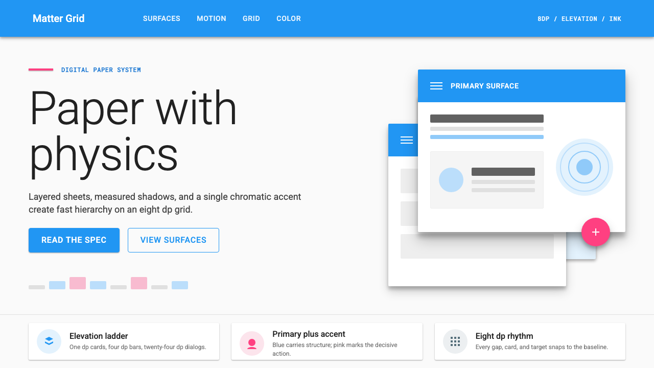 Material Design 1.0Depth made flat usable. Blue app bars, pink FABs, 8dp grids, and crisp paper…让扁平拥有深度:蓝色应用栏、粉色FAB、8dp网格与纸张投影。